


More on Marketing

Guillaume Dumortier
3 years ago
Mastering the Art of Rhetoric: A Guide to Rhetorical Devices in Successful Headlines and Titles
Unleash the power of persuasion and captivate your audience with compelling headlines.
As the old adage goes, "You never get a second chance to make a first impression."
In the world of content creation and social ads, headlines and titles play a critical role in making that first impression.
A well-crafted headline can make the difference between an article being read or ignored, a video being clicked on or bypassed, or a product being purchased or passed over.
To make an impact with your headlines, mastering the art of rhetoric is essential. In this post, we'll explore various rhetorical devices and techniques that can help you create headlines that captivate your audience and drive engagement.
tl;dr : Headline Magician will help you craft the ultimate headline titles powered by rhetoric devices
Example with a high-end luxury organic zero-waste skincare brand
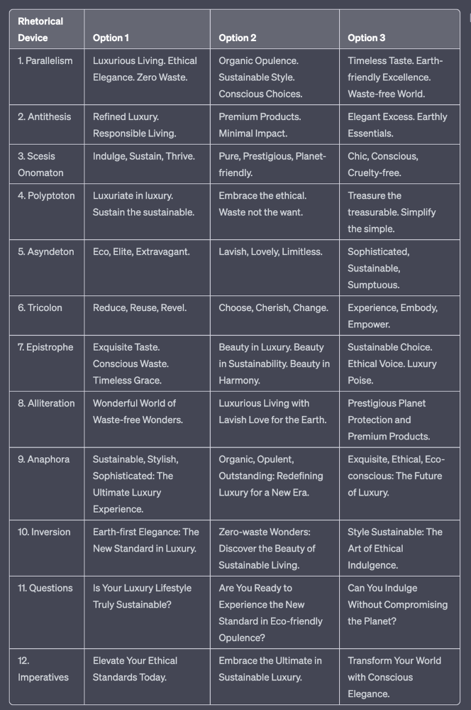
✍️ The Power of Alliteration
Alliteration is the repetition of the same consonant sound at the beginning of words in close proximity. This rhetorical device lends itself well to headlines, as it creates a memorable, rhythmic quality that can catch a reader's attention.
By using alliteration, you can make your headlines more engaging and easier to remember.
Examples:
"Crafting Compelling Content: A Comprehensive Course"
"Mastering the Art of Memorable Marketing"
🔁 The Appeal of Anaphora
Anaphora is the repetition of a word or phrase at the beginning of successive clauses. This rhetorical device emphasizes a particular idea or theme, making it more memorable and persuasive.
In headlines, anaphora can be used to create a sense of unity and coherence, which can draw readers in and pique their interest.
Examples:
"Create, Curate, Captivate: Your Guide to Social Media Success"
"Innovation, Inspiration, and Insight: The Future of AI"
🔄 The Intrigue of Inversion
Inversion is a rhetorical device where the normal order of words is reversed, often to create an emphasis or achieve a specific effect.
In headlines, inversion can generate curiosity and surprise, compelling readers to explore further.
Examples:
"Beneath the Surface: A Deep Dive into Ocean Conservation"
"Beyond the Stars: The Quest for Extraterrestrial Life"
⚖️ The Persuasive Power of Parallelism
Parallelism is a rhetorical device that involves using similar grammatical structures or patterns to create a sense of balance and symmetry.
In headlines, parallelism can make your message more memorable and impactful, as it creates a pleasing rhythm and flow that can resonate with readers.
Examples:
"Eat Well, Live Well, Be Well: The Ultimate Guide to Wellness"
"Learn, Lead, and Launch: A Blueprint for Entrepreneurial Success"
⏭️ The Emphasis of Ellipsis
Ellipsis is the omission of words, typically indicated by three periods (...), which suggests that there is more to the story.
In headlines, ellipses can create a sense of mystery and intrigue, enticing readers to click and discover what lies behind the headline.
Examples:
"The Secret to Success... Revealed"
"Unlocking the Power of Your Mind... A Step-by-Step Guide"
🎭 The Drama of Hyperbole
Hyperbole is a rhetorical device that involves exaggeration for emphasis or effect.
In headlines, hyperbole can grab the reader's attention by making bold, provocative claims that stand out from the competition. Be cautious with hyperbole, however, as overuse or excessive exaggeration can damage your credibility.
Examples:
"The Ultimate Guide to Mastering Any Skill in Record Time"
"Discover the Revolutionary Technique That Will Transform Your Life"
❓The Curiosity of Questions
Posing questions in your headlines can be an effective way to pique the reader's curiosity and encourage engagement.
Questions compel the reader to seek answers, making them more likely to click on your content. Additionally, questions can create a sense of connection between the content creator and the audience, fostering a sense of dialogue and discussion.
Examples:
"Are You Making These Common Mistakes in Your Marketing Strategy?"
"What's the Secret to Unlocking Your Creative Potential?"
💥 The Impact of Imperatives
Imperatives are commands or instructions that urge the reader to take action. By using imperatives in your headlines, you can create a sense of urgency and importance, making your content more compelling and actionable.
Examples:
"Master Your Time Management Skills Today"
"Transform Your Business with These Innovative Strategies"
💢 The Emotion of Exclamations
Exclamations are powerful rhetorical devices that can evoke strong emotions and convey a sense of excitement or urgency.
Including exclamations in your headlines can make them more attention-grabbing and shareable, increasing the chances of your content being read and circulated.
Examples:
"Unlock Your True Potential: Find Your Passion and Thrive!"
"Experience the Adventure of a Lifetime: Travel the World on a Budget!"
🎀 The Effectiveness of Euphemisms
Euphemisms are polite or indirect expressions used in place of harsher, more direct language.
In headlines, euphemisms can make your message more appealing and relatable, helping to soften potentially controversial or sensitive topics.
Examples:
"Navigating the Challenges of Modern Parenting"
"Redefining Success in a Fast-Paced World"
⚡Antithesis: The Power of Opposites
Antithesis involves placing two opposite words side-by-side, emphasizing their contrasts. This device can create a sense of tension and intrigue in headlines.
Examples:
"Once a day. Every day"
"Soft on skin. Kill germs"
"Mega power. Mini size."
To utilize antithesis, identify two opposing concepts related to your content and present them in a balanced manner.
🎨 Scesis Onomaton: The Art of Verbless Copy
Scesis onomaton is a rhetorical device that involves writing verbless copy, which quickens the pace and adds emphasis.
Example:
"7 days. 7 dollars. Full access."
To use scesis onomaton, remove verbs and focus on the essential elements of your headline.
🌟 Polyptoton: The Charm of Shared Roots
Polyptoton is the repeated use of words that share the same root, bewitching words into memorable phrases.
Examples:
"Real bread isn't made in factories. It's baked in bakeries"
"Lose your knack for losing things."
To employ polyptoton, identify words with shared roots that are relevant to your content.
✨ Asyndeton: The Elegance of Omission
Asyndeton involves the intentional omission of conjunctions, adding crispness, conviction, and elegance to your headlines.
Examples:
"You, Me, Sushi?"
"All the latte art, none of the environmental impact."
To use asyndeton, eliminate conjunctions and focus on the core message of your headline.
🔮 Tricolon: The Magic of Threes
Tricolon is a rhetorical device that uses the power of three, creating memorable and impactful headlines.
Examples:
"Show it, say it, send it"
"Eat Well, Live Well, Be Well."
To use tricolon, craft a headline with three key elements that emphasize your content's main message.
🔔 Epistrophe: The Chime of Repetition
Epistrophe involves the repetition of words or phrases at the end of successive clauses, adding a chime to your headlines.
Examples:
"Catch it. Bin it. Kill it."
"Joint friendly. Climate friendly. Family friendly."
To employ epistrophe, repeat a key phrase or word at the end of each clause.

Emma Jade
3 years ago
6 hacks to create content faster
Content gurus' top time-saving hacks.

I'm a content strategist, writer, and graphic designer. Time is more valuable than money.
Money is always available. Even if you're poor. Ways exist.
Time is passing, and one day we'll run out.
Sorry to be morbid.
In today's digital age, you need to optimize how you create content for your organization. Here are six content creation hacks.
1. Use templates
Use templates to streamline your work whether generating video, images, or documents.
Setup can take hours. Using a free resource like Canva, you can create templates for any type of material.
This will save you hours each month.
2. Make a content calendar
You post without a plan? A content calendar solves 50% of these problems.
You can prepare, organize, and plan your material ahead of time so you're not scrambling when you remember, "Shit, it's Mother's Day!"
3. Content Batching
Batching content means creating a lot in one session. This is helpful for video content that requires a lot of setup time.
Batching monthly content saves hours. Time is a valuable resource.
When working on one type of task, it's easy to get into a flow state. This saves time.
4. Write Caption
On social media, we generally choose the image first and then the caption. Writing captions first sometimes work better, though.
Writing the captions first can allow you more creative flexibility and be easier if you're not excellent with language.
Say you want to tell your followers something interesting.
Writing a caption first is easier than choosing an image and then writing a caption to match.
Not everything works. You may have already-created content that needs captioning. When you don't know what to share, think of a concept, write the description, and then produce a video or graphic.
Cats can be skinned in several ways..
5. Repurpose
Reuse content when possible. You don't always require new stuff. In fact, you’re pretty stupid if you do #SorryNotSorry.
Repurpose old content. All those blog entries, videos, and unfinished content on your desk or hard drive.
This blog post can be turned into a social media infographic. Canva's motion graphic function can animate it. I can record a YouTube video regarding this issue for a podcast. I can make a post on each point in this blog post and turn it into an eBook or paid course.
And it doesn’t stop there.
My point is, to think outside the box and really dig deep into ways you can leverage the content you’ve already created.
6. Schedule Them
If you're still manually posting content, get help. When you batch your content, schedule it ahead of time.
Some scheduling apps are free or cheap. No excuses.
Don't publish and ghost.
Scheduling saves time by preventing you from doing it manually. But if you never engage with your audience, the algorithm won't reward your material.
Be online and engage your audience.
Content Machine
Use these six content creation hacks. They help you succeed and save time.

Jenn Leach
3 years ago
This clever Instagram marketing technique increased my sales to $30,000 per month.
No Paid Ads Required

I had an online store. After a year of running the company alongside my 9-to-5, I made enough to resign.
That day was amazing.
This Instagram marketing plan helped the store succeed.
How did I increase my sales to five figures a month without using any paid advertising?
I used customer event marketing.
I'm not sure this term exists. I invented it to describe what I was doing.
Instagram word-of-mouth, fan engagement, and interaction drove sales.
If a customer liked or disliked a product, the buzz would drive attention to the store.
I used customer-based events to increase engagement and store sales.
Success!
Here are the weekly Instagram customer events I coordinated while running my business:
Be the Buyer Days
Flash sales
Mystery boxes
Be the Buyer Days: How do they work?
Be the Buyer Days are exactly that.
You choose a day to share stock selections with social media followers.
This is an easy approach to engaging customers and getting fans enthusiastic about new releases.
First, pick a handful of items you’re considering ordering. I’d usually pick around 3 for Be the Buyer Day.
Then I'd poll the crowd on Instagram to vote on their favorites.
This was before Instagram stories, polls, and all the other cool features Instagram offers today. I think using these tools now would make this event even better.
I'd ask customers their favorite back then.
The growing comments excited customers.
Then I'd declare the winner, acquire the products, and start selling it.
How do flash sales work?
I mostly ran flash sales.
You choose a limited number of itemsdd for a few-hour sale.
We wanted most sales to result in sold-out items.
When an item sells out, it contributes to the sensation of scarcity and can inspire customers to visit your store to buy a comparable product, join your email list, become a fan, etc.
We hoped they'd act quickly.
I'd hold flash deals twice a week, which generated scarcity and boosted sales.
The store had a few thousand Instagram followers when I started flash deals.
Each flash sale item would make $400 to $600.
$400 x 3= $1,200
That's $1,200 on social media!
Twice a week, you'll make roughly $10K a month from Instagram.
$1,200/day x 8 events/month=$9,600
Flash sales did great.
We held weekly flash deals and sent social media and email reminders. That’s about it!
How are mystery boxes put together?
All you do is package a box of store products and sell it as a mystery box on TikTok or retail websites.
A $100 mystery box would cost $30.
You're discounting high-value boxes.
This is a clever approach to get rid of excess inventory and makes customers happy.
It worked!
Be the Buyer Days, flash deals, and mystery boxes helped build my company without paid advertisements.
All companies can use customer event marketing. Involving customers and providing an engaging environment can boost sales.
Try it!
You might also like

Caleb Naysmith
3 years ago Draft
A Myth: Decentralization
It’s simply not conceivable, or at least not credible.
One of the most touted selling points of Crypto has always been this grandiose idea of decentralization. Bitcoin first arose in 2009 after the housing crisis and subsequent crash that came with it. It aimed to solve this supposed issue of centralization. Nobody “owns” Bitcoin in theory, so the idea then goes that it won’t be subject to the same downfalls that led to the 2008 crash or similarly speculative events that led to the 2008 disaster. The issue is the banks, not the human nature associated with the greedy individuals running them.
Subsequent blockchains have attempted to fix many of the issues of Bitcoin by increasing capacity, decreasing the costs and processing times associated with Bitcoin, and expanding what can be done with their blockchains. Since nobody owns Bitcoin, it hasn’t really been able to be expanded on. You have people like Vitalk Buterin, however, that actively work on Ethereum though.
The leap from Bitcoin to Ethereum was a massive leap toward centralization, and the trend has only gotten worse. In fact, crypto has since become almost exclusively centralized in recent years.
Decentralization is only good in theory
It’s a good idea. In fact, it’s a wonderful idea. However, like other utopian societies, individuals misjudge human nature and greed. In a perfect world, decentralization would certainly be a wonderful idea because sure, people may function as their own banks, move payments immediately, remain anonymous, and so on. However, underneath this are a couple issues:
You can already send money instantaneously today.
They are not decentralized.
Decentralization is a bad idea.
Being your own bank is a stupid move.
Let’s break these down. Some are quite simple, but lets have a look.
Sending money right away
One thing with crypto is the idea that you can send payments instantly. This has pretty much been entirely solved in current times. You can transmit significant sums of money instantly for a nominal cost and it’s instantaneously cleared. Venmo was launched in 2009 and has since increased to prominence, and currently is on most people's phones. I can directly send ANY amount of money quickly from my bank to another person's Venmo account.
Comparing that with ETH and Bitcoin, Venmo wins all around. I can send money to someone for free instantly in dollars and the only fee paid is optional depending on when you want it.
Both Bitcoin and Ethereum are subject to demand. If the blockchains have a lot of people trying to process transactions fee’s go up, and the time that it takes to receive your crypto takes longer. When Ethereum gets bad, people have reported spending several thousand of dollars on just 1 transaction.
These transactions take place via “miners” bundling and confirming transactions, then recording them on the blockchain to confirm that the transaction did indeed happen. They charge fees to do this and are also paid in Bitcoin/ETH. When a transaction is confirmed, it's then sent to the other users wallet. This within itself is subject to lots of controversy because each transaction needs to be confirmed 6 times, this takes massive amounts of power, and most of the power is wasted because this is an adversarial system in which the person that mines the transaction gets paid, and everyone else is out of luck. Also, these could theoretically be subject to a “51% attack” in which anyone with over 51% of the mining hash rate could effectively control all of the transactions, and reverse transactions while keeping the BTC resulting in “double spending”.
There are tons of other issues with this, but essentially it means: They rely on these third parties to confirm the transactions. Without people confirming these transactions, Bitcoin stalls completely, and if anyone becomes too dominant they can effectively control bitcoin.
Not to mention, these transactions are in Bitcoin and ETH, not dollars. So, you need to convert them to dollars still, and that's several more transactions, and likely to take several days anyway as the centralized exchange needs to send you the money by traditional methods.
They are not distributed
That takes me to the following point. This isn’t decentralized, at all. Bitcoin is the closest it gets because Satoshi basically closed it to new upgrades, although its still subject to:
Whales
Miners
It’s vital to realize that these are often the same folks. While whales aren’t centralized entities typically, they can considerably effect the price and outcome of Bitcoin. If the largest wallets holding as much as 1 million BTC were to sell, it’d effectively collapse the price perhaps beyond repair. However, Bitcoin can and is pretty much controlled by the miners. Further, Bitcoin is more like an oligarchy than decentralized. It’s been effectively used to make the rich richer, and both the mining and price is impacted by the rich. The overwhelming minority of those actually using it are retail investors. The retail investors are basically never the ones generating money from it either.
As far as ETH and other cryptos go, there is realistically 0 case for them being decentralized. Vitalik could not only kill it but even walking away from it would likely lead to a significant decline. It has tons of issues right now that Vitalik has promised to fix with the eventual Ethereum 2.0., and stepping away from it wouldn’t help.
Most tokens as well are generally tied to some promise of future developments and creators. The same is true for most NFT projects. The reason 99% of crypto and NFT projects fail is because they failed to deliver on various promises or bad dev teams, or poor innovation, or the founders just straight up stole from everyone. I could go more in-depth than this but go find any project and if there is a dev team, company, or person tied to it then it's likely, not decentralized. The success of that project is directly tied to the dev team, and if they wanted to, most hold large wallets and could sell it all off effectively killing the project. Not to mention, any crypto project that doesn’t have a locked contract can 100% be completely rugged and they can run off with all of the money.
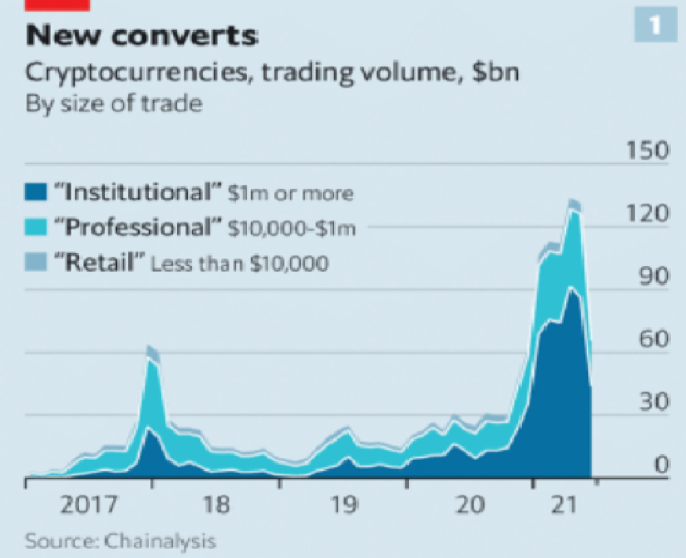
Decentralization is undesirable
Even if they were decentralized then it would not be a good thing. The graphic above indicates this is effectively a rich person’s unregulated playground… so it’s exactly like… the very issue it tried to solve?
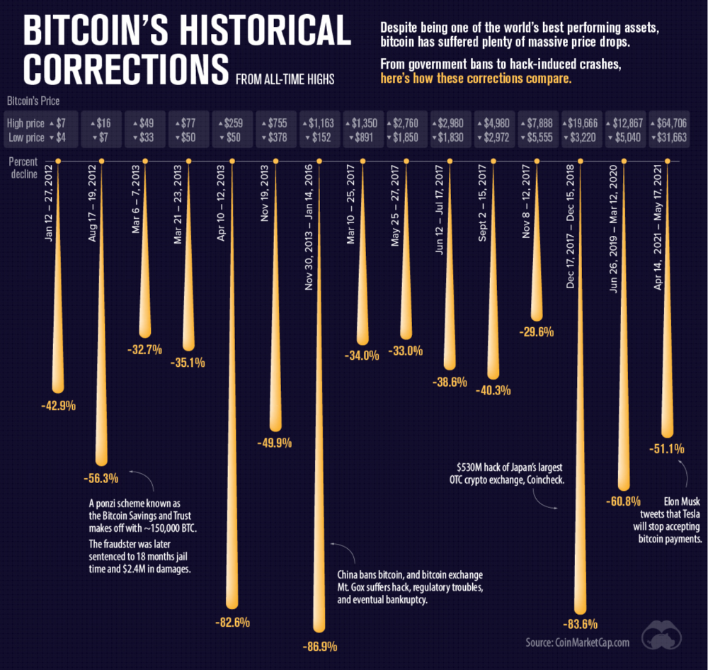
Not to mention, it’s supposedly meant to prevent things like 2008, but is regularly subjected to 50–90% drawdowns in value? Back when Bitcoin was only known in niche parts of the dark web and illegal markets, it would regularly drop as much as 90% and has a long history of massive drawdowns.
The majority of crypto is blatant scams, and ALL of crypto is a “zero” or “negative” sum game in that it relies on the next person buying for people to make money. This is not a good thing. This has yet to solve any issues around what caused the 2008 crisis. Rather, it seemingly amplified all of the bad parts of it actually. Crypto is the ultimate speculative asset and realistically has no valuation metric. People invest in Apple because it has revenue and cash on hand. People invest in crypto purely for speculation. The lack of regulation or accountability means this is amplified to the most extreme degree where anything goes: Fraud, deception, pump and dumps, scams, etc. This results in a pure speculative madhouse where, unsurprisingly, only the rich win. Not only that but the deck is massively stacked in against the everyday investor because you can’t do a pump and dump without money.
At the heart of all of this is still the same issues: greed and human nature. However, in setting out to solve the issues that allowed 2008 to happen, they made something that literally took all of the bad parts of 2008 and then amplified it. 2008, similarly, was due to greed and human nature but was allowed to happen due to lack of oversite, rich people's excessive leverage over the poor, and excessive speculation. Crypto trades SOLELY on human emotion, has 0 oversite, is pure speculation, and the power dynamic is just as bad or worse.
Why should each individual be their own bank?
This is the last one, and it's short and basic. Why do we want people functioning as their own bank? Everything we do relies on another person. Without the internet, and internet providers there is no crypto. We don’t have people functioning as their own home and car manufacturers or internet service providers. Sure, you might specialize in some of these things, but masquerading as your own bank is a horrible idea.
I am not in the banking industry so I don’t know all the issues with banking. Most people aren’t in banking or crypto, so they don’t know the ENDLESS scams associated with it, and they are bound to lose their money eventually.
If you appreciate this article and want to read more from me and authors like me, without any limits, consider buying me a coffee: buymeacoffee.com/calebnaysmith
Matt Nutsch
3 years ago
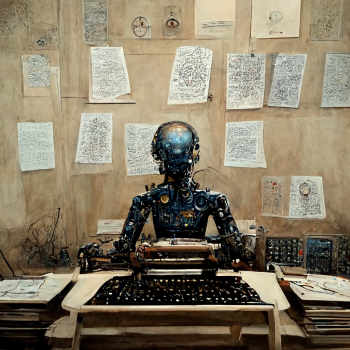
Most people are unaware of how artificial intelligence (A.I.) is changing the world.

Recently, I saw an interesting social media post. In an entrepreneurship forum. A blogger asked for help because he/she couldn't find customers. I now suspect that the writer’s occupation is being disrupted by A.I.
Introduction
Artificial Intelligence (A.I.) has been a hot topic since the 1950s. With recent advances in machine learning, A.I. will touch almost every aspect of our lives. This article will discuss A.I. technology and its social and economic implications.
What's AI?
A computer program or machine with A.I. can think and learn. In general, it's a way to make a computer smart. Able to understand and execute complex tasks. Machine learning, NLP, and robotics are common types of A.I.
AI's global impact
AI will change the world, but probably faster than you think. A.I. already affects our daily lives. It improves our decision-making, efficiency, and productivity.
A.I. is transforming our lives and the global economy. It will create new business and job opportunities but eliminate others. Affected workers may face financial hardship.
AI examples:
OpenAI's GPT-3 text-generation
Developers can train, deploy, and manage models on GPT-3. It handles data preparation, model training, deployment, and inference for machine learning workloads. GPT-3 is easy to use for both experienced and new data scientists.
My team conducted an experiment. We needed to generate some blog posts for a website. We hired a blogger on Upwork. OpenAI created a blog post. The A.I.-generated blog post was of higher quality and lower cost.
MidjourneyAI's Art Contests
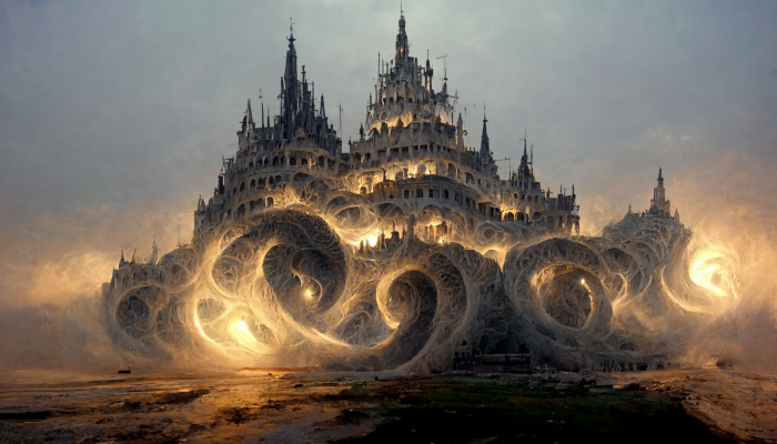
AI already affects artists. Artists use A.I. to create realistic 3D images and videos for digital art. A.I. is also used to generate new art ideas and methods.
MidjourneyAI and GigapixelAI won a contest last month. It's AI. created a beautiful piece of art that captured the contest's spirit. AI triumphs. It could open future doors.
After the art contest win, I registered to try out these new image generating A.I.s. In the MidjourneyAI chat forum, I noticed an artist's plea. The artist begged others to stop flooding RedBubble with AI-generated art.
Shutterstock and Getty Images have halted user uploads. AI-generated images flooded online marketplaces.
Imagining Videos with Meta
Meta released Make-a-Video this week. It's an A.I. app that creates videos from text. What you type creates a video.
This technology will impact TV, movies, and video games greatly. Imagine a movie or game that's personalized to your tastes. It's closer than you think.
Uses and Abuses of Deepfakes

Deepfake videos are computer-generated images of people. AI creates realistic images and videos of people.
Deepfakes are entertaining but have social implications. Porn introduced deepfakes in 2017. People put famous faces on porn actors and actresses without permission.
Soon, deepfakes were used to show dead actors/actresses or make them look younger. Carrie Fischer was included in films after her death using deepfake technology.
Deepfakes can be used to create fake news or manipulate public opinion, according to an AI.
Voices for Darth Vader and Iceman
James Earl Jones, who voiced Darth Vader, sold his voice rights this week. Aged actor won't be in those movies. Respeecher will use AI to mimic Jones's voice. This technology could change the entertainment industry. One actor can now voice many characters.

AI can generate realistic voice audio from text. Top Gun 2 actor Val Kilmer can't speak for medical reasons. Sonantic created Kilmer's voice from the movie script. This entertaining technology has social implications. It blurs authentic recordings and fake media.
Medical A.I. fights viruses
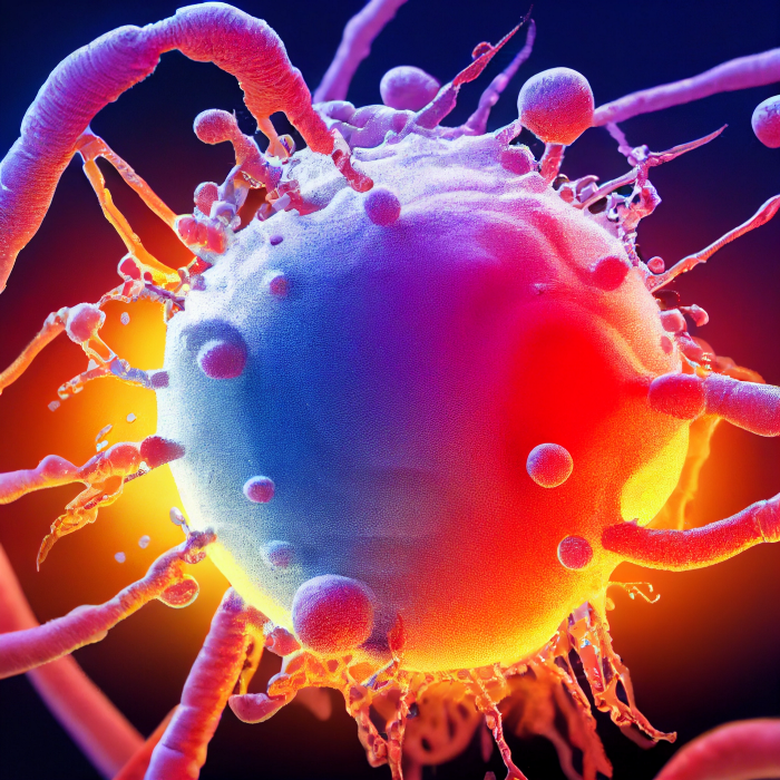
A team of Chinese scientists used machine learning to predict effective antiviral drugs last year. They started with a large dataset of virus-drug interactions. Researchers combined that with medication and virus information. Finally, they used machine learning to predict effective anti-virus medicines. This technology could solve medical problems.
AI ideas AI-generated Itself

OpenAI's GPT-3 predicted future A.I. uses. Here's what it told me:
AI will affect the economy. Businesses can operate more efficiently and reinvest resources with A.I.-enabled automation. AI can automate customer service tasks, reducing costs and improving satisfaction.
A.I. makes better pricing, inventory, and marketing decisions. AI automates tasks and makes decisions. A.I.-powered robots could help the elderly or disabled. Self-driving cars could reduce accidents.
A.I. predictive analytics can predict stock market or consumer behavior trends and patterns. A.I. also personalizes recommendations. sways. A.I. recommends products and movies. AI can generate new ideas based on data analysis.
Conclusion
A.I. will change business as it becomes more common. It will change how we live and work by creating growth and prosperity.
Exciting times, but also one which should give us all pause. Technology can be good or evil. We must use new technologies ethically, fairly, and honestly.
“The author generated some sentences in this text in part with GPT-3, OpenAI’s large-scale language-generation model. Upon generating draft language, the author reviewed, edited, and revised the language to their own liking and takes ultimate responsibility for the content of this publication. The text of this post was further edited using HemingWayApp. Many of the images used were generated using A.I. as described in the captions.”

Daniel Vassallo
4 years ago
Why I quit a $500K job at Amazon to work for myself
I quit my 8-year Amazon job last week. I wasn't motivated to do another year despite promotions, pay, recognition, and praise.
In AWS, I built developer tools. I could have worked in that field forever.
I became an Amazon developer. Within 3.5 years, I was promoted twice to senior engineer and would have been promoted to principal engineer if I stayed. The company said I had great potential.
Over time, I became a reputed expert and leader within the company. I was respected.
First year I made $75K, last year $511K. If I stayed another two years, I could have made $1M.
Despite Amazon's reputation, my work–life balance was good. I no longer needed to prove myself and could do everything in 40 hours a week. My team worked from home once a week, and I rarely opened my laptop nights or weekends.
My coworkers were great. I had three generous, empathetic managers. I’m very grateful to everyone I worked with.
Everything was going well and getting better. My motivation to go to work each morning was declining despite my career and income growth.
Another promotion, pay raise, or big project wouldn't have boosted my motivation. Motivation was also waning. It was my freedom.
Demotivation
My motivation was high in the beginning. I worked with someone on an internal tool with little scrutiny. I had more freedom to choose how and what to work on than in recent years. Me and another person improved it, talked to users, released updates, and tested it. Whatever we wanted, we did. We did our best and were mostly self-directed.
In recent years, things have changed. My department's most important project had many stakeholders and complex goals. What I could do depended on my ability to convince others it was the best way to achieve our goals.
Amazon was always someone else's terms. The terms started out simple (keep fixing it), but became more complex over time (maximize all goals; satisfy all stakeholders). Working in a large organization imposed restrictions on how to do the work, what to do, what goals to set, and what business to pursue. This situation forced me to do things I didn't want to do.
Finding New Motivation
What would I do forever? Not something I did until I reached a milestone (an exit), but something I'd do until I'm 80. What could I do for the next 45 years that would make me excited to wake up and pay my bills? Is that too unambitious? Nope. Because I'm motivated by two things.
One is an external carrot or stick. I'm not forced to file my taxes every April, but I do because I don't want to go to jail. Or I may not like something but do it anyway because I need to pay the bills or want a nice car. Extrinsic motivation
One is internal. When there's no carrot or stick, this motivates me. This fuels hobbies. I wanted a job that was intrinsically motivated.
Is this too low-key? Extrinsic motivation isn't sustainable. Getting promoted felt good for a week, then it was over. When I hit $100K, I admired my W2 for a few days, but then it wore off. Same thing happened at $200K, $300K, $400K, and $500K. Earning $1M or $10M wouldn't change anything. I feel the same about every material reward or possession. Getting them feels good at first, but quickly fades.
Things I've done since I was a kid, when no one forced me to, don't wear off. Coding, selling my creations, charting my own path, and being honest. Why not always use my strengths and motivation? I'm lucky to live in a time when I can work independently in my field without large investments. So that’s what I’m doing.
What’s Next?
I'm going all-in on independence and will make a living from scratch. I won't do only what I like, but on my terms. My goal is to cover my family's expenses before my savings run out while doing something I enjoy. What more could I want from my work?
You can now follow me on Twitter as I continue to document my journey.
This post is a summary. Read full article here