


More on Economics & Investing

Justin Kuepper
3 years ago
Day Trading Introduction
Historically, only large financial institutions, brokerages, and trading houses could actively trade in the stock market. With instant global news dissemination and low commissions, developments such as discount brokerages and online trading have leveled the playing—or should we say trading—field. It's never been easier for retail investors to trade like pros thanks to trading platforms like Robinhood and zero commissions.
Day trading is a lucrative career (as long as you do it properly). But it can be difficult for newbies, especially if they aren't fully prepared with a strategy. Even the most experienced day traders can lose money.
So, how does day trading work?
Day Trading Basics
Day trading is the practice of buying and selling a security on the same trading day. It occurs in all markets, but is most common in forex and stock markets. Day traders are typically well educated and well funded. For small price movements in highly liquid stocks or currencies, they use leverage and short-term trading strategies.
Day traders are tuned into short-term market events. News trading is a popular strategy. Scheduled announcements like economic data, corporate earnings, or interest rates are influenced by market psychology. Markets react when expectations are not met or exceeded, usually with large moves, which can help day traders.
Intraday trading strategies abound. Among these are:
- Scalping: This strategy seeks to profit from minor price changes throughout the day.
- Range trading: To determine buy and sell levels, range traders use support and resistance levels.
- News-based trading exploits the increased volatility around news events.
- High-frequency trading (HFT): The use of sophisticated algorithms to exploit small or short-term market inefficiencies.
A Disputed Practice
Day trading's profit potential is often debated on Wall Street. Scammers have enticed novices by promising huge returns in a short time. Sadly, the notion that trading is a get-rich-quick scheme persists. Some daytrade without knowledge. But some day traders succeed despite—or perhaps because of—the risks.
Day trading is frowned upon by many professional money managers. They claim that the reward rarely outweighs the risk. Those who day trade, however, claim there are profits to be made. Profitable day trading is possible, but it is risky and requires considerable skill. Moreover, economists and financial professionals agree that active trading strategies tend to underperform passive index strategies over time, especially when fees and taxes are factored in.
Day trading is not for everyone and is risky. It also requires a thorough understanding of how markets work and various short-term profit strategies. Though day traders' success stories often get a lot of media attention, keep in mind that most day traders are not wealthy: Many will fail, while others will barely survive. Also, while skill is important, bad luck can sink even the most experienced day trader.
Characteristics of a Day Trader
Experts in the field are typically well-established professional day traders.
They usually have extensive market knowledge. Here are some prerequisites for successful day trading.
Market knowledge and experience
Those who try to day-trade without understanding market fundamentals frequently lose. Day traders should be able to perform technical analysis and read charts. Charts can be misleading if not fully understood. Do your homework and know the ins and outs of the products you trade.
Enough capital
Day traders only use risk capital they can lose. This not only saves them money but also helps them trade without emotion. To profit from intraday price movements, a lot of capital is often required. Most day traders use high levels of leverage in margin accounts, and volatile market swings can trigger large margin calls on short notice.
Strategy
A trader needs a competitive advantage. Swing trading, arbitrage, and trading news are all common day trading strategies. They tweak these strategies until they consistently profit and limit losses.
Strategy Breakdown:
Type | Risk | Reward
Swing Trading | High | High
Arbitrage | Low | Medium
Trading News | Medium | Medium
Mergers/Acquisitions | Medium | High
Discipline
A profitable strategy is useless without discipline. Many day traders lose money because they don't meet their own criteria. “Plan the trade and trade the plan,” they say. Success requires discipline.
Day traders profit from market volatility. For a day trader, a stock's daily movement is appealing. This could be due to an earnings report, investor sentiment, or even general economic or company news.
Day traders also prefer highly liquid stocks because they can change positions without affecting the stock's price. Traders may buy a stock if the price rises. If the price falls, a trader may decide to sell short to profit.
A day trader wants to trade a stock that moves (a lot).
Day Trading for a Living
Professional day traders can be self-employed or employed by a larger institution.
Most day traders work for large firms like hedge funds and banks' proprietary trading desks. These traders benefit from direct counterparty lines, a trading desk, large capital and leverage, and expensive analytical software (among other advantages). By taking advantage of arbitrage and news events, these traders can profit from less risky day trades before individual traders react.
Individual traders often manage other people’s money or simply trade with their own. They rarely have access to a trading desk, but they frequently have strong ties to a brokerage (due to high commissions) and other resources. However, their limited scope prevents them from directly competing with institutional day traders. Not to mention more risks. Individuals typically day trade highly liquid stocks using technical analysis and swing trades, with some leverage.
Day trading necessitates access to some of the most complex financial products and services. Day traders usually need:
Access to a trading desk
Traders who work for large institutions or manage large sums of money usually use this. The trading or dealing desk provides these traders with immediate order execution, which is critical during volatile market conditions. For example, when an acquisition is announced, day traders interested in merger arbitrage can place orders before the rest of the market.
News sources
The majority of day trading opportunities come from news, so being the first to know when something significant happens is critical. It has access to multiple leading newswires, constant news coverage, and software that continuously analyzes news sources for important stories.
Analytical tools
Most day traders rely on expensive trading software. Technical traders and swing traders rely on software more than news. This software's features include:
-
Automatic pattern recognition: It can identify technical indicators like flags and channels, or more complex indicators like Elliott Wave patterns.
-
Genetic and neural applications: These programs use neural networks and genetic algorithms to improve trading systems and make more accurate price predictions.
-
Broker integration: Some of these apps even connect directly to the brokerage, allowing for instant and even automatic trade execution. This reduces trading emotion and improves execution times.
-
Backtesting: This allows traders to look at past performance of a strategy to predict future performance. Remember that past results do not always predict future results.
Together, these tools give traders a competitive advantage. It's easy to see why inexperienced traders lose money without them. A day trader's earnings potential is also affected by the market in which they trade, their capital, and their time commitment.
Day Trading Risks
Day trading can be intimidating for the average investor due to the numerous risks involved. The SEC highlights the following risks of day trading:
Because day traders typically lose money in their first months of trading and many never make profits, they should only risk money they can afford to lose.
Trading is a full-time job that is stressful and costly: Observing dozens of ticker quotes and price fluctuations to spot market trends requires intense concentration. Day traders also spend a lot on commissions, training, and computers.
Day traders heavily rely on borrowing: Day-trading strategies rely on borrowed funds to make profits, which is why many day traders lose everything and end up in debt.
Avoid easy profit promises: Avoid “hot tips” and “expert advice” from day trading newsletters and websites, and be wary of day trading educational seminars and classes.
Should You Day Trade?
As stated previously, day trading as a career can be difficult and demanding.
- First, you must be familiar with the trading world and know your risk tolerance, capital, and goals.
- Day trading also takes a lot of time. You'll need to put in a lot of time if you want to perfect your strategies and make money. Part-time or whenever isn't going to cut it. You must be fully committed.
- If you decide trading is for you, remember to start small. Concentrate on a few stocks rather than jumping into the market blindly. Enlarging your trading strategy can result in big losses.
- Finally, keep your cool and avoid trading emotionally. The more you can do that, the better. Keeping a level head allows you to stay focused and on track.
If you follow these simple rules, you may be on your way to a successful day trading career.
Is Day Trading Illegal?
Day trading is not illegal or unethical, but it is risky. Because most day-trading strategies use margin accounts, day traders risk losing more than they invest and becoming heavily in debt.
How Can Arbitrage Be Used in Day Trading?
Arbitrage is the simultaneous purchase and sale of a security in multiple markets to profit from small price differences. Because arbitrage ensures that any deviation in an asset's price from its fair value is quickly corrected, arbitrage opportunities are rare.
Why Don’t Day Traders Hold Positions Overnight?
Day traders rarely hold overnight positions for several reasons: Overnight trades require more capital because most brokers require higher margin; stocks can gap up or down on overnight news, causing big trading losses; and holding a losing position overnight in the hope of recovering some or all of the losses may be against the trader's core day-trading philosophy.
What Are Day Trader Margin Requirements?
Regulation D requires that a pattern day trader client of a broker-dealer maintain at all times $25,000 in equity in their account.
How Much Buying Power Does Day Trading Have?
Buying power is the total amount of funds an investor has available to trade securities. FINRA rules allow a pattern day trader to trade up to four times their maintenance margin excess as of the previous day's close.
The Verdict
Although controversial, day trading can be a profitable strategy. Day traders, both institutional and retail, keep the markets efficient and liquid. Though day trading is still popular among novice traders, it should be left to those with the necessary skills and resources.

Cody Collins
2 years ago
The direction of the economy is as follows.
What quarterly bank earnings reveal

Big banks know the economy best. Unless we’re talking about a housing crisis in 2007…
Banks are crucial to the U.S. economy. The Fed, communities, and investments exchange money.
An economy depends on money flow. Banks' views on the economy can affect their decision-making.
Most large banks released quarterly earnings and forward guidance last week. Others were pessimistic about the future.
What Makes Banks Confident
Bank of America's profit decreased 30% year-over-year, but they're optimistic about the economy. Comparatively, they're bullish.
Who banks serve affects what they see. Bank of America supports customers.
They think consumers' future is bright. They believe this for many reasons.
The average customer has decent credit, unless the system is flawed. Bank of America's new credit card and mortgage borrowers averaged 771. New-car loan and home equity borrower averages were 791 and 797.
2008's housing crisis affected people with scores below 620.
Bank of America and the economy benefit from a robust consumer. Major problems can be avoided if individuals maintain spending.
Reasons Other Banks Are Less Confident
Spending requires income. Many companies, mostly in the computer industry, have announced they will slow or freeze hiring. Layoffs are frequently an indication of poor times ahead.
BOA is positive, but investment banks are bearish.
Jamie Dimon, CEO of JPMorgan, outlined various difficulties our economy could confront.
But geopolitical tension, high inflation, waning consumer confidence, the uncertainty about how high rates have to go and the never-before-seen quantitative tightening and their effects on global liquidity, combined with the war in Ukraine and its harmful effect on global energy and food prices are very likely to have negative consequences on the global economy sometime down the road.
That's more headwinds than tailwinds.
JPMorgan, which helps with mergers and IPOs, is less enthusiastic due to these concerns. Incoming headwinds signal drying liquidity, they say. Less business will be done.
Final Reflections
I don't think we're done. Yes, stocks are up 10% from a month ago. It's a long way from old highs.
I don't think the stock market is a strong economic indicator.
Many executives foresee a 2023 recession. According to the traditional definition, we may be in a recession when Q2 GDP statistics are released next week.
Regardless of criteria, I predict the economy will have a terrible year.
Weekly layoffs are announced. Inflation persists. Will prices return to 2020 levels if inflation cools? Perhaps. Still expensive energy. Ukraine's war has global repercussions.
I predict BOA's next quarter earnings won't be as bullish about the consumer's strength.
Sam Hickmann
3 years ago
Donor-Advised Fund Tax Benefits (DAF)
Giving through a donor-advised fund can be tax-efficient. Using a donor-advised fund can reduce your tax liability while increasing your charitable impact.
Grow Your Donations Tax-Free.
Your DAF's charitable dollars can be invested before being distributed. Your DAF balance can grow with the market. This increases grantmaking funds. The assets of the DAF belong to the charitable sponsor, so you will not be taxed on any growth.
Avoid a Windfall Tax Year.
DAFs can help reduce tax burdens after a windfall like an inheritance, business sale, or strong market returns. Contributions to your DAF are immediately tax deductible, lowering your taxable income. With DAFs, you can effectively pre-fund years of giving with assets from a single high-income event.
Make a contribution to reduce or eliminate capital gains.
One of the most common ways to fund a DAF is by gifting publicly traded securities. Securities held for more than a year can be donated at fair market value and are not subject to capital gains tax. If a donor liquidates assets and then donates the proceeds to their DAF, capital gains tax reduces the amount available for philanthropy. Gifts of appreciated securities, mutual funds, real estate, and other assets are immediately tax deductible up to 30% of Adjusted gross income (AGI), with a five-year carry-forward for gifts that exceed AGI limits.
Using Appreciated Stock as a Gift
Donating appreciated stock directly to a DAF rather than liquidating it and donating the proceeds reduces philanthropists' tax liability by eliminating capital gains tax and lowering marginal income tax.
In the example below, a donor has $100,000 in long-term appreciated stock with a cost basis of $10,000:
Using a DAF would allow this donor to give more to charity while paying less taxes. This strategy often allows donors to give more than 20% more to their favorite causes.
For illustration purposes, this hypothetical example assumes a 35% income tax rate. All realized gains are subject to the federal long-term capital gains tax of 20% and the 3.8% Medicare surtax. No other state taxes are considered.
The information provided here is general and educational in nature. It is not intended to be, nor should it be construed as, legal or tax advice. NPT does not provide legal or tax advice. Furthermore, the content provided here is related to taxation at the federal level only. NPT strongly encourages you to consult with your tax advisor or attorney before making charitable contributions.
You might also like

Jano le Roux
2 years ago
Quit worrying about Twitter: Elon moves quickly before refining
Elon's rides start rough, but then...
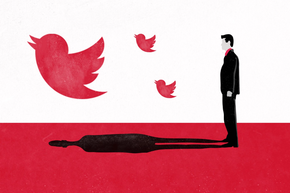
Elon Musk has never been so hated.
They don’t get Elon.
He began using PayPal in this manner.
He began with SpaceX in a similar manner.
He began with Tesla in this manner.
Disruptive.
Elon had rocky starts. His creativity requires it. Just like writing a first draft.
His fastest way to find the way is to avoid it.
PayPal's pricey launch
PayPal was a 1999 business flop.
They were considered insane.
Elon and his co-founders had big plans for PayPal. They adopted the popular philosophy of the time, exchanging short-term profit for growth, and pulled off a miracle just before the bubble burst.
PayPal was created as a dollar alternative. Original PayPal software allowed PalmPilot money transfers. Unfortunately, there weren't enough PalmPilot users.
Since everyone had email, the company emailed payments. Costs rose faster than sales.
The startup wanted to get a million subscribers by paying $10 to sign up and $10 for each referral. Elon thought the price was fair because PayPal made money by charging transaction fees. They needed to make money quickly.
A Wall Street Journal article valuing PayPal at $500 million attracted investors. The dot-com bubble burst soon after they rushed to get financing.
Musk and his partners sold PayPal to eBay for $1.5 billion in 2002. Musk's most successful company was PayPal.
SpaceX's start-up error
Elon and his friends bought a reconditioned ICBM in Russia in 2002.
He planned to invest much of his wealth in a stunt to promote NASA and space travel.
Many called Elon crazy.
The goal was to buy a cheap Russian rocket to launch mice or plants to Mars and return them. He thought SpaceX would revive global space interest. After a bad meeting in Moscow, Elon decided to build his own rockets to undercut launch contracts.
Then SpaceX was founded.
Elon’s plan was harder than expected.
Explosions followed explosions.
Millions lost on cargo.
Millions lost on the rockets.
Investors thought Elon was crazy, but he wasn't.
NASA's biggest competitor became SpaceX. NASA hired SpaceX to handle many of its missions.
Tesla's shaky beginning
Tesla began shakily.
Clients detested their roadster.
They continued to miss deadlines.
Lotus would handle the car while Tesla focused on the EV component, easing Tesla's entry. The business experienced elegance creep. Modifying specific parts kept the car from getting worse.
Cost overruns, delays, and other factors changed the Elise-like car's appearance. Only 7% of the Tesla Roadster's parts matched its Lotus twin.
Tesla was about to die.
Elon saved the mess as CEO.
He fired 25% of the workforce to reduce costs.
Elon Musk transformed Tesla into the world's most valuable automaker by running it like a startup.
Tesla hasn't spent a dime on advertising. They let the media do the talking by investing in innovation.
Elon sheds. Elon tries. Elon learns. Elon refines.
Twitter doesn't worry me.
The media is shocked. I’m not.
This is just Elon being Elon.
Elon makes lean.
Elon tries new things.
Elon listens to feedback.
Elon refines.
Besides Twitter will always be Twitter.

Jim Clyde Monge
3 years ago
Can You Sell Images Created by AI?
Some AI-generated artworks sell for enormous sums of money.
But can you sell AI-Generated Artwork?
Simple answer: yes.
However, not all AI services enable allow usage and redistribution of images.
Let's check some of my favorite AI text-to-image generators:
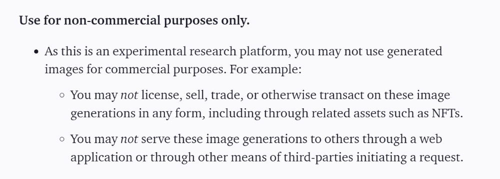
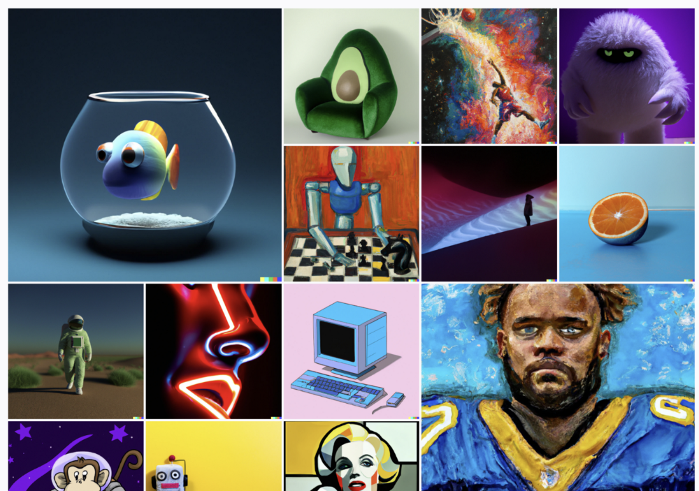
Dall-E2 by OpenAI
The AI art generator Dall-E2 is powerful. Since it’s still in beta, you can join the waitlist here.
OpenAI DOES NOT allow the use and redistribution of any image for commercial purposes.
Here's the policy as of April 6, 2022.
Here are some images from Dall-E2’s webpage to show its art quality.
Several Reddit users reported receiving pricing surveys from OpenAI.
This suggests the company may bring out a subscription-based tier and a commercial license to sell images soon.
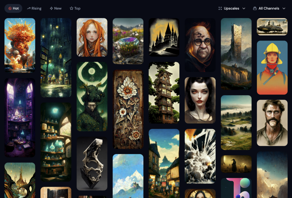
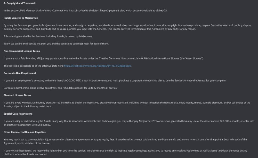
MidJourney
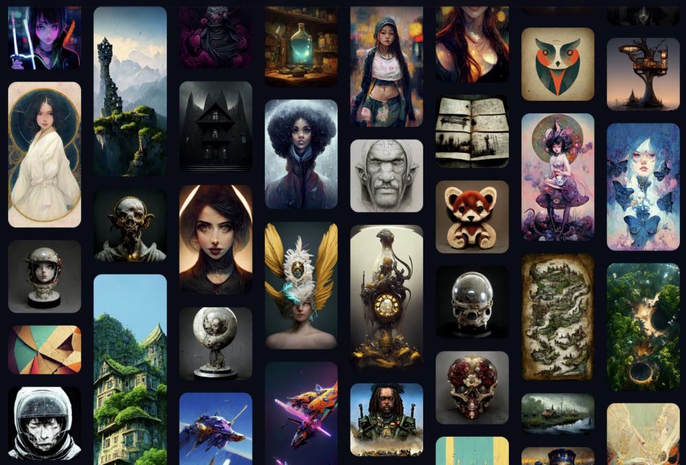
I like Midjourney's art generator. It makes great AI images. Here are some samples:
Standard Licenses are available for $10 per month.
Standard License allows you to use, copy, modify, merge, publish, distribute, and/or sell copies of the images, except for blockchain technologies.
If you utilize or distribute the Assets using blockchain technology, you must pay MidJourney 20% of revenue above $20,000 a month or engage in an alternative agreement.
Here's their copyright and trademark page.
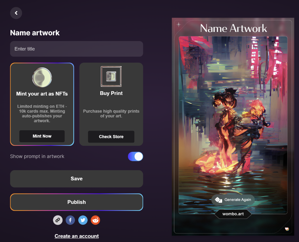
Dream by Wombo
Dream is one of the first public AI art generators.
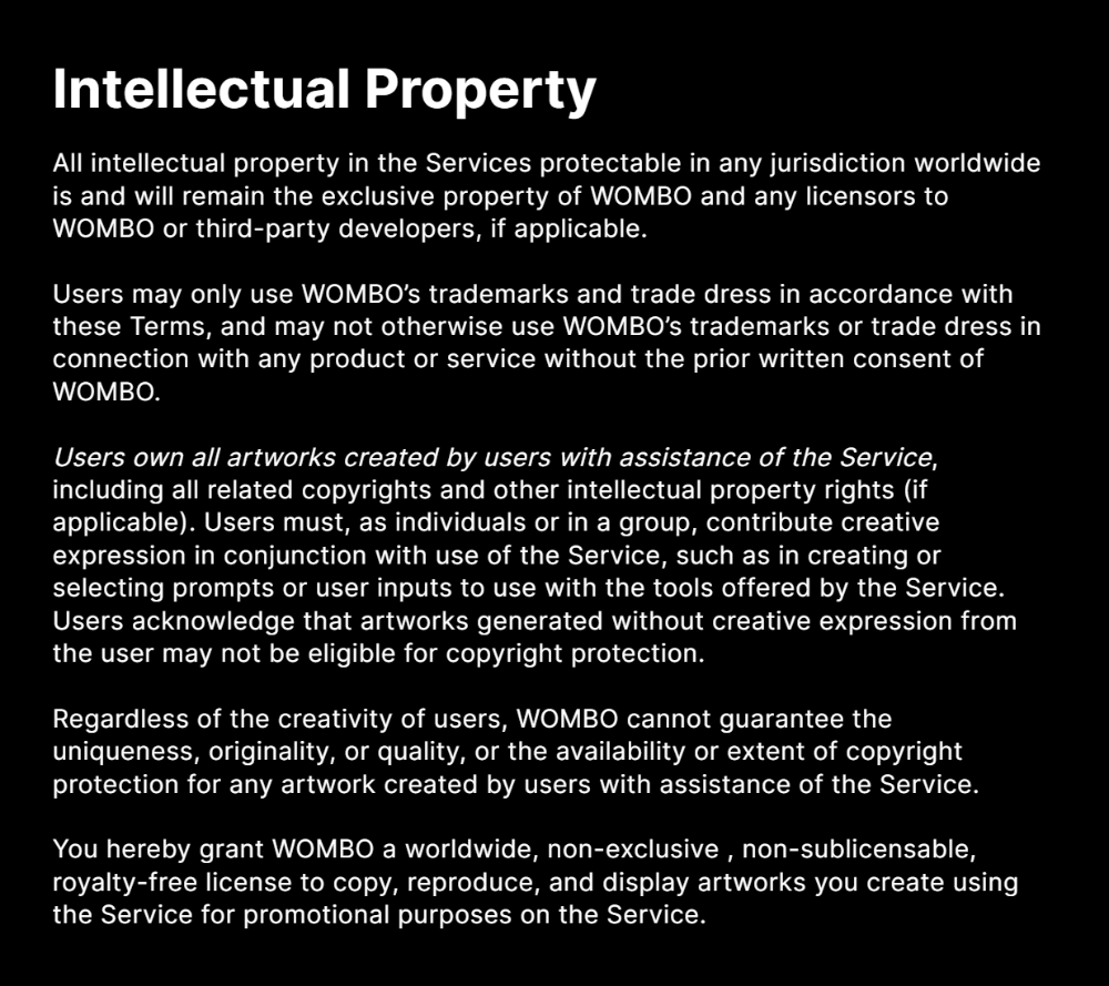
This AI program is free, easy to use, and Wombo gives a royalty-free license to copy or share artworks.
Users own all artworks generated by the tool. Including all related copyrights or intellectual property rights.
Here’s Wombos' intellectual property policy.
Final Reflections
AI is creating a new sort of art that's selling well. It’s becoming popular and valued, despite some skepticism.
Now that you know MidJourney and Wombo let you sell AI-generated art, you need to locate buyers. There are several ways to achieve this, but that’s for another story.
Matthew Royse
3 years ago
These 10 phrases are unprofessional at work.
Successful workers don't talk this way.

"I know it's unprofessional, but I can't stop." — Author Sandy Hall
Do you realize your unprofessionalism? Do you care? Self-awareness?
Everyone can improve their unprofessionalism. Some workplace phrases and words shouldn't be said.
People often say out loud what they're thinking. They show insecurity, incompetence, and disrespect.
"Think before you speak," goes the saying.
Some of these phrases are "okay" in certain situations, but you'll lose colleagues' respect if you use them often.
Your word choice. Your tone. Your intentions. They matter.
Choose your words carefully to build work relationships and earn peer respect. You should build positive relationships with coworkers and clients.
These 10 phrases are unprofessional.
1. That Meeting Really Sucked
Wow! Were you there? You should be responsible if you attended. You can influence every conversation.
Alternatives
Improve the meeting instead of complaining afterward. Make it more meaningful and productive.
2. Not Sure if You Saw My Last Email
Referencing a previous email irritates people. Email follow-up can be difficult. Most people get tons of emails a day, so it may have been buried, forgotten, or low priority.
Alternatives
It's okay to follow up, but be direct, short, and let the recipient "save face"
3. Any Phrase About Sex, Politics, and Religion
Discussing sex, politics, and religion at work is foolish. If you discuss these topics, you could face harassment lawsuits.
Alternatives
Keep quiet about these contentious issues. Don't touch them.
4. I Know What I’m Talking About
Adding this won't persuade others. Research, facts, and topic mastery are key to persuasion. If you're knowledgeable, you don't need to say this.
Alternatives
Please don’t say it at all. Justify your knowledge.
5. Per Our Conversation
This phrase sounds like legal language. You seem to be documenting something legally. Cold, stern, and distant. "As discussed" sounds inauthentic.
Alternatives
It was great talking with you earlier; here's what I said.
6. Curse-Word Phrases
Swearing at work is unprofessional. You never know who's listening, so be careful. A child may be at work or on a Zoom or Teams call. Workplace cursing is unacceptable.
Alternatives
Avoid adult-only words.
7. I Hope This Email Finds You Well
This is a unique way to wish someone well. This phrase isn't as sincere as the traditional one. When you talk about the email, you're impersonal.
Alternatives
Genuinely care for others.
8. I Am Really Stressed
Happy, strong, stress-managing coworkers are valued. Manage your own stress. Exercise, sleep, and eat better.
Alternatives
Everyone has stress, so manage it. Don't talk about your stress.
9. I Have Too Much to Do
You seem incompetent. People think you can't say "no" or have poor time management. If you use this phrase, you're telling others you may need to change careers.
Alternatives
Don't complain about your workload; just manage it.
10. Bad Closing Salutations
"Warmly," "best," "regards," and "warm wishes" are common email closings. This conclusion sounds impersonal. Why use "warmly" for finance's payment status?
Alternatives
Personalize the closing greeting to the message and recipient. Use "see you tomorrow" or "talk soon" as closings.
Bringing It All Together
These 10 phrases are unprofessional at work. That meeting sucked, not sure if you saw my last email, and sex, politics, and religion phrases.
Also, "I know what I'm talking about" and any curse words. Also, avoid phrases like I hope this email finds you well, I'm stressed, and I have too much to do.
Successful workers communicate positively and foster professionalism. Don't waste chances to build strong work relationships by being unprofessional.
“Unprofessionalism damages the business reputation and tarnishes the trust of society.” — Pearl Zhu, an American author
This post is a summary. Read full article here