


More on Marketing

Victoria Kurichenko
3 years ago
My Blog Is in Google's Top 10—Here's How to Compete
"Competition" is beautiful and hateful.
Some people bury their dreams because they are afraid of competition. Others challenge themselves, shaping our world.
Competition is normal.
It spurs innovation and progress.
I wish more people agreed.
As a marketer, content writer, and solopreneur, my readers often ask:
"I want to create a niche website, but I have no ideas. Everything's done"
"Is a website worthwhile?"
I can't count how many times I said, "Yes, it makes sense, and you can succeed in a competitive market."
I encourage and share examples, but it's not enough to overcome competition anxiety.
I launched an SEO writing website for content creators a year ago, knowing it wouldn't beat Ahrefs, Semrush, Backlinko, etc.
Not needed.
Many of my website's pages rank highly on Google.
Everyone can eat the pie.
In a competitive niche, I took a different approach.
Look farther
When chatting with bloggers that want a website, I discovered something fascinating.
They want to launch a website but have no ideas. As a next step, they start listing the interests they believe they should work on, like wellness, lifestyle, investments, etc. I could keep going.
Too many generalists who claim to know everything confuse many.
Generalists aren't trusted.
We want someone to fix our problems immediately.
I don't think broad-spectrum experts are undervalued. People have many demands that go beyond generalists' work. Narrow-niche experts can help.
I've done SEO for three years. I learned from experts and courses. I couldn't find a comprehensive SEO writing resource.
I read tons of articles before realizing that wasn't it. I took courses that covered SEO basics eventually.
I had a demand for learning SEO writing, but there was no solution on the market. My website fills this micro-niche.
Have you ever had trouble online?
Professional courses too general, boring, etc.?
You've bought off-topic books, right?
You're not alone.
Niche ideas!
Big players often disregard new opportunities. Too small. Individual content creators can succeed here.
In a competitive market:
Never choose wide subjects
Think about issues you can relate to and have direct experience with.
Be a consumer to discover both the positive and negative aspects of a good or service.
Merchandise your annoyances.
Consider ways to transform your frustrations into opportunities.
The right niche is half-success. Here is what else I did to hit the Google front page with my website.
An innovative method for choosing subjects
Why publish on social media and websites?
Want likes, shares, followers, or fame?
Some people do it for fun. No judgment.
I bet you want more.
You want to make decent money from blogging.
Writing about random topics, even if they are related to your niche, won’t help you attract an audience from organic search. I'm a marketer and writer.
I worked at companies with dead blogs because they posted for themselves, not readers. They did not follow SEO writing rules; that’s why most of their content flopped.
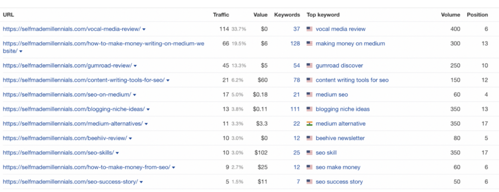
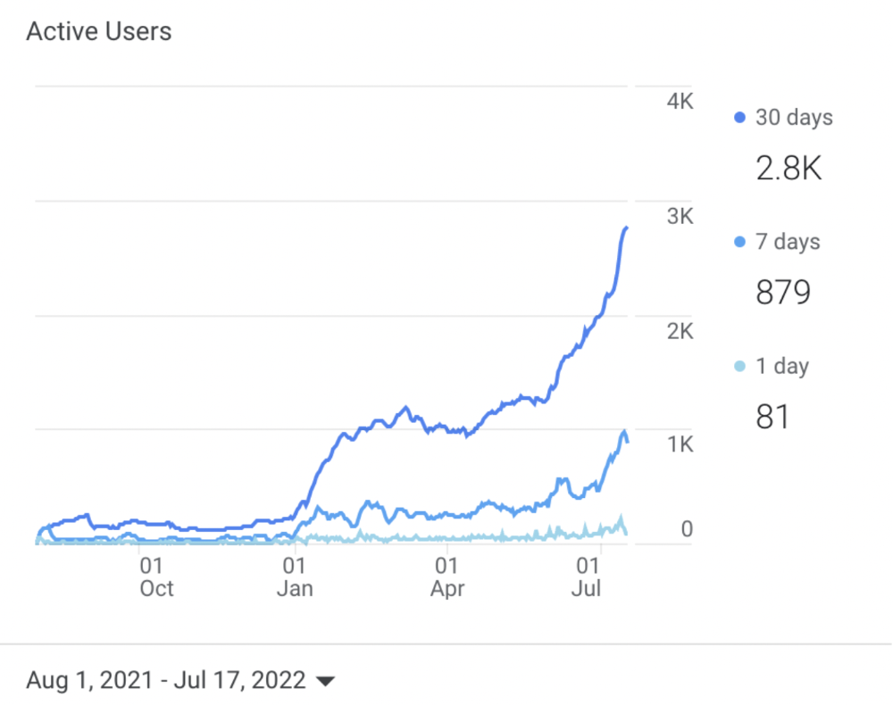
I learned these hard lessons and grew my website from 0 to 3,000+ visitors per month while working on it a few hours a week only. Evidence:
I choose website topics using these criteria:
- Business potential. The information should benefit my audience and generate revenue. There would be no use in having it otherwise.
My topics should help me:
Attract organic search traffic with my "fluff-free" content -> Subscribers > SEO ebook sales.
Simple and effective.
- traffic on search engines. The number of monthly searches reveals how popular my topic is all across the world. If I find that no one is interested in my suggested topic, I don't write a blog article.
- Competition. Every search term is up against rivals. Some are more popular (thus competitive) since more websites target them in organic search. A new website won't score highly for keywords that are too competitive. On the other side, keywords with moderate to light competition can help you rank higher on Google more quickly.
- Search purpose. The "why" underlying users' search requests is revealed. I analyze search intent to understand what users need when they plug various queries in the search bar and what content can perfectly meet their needs.
My specialty website produces money, ranks well, and attracts the target audience because I handpick high-traffic themes.
Following these guidelines, even a new website can stand out.
I wrote a 50-page SEO writing guide where I detailed topic selection and share my front-page Google strategy.
My guide can help you run a successful niche website.
In summary
You're not late to the niche-website party.
The Internet offers many untapped opportunities.
We need new solutions and are willing to listen.
There are unexplored niches in any topic.
Don't fight giants. They have their piece of the pie. They might overlook new opportunities while trying to keep that piece of the pie. You should act now.

Joseph Mavericks
3 years ago
You Don't Have to Spend $250 on TikTok Ads Because I Did
900K impressions, 8K clicks, and $$$ orders…
I recently started dropshipping. Now that I own my business and can charge it as a business expense, it feels less like money wasted if it doesn't work. I also made t-shirts to sell. I intended to open a t-shirt store and had many designs on a hard drive. I read that Tiktok advertising had a high conversion rate and low cost because they were new. According to many, the advertising' cost/efficiency ratio would plummet and become as bad as Google or Facebook Ads. Now felt like the moment to try Tiktok marketing and dropshipping. I work in marketing for a SaaS firm and have seen how poorly ads perform. I wanted to try it alone.
I set up $250 and ran advertising for a week. Before that, I made my own products, store, and marketing. In this post, I'll show you my process and results.
Setting up the store
Dropshipping is a sort of retail business in which the manufacturer ships the product directly to the client through an online platform maintained by a seller. The seller takes orders but has no stock. The manufacturer handles all orders. This no-stock concept increases profitability and flexibility.
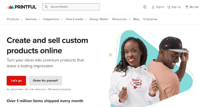
In my situation, I used previous t-shirt designs to make my own product. I didn't want to handle order fulfillment logistics, so I looked for a way to print my designs on demand, ship them, and handle order tracking/returns automatically. So I found Printful.
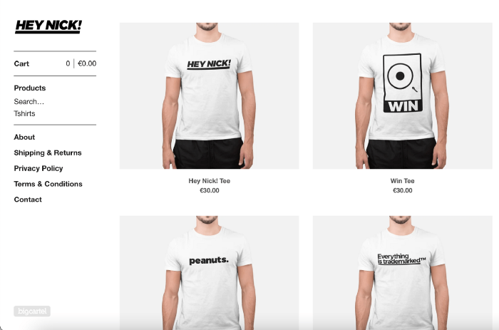
I needed to connect my backend and supplier to a storefront so visitors could buy. 99% of dropshippers use Shopify, but I didn't want to master the difficult application. I wanted a one-day project. I'd previously worked with Big Cartel, so I chose them.
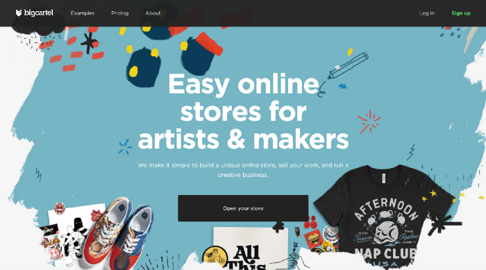
Big Cartel doesn't collect commissions on sales, simply a monthly flat price ($9.99 to $19.99 depending on your plan).
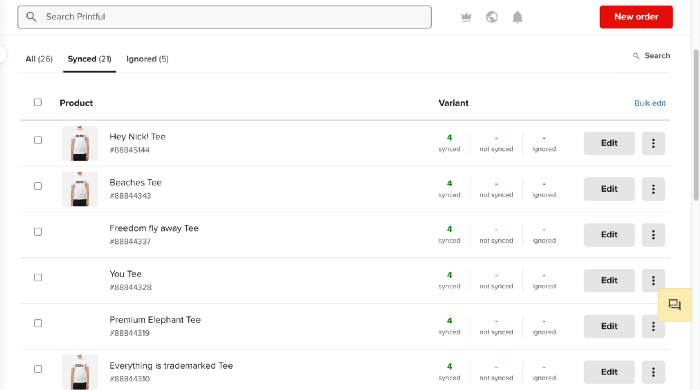
After opening a Big Cartel account, I uploaded 21 designs and product shots, then synced each product with Printful.
Developing the ads
I mocked up my designs on cool people photographs from placeit.net, a great tool for creating product visuals when you don't have a studio, camera gear, or models to wear your t-shirts.
I opened an account on the website and had advertising visuals within 2 hours.
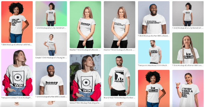
Because my designs are simple (black design on white t-shirt), I chose happy, stylish people on plain-colored backdrops. After that, I had to develop an animated slideshow.
Because I'm a graphic designer, I chose to use Adobe Premiere to create animated Tiktok advertising.
Premiere is a fancy video editing application used for more than advertisements. Premiere is used to edit movies, not social media marketing. I wanted this experiment to be quick, so I got 3 social media ad templates from motionarray.com and threw my visuals in. All the transitions and animations were pre-made in the files, so it only took a few hours to compile. The result:
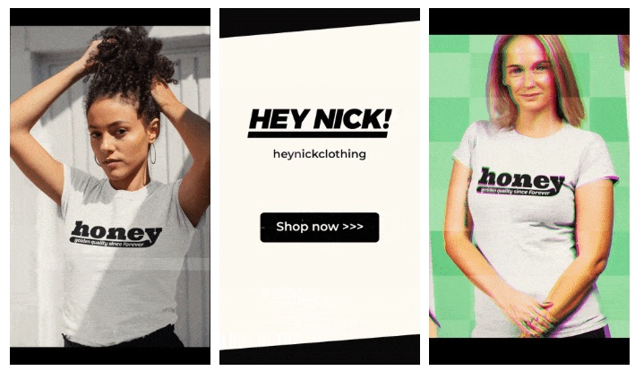
I downloaded 3 different soundtracks for the videos to determine which would convert best.
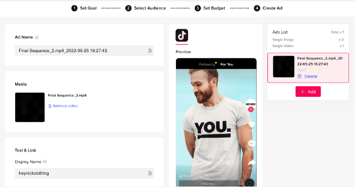
After that, I opened a Tiktok business account, uploaded my films, and inserted ad info. They went live within one hour.
The (poor) outcomes
As a European company, I couldn't deliver ads in the US. All of my advertisements' material (title, description, and call to action) was in English, hence they continued getting rejected in Europe for countries that didn't speak English. There are a lot of them:
I lost a lot of quality traffic, but I felt that if the images were engaging, people would check out the store and buy my t-shirts. I was wrong.
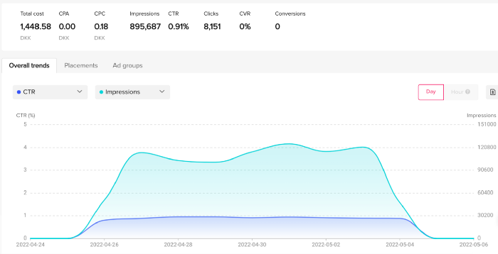
51,071 impressions on Day 1. 0 orders after 411 clicks
114,053 impressions on Day 2. 1.004 clicks and no orders
Day 3: 987 clicks, 103,685 impressions, and 0 orders
101,437 impressions on Day 4. 0 orders after 963 clicks
115,053 impressions on Day 5. 1,050 clicks and no purchases
125,799 impressions on day 6. 1,184 clicks, no purchases
115,547 impressions on Day 7. 1,050 clicks and no purchases
121,456 impressions on day 8. 1,083 clicks, no purchases
47,586 impressions on Day 9. 419 Clicks. No orders
My overall conversion rate for video advertisements was 0.9%. TikTok's paid ad formats all result in strong engagement rates (ads average 3% to 12% CTR to site), therefore a 1 to 2% CTR should have been doable.
My one-week experiment yielded 8,151 ad clicks but no sales. Even if 0.1% of those clicks converted, I should have made 8 sales. Even companies with horrible web marketing would get one download or trial sign-up for every 8,151 clicks. I knew that because my advertising were in English, I had no impressions in the main EU markets (France, Spain, Italy, Germany), and that this impacted my conversion potential. I still couldn't believe my numbers.
I dug into the statistics and found that Tiktok's stats didn't match my store traffic data.
Looking more closely at the numbers
My ads were approved on April 26 but didn't appear until April 27. My store dashboard showed 440 visitors but 1,004 clicks on Tiktok. This happens often while tracking campaign results since different platforms handle comparable user activities (click, view) differently. In online marketing, residual data won't always match across tools.
My data gap was too large. Even if half of the 1,004 persons who clicked closed their browser or left before the store site loaded, I would have gained 502 visitors. The significant difference between Tiktok clicks and Big Cartel store visits made me suspicious. It happened all week:
Day 1: 440 store visits and 1004 ad clicks
Day 2: 482 store visits, 987 ad clicks
3rd day: 963 hits on ads, 452 store visits
443 store visits and 1,050 ad clicks on day 4.
Day 5: 459 store visits and 1,184 ad clicks
Day 6: 430 store visits and 1,050 ad clicks
Day 7: 409 store visits and 1,031 ad clicks
Day 8: 166 store visits and 418 ad clicks
The disparity wasn't related to residual data or data processing. The disparity between visits and clicks looked regular, but I couldn't explain it.
After the campaign concluded, I discovered all my creative assets (the videos) had a 0% CTR and a $0 expenditure in a separate dashboard. Whether it's a dashboard reporting issue or a budget allocation bug, online marketers shouldn't see this.
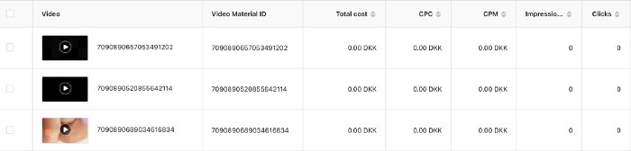
Tiktok can present any stats they want on their dashboard, just like any other platform that runs advertisements to promote content to its users. I can't verify that 895,687 individuals saw and clicked on my ad. I invested $200 for what appears to be around 900K impressions, which is an excellent ROI. No one bought a t-shirt, even an unattractive one, out of 900K people?
Would I do it again?
Nope. Whether I didn't make sales because Tiktok inflated the dashboard numbers or because I'm horrible at producing advertising and items that sell, I’ll stick to writing content and making videos. If setting up a business and ads in a few days was all it took to make money online, everyone would do it.
Video advertisements and dropshipping aren't dead. As long as the internet exists, people will click ads and buy stuff. Converting ads and selling stuff takes a lot of work, and I want to focus on other things.
I had always wanted to try dropshipping and I’m happy I did, I just won’t stick to it because that’s not something I’m interested in getting better at.
If I want to sell t-shirts again, I'll avoid Tiktok advertisements and find another route.

Jenn Leach
3 years ago
This clever Instagram marketing technique increased my sales to $30,000 per month.
No Paid Ads Required
I had an online store. After a year of running the company alongside my 9-to-5, I made enough to resign.
That day was amazing.
This Instagram marketing plan helped the store succeed.
How did I increase my sales to five figures a month without using any paid advertising?
I used customer event marketing.
I'm not sure this term exists. I invented it to describe what I was doing.
Instagram word-of-mouth, fan engagement, and interaction drove sales.
If a customer liked or disliked a product, the buzz would drive attention to the store.
I used customer-based events to increase engagement and store sales.
Success!
Here are the weekly Instagram customer events I coordinated while running my business:
Be the Buyer Days
Flash sales
Mystery boxes
Be the Buyer Days: How do they work?
Be the Buyer Days are exactly that.
You choose a day to share stock selections with social media followers.
This is an easy approach to engaging customers and getting fans enthusiastic about new releases.
First, pick a handful of items you’re considering ordering. I’d usually pick around 3 for Be the Buyer Day.
Then I'd poll the crowd on Instagram to vote on their favorites.
This was before Instagram stories, polls, and all the other cool features Instagram offers today. I think using these tools now would make this event even better.
I'd ask customers their favorite back then.
The growing comments excited customers.
Then I'd declare the winner, acquire the products, and start selling it.
How do flash sales work?
I mostly ran flash sales.
You choose a limited number of itemsdd for a few-hour sale.
We wanted most sales to result in sold-out items.
When an item sells out, it contributes to the sensation of scarcity and can inspire customers to visit your store to buy a comparable product, join your email list, become a fan, etc.
We hoped they'd act quickly.
I'd hold flash deals twice a week, which generated scarcity and boosted sales.
The store had a few thousand Instagram followers when I started flash deals.
Each flash sale item would make $400 to $600.
$400 x 3= $1,200
That's $1,200 on social media!
Twice a week, you'll make roughly $10K a month from Instagram.
$1,200/day x 8 events/month=$9,600
Flash sales did great.
We held weekly flash deals and sent social media and email reminders. That’s about it!
How are mystery boxes put together?
All you do is package a box of store products and sell it as a mystery box on TikTok or retail websites.
A $100 mystery box would cost $30.
You're discounting high-value boxes.
This is a clever approach to get rid of excess inventory and makes customers happy.
It worked!
Be the Buyer Days, flash deals, and mystery boxes helped build my company without paid advertisements.
All companies can use customer event marketing. Involving customers and providing an engaging environment can boost sales.
Try it!
You might also like

SAHIL SAPRU
3 years ago
How I grew my business to a $5 million annual recurring revenue
Scaling your startup requires answering customer demands, not growth tricks.
I cofounded Freedo Rentals in 2019. I reached 50 lakh+ ARR in 6 months before quitting owing to the epidemic.
Freedo aimed to solve 2 customer pain points:
Users lacked a reliable last-mile transportation option.
The amount that Auto walas charge for unmetered services
Solution?
Effectively simple.
Build ports at high-demand spots (colleges, residential societies, metros). Electric ride-sharing can meet demand.
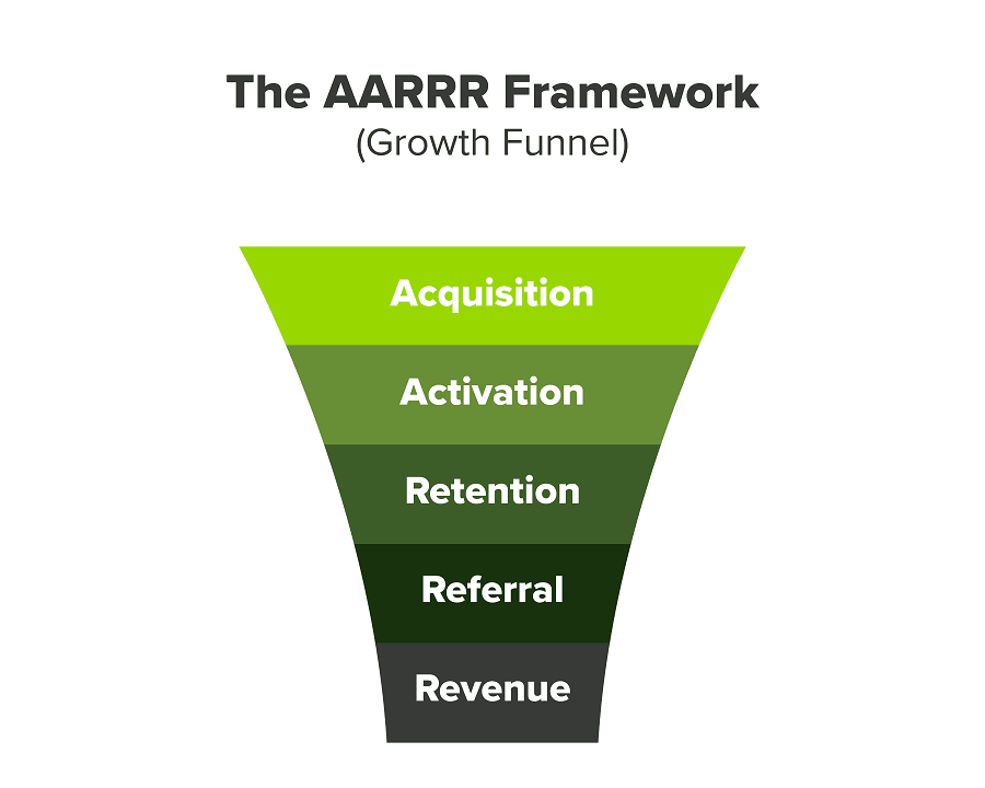
We had many problems scaling. I'll explain using the AARRR model.
Brand unfamiliarity or a novel product offering were the problems with awareness. Nobody knew what Freedo was or what it did.
Problem with awareness: Content and advertisements did a poor job of communicating the task at hand. The advertisements clashed with the white-collar part because they were too cheesy.
Retention Issue: We encountered issues, indicating that the product was insufficient. Problems with keyless entry, creating bills, stealing helmets, etc.
Retention/Revenue Issue: Costly compared to established rivals. Shared cars were 1/3 of our cost.
Referral Issue: Missing the opportunity to seize the AHA moment. After the ride, nobody remembered us.
Once you know where you're struggling with AARRR, iterative solutions are usually best.
Once you have nailed the AARRR model, most startups use paid channels to scale. This dependence, on paid channels, increases with scale unless you crack your organic/inbound game.
Over-index growth loops. Growth loops increase inflow and customers as you scale.
When considering growth, ask yourself:
Who is the solution's ICP (Ideal Customer Profile)? (To whom are you selling)
What are the most important messages I should convey to customers? (This is an A/B test.)
Which marketing channels ought I prioritize? (Conduct analysis based on the startup's maturity/stage.)
Choose the important metrics to monitor for your AARRR funnel (not all metrics are equal)
Identify the Flywheel effect's growth loops (inertia matters)
My biggest mistakes:
not paying attention to consumer comments or satisfaction. It is the main cause of problems with referrals, retention, and acquisition for startups. Beyond your NPS, you should consider second-order consequences.
The tasks at hand should be quite clear.
Here's my scaling equation:
Growth = A x B x C
A = Funnel top (Traffic)
B = Product Valuation (Solving a real pain point)
C = Aha! (Emotional response)
Freedo's A, B, and C created a unique offering.
Freedo’s ABC:
A — Working or Studying population in NCR
B — Electric Vehicles provide last-mile mobility as a clean and affordable solution
C — One click booking with a no-noise scooter
Final outcome:
FWe scaled Freedo to Rs. 50 lakh MRR and were growing 60% month on month till the pandemic ceased our growth story.
How we did it?
We tried ambassadors and coupons. WhatsApp was our most successful A/B test.
We grew widespread adoption through college and society WhatsApp groups. We requested users for referrals in community groups.
What worked for us won't work for others. This scale underwent many revisions.
Every firm is different, thus you must know your customers. Needs to determine which channel to prioritize and when.
Users desired a safe, time-bound means to get there.
This (not mine) growth framework helped me a lot. You should follow suit.
Hannah Elliott
3 years ago
Pebble Beach Auto Auctions Set $469M Record
The world's most prestigious vintage vehicle show included amazing autos and record-breaking sums.
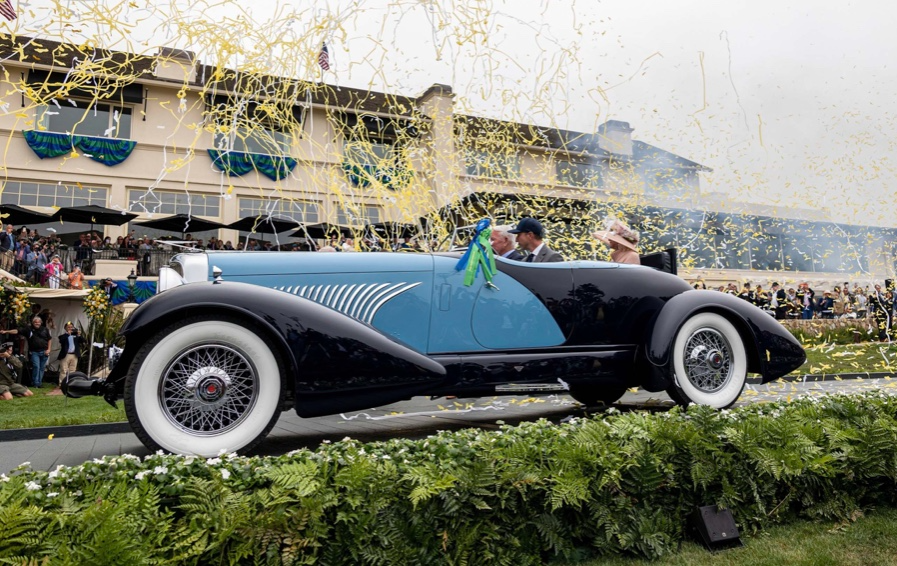
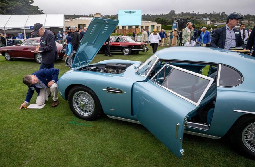
This 1932 Duesenberg J Figoni Sports Torpedo earned Best of Show in 2022.
David Paul Morris (DPM)/Bloomberg
2022 Pebble Beach Concours d'Elegance winner was a pre-war roadster.
Lee Anderson's 1932 Duesenberg J Figoni Sports Torpedo won Best of Show at Pebble Beach Golf Links near Carmel, Calif., on Sunday. First American win since 2013.
Sandra Button, chairperson of the annual concours, said the car, whose chassis and body had been separated for years, "marries American force with European style." "Its resurrection story is passionate."
Pebble Beach Concours d'Elegance Auction
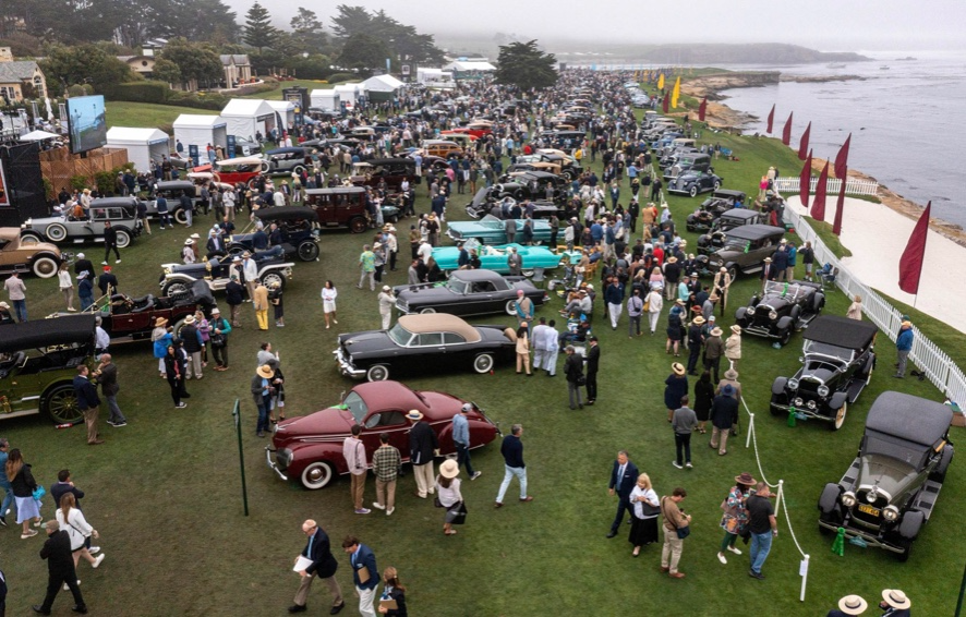
Since 1950, the Pebble Beach Concours d'Elegance has welcomed the world's most costly collectable vehicles for a week of parties, auctions, rallies, and high-roller meetings. The cold, dreary weather highlighted the automobiles' stunning lines and hues.
DPM/Bloomberg

A visitor photographs a 1948 Ferrari 166 MM Touring Barchetta. This is one of 25 Ferraris manufactured in the years after World War II. First shown at the 1948 Turin Salon. Others finished Mille Miglia and Le Mans, which set the tone for Ferrari racing for years.
DPM/Bloomberg
This year's frontrunners were ultra-rare pre-war and post-war automobiles with long and difficult titles, such a 1937 Talbot-Lago T150C-SS Figoni & Falaschi Teardrop Coupe and a 1951 Talbot-Lago T26 Grand Sport Stabilimenti Farina Cabriolet.
The hefty, enormous coaches inspire visions of golden pasts when mysterious saloons swept over the road with otherworldly style, speed, and grace. Only the richest and most powerful people, like Indian maharaja and Hollywood stars, owned such vehicles.
Antonio Chopitea, a Peruvian sugar tycoon, ordered a new Duesenberg in Paris. Hemmings says the two-tone blue beauty was moved to the US and dismantled in the 1960s. Body and chassis were sold separately and rejoined decades later in a three-year, prize-winning restoration.
The concours is the highlight of Monterey Car Week, a five-day Super Bowl for car enthusiasts. Early events included Porsche and Ferrari displays, antique automobile races, and new-vehicle debuts. Many auto executives call Monterey Car Week the "new auto show."
Many visitors were drawn to the record-breaking auctions.
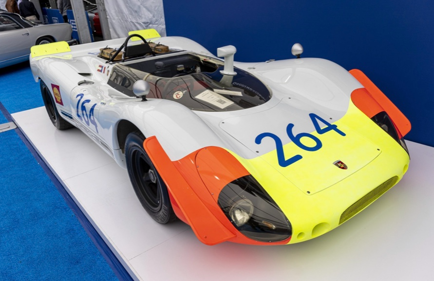
A 1969 Porsche 908/02 auctioned for $4.185 million. Flat-eight air-cooled engine, 90.6-inch wheelbase, 1,320-pound weight. Vic Elford, Richard Attwood, Rudi Lins, Gérard Larrousse, Kurt Ahrens Jr., Masten Gregory, and Pedro Rodriguez drove it, according to Gooding.
DPM/Bloomberg
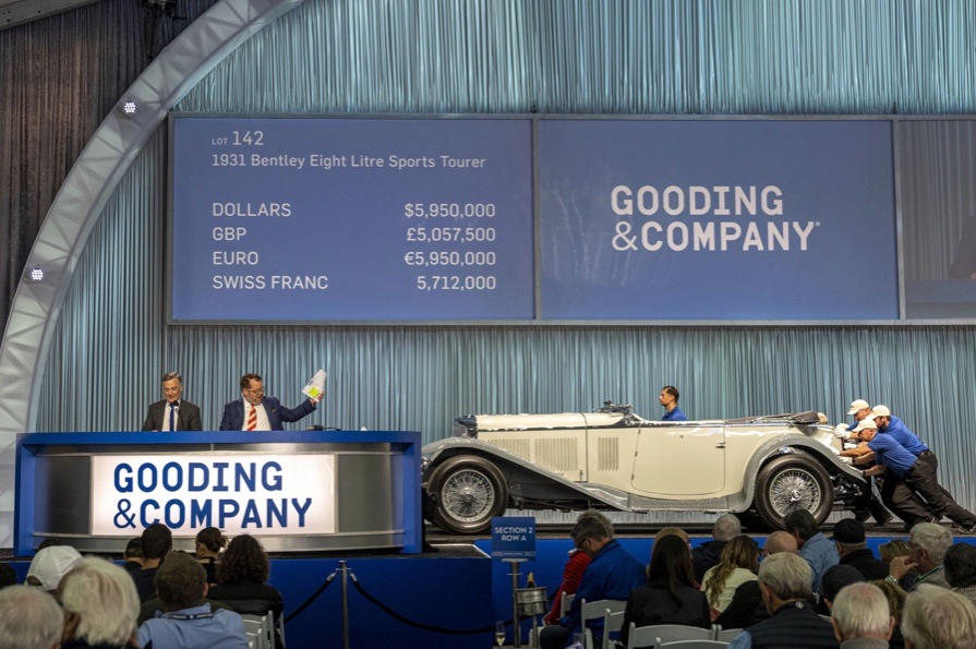
The 1931 Bentley Eight Liter Sports Tourer doesn't meet its reserve. Gooding & Co., the official auction house of the concours, made more than $105 million and had an 82% sell-through rate. This powerful open-top tourer is one of W.O. Bentley's 100 automobiles. Only 80 remain.
DPM/Bloomberg
The final auction on Aug. 21 brought in $456.1 million, breaking the previous high of $394.48 million established in 2015 in Monterey. “The week put an exclamation point on what has been an exceptional year for the collector automobile market,” Hagerty analyst John Wiley said.
Many cars that go unsold at public auction are sold privately in the days after. After-sales pushed the week's haul to $469 million on Aug. 22, up 18.9% from 2015's record.
In today's currencies, 2015's record sales amount to $490 million, Wiley noted. The dollar is degrading faster than old autos.
Still, 113 million-dollar automobiles sold. The average car sale price was $583,211, up from $446,042 last year, while multimillion-dollar hammer prices made up around 75% of total sales.
Industry insiders and market gurus expected that stock market volatility, the crisis in Ukraine, and the dollar-euro exchange rate wouldn't influence the world's biggest spenders.
Classic.com's CEO said there's no hint of a recession in an e-mail. Big sales and crowds.

Ticket-holders wore huge hats, flowery skirts, and other Kentucky Derby-esque attire. Coffee, beverages, and food are extra.
DPM/Bloomberg
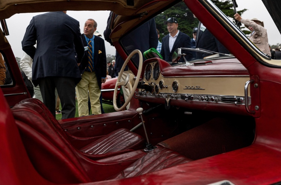
Mercedes-Benz 300 SL Gullwing, 1955. Mercedes produced the two-seat gullwing coupe from 1954–1957 and the roadster from 1957–1963. It was once West Germany's fastest and most powerful automobile. You'd be hard-pressed to locate one for less $1 million.
DPM/Bloomberg
1955 Ferrari 410 Sport sold for $22 million at RM Sotheby's. It sold a 1937 Mercedes-Benz 540K Sindelfingen Roadster for $9.9 million and a 1924 Hispano-Suiza H6C Transformable Torpedo for $9.245 million. The family-run mansion sold $221.7 million with a 90% sell-through rate, up from $147 million in 2021. This year, RM Sotheby's cars averaged $1.3 million.
Not everyone saw such great benefits.
Gooding & Co., the official auction house of the concours, made more than $105 million and had an 82% sell-through rate. 1937 Bugatti Type 57SC Atalante, 1990 Ferrari F40, and 1994 Bugatti EB110 Super Sport were top sellers.
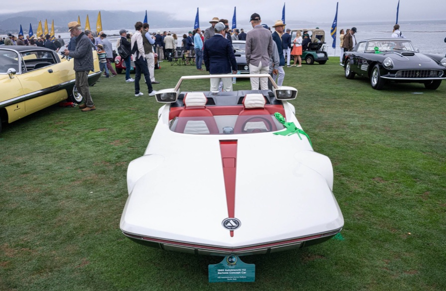
The 1969 Autobianchi A112 Bertone. This idea two-seater became a Hot Wheels toy but was never produced. It has a four-speed manual drive and an inline-four mid-engine arrangement like the Lamborghini Miura.
DPM/Bloomberg
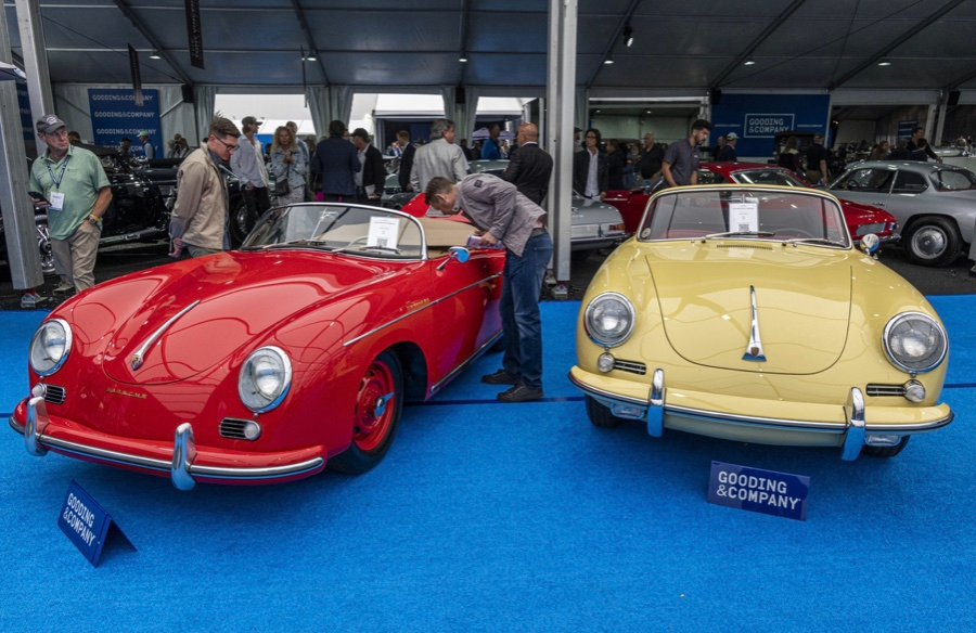
1956 Porsche 356 A Speedster at Gooding & Co. The Porsche 356 is a lightweight, rear-engine, rear-wheel drive vehicle that lacks driving power but is loved for its rounded, Beetle-like hardtop coupé and open-top versions.
DPM/Bloomberg
Mecum sold $50.8 million with a 64% sell-through rate, down from $53.8 million and 77% in 2021. Its top lot, a 1958 Ferrari 250 GT 'Tour de France' Alloy Coupe, sold for $2.86 million, but its average price was $174,016.
Bonhams had $27.8 million in sales with an 88% sell-through rate. The same sell-through generated $35.9 million in 2021.
Gooding & Co. and RM Sotheby's posted all 10 top sales, leaving Bonhams, Mecum, and Hagerty-owned Broad Arrow fighting for leftovers. Six of the top 10 sellers were Ferraris, which remain the gold standard for collectable automobiles. Their prices have grown over decades.
Classic.com's Calle claimed RM Sotheby's "stole the show," but "BroadArrow will be a force to reckon with."
Although pre-war cars were hot, '80s and '90s cars showed the most appreciation and attention. Generational transition and new buyer profile."
2022 Pebble Beach Concours d'Elegance judges inspect 1953 Siata 208. The rounded coupe was introduced at the 1952 Turin Auto Show in Italy and is one of 18 ever produced. It sports a 120hp Fiat engine, five-speed manual transmission, and alloy drum brakes. Owners liked their style, but not their reliability.
DPM/Bloomberg
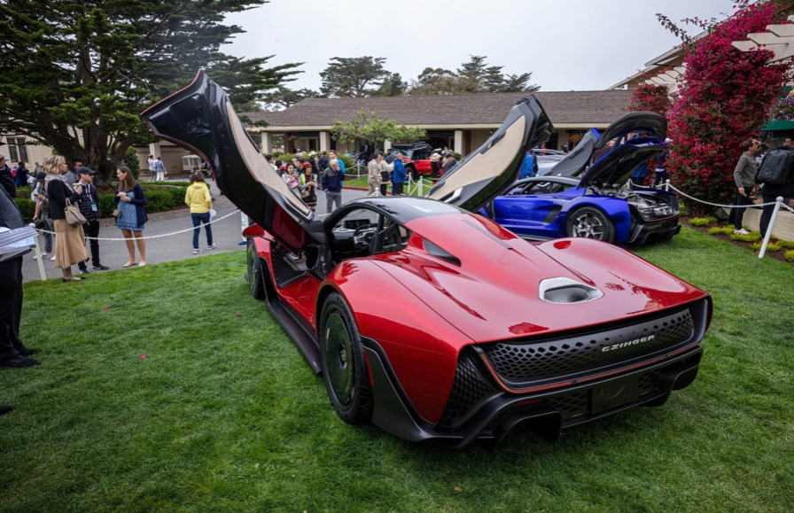
The Czinger 21 CV Max at Pebble Beach. Monterey Car Week concentrates on historic and classic automobiles, but modern versions like this Czinger hypercar also showed.
DPM/Bloomberg
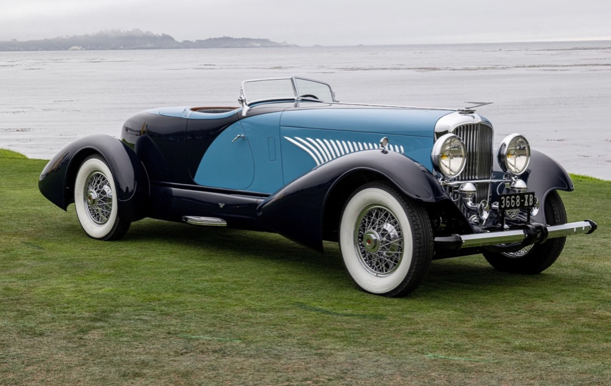
The 1932 Duesenberg J Figoni Sports Torpedo won Best in Show in 2022. Lee and Penny Anderson of Naples, Fla., own the once-separate-chassis-from-body automobile.
DPM/Bloomberg

Jennifer Tieu
4 years ago
Why I Love Azuki
Azuki Banner (www.azuki.com)
Disclaimer: This is my personal viewpoint. I'm not on the Azuki team. Please keep in mind that I am merely a fan, community member, and holder. Please do your own research and pardon my grammar. Thanks!
Azuki has changed my view of NFTs.
When I first entered the NFT world, I had no idea what to expect. I liked the idea. So I invested in some projects, fought for whitelists, and discovered some cool NFTs projects (shout-out to CATC). I lost more money than I earned at one point, but I hadn't invested excessively (only put in what you can afford to lose). Despite my losses, I kept looking. I almost waited for the “ah-ha” moment. A NFT project that changed my perspective on NFTs. What makes an NFT project more than a work of art?
Answer: Azuki.
The Art
The Azuki art drew me in as an anime fan. It looked like something out of an anime, and I'd never seen it before in NFT.
The project was still new. The first two animated teasers were released with little fanfare, but I was impressed with their quality. You can find them on Instagram or in their earlier Tweets.
The teasers hinted that this project could be big and that the team could deliver. It was amazing to see Shao cut the Azuki posters with her katana. Especially at the end when she sheaths her sword and the music cues. Then the live action video of the young boy arranging the Azuki posters seemed movie-like. I felt like I was entering the Azuki story, brand, and dope theme.
The team did not disappoint with the Azuki NFTs. The level of detail in the art is stunning. There were Azukis of all genders, skin and hair types, and more. These 10,000 Azukis have so much representation that almost anyone can find something that resonates. Rather than me rambling on, I suggest you visit the Azuki gallery
The Team
If the art is meant to draw you in and be the project's face, the team makes it more. The NFT would be a JPEG without a good team leader. Not that community isn't important, but no community would rally around a bad team.
Because I've been rugged before, I'm very focused on the team when considering a project. While many project teams are anonymous, I try to find ones that are doxxed (public) or at least appear to be established. Unlike Azuki, where most of the Azuki team is anonymous, Steamboy is public. He is (or was) Overwatch's character art director and co-creator of Azuki. I felt reassured and could trust the project after seeing someone from a major game series on the team.
Then I tried to learn as much as I could about the team. Following everyone on Twitter, reading their tweets, and listening to recorded AMAs. I was impressed by the team's professionalism and dedication to their vision for Azuki, led by ZZZAGABOND.
I believe the phrase “actions speak louder than words” applies to Azuki. I can think of a few examples of what the Azuki team has done, but my favorite is ERC721A.
With ERC721A, Azuki has created a new algorithm that allows minting multiple NFTs for essentially the same cost as minting one NFT.
I was ecstatic when the dev team announced it. This fascinates me as a self-taught developer. Azuki released a product that saves people money, improves the NFT space, and is open source. It showed their love for Azuki and the NFT community.
The Community
Community, community, community. It's almost a chant in the NFT space now. A community, like a team, can make or break a project. We are the project's consumers, shareholders, core, and lifeblood. The team builds the house, and we fill it. We stay for the community.
When I first entered the Azuki Discord, I was surprised by the calm atmosphere. There was no news about the project. No release date, no whitelisting requirements. No grinding or spamming either. People just wanted to hangout, get to know each other, and talk. It was nice. So the team could pick genuine people for their mintlist (aka whitelist).
But nothing fundamental has changed since the release. It has remained an authentic, fun, and helpful community. I'm constantly logging into Discord to chat with others or follow conversations. I see the community's openness to newcomers. Everyone respects each other (barring a few bad apples) and the variety of people passing through is fascinating. This human connection and interaction is what I enjoy about this place. Being a part of a group that supports a cause.
Finally, I want to thank the amazing Azuki mod team and the kissaten channel for their contributions.
The Brand
So, what sets Azuki apart from other projects? They are shaping a brand or identity. The Azuki website, I believe, best captures their vision. (This is me gushing over the site.)
If you go to the website, turn on the dope playlist in the bottom left. The playlist features a mix of Asian and non-Asian hip-hop and rap artists, with some lo-fi thrown in. The songs on the playlist change, but I think you get the vibe Azuki embodies just by turning on the music.
The Garden is our next stop where we are introduced to Azuki.
A brand.
We're creating a new brand together.
A metaverse brand. By the people.
A collection of 10,000 avatars that grant Garden membership. It starts with exclusive streetwear collabs, NFT drops, live events, and more. Azuki allows for a new media genre that the world has yet to discover. Let's build together an Azuki, your metaverse identity.
The Garden is a magical internet corner where art, community, and culture collide. The boundaries between the physical and digital worlds are blurring.
Try a Red Bean.
The text begins with Azuki's intention in the space. It's a community-made metaverse brand. Then it goes into more detail about Azuki's plans. Initiation of a story or journey. "Would you like to take the red bean and jump down the rabbit hole with us?" I love the Matrix red pill or blue pill play they used. (Azuki in Japanese means red bean.)
Morpheus, the rebel leader, offers Neo the choice of a red or blue pill in The Matrix. “You take the blue pill... After the story, you go back to bed and believe whatever you want. Your red pill... Let me show you how deep the rabbit hole goes.” Aware that the red pill will free him from the enslaving control of the machine-generated dream world and allow him to escape into the real world, he takes it. However, living the “truth of reality” is harsher and more difficult.
It's intriguing and draws you in. Taking the red bean causes what? Where am I going? I think they did well in piqueing a newcomer's interest.
Not convinced by the Garden? Read the Manifesto. It reinforces Azuki's role.
Here comes a new wave…
And surfing here is different.
Breaking down barriers.
Building open communities.
Creating magic internet money with our friends.
To those who don’t get it, we tell them: gm.
They’ll come around eventually.
Here’s to the ones with the courage to jump down a peculiar rabbit hole.
One that pulls you away from a world that’s created by many and owned by few…
To a world that’s created by more and owned by all.
From The Garden come the human beans that sprout into your family.
We rise together.
We build together.
We grow together.
Ready to take the red bean?
Not to mention the Mindmap, it sets Azuki apart from other projects and overused Roadmaps. I like how the team recognizes that the NFT space is not linear. So many of us are still trying to figure it out. It is Azuki's vision to adapt to changing environments while maintaining their values. I admire their commitment to long-term growth.
Conclusion
To be honest, I have no idea what the future holds. Azuki is still new and could fail. But I'm a long-term Azuki fan. I don't care about quick gains. The future looks bright for Azuki. I believe in the team's output. I love being an Azuki.
Thank you! IKUZO!
Full post here