


Because of regulations, the $3 million Mercedes-AMG ONE will not (officially) be available in the United States or Canada.
We asked Mercedes to clarify whether "customers" refers to people who have expressed interest in buying the AMG ONE but haven't made a down payment or paid in full for a production slot, and a company spokesperson told that it's the latter – "Actual customers for AMG ONE in the United States and Canada."
The Mercedes-AMG ONE has finally arrived in manufacturing form after numerous delays. This may be the most complicated and magnificent hypercar ever created, but according to Mercedes, those roads will not be found in the United States or Canada.
Despite all of the well-deserved excitement around the gorgeous AMG ONE, there was no word on when US customers could expect their cars. Our Editor-in-Chief became aware of this and contacted Mercedes to clarify the matter. Mercedes-hypercar AMG's with the F1-derived 1,049 HP 1.6-liter V6 engine will not be homologated for the US market, they've confirmed.
Mercedes has informed its customers in the United States and Canada that the ONE will not be arriving to North America after all, as of today, June 1, 2022. The whole text of the letter is included below, so sit back and wait for Mercedes to explain why we (or they) won't be getting (or seeing) the hypercar. Mercedes claims that all 275 cars it wants to produce have already been reserved, with net pricing in Europe starting at €2.75 million (about US$2.93 million at today's exchange rates), before country-specific taxes.
"The AMG-ONE was created with one purpose in mind: to provide a straight technology transfer of the World Championship-winning Mercedes-AMG Petronas Formula 1 E PERFORMANCE drive unit to the road." It's the first time a complete Formula 1 drive unit has been integrated into a road car.
Every component of the AMG ONE has been engineered to redefine high performance, with 1,000+ horsepower, four electric motors, and a blazing top speed of more than 217 mph. While the engine's beginnings are in competition, continuous research and refinement has left us with a difficult choice for the US market.
We determined that following US road requirements would considerably damage its performance and overall driving character in order to preserve the distinctive nature of its F1 powerplant. We've made the strategic choice to make the automobile available for road use in Europe, where it complies with all necessary rules."
If this is the first time US customers have heard about it, which it shouldn't be, we understand if it's a bit off-putting. The AMG ONE could very probably be Mercedes' final internal combustion hypercar of this type.
Nonetheless, we wouldn't be surprised if a few make their way to the United States via the federal government's "Show and Display" exemption provision. This legislation permits the importation of automobiles such as the AMG ONE, but only for a total of 2,500 miles per year.
The McLaren Speedtail, the Koenigsegg One:1, and the Bugatti EB110 are among the automobiles that have been imported under this special rule. We just hope we don't have to wait too long to see the ONE in the United States.
More on Lifestyle

Sneaker News
4 years ago
This Month Will See The Release Of Travis Scott x Nike Footwear
Following the catastrophes at Astroworld, Travis Scott was swiftly vilified by both media outlets and fans alike, and the names who had previously supported him were quickly abandoned. Nike, on the other hand, remained silent, only delaying the release of La Flame's planned collaborations, such as the Air Max 1 and Air Trainer 1, indefinitely. While some may believe it is too soon for the artist to return to the spotlight, the Swoosh has other ideas, as Nice Kicks reveals that these exact sneakers will be released in May.
Both the Travis Scott x Nike Air Max 1 and the Travis Scott x Nike Air Trainer 1 are set to come in two colorways this month. Tinker Hatfield's renowned runner will meet La Flame's "Baroque Brown" and "Saturn Gold" make-ups, which have been altered with backwards Swooshes and outdoors-themed webbing. The high-top trainer is being customized with Hatfield's "Wheat" and "Grey Haze" palettes, both of which include zippers across the heel, co-branded patches, and other details.
See below for a closer look at the four footwear. TravisScott.com is expected to release the shoes on May 20th, according to Nice Kicks. Following that, on May 27th, Nike SNKRS will release the shoe.
Travis Scott x Nike Air Max 1 "Baroque Brown"
Release Date: 2022
Color: Baroque Brown/Lemon Drop/Wheat/Chile Red
Mens: $160
Style Code: DO9392-200
Pre-School: $85
Style Code: DN4169-200
Infant & Toddler: $70
Style Code: DN4170-200
Travis Scott x Nike Air Max 1 "Saturn Gold"
Release Date: 2022
Color: N/A
Mens: $160
Style Code: DO9392-700
Travis Scott x Nike Air Trainer 1 "Wheat"
Restock Date: May 27th, 2022 (Friday)
Original Release Date: May 20th, 2022 (Friday)
Color: N/A
Mens: $140
Style Code: DR7515-200
Travis Scott x Nike Air Trainer 1 "Grey Haze"
Restock Date: May 27th, 2022 (Friday)
Original Release Date: May 20th, 2022 (Friday)
Color: N/A
Mens: $140
Style Code: DR7515-001

Joanna Henderson
3 years ago
An Average Day in the Life of a 25-Year-Old -A Rich Man's At-Home Unemployed Girlfriend
And morning water bottle struggles.

Welcome to my TikTok, where I share my stay-at-home life! I'll show you my usual day from morning to night.
I rise early to prepare my guy iced coffee. I make matcha, my favorite drink. I also fill our water bottles, which takes time and effort, so I record and describe the procedure. As you see me perform the unthinkable by putting a water bottle in a soda machine, you'll see my magnificent but unowned condo. My lover has everything, including:
In the living room, a sizable velvet alabaster divan. I was unable to use the words white or sofa in place of alabaster or a divan since they are insufficiently elegant and do not adequately convey how opulent the item is. The price tag on the divan was another huge feature; I'm sure my lover wouldn't purchase any furniture for less than $20k because it would be beneath him.
A plush Swiss coffee-colored Tabriz carpet. Once more, white is a color associated with the underclass; for us, the wealthy, it's alabaster or swiss coffee. Sorry, my boyfriend is wealthy; I'm truly in the same situation. And yet, I’m the one whos freeloading off of him, not you haha!
Soft translucent powder is the hue of the vinyl wallcoverings. I merely made up the name of that hue, but I have to maintain the online character I've established. There is no room for adopting language typical of peasant people; I must reiterate that I am wealthy while they are not.
I rest after filling our water bottles. I'm really fatigued from chores. My boyfriend is skeptical about hiring a housekeeper and cook. Does he assume I'm a servant or maid? I can't be overly demanding or throw a tantrum since he may replace me with a younger version. Leonardo Di Caprio's fault!
After the break, I bring my lover a water bottle. He's off to work with my best wishes. After cleaning the shower, I text my BF saying I broke a nail. He charged $675 for a crystal-topped shellac manicure. Lucky me!
After this morning's crazy choirs, especially the water bottle one, I'm famished. I dress quickly and go to the neighborhood organic-vegan-gluten-free-sugar-free-plasma-free-GMO-free-HBO-free breakfast place. Most folks can't afford $17.99 for a caffeine-free-mushroom-plus-mud-and-electrolytes morning beverage. It goes nicely with my matcha. Eggs Benedict cost $68. English muffins are off-limits. I can't make myself obese. My partner said he'd swap me for a 19-year-old Eastern European if I keep eating bacon.
I leave no tip since tipping is too much pressure and math for me, so I go shopping.
My shopping adventures have gotten monotonous. 47 designer bags and 114 bag covers Birkins need their own luggage. My babies! I've never caught my BF with a baby. I have sleeping medications and a turkey baster. Tatiana is much younger and thinner than me, so I can't lose him to her. The goal is to become a stay-at-home wife shortly. A turkey baster is essential.
After spending $955 on La Mer lotions and getting a crystal manicure, I nap. Before my boyfriend's return, I can nap for 5 hours.
I wake up around 4 pm — it’s time to prepare dinner. Yes, I said “prepare for dinner,” not “prepare dinner.” I have crystals on my nails! Do you really think I would cook? No way.
My husband's arrival still requires much work. I clean the kitchen, get cutlery and napkins. I order UberEats while my BF is 30-45 minutes away.
Wagyu steaks with Matsutake mushroom soup today. I pick desserts for my lover but not myself. Eastern European threat?
When my BF gets home from work, we eat. I don't believe in tipping UberEats drivers. If he wants to appreciate life's finer things, he should locate a rich woman.
After eating, we plan our getaway. I requested Aruba's fanciest hotel for winter and expect a butler. We're bickering over who gets the butler. We may need two.
Day's end, I'm exhausted. Stay-at-home girlfriends put in a lot of time and work. Work and duties are never-ending.
Before bed, I shower and use a liquid gold mask in my 27-step makeup procedure. It's a French luxury brand, not La Mer.
Here's my day.
Note: I like satire and absurd trends. Stay-at-home-girlfriend TikTok videos have become popular recently.
I don't shame or support such agreements; I'm just an observer. Thanks for reading.

Peter Steven Ho
4 years ago
Thank You for 21 Fantastic Years, iPod
Apple's latest revelation may shock iPod fans and former owners.

Apple discontinued the iPod touch on May 11, 2022. After 21 years, Apple killed the last surviving iPod, a device Steve Jobs believed would revolutionize the music industry.
Jobs was used to making bold predictions, but few expected Apple's digital music player to change the music industry. It did.
This chaos created new business opportunities. Spotify, YouTube, and Amazon are products of that chaotic era.
As the digital landscape changes, so do consumers, and the iPod has lost favor. I'm sure Apple realizes the importance of removing an icon. The iPod was Apple like the Mac and iPhone. I think it's bold to retire such a key Apple cornerstone. What would Jobs do?
iPod evolution across the ages
Here's an iPod family tree for all you enthusiasts.
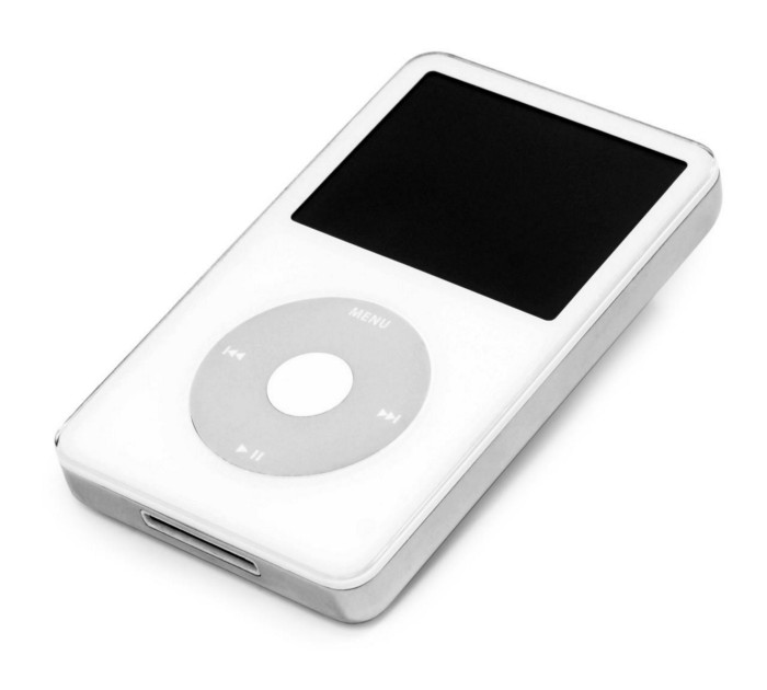
iPod vintage (Oct 2001 to Sep 2014, 6 generations)
The original iPod had six significant upgrades since 2001. Apple announced an 80 GB ($249) and 160 GB ($349) iPod classic in 2007.
Apple updated the 80 GB model with a 120 GB device in September 2008. Apple upgraded the 120 GB model with a 160 GB variant a year later (2009). This was the last iteration, and Apple discontinued the classic in September 2014.
iPod nano (Jan 2004 to Sep 2005, 2 generations)
Apple debuted a smaller, brightly-colored iPod in 2004. The first model featured 4 GB, enough for 1,000 songs.
Apple produced a new 4 GB or 6 GB iPod mini in February 2005 and discontinued it in September when they released a better-looking iPod nano.
iTouch nano (Sep 2005 to July 2017, 7 generations)
I loved the iPod nano. It was tiny and elegant with enough tech to please most music aficionados, unless you carry around your complete music collection.

Apple owed much of the iPod nano's small form and success to solid-state flash memory. Flash memory doesn't need power because it has no moving parts. This makes the iPod nano more durable than the iPod classic and mini, which employ hard drives.
Apple manufactured seven generations of the iPod nano, improving its design, display screen, memory, battery, and software, but abandoned it in July 2017 due to dwindling demand.
Shuffle iPod (Jan 2005 to Jul 2017, 4 generations)
The iPod shuffle was entry-level. It was a simple, lightweight, tiny music player. The iPod shuffle was perfect for lengthy bike trips, runs, and hikes.

Apple sold 10 million iPod shuffles in the first year and kept making them for 12 years, through four significant modifications.
iOS device (Sep 2007 to May 2022, 7 generations)
The iPod touch's bigger touchscreen interface made it a curious addition to the iPod family. The iPod touch resembled an iPhone more than the other iPods, making them hard to tell apart.
Many were dissatisfied that Apple removed functionality from the iPod touch to avoid making it too similar to the iPhone. Seven design improvements over 15 years brought the iPod touch closer to the iPhone, but not completely.
The iPod touch uses the same iOS operating system as the iPhone, giving it access to many apps, including handheld games.
The iPod touch's long production run is due to the next generation of music-loving gamers.
What made the iPod cool
iPod revolutionized music listening. It was the first device to store and play MP3 music, allowing you to carry over 1,000 songs anywhere.
The iPod changed consumer electronics with its scroll wheel and touchscreen. Jobs valued form and function equally. He showed people that a product must look good to inspire an emotional response and ignite passion.
The elegant, tiny iPod was a tremendous sensation when it arrived for $399 in October 2001. Even at this price, it became a must-have for teens to CEOs.
It's hard to identify any technology that changed how music was downloaded and played like the iPod. Apple iPod and iTunes had 63% of the paid music download market in the fourth quarter of 2012.
The demise of the iPod was inevitable
Apple discontinuing the iPod touch after 21 years is sad. This ends a 00s music icon.
Jobs was a genius at anticipating market needs and opportunities, and Apple launched the iPod at the correct time.
Few consumer electronics items have had such a lasting impact on music lovers and the music industry as the iPod.
Smartphones and social media have contributed to the iPod's decline. Instead of moving to the music, the new generation of consumers is focused on social media. They're no longer passive content consumers; they're active content creators seeking likes and followers. Here, the smartphone has replaced the iPod.
It's hard not to feel a feeling of loss, another part of my adolescence now forgotten by the following generation.
So, if you’re lucky enough to have a working iPod, hang on to that relic and enjoy the music and the nostalgia.
You might also like

INTΞGRITY team
4 years ago
Terms of Service
Effective: August 31, 2022
These Terms of Service ("Terms") govern your access to and use of INTΞGRITY’s (or "we") websites, mobile applications, and other online products and services (collectively, the "Services"). By clicking your assent (e.g. "Continue," "Sign-in," or "Sign-up") or by utilizing our Services, you consent to these Terms, including the mandatory arbitration provision and class action waiver in the Resolving Disputes; Binding Arbitration Section.
Our Privacy Policy describes how we gather and utilize your information, while our Rules detail your duties when utilizing our Services. You agree to be bound by these Terms and our Rules by utilizing our Services. Please refer to our Privacy Statement for details on how we collect, utilize, disclose, and otherwise manage your information.
Please contact us at hello@int3grity.com if you have any queries regarding these Terms or our Services.
Account Details and Responsibilities
You are responsible for your use of the Services and any content you contribute, including compliance with all relevant laws. The Services may host content that is protected by the intellectual property rights of third parties. Please do not copy, post, download, or distribute content without permission.
You must adhere to our Rules when using the Services.
To use any or all of our services, you may need to register for an account. Contribute to the protection of your account. Protect your account's password, and maintain accurate account details. We advise you not to share your password with anyone else.
If you are accepting these Terms and using the Services on behalf of someone else (such as another person or entity), you confirm that you are allowed to do so, and the words "you" or "your" in these Terms refer to that other person or entity.
You must be at least 13 years old to access our services.
If you use the Services to access, collect, or otherwise utilize the personal information of other INTΞGRITY users ("Personal Information"), you agree to comply with all applicable laws. You also undertake not to sell any Personal Information, where "sell" has the meaning ascribed to it by relevant legislation.
For Personal Information you provide to us (as a Newsletter Editor, for example), you represent and warrant that you have lawfully collected the Personal Information and that you or a third party have provided all required notices and obtained all required consents prior to collecting the Personal Information. You further represent and warrant that INTΞGRITY’s use of such Personal Information in accordance with the purposes for which you provided the Personal Information will not violate, misappropriate, or infringe any rights of a third party (including intellectual property rights or privacy rights) or cause us to violate any applicable laws.
The Services' User Content
INTΞGRITY may monitor your conduct and material for compliance with these Terms and our Rules, and reserves the right to remove any content that violates these guidelines.
INTΞGRITY maintains the right to remove or disable content that is accused to violate the intellectual property rights of others, as well as to cancel the accounts of repeat infringers. We respond to notifications of alleged copyright violations if they comply with the law; please report such notices using our Copyright Policy.
Ownership and Rights
You maintain ownership of all content that you submit, upload, or display on or through the Services.
By submitting, posting, or displaying content on or through the Services, unless otherwise agreed in writing, you grant INTΞGRITY a nonexclusive, royalty-free, worldwide, fully paid, and sublicensable license to use, reproduce, modify, adapt, publish, translate, create derivative works from, distribute, publicly perform and display your content and any name, username or likeness provided in connection with your content in all media formats and distribution methods now known or later developed.
INTΞGRITY requires this license because you are the owner of your material, and INTΞGRITY cannot show it across its multiple platforms (mobile, online) without your consent.
This type of license is also required for content distribution throughout our Services. For example, you may publish a piece on INTΞGRITY. It is duplicated as versions on both our website and app, and distributed to many locations on INTΞGRITY, including the homepage and reading lists. A tweak could be that we display a fragment of your work as a preview (rather than the entire post), with attribution. An example of a derivative work might be a list of top authors or quotations on INTΞGRITY that includes chunks of your article, again with full attribution. This license solely applies to our Services and does not grant us permissions outside of our Services.
So long as you comply with these Terms, INTΞGRITY grants you a limited, non-exclusive, personal, and non-transferable license to access and utilize our Services.
Copyright, trademark, and other United States and international laws protect the Services. These Terms do not grant you any right, title, or interest in the Services, the material posted by other users on the Services, or INTΞGRITY’s trademarks, logos, or other brand characteristics.
In addition to the content you submit, post, or display on our Services, we appreciate your feedback, which may include your thoughts, ideas, and suggestions regarding our Services. This input may be used for any reason at our sole discretion and without obligation to you. We may treat your comments as non-confidential.
We reserve the right, at our sole discretion, to discontinue the Services or any of its features. In addition, we reserve the right to impose limits on use and storage, and to remove or restrict the distribution of content on the Services.
Termination
You are allowed to terminate your use of our services at any time. We have the right to stop or cancel your use of the Services with or without notice.
Moving and Processing Information
To enable us to deliver our Services, you accept that we may handle, transfer, and retain information about you in the United States and other countries, where you may not enjoy the same rights and protections as you do under local law.
Indemnification
To the maximum extent permitted by applicable law, you will indemnify, defend, and hold harmless INTΞGRITY, and our officers, directors, agents, partners, and employees (collectively, the "INTΞGRITY Parties"), from and against any losses, liabilities, claims, demands, damages, expenses or costs ("Claims") arising out of or relating to your violation, misappropriation, or infringement of any rights of another (including intellectual property rights or privacy rights). You undertake to promptly notify INTΞGRITY Parties of any third-party Claims, to assist INTΞGRITY Parties in fighting such Claims, and to pay any fees, charges, and expenses connected with defending such Claims (including attorneys' fees). You further agree that, at INTΞGRITY’s sole discretion, the INTΞGRITY Parties will govern the defense or settlement of any third-party Claims.
Disclaimers — Services Provided "As Is"
INTΞGRITY strives to provide you with excellent Services, but there are certain things we cannot guarantee. Utilization of our services is at your own risk. You acknowledge that our Services and any content uploaded or shared by users on the Services are given "as is" and "as available" without explicit or implied warranties of any kind, including warranties of merchantability, fitness for a particular purpose, title, and non-infringement. In addition, INTΞGRITY does not represent or promise that our Services are accurate, comprehensive, dependable, up-to-date, or error-free. No advice or information gained from INTΞGRITY or via the Services shall create any warranty or representation unless expressly set forth in this section. INTΞGRITY may provide information on third-party products, services, activities, or events, or we may permit third parties to make their material and information accessible via our Services (collectively, "Third-Party Content"). We neither control nor endorse any Third-Party Content, nor do we make any claims or warranties about it. Accessing and utilizing Third-Party Content is at your own risk. The disclaimers in this section may not apply to you if they are prohibited in your location.
Limitation of Liability
We do not exclude or limit our obligation to you where it would be unlawful to do so; this includes any liability for the gross negligence, fraud, or willful misconduct of INTΞGRITY or the other INTΞGRITY Parties in providing the Services. In jurisdictions where the foregoing exclusions are not permitted, our liability to you is limited to losses and damages that are reasonably foreseeable as a result of our failure to exercise reasonable care and skill or breach of contract with you. This paragraph does not impact consumer rights that cannot be waived or limited by contract.
In jurisdictions that permit liability exclusions or limits, INTΞGRITY and INTΞGRITY Parties will not be liable for:
(a) Any indirect, consequential, exemplary, incidental, punitive, or extraordinary damages, or any loss of use, data, or profits, based on any legal theory, even if INTΞGRITY or the other INTΞGRITY Parties were advised of the potential of such damages.
(b) Except for the types of liability we cannot limit by law (as described in this section), we limit the total liability of INTΞGRITY and the other INTΞGRITY Parties for any claim arising out of or related to these Terms or our Services, regardless of the form of action, to $100.00 USD.
Arbitration; Resolution of Disputes
We intend to address your concerns without filing a formal lawsuit. Before making a claim against INTΞGRITY, you agree to contact us and attempt to resolve the dispute informally by emailing hello@int3grity.com or by sending certified mail to INTΞGRITY, P.O. JOY, 479 Jessie St, San Francisco, CA 94103. The notice must (a) contain your name, address, email address, and telephone number; (b) identify the nature and grounds of the claim; and (c) detail the relief requested. Our notice to you will be sent to the email address linked with your online account and will contain the information specified in the preceding section. Any party may commence a formal procedure if we are unable to reach a resolution within thirty (30) days of the date of any notice.
Please read the following section carefully because it compels you to arbitrate certain claims and disputes with INTΞGRITY and limits the method in which you can seek redress from us, unless you opt out of arbitration by following the steps provided below. This arbitration provision does not permit class or representative lawsuits or arbitrations. In addition, arbitration prohibits you from filing a lawsuit or having a jury trial.
(a) Absence of Representative Actions You and INTΞGRITY agree that any dispute arising out of or relating to these Terms or our Services is personal to you and INTΞGRITY and will be resolved entirely via individual action, and not by class arbitration, class action, or other representative procedure.
(b) Dispute Arbitration. Except for small claims disputes in which you or INTΞGRITY seeks to bring an individual action in small claims court located in the county where you reside and disputes in which you or INTΞGRITY seeks injunctive or other equitable relief for the alleged infringement or misappropriation of intellectual property, you and INTΞGRITY waive your rights to a jury trial and to have any other dispute arising out of or relating to these Terms or our Services, including claims related to privity of contract, decided by a jury. All Disputes submitted to JAMS shall be decided by confidential, binding arbitration before a single arbitrator. If you are a consumer, you may choose to have the arbitration in your county of residence. A "consumer" is a person who uses the Services for personal, family, or household purposes for the purposes of this provision. You and INTΞGRITY agree that Disputes shall be resolved using the JAMS Streamlined Arbitration Rules and Procedures ("JAMS Rules"). The latest version of the JAMS Rules is accessible on the JAMS website and is incorporated herein by reference. Either you accept and agree that you have read and comprehended the JAMS Rules or you forfeit your right to read the JAMS Rules and any claim that the JAMS Rules are unreasonable or should not apply for any reason.
(c) You and INTΞGRITY agree that these Terms affect interstate commerce and that the enforceability of this provision is subject to the Federal Arbitration Act, 9 U.S.C. 1 et seq. (the "FAA"), to the maximum extent permissible by applicable law. As limited by the FAA, these Terms, and the JAMS Rules, the arbitrator will have sole authority to make all procedural and substantive judgments regarding any Dispute, and to grant any remedy that would otherwise be available in court, including the authority to determine arbitrability. The arbitrator may only conduct an individual arbitration and may not consolidate the claims of more than one party, preside over any sort of class or representative procedure, or preside over any proceeding involving more than one party.
d) The arbitration will permit the discovery or exchange of nonconfidential information pertinent to the Dispute. The arbitrator, INTΞGRITY, and you will maintain the confidentiality of all arbitration proceedings, judgments, and awards, as well as any information gathered, prepared, or presented for the purposes of the arbitration or relating to the Dispute(s) therein. Unless the law specifies otherwise, the arbitrator will have the right to make decisions that protect confidentiality. The duty of confidentiality does not apply where disclosure is required to prepare for or conduct the arbitration hearing on the merits, in connection with a court application for a preliminary remedy, in connection with a judicial challenge to an arbitration award or its enforcement, or where disclosure is otherwise required by law or judicial decision.
e) You and INTΞGRITY agree that for any arbitration you begin, you will pay the filing fee (up to $250 if you are a consumer) and INTΞGRITY will pay the remaining JAMS fees and costs. INTΞGRITY will pay all JAMS fees and costs for any and all arbitrations it initiates. You and INTΞGRITY agree that the state and federal courts of California and the United States located in San Francisco have exclusive jurisdiction over any appeals and the implementation of an arbitration award.
(f) Any Dispute must be filed within one year after the relevant claim arose; otherwise, the Dispute is permanently barred, meaning that neither you nor INTΞGRITY will be able to assert the claim.
(g) You have the right to opt-out of binding arbitration within 30 days of the date you initially accepted the terms of this section by sending an email to hello@int3grity.com. For the opt-out notification to be effective, it must include your full name and address and clearly explain your intent to opt out of binding arbitration. By declining binding arbitration, you consent to the resolution of Disputes in accordance with "Governing Law and Venue" below.
(h) If any portion of this section is found to be unenforceable or unlawful for any reason: (1) the unenforceable or unlawful provision shall be severed from these Terms; (2) the severance of the unenforceable or unlawful provision shall have no effect whatsoever on the remainder of this section or the parties' ability to compel arbitration of any remaining claims on an individual basis pursuant to this section; and (3) to the extent that any claims must therefore proceed on an individual basis, the parties agree to arbitrate those claims on an individual basis. In addition, if it is determined that any portion of this section prohibits an individual claim seeking public injunctive relief, that provision will be null and void to the extent that such relief may be sought outside of arbitration, and the balance of this section will be enforceable.
Statute and Location
These Terms and any dispute that may arise between you and INTΞGRITY are governed by California law, excluding its conflict of law provisions. Any issue between the parties that is not arbitrable or cannot be heard in small claims court will be determined by the state or federal courts of California and the United States, sitting in San Francisco, California.
Some nations have regulations that require agreements to be controlled by the consumer's country's laws. These statutes are not overridden by this paragraph.
Amendments
Periodically, we may make modifications to these Terms. If we make modifications, we will notify you by sending an email to the address connected with your account, providing an in-product message, or amending the date at the top of these Terms. Unless we specify otherwise in our notification, the modified Terms will take effect immediately, and your continued use of our Services after we issue such notice indicates your acceptance of the changes. If you do not accept the updated Terms, you must cease using our services.
Severability
If any section or portion of a provision of these Terms is determined to be unlawful, void, or unenforceable, that provision or part of the provision shall be deemed severable from these Terms and shall not affect the validity and enforceability of the other terms.
Miscellaneous INTΞGRITY’s omission to assert or enforce any right or term of these Terms is not a waiver of such right or provision. These Terms and the terms and policies specified in the Other Terms and Policies that May Apply to You Section constitute the complete agreement between the parties pertaining to the subject matter hereof and supersede all prior agreements, statements, and understandings between the parties. The section headings in these Terms are for convenience only and have no legal or contractual significance. The use of the word "including" shall be taken to mean "including without limitation." Unless otherwise specified, these Terms are intended solely for the benefit of the parties and are not intended to confer third-party beneficiary rights on any other person or entity. You consent to the use of electronic means for our communications and transactions.

Jayden Levitt
3 years ago
Billionaire who was disgraced lost his wealth more quickly than anyone in history
If you're not genuine, you'll be revealed.
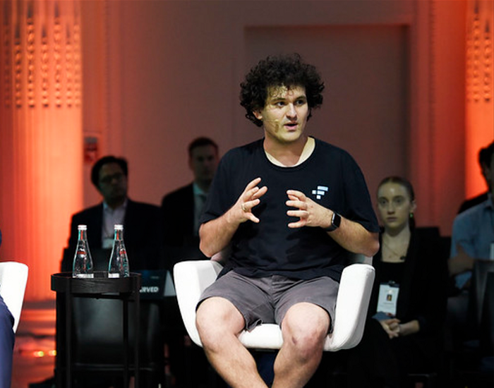
Sam Bankman-Fried (SBF) was called the Cryptocurrency Warren Buffet.
No wonder.
SBF's trading expertise, Blockchain knowledge, and ability to construct FTX attracted mainstream investors.
He had a fantastic worldview, donating much of his riches to charity.
As the onion layers peel back, it's clear he wasn't the altruistic media figure he portrayed.
SBF's mistakes were disastrous.
Customer deposits were traded and borrowed by him.
With ten other employees, he shared a $40 million mansion where they all had polyamorous relationships.
Tone-deaf and wasteful marketing expenditures, such as the $200 million spent to change the name of the Miami Heat stadium to the FTX Arena
Democrats received a $40 million campaign gift.
And now there seems to be no regret.
FTX was a 32-billion-dollar cryptocurrency exchange.
It went bankrupt practically overnight.
SBF, FTX's creator, exploited client funds to leverage trade.
FTX had $1 billion in customer withdrawal reserves against $9 billion in liabilities in sister business Alameda Research.
Bloomberg Billionaire Index says it's the largest and fastest net worth loss in history.
It gets worse.
SBF's net worth is $900 Million, however he must still finalize FTX's bankruptcy.
SBF's arrest in the Bahamas and SEC inquiry followed news that his cryptocurrency exchange had crashed, losing billions in customer deposits.
A journalist contacted him on Twitter D.M., and their exchange is telling.
His ideas are revealed.
Kelsey Piper says they didn't expect him to answer because people under investigation don't comment.
Bankman-Fried wanted to communicate, and the interaction shows he has little remorse.
SBF talks honestly about FTX gaming customers' money and insults his competition.
Reporter Kelsey Piper was outraged by what he said and felt the mistakes SBF says plague him didn't evident in the messages.
Before FTX's crash, SBF was a poster child for Cryptocurrency regulation and avoided criticizing U.S. regulators.
He tells Piper that his lobbying is just excellent PR.
It shows his genuine views and supports cynics' opinions that his attempts to win over U.S. authorities were good for his image rather than Crypto.
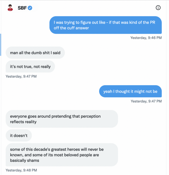
SBF’s responses are in Grey, and Pipers are in Blue.
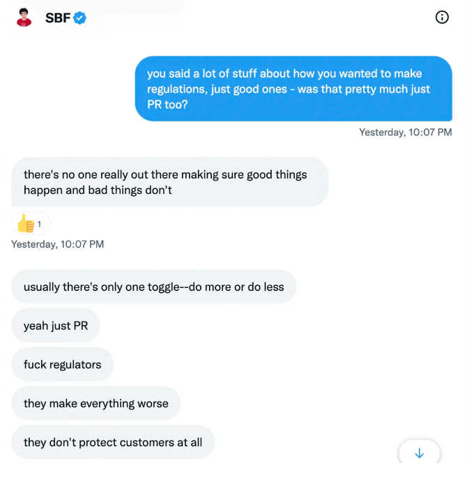
It's unclear if SBF cut corners for his gain. In their Twitter exchange, Piper revisits an interview question about ethics.
SBF says, "All the foolish sh*t I said"
SBF claims FTX has never invested customer monies.
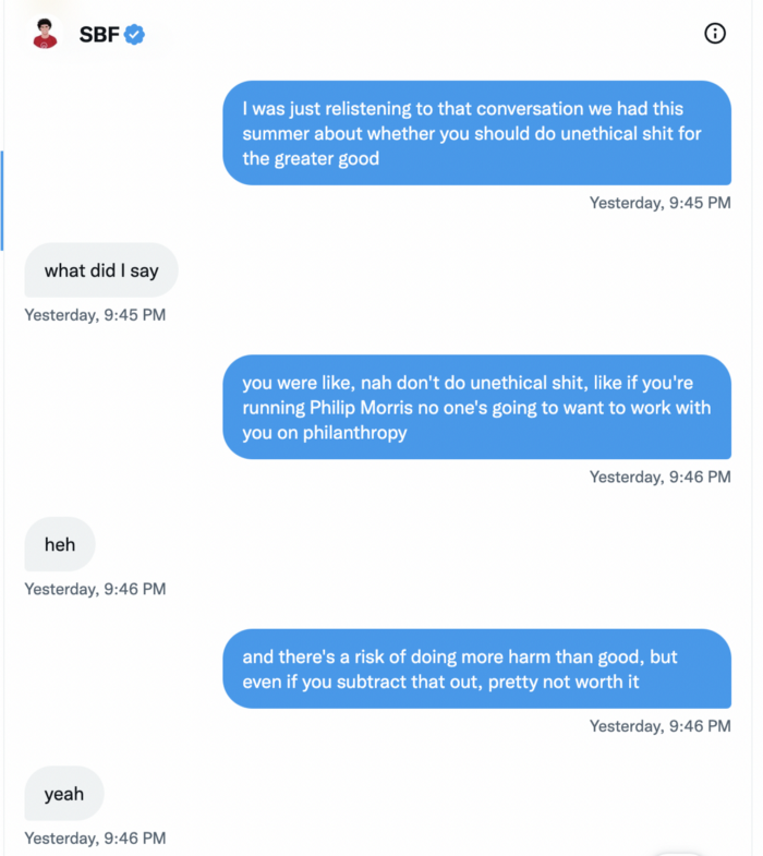
Piper challenged him on Twitter.
While he insisted FTX didn't use customer deposits, he said sibling business Alameda borrowed too much from FTX's balance sheet.
He did, basically.
When consumers tried to withdraw money, FTX was short.
SBF thought Alameda had enough money to cover FTX customers' withdrawals, but life sneaks up on you.
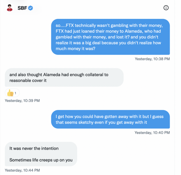
SBF believes most exchanges have done something similar to FTX, but they haven't had a bank run (a bunch of people all wanting to get their deposits out at the same time).
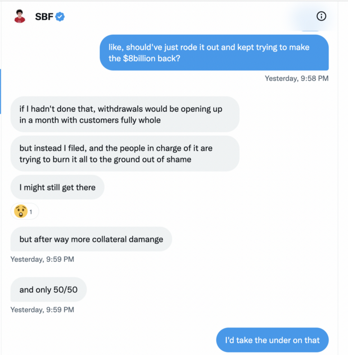
SBF believes he shouldn't have consented to the bankruptcy and kept attempting to raise more money because withdrawals would be open in a month with clients whole.
If additional money came in, he needed $8 billion to bridge the creditors' deficit, and there aren't many corporations with $8 billion to spare.
Once clients feel protected, they will continue to leave their assets on the exchange, according to one idea.
Kevin OLeary, a world-renowned hedge fund manager, says not all investors will walk through the open gate once the company is safe, therefore the $8 Billion wasn't needed immediately.
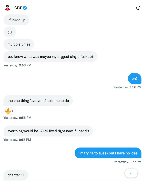
SBF claims the bankruptcy was his biggest error because he could have accumulated more capital.
Final Reflections
Sam Bankman-Fried, 30, became the world's youngest billionaire in four years.
Never listen to what people say about investing; watch what they do.
SBF is a trader who gets wrecked occasionally.
Ten first-time entrepreneurs ran FTX, screwing each other with no risk management.
It prevents opposing or challenging perspectives and echo chamber highs.
Twitter D.M. conversation with a journalist is the final nail.
He lacks an experienced crew.
This event will surely speed up much-needed regulation.
It's also prompted cryptocurrency exchanges to offer proof of reserves to calm customers.

Ezra Reguerra
4 years ago
Yuga Labs’ Otherdeeds NFT mint triggers backlash from community
Unhappy community members accuse Yuga Labs of fraud, manipulation, and favoritism over Otherdeeds NFT mint.
Following the Otherdeeds NFT mint, disgruntled community members took to Twitter to criticize Yuga Labs' handling of the event.
Otherdeeds NFTs were a huge hit with the community, selling out almost instantly. Due to high demand, the launch increased Ethereum gas fees from 2.6 ETH to 5 ETH.
But the event displeased many people. Several users speculated that the mint was “planned to fail” so the group could advertise launching its own blockchain, as the team mentioned a chain migration in one tweet.
Others like Mark Beylin tweeted that he had "sold out" on all Ape-related NFT investments after Yuga Labs "revealed their true colors." Beylin also advised others to assume Yuga Labs' owners are “bad actors.”
Some users who failed to complete transactions claim they lost ETH. However, Yuga Labs promised to refund lost gas fees.
CryptoFinally, a Twitter user, claimed Yuga Labs gave BAYC members better land than non-members. Others who wanted to participate paid for shittier land, while BAYCS got the only worthwhile land.
The Otherdeed NFT drop also increased Ethereum's burn rate. Glassnode and Data Always reported nearly 70,000 ETH burned on mint day.