


More on Marketing

Jon Brosio
3 years ago
This Landing Page is a (Legal) Money-Printing Machine
and it’s easy to build.
A landing page with good copy is a money-maker.
Let's be honest, page-builder templates are garbage.
They can help you create a nice-looking landing page, but not persuasive writing.
Over the previous 90 days, I've examined 200+ landing pages.
What's crazy?
Top digital entrepreneurs use a 7-part strategy to bring in email subscribers, generate prospects, and (passively) sell their digital courses.
Steal this 7-part landing page architecture to maximize digital product sales.
The offer
Landing pages require offers.
Newsletter, cohort, or course offer.
Your reader should see this offer first. Includind:
Headline
Imagery
Call-to-action
Clear, persuasive, and simplicity are key. Example: the Linkedin OS course home page of digital entrepreneur Justin Welsh offers:
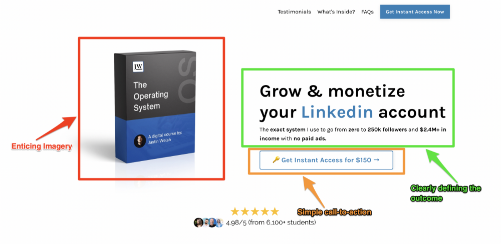
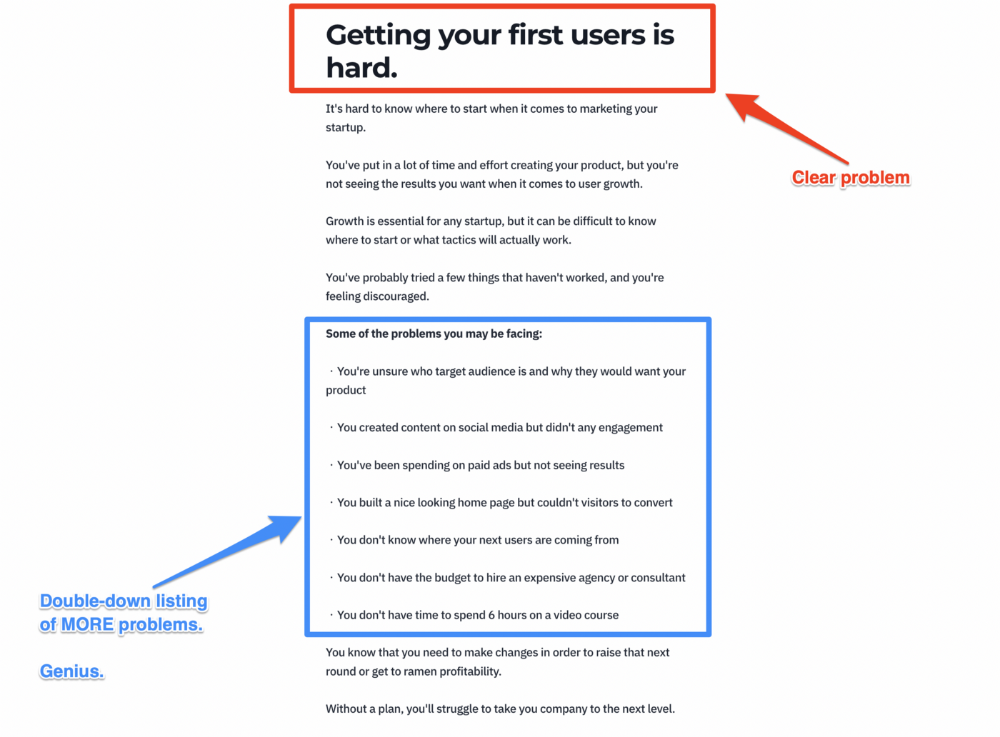
A distinctly defined problem
Everyone needs an enemy.
You need an opponent on your landing page. Problematic.
Next, employ psychology to create a struggle in your visitor's thoughts.
Don't be clever here; label your customer's problem. The more particular you are, the bigger the situation will seem.
When you build a clear monster, you invite defeat. I appreciate Theo Ohene's Growth Roadmaps landing page.
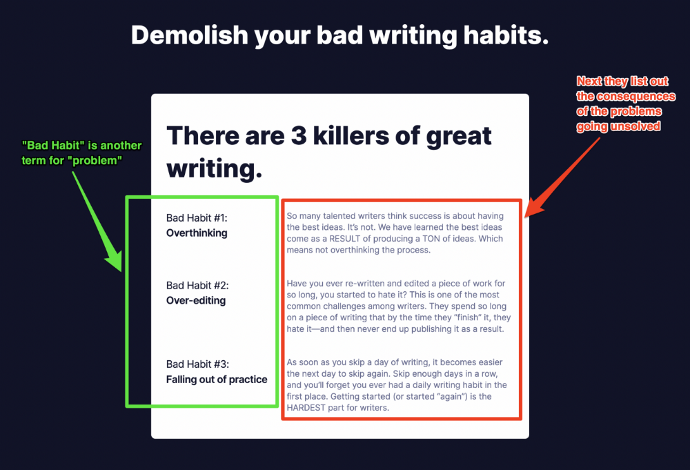
Exacerbation of the effects
Problem identification doesn't motivate action.
What would an unresolved problem mean?
This is landing page copy. When you describe the unsolved problem's repercussions, you accomplish several things:
You write a narrative (and stories are remembered better than stats)
You cause the reader to feel something.
You help the reader relate to the issue
Important!
My favorite script is:
"Sure, you can let [problem] go untreated. But what will happen if you do? Soon, you'll begin to notice [new problem 1] will start to arise. That might bring up [problem 2], etc."
Take the copywriting course, digital writer and entrepreneur Dickie Bush illustrates below when he labels the problem (see: "poor habit") and then illustrates the repercussions.
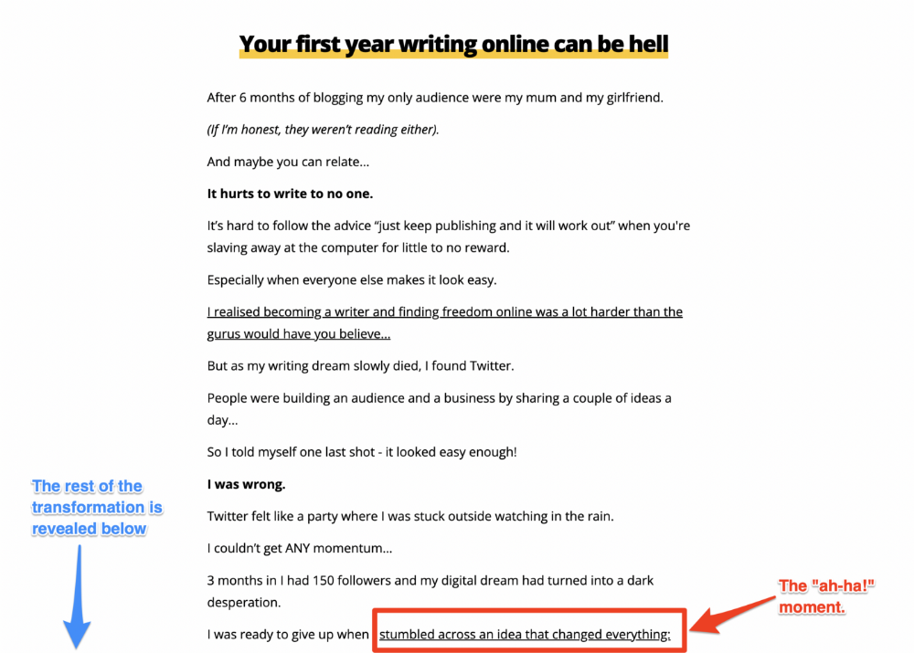
The tale of transformation
Every landing page needs that "ah-ha!" moment.
Transformation stories do this.
Did you find a solution? Someone else made the discovery? Have you tested your theory?
Next, describe your (or your subject's) metamorphosis.
Kieran Drew nails his narrative (and revelation) here. Right before the disclosure, he introduces his "ah-ha!" moment:
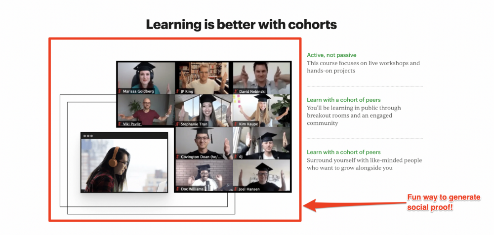
Testimonials
Social proof completes any landing page.
Social proof tells the reader, "If others do it, it must be worthwhile."
This is your argument.
Positive social proof helps (obviously).
Offer "free" training in exchange for a testimonial if you need social evidence. This builds social proof.
Most social proof is testimonies (recommended). Kurtis Hanni's creative take on social proof (using a screenshot of his colleague) is entertaining.
Bravo.
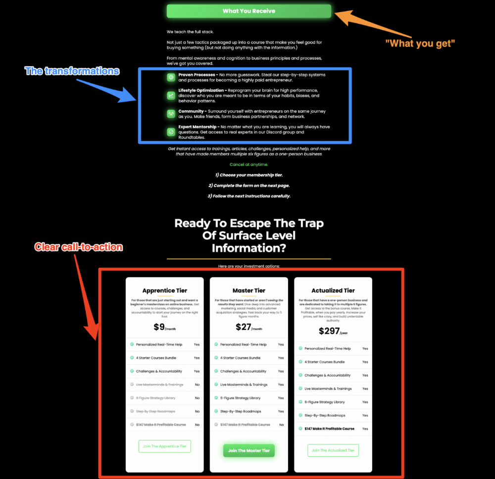
Reveal your offer
Now's the moment to act.
Describe the "bundle" that provides the transformation.
Here's:
Course
Cohort
Ebook
Whatever you're selling.
Include a product or service image, what the consumer is getting ("how it works"), the price, any "free" bonuses (preferred), and a CTA ("buy now").
Clarity is key. Don't make a cunning offer. Make sure your presentation emphasizes customer change (benefits). Dan Koe's Modern Mastery landing page makes an offer. Consider:
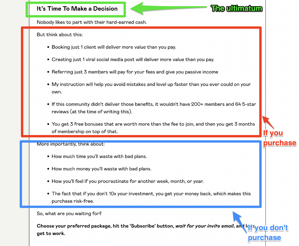
An ultimatum
Offering isn't enough.
You must give your prospect an ultimatum.
They can buy your merchandise from you.
They may exit the webpage.
That’s it.
It's crucial to show what happens if the reader does either. Stress the consequences of not buying (again, a little consequence amplification). Remind them of the benefits of buying.
I appreciate Charles Miller's product offer ending:
The top online creators use a 7-part landing page structure:
Offer the service
Describe the problem
Amplify the consequences
Tell the transformational story
Include testimonials and social proof.
Reveal the offer (with any bonuses if applicable)
Finally, give the reader a deadline to encourage them to take action.
Sequence these sections to develop a landing page that (essentially) prints money.

Ivona Hirschi
3 years ago
7 LinkedIn Tips That Will Help in Audience Growth
In 8 months, I doubled my audience with them.

LinkedIn's buzz isn't over.
People dream of social proof every day. They want clients, interesting jobs, and field recognition.
LinkedIn coaches will benefit greatly. Sell learning? Probably. Can you use it?
Consistency has been key in my eight-month study of LinkedIn. However, I'll share seven of my tips. 700 to 4500 people followed me.
1. Communication, communication, communication
LinkedIn is a social network. I like to think of it as a cafe. Here, you can share your thoughts, meet friends, and discuss life and work.
Do not treat LinkedIn as if it were a board for your post-its.
More socializing improves relationships. It's about people, like any network.
Consider interactions. Three main areas:
Respond to criticism left on your posts.
Comment on other people's posts
Start and maintain conversations through direct messages.
Engage people. You spend too much time on Facebook if you only read your wall. Keeping in touch and having meaningful conversations helps build your network.
Every day, start a new conversation to make new friends.
2. Stick with those you admire
Interact thoughtfully.
Choose your contacts. Build your tribe is a term. Respectful networking.
I only had past colleagues, family, and friends in my network at the start of this year. Not business-friendly. Since then, I've sought out people I admire or can learn from.
Finding a few will help you. As they connect you to their networks. Friendships can lead to clients.
Don't underestimate network power. Cafe-style. Meet people at each table. But avoid people who sell SEO, web redesign, VAs, mysterious job opportunities, etc.
3. Share eye-catching infographics
Daily infographics flood LinkedIn. Visuals are popular. Use Canva's free templates if you can't draw them.
Last week's:
It's a fun way to visualize your topic.
You can repost and comment on infographics. Involve your network. I prefer making my own because I build my brand around certain designs.
My friend posted infographics consistently for four months and grew his network to 30,000.
If you start, credit the authors. As you steal someone's work.
4. Invite some friends over.
LinkedIn alone can be lonely. Having a few friends who support your work daily will boost your growth.
I was lucky to be invited to a group of networkers. We share knowledge and advice.
Having a few regulars who can discuss your posts is helpful. It's artificial, but it works and engages others.
Consider who you'd support if they were in your shoes.
You can pay for an engagement group, but you risk supporting unrelated people with rubbish posts.
Help each other out.
5. Don't let your feed or algorithm divert you.
LinkedIn's algorithm is magical.
Which time is best? How fast do you need to comment? Which days are best?
Overemphasize algorithms. Consider the user. No need to worry about the best time.
Remember to spend time on LinkedIn actively. Not passively. That is what Facebook is for.
Surely someone would find a LinkedIn recipe. Don't beat the algorithm yet. Consider your audience.
6. The more personal, the better
Personalization isn't limited to selfies. Share your successes and failures.
The more personality you show, the better.
People relate to others, not theories or quotes. Why should they follow you? Everyone posts the same content?
Consider your friends. What's their appeal?
Because they show their work and identity. It's simple. Medium and Linkedin are your platforms. Find out what works.
You can copy others' hooks and structures. You decide how simple to make it, though.
7. Have fun with those who have various post structures.
I like writing, infographics, videos, and carousels. Because you can:
Repurpose your content!
Out of one blog post I make:
Newsletter
Infographics (positive and negative points of view)
Carousel
Personal stories
Listicle
Create less but more variety. Since LinkedIn posts last 24 hours, you can rotate the same topics for weeks without anyone noticing.
Effective!
The final LI snippet to think about
LinkedIn is about consistency. Some say 15 minutes. If you're serious about networking, spend more time there.
The good news is that it is worth it. The bad news is that it takes time.

Guillaume Dumortier
2 years ago
Mastering the Art of Rhetoric: A Guide to Rhetorical Devices in Successful Headlines and Titles
Unleash the power of persuasion and captivate your audience with compelling headlines.
As the old adage goes, "You never get a second chance to make a first impression."
In the world of content creation and social ads, headlines and titles play a critical role in making that first impression.
A well-crafted headline can make the difference between an article being read or ignored, a video being clicked on or bypassed, or a product being purchased or passed over.
To make an impact with your headlines, mastering the art of rhetoric is essential. In this post, we'll explore various rhetorical devices and techniques that can help you create headlines that captivate your audience and drive engagement.
tl;dr : Headline Magician will help you craft the ultimate headline titles powered by rhetoric devices
Example with a high-end luxury organic zero-waste skincare brand
✍️ The Power of Alliteration
Alliteration is the repetition of the same consonant sound at the beginning of words in close proximity. This rhetorical device lends itself well to headlines, as it creates a memorable, rhythmic quality that can catch a reader's attention.
By using alliteration, you can make your headlines more engaging and easier to remember.
Examples:
"Crafting Compelling Content: A Comprehensive Course"
"Mastering the Art of Memorable Marketing"
🔁 The Appeal of Anaphora
Anaphora is the repetition of a word or phrase at the beginning of successive clauses. This rhetorical device emphasizes a particular idea or theme, making it more memorable and persuasive.
In headlines, anaphora can be used to create a sense of unity and coherence, which can draw readers in and pique their interest.
Examples:
"Create, Curate, Captivate: Your Guide to Social Media Success"
"Innovation, Inspiration, and Insight: The Future of AI"
🔄 The Intrigue of Inversion
Inversion is a rhetorical device where the normal order of words is reversed, often to create an emphasis or achieve a specific effect.
In headlines, inversion can generate curiosity and surprise, compelling readers to explore further.
Examples:
"Beneath the Surface: A Deep Dive into Ocean Conservation"
"Beyond the Stars: The Quest for Extraterrestrial Life"
⚖️ The Persuasive Power of Parallelism
Parallelism is a rhetorical device that involves using similar grammatical structures or patterns to create a sense of balance and symmetry.
In headlines, parallelism can make your message more memorable and impactful, as it creates a pleasing rhythm and flow that can resonate with readers.
Examples:
"Eat Well, Live Well, Be Well: The Ultimate Guide to Wellness"
"Learn, Lead, and Launch: A Blueprint for Entrepreneurial Success"
⏭️ The Emphasis of Ellipsis
Ellipsis is the omission of words, typically indicated by three periods (...), which suggests that there is more to the story.
In headlines, ellipses can create a sense of mystery and intrigue, enticing readers to click and discover what lies behind the headline.
Examples:
"The Secret to Success... Revealed"
"Unlocking the Power of Your Mind... A Step-by-Step Guide"
🎭 The Drama of Hyperbole
Hyperbole is a rhetorical device that involves exaggeration for emphasis or effect.
In headlines, hyperbole can grab the reader's attention by making bold, provocative claims that stand out from the competition. Be cautious with hyperbole, however, as overuse or excessive exaggeration can damage your credibility.
Examples:
"The Ultimate Guide to Mastering Any Skill in Record Time"
"Discover the Revolutionary Technique That Will Transform Your Life"
❓The Curiosity of Questions
Posing questions in your headlines can be an effective way to pique the reader's curiosity and encourage engagement.
Questions compel the reader to seek answers, making them more likely to click on your content. Additionally, questions can create a sense of connection between the content creator and the audience, fostering a sense of dialogue and discussion.
Examples:
"Are You Making These Common Mistakes in Your Marketing Strategy?"
"What's the Secret to Unlocking Your Creative Potential?"
💥 The Impact of Imperatives
Imperatives are commands or instructions that urge the reader to take action. By using imperatives in your headlines, you can create a sense of urgency and importance, making your content more compelling and actionable.
Examples:
"Master Your Time Management Skills Today"
"Transform Your Business with These Innovative Strategies"
💢 The Emotion of Exclamations
Exclamations are powerful rhetorical devices that can evoke strong emotions and convey a sense of excitement or urgency.
Including exclamations in your headlines can make them more attention-grabbing and shareable, increasing the chances of your content being read and circulated.
Examples:
"Unlock Your True Potential: Find Your Passion and Thrive!"
"Experience the Adventure of a Lifetime: Travel the World on a Budget!"
🎀 The Effectiveness of Euphemisms
Euphemisms are polite or indirect expressions used in place of harsher, more direct language.
In headlines, euphemisms can make your message more appealing and relatable, helping to soften potentially controversial or sensitive topics.
Examples:
"Navigating the Challenges of Modern Parenting"
"Redefining Success in a Fast-Paced World"
⚡Antithesis: The Power of Opposites
Antithesis involves placing two opposite words side-by-side, emphasizing their contrasts. This device can create a sense of tension and intrigue in headlines.
Examples:
"Once a day. Every day"
"Soft on skin. Kill germs"
"Mega power. Mini size."
To utilize antithesis, identify two opposing concepts related to your content and present them in a balanced manner.
🎨 Scesis Onomaton: The Art of Verbless Copy
Scesis onomaton is a rhetorical device that involves writing verbless copy, which quickens the pace and adds emphasis.
Example:
"7 days. 7 dollars. Full access."
To use scesis onomaton, remove verbs and focus on the essential elements of your headline.
🌟 Polyptoton: The Charm of Shared Roots
Polyptoton is the repeated use of words that share the same root, bewitching words into memorable phrases.
Examples:
"Real bread isn't made in factories. It's baked in bakeries"
"Lose your knack for losing things."
To employ polyptoton, identify words with shared roots that are relevant to your content.
✨ Asyndeton: The Elegance of Omission
Asyndeton involves the intentional omission of conjunctions, adding crispness, conviction, and elegance to your headlines.
Examples:
"You, Me, Sushi?"
"All the latte art, none of the environmental impact."
To use asyndeton, eliminate conjunctions and focus on the core message of your headline.
🔮 Tricolon: The Magic of Threes
Tricolon is a rhetorical device that uses the power of three, creating memorable and impactful headlines.
Examples:
"Show it, say it, send it"
"Eat Well, Live Well, Be Well."
To use tricolon, craft a headline with three key elements that emphasize your content's main message.
🔔 Epistrophe: The Chime of Repetition
Epistrophe involves the repetition of words or phrases at the end of successive clauses, adding a chime to your headlines.
Examples:
"Catch it. Bin it. Kill it."
"Joint friendly. Climate friendly. Family friendly."
To employ epistrophe, repeat a key phrase or word at the end of each clause.
You might also like

caroline sinders
3 years ago
Holographic concerts are the AI of the Future.
A few days ago, I was discussing dall-e with two art and tech pals. One artist acquaintance said she knew a frightened illustrator. Would the ability to create anything with a click derail her career? The artist feared this. My curator friend smiled and said this has always been a dread among artists. When the camera was invented, didn't painters say this? Even in the Instagram era, painting exists.
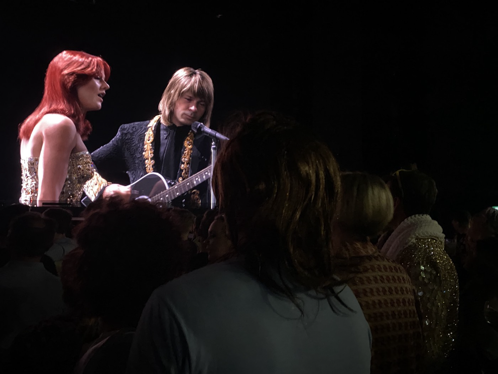
When art and technology collide, there's room for innovation, experimentation, and fear — especially if the technology replicates or replaces art making. What is art's future with dall-e? How does technology affect music, beyond visual art? Recently, I saw "ABBA Voyage," a holographic ABBA concert in London.
"Abba voyage?" my phone asked in early March. A Gen X friend I met through a fashion blogging ring texted me.
"What's abba Voyage?" I asked while opening my front door with keys and coffee.
We're going! Marti, visiting London, took me to a show.
"Absolutely no ABBA songs here." I responded.
My parents didn't play ABBA much, so I don't know much about them. Dad liked Jimi Hendrix, Cream, Deep Purple, and New Orleans jazz. Marti told me ABBA Voyage was a holographic ABBA show with a live band.
The show was fun, extraordinary fun. Nearly everyone on the dance floor wore wigs, ankle-breaking platforms, sequins, and bellbottoms. I saw some millennials and Zoomers among the boomers.
I was intoxicated by the experience.
Automatons date back to the 18th-century mechanical turk. The mechanical turk was a chess automaton operated by a person. The mechanical turk seemed to perform like a human without human intervention, but it required a human in the loop to work properly.
Humans have used non-humans in entertainment for centuries, such as puppets, shadow play, and smoke and mirrors. A show can have animatronic, technological, and non-technological elements, and a live show can blur real and illusion. From medieval puppet shows to mechanical turks to AI filters, bots, and holograms, entertainment has evolved over time.
I'm not a hologram skeptic, but I'm skeptical of technology, especially since I work with it. I love live performances, I love hearing singers breathe, forget lines, and make jokes. Live shows are my favorite because I love watching performers make mistakes or interact with the audience. ABBA Voyage was different.
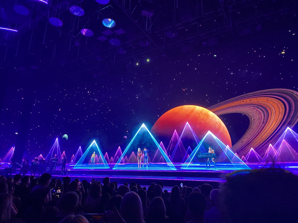
Marti and I traveled to Manchester after ABBA Voyage to see Liam Gallagher. Similar but different vibe. Similar in that thousands dressed up for the show. ABBA's energy was dizzying. 90s chic replaced sequins in the crowd. Doc Martens, nylon jackets, bucket hats, shaggy hair. The Charlatans and Liam Gallagher opened and closed, respectively. Fireworks. Incredible. People went crazy. Yelling exhausted my voice.
This week in music featured AI-enabled holograms and a decades-old rocker. Both are warm and gooey in our memories.
After seeing both, I'm wondering if we need AI hologram shows. Why? Is it good?
Like everything tech-related, my answer is "maybe." Because context and performance matter. Liam Gallagher and ABBA both had great, different shows.
For a hologram to work, it must be impossible and big. It must be big, showy, and improbable to justify a hologram. It must feel...expensive, like a stadium pop show. According to a quick search, ABBA broke up on bad terms. Reuniting is unlikely. This is also why Prince or Tupac hologram shows work. We can only engage with their legacy through covers or...holograms.
I drove around listening to the radio a few weeks ago. "Dreaming of You" by Selena played. Selena's music defined my childhood. I sang along and turned up the volume (or as loud as my husband would allow me while driving on the highway).
I discovered Selena's music six months after her death, so I never saw her perform live. My babysitter Melissa played me her album after I moved to Houston. Melissa took me to see the Selena movie five times when it came out. I quickly wore out my VHS copy. I constantly sang "Bibi Bibi Bom Bom" and "Como la Flor." I love Selena. A Selena hologram? Yes, probably.
Instagram advertised a cellist's Arthur Russell tribute show. Russell is another deceased artist I love. I almost walked down the aisle to "This is How We Walk on the Moon," but our cellist couldn't find it. Instead, I walked to Magnetic Fields' "The Book of Love." I "discovered" Russell after a friend introduced me to his music a few years ago.
I use these as analogies for the Liam Gallagher and ABBA concerts.
You have no idea how much I'd pay to see a hologram of Selena's 1995 Houston Livestock Show and Rodeo concert. Arthur Russell's hologram is unnecessary. Russell's work was intimate and performance-based. We can't separate his life from his legacy; popular audiences overlooked his genius. He died of AIDS broke. Like Selena, he died prematurely. Given his music and history, another performer would be a better choice than a hologram. He's no Selena. Selena could have rivaled Beyonce.
Pop shows' size works for holograms. Along with ABBA holograms, there was an anime movie and a light show that would put Tron to shame. ABBA created a tourable stadium show. The event was lavish, expensive, and well-planned. Pop, unlike rock, isn't gritty. Liam Gallagher hologram? No longer impossible, it wouldn't work. He's touring. I'm not sure if a rockstar alone should be rendered as a hologram; it was the show that made ABBA a hologram.
Holograms, like AI, are part of the future of entertainment, but not all of it. Because only modern interpretations of Arthur Russell's work reveal his legacy. That's his legacy.
Large-scale arena performers may use holograms in the future, but the experience must be impossible. A teacher once said that the only way to convey emotion in opera is through song, and I feel the same way about holograms, AR, VR, and mixed reality. A story's impossibility must make sense, like in opera. Impossibility and bombastic performance must be present for an immersive element to "work." ABBA was an impossible and improbable experience, which made it magical. It helped the holographic show work.
Marti told me about ABBA Voyage. She said it was a great concert. Marti has worked in music since the 1990s. She's a music expert; she's seen many shows.
Ai isn't a god or sentient, and the ABBA holograms aren't real. The renderings were glassy-eyed, flat, and robotic, like the Polar Express or the Jaws shark. Even today, the uncanny valley is insurmountable. We know it's not real because it's not about reality. It was about a suspended moment and performance feelings.
I knew this was impossible, an 'unreal' experience, but the emotions I felt were real, like watching a movie or tv show. Perhaps this is one of the better uses of AI, like CGI and special effects, like the beauty of entertainment- we were enraptured and entertained for hours. I've been playing ABBA since then.

B Kean
3 years ago
Russia's greatest fear is that no one will ever fear it again.
When everyone laughs at him, he's powerless.

1-2-3: Fold your hands and chuckle heartily. Repeat until you're really laughing.
We're laughing at Russia's modern-day shortcomings, if you hadn't guessed.
Watch Good Fellas' laughing scene on YouTube. Ray Liotta, Joe Pesci, and others laugh hysterically in a movie. Laugh at that scene, then think of Putin's macho guy statement on February 24 when he invaded Ukraine. It's cathartic to laugh at his expense.
Right? It makes me feel great that he was convinced the military action will be over in a week. I love reading about Putin's morning speech. Many stupid people on Earth supported him. Many loons hailed his speech historic.
Russia preys on the weak. Strong Ukraine overcame Russia. Ukraine's right. As usual, Russia is in the wrong.
A so-called thought leader recently complained on Russian TV that the West no longer fears Russia, which is why Ukraine is kicking Russia's ass.
Let's simplify for this Russian intellectual. Except for nuclear missiles, the West has nothing to fear from Russia. Russia is a weak, morally-empty country whose DNA has degraded to the point that evolution is already working to flush it out.
The West doesn't fear Russia since he heads a prominent Russian institution. Russian universities are intellectually barren. I taught at St. Petersburg University till June (since February I was virtually teaching) and was astounded by the lack of expertise.
Russians excel in science, math, engineering, IT, and anything that doesn't demand critical thinking or personal ideas.
Reflecting on many of the high-ranking individuals from around the West, Satanovsky said: “They are not interested in us. We only think we’re ‘big politics’ for them but for those guys we’re small politics. “We’re small politics, even though we think of ourselves as the descendants of the Russian Empire, of the USSR. We are not the Soviet Union, we don’t have enough weirdos and lunatics, we practically don’t have any (U.S. Has Stopped Fearing Us).”
Professor Dmitry Evstafiev, president of the Institute of the Middle East, praised Nikita Khrushchev's fiery nature because he made the world fear him, which made the Soviet Union great. If the world believes Putin is crazy, then Russia will be great, says this man. This is crazy.
Evstafiev covered his cowardice by saluting Putin. He praised his culture and Ukraine patience. This weakling professor ingratiates himself to Putin instead of calling him a cowardly, demonic shithead.
This is why we don't fear Russia, professor. Because you're all sycophantic weaklings who sold your souls to a Leningrad narcissist. Putin's nothing. He lacks intelligence. You've tied your country's fate and youth's future to this terrible monster. Disgraceful!
How can you loathe your country's youth so much to doom them to decades or centuries of ignominy? My son is half Russian and must now live with this portion of him.
We don't fear Russia because you don't realize that it should be appreciated, not frightened. That would need lobotomizing tens of millions of people like you.
Sadman. You let a Leningrad weakling castrate you and display your testicles. He shakes the container, saying, "Your balls are mine."
Why is Russia not feared?
Your self-inflicted national catastrophe is hilarious. Sadly, it's laugh-through-tears.
Monroe Mayfield
2 years ago
CES 2023: A Third Look At Upcoming Trends
Las Vegas hosted CES 2023. This third and last look at CES 2023 previews upcoming consumer electronics trends that will be crucial for market share.
Definitely start with ICT. Qualcomm CEO Cristiano Amon spoke to CNBC from Las Vegas on China's crackdown and the company's automated driving systems for electric vehicles (EV). The business showed a concept car and its latest Snapdragon processor designs, which offer expanded digital interactions through SalesForce-partnered CRM platforms.
Electrification is reviving Michigan's automobile industry. Michigan Local News reports that $14 billion in EV and battery manufacturing investments will benefit the state. The report also revealed that the Strategic Outreach and Attraction Reserve (SOAR) fund had generated roughly $1 billion for the state's automotive sector.
Ars Technica is great for technology, society, and the future. After CES 2023, Jonathan M. Gitlin published How many electric car chargers are enough? Read about EV charging network issues and infrastructure spending. Politics aside, rapid technological advances enable EV charging network expansion in American cities and abroad.
Finally, the UNEP's The Future of Electric Vehicles and Material Resources: A Foresight Brief. Understanding how lithium-ion batteries will affect EV sales is crucial. Climate change affects EVs in various ways, but electrification and mining trends stand out because more EVs demand more energy-intensive metals and rare earths. Areas & Producers has been publishing my electrification and mining trends articles. Follow me if you wish to write for the publication.
The Weekend Brief (TWB) will routinely cover tech, industrials, and global commodities in global markets, including stock markets. Read more about the future of key areas and critical producers of the global economy in Areas & Producers.