


More on Entrepreneurship/Creators

Eitan Levy
3 years ago
The Top 8 Growth Hacking Techniques for Startups
The Top 8 Growth Hacking Techniques for Startups

These startups, and how they used growth-hack marketing to flourish, are some of the more ethical ones, while others are less so.
Before the 1970 World Cup began, Puma paid footballer Pele $120,000 to tie his shoes. The cameras naturally focused on Pele and his Pumas, causing people to realize that Puma was the top football brand in the world.
Early workers of Uber canceled over 5,000 taxi orders made on competing applications in an effort to financially hurt any of their rivals.
PayPal developed a bot that advertised cheap goods on eBay, purchased them, and paid for them with PayPal, fooling eBay into believing that customers preferred this payment option. Naturally, Paypal became eBay's primary method of payment.
Anyone renting a space on Craigslist had their emails collected by AirBnB, who then urged them to use their service instead. A one-click interface was also created to list immediately on AirBnB from Craigslist.
To entice potential single people looking for love, Tinder developed hundreds of bogus accounts of attractive people. Additionally, for at least a year, users were "accidentally" linked.
Reddit initially created a huge number of phony accounts and forced them all to communicate with one another. It eventually attracted actual users—the real meaning of "fake it 'til you make it"! Additionally, this gave Reddit control over the tone of voice they wanted for their site, which is still present today.
To disrupt the conferences of their main rival, Salesforce recruited fictitious protestors. The founder then took over all of the event's taxis and gave a 45-minute pitch for his startup. No place to hide!
When a wholesaler required a minimum purchase of 10, Amazon CEO Jeff Bezos wanted a way to purchase only one book from them. A wholesaler would deliver the one book he ordered along with an apology for the other eight books after he discovered a loophole and bought the one book before ordering nine books about lichens. On Amazon, he increased this across all of the users.
Original post available here

Jerry Keszka
3 years ago
10 Crazy Useful Free Websites No One Told You About But You Needed
The internet is a massive information resource. With so much stuff, it's easy to forget about useful websites. Here are five essential websites you may not have known about.

1. Companies.tools
Companies.tools are what successful startups employ. This website offers a curated selection of design, research, coding, support, and feedback resources. Ct has the latest app development platform and greatest client feedback method.
2. Excel Formula Bot
Excel Formula Bot can help if you forget a formula. Formula Bot uses AI to convert text instructions into Excel formulas, so you don't have to remember them.
Just tell the Bot what to do, and it will do it. Excel Formula Bot can calculate sales tax and vacation days. When you're stuck, let the Bot help.
3.TypeLit
TypeLit helps you improve your typing abilities while reading great literature.
TypeLit.io lets you type any book or dozens of preset classics. TypeLit provides real-time feedback on accuracy and speed.
Goals and progress can be tracked. Why not improve your typing and learn great literature with TypeLit?
4. Calm Schedule
Finding a meeting time that works for everyone is difficult. Personal and business calendars might be difficult to coordinate.
Synchronize your two calendars to save time and avoid problems. You may avoid searching through many calendars for conflicts and keep your personal information secret. Having one source of truth for personal and work occasions will help you never miss another appointment.
https://calmcalendar.com/
5. myNoise
myNoise makes the outside world quieter. myNoise is the right noise for a noisy office or busy street.
If you can't locate the right noise, make it. MyNoise unlocks the world. Shut out distractions. Thank your ears.
6. Synthesia
Professional videos require directors, filmmakers, editors, and animators. Now, thanks to AI, you can generate high-quality videos without video editing experience.
AI avatars are crucial. You can design a personalized avatar using a web-based software like synthesia.io. Our avatars can lip-sync in over 60 languages, so you can make worldwide videos. There's an AI avatar for every video goal.
Not free. Amazing service, though.
7. Cleaning-up-images
Have you shot a wonderful photo just to notice something in the background? You may have a beautiful headshot but wish to erase an imperfection.
Cleanup.pictures removes undesirable objects from photos. Our algorithms will eliminate the selected object.
Cleanup.pictures can help you obtain the ideal shot every time. Next time you take images, let Cleanup.pictures fix any flaws.
8. PDF24 Tools
Editing a PDF can be a pain. Most of us don't know Adobe Acrobat's functionalities. Why buy something you'll rarely use? Better options exist.
PDF24 is an online PDF editor that's free and subscription-free. Rotate, merge, split, compress, and convert PDFs in your browser. PDF24 makes document signing easy.
Upload your document, sign it (or generate a digital signature), and download it. It's easy and free. PDF24 is a free alternative to pricey PDF editing software.
9. Class Central
Finding online classes is much easier. Class Central has classes from Harvard, Stanford, Coursera, Udemy, and Google, Amazon, etc. in one spot.
Whether you want to acquire a new skill or increase your knowledge, you'll find something. New courses bring variety.
10. Rome2rio
Foreign travel offers countless transport alternatives. How do you get from A to B? It’s easy!
Rome2rio will show you the best method to get there, including which mode of transport is ideal.
Plane
Car
Train
Bus
Ferry
Driving
Shared bikes
Walking
Do you know any free, useful websites?
Benjamin Lin
3 years ago
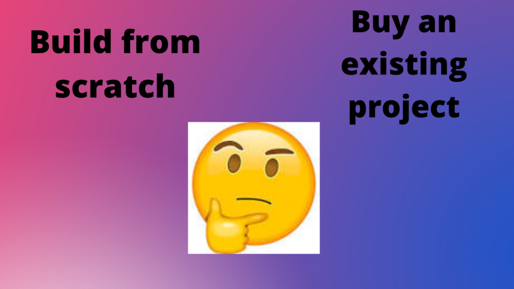
I sold my side project for $20,000: 6 lessons I learned
How I monetized and sold an abandoned side project for $20,000

The Origin Story
I've always wanted to be an entrepreneur but never succeeded. I often had business ideas, made a landing page, and told my buddies. Never got customers.
In April 2021, I decided to try again with a new strategy. I noticed that I had trouble acquiring an initial set of customers, so I wanted to start by acquiring a product that had a small user base that I could grow.
I found a SaaS marketplace called MicroAcquire.com where you could buy and sell SaaS products. I liked Shareit.video, an online Loom-like screen recorder.
Shareit.video didn't generate revenue, but 50 people visited daily to record screencasts.
Purchasing a Failed Side Project
I eventually bought Shareit.video for $12,000 from its owner.
$12,000 was probably too much for a website without revenue or registered users.
I thought time was most important. I could have recreated the website, but it would take months. $12,000 would give me an organized code base and a working product with a few users to monetize.
I considered buying a screen recording website and trying to grow it versus buying a new car or investing in crypto with the $12K.
Buying the website would make me a real entrepreneur, which I wanted more than anything.
Putting down so much money would force me to commit to the project and prevent me from quitting too soon.
A Year of Development
I rebranded the website to be called RecordJoy and worked on it with my cousin for about a year. Within a year, we made $5000 and had 3000 users.
We spent $3500 on ads, hosting, and software to run the business.
AppSumo promoted our $120 Life Time Deal in exchange for 30% of the revenue.
We put RecordJoy on maintenance mode after 6 months because we couldn't find a scalable user acquisition channel.
We improved SEO and redesigned our landing page, but nothing worked.

Despite not being able to grow RecordJoy any further, I had already learned so much from working on the project so I was fine with putting it on maintenance mode. RecordJoy still made $500 a month, which was great lunch money.
Getting Taken Over
One of our customers emailed me asking for some feature requests and I replied that we weren’t going to add any more features in the near future. They asked if we'd sell.
We got on a call with the customer and I asked if he would be interested in buying RecordJoy for 15k. The customer wanted around $8k but would consider it.
Since we were negotiating with one buyer, we put RecordJoy on MicroAcquire to see if there were other offers.

We quickly received 10+ offers. We got 18.5k. There was also about $1000 in AppSumo that we could not withdraw, so we agreed to transfer that over for $600 since about 40% of our sales on AppSumo usually end up being refunded.
Lessons Learned
First, create an acquisition channel
We couldn't discover a scalable acquisition route for RecordJoy. If I had to start another project, I'd develop a robust acquisition channel first. It might be LinkedIn, Medium, or YouTube.
Purchase Power of the Buyer Affects Acquisition Price
Some of the buyers we spoke to were individuals looking to buy side projects, as well as companies looking to launch a new product category. Individual buyers had less budgets than organizations.
Customers of AppSumo vary.
AppSumo customers value lifetime deals and low prices, which may not be a good way to build a business with recurring revenue. Designed for AppSumo users, your product may not connect with other users.
Try to increase acquisition trust
Acquisition often fails. The buyer can go cold feet, cease communicating, or run away with your stuff. Trusting the buyer ensures a smooth asset exchange. First acquisition meeting was unpleasant and price negotiation was tight. In later meetings, we spent the first few minutes trying to get to know the buyer’s motivations and background before jumping into the negotiation, which helped build trust.
Operating expenses can reduce your earnings.
Monitor operating costs. We were really happy when we withdrew the $5000 we made from AppSumo and Stripe until we realized that we had spent $3500 in operating fees. Spend money on software and consultants to help you understand what to build.
Don't overspend on advertising
We invested $1500 on Google Ads but made little money. For a side project, it’s better to focus on organic traffic from SEO rather than paid ads unless you know your ads are going to have a positive ROI.
You might also like

Karthik Rajan
3 years ago
11 Cooking Hacks I Wish I Knew Earlier
Quick, easy and tasty (and dollops of parenting around food).

My wife and mom are both great mothers. They're super-efficient planners. They soak and ferment food. My 104-year-old grandfather loved fermented foods.
When I'm hungry and need something fast, I waffle to the pantry. Like most people, I like to improvise. I wish I knew these 11 hacks sooner.
1. The world's best pasta sauce only has 3 ingredients.
You watch recipe videos with prepped ingredients. In reality, prepping and washing take time. The food's taste isn't guaranteed. The raw truth at a sublime level is not talked about often.
Sometimes a radical recipe comes along that's so easy and tasty, you're dumbfounded. The Classic Italian Cook Book has a pasta recipe.
One 28-ounce can of whole, peeled tomatoes, one medium peeled onion, and 5 tablespoons of butter. And salt to taste.
Combine everything in a single pot and simmer for 45 minutes, uncovered. Stir occasionally. Toss the onion halves after 45 minutes and pour the sauce over pasta. Finish!
This simple recipe fights our deepest fears.
Salt to taste! Customized to perfection, no frills.
2. Reheating rice with ice. Magical.
Most of the world eats rice. I was raised in south India. My grandfather farmed rice in the Cauvery river delta.
The problem with rice With growing kids, you can't cook just enough. Leftovers are a norm. Microwaves help most people. Ice cubes are the frosting.
Before reheating rice in the microwave, add an ice cube. The ice will steam the rice, making it fluffy and delicious again.
3. Pineapple leaf
if it comes off easy, it is ripe enough to cut. No rethinking.
My daughter loves pineapples like her dad. One daddy task is cutting them. Sharing immediate results is therapeutic.
Timing the cut has been the most annoying part over the years. The pineapple leaf tip reveals the fruitiness inside. Always loved it.
4. Magic knife words (rolling and curling)
Cutting hand: Roll the blade's back, not its tip, to cut.
Other hand: If you can’t see your finger tips, you can’t cut them. So curl your fingers.
I dislike that schools don't teach financial literacy or cutting skills.
My wife and I used scissors differently for 25 years. We both used the thumb. My index finger, her middle. We googled the difference when I noticed it and laughed. She's right.
This video teaches knifing skills:
5. Best advice about heat
If it's done in the pan, it's overdone on the plate.
This simple advice stands out when we worry about ingredients and proportions.
6. The truth about pasta water
Pasta water should be sea-salty.
Properly seasoning food separates good from great. Salt depends is a good line.
Want delicious pasta? Well, then kind of a lot, to be perfectly honest.
7. Clean as you go
Clean blender as you go by blending water and dish soap.
I find clean as you go easier than clean afterwords. This easy tip is gold.
8. Clean as you go (bis)
Microwave a bowl of water, vinegar, and a toothpick for 5 minutes.
2 cups water, 2 tablespoons vinegar, and a toothpick to prevent overflow.
5-minute microwave. Let the steam work for another 2 minutes. Sponge-off dirt and food. Simple.
9 and 10. Tools,tools, tools
Immersion blender and pressure cooker save time and money.
Narrative: I experienced fatherly pride. My middle-schooler loves science. We discussed boiling. I spoke. Water doesn't need 100°C to boil. She looked confused. 100 degrees assume something. The world around the water is a normal room. Changing water pressure affects its boiling point. This saves energy. Pressure cooker magic.
I captivated her. She's into science and sustainable living.
Whistling is a subliminal form of self-expression when done right. Pressure cookers remind me of simple pleasures.
Your handiness depends on your home tools. Immersion blenders are great for pre- and post-cooking. It eliminates chopping and washing. Second to the dishwasher, in my opinion.
11. One pepper is plenty
A story I share with my daughters.
Once, everyone thought about spice (not spicy). More valuable than silk. One of the three mighty oceans was named after a source country. Columbus sailed the wrong way and found America. The explorer called the natives after reaching his spice destination.
It was pre-internet days. His Google wasn't working.
My younger daughter listens in awe. Strong roots. Image cast. She can contextualize one of the ocean names.
I struggle with spices in daily life. Combinations are mind-boggling. I have more spices than Columbus. Flavor explosion has repercussions. You must closely follow the recipe without guarantees. Best aha. Double down on one spice and move on. If you like it, it's great.
I naturally gravitate towards cumin soups, fennel dishes, mint rice, oregano pasta, basil thai curry and cardamom pudding.
Variety enhances life. Each of my dishes is unique.
To each their own comfort food and nostalgic memories.
Happy living!

Theo Seeds
3 years ago
The nine novels that have fundamentally altered the way I view the world
I read 53 novels last year and hope to do so again.
Books are best if you love learning. You get a range of perspectives, unlike podcasts and YouTube channels where you get the same ones.
Book quality varies. I've read useless books. Most books teach me something.

These 9 novels have changed my outlook in recent years. They've made me rethink what I believed or introduced me to a fresh perspective that changed my worldview.
You can order these books yourself. Or, read my summaries to learn what I've synthesized.
Enjoy!
Fooled By Randomness
Nassim Taleb worked as a Wall Street analyst. He used options trading to bet on unlikely events like stock market crashes.
Using financial models, investors predict stock prices. The models assume constant, predictable company growth.
These models base their assumptions on historical data, so they assume the future will be like the past.
Fooled By Randomness argues that the future won't be like the past. We often see impossible market crashes like 2008's housing market collapse. The world changes too quickly to use historical data: by the time we understand how it works, it's changed.
Most people don't live to see history unfold. We think our childhood world will last forever. That goes double for stable societies like the U.S., which hasn't seen major turbulence in anyone's lifetime.
Fooled By Randomness taught me to expect the unexpected. The world is deceptive and rarely works as we expect. You can't always trust your past successes or what you've learned.
Antifragile
More Taleb. Some things, like the restaurant industry and the human body, improve under conditions of volatility and turbulence.
We didn't have a word for this counterintuitive concept until Taleb wrote Antifragile. The human body (which responds to some stressors, like exercise, by getting stronger) and the restaurant industry both benefit long-term from disorder (when economic turbulence happens, bad restaurants go out of business, improving the industry as a whole).
Many human systems are designed to minimize short-term variance because humans don't understand it. By eliminating short-term variation, we increase the likelihood of a major disaster.
Once, we put out every forest fire we found. Then, dead wood piled up in forests, causing catastrophic fires.
We don't like price changes, so politicians prop up markets with stimulus packages and printing money. This leads to a bigger crash later. Two years ago, we printed a ton of money for stimulus checks, and now we have double-digit inflation.
Antifragile taught me how important Plan B is. A system with one or two major weaknesses will fail. Make large systems redundant, foolproof, and change-responsive.
Reality is broken
We dread work. Work is tedious. Right?
Wrong. Work gives many people purpose. People are happiest when working. (That's why some are workaholics.)
Factory work saps your soul, office work is boring, and working for a large company you don't believe in and that operates unethically isn't satisfying.
Jane McGonigal says in Reality Is Broken that meaningful work makes us happy. People love games because they simulate good work. McGonigal says work should be more fun.
Some think they'd be happy on a private island sipping cocktails all day. That's not true. Without anything to do, most people would be bored. Unemployed people are miserable. Many retirees die within 2 years, much more than expected.
Instead of complaining, find meaningful work. If you don't like your job, it's because you're in the wrong environment. Find the right setting.
The Lean Startup
Before the airplane was invented, Harvard scientists researched flying machines. Who knew two North Carolina weirdos would beat them?
The Wright Brothers' plane design was key. Harvard researchers were mostly theoretical, designing an airplane on paper and trying to make it fly in theory. They'd build it, test it, and it wouldn't fly.
The Wright Brothers were different. They'd build a cheap plane, test it, and it'd crash. Then they'd learn from their mistakes, build another plane, and it'd crash.
They repeated this until they fixed all the problems and one of their planes stayed aloft.
Mistakes are considered bad. On the African savannah, one mistake meant death. Even today, if you make a costly mistake at work, you'll be fired as a scapegoat. Most people avoid failing.
In reality, making mistakes is the best way to learn.
Eric Reis offers an unintuitive recipe in The Lean Startup: come up with a hypothesis, test it, and fail. Then, try again with a new hypothesis. Keep trying, learning from each failure.
This is a great startup strategy. Startups are new businesses. Startups face uncertainty. Run lots of low-cost experiments to fail, learn, and succeed.
Don't fear failing. Low-cost failure is good because you learn more from it than you lose. As long as your worst-case scenario is acceptable, risk-taking is good.
The Sovereign Individual
Today, nation-states rule the world. The UN recognizes 195 countries, and they claim almost all land outside of Antarctica.
We agree. For the past 2,000 years, much of the world's territory was ungoverned.
Why today? Because technology has created incentives for nation-states for most of the past 500 years. The logic of violence favors nation-states, according to James Dale Davidson, author of the Sovereign Individual. Governments have a lot to gain by conquering as much territory as possible, so they do.
Not always. During the Dark Ages, Europe was fragmented and had few central governments. Partly because of armor. With armor, a sword, and a horse, you couldn't be stopped. Large states were hard to form because they rely on the threat of violence.
When gunpowder became popular in Europe, violence changed. In a world with guns, assembling large armies and conquest are cheaper.
James Dale Davidson says the internet will make nation-states obsolete. Most of the world's wealth will be online and in people's heads, making capital mobile.
Nation-states rely on predatory taxation of the rich to fund large militaries and welfare programs.
When capital is mobile, people can live anywhere in the world, Davidson says, making predatory taxation impossible. They're not bound by their job, land, or factory location. Wherever they're treated best.
Davidson says that over the next century, nation-states will collapse because they won't have enough money to operate as they do now. He imagines a world of small city-states, like Italy before 1900. (or Singapore today).
We've already seen some movement toward a more Sovereign Individual-like world. The pandemic proved large-scale remote work is possible, freeing workers from their location. Many cities and countries offer remote workers incentives to relocate.
Many Western businesspeople live in tax havens, and more people are renouncing their US citizenship due to high taxes. Increasing globalization has led to poor economic conditions and resentment among average people in the West, which is why politicians like Trump and Sanders rose to popularity with angry rhetoric, even though Obama rose to popularity with a more hopeful message.
The Sovereign Individual convinced me that the future will be different than Nassim Taleb's. Large countries like the U.S. will likely lose influence in the coming decades, while Portugal, Singapore, and Turkey will rise. If the trend toward less freedom continues, people may flee the West en masse.
So a traditional life of college, a big firm job, hard work, and corporate advancement may not be wise. Young people should learn as much as possible and develop flexible skills to adapt to the future.
Sapiens
Sapiens is a history of humanity, from proto-humans in Ethiopia to our internet society today, with some future speculation.
Sapiens views humans (and Homo sapiens) as a unique species on Earth. We were animals 100,000 years ago. We're slowly becoming gods, able to affect the climate, travel to every corner of the Earth (and the Moon), build weapons that can kill us all, and wipe out thousands of species.
Sapiens examines what makes Homo sapiens unique. Humans can believe in myths like religion, money, and human-made entities like countries and LLCs.
These myths facilitate large-scale cooperation. Ants from the same colony can cooperate. Any two humans can trade, though. Even if they're not genetically related, large groups can bond over religion and nationality.
Combine that with intelligence, and you have a species capable of amazing feats.
Sapiens may make your head explode because it looks at the world without presupposing values, unlike most books. It questions things that aren't usually questioned and says provocative things.
It also shows how human history works. It may help you understand and predict the world. Maybe.
The 4-hour Workweek
Things can be done better.
Tradition, laziness, bad bosses, or incentive structures cause complacency. If you're willing to make changes and not settle for the status quo, you can do whatever you do better and achieve more in less time.
The Four-Hour Work Week advocates this. Tim Ferriss explains how he made more sales in 2 hours than his 8-hour-a-day colleagues.
By firing 2 of his most annoying customers and empowering his customer service reps to make more decisions, he was able to leave his business and travel to Europe.
Ferriss shows how to escape your 9-to-5, outsource your life, develop a business that feeds you with little time, and go on mini-retirement adventures abroad.
Don't accept the status quo. Instead, level up. Find a way to improve your results. And try new things.
Why Nations Fail
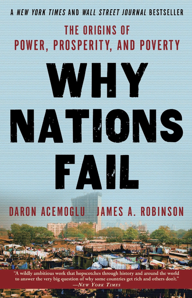
Nogales, Arizona and Mexico were once one town. The US/Mexico border was arbitrarily drawn.
Both towns have similar cultures and populations. Nogales, Arizona is well-developed and has a high standard of living. Nogales, Mexico is underdeveloped and has a low standard of living. Whoa!
Why Nations Fail explains how government-created institutions affect country development. Strong property rights, capitalism, and non-corrupt governments promote development. Countries without capitalism, strong property rights, or corrupt governments don't develop.
Successful countries must also embrace creative destruction. They must offer ordinary citizens a way to improve their lot by creating value for others, not reducing them to slaves, serfs, or peasants. Authors say that ordinary people could get rich on trading expeditions in 11th-century Venice.
East and West Germany and North and South Korea have different economies because their citizens are motivated differently. It explains why Chile, China, and Singapore grow so quickly after becoming market economies.
People have spent a lot of money on third-world poverty. According to Why Nations Fail, education and infrastructure aren't the answer. Developing nations must adopt free-market economic policies.
Elon Musk
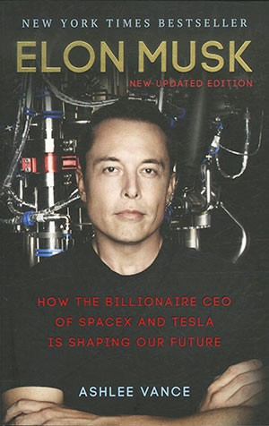
Elon Musk is the world's richest man, but that’s not a good way to describe him. Elon Musk is the world's richest man, which is like calling Steve Jobs a turtleneck-wearer or Benjamin Franklin a printer.
Elon Musk does cool sci-fi stuff to help humanity avoid existential threats.
Oil will run out. We've delayed this by developing better extraction methods. We only have so much nonrenewable oil.
Our society is doomed if it depends on oil. Elon Musk invested heavily in Tesla and SolarCity to speed the shift to renewable energy.
Musk worries about AI: we'll build machines smarter than us. We won't be able to stop these machines if something goes wrong, just like cows can't fight humans. Neuralink: we need to be smarter to compete with AI when the time comes.
If Earth becomes uninhabitable, we need a backup plan. Asteroid or nuclear war could strike Earth at any moment. We may not have much time to react if it happens in a few days. We must build a new civilization while times are good and resources are plentiful.
Short-term problems dominate our politics, but long-term issues are more important. Long-term problems can cause mass casualties and homelessness. Musk demonstrates how to think long-term.
The main reason people are impressed by Elon Musk, and why Ashlee Vances' biography influenced me so much, is that he does impossible things.
Electric cars were once considered unprofitable, but Tesla has made them mainstream. SpaceX is the world's largest private space company.
People lack imagination and dismiss ununderstood ideas as impossible. Humanity is about pushing limits. Don't worry if your dreams seem impossible. Try it.
Thanks for reading.

Jennifer Tieu
4 years ago
Why I Love Azuki
Azuki Banner (www.azuki.com)
Disclaimer: This is my personal viewpoint. I'm not on the Azuki team. Please keep in mind that I am merely a fan, community member, and holder. Please do your own research and pardon my grammar. Thanks!
Azuki has changed my view of NFTs.
When I first entered the NFT world, I had no idea what to expect. I liked the idea. So I invested in some projects, fought for whitelists, and discovered some cool NFTs projects (shout-out to CATC). I lost more money than I earned at one point, but I hadn't invested excessively (only put in what you can afford to lose). Despite my losses, I kept looking. I almost waited for the “ah-ha” moment. A NFT project that changed my perspective on NFTs. What makes an NFT project more than a work of art?
Answer: Azuki.
The Art
The Azuki art drew me in as an anime fan. It looked like something out of an anime, and I'd never seen it before in NFT.
The project was still new. The first two animated teasers were released with little fanfare, but I was impressed with their quality. You can find them on Instagram or in their earlier Tweets.
The teasers hinted that this project could be big and that the team could deliver. It was amazing to see Shao cut the Azuki posters with her katana. Especially at the end when she sheaths her sword and the music cues. Then the live action video of the young boy arranging the Azuki posters seemed movie-like. I felt like I was entering the Azuki story, brand, and dope theme.
The team did not disappoint with the Azuki NFTs. The level of detail in the art is stunning. There were Azukis of all genders, skin and hair types, and more. These 10,000 Azukis have so much representation that almost anyone can find something that resonates. Rather than me rambling on, I suggest you visit the Azuki gallery
The Team
If the art is meant to draw you in and be the project's face, the team makes it more. The NFT would be a JPEG without a good team leader. Not that community isn't important, but no community would rally around a bad team.
Because I've been rugged before, I'm very focused on the team when considering a project. While many project teams are anonymous, I try to find ones that are doxxed (public) or at least appear to be established. Unlike Azuki, where most of the Azuki team is anonymous, Steamboy is public. He is (or was) Overwatch's character art director and co-creator of Azuki. I felt reassured and could trust the project after seeing someone from a major game series on the team.
Then I tried to learn as much as I could about the team. Following everyone on Twitter, reading their tweets, and listening to recorded AMAs. I was impressed by the team's professionalism and dedication to their vision for Azuki, led by ZZZAGABOND.
I believe the phrase “actions speak louder than words” applies to Azuki. I can think of a few examples of what the Azuki team has done, but my favorite is ERC721A.
With ERC721A, Azuki has created a new algorithm that allows minting multiple NFTs for essentially the same cost as minting one NFT.
I was ecstatic when the dev team announced it. This fascinates me as a self-taught developer. Azuki released a product that saves people money, improves the NFT space, and is open source. It showed their love for Azuki and the NFT community.
The Community
Community, community, community. It's almost a chant in the NFT space now. A community, like a team, can make or break a project. We are the project's consumers, shareholders, core, and lifeblood. The team builds the house, and we fill it. We stay for the community.
When I first entered the Azuki Discord, I was surprised by the calm atmosphere. There was no news about the project. No release date, no whitelisting requirements. No grinding or spamming either. People just wanted to hangout, get to know each other, and talk. It was nice. So the team could pick genuine people for their mintlist (aka whitelist).
But nothing fundamental has changed since the release. It has remained an authentic, fun, and helpful community. I'm constantly logging into Discord to chat with others or follow conversations. I see the community's openness to newcomers. Everyone respects each other (barring a few bad apples) and the variety of people passing through is fascinating. This human connection and interaction is what I enjoy about this place. Being a part of a group that supports a cause.
Finally, I want to thank the amazing Azuki mod team and the kissaten channel for their contributions.
The Brand
So, what sets Azuki apart from other projects? They are shaping a brand or identity. The Azuki website, I believe, best captures their vision. (This is me gushing over the site.)
If you go to the website, turn on the dope playlist in the bottom left. The playlist features a mix of Asian and non-Asian hip-hop and rap artists, with some lo-fi thrown in. The songs on the playlist change, but I think you get the vibe Azuki embodies just by turning on the music.
The Garden is our next stop where we are introduced to Azuki.
A brand.
We're creating a new brand together.
A metaverse brand. By the people.
A collection of 10,000 avatars that grant Garden membership. It starts with exclusive streetwear collabs, NFT drops, live events, and more. Azuki allows for a new media genre that the world has yet to discover. Let's build together an Azuki, your metaverse identity.
The Garden is a magical internet corner where art, community, and culture collide. The boundaries between the physical and digital worlds are blurring.
Try a Red Bean.
The text begins with Azuki's intention in the space. It's a community-made metaverse brand. Then it goes into more detail about Azuki's plans. Initiation of a story or journey. "Would you like to take the red bean and jump down the rabbit hole with us?" I love the Matrix red pill or blue pill play they used. (Azuki in Japanese means red bean.)
Morpheus, the rebel leader, offers Neo the choice of a red or blue pill in The Matrix. “You take the blue pill... After the story, you go back to bed and believe whatever you want. Your red pill... Let me show you how deep the rabbit hole goes.” Aware that the red pill will free him from the enslaving control of the machine-generated dream world and allow him to escape into the real world, he takes it. However, living the “truth of reality” is harsher and more difficult.
It's intriguing and draws you in. Taking the red bean causes what? Where am I going? I think they did well in piqueing a newcomer's interest.
Not convinced by the Garden? Read the Manifesto. It reinforces Azuki's role.
Here comes a new wave…
And surfing here is different.
Breaking down barriers.
Building open communities.
Creating magic internet money with our friends.
To those who don’t get it, we tell them: gm.
They’ll come around eventually.
Here’s to the ones with the courage to jump down a peculiar rabbit hole.
One that pulls you away from a world that’s created by many and owned by few…
To a world that’s created by more and owned by all.
From The Garden come the human beans that sprout into your family.
We rise together.
We build together.
We grow together.
Ready to take the red bean?
Not to mention the Mindmap, it sets Azuki apart from other projects and overused Roadmaps. I like how the team recognizes that the NFT space is not linear. So many of us are still trying to figure it out. It is Azuki's vision to adapt to changing environments while maintaining their values. I admire their commitment to long-term growth.
Conclusion
To be honest, I have no idea what the future holds. Azuki is still new and could fail. But I'm a long-term Azuki fan. I don't care about quick gains. The future looks bright for Azuki. I believe in the team's output. I love being an Azuki.
Thank you! IKUZO!
Full post here