


More on Entrepreneurship/Creators

Greg Lim
4 years ago
How I made $160,000 from non-fiction books
I've sold over 40,000 non-fiction books on Amazon and made over $160,000 in six years while writing on the side.
I have a full-time job and three young sons; I can't spend 40 hours a week writing. This article describes my journey.
I write mainly tech books:
Thanks to my readers, many wrote positive evaluations. Several are bestsellers.
A few have been adopted by universities as textbooks:
My books' passive income allows me more time with my family.
Knowing I could quit my job and write full time gave me more confidence. And I find purpose in my work (i am in christian ministry).
I'm always eager to write. When work is a dread or something bad happens, writing gives me energy. Writing isn't scary. In fact, I can’t stop myself from writing!
Writing has also established my tech authority. Universities use my books, as I've said. Traditional publishers have asked me to write books.
These mindsets helped me become a successful nonfiction author:
1. You don’t have to be an Authority
Yes, I have computer science experience. But I'm no expert on my topics. Before authoring "Beginning Node.js, Express & MongoDB," my most profitable book, I had no experience with those topics. Node was a new server-side technology for me. Would that stop me from writing a book? It can. I liked learning a new technology. So I read the top three Node books, took the top online courses, and put them into my own book (which makes me know more than 90 percent of people already).
I didn't have to worry about using too much jargon because I was learning as I wrote. An expert forgets a beginner's hardship.
"The fellow learner can aid more than the master since he knows less," says C.S. Lewis. The problem he must explain is recent. The expert has forgotten.”
2. Solve a micro-problem (Niching down)
I didn't set out to write a definitive handbook. I found a market with several challenges and wrote one book. Ex:
- Instead of web development, what about web development using Angular?
- Instead of Blockchain, what about Blockchain using Solidity and React?
- Instead of cooking recipes, how about a recipe for a specific kind of diet?
- Instead of Learning math, what about Learning Singapore Math?
3. Piggy Backing Trends
The above topics may still be a competitive market. E.g. Angular, React. To stand out, include the latest technologies or trends in your book. Learn iOS 15 instead of iOS programming. Instead of personal finance, what about personal finance with NFTs.
Even though you're a newbie author, your topic is well-known.
4. Publish short books
My books are known for being direct. Many people like this:
Your reader will appreciate you cutting out the fluff and getting to the good stuff. A reader can finish and review your book.
Second, short books are easier to write. Instead of creating a 500-page book for $50 (which few will buy), write a 100-page book that answers a subset of the problem and sell it for less. (You make less, but that's another subject). At least it got published instead of languishing. Less time spent creating a book means less time wasted if it fails. Write a small-bets book portfolio like Daniel Vassallo!
Third, it's $2.99-$9.99 on Amazon (gets 70 percent royalties for ebooks). Anything less receives 35% royalties. $9.99 books have 20,000–30,000 words. If you write more and charge more over $9.99, you get 35% royalties. Why not make it a $9.99 book?
(This is the ebook version.) Paperbacks cost more. Higher royalties allow for higher prices.
5. Validate book idea
Amazon will tell you if your book concept, title, and related phrases are popular. See? Check its best-sellers list.
150,000 is preferable. It sells 2–3 copies daily. Consider your rivals. Profitable niches have high demand and low competition.
Don't be afraid of competitive niches. First, it shows high demand. Secondly, what are the ways you can undercut the completion? Better book? Or cheaper option? There was lots of competition in my NodeJS book's area. None received 4.5 stars or more. I wrote a NodeJS book. Today, it's a best-selling Node book.
What’s Next
So long. Part II follows. Meanwhile, I will continue to write more books!
Follow my journey on Twitter.
This post is a summary. Read full article here

The woman
3 years ago
Because he worked on his side projects during working hours, my junior was fired and sued.
Many developers do it, but I don't approve.

Aren't many programmers part-time? Many work full-time but also freelance. If the job agreement allows it, I see no problem.
Tech businesses' policies vary. I have a friend in Google, Germany. According to his contract, he couldn't do an outside job. Google owns any code he writes while employed.
I was shocked. Later, I found that different Google regions have different policies.
A corporation can normally establish any agreement before hiring you. They're negotiable. When there's no agreement, state law may apply. In court, law isn't so simple.
I won't delve into legal details. Instead, let’s talk about the incident.
How he was discovered
In one month, he missed two deadlines. His boss was frustrated because the assignment wasn't difficult to miss twice. When a team can't finish work on time, they all earn bad grades.
He annoyed the whole team. One team member (anonymous) told the project manager he worked on side projects during office hours. He may have missed deadlines because of this.
The project manager was furious. He needed evidence. The manager caught him within a week. The manager told higher-ups immediately.
The company wanted to set an example
Management could terminate him and settle the problem. But the company wanted to set an example for those developers who breached the regulation.
Because dismissal isn't enough. Every organization invests heavily in developer hiring. If developers depart or are fired after a few months, the company suffers.
The developer spent 10 months there. The employer sacked him and demanded ten months' pay. Or they'd sue him.
It was illegal and unethical. The youngster paid the fine and left the company quietly to protect his career.
Right or wrong?
Is the developer's behavior acceptable? Let's discuss developer malpractice.
During office hours, may developers work on other projects? If they're bored during office hours, they might not. Check the employment contract or state law.
If there's no employment clause, check country/state law. Because you can't justify breaking the law. Always. Most employers own their employees' work hours unless it's a contractual position.
If the company agrees, it's fine.
I also oppose companies that force developers to work overtime without pay.
Most states and countries have laws that help companies and workers. Law supports employers in this case. If any of the following are true, the company/employer owns the IP under California law.
using the business's resources
any equipment, including a laptop used for business.
company's mobile device.
offices of the company.
business time as well. This is crucial. Because this occurred in the instance of my junior.
Company resources are dangerous. Because your company may own the product's IP. If you have seen the TV show Silicon Valley, you have seen a similar situation there, right?
Conclusion
Simple rule. I avoid big side projects. I work on my laptop on weekends for side projects. I'm safe. But I also know that my company might not be happy with that.
As an employee, I suppose I can. I can make side money. I won't promote it, but I'll respect their time, resources, and task. I also sometimes work extra time to finish my company’s deadlines.

Aaron Dinin, PhD
3 years ago
Are You Unintentionally Creating the Second Difficult Startup Type?
Most don't understand the issue until it's too late.

My first startup was what entrepreneurs call the hardest. A two-sided marketplace.
Two-sided marketplaces are the hardest startups because founders must solve the chicken or the egg conundrum.
A two-sided marketplace needs suppliers and buyers. Without suppliers, buyers won't come. Without buyers, suppliers won't come. An empty marketplace and a founder striving to gain momentum result.
My first venture made me a struggling founder seeking to achieve traction for a two-sided marketplace. The company failed, and I vowed never to start another like it.
I didn’t. Unfortunately, my second venture was almost as hard. It failed like the second-hardest startup.
What kind of startup is the second-hardest?
The second-hardest startup, which is almost as hard to develop, is rarely discussed in the startup community. Because of this, I predict more founders fail each year trying to develop the second-toughest startup than the hardest.
Fairly, I have no proof. I see many startups, so I have enough of firsthand experience. From what I've seen, for every entrepreneur developing a two-sided marketplace, I'll meet at least 10 building this other challenging startup.
I'll describe a startup I just met with its two co-founders to explain the second hardest sort of startup and why it's so hard. They created a financial literacy software for parents of high schoolers.
The issue appears plausible. Children struggle with money. Parents must teach financial responsibility. Problems?
It's possible.
Buyers and users are different.
Buyer-user mismatch.
The financial literacy app I described above targets parents. The parent doesn't utilize the app. Child is end-user. That may not seem like much, but it makes customer and user acquisition and onboarding difficult for founders.
The difficulty of a buyer-user imbalance
The company developing a product faces a substantial operational burden when the buyer and end customer are different. Consider classic firms where the buyer is the end user to appreciate that responsibility.
Entrepreneurs selling directly to end users must educate them about the product's benefits and use. Each demands a lot of time, effort, and resources.
Imagine selling a financial literacy app where the buyer and user are different. To make the first sale, the entrepreneur must establish all the items I mentioned above. After selling, the entrepreneur must supply a fresh set of resources to teach, educate, or train end-users.
Thus, a startup with a buyer-user mismatch must market, sell, and train two organizations at once, requiring twice the work with the same resources.
The second hardest startup is hard for reasons other than the chicken-or-the-egg conundrum. It takes a lot of creativity and luck to solve the chicken-or-egg conundrum.
The buyer-user mismatch problem cannot be overcome by innovation or luck. Buyer-user mismatches must be solved by force. Simply said, when a product buyer is different from an end-user, founders have a lot more work. If they can't work extra, their companies fail.
You might also like

Will Lockett
3 years ago
Thanks to a recent development, solar energy may prove to be the best energy source.
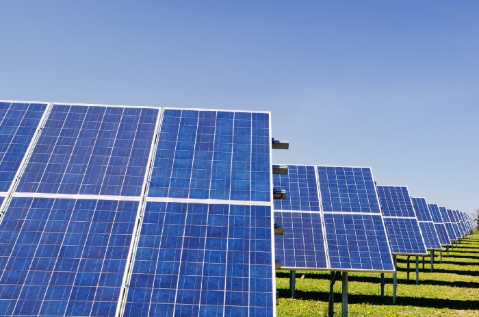
Perovskite solar cells will revolutionize everything.
Humanity is in a climatic Armageddon. Our widespread ecological crimes of the previous century are catching up with us, and planet-scale karma threatens everyone. We must adjust to new technologies and lifestyles to avoid this fate. Even solar power, a renewable energy source, has climate problems. A recent discovery could boost solar power's eco-friendliness and affordability. Perovskite solar cells are amazing.
Perovskite is a silicon-like semiconductor. Semiconductors are used to make computer chips, LEDs, camera sensors, and solar cells. Silicon makes sturdy and long-lasting solar cells, thus it's used in most modern solar panels.
Perovskite solar cells are far better. First, they're easy to make at room temperature, unlike silicon cells, which require long, intricate baking processes. This makes perovskite cells cheaper to make and reduces their carbon footprint. Perovskite cells are efficient. Most silicon panel solar farms are 18% efficient, meaning 18% of solar radiation energy is transformed into electricity. Perovskite cells are 25% efficient, making them 38% more efficient than silicon.
However, perovskite cells are nowhere near as durable. A normal silicon panel will lose efficiency after 20 years. The first perovskite cells were ineffective since they lasted barely minutes.
Recent research from Princeton shows that perovskite cells can endure 30 years. The cells kept their efficiency, therefore no sacrifices were made.
No electrical or chemical engineer here, thus I can't explain how they did it. But strangely, the team said longevity isn't the big deal. In the next years, perovskite panels will become longer-lasting. How do you test a panel if you only have a month or two? This breakthrough technique needs a uniform method to estimate perovskite life expectancy fast. The study's key milestone was establishing a standard procedure.
Lab-based advanced aging tests are their solution. Perovskite cells decay faster at higher temperatures, so scientists can extrapolate from that. The test heated the panel to 110 degrees and waited for its output to reduce by 20%. Their panel lasted 2,100 hours (87.5 days) before a 20% decline.
They did some math to extrapolate this data and figure out how long the panel would have lasted in different climates, and were shocked to find it would last 30 years in Princeton. This made perovskite panels as durable as silicon panels. This panel could theoretically be sold today.
This technology will soon allow these brilliant panels to be released into the wild. This technology could be commercially viable in ten, maybe five years.
Solar power will be the best once it does. Solar power is cheap and low-carbon. Perovskite is the cheapest renewable energy source if we switch to it. Solar panel manufacturing's carbon footprint will also drop.
Perovskites' impact goes beyond cost and carbon. Silicon panels require harmful mining and contain toxic elements (cadmium). Perovskite panels don't require intense mining or horrible materials, making their production and expiration more eco-friendly.
Solar power destroys habitat. Massive solar farms could reduce biodiversity and disrupt local ecology by destroying vital habitats. Perovskite cells are more efficient, so they can shrink a solar farm while maintaining energy output. This reduces land requirements, making perovskite solar power cheaper, and could reduce solar's environmental impact.
Perovskite solar power is scalable and environmentally friendly. Princeton scientists will speed up the development and rollout of this energy.
Why bother with fusion, fast reactors, SMRs, or traditional nuclear power? We're close to developing a nearly perfect environmentally friendly power source, and we have the tools and systems to do so quickly. It's also affordable, so we can adopt it quickly and let the developing world use it to grow. Even I struggle to justify spending billions on fusion when a great, cheap technology outperforms it. Perovskite's eco-credentials and cost advantages could save the world and power humanity's future.

Michael Le
4 years ago
Union LA x Air Jordan 2 “Future Is Now” PREVIEW
With the help of Virgil Abloh and Union LA‘s Chris Gibbs, it's now clear that Jordan Brand intended to bring the Air Jordan 2 back in 2022.
The “Future Is Now” collection includes two colorways of MJ's second signature as well as an extensive range of apparel and accessories.
“We wanted to juxtapose what some futuristic gear might look like after being worn and patina'd,”
Union stated on the collaboration's landing page.
“You often see people's future visions that are crisp and sterile. We thought it would be cool to wear it in and make it organic...”
The classic co-branding appears on short-sleeve tees, hoodies, and sweat shorts/sweat pants, all lightly distressed at the hems and seams.
Also, a filtered black-and-white photo of MJ graces the adjacent long sleeves, labels stitch into the socks, and the Jumpman logo adorns the four caps.
Liner jackets and flight pants will also be available, adding reimagined militaria to a civilian ensemble.
The Union LA x Air Jordan 2 (Grey Fog and Rattan) shares many of the same beats. Vintage suedes show age, while perforations and detailing reimagine Bruce Kilgore's design for the future.
The “UN/LA” tag across the modified eye stays, the leather patch across the tongue, and the label that wraps over the lateral side of the collar complete the look.
The footwear will also include a Crater Slide in the “Grey Fog” color scheme.
BUYING
On 4/9 and 4/10 from 9am-3pm, Union LA will be giving away a pair of Air Jordan 2s at their La Brea storefront (110 S. LA BREA AVE. LA, CA 90036). The raffle is only open to LA County residents with a valid CA ID. You must enter by 11:59pm on 4/10 to win. Winners will be notified via email.

Enrique Dans
3 years ago
You may not know about The Merge, yet it could change society
Ethereum is the second-largest cryptocurrency. The Merge, a mid-September event that will convert Ethereum's consensus process from proof-of-work to proof-of-stake if all goes according to plan, will be a game changer.
Why is Ethereum ditching proof-of-work? Because it can. We're talking about a fully functioning, open-source ecosystem with a capacity for evolution that other cryptocurrencies lack, a change that would allow it to scale up its performance from 15 transactions per second to 100,000 as its blockchain is used for more and more things. It would reduce its energy consumption by 99.95%. Vitalik Buterin, the system's founder, would play a less active role due to decentralization, and miners, who validated transactions through proof of work, would be far less important.
Why has this conversion taken so long and been so cautious? Because it involves modifying a core process while it's running to boost its performance. It requires running the new mechanism in test chains on an ever-increasing scale, assessing participant reactions, and checking for issues or restrictions. The last big test was in early June and was successful. All that's left is to converge the mechanism with the Ethereum blockchain to conclude the switch.
What's stopping Bitcoin, the leader in market capitalization and the cryptocurrency that began blockchain's appeal, from doing the same? Satoshi Nakamoto, whoever he or she is, departed from public life long ago, therefore there's no community leadership. Changing it takes a level of consensus that is impossible to achieve without strong leadership, which is why Bitcoin's evolution has been sluggish and conservative, with few modifications.
Secondly, The Merge will balance the consensus mechanism (proof-of-work or proof-of-stake) and the system decentralization or centralization. Proof-of-work prevents double-spending, thus validators must buy hardware. The system works, but it requires a lot of electricity and, as it scales up, tends to re-centralize as validators acquire more hardware and the entire network activity gets focused in a few nodes. Larger operations save more money, which increases profitability and market share. This evolution runs opposed to the concept of decentralization, and some anticipate that any system that uses proof of work as a consensus mechanism will evolve towards centralization, with fewer large firms able to invest in efficient network nodes.
Yet radical bitcoin enthusiasts share an opposite argument. In proof-of-stake, transaction validators put their funds at stake to attest that transactions are valid. The algorithm chooses who validates each transaction, giving more possibilities to nodes that put more coins at stake, which could open the door to centralization and government control.
In both cases, we're talking about long-term changes, but Bitcoin's proof-of-work has been evolving longer and seems to confirm those fears, while proof-of-stake is only employed in coins with a minuscule volume compared to Ethereum and has no predictive value.
As of mid-September, we will have two significant cryptocurrencies, each with a different consensus mechanisms and equally different characteristics: one is intrinsically conservative and used only for economic transactions, while the other has been evolving in open source mode, and can be used for other types of assets, smart contracts, or decentralized finance systems. Some even see it as the foundation of Web3.
Many things could change before September 15, but The Merge is likely to be a turning point. We'll have to follow this closely.