


More on Marketing

Saskia Ketz
2 years ago
I hate marketing for my business, but here's how I push myself to keep going
Start now.

When it comes to building my business, I’m passionate about a lot of things. I love creating user experiences that simplify branding essentials. I love creating new typefaces and color combinations to inspire logo designers. I love fixing problems to improve my product.
Business marketing isn't my thing.
This is shared by many. Many solopreneurs, like me, struggle to advertise their business and drive themselves to work on it.
Without a lot of promotion, no company will succeed. Marketing is 80% of developing a firm, and when you're starting out, it's even more. Some believe that you shouldn't build anything until you've begun marketing your idea and found enough buyers.
Marketing your business without marketing experience is difficult. There are various outlets and techniques to learn. Instead of figuring out where to start, it's easier to return to your area of expertise, whether that's writing, designing product features, or improving your site's back end. Right?
First, realize that your role as a founder is to market your firm. Being a founder focused on product, I rarely work on it.
Secondly, use these basic methods that have helped me dedicate adequate time and focus to marketing. They're all simple to apply, and they've increased my business's visibility and success.
1. Establish buckets for every task.
You've probably heard to schedule tasks you don't like. As simple as it sounds, blocking a substantial piece of my workday for marketing duties like LinkedIn or Twitter outreach, AppSumo customer support, or SEO has forced me to spend time on them.
Giving me lots of room to focus on product development has helped even more. Sure, this means scheduling time to work on product enhancements after my four-hour marketing sprint.
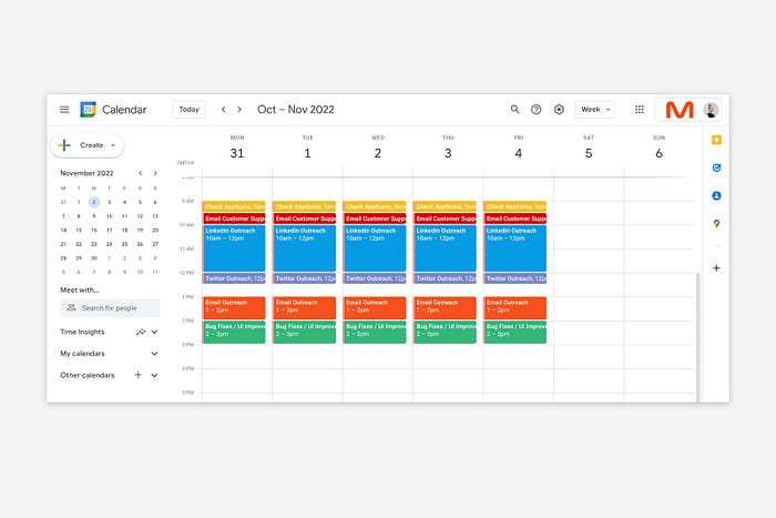
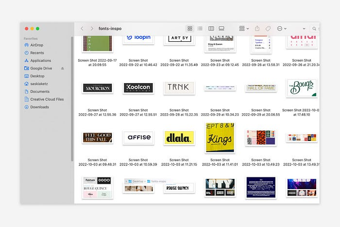
It also involves making space to store product inspiration and ideas throughout the day so I don't get distracted. This is like the advice to keep a notebook beside your bed to write down your insomniac ideas. I keep fonts, color palettes, and product ideas in folders on my desktop. Knowing these concepts won't be lost lets me focus on marketing in the moment. When I have limited time to work on something, I don't have to conduct the research I've been collecting, so I can get more done faster.
2. Look for various accountability systems
Accountability is essential for self-discipline. To keep focused on my marketing tasks, I've needed various streams of accountability, big and little.
Accountability groups are great for bigger things. SaaS Camp, a sales outreach coaching program, is mine. We discuss marketing duties and results every week. This motivates me to do enough each week to be proud of my accomplishments. Yet hearing what works (or doesn't) for others gives me benchmarks for my own marketing outcomes and plenty of fresh techniques to attempt.
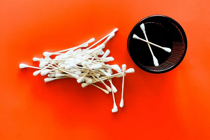
… say, I want to DM 50 people on Twitter about my product — I get that many Q-tips and place them in one pen holder on my desk.
The best accountability group can't watch you 24/7. I use a friend's simple method that shouldn't work (but it does). When I have a lot of marketing chores, like DMing 50 Twitter users about my product, That many Q-tips go in my desk pen holder. After each task, I relocate one Q-tip to an empty pen holder. When you have a lot of minor jobs to perform, it helps to see your progress. You might use toothpicks, M&Ms, or anything else you have a lot of.
3. Continue to monitor your feedback loops
Knowing which marketing methods work best requires monitoring results. As an entrepreneur with little go-to-market expertise, every tactic I pursue is an experiment. I need to know how each trial is doing to maximize my time.
I placed Google and Facebook advertisements on hold since they took too much time and money to obtain Return. LinkedIn outreach has been invaluable to me. I feel that talking to potential consumers one-on-one is the fastest method to grasp their problem areas, figure out my messaging, and find product market fit.
Data proximity offers another benefit. Seeing positive results makes it simpler to maintain doing a work you don't like. Why every fitness program tracks progress.
Marketing's goal is to increase customers and revenues, therefore I've found it helpful to track those metrics and celebrate monthly advances. I provide these updates for extra accountability.
Finding faster feedback loops is also motivating. Marketing brings more clients and feedback, in my opinion. Product-focused founders love that feedback. Positive reviews make me proud that my product is benefitting others, while negative ones provide me with suggestions for product changes that can improve my business.
The best advice I can give a lone creator who's afraid of marketing is to just start. Start early to learn by doing and reduce marketing stress. Start early to develop habits and successes that will keep you going. The sooner you start, the sooner you'll have enough consumers to return to your favorite work.

Jano le Roux
3 years ago
Here's What I Learned After 30 Days Analyzing Apple's Microcopy
Move people with tiny words.
Apple fanboy here.
Macs are awesome.
Their iPhones rock.
$19 cloths are great.
$999 stands are amazing.
I love Apple's microcopy even more.
It's like the marketing goddess bit into the Apple logo and blessed the world with microcopy.
I took on a 30-day micro-stalking mission.
Every time I caught myself wasting time on YouTube, I had to visit Apple’s website to learn the secrets of the marketing goddess herself.
We've learned. Golden apples are calling.
Cut the friction
Benefit-first, not commitment-first.
Brands lose customers through friction.
Most brands don't think like customers.
Brands want sales.
Brands want newsletter signups.
Here's their microcopy:
“Buy it now.”
“Sign up for our newsletter.”
Both are difficult. They ask for big commitments.
People are simple creatures. Want pleasure without commitment.
Apple nails this.
So, instead of highlighting the commitment, they highlight the benefit of the commitment.
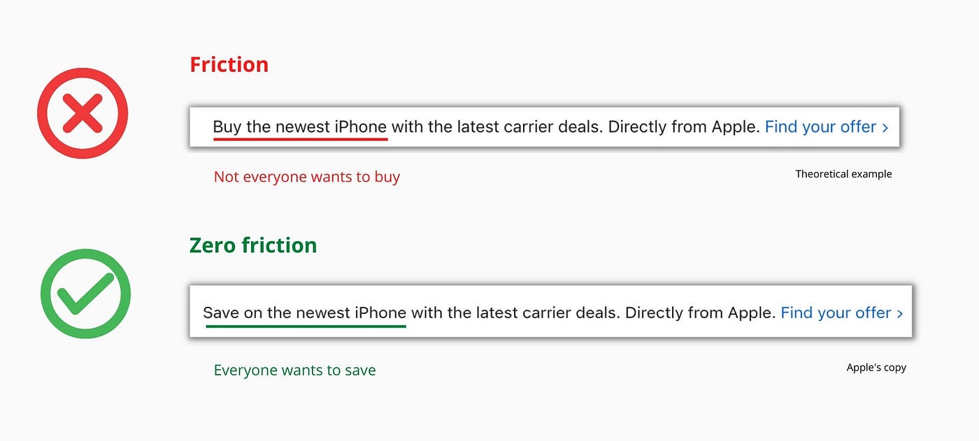
Saving on the latest iPhone sounds easier than buying it. Everyone saves, but not everyone buys.
A subtle change in framing reduces friction.
Apple eliminates customer objections to reduce friction.
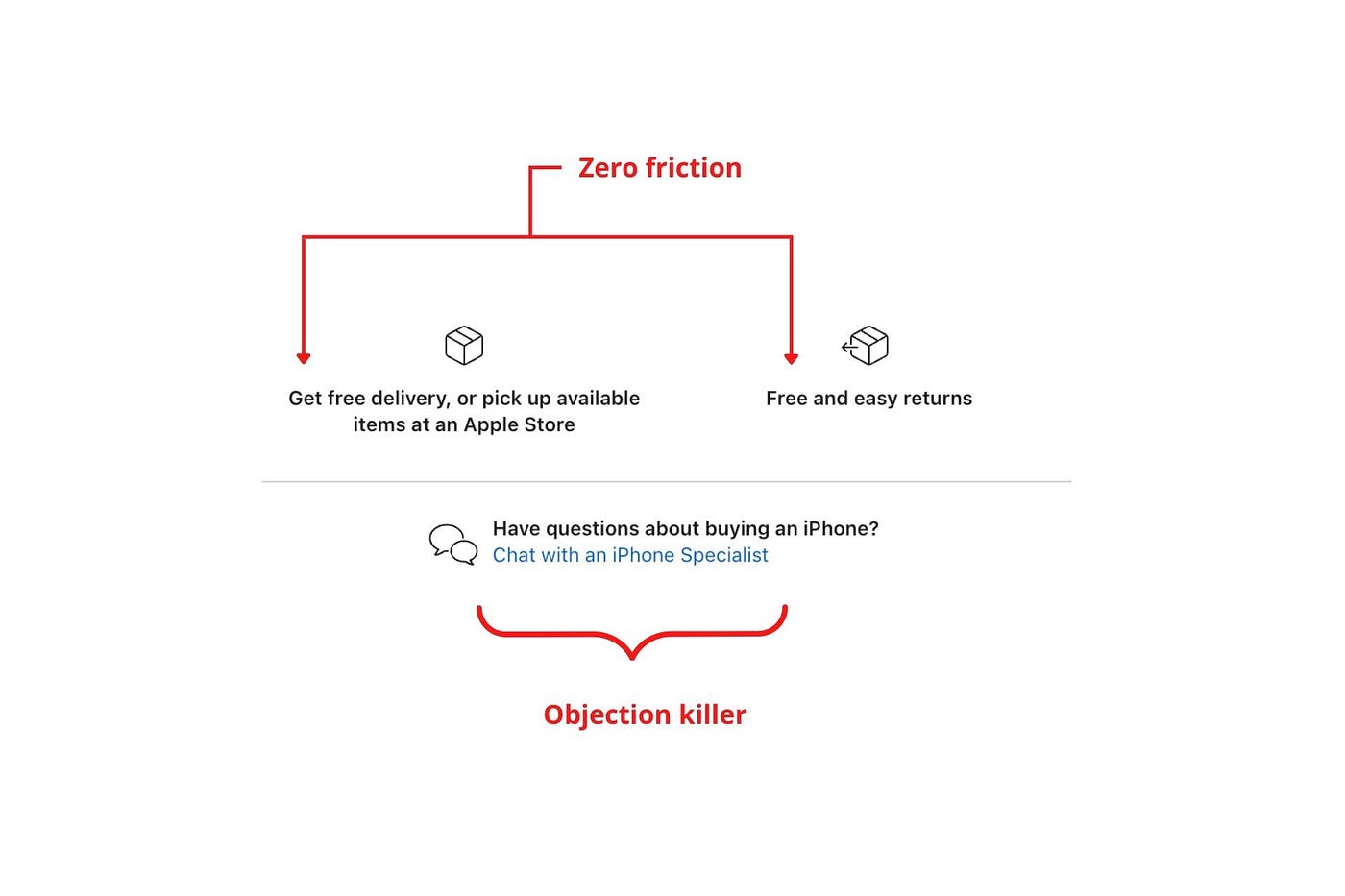
Less customer friction means simpler processes.
Apple's copy expertly reassures customers about shipping fees and not being home. Apple assures customers that returning faulty products is easy.
Apple knows that talking to a real person is the best way to reduce friction and improve their copy.
Always rhyme
Learn about fine rhyme.
Poets make things beautiful with rhyme.
Copywriters use rhyme to stand out.
Apple’s copywriters have mastered the art of corporate rhyme.
Two techniques are used.
1. Perfect rhyme
Here, rhymes are identical.

2. Imperfect rhyme
Here, rhyming sounds vary.

Apple prioritizes meaning over rhyme.
Apple never forces rhymes that don't fit.
It fits so well that the copy seems accidental.
Add alliteration
Alliteration always entertains.
Alliteration repeats initial sounds in nearby words.
Apple's copy uses alliteration like no other brand I've seen to create a rhyming effect or make the text more fun to read.
For example, in the sentence "Sam saw seven swans swimming," the initial "s" sound is repeated five times. This creates a pleasing rhythm.
Microcopy overuse is like pouring ketchup on a Michelin-star meal.
Alliteration creates a memorable phrase in copywriting. It's subtler than rhyme, and most people wouldn't notice; it simply resonates.
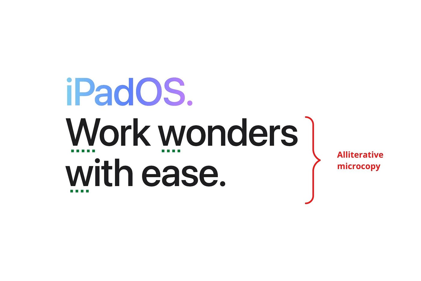
I love how Apple uses alliteration and contrast between "wonders" and "ease".
Assonance, or repeating vowels, isn't Apple's thing.
You ≠ Hero, Customer = Hero
Your brand shouldn't be the hero.
Because they'll be using your product or service, your customer should be the hero of your copywriting. With your help, they should feel like they can achieve their goals.
I love how Apple emphasizes what you can do with the machine in this microcopy.

It's divine how they position their tools as sidekicks to help below.
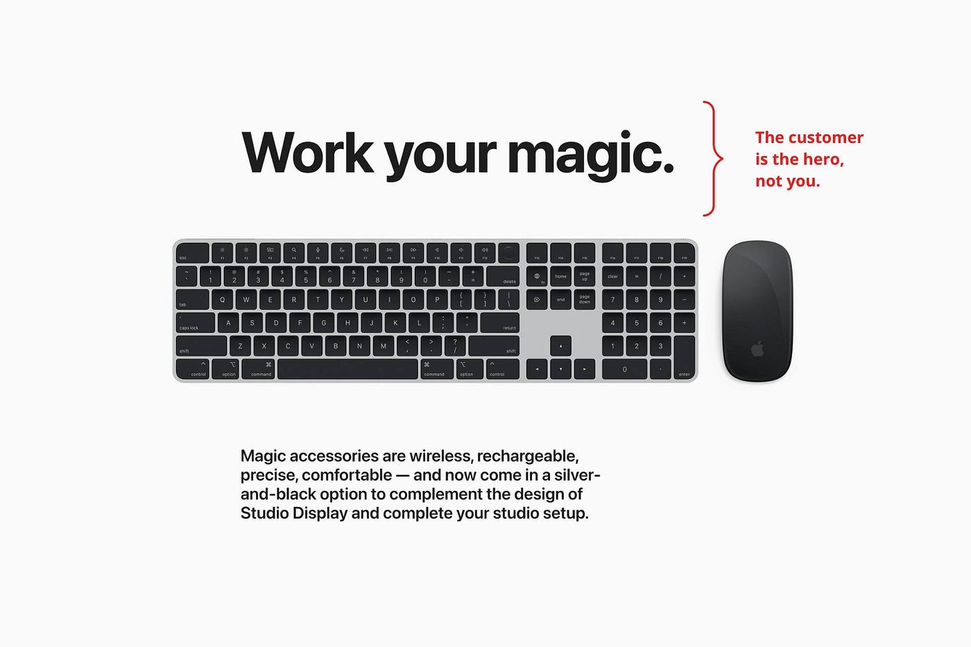
This one takes the cake:

Dialogue-style writing
Conversational copy engages.
Excellent copy Like sharing gum with a friend.
This helps build audience trust.
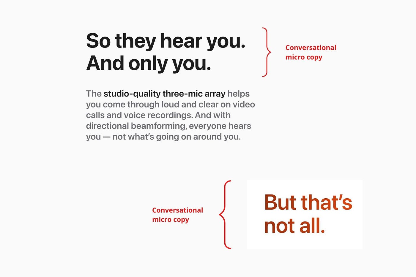
Apple does this by using natural connecting words like "so" and phrases like "But that's not all."
Snowclone-proof
The mother of all microcopy techniques.
A snowclone uses an existing phrase or sentence to create a new one. The new phrase or sentence uses the same structure but different words.
It’s usually a well know saying like:
To be or not to be.
This becomes a formula:
To _ or not to _.
Copywriters fill in the blanks with cause-related words. Example:
To click or not to click.

Apple turns "survival of the fittest" into "arrival of the fittest."
It's unexpected and surprises the reader.
So this was fun.
But my fun has just begun.
Microcopy is 21st-century poetry.
I came as an Apple fanboy.
I leave as an Apple fanatic.
Now I’m off to find an apple tree.
Cause you know how it goes.
(Apples, trees, etc.)
This post is a summary. Original post available here.

Jon Brosio
3 years ago
This Landing Page is a (Legal) Money-Printing Machine
and it’s easy to build.

A landing page with good copy is a money-maker.
Let's be honest, page-builder templates are garbage.
They can help you create a nice-looking landing page, but not persuasive writing.
Over the previous 90 days, I've examined 200+ landing pages.
What's crazy?
Top digital entrepreneurs use a 7-part strategy to bring in email subscribers, generate prospects, and (passively) sell their digital courses.
Steal this 7-part landing page architecture to maximize digital product sales.
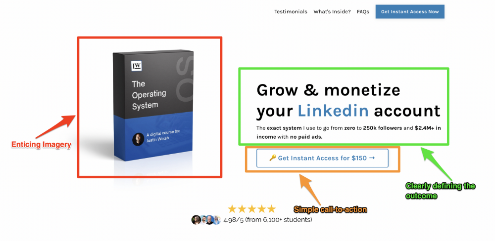
The offer
Landing pages require offers.
Newsletter, cohort, or course offer.
Your reader should see this offer first. Includind:
Headline
Imagery
Call-to-action
Clear, persuasive, and simplicity are key. Example: the Linkedin OS course home page of digital entrepreneur Justin Welsh offers:
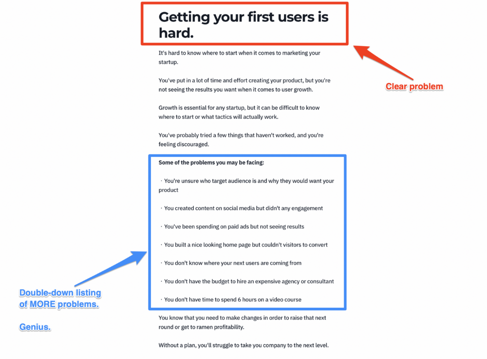
A distinctly defined problem
Everyone needs an enemy.
You need an opponent on your landing page. Problematic.
Next, employ psychology to create a struggle in your visitor's thoughts.
Don't be clever here; label your customer's problem. The more particular you are, the bigger the situation will seem.
When you build a clear monster, you invite defeat. I appreciate Theo Ohene's Growth Roadmaps landing page.
Exacerbation of the effects
Problem identification doesn't motivate action.
What would an unresolved problem mean?
This is landing page copy. When you describe the unsolved problem's repercussions, you accomplish several things:
You write a narrative (and stories are remembered better than stats)
You cause the reader to feel something.
You help the reader relate to the issue
Important!
My favorite script is:
"Sure, you can let [problem] go untreated. But what will happen if you do? Soon, you'll begin to notice [new problem 1] will start to arise. That might bring up [problem 2], etc."
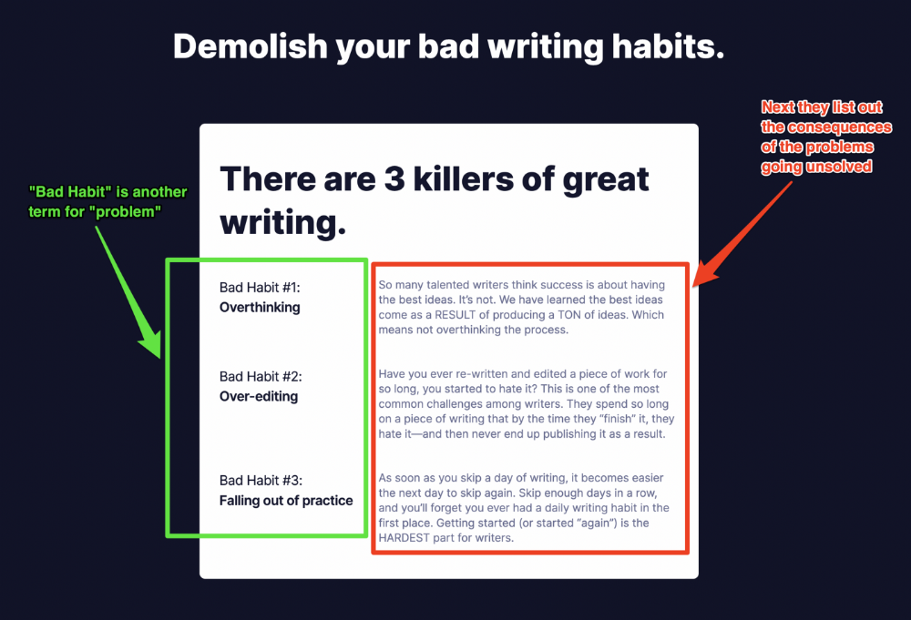
Take the copywriting course, digital writer and entrepreneur Dickie Bush illustrates below when he labels the problem (see: "poor habit") and then illustrates the repercussions.
The tale of transformation
Every landing page needs that "ah-ha!" moment.
Transformation stories do this.
Did you find a solution? Someone else made the discovery? Have you tested your theory?
Next, describe your (or your subject's) metamorphosis.
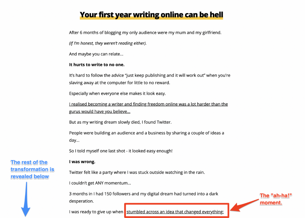
Kieran Drew nails his narrative (and revelation) here. Right before the disclosure, he introduces his "ah-ha!" moment:
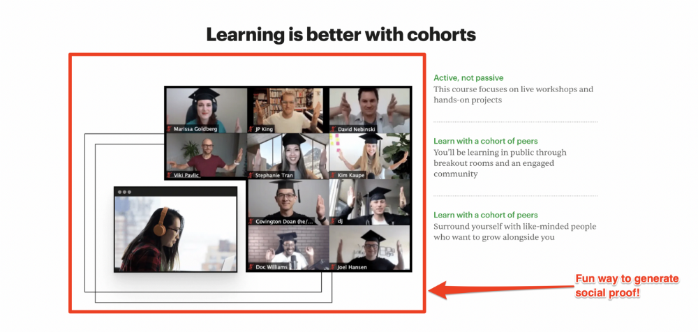
Testimonials
Social proof completes any landing page.
Social proof tells the reader, "If others do it, it must be worthwhile."
This is your argument.
Positive social proof helps (obviously).
Offer "free" training in exchange for a testimonial if you need social evidence. This builds social proof.
Most social proof is testimonies (recommended). Kurtis Hanni's creative take on social proof (using a screenshot of his colleague) is entertaining.
Bravo.
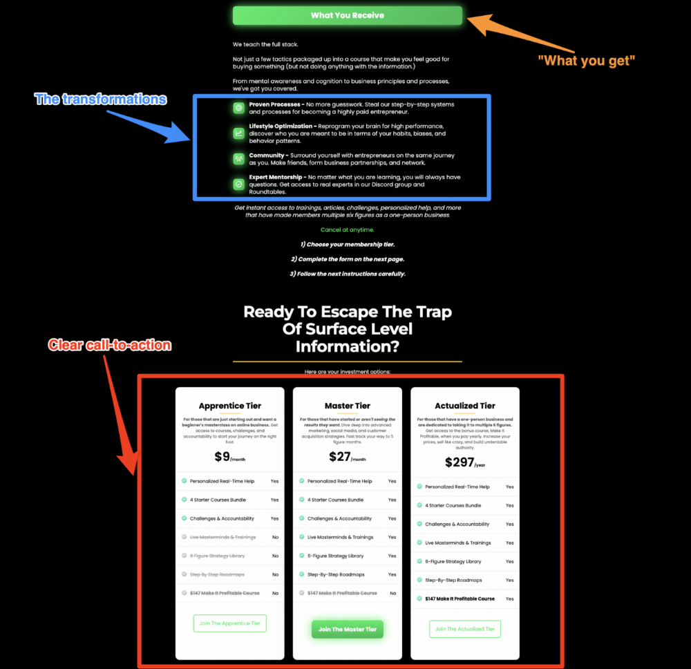
Reveal your offer
Now's the moment to act.
Describe the "bundle" that provides the transformation.
Here's:
Course
Cohort
Ebook
Whatever you're selling.
Include a product or service image, what the consumer is getting ("how it works"), the price, any "free" bonuses (preferred), and a CTA ("buy now").
Clarity is key. Don't make a cunning offer. Make sure your presentation emphasizes customer change (benefits). Dan Koe's Modern Mastery landing page makes an offer. Consider:
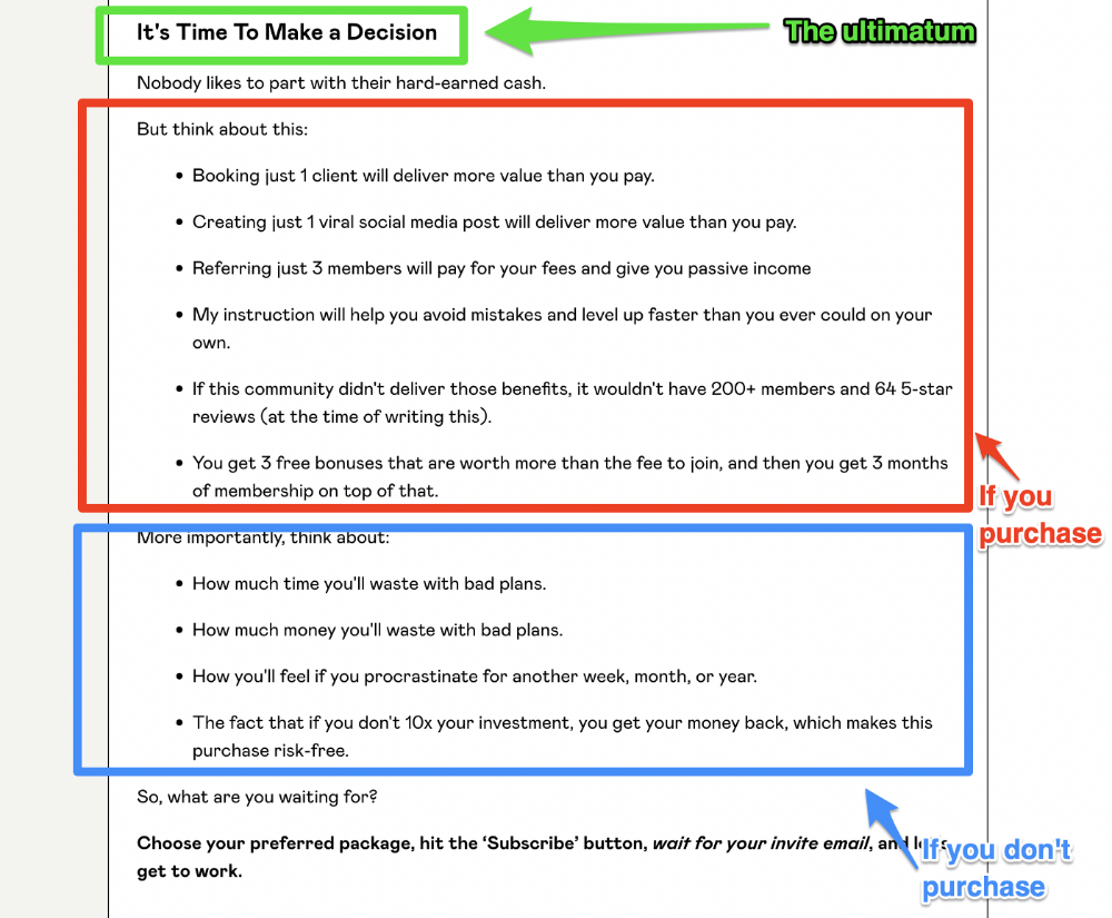
An ultimatum
Offering isn't enough.
You must give your prospect an ultimatum.
They can buy your merchandise from you.
They may exit the webpage.
That’s it.
It's crucial to show what happens if the reader does either. Stress the consequences of not buying (again, a little consequence amplification). Remind them of the benefits of buying.
I appreciate Charles Miller's product offer ending:
The top online creators use a 7-part landing page structure:
Offer the service
Describe the problem
Amplify the consequences
Tell the transformational story
Include testimonials and social proof.
Reveal the offer (with any bonuses if applicable)
Finally, give the reader a deadline to encourage them to take action.
Sequence these sections to develop a landing page that (essentially) prints money.
You might also like

Will Lockett
3 years ago
The Unlocking Of The Ultimate Clean Energy

The company seeking 24/7 ultra-powerful solar electricity.
We're rushing to adopt low-carbon energy to prevent a self-made doomsday. We're using solar, wind, and wave energy. These low-carbon sources aren't perfect. They consume large areas of land, causing habitat loss. They don't produce power reliably, necessitating large grid-level batteries, an environmental nightmare. We can and must do better than fossil fuels. Longi, one of the world's top solar panel producers, is creating a low-carbon energy source. Solar-powered spacecraft. But how does it work? Why is it so environmentally harmonious? And how can Longi unlock it?
Space-based solar makes sense. Satellites above Medium Earth Orbit (MEO) enjoy 24/7 daylight. Outer space has no atmosphere or ozone layer to block the Sun's high-energy UV radiation. Solar panels can create more energy in space than on Earth due to these two factors. Solar panels in orbit can create 40 times more power than those on Earth, according to estimates.
How can we utilize this immense power? Launch a geostationary satellite with solar panels, then beam power to Earth. Such a technology could be our most eco-friendly energy source. (Better than fusion power!) How?
Solar panels create more energy in space, as I've said. Solar panel manufacture and grid batteries emit the most carbon. This indicates that a space-solar farm's carbon footprint (which doesn't need a battery because it's a constant power source) might be over 40 times smaller than a terrestrial one. Combine that with carbon-neutral launch vehicles like Starship, and you have a low-carbon power source. Solar power has one of the lowest emissions per kWh at 6g/kWh, so space-based solar could approach net-zero emissions.
Space solar is versatile because it doesn't require enormous infrastructure. A space-solar farm could power New York and Dallas with the same efficiency, without cables. The satellite will transmit power to a nearby terminal. This allows an energy system to evolve and adapt as the society it powers changes. Building and maintaining infrastructure can be carbon-intensive, thus less infrastructure means less emissions.
Space-based solar doesn't destroy habitats, either. Solar and wind power can be engineered to reduce habitat loss, but they still harm ecosystems, which must be restored. Space solar requires almost no land, therefore it's easier on Mother Nature.
Space solar power could be the ultimate energy source. So why haven’t we done it yet?
Well, for two reasons: the cost of launch and the efficiency of wireless energy transmission.
Advances in rocket construction and reusable rocket technology have lowered orbital launch costs. In the early 2000s, the Space Shuttle cost $60,000 per kg launched into LEO, but a SpaceX Falcon 9 costs only $3,205. 95% drop! Even at these low prices, launching a space-based solar farm is commercially questionable.
Energy transmission efficiency is half of its commercial viability. Space-based solar farms must be in geostationary orbit to get 24/7 daylight, 22,300 miles above Earth's surface. It's a long way to wirelessly transmit energy. Most laser and microwave systems are below 20% efficient.
Space-based solar power is uneconomical due to low efficiency and high deployment costs.
Longi wants to create this ultimate power. But how?
They'll send solar panels into space to develop space-based solar power that can be beamed to Earth. This mission will help them design solar panels tough enough for space while remaining efficient.
Longi is a Chinese company, and China's space program and universities are developing space-based solar power and seeking commercial partners. Xidian University has built a 98%-efficient microwave-based wireless energy transmission system for space-based solar power. The Long March 5B is China's super-cheap (but not carbon-offset) launch vehicle.
Longi fills the gap. They have the commercial know-how and ability to build solar satellites and terrestrial terminals at scale. Universities and the Chinese government have transmission technology and low-cost launch vehicles to launch this technology.
It may take a decade to develop and refine this energy solution. This could spark a clean energy revolution. Once operational, Longi and the Chinese government could offer the world a flexible, environmentally friendly, rapidly deployable energy source.
Should the world adopt this technology and let China control its energy? I'm not very political, so you decide. This seems to be the beginning of tapping into this planet-saving energy source. Forget fusion reactors. Carbon-neutral energy is coming soon.
Maddie Wang
3 years ago
Easiest and fastest way to test your startup idea!
Here's the fastest way to validate company concepts.
I squandered a year after dropping out of Stanford designing a product nobody wanted.
But today, I’m at 100k!
Differences:
I was designing a consumer product when I dropped out.
I coded MVP, got 1k users, and got YC interview.
Nice, huh?
WRONG!
Still coding and getting users 12 months later
WOULD PEOPLE PAY FOR IT? was the riskiest assumption I hadn't tested.
When asked why I didn't verify payment, I said,
Not-ready products. Now, nobody cares. The website needs work. Include this. Increase usage…
I feared people would say no.
After 1 year of pushing it off, my team told me they were really worried about the Business Model. Then I asked my audience if they'd buy my product.
So?
No, overwhelmingly.
I felt like I wasted a year building a product no one would buy.
Founders Cafe was the opposite.
Before building anything, I requested payment.
40 founders were interviewed.
Then we emailed Stanford, YC, and other top founders, asking them to join our community.
BOOM! 10/12 paid!
Without building anything, in 1 day I validated my startup's riskiest assumption. NOT 1 year.
Asking people to pay is one of the scariest things.
I understand.
I asked Stanford queer women to pay before joining my gay sorority.
I was afraid I'd turn them off or no one would pay.
Gay women, like those founders, were in such excruciating pain that they were willing to pay me upfront to help.
You can ask for payment (before you build) to see if people have the burning pain. Then they'll pay!
Examples from Founders Cafe members:
😮 Using a fake landing page, a college dropout tested a product. Paying! He built it and made $3m!
😮 YC solo founder faked a Powerpoint demo. 5 Enterprise paid LOIs. $1.5m raised, built, and in YC!
😮 A Harvard founder can convert Figma to React. 1 day, 10 customers. Built a tool to automate Figma -> React after manually fulfilling requests. 1m+
Bad example:
😭 Stanford Dropout Spends 1 Year Building Product Without Payment Validation
Some people build for a year and then get paying customers.
What I'm sharing is my experience and what Founders Cafe members have told me about validating startup ideas.
Don't waste a year like I did.
After my first startup failed, I planned to re-enroll at Stanford/work at Facebook.
After people paid, I quit for good.
I've hit $100k!
Hope this inspires you to request upfront payment! It'll change your life

Shawn Mordecai
3 years ago
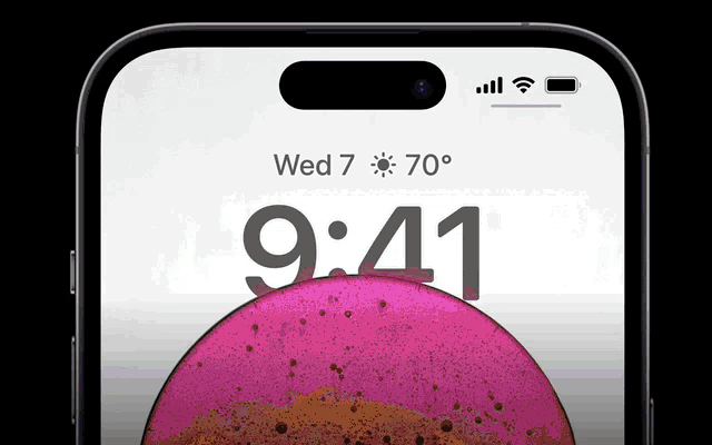
The Apple iPhone 14 Pill is Easier to Swallow
Is iPhone's Dynamic Island invention or a marketing ploy?
First of all, why the notch?
When Apple debuted the iPhone X with the notch, some were surprised, confused, and amused by the goof. Let the Brits keep the new meaning of top-notch.
Apple removed the bottom home button to enhance screen space. The tides couldn't overtake part of the top. This section contained sensors, a speaker, a microphone, and cameras for facial recognition. A town resisted Apple's new iPhone design.
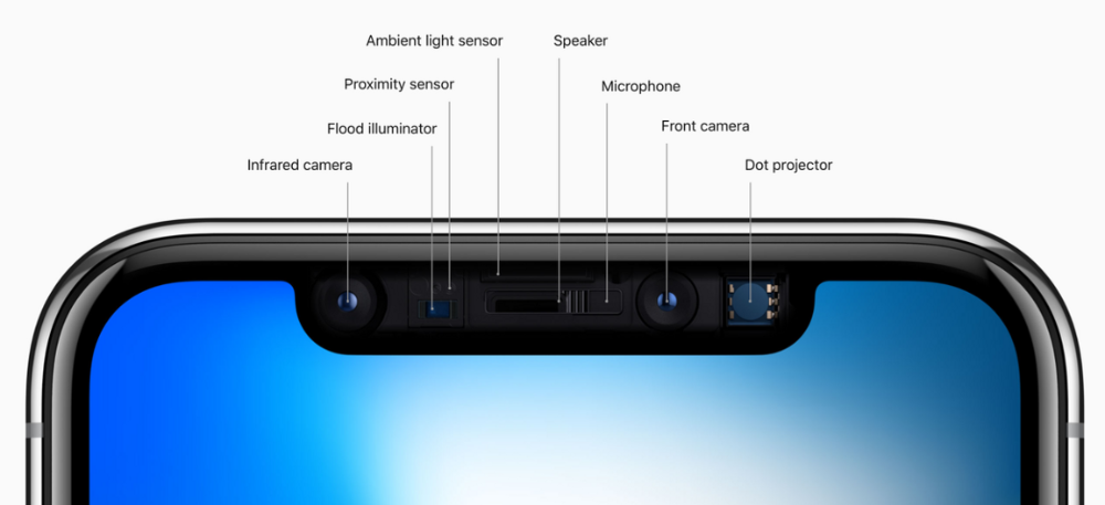
From iPhone X to 13, the notch has gotten smaller. We expected this as technology and engineering progressed, but we hated the notch. Apple approved. They attached it to their other gadgets.
Apple accepted, owned, and ran with the iPhone notch, it has become iconic (or infamous); and that’s intentional.
The Island Where Apple Is
Apple needs to separate itself, but they know how to do it well. The iPhone 14 Pro finally has us oohing and aahing. Life-changing, not just higher pixel density or longer battery.
Dynamic Island turned a visual differentiation into great usefulness, which may not be life-changing. Apple always welcomes the controversy, whether it's $700 for iMac wheels, no charging block with a new phone, or removing the headphone jack.
Apple knows its customers will be loyal, even if they're irritated. Their odd design choices often cause controversy. It's calculated that people blog, review, and criticize Apple's products. We accept what works for them.
While the competition zigs, Apple zags. Sometimes they zag too hard and smash into a wall, but we talk about it anyways, and that’s great publicity for them.
Getting Dependent on the drug
The notch became a crop. Dynamic Island's design is helpful, intuitive, elegant, and useful. It increases iPhone usability, productivity (slightly), and joy. No longer unsightly.
The medication helps with multitasking. It's a compact version of the iPhone's Live Activities lock screen function. Dynamic Island enhances apps and activities with visual effects and animations whether you engage with it or not. As you use the pill, its usefulness lessens. It lowers user notifications and consolidates them with live and permanent feeds, delivering quick app statuses. It uses the black pixels on the iPhone 14's display, which looked like a poor haircut.
The pill may be a gimmick to entice customers to use more Apple products and services. Apps may promote to their users like a live billboard.
Be prepared to get a huge dose of Dynamic Island’s “pill” like you never had before with the notch. It might become so satisfying and addicting to use, that every interaction with it will become habit-forming, and you’re going to forget that it ever existed.
WARNING: A Few Potential Side Effects
Vision blurred Dynamic Island's proximity to the front-facing camera may leave behind grease that blurs photos. Before taking a selfie, wipe the camera clean.
Strained thumb To fully use Dynamic Island, extend your thumb's reach 6.7 inches beyond your typical, comfortable range.
Happiness, contentment The Dynamic Island may enhance Endorphins and Dopamine. Multitasking, interactions, animations, and haptic feedback make you want to use this function again and again.
Motion-sickness Dynamic Island's motions and effects may make some people dizzy. If you can disable animations, you can avoid motion sickness.
I'm not a doctor, therefore they aren't established adverse effects.
Does Dynamic Island Include Multiple Tasks?
Dynamic Islands is a placebo for multitasking. Apple might have compromised on iPhone multitasking. It won't make you super productive, but it's a step up.
iPhone is primarily for personal use, like watching videos, messaging friends, sending money to friends, calling friends about the money you were supposed to send them, taking 50 photos of the same leaf, investing in crypto, driving for Uber because you lost all your money investing in crypto, listening to music and hailing an Uber from a deserted crop field because while you were driving for Uber your passenger stole your car and left you stranded, so you used Apple’s new SOS satellite feature to message your friend, who still didn’t receive their money, to hail you an Uber; now you owe them more money… karma?
We won't be watching videos on iPhones while perusing 10,000-row spreadsheets anytime soon. True multitasking and productivity aren't priorities for Apple's iPhone. Apple doesn't to preserve the iPhone's experience. Like why there's no iPad calculator. Apple doesn't want iPad users to do math, but isn't essential for productivity?
Digressing.
Apple will block certain functions so you must buy and use their gadgets and services, immersing yourself in their ecosystem and dictating how to use their goods.
Dynamic Island is a poor man’s multi-task for iPhone, and that’s fine it works for most iPhone users. For substantial productivity Apple prefers you to get an iPad or a MacBook. That’s part of the reason for restrictive features on certain Apple devices, but sometimes it’s based on principles to preserve the integrity of the product, according to Apple’s definition.
Is Apple using deception?
Dynamic Island may be distracting you from a design decision. The answer is kind of. Elegant distraction
When you pull down a smartphone webpage to refresh it or minimize an app, you get seamless animations. It's not simply because it appears better; it's due to iPhone and smartphone processing speeds. Such limits reduce the system's response to your activity, slowing the experience. Designers and developers use animations and effects to distract us from the time lag (most of the time) and sometimes because it looks cooler and smoother.
Dynamic Island makes apps more useable and interactive. It shows system states visually. Turn signal audio and visual cues, voice assistance, physical and digital haptic feedbacks, heads-up displays, fuel and battery level gauges, and gear shift indicators helped us overcome vehicle design problems.
Dynamic Island is a wonderfully delightful (and temporary) solution to a design “problem” until Apple or other companies can figure out a way to sink the cameras under the smartphone screen.

Apple Has Returned to Being an Innovative & Exciting Company
Now Apple's products are exciting. Next, bring back real Apple events, not pre-recorded demos.
Dynamic Island integrates hardware and software. What will this new tech do? How would this affect device use? Or is it just hype?
Dynamic Island may be an insignificant improvement to the iPhone, but it sure is promising for the future of bridging the human and computer interaction gap.