


More on Technology

Enrique Dans
3 years ago
You may not know about The Merge, yet it could change society
Ethereum is the second-largest cryptocurrency. The Merge, a mid-September event that will convert Ethereum's consensus process from proof-of-work to proof-of-stake if all goes according to plan, will be a game changer.
Why is Ethereum ditching proof-of-work? Because it can. We're talking about a fully functioning, open-source ecosystem with a capacity for evolution that other cryptocurrencies lack, a change that would allow it to scale up its performance from 15 transactions per second to 100,000 as its blockchain is used for more and more things. It would reduce its energy consumption by 99.95%. Vitalik Buterin, the system's founder, would play a less active role due to decentralization, and miners, who validated transactions through proof of work, would be far less important.
Why has this conversion taken so long and been so cautious? Because it involves modifying a core process while it's running to boost its performance. It requires running the new mechanism in test chains on an ever-increasing scale, assessing participant reactions, and checking for issues or restrictions. The last big test was in early June and was successful. All that's left is to converge the mechanism with the Ethereum blockchain to conclude the switch.
What's stopping Bitcoin, the leader in market capitalization and the cryptocurrency that began blockchain's appeal, from doing the same? Satoshi Nakamoto, whoever he or she is, departed from public life long ago, therefore there's no community leadership. Changing it takes a level of consensus that is impossible to achieve without strong leadership, which is why Bitcoin's evolution has been sluggish and conservative, with few modifications.
Secondly, The Merge will balance the consensus mechanism (proof-of-work or proof-of-stake) and the system decentralization or centralization. Proof-of-work prevents double-spending, thus validators must buy hardware. The system works, but it requires a lot of electricity and, as it scales up, tends to re-centralize as validators acquire more hardware and the entire network activity gets focused in a few nodes. Larger operations save more money, which increases profitability and market share. This evolution runs opposed to the concept of decentralization, and some anticipate that any system that uses proof of work as a consensus mechanism will evolve towards centralization, with fewer large firms able to invest in efficient network nodes.
Yet radical bitcoin enthusiasts share an opposite argument. In proof-of-stake, transaction validators put their funds at stake to attest that transactions are valid. The algorithm chooses who validates each transaction, giving more possibilities to nodes that put more coins at stake, which could open the door to centralization and government control.
In both cases, we're talking about long-term changes, but Bitcoin's proof-of-work has been evolving longer and seems to confirm those fears, while proof-of-stake is only employed in coins with a minuscule volume compared to Ethereum and has no predictive value.
As of mid-September, we will have two significant cryptocurrencies, each with a different consensus mechanisms and equally different characteristics: one is intrinsically conservative and used only for economic transactions, while the other has been evolving in open source mode, and can be used for other types of assets, smart contracts, or decentralized finance systems. Some even see it as the foundation of Web3.
Many things could change before September 15, but The Merge is likely to be a turning point. We'll have to follow this closely.

Christianlauer
3 years ago
Looker Studio Pro is now generally available, according to Google.
Great News about the new Google Business Intelligence Solution

Google has renamed Data Studio to Looker Studio and Looker Studio Pro.
Now, Google releases Looker Studio Pro. Similar to the move from Data Studio to Looker Studio, Looker Studio Pro is basically what Looker was previously, but both solutions will merge. Google says the Pro edition will acquire new enterprise management features, team collaboration capabilities, and SLAs.
![Dashboard Example in Looker Studio Pro — Image Source: Google[2]](https://storage.googleapis.com/int3grity/posts/m9yb4IqJCm7D/images/ZuJudlWT6GUeTKKNVduA5)
In addition to Google's announcements and sales methods, additional features include:
Looker Studio assets can now have organizational ownership. Customers can link Looker Studio to a Google Cloud project and migrate existing assets once. This provides:
Your users' created Looker Studio assets are all kept in a Google Cloud project.
When the users who own assets leave your organization, the assets won't be removed.
Using IAM, you may provide each Looker Studio asset in your company project-level permissions.
Other Cloud services can access Looker Studio assets that are owned by a Google Cloud project.
Looker Studio Pro clients may now manage report and data source access at scale using team workspaces.
Google announcing these features for the pro version is fascinating. Both products will likely converge, but Google may only release many features in the premium version in the future. Microsoft with Power BI and its free and premium variants already achieves this.
Sources and Further Readings
Google, Release Notes (2022)
Google, Looker (2022)

Tom Smykowski
3 years ago
CSS Scroll-linked Animations Will Transform The Web's User Experience
We may never tap again in ten years.
I discussed styling websites and web apps on smartwatches in my earlier article on W3C standardization.
The Parallax Chronicles
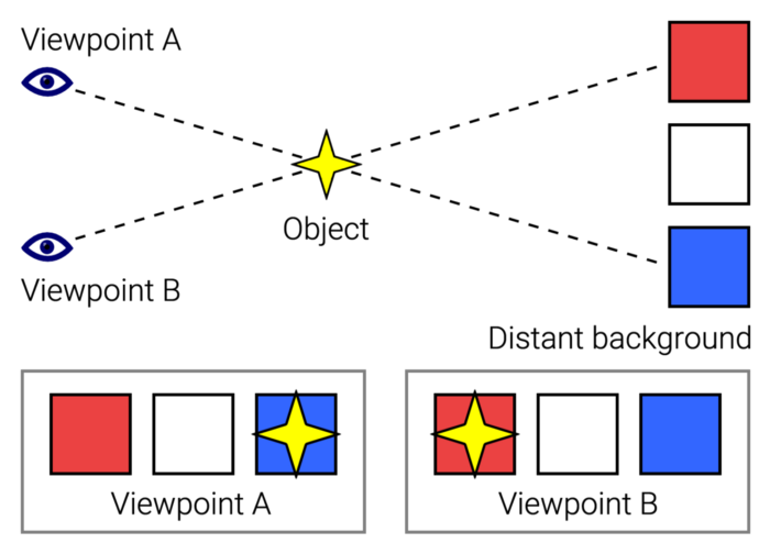
Section containing examples and flying objects
Another intriguing Working Draft I found applies to all devices, including smartphones.
These pages may have something intriguing. Take your time. Return after scrolling:
What connects these three pages?
JustinWick at English Wikipedia • CC-BY-SA-3.0
Scroll-linked animation, commonly called parallax, is the effect.
WordPress theme developers' quick setup and low-code tools made the effect popular around 2014.
Parallax: Why Designers Love It
The chapter that your designer shouldn't read
Online video playback required searching, scrolling, and clicking ten years ago. Scroll and click four years ago.
Some video sites let you swipe to autoplay the next video from an endless list.
UI designers create scrollable pages and apps to accommodate the behavioral change.
Web interactivity used to be mouse-based. Clicking a button opened a help drawer, and hovering animated it.
However, a large page with more material requires fewer buttons and less interactiveness.
Designers choose scroll-based effects. Design and frontend developers must fight the trend but prepare for the worst.
How to Create Parallax
The component that you might want to show the designer
JavaScript-based effects track page scrolling and apply animations.
Javascript libraries like lax.js simplify it.
Using it needs a lot of human mathematical and physical computations.
Your asset library must also be prepared to display your website on a laptop, television, smartphone, tablet, foldable smartphone, and possibly even a microwave.
Overall, scroll-based animations can be solved better.
CSS Scroll-linked Animations
CSS makes sense since it's presentational. A Working Draft has been laying the groundwork for the next generation of interactiveness.
The new CSS property scroll-timeline powers the feature, which MDN describes well.
Before testing it, you should realize it is poorly supported:
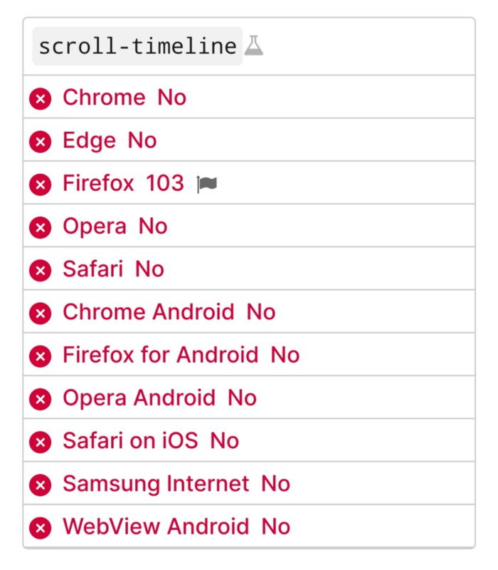
Firefox 103 currently supports it.
There is also a polyfill, with some demo examples to explore.
Summary
Web design was a protracted process. Started with pages with static backdrop images and scrollable text. Artists and designers may use the scroll-based animation CSS API to completely revamp our web experience.
It's a promising frontier. This post may attract a future scrollable web designer.
Ps. I have created flashcards for HTML, Javascript etc. Check them out!
You might also like

forkast
3 years ago
Three Arrows Capital collapse sends crypto tremors

Three Arrows Capital's Google search volume rose over 5,000%.
Three Arrows Capital, a Singapore-based cryptocurrency hedge fund, filed for Chapter 15 bankruptcy last Friday to protect its U.S. assets from creditors.
Three Arrows filed for bankruptcy on July 1 in New York.
Three Arrows was ordered liquidated by a British Virgin Islands court last week after defaulting on a $670 million loan from Voyager Digital. Three days later, the Singaporean government reprimanded Three Arrows for spreading misleading information and exceeding asset limits.
Three Arrows' troubles began with Terra's collapse in May, after it bought US$200 million worth of Terra's LUNA tokens in February, co-founder Kyle Davies told the Wall Street Journal. Three Arrows has failed to meet multiple margin calls since then, including from BlockFi and Genesis.
Three Arrows Capital, founded by Kyle Davies and Su Zhu in 2012, manages $10 billion in crypto assets.
Bitcoin's price fell from US$20,600 to below US$19,200 after Three Arrows' bankruptcy petition. According to CoinMarketCap, BTC is now above US$20,000.
What does it mean?
Every action causes an equal and opposite reaction, per Newton's third law. Newtonian physics won't comfort Three Arrows investors, but future investors will thank them for their overconfidence.
Regulators are taking notice of crypto's meteoric rise and subsequent fall. Historically, authorities labeled the industry "high risk" to warn traditional investors against entering it. That attitude is changing. Regulators are moving quickly to regulate crypto to protect investors and prevent broader asset market busts.
The EU has reached a landmark deal that will regulate crypto asset sales and crypto markets across the 27-member bloc. The U.S. is close behind with a similar ruling, and smaller markets are also looking to improve safeguards.
For many, regulation is the only way to ensure the crypto industry survives the current winter.

CNET
4 years ago
How a $300K Bored Ape Yacht Club NFT was accidentally sold for $3K
The Bored Ape Yacht Club is one of the most prestigious NFT collections in the world. A collection of 10,000 NFTs, each depicting an ape with different traits and visual attributes, Jimmy Fallon, Steph Curry and Post Malone are among their star-studded owners. Right now the price of entry is 52 ether, or $210,000.
Which is why it's so painful to see that someone accidentally sold their Bored Ape NFT for $3,066.
Unusual trades are often a sign of funny business, as in the case of the person who spent $530 million to buy an NFT from themselves. In Saturday's case, the cause was a simple, devastating "fat-finger error." That's when people make a trade online for the wrong thing, or for the wrong amount. Here the owner, real name Max or username maxnaut, meant to list his Bored Ape for 75 ether, or around $300,000. Instead he accidentally listed it for 0.75. One hundredth the intended price.
It was bought instantaneously. The buyer paid an extra $34,000 to speed up the transaction, ensuring no one could snap it up before them. The Bored Ape was then promptly listed for $248,000. The transaction appears to have been done by a bot, which can be coded to immediately buy NFTs listed below a certain price on behalf of their owners in order to take advantage of these exact situations.
"How'd it happen? A lapse of concentration I guess," Max told me. "I list a lot of items every day and just wasn't paying attention properly. I instantly saw the error as my finger clicked the mouse but a bot sent a transaction with over 8 eth [$34,000] of gas fees so it was instantly sniped before I could click cancel, and just like that, $250k was gone."
"And here within the beauty of the Blockchain you can see that it is both honest and unforgiving," he added.
Fat finger trades happen sporadically in traditional finance -- like the Japanese trader who almost bought 57% of Toyota's stock in 2014 -- but most financial institutions will stop those transactions if alerted quickly enough. Since cryptocurrency and NFTs are designed to be decentralized, you essentially have to rely on the goodwill of the buyer to reverse the transaction.
Fat finger errors in cryptocurrency trades have made many a headline over the past few years. Back in 2019, the company behind Tether, a cryptocurrency pegged to the US dollar, nearly doubled its own coin supply when it accidentally created $5 billion-worth of new coins. In March, BlockFi meant to send 700 Gemini Dollars to a set of customers, worth roughly $1 each, but mistakenly sent out millions of dollars worth of bitcoin instead. Last month a company erroneously paid a $24 million fee on a $100,000 transaction.
Similar incidents are increasingly being seen in NFTs, now that many collections have accumulated in market value over the past year. Last month someone tried selling a CryptoPunk NFT for $19 million, but accidentally listed it for $19,000 instead. Back in August, someone fat finger listed their Bored Ape for $26,000, an error that someone else immediately capitalized on. The original owner offered $50,000 to the buyer to return the Bored Ape -- but instead the opportunistic buyer sold it for the then-market price of $150,000.
"The industry is so new, bad things are going to happen whether it's your fault or the tech," Max said. "Once you no longer have control of the outcome, forget and move on."
The Bored Ape Yacht Club launched back in April 2021, with 10,000 NFTs being sold for 0.08 ether each -- about $190 at the time. While NFTs are often associated with individual digital art pieces, collections like the Bored Ape Yacht Club, which allow owners to flaunt their NFTs by using them as profile pictures on social media, are becoming increasingly prevalent. The Bored Ape Yacht Club has since become the second biggest NFT collection in the world, second only to CryptoPunks, which launched in 2017 and is considered the "original" NFT collection.

Jenn Leach
3 years ago
What TikTok Paid Me in 2021 with 100,000 Followers

I thought it would be interesting to share how much TikTok paid me in 2021.
Onward!
Oh, you get paid by TikTok?
Yes.
They compensate thousands of creators. My Tik Tok account

I launched my account in March 2020 and generally post about money, finance, and side hustles.
TikTok creators are paid in several ways.
Fund for TikTok creators
Sponsorships (aka brand deals)
Affiliate promotion
My own creations
Only one, the TikTok Creator Fund, pays me.
The TikTok Creator Fund: What Is It?
TikTok's initiative pays creators.
YouTube's Shorts Fund, Snapchat Spotlight, and other platforms have similar programs.
Creator Fund doesn't pay everyone. Some prerequisites are:
age requirement of at least 18 years
In the past 30 days, there must have been 100,000 views.
a minimum of 10,000 followers
If you qualify, you can apply using your TikTok account, and once accepted, your videos can earn money.
My earnings from the TikTok Creator Fund
Since 2020, I've made $273.65. My 2021 payment is $77.36.
Yikes!
I made between $4.91 to around $13 payout each time I got paid.
TikTok reportedly pays 3 to 5 cents per thousand views.
To live off the Creator Fund, you'd need billions of monthly views.
Top personal finance creator Sara Finance has millions (if not billions) of views and over 700,000 followers yet only received $3,000 from the TikTok Creator Fund.
Goals for 2022
TikTok pays me in different ways, as listed above.
My largest TikTok account isn't my only one.
In 2022, I'll revamp my channel.
It's been a tumultuous year on TikTok for my account, from getting shadow-banned to being banned from the Creator Fund to being accepted back (not at my wish).
What I've experienced isn't rare. I've read about other creators' experiences.
So, some quick goals for this account…
200,000 fans by the year 2023
Consistent monthly income of $5,000
two brand deals each month
For now, that's all.