



More on NFTs & Art

Jake Prins
3 years ago
What are NFTs 2.0 and what issues are they meant to address?
New standards help NFTs reach their full potential.
NFTs lack interoperability and functionality. They have great potential but are mostly speculative. To maximize NFTs, we need flexible smart contracts.
Current requirements are too restrictive.
Most NFTs are based on ERC-721, which makes exchanging them easy. CryptoKitties, a popular online game, used the 2017 standard to demonstrate NFTs' potential.
This simple standard includes a base URI and incremental IDs for tokens. Add the tokenID to the base URI to get the token's metadata.
This let creators collect NFTs. Many NFT projects store metadata on IPFS, a distributed storage network, but others use Google Drive. NFT buyers often don't realize that if the creators delete or move the files, their NFT is just a pointer.
This isn't the standard's biggest issue. There's no way to validate NFT projects.
Creators are one of the most important aspects of art, but nothing is stored on-chain.
ERC-721 contracts only have a name and symbol.
Most of the data on OpenSea's collection pages isn't from the NFT's smart contract. It was added through a platform input field, so it's in the marketplace's database. Other websites may have different NFT information.
In five years, your NFT will be just a name, symbol, and ID.
Your NFT doesn't mention its creators. Although the smart contract has a public key, it doesn't reveal who created it.
The NFT's creators and their reputation are crucial to its value. Think digital fashion and big brands working with well-known designers when more professionals use NFTs. Don't you want them in your NFT?
Would paintings be as valuable if their artists were unknown? Would you believe it's real?
Buying directly from an on-chain artist would reduce scams. Current standards don't allow this data.
Most creator profiles live on centralized marketplaces and could disappear. Current platforms have outpaced underlying standards. The industry's standards are lagging.
For NFTs to grow beyond pointers to a monkey picture file, we may need to use new Web3-based standards.
Introducing NFTs 2.0
Fabian Vogelsteller, creator of ERC-20, developed new web3 standards. He proposed LSP7 Digital Asset and LSP8 Identifiable Digital Asset, also called NFT 2.0.
NFT and token metadata inputs are extendable. Changes to on-chain metadata inputs allow NFTs to evolve. Instead of public keys, the contract can have Universal Profile addresses attached. These profiles show creators' faces and reputations. NFTs can notify asset receivers, automating smart contracts.
LSP7 and LSP8 use ERC725Y. Using a generic data key-value store gives contracts much-needed features:
The asset can be customized and made to stand out more by allowing for unlimited data attachment.
Recognizing changes to the metadata
using a hash reference for metadata rather than a URL reference
This base will allow more metadata customization and upgradeability. These guidelines are:
Genuine and Verifiable Now, the creation of an NFT by a specific Universal Profile can be confirmed by smart contracts.
Dynamic NFTs can update Flexible & Updatable Metadata, allowing certain things to evolve over time.
Protected metadata Now, secure metadata that is readable by smart contracts can be added indefinitely.
Better NFTS prevent the locking of NFTs by only being sent to Universal Profiles or a smart contract that can interact with them.
Summary
NFTS standards lack standardization and powering features, limiting the industry.
ERC-721 is the most popular NFT standard, but it only represents incremental tokenIDs without metadata or asset representation. No standard sender-receiver interaction or security measures ensure safe asset transfers.
NFT 2.0 refers to the new LSP7-DigitalAsset and LSP8-IdentifiableDigitalAsset standards.
They have new standards for flexible metadata, secure transfers, asset representation, and interactive transfer.
With NFTs 2.0 and Universal Profiles, creators could build on-chain reputations.
NFTs 2.0 could bring the industry's needed innovation if it wants to move beyond trading profile pictures for speculation.

nft now
4 years ago
Instagram NFTs Are Here… How does this affect artists?
Instagram (IG) is officially joining NFT. With the debut of new in-app NFT functionalities, influential producers can interact with blockchain tech on the social media platform.
Meta unveiled intentions for an Instagram NFT marketplace in March, but these latest capabilities focus more on content sharing than commerce. And why shouldn’t they? IG's entry into the NFT market is overdue, given that Twitter and Discord are NFT hotspots.
The NFT marketplace/Web3 social media race has continued to expand, with the expected Coinbase NFT Beta now live and blazing a trail through the NFT ecosystem.
IG's focus is on visual art. It's unlike any NFT marketplace or platform. IG NFTs and artists: what's the deal? Let’s take a look.
What are Instagram’s NFT features anyways?
As said, not everyone has Instagram's new features. 16 artists, NFT makers, and collectors can now post NFTs on IG by integrating third-party digital wallets (like Rainbow or MetaMask) in-app. IG doesn't charge to publish or share digital collectibles.
NFTs displayed on the app have a "shimmer" aesthetic effect. NFT posts also have a "digital collectable" badge that lists metadata such as the creator and/or owner, the platform it was created on, a brief description, and a blockchain identification.
Meta's social media NFTs have launched on Instagram, but the company is also preparing to roll out digital collectibles on Facebook, with more on the way for IG. Currently, only Ethereum and Polygon are supported, but Flow and Solana will be added soon.
How will artists use these new features?
Artists are publishing NFTs they developed or own on IG by linking third-party digital wallets. These features have no NFT trading aspects built-in, but are aimed to let authors share NFTs with IG audiences.
Creators, like IG-native aerial/street photographer Natalie Amrossi (@misshattan), are discovering novel uses for IG NFTs.
Amrossi chose to not only upload his own NFTs but also encourage other artists in the field. "That's the beauty of connecting your wallet and sharing NFTs. It's not just what you make, but also what you accumulate."
Amrossi has been producing and posting Instagram art for years. With IG's NFT features, she can understand Instagram's importance in supporting artists.
Web2 offered Amrossi the tools to become an artist and make a life. "Before 'influencer' existed, I was just making art. Instagram helped me reach so many individuals and brands, giving me a living.
Even artists without millions of viewers are encouraged to share NFTs on IG. Wilson, a relatively new name in the NFT space, seems to have already gone above and beyond the scope of these new IG features. By releasing "Losing My Mind" via IG NFT posts, she has evaded the lack of IG NFT commerce by using her network to market her multi-piece collection.
"'Losing My Mind' is a long-running photo series. Wilson was preparing to release it as NFTs before IG approached him, so it was a perfect match.
Wilson says the series is about Black feminine figures and media depiction. Respectable effort, given POC artists have been underrepresented in NFT so far.
“Over the past year, I've had mental health concerns that made my emotions so severe it was impossible to function in daily life, therefore that prompted this photo series. Every Wednesday and Friday for three weeks, I'll release a new Meta photo for sale.
Wilson hopes these new IG capabilities will help develop a connection between the NFT community and other internet subcultures that thrive on Instagram.
“NFTs can look scary as an outsider, but seeing them on your daily IG feed makes it less foreign,” adds Wilson. I think Instagram might become a hub for NFT aficionados, making them more accessible to artists and collectors.
What does it all mean for the NFT space?
Meta's NFT and metaverse activities will continue to impact Instagram's NFT ecosystem. Many think it will be for the better, as IG NFT frauds are another problem hurting the NFT industry.
IG's new NFT features seem similar to Twitter's PFP NFT verifications, but Instagram's tools should help cut down on scams as users can now verify the creation and ownership of whole NFT collections included in IG posts.
Given the number of visual artists and NFT creators on IG, it might become another hub for NFT fans, as Wilson noted. If this happens, it raises questions about Instagram success. Will artists be incentivized to distribute NFTs? Or will those with a large fanbase dominate?
Elise Swopes (@swopes) believes these new features should benefit smaller artists. Swopes was one of the first profiles placed to Instagram's original suggested user list in 2012.
Swopes says she wants IG to be a magnet for discovery and understands the value of NFT artists and producers.
"I'd love to see IG become a focus of discovery for everyone, not just the Beeples and Apes and PFPs. That's terrific for them, but [IG NFT features] are more about using new technology to promote emerging artists, Swopes added.
“Especially music artists. It's everywhere. Dancers, writers, painters, sculptors, musicians. My element isn't just for digital artists; it can be anything. I'm delighted to witness people's creativity."
Swopes, Wilson, and Amrossi all believe IG's new features can help smaller artists. It remains to be seen how these new features will effect the NFT ecosystem once unlocked for the rest of the IG NFT community, but we will likely see more social media NFT integrations in the months and years ahead.
Read the full article here

Boris Müller
3 years ago
Why Do Websites Have the Same Design?
My kids redesigned the internet because it lacks inventiveness.
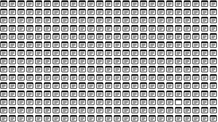
Internet today is bland. Everything is generic: fonts, layouts, pages, and visual language. Microtypography is messy.
Web design today seems dictated by technical and ideological constraints rather than creativity and ideas. Text and graphics are in containers on every page. All design is assumed.
Ironically, web technologies can design a lot. We can execute most designs. We make shocking, evocative websites. Experimental typography, generating graphics, and interactive experiences are possible.
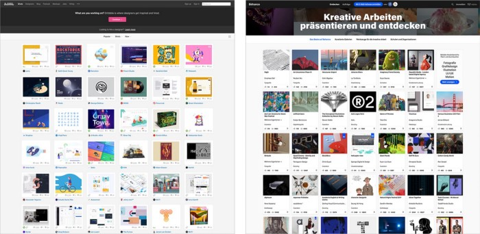
Even designer websites use containers in containers. Dribbble and Behance, the two most popular creative websites, are boring. Lead image.
How did this happen?
Several reasons. WordPress and other blogging platforms use templates. These frameworks build web pages by combining graphics, headlines, body content, and videos. Not designs, templates. These rules combine related data types. These platforms don't let users customize pages beyond the template. You filled the template.
Templates are content-neutral. Thus, the issue.
Form should reflect and shape content, which is a design principle. Separating them produces content containers. Templates have no design value.
One of the fundamental principles of design is a deep and meaningful connection between form and content.
Web design lacks imagination for many reasons. Most are pragmatic and economic. Page design takes time. Large websites lack the resources to create a page from scratch due to the speed of internet news and the frequency of new items. HTML, JavaScript, and CSS continue to challenge web designers. Web design can't match desktop publishing's straightforward operations.
Designers may also be lazy. Mobile-first, generic, framework-driven development tends to ignore web page visual and contextual integrity.
How can we overcome this? How might expressive and avant-garde websites look today?
Rediscovering the past helps design the future.
'90s-era web design
At the University of the Arts Bremen's research and development group, I created my first website 23 years ago. Web design was trendy. Young web. Pages inspired me.
We struggled with HTML in the mid-1990s. Arial, Times, and Verdana were the only web-safe fonts. Anything exciting required table layouts, monospaced fonts, or GIFs. HTML was originally content-driven, thus we had to work against it to create a page.
Experimental typography was booming. Designers challenged the established quo from Jan Tschichold's Die Neue Typographie in the twenties to April Greiman's computer-driven layouts in the eighties. By the mid-1990s, an uncommon confluence of technological and cultural breakthroughs enabled radical graphic design. Irma Boom, David Carson, Paula Scher, Neville Brody, and others showed it.
Early web pages were dull compared to graphic design's aesthetic explosion. The Web Design Museum shows this.
Nobody knew how to conduct browser-based graphic design. Web page design was undefined. No standards. No CMS (nearly), CSS, JS, video, animation.
Now is as good a time as any to challenge the internet’s visual conformity.
In 2018, everything is browser-based. Massive layouts to micro-typography, animation, and video. How do we use these great possibilities? Containerized containers. JavaScript-contaminated mobile-first pages. Visually uniform templates. Web design 23 years later would disappoint my younger self.
Our imagination, not technology, restricts web design. We're too conformist to aesthetics, economics, and expectations.
Crisis generates opportunity. Challenge online visual conformity now. I'm too old and bourgeois to develop a radical, experimental, and cutting-edge website. I can ask my students.
I taught web design at the Potsdam Interface Design Programme in 2017. Each team has to redesign a website. Create expressive, inventive visual experiences on the browser. Create with contemporary web technologies. Avoid usability, readability, and flexibility concerns. Act. Ignore Erwartungskonformität.
The class outcome pleased me. This overview page shows all results. Four diverse projects address the challenge.
1. ZKM by Frederic Haase and Jonas Köpfer
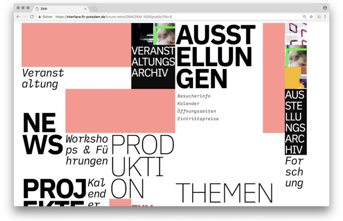
Frederic and Jonas began their experiments on the ZKM website. The ZKM is Germany's leading media art exhibition location, but its website remains conventional. It's useful but not avant-garde like the shows' art.
Frederic and Jonas designed the ZKM site's concept, aesthetic language, and technical configuration to reflect the museum's progressive approach. A generative design engine generates new layouts for each page load.
ZKM redesign.
2. Streem by Daria Thies, Bela Kurek, and Lucas Vogel
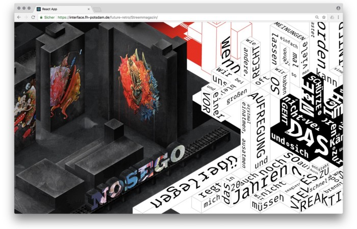
Street art magazine Streem. It promotes new artists and societal topics. Streem includes artwork, painting, photography, design, writing, and journalism. Daria, Bela, and Lucas used these influences to develop a conceptual metropolis. They designed four neighborhoods to reflect magazine sections for their prototype. For a legible city, they use powerful illustrative styles and spatial typography.
Streem makeover.
3. Medium by Amelie Kirchmeyer and Fabian Schultz
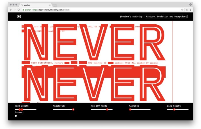
Amelie and Fabian structured. Instead of developing a form for a tale, they dissolved a web page into semantic, syntactical, and statistical aspects. HTML's flexibility was their goal. They broke Medium posts into experimental typographic space.
Medium revamp.
4. Hacker News by Fabian Dinklage and Florian Zia
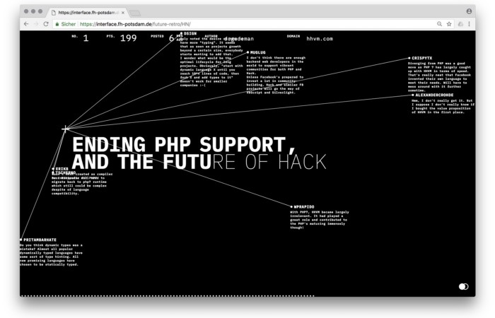
Florian and Fabian made Hacker News interactive. The social networking site aggregates computer science and IT news. Its voting and debate features are extensive despite its simple style. Fabian and Florian transformed the structure into a typographic timeline and network area. News and comments sequence and connect the visuals. To read Hacker News, they connected their design to the API. Hacker News makeover.
Communication is not legibility, said Carson. Apply this to web design today. Modern websites must be legible, usable, responsive, and accessible. They shouldn't limit its visual palette. Visual and human-centered design are not stereotypes.
I want radical, generative, evocative, insightful, adequate, content-specific, and intelligent site design. I want to rediscover web design experimentation. More surprises please. I hope the web will appear different in 23 years.
Update: this essay has sparked a lively discussion! I wrote a brief response to the debate's most common points: Creativity vs. Usability
You might also like

Liz Martin
3 years ago
What Motivated Amazon to Spend $1 Billion for The Rings of Power?
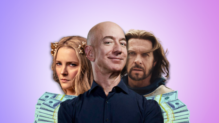
Amazon's Rings of Power is the most costly TV series ever made. This is merely a down payment towards Amazon's grand goal.
Here's a video:
Amazon bought J.R.R. Tolkien's fantasy novels for $250 million in 2017. This agreement allows Amazon to create a Tolkien series for Prime Video.
The business spent years developing and constructing a Lord of the Rings prequel. Rings of Power premiered on September 2, 2022.
It drew 25 million global viewers in 24 hours. Prime Video's biggest debut.
An Exorbitant Budget
The most expensive. First season cost $750 million to $1 billion, making it the most costly TV show ever.
Jeff Bezos has spent years looking for the next Game of Thrones, a critically and commercially successful original series. Rings of Power could help.
Why would Amazon bet $1 billion on one series?
It's Not Just About the Streaming War
It's simple to assume Amazon just wants to win. Since 2018, the corporation has been fighting Hulu, Netflix, HBO, Apple, Disney, and NBC. Each wants your money, talent, and attention. Amazon's investment goes beyond rivalry.
Subscriptions Are the Bait
Audible, Amazon Music, and Prime Video are subscription services, although the company's fundamental business is retail. Amazon's online stores contribute over 50% of company revenue. Subscription services contribute 6.8%. The company's master plan depends on these subscriptions.
Streaming videos on Prime increases membership renewals. Free trial participants are more likely to join. Members buy twice as much as non-members.
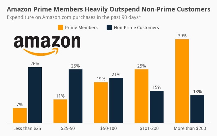
Amazon Studios doesn't generate original programming to earn from Prime Video subscriptions. It aims to retain and attract clients.
Amazon can track what you watch and buy. Its algorithm recommends items and services. Mckinsey says you'll use more Amazon products, shop at Amazon stores, and watch Amazon entertainment.
In 2015, the firm launched the first season of The Man in the High Castle, a dystopian alternate history TV series depicting a world ruled by Nazi Germany and Japan after World War II.

This $72 million production earned two Emmys. It garnered 1.15 million new Prime users globally.
When asked about his Hollywood investment, Bezos said, "A Golden Globe helps us sell more shoes."
Selling more footwear
Amazon secured a deal with DirecTV to air Thursday Night Football in restaurants and bars. First streaming service to have exclusive NFL games.
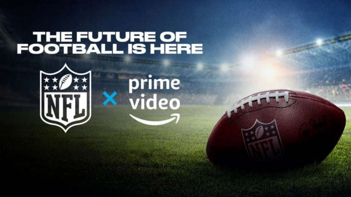
This isn't just about Thursday night football, says media analyst Ritchie Greenfield. This sells t-shirts. This may be a ticket. Amazon does more than stream games.
The Rings of Power isn't merely a production showcase, either. This sells Tolkien's fantasy novels such Lord of the Rings, The Hobbit, and The Silmarillion.
This tiny commitment keeps you in Amazon's ecosystem.

Architectural Digest
4 years ago
Take a look at The One, a Los Angeles estate with a whopping 105,000 square feet of living area.
The interiors of the 105,000-square-foot property, which sits on a five-acre parcel in the wealthy Los Angeles suburb of Bel Air and is suitably titled The One, have been a well guarded secret. We got an intimate look inside this world-record-breaking property, as well as the creative and aesthetic geniuses behind it.
The estate appears to float above the city, surrounded on three sides by a moat and a 400-foot-long running track. Completed over eight years—and requiring 600 workers to build—the home was designed by architect Paul McClean and interior designer Kathryn Rotondi, who were enlisted by owner and developer Nile Niami to help it live up to its standard.
"This endeavor seemed both exhilarating and daunting," McClean says. However, the home's remarkable location and McClean's long-standing relationship with Niami persuaded him to "build something unique and extraordinary" rather than just take on the job.
And McClean has more than delivered.
The home's main entrance leads to a variety of meeting places with magnificent 360-degree views of the Pacific Ocean, downtown Los Angeles, and the San Gabriel Mountains, thanks to its 26-foot-high ceilings. There is water at the entrance area, as well as a sculpture and a bridge. "We often employ water in our design approach because it provides a sensory change that helps you acclimatize to your environment," McClean explains.
Niami wanted a neutral palette that would enable the environment and vistas to shine, so she used black, white, and gray throughout the house.
McClean has combined the home's inside with outside "to create that quintessential L.A. lifestyle but on a larger scale," he says, drawing influence from the local environment and history of Los Angeles modernism. "We separated the entertaining spaces from the living portions to make the house feel more livable. The former are on the lowest level, which serves as a plinth for the rest of the house and minimizes its apparent mass."
The home's statistics, in addition to its eye-catching style, are equally impressive. There are 42 bathrooms, 21 bedrooms, a 5,500-square-foot master suite, a 30-car garage gallery with two car-display turntables, a four-lane bowling alley, a spa level, a 30-seat movie theater, a "philanthropy wing (with a capacity of 200) for charity galas, a 10,000-square-foot sky deck, and five swimming pools.
Rotondi, the creator of KFR Design, collaborated with Niami on the interior design to create different spaces that flow into one another despite the house's grandeur. "I was especially driven to 'wow factor' components in the hospitality business," Rotondi says, citing top luxury hotel brands such as Aman, Bulgari, and Baccarat as sources of inspiration. Meanwhile, the home's color scheme, soft textures, and lighting are a nod to Niami and McClean's favorite Tom Ford boutique on Rodeo Drive.
The house boasts an extraordinary collection of art, including a butterfly work by Stephen Wilson on the lower level and a Niclas Castello bespoke panel in black and silver in the office, thanks to a cooperation between Creative Art Partners and Art Angels. There is also a sizable collection of bespoke furniture pieces from byShowroom.
A house of this size will never be erected again in Los Angeles, thanks to recently enacted city rules, so The One will truly be one of a kind. "For all of us, this project has been such a long and instructive trip," McClean says. "It was exciting to develop and approached with excitement, but I don't think any of us knew how much effort and time it would take to finish the project."
Matthew Royse
4 years ago
Ten words and phrases to avoid in presentations
Don't say this in public!
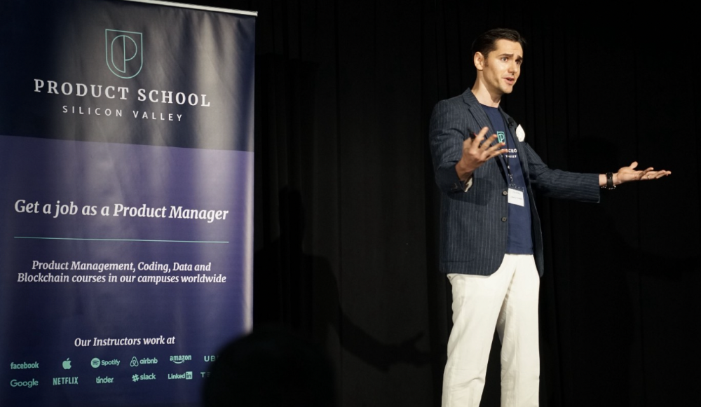
Want to wow your audience? Want to deliver a successful presentation? Do you want practical takeaways from your presentation?
Then avoid these phrases.
Public speaking is difficult. People fear public speaking, according to research.
"Public speaking is people's biggest fear, according to studies. Number two is death. "Sounds right?" — Comedian Jerry Seinfeld
Yes, public speaking is scary. These words and phrases will make your presentation harder.
Using unnecessary words can weaken your message.
You may have prepared well for your presentation and feel confident. During your presentation, you may freeze up. You may blank or forget.
Effective delivery is even more important than skillful public speaking.
Here are 10 presentation pitfalls.
1. I or Me
Presentations are about the audience, not you. Replace "I or me" with "you, we, or us." Focus on your audience. Reward them with expertise and intriguing views about your issue.
Serve your audience actionable items during your presentation, and you'll do well. Your audience will have a harder time listening and engaging if you're self-centered.
2. Sorry if/for
Your presentation is fine. These phrases make you sound insecure and unprepared. Don't pressure the audience to tell you not to apologize. Your audience should focus on your presentation and essential messages.
3. Excuse the Eye Chart, or This slide's busy
Why add this slide if you're utilizing these phrases? If you don't like this slide, change it before presenting. After the presentation, extra data can be provided.
Don't apologize for unclear slides. Hide or delete a broken PowerPoint slide. If so, divide your message into multiple slides or remove the "business" slide.
4. Sorry I'm Nervous
Some think expressing yourself will win over the audience. Nerves are horrible. Even public speakers are nervous.
Nerves aren't noticeable. What's the point? Let the audience judge your nervousness. Please don't make this obvious.
5. I'm not a speaker or I've never done this before.
These phrases destroy credibility. People won't listen and will check their phones or computers.
Why present if you use these phrases?
Good speakers aren't necessarily public speakers. Be confident in what you say. When you're confident, many people will like your presentation.
6. Our Key Differentiators Are
Overused term. It's widely utilized. This seems "salesy," and your "important differentiators" are probably like a competitor's.
This statement has been diluted; say, "what makes us different is..."
7. Next Slide
Many slides or stories? Your presentation needs transitions. They help your viewers understand your argument.
You didn't transition well when you said "next slide." Think about organic transitions.
8. I Didn’t Have Enough Time, or I’m Running Out of Time
The phrase "I didn't have enough time" implies that you didn't care about your presentation. This shows the viewers you rushed and didn't care.
Saying "I'm out of time" shows poor time management. It means you didn't rehearse enough and plan your time well.
9. I've been asked to speak on
This phrase is used to emphasize your importance. This phrase conveys conceit.
When you say this sentence, you tell others you're intelligent, skilled, and appealing. Don't utilize this term; focus on your topic.
10. Moving On, or All I Have
These phrases don't consider your transitions or presentation's end. People recall a presentation's beginning and end.
How you end your discussion affects how people remember it. You must end your presentation strongly and use natural transitions.
Conclusion
10 phrases to avoid in a presentation. I or me, sorry if or sorry for, pardon the Eye Chart or this busy slide, forgive me if I appear worried, or I'm really nervous, and I'm not good at public speaking, I'm not a speaker, or I've never done this before.
Please don't use these phrases: next slide, I didn't have enough time, I've been asked to speak about, or that's all I have.
We shouldn't make public speaking more difficult than it is. We shouldn't exacerbate a difficult issue. Better public speakers avoid these words and phrases.
“Remember not only to say the right thing in the right place, but far more difficult still, to leave unsaid the wrong thing at the tempting moment.” — Benjamin Franklin, Founding Father
This is a summary. See the original post here.