


More on Entrepreneurship/Creators

Jayden Levitt
3 years ago
Billionaire who was disgraced lost his wealth more quickly than anyone in history
If you're not genuine, you'll be revealed.
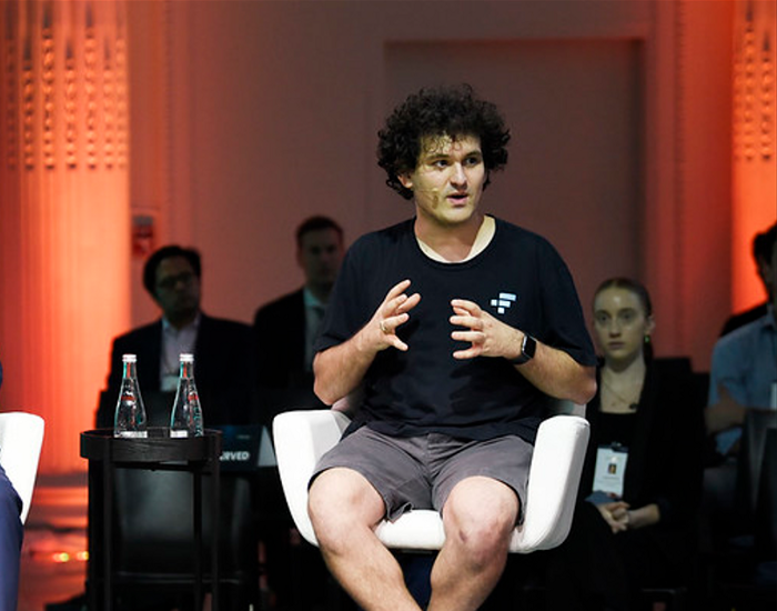
Sam Bankman-Fried (SBF) was called the Cryptocurrency Warren Buffet.
No wonder.
SBF's trading expertise, Blockchain knowledge, and ability to construct FTX attracted mainstream investors.
He had a fantastic worldview, donating much of his riches to charity.
As the onion layers peel back, it's clear he wasn't the altruistic media figure he portrayed.
SBF's mistakes were disastrous.
Customer deposits were traded and borrowed by him.
With ten other employees, he shared a $40 million mansion where they all had polyamorous relationships.
Tone-deaf and wasteful marketing expenditures, such as the $200 million spent to change the name of the Miami Heat stadium to the FTX Arena
Democrats received a $40 million campaign gift.
And now there seems to be no regret.
FTX was a 32-billion-dollar cryptocurrency exchange.
It went bankrupt practically overnight.
SBF, FTX's creator, exploited client funds to leverage trade.
FTX had $1 billion in customer withdrawal reserves against $9 billion in liabilities in sister business Alameda Research.
Bloomberg Billionaire Index says it's the largest and fastest net worth loss in history.
It gets worse.
SBF's net worth is $900 Million, however he must still finalize FTX's bankruptcy.
SBF's arrest in the Bahamas and SEC inquiry followed news that his cryptocurrency exchange had crashed, losing billions in customer deposits.
A journalist contacted him on Twitter D.M., and their exchange is telling.
His ideas are revealed.
Kelsey Piper says they didn't expect him to answer because people under investigation don't comment.
Bankman-Fried wanted to communicate, and the interaction shows he has little remorse.
SBF talks honestly about FTX gaming customers' money and insults his competition.
Reporter Kelsey Piper was outraged by what he said and felt the mistakes SBF says plague him didn't evident in the messages.
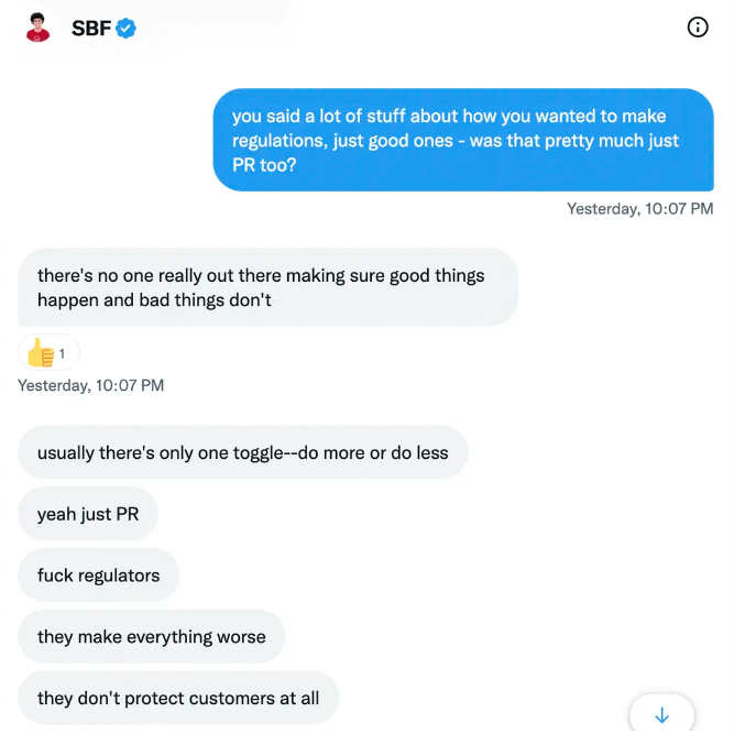
Before FTX's crash, SBF was a poster child for Cryptocurrency regulation and avoided criticizing U.S. regulators.
He tells Piper that his lobbying is just excellent PR.
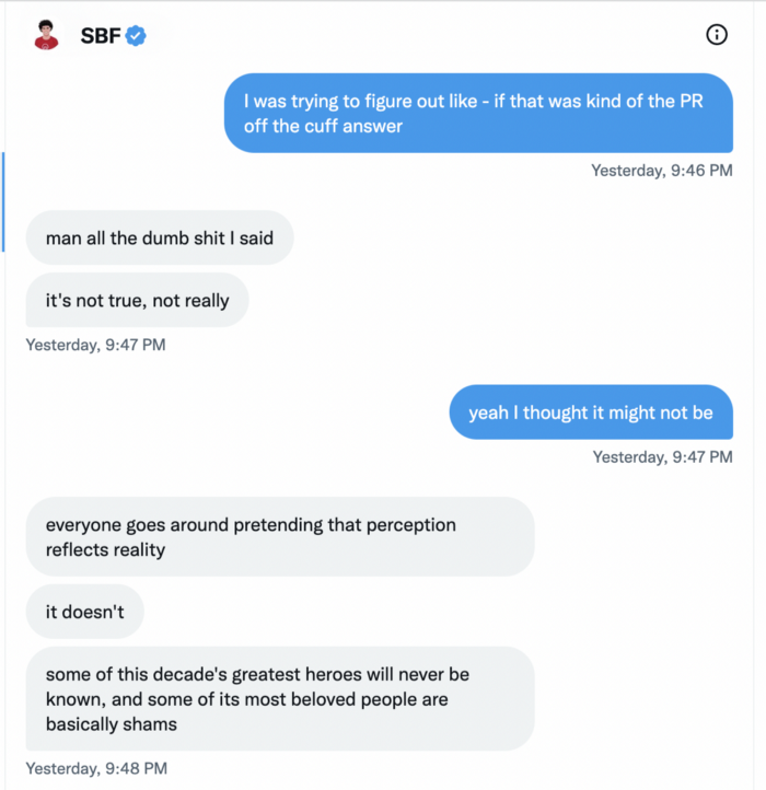
It shows his genuine views and supports cynics' opinions that his attempts to win over U.S. authorities were good for his image rather than Crypto.
SBF’s responses are in Grey, and Pipers are in Blue.
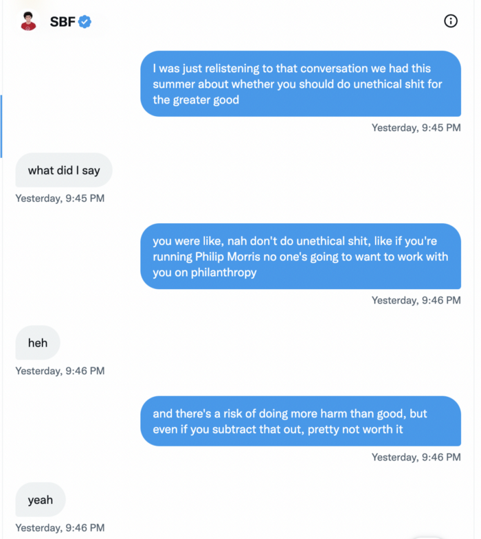
It's unclear if SBF cut corners for his gain. In their Twitter exchange, Piper revisits an interview question about ethics.
SBF says, "All the foolish sh*t I said"
SBF claims FTX has never invested customer monies.
Piper challenged him on Twitter.
While he insisted FTX didn't use customer deposits, he said sibling business Alameda borrowed too much from FTX's balance sheet.
He did, basically.
When consumers tried to withdraw money, FTX was short.
SBF thought Alameda had enough money to cover FTX customers' withdrawals, but life sneaks up on you.
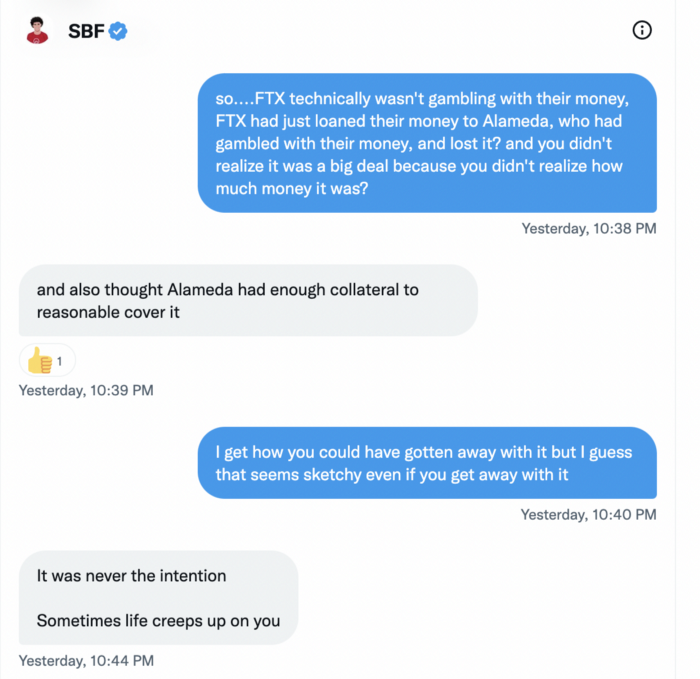
SBF believes most exchanges have done something similar to FTX, but they haven't had a bank run (a bunch of people all wanting to get their deposits out at the same time).
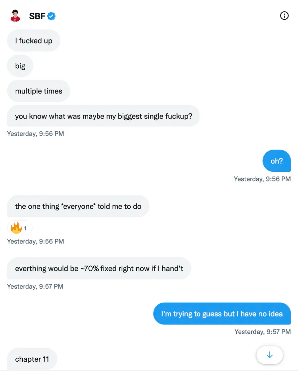
SBF believes he shouldn't have consented to the bankruptcy and kept attempting to raise more money because withdrawals would be open in a month with clients whole.
If additional money came in, he needed $8 billion to bridge the creditors' deficit, and there aren't many corporations with $8 billion to spare.
Once clients feel protected, they will continue to leave their assets on the exchange, according to one idea.
Kevin OLeary, a world-renowned hedge fund manager, says not all investors will walk through the open gate once the company is safe, therefore the $8 Billion wasn't needed immediately.
SBF claims the bankruptcy was his biggest error because he could have accumulated more capital.
Final Reflections
Sam Bankman-Fried, 30, became the world's youngest billionaire in four years.
Never listen to what people say about investing; watch what they do.
SBF is a trader who gets wrecked occasionally.
Ten first-time entrepreneurs ran FTX, screwing each other with no risk management.
It prevents opposing or challenging perspectives and echo chamber highs.
Twitter D.M. conversation with a journalist is the final nail.
He lacks an experienced crew.
This event will surely speed up much-needed regulation.
It's also prompted cryptocurrency exchanges to offer proof of reserves to calm customers.

Sammy Abdullah
3 years ago
SaaS payback period data
It's ok and even desired to be unprofitable if you're gaining revenue at a reasonable cost and have 100%+ net dollar retention, meaning you never lose customers and expand them. To estimate the acceptable cost of new SaaS revenue, we compare new revenue to operating loss and payback period. If you pay back the customer acquisition cost in 1.5 years and never lose them (100%+ NDR), you're doing well.
To evaluate payback period, we compared new revenue to net operating loss for the last 73 SaaS companies to IPO since October 2017. (55 out of 73). Here's the data. 1/(new revenue/operating loss) equals payback period. New revenue/operating loss equals cost of new revenue.
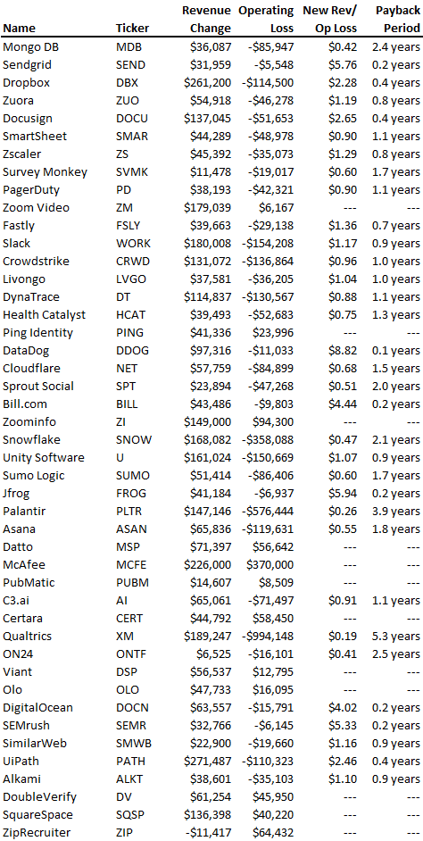
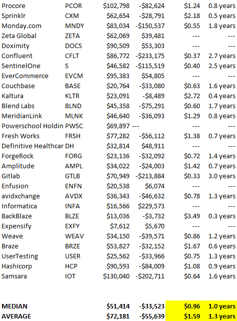
Payback averages a year. 55 SaaS companies that weren't profitable at IPO got a 1-year payback. Outstanding. If you pay for a customer in a year and never lose them (100%+ NDR), you're establishing a valuable business. The average was 1.3 years, which is within the 1.5-year range.
New revenue costs $0.96 on average. These SaaS companies lost $0.96 every $1 of new revenue last year. Again, impressive. Average new revenue per operating loss was $1.59.
Loss-in-operations definition. Operating loss revenue COGS S&M R&D G&A (technical point: be sure to use the absolute value of operating loss). It's wrong to only consider S&M costs and ignore other business costs. Operating loss and new revenue are measured over one year to eliminate seasonality.
Operating losses are desirable if you never lose a customer and have a quick payback period, especially when SaaS enterprises are valued on ARR. The payback period should be under 1.5 years, the cost of new income < $1, and net dollar retention 100%.

Grace Huang
3 years ago
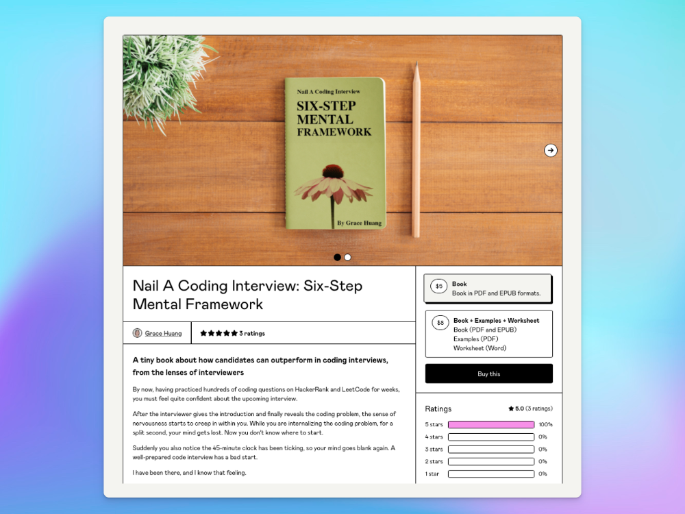
I sold 100 copies of my book when I had anticipated selling none.
After a decade in large tech, I know how software engineers were interviewed. I've seen outstanding engineers fail interviews because their responses were too vague.
So I wrote Nail A Coding Interview: Six-Step Mental Framework. Give candidates a mental framework for coding questions; help organizations better prepare candidates so they can calibrate traits.
Recently, I sold more than 100 books, something I never expected.
In this essay, I'll describe my publication journey, which included self-doubt and little triumphs. I hope this helps if you want to publish.
It was originally a Medium post.
How did I know to develop a coding interview book? Years ago, I posted on Medium.
Six steps to ace a coding interview Inhale. blog.devgenius.io
This story got a lot of attention and still gets a lot of daily traffic. It indicates this domain's value.
Converted the Medium article into an ebook
The Medium post contains strong bullet points, but it is missing the “flesh”. How to use these strategies in coding interviews, for example. I filled in the blanks and made a book.
I made the book cover for free. It's tidy.
Shared the article with my close friends on my social network WeChat.
I shared the book on Wechat's Friend Circle (朋友圈) after publishing it on Gumroad. Many friends enjoyed my post. It definitely triggered endorphins.
In Friend Circle, I presented a 100% off voucher. No one downloaded the book. Endorphins made my heart sink.
Several days later, my Apple Watch received a Gumroad notification. A friend downloaded it. I majored in finance, he subsequently said. My brother-in-law can get it? He downloaded it to cheer me up.
I liked him, but was disappointed that he didn't read it.
The Tipping Point: Reddit's Free Giving
I trusted the book. It's based on years of interviewing. I felt it might help job-hunting college students. If nobody wants it, it can still have value.
I posted the book's link on /r/leetcode. I told them to DM me for a free promo code.
Momentum shifted everything. Gumroad notifications kept coming when I was out with family. Following orders.
As promised, I sent DMs a promo code. Some consumers ordered without asking for a promo code. Some readers finished the book and posted reviews.
My book was finally on track.
A 5-Star Review, plus More
A reader afterwards DMed me and inquired if I had another book on system design interviewing. I said that was a good idea, but I didn't have one. If you write one, I'll be your first reader.
Later, I asked for a book review. Yes, but how? That's when I learned readers' reviews weren't easy. I built up an email pipeline to solicit customer reviews. Since then, I've gained credibility through ratings.
Learnings
I wouldn't have gotten 100 if I gave up when none of my pals downloaded. Here are some lessons.
Your friends are your allies, but they are not your clients.
Be present where your clients are
Request ratings and testimonials
gain credibility gradually
I did it, so can you. Follow me on Twitter @imgracehuang for my publishing and entrepreneurship adventure.
You might also like

rekt
4 years ago
LCX is the latest CEX to have suffered a private key exploit.
The attack began around 10:30 PM +UTC on January 8th.
Peckshield spotted it first, then an official announcement came shortly after.
We’ve said it before; if established companies holding millions of dollars of users’ funds can’t manage their own hot wallet security, what purpose do they serve?
The Unique Selling Proposition (USP) of centralised finance grows smaller by the day.
The official incident report states that 7.94M USD were stolen in total, and that deposits and withdrawals to the platform have been paused.
LCX hot wallet: 0x4631018f63d5e31680fb53c11c9e1b11f1503e6f
Hacker’s wallet: 0x165402279f2c081c54b00f0e08812f3fd4560a05
Stolen funds:
- 162.68 ETH (502,671 USD)
- 3,437,783.23 USDC (3,437,783 USD)
- 761,236.94 EURe (864,840 USD)
- 101,249.71 SAND Token (485,995 USD)
- 1,847.65 LINK (48,557 USD)
- 17,251,192.30 LCX Token (2,466,558 USD)
- 669.00 QNT (115,609 USD)
- 4,819.74 ENJ (10,890 USD)
- 4.76 MKR (9,885 USD)
**~$1M worth of $LCX remains in the address, along with 611k EURe which has been frozen by Monerium.
The rest, a total of 1891 ETH (~$6M) was sent to Tornado Cash.**
Why can’t they keep private keys private?
Is it really that difficult for a traditional corporate structure to maintain good practice?
CeFi hacks leave us with little to say - we can only go on what the team chooses to tell us.
Next time, they can write this article themselves.
See below for a template.

Alexander Nguyen
3 years ago
How can you bargain for $300,000 at Google?
Don’t give a number

Google pays its software engineers generously. While many of their employees are competent, they disregard a critical skill to maximize their pay.
Negotiation.
If Google employees have never negotiated, they're as helpless as anyone else.
In this piece, I'll reveal a compensation negotiation tip that will set you apart.
The Fallacy of Negotiating
How do you negotiate your salary? “Just give them a number twice the amount you really want”. - Someplace on the internet
Above is typical negotiation advice. If you ask for more than you want, the recruiter may meet you halfway.
It seems logical and great, but here's why you shouldn't follow that advice.
Haitian hostage rescue
In 1977, an official's aunt was kidnapped in Haiti. The kidnappers demanded $150,000 for the aunt's life. It seems reasonable until you realize why kidnappers want $150,000.
FBI detective and negotiator Chris Voss researched why they demanded so much.
“So they could party through the weekend”
When he realized their ransom was for partying, he offered $4,751 and a CD stereo. Criminals freed the aunt.
These thieves gave 31.57x their estimated amount and got a fraction. You shouldn't trust these thieves to negotiate your compensation.
What happened?
Negotiating your offer and Haiti
This narrative teaches you how to negotiate with a large number.
You can and will be talked down.
If a recruiter asks your wage expectation and you offer double, be ready to explain why.
If you can't justify your request, you may be offered less. The recruiter will notice and talk you down.
Reasonably,
a tiny bit more than the present amount you earn
a small premium over an alternative offer
a little less than the role's allotted amount
Real-World Illustration

Recruiter: What’s your expected salary? Candidate: (I know the role is usually $100,000) $200,000 Recruiter: How much are you compensated in your current role? Candidate: $90,000 Recruiter: We’d be excited to offer you $95,000 for your experiences for the role.
So Why Do They Even Ask?
Recruiters ask for a number to negotiate a lower one. Asking yourself limits you.
You'll rarely get more than you asked for, and your request can be lowered.
The takeaway from all of this is to never give an expected compensation.
Tell them you haven't thought about it when you applied.

Vivek Singh
4 years ago
A Warm Welcome to Web3 and the Future of the Internet
Let's take a look back at the internet's history and see where we're going — and why.
Tim Berners Lee had a problem. He was at CERN, the world's largest particle physics factory, at the time. The institute's stated goal was to study the simplest particles with the most sophisticated scientific instruments. The institute completed the LEP Tunnel in 1988, a 27 kilometer ring. This was Europe's largest civil engineering project (to study smaller particles — electrons).
The problem Tim Berners Lee found was information loss, not particle physics. CERN employed a thousand people in 1989. Due to team size and complexity, people often struggled to recall past project information. While these obstacles could be overcome, high turnover was nearly impossible. Berners Lee addressed the issue in a proposal titled ‘Information Management'.
When a typical stay is two years, data is constantly lost. The introduction of new people takes a lot of time from them and others before they understand what is going on. An emergency situation may require a detective investigation to recover technical details of past projects. Often, the data is recorded but cannot be found. — Information Management: A Proposal
He had an idea. Create an information management system that allowed users to access data in a decentralized manner using a new technology called ‘hypertext'.
To quote Berners Lee, his proposal was “vague but exciting...”. The paper eventually evolved into the internet we know today. Here are three popular W3C standards used by billions of people today:
(credit: CERN)
HTML (Hypertext Markup)
A web formatting language.
URI (Unique Resource Identifier)
Each web resource has its own “address”. Known as ‘a URL'.
HTTP (Hypertext Transfer Protocol)
Retrieves linked resources from across the web.
These technologies underpin all computer work. They were the seeds of our quest to reorganize information, a task as fruitful as particle physics.
Tim Berners-Lee would probably think the three decades from 1989 to 2018 were eventful. He'd be amazed by the billions, the inspiring, the novel. Unlocking innovation at CERN through ‘Information Management'.
The fictional character would probably need a drink, walk, and a few deep breaths to fully grasp the internet's impact. He'd be surprised to see a few big names in the mix.
Then he'd say, "Something's wrong here."
We should review the web's history before going there. Was it a success after Berners Lee made it public? Web1 and Web2: What is it about what we are doing now that so many believe we need a new one, web3?
Per Outlier Ventures' Jamie Burke:
Web 1.0 was read-only.
Web 2.0 was the writable
Web 3.0 is a direct-write web.
Let's explore.
Web1: The Read-Only Web
Web1 was the digital age. We put our books, research, and lives ‘online'. The web made information retrieval easier than any filing cabinet ever. Massive amounts of data were stored online. Encyclopedias, medical records, and entire libraries were put away into floppy disks and hard drives.
In 2015, the web had around 305,500,000,000 pages of content (280 million copies of Atlas Shrugged).
Initially, one didn't expect to contribute much to this database. Web1 was an online version of the real world, but not yet a new way of using the invention.
One gets the impression that the web has been underutilized by historians if all we can say about it is that it has become a giant global fax machine. — Daniel Cohen, The Web's Second Decade (2004)
That doesn't mean developers weren't building. The web was being advanced by great minds. Web2 was born as technology advanced.
Web2: Read-Write Web
Remember when you clicked something on a website and the whole page refreshed? Is it too early to call the mid-2000s ‘the good old days'?
Browsers improved gradually, then suddenly. AJAX calls augmented CGI scripts, and applications began sending data back and forth without disrupting the entire web page. One button to ‘digg' a post (see below). Web experiences blossomed.
In 2006, Digg was the most active ‘Web 2.0' site. (Photo: Ethereum Foundation Taylor Gerring)
Interaction was the focus of new applications. Posting, upvoting, hearting, pinning, tweeting, liking, commenting, and clapping became a lexicon of their own. It exploded in 2004. Easy ways to ‘write' on the internet grew, and continue to grow.
Facebook became a Web2 icon, where users created trillions of rows of data. Google and Amazon moved from Web1 to Web2 by better understanding users and building products and services that met their needs.
Business models based on Software-as-a-Service and then managing consumer data within them for a fee have exploded.
Web2 Emerging Issues
Unbelievably, an intriguing dilemma arose. When creating this read-write web, a non-trivial question skirted underneath the covers. Who owns it all?
You have no control over [Web 2] online SaaS. People didn't realize this because SaaS was so new. People have realized this is the real issue in recent years.
Even if these organizations have good intentions, their incentive is not on the users' side.
“You are not their customer, therefore you are their product,” they say. With Laura Shin, Vitalik Buterin, Unchained
A good plot line emerges. Many amazing, world-changing software products quietly lost users' data control.
For example: Facebook owns much of your social graph data. Even if you hate Facebook, you can't leave without giving up that data. There is no ‘export' or ‘exit'. The platform owns ownership.
While many companies can pull data on you, you cannot do so.
On the surface, this isn't an issue. These companies use my data better than I do! A complex group of stakeholders, each with their own goals. One is maximizing shareholder value for public companies. Tim Berners-Lee (and others) dislike the incentives created.
“Show me the incentive and I will show you the outcome.” — Berkshire Hathaway's CEO
It's easy to see what the read-write web has allowed in retrospect. We've been given the keys to create content instead of just consume it. On Facebook and Twitter, anyone with a laptop and internet can participate. But the engagement isn't ours. Platforms own themselves.
Web3: The ‘Unmediated’ Read-Write Web
Tim Berners Lee proposed a decade ago that ‘linked data' could solve the internet's data problem.
However, until recently, the same principles that allowed the Web of documents to thrive were not applied to data...
The Web of Data also allows for new domain-specific applications. Unlike Web 2.0 mashups, Linked Data applications work with an unbound global data space. As new data sources appear on the Web, they can provide more complete answers.
At around the same time as linked data research began, Satoshi Nakamoto created Bitcoin. After ten years, it appears that Berners Lee's ideas ‘link' spiritually with cryptocurrencies.
What should Web 3 do?
Here are some quick predictions for the web's future.
Users' data:
Users own information and provide it to corporations, businesses, or services that will benefit them.
Defying censorship:
No government, company, or institution should control your access to information (1, 2, 3)
Connect users and platforms:
Create symbiotic rather than competitive relationships between users and platform creators.
Open networks:
“First, the cryptonetwork-participant contract is enforced in open source code. Their voices and exits are used to keep them in check.” Dixon, Chris (4)
Global interactivity:
Transacting value, information, or assets with anyone with internet access, anywhere, at low cost
Self-determination:
Giving you the ability to own, see, and understand your entire digital identity.
Not pull, push:
‘Push' your data to trusted sources instead of ‘pulling' it from others.
Where Does This Leave Us?
Change incentives, change the world. Nick Babalola
People believe web3 can help build a better, fairer system. This is not the same as equal pay or outcomes, but more equal opportunity.
It should be noted that some of these advantages have been discussed previously. Will the changes work? Will they make a difference? These unanswered questions are technical, economic, political, and philosophical. Unintended consequences are likely.
We hope Web3 is a more democratic web. And we think incentives help the user. If there’s one thing that’s on our side, it’s that open has always beaten closed, given a long enough timescale.
We are at the start.