


More on Leadership

Caspar Mahoney
3 years ago
Changing Your Mindset From a Project to a Product
Product game mindsets? How do these vary from Project mindset?

1950s spawned the Iron Triangle. Project people everywhere know and live by it. In stakeholder meetings, it is used to stretch the timeframe, request additional money, or reduce scope.
Quality was added to this triangle as things matured.
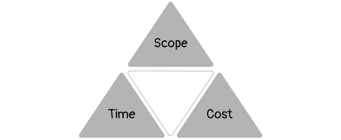
Quality was intended to be transformative, but none of these principles addressed why we conduct projects.
Value and benefits are key.
Product value is quantified by ROI, revenue, profit, savings, or other metrics. For me, every project or product delivery is about value.
Most project managers, especially those schooled 5-10 years or more ago (thousands working in huge corporations worldwide), understand the world in terms of the iron triangle. What does that imply? They worry about:
a) enough time to get the thing done.
b) have enough resources (budget) to get the thing done.
c) have enough scope to fit within (a) and (b) >> note, they never have too little scope, not that I have ever seen! although, theoretically, this could happen.
Boom—iron triangle.
To make the triangle function, project managers will utilize formal governance (Steering) to move those things. Increase money, scope, or both if time is short. Lacking funds? Increase time, scope, or both.
In current product development, shifting each item considerably may not yield value/benefit.
Even terrible. This approach will fail because it deprioritizes Value/Benefit by focusing the major stakeholders (Steering participants) and delivery team(s) on Time, Scope, and Budget restrictions.
Pre-agile, this problem was terrible. IT projects failed wildly. History is here.
Value, or benefit, is central to the product method. Product managers spend most of their time planning value-delivery paths.
Product people consider risk, schedules, scope, and budget, but value comes first. Let me illustrate.
Imagine managing internal products in an enterprise. Your core customer team needs a rapid text record of a chat to fix a problem. The consumer wants a feature/features added to a product you're producing because they think it's the greatest spot.
Project-minded, I may say;
Ok, I have budget as this is an existing project, due to run for a year. This is a new requirement to add to the features we’re already building. I think I can keep the deadline, and include this scope, as it sounds related to the feature set we’re building to give the desired result”.
This attitude repeats Scope, Time, and Budget.
Since it meets those standards, a project manager will likely approve it. If they have a backlog, they may add it and start specking it out assuming it will be built.
Instead, think like a product;
What problem does this feature idea solve? Is that problem relevant to the product I am building? Can that problem be solved quicker/better via another route ? Is it the most valuable problem to solve now? Is the problem space aligned to our current or future strategy? or do I need to alter/update the strategy?
A product mindset allows you to focus on timing, resource/cost, feasibility, feature detail, and so on after answering the aforementioned questions.
The above oversimplifies because
Leadership in discovery

Project managers are facilitators of ideas. This is as far as they normally go in the ‘idea’ space.
Business Requirements collection in classic project delivery requires extensive upfront documentation.
Agile project delivery analyzes requirements iteratively.
However, the project manager is a facilitator/planner first and foremost, therefore topic knowledge is not expected.
I mean business domain, not technical domain (to confuse matters, it is true that in some instances, it can be both technical and business domains that are important for a single individual to master).
Product managers are domain experts. They will become one if they are training/new.
They lead discovery.
Product Manager-led discovery is much more than requirements gathering.
Requirements gathering involves a Business Analyst interviewing people and documenting their requests.
The project manager calculates what fits and what doesn't using their Iron Triangle (presumably in their head) and reports back to Steering.
If this requirements-gathering exercise failed to identify requirements, what would a project manager do? or bewildered by project requirements and scope?
They would tell Steering they need a Business SME or Business Lead assigning or more of their time.
Product discovery requires the Product Manager's subject knowledge and a new mindset.
How should a Product Manager handle confusing requirements?
Product Managers handle these challenges with their talents and tools. They use their own knowledge to fill in ambiguity, but they have the discipline to validate those assumptions.
To define the problem, they may perform qualitative or quantitative primary research.
They might discuss with UX and Engineering on a whiteboard and test assumptions or hypotheses.
Do Product Managers escalate confusing requirements to Steering/Senior leaders? They would fix that themselves.
Product managers raise unclear strategy and outcomes to senior stakeholders. Open talks, soft skills, and data help them do this. They rarely raise requirements since they have their own means of handling them without top stakeholder participation.
Discovery is greenfield, exploratory, research-based, and needs higher-order stakeholder management, user research, and UX expertise.
Product Managers also aid discovery. They lead discovery. They will not leave customer/user engagement to a Business Analyst. Administratively, a business analyst could aid. In fact, many product organizations discourage business analysts (rely on PM, UX, and engineer involvement with end-users instead).
The Product Manager must drive user interaction, research, ideation, and problem analysis, therefore a Product professional must be skilled and confident.
Creating vs. receiving and having an entrepreneurial attitude
Product novices and project managers focus on details rather than the big picture. Project managers prefer spreadsheets to strategy whiteboards and vision statements.
These folks ask their manager or senior stakeholders, "What should we do?"
They then elaborate (in Jira, in XLS, in Confluence or whatever).
They want that plan populated fast because it reduces uncertainty about what's going on and who's supposed to do what.
Skilled Product Managers don't only ask folks Should we?
They're suggesting this, or worse, Senior stakeholders, here are some options. After asking and researching, they determine what value this product adds, what problems it solves, and what behavior it changes.
Therefore, to move into Product, you need to broaden your view and have courage in your ability to discover ideas, find insightful pieces of information, and collate them to form a valuable plan of action. You are constantly defining RoI and building Business Cases, so much so that you no longer create documents called Business Cases, it is simply ingrained in your work through metrics, intelligence, and insights.
Product Management is not a free lunch.
Plateless.
Plates and food must be prepared.
In conclusion, Product Managers must make at least three mentality shifts:
You put value first in all things. Time, money, and scope are not as important as knowing what is valuable.
You have faith in the field and have the ability to direct the search. YYou facilitate, but you don’t just facilitate. You wouldn't want to limit your domain expertise in that manner.
You develop concepts, strategies, and vision. You are not a waiter or an inbox where other people can post suggestions; you don't merely ask folks for opinion and record it. However, you excel at giving things that aren't clearly spoken or written down physical form.

Trevor Stark
3 years ago
Peter Thiels's Multi-Billion Dollar Net Worth's Unknown Philosopher
Peter Thiel studied philosophy as an undergraduate.
Peter Thiel has $7.36 billion.
Peter is a world-ranked chess player, has a legal degree, and has written profitable novels.
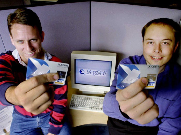
In 1999, he co-founded PayPal with Max Levchin, which merged with X.com.
Peter Thiel made $55 million after selling the company to eBay for $1.5 billion in 2002.
You may be wondering…
How did Peter turn $55 million into his now multi-billion dollar net worth?
One amazing investment?
Facebook.
Thiel was Facebook's first external investor. He bought 10% of the company for $500,000 in 2004.
This investment returned 159% annually, 200x in 8 years.
By 2012, Thiel sold almost all his Facebook shares, becoming a billionaire.
What was the investment thesis of Peter?
This investment appeared ridiculous. Facebook was an innovative startup.
Thiel's $500,000 contribution transformed Facebook.
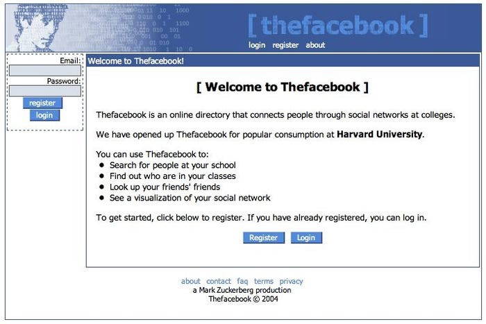
Harvard students have access to Facebook's 8 features and 1 photo per profile.
How did Peter determine that this would be a wise investment, then?
Facebook is a mimetic desire machine.
Social media's popularity is odd. Why peek at strangers' images on a computer?
Peter Thiel studied under French thinker Rene Girard at Stanford.
Mimetic Desire explains social media's success.
Mimetic Desire is the idea that humans desire things simply because other people do.
If nobody wanted it, would you?
Would you desire a family, a luxury car, or expensive clothes if no one else did? Girard says no.
People we admire affect our aspirations because we're social animals. Every person has a role model.
Our nonreligious culture implies role models are increasingly other humans, not God.
The idea explains why social media influencers are so powerful.
Why would Andrew Tate or Kim Kardashian matter if people weren't mimetic?
Humanity is fundamentally motivated by social comparison.
Facebook takes advantage of this need for social comparison, and puts it on a global scale.
It aggregates photographs and updates from millions of individuals.
Facebook mobile allows 24/7 social comparison.
Thiel studied mimetic desire with Girard and realized Facebook exploits the urge for social comparison to gain money.
Social media is more significant and influential than ever, despite Facebook's decline.
Thiel and Girard show that applied philosophy (particularly in business) can be immensely profitable.

William Anderson
3 years ago
When My Remote Leadership Skills Took Off
4 Ways To Manage Remote Teams & Employees
The wheels hit the ground as I landed in Rochester.
Our six-person satellite office was now part of my team.
Their manager only reported to me the day before, but I had my ticket booked ahead of time.
I had managed remote employees before but this was different. Engineers dialed into headquarters for every meeting.
So when I learned about the org chart change, I knew a strong first impression would set the tone for everything else.
I was either their boss, or their boss's boss, and I needed them to know I was committed.
Managing a fleet of satellite freelancers or multiple offices requires treating others as more than just a face behind a screen.
You must comprehend each remote team member's perspective and daily interactions.
The good news is that you can start using these techniques right now to better understand and elevate virtual team members.
1. Make Visits To Other Offices
If budgeted, visit and work from offices where teams and employees report to you. Only by living alongside them can one truly comprehend their problems with communication and other aspects of modern life.
2. Have Others Come to You
• Having remote, distributed, or satellite employees and teams visit headquarters every quarter or semi-quarterly allows the main office culture to rub off on them.
When remote team members visit, more people get to meet them, which builds empathy.
If you can't afford to fly everyone, at least bring remote managers or leaders. Hopefully they can resurrect some culture.
3. Weekly Work From Home
No home office policy?
Make one.
WFH is a team-building, problem-solving, and office-viewing opportunity.
For dial-in meetings, I started working from home on occasion.
It also taught me which teams “forget” or “skip” calls.
As a remote team member, you experience all the issues first hand.
This isn't as accurate for understanding teams in other offices, but it can be done at any time.
4. Increase Contact Even If It’s Just To Chat
Don't underestimate office banter.
Sometimes it's about bonding and trust, other times it's about business.
If you get all this information in real-time, please forward it.
Even if nothing critical is happening, call remote team members to check in and chat.
I guarantee that building relationships and rapport will increase both their job satisfaction and yours.
You might also like

Jayden Levitt
3 years ago
The country of El Salvador's Bitcoin-obsessed president lost $61.6 million.
It’s only a loss if you sell, right?
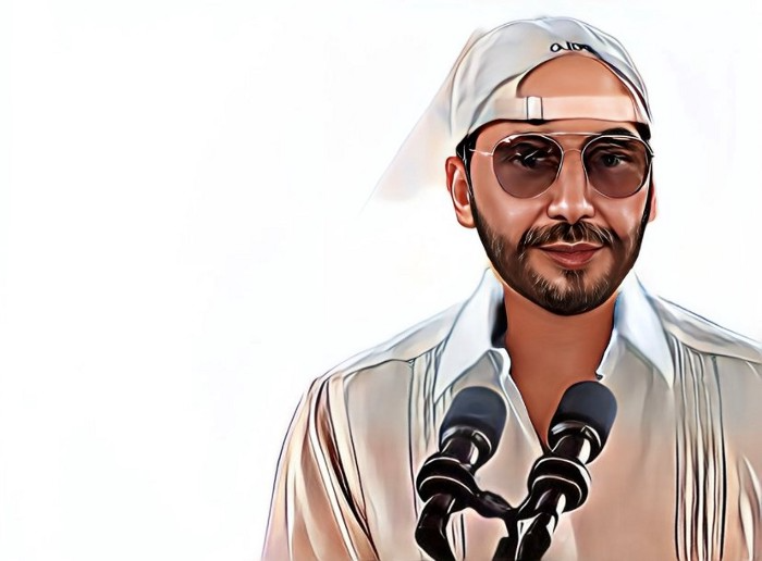
Nayib Bukele proclaimed himself “the world’s coolest dictator”.
His jokes aren't clear.
El Salvador's 43rd president self-proclaimed “CEO of El Salvador” couldn't be less presidential.
His thin jeans, aviator sunglasses, and baseball caps like a cartel lord.
He's popular, though.
Bukele won 53% of the vote by fighting violent crime and opposition party corruption.
El Salvador's 6.4 million inhabitants are riding the cryptocurrency volatility wave.
They were powerless.
Their autocratic leader, a former Yamaha Motors salesperson and Bitcoin believer, wants to help 70% unbanked locals.
He intended to give the citizens a way to save money and cut the country's $200 million remittance cost.
Transfer and deposit costs.
This makes logical sense when the president’s theatrics don’t blind you.
El Salvador's Bukele revealed plans to make bitcoin legal tender.
Remittances total $5.9 billion (23%) of the country's expenses.
Anything that reduces costs could boost the economy.
The country’s unbanked population is staggering. Here’s the data by % of people who either have a bank account (Blue) or a mobile money account (Black).
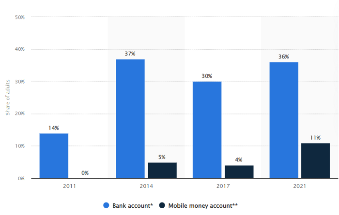
According to Bukele, 46% of the population has downloaded the Chivo Bitcoin Wallet.
In 2021, 36% of El Salvadorans had bank accounts.
Large rural countries like Kenya seem to have resolved their unbanked dilemma.
An economy surfaced where village locals would sell, trade and store network minutes and data as a store of value.
Kenyan phone networks realized unbanked people needed a safe way to accumulate wealth and have an emergency fund.
96% of Kenyans utilize M-PESA, which doesn't require a bank account.
The software involves human agents who hang out with cash and a phone.
These people are like ATMs.
You offer them cash to deposit money in your mobile money account or withdraw cash.
In a country with a faulty banking system, cash availability and a safe place to deposit it are important.
William Jack and Tavneet Suri found that M-PESA brought 194,000 Kenyan households out of poverty by making transactions cheaper and creating a safe store of value.
Mobile money, a service that allows monetary value to be stored on a mobile phone and sent to other users via text messages, has been adopted by most Kenyan households. We estimate that access to the Kenyan mobile money system M-PESA increased per capita consumption levels and lifted 194,000 households, or 2% of Kenyan households, out of poverty.
The impacts, which are more pronounced for female-headed households, appear to be driven by changes in financial behaviour — in particular, increased financial resilience and saving. Mobile money has therefore increased the efficiency of the allocation of consumption over time while allowing a more efficient allocation of labour, resulting in a meaningful reduction of poverty in Kenya.
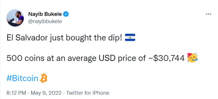
Currently, El Salvador has 2,301 Bitcoin.
At publication, it's worth $44 million. That remains 41% of Bukele's original $105.6 million.
Unknown if the country has sold Bitcoin, but Bukeles keeps purchasing the dip.
It's still falling.
This might be a fantastic move for the impoverished country over the next five years, if they can live economically till Bitcoin's price recovers.
The evidence demonstrates that a store of value pulls individuals out of poverty, but others say Bitcoin is premature.
You may regard it as an aggressive endeavor to front run the next wave of adoption, offering El Salvador a financial upside.

ʟ ᴜ ᴄ ʏ
3 years ago
The Untapped Gold Mine of Inspiration and Startup Ideas
I joined the 1000 Digital Startups Movement (Gerakan 1000 Startup Digital) in 2017 and learned a lot about the startup sector. My previous essay outlined what a startup is and what must be prepared. Here I'll offer raw ideas for better products.

Intro
A good startup solves a problem. These can include environmental, economic, energy, transportation, logistics, maritime, forestry, livestock, education, tourism, legal, arts and culture, communication, and information challenges. Everything I wrote is simply a basic idea (as inspiration) and requires more mapping and validation. Learn how to construct a startup to maximize launch success.
Adrian Gunadi (Investree Co-Founder) taught me that a Founder or Co-Founder must be willing to be CEO (Chief Everything Officer). Everything is independent, including drafting a proposal, managing finances, and scheduling appointments. The best individuals will come to you if you're the best. It's easier than consulting Andy Zain (Kejora Capital Founder).
Description
To help better understanding from your idea, try to answer this following questions:
- Describe your idea/application
Maximum 1000 characters.
- Background
Explain the reasons that prompted you to realize the idea/application.
- Objective
Explain the expected goals of the creation of the idea/application.
- Solution
A solution that tells your idea can be the right solution for the problem at hand.
- Uniqueness
What makes your idea/app unique?
- Market share
Who are the people who need and are looking for your idea?
- Marketing Ways and Business Models
What is the best way to sell your idea and what is the business model?
Not everything here is a startup idea. It's meant to inspire creativity and new perspectives.
Ideas
#Application
1. Medical students can operate on patients or not. Applications that train prospective doctors to distinguish body organs and their placement are useful. In the advanced stage, the app can be built with numerous approaches so future doctors can practice operating on patients based on their ailments. If they made a mistake, they'd start over. Future doctors will be more assured and make fewer mistakes this way.
2. VR (virtual reality) technology lets people see 3D space from afar. Later, similar technology was utilized to digitally sell properties, so buyers could see the inside and room contents. Every gadget has flaws. It's like a gold mine for robbers. VR can let prospective students see a campus's facilities. This facility can also help hotels promote their products.
3. How can retail entrepreneurs maximize sales? Most popular goods' sales data. By using product and brand/type sales figures, entrepreneurs can avoid overstocking. Walmart computerized their procedures to track products from the manufacturer to the store. As Retail Link products sell out, suppliers can immediately step in.
4. Failing to marry is something to be avoided. But if it had to happen, the loss would be like the proverb “rub salt into the wound”. On the I do Now I dont website, Americans who don't marry can resell their jewelry to other brides-to-be. If some want to cancel the wedding and receive their down money and dress back, others want a wedding with particular criteria, such as a quick date and the expected building. Create a DP takeover marketplace for both sides.
#Games
1. Like in the movie, players must exit the maze they enter within 3 minutes or the shape will change, requiring them to change their strategy. The maze's transformation time will shorten after a few stages.
2. Treasure hunts involve following clues to uncover hidden goods. Here, numerous sponsors are combined in one boat, and participants can choose a game based on the prizes. Let's say X-mart is a sponsor and provides riddles or puzzles to uncover the prize in their store. After gathering enough points, the player can trade them for a gift utilizing GPS and AR (augmented reality). Players can collaborate to increase their chances of success.
3. Where's Wally? Where’s Wally displays a thick image with several things and various Wally-like characters. We must find the actual Wally, his companions, and the desired object. Make a game with a map where players must find objects for the next level. The player must find 5 artifacts randomly placed in an Egyptian-style mansion, for example. In the room, there are standard tickets, pass tickets, and gold tickets that can be removed for safekeeping, as well as a wall-mounted carpet that can be stored but not searched and turns out to be a flying rug that can be used to cross/jump to a different place. Regular tickets are spread out since they can buy life or stuff. At a higher level, a black ticket can lower your ordinary ticket. Objects can explode, scattering previously acquired stuff. If a player runs out of time, they can exchange a ticket for more.
#TVprogram
1. At the airport there are various visitors who come with different purposes. Asking tourists to live for 1 or 2 days in the city will be intriguing to witness.
2. Many professions exist. Carpenters, cooks, and lawyers must have known about job desks. Does HRD (Human Resource Development) only recruit new employees? Many don't know how to become a CEO, CMO, COO, CFO, or CTO. Showing young people what a Program Officer in an NGO does can help them choose a career.
#StampsCreations
Philatelists know that only the government can issue stamps. I hope stamps are creative so they have more worth.
1. Thermochromic pigments (leuco dyes) are well-known for their distinctive properties. By putting pigments to black and white batik stamps, for example, the black color will be translucent and display the basic color when touched (at a hot temperature).
2. In 2012, Liechtenstein Post published a laser-art Chinese zodiac stamp. Belgium (Bruges Market Square 2012), Taiwan (Swallow Tail Butterfly 2009), etc. Why not make a stencil of the president or king/queen?
3. Each country needs its unique identity, like Taiwan's silk and bamboo stamps. Create from your country's history. Using traditional paper like washi (Japan), hanji (Korea), and daluang/saeh (Indonesia) can introduce a country's culture.
4. Garbage has long been a problem. Bagasse, banana fronds, or corn husks can be used as stamp material.
5. Austria Post published a stamp containing meteor dust in 2006. 2004 meteorite found in Morocco produced the dust. Gibraltar's Rock of Gilbraltar appeared on stamps in 2002. What's so great about your country? East Java is muddy (Lapindo mud). Lapindo mud stamps will be popular. Red sand at Pink Beach, East Nusa Tenggara, could replace the mud.
#PostcardCreations
1. Map postcards are popular because they make searching easier. Combining laser-cut road map patterns with perforated 200-gram paper glued on 400-gram paper as a writing medium. Vision-impaired people can use laser-cut maps.
2. Regional art can be promoted by tucking traditional textiles into postcards.
3. A thin canvas or plain paper on the card's front allows the giver to be creative.
4. What is local crop residue? Cork lids, maize husks, and rice husks can be recycled into postcard materials.
5. Have you seen a dried-flower bookmark? Cover the postcard with mica and add dried flowers. If you're worried about losing the flowers, you can glue them or make a postcard envelope.
6. Wood may be ubiquitous; try a 0.2-mm copper plate engraved with an image and connected to a postcard as a writing medium.
7. Utilized paper pulp can be used to hold eggs, smartphones, and food. Form a smooth paper pulp on the plate with the desired image, the Golden Gate bridge, and paste it on your card.
8. Postcards can promote perfume. When customers rub their hands on the card with the perfume image, they'll smell the aroma.
#Tour #Travel
Tourism activities can be tailored to tourists' interests or needs. Each tourist benefits from tourism's distinct aim.
Let's define tourism's objective and purpose.
Holiday Tour is a tour that its participants plan and do in order to relax, have fun, and amuse themselves.
A familiarization tour is a journey designed to help travelers learn more about (survey) locales connected to their line of work.
An educational tour is one that aims to give visitors knowledge of the field of work they are visiting or an overview of it.
A scientific field is investigated and knowledge gained as the major goal of a scientific tour.
A pilgrimage tour is one designed to engage in acts of worship.
A special mission tour is one that has a specific goal, such a commerce mission or an artistic endeavor.
A hunting tour is a destination for tourists that plans organized animal hunting that is only allowed by local authorities for entertainment purposes.
Every part of life has tourism potential. Activities include:
1. Those who desire to volunteer can benefit from the humanitarian theme and collaboration with NGOs. This activity's profit isn't huge but consider the environmental impact.
2. Want to escape the city? Meditation travel can help. Beautiful spots around the globe can help people forget their concerns. A certified yoga/meditation teacher can help travelers release bad energy.
3. Any prison visitors? Some prisons, like those for minors under 17, are open to visitors. This type of tourism helps mental convicts reach a brighter future.
4. Who has taken a factory tour/study tour? Outside-of-school study tour (for ordinary people who have finished their studies). Not everyone in school could tour industries, workplaces, or embassies to learn and be inspired. Shoyeido (an incense maker) and Royce (a chocolate maker) offer factory tours in Japan.
5. Develop educational tourism like astronomy and archaeology. Until now, only a few astronomy enthusiasts have promoted astronomy tourism. In Indonesia, archaeology activities focus on site preservation, and to participate, office staff must undertake a series of training (not everyone can take a sabbatical from their routine). Archaeological tourist activities are limited, whether held by history and culture enthusiasts or in regional tours.
6. Have you ever longed to observe a film being made or your favorite musician rehearsing? Such tours can motivate young people to pursue entertainment careers.
7. Pamper your pets to reduce stress. Many pet owners don't have time for walks or treats. These premium services target the wealthy.
8. A quirky idea to provide tours for imaginary couples or things. Some people marry inanimate objects or animals and seek to make their lover happy; others cherish their ashes after death.
#MISCideas
1. Fashion is a lifestyle, thus people often seek fresh materials. Chicken claws, geckos, snake skin casings, mice, bats, and fish skins are also used. Needs some improvement, definitely.
2. As fuel supplies become scarcer, people hunt for other energy sources. Sound is an underutilized renewable energy. The Batechsant technology converts environmental noise into electrical energy, according to study (Battery Technology Of Sound Power Plant). South Korean researchers use Sound-Driven Piezoelectric Nanowire based on Nanogenerators to recharge cell phone batteries. The Batechsant system uses existing noise levels to provide electricity for street lamp lights, aviation, and ships. Using waterfall sound can also energize hard-to-reach locations.
3. A New York Times reporter said IQ doesn't ensure success. Our school system prioritizes IQ above EQ (Emotional Quotient). EQ is a sort of human intelligence that allows a person to perceive and analyze the dynamics of his emotions when interacting with others (and with himself). EQ is suspected of being a bigger source of success than IQ. EQ training can gain greater attention to help people succeed. Prioritize role models from school stakeholders, teachers, and parents to improve children' EQ.
4. Teaching focuses more on theory than practice, so students are less eager to explore and easily forget if they don't pay attention. Has an engineer ever made bricks from arid red soil? Morocco's non-college-educated builders can create weatherproof bricks from red soil without equipment. Can mechanical engineering grads create a water pump to solve water shortages in remote areas? Art graduates can innovate beyond only painting. Artists may create kinetic sculpture by experimenting so much. Young people should understand these sciences so they can be more creative with their potential. These might be extracurricular activities in high school and university.
5. People have been trying to recycle agricultural waste for a long time. Mycelium helps replace light, easily crushed tiles and bricks (a collection of hyphae like in the manufacture of tempe). Waste must contain lignocellulose. In this vein, anti-mainstream painting canvases can be made. The goal is to create the canvas uneven like an amoeba outline, not square or spherical. The resulting canvas is lightweight and needs no frame. Then what? Open source your idea like Precious Plastic to establish a community. By propagating this notion, many knowledgeable people will help improve your product's quality and impact.
6. As technology and humans adapt, fraud increases. Making phony doctor's letters to fool superiors, fake credentials to get hired, fraudulent land certificates to make money, and fake news (hoax). The existence of a Wikimedia can aid the community by comparing bogus and original information.
7. Do you often hit a problem-solving impasse? Since the Doraemon bag hasn't been made, construct an Idea Bank. Everyone can contribute to solving problems here. How do you recruit volunteers? Obviously, a reward is needed. Contributors can become moderators or gain complimentary tickets to TIA (Tech in Asia) conferences. Idea Bank-related concepts: the rise of startups without a solid foundation generates an age as old as corn that does not continue. Those with startup ideas should describe them here so they can be validated by other users. Other users can contribute input if a comparable notion is produced to improve the product or integrate it. Similar-minded users can become Co-Founders.
8. Why not invest in fruit/vegetables, inspired by digital farming? The landowner obtains free fruit without spending much money on maintenance. Investors can get fruits/vegetables in larger quantities, fresher, and cheaper during harvest. Fruits and vegetables are often harmed if delivered too slowly. Rich investors with limited land can invest in teak, agarwood, and other trees. When harvesting, investors might choose raw results or direct wood sales earnings. Teak takes at least 7 years to harvest, therefore long-term wood investments carry the risk of crop failure.
9. Teenagers in distant locations can't count, read, or write. Many factors hinder locals' success. Life's demands force them to work instead of study. Creating a learning playground may attract young people to learning. Make a skatepark at school. Skateboarders must learn in school. Donations buy skateboards.
10. Globally, online taxi-bike is known. By hiring a motorcycle/car online, people no longer bother traveling without a vehicle. What if you wish to cross the island or visit remote areas? Is online boat or helicopter rental possible like online taxi-bike? Such a renting process has been done independently thus far and cannot be done quickly.
11. What do startups need now? A startup or investor consultant. How many startups fail to become Unicorns? Many founders don't know how to manage investor money, therefore they waste it on promotions and other things. Many investors only know how to invest and can't guide a struggling firm.
“In times of crisis, the wise build bridges, while the foolish build barriers.” — T’Challa [Black Panther]
Don't chase cash. Money is a byproduct. Profit-seeking is stressful. Market requirements are opportunities. If you have something to say, please comment.
This is only informational. Before implementing ideas, do further study.

Glorin Santhosh
3 years ago
Start organizing your ideas by using The Second Brain.

Building A Second Brain helps us remember connections, ideas, inspirations, and insights. Using contemporary technologies and networks increases our intelligence.
This approach makes and preserves concepts. It's a straightforward, practical way to construct a second brain—a remote, centralized digital store for your knowledge and its sources.
How to build ‘The Second Brain’
Have you forgotten any brilliant ideas? What insights have you ignored?
We're pressured to read, listen, and watch informative content. Where did the data go? What happened?
Our brains can store few thoughts at once. Our brains aren't idea banks.
Building a Second Brain helps us remember thoughts, connections, and insights. Using digital technologies and networks expands our minds.
Ten Rules for Creating a Second Brain
1. Creative Stealing
Instead of starting from scratch, integrate other people's ideas with your own.
This way, you won't waste hours starting from scratch and can focus on achieving your goals.
Users of Notion can utilize and customize each other's templates.
2. The Habit of Capture
We must record every idea, concept, or piece of information that catches our attention since our minds are fragile.
When reading a book, listening to a podcast, or engaging in any other topic-related activity, save and use anything that resonates with you.
3. Recycle Your Ideas
Reusing our own ideas across projects might be advantageous since it helps us tie new information to what we already know and avoids us from starting a project with no ideas.
4. Projects Outside of Category
Instead of saving an idea in a folder, group it with documents for a project or activity.
If you want to be more productive, gather suggestions.
5. Burns Slowly
Even if you could finish a job, work, or activity if you focused on it, you shouldn't.
You'll get tired and can't advance many projects. It's easier to divide your routine into daily tasks.
Few hours of daily study is more productive and healthier than entire nights.
6. Begin with a surplus
Instead of starting with a blank sheet when tackling a new subject, utilise previous articles and research.
You may have read or saved related material.
7. Intermediate Packets
A bunch of essay facts.
You can utilize it as a document's section or paragraph for different tasks.
Memorize useful information so you can use it later.
8. You only know what you make
We can see, hear, and read about anything.
What matters is what we do with the information, whether that's summarizing it or writing about it.
9. Make it simpler for yourself in the future.
Create documents or files that your future self can easily understand. Use your own words, mind maps, or explanations.
10. Keep your thoughts flowing.
If you don't employ the knowledge in your second brain, it's useless.
Few people exercise despite knowing its benefits.
Conclusion:
You may continually move your activities and goals closer to completion by organizing and applying your information in a way that is results-focused.
Profit from the information economy's explosive growth by turning your specialized knowledge into cash.
Make up original patterns and linkages between topics.
You may reduce stress and information overload by appropriately curating and managing your personal information stream.
Learn how to apply your significant experience and specific knowledge to a new job, business, or profession.
Without having to adhere to tight, time-consuming constraints, accumulate a body of relevant knowledge and concepts over time.
Take advantage of all the learning materials that are at your disposal, including podcasts, online courses, webinars, books, and articles.