


More on Entrepreneurship/Creators

Jenn Leach
3 years ago
I created a faceless TikTok account. Six months later.
Follower count, earnings, and more

I created my 7th TikTok account six months ago. TikTok's great. I've developed accounts for Amazon products, content creators/brand deals education, website flipping, and more.
Introverted or shy people use faceless TikTok accounts.
Maybe they don't want millions of people to see their face online, or they want to remain anonymous so relatives and friends can't locate them.
Going faceless on TikTok can help you grow a following, communicate your message, and make money online.
Here are 6 steps I took to turn my Tik Tok account into a $60,000/year side gig.
From nothing to $60K in 6 months
It's clickbait, but it’s true. Here’s what I did to get here.
Quick context:
I've used social media before. I've spent years as a social creator and brand.
I've built Instagram, TikTok, and YouTube accounts to nearly 100K.
How I did it
First, select a niche.
If you can focus on one genre on TikTok, you'll have a better chance of success, however lifestyle creators do well too.
Niching down is easier, in my opinion.
Examples:
Travel
Food
Kids
Earning cash
Finance
You can narrow these niches if you like.
During the pandemic, a travel blogger focused on Texas-only tourism and gained 1 million subscribers.
Couponing might be a finance specialization.
One of my finance TikTok accounts gives credit tips and grants and has 23K followers.
Tons of ways you can get more specific.
Consider how you'll monetize your TikTok account. I saw many enormous TikTok accounts that lose money.
Why?
They can't monetize their niche. Not impossible to commercialize, but tough enough to inhibit action.
First, determine your goal.
In this first step, consider what your end goal is.
Are you trying to promote your digital products or social media management services?
You want brand deals or e-commerce sales.
This will affect your TikTok specialty.
This is the first step to a TikTok side gig.
Step 2: Pick a content style
Next, you want to decide on your content style.
Do you do voiceover and screenshots?
You'll demonstrate a product?
Will you faceless vlog?
Step 3: Look at the competition
Find anonymous accounts and analyze what content works, where they thrive, what their audience wants, etc.
This can help you make better content.
Like the skyscraper method for TikTok.
Step 4: Create a content strategy.
Your content plan is where you sit down and decide:
How many videos will you produce each day or each week?
Which links will you highlight in your biography?
What amount of time can you commit to this project?
You may schedule when to post videos on a calendar. Make videos.
5. Create videos.
No video gear needed.
Using a phone is OK, and I think it's preferable than posting drafts from a computer or phone.
TikTok prefers genuine material.
Use their app, tools, filters, and music to make videos.
And imperfection is preferable. Tik okers like to see videos made in a bedroom, not a film studio.
Make sense?
When making videos, remember this.
I personally use my phone and tablet.
Step 6: Monetize
Lastly, it’s time to monetize How will you make money? You decided this in step 1.
Time to act!
For brand agreements
Include your email in the bio.
Share several sites and use a beacons link in your bio.
Make cold calls to your favorite companies to get them to join you in a TikTok campaign.
For e-commerce
Include a link to your store's or a product's page in your bio.
For client work
Include your email in the bio.
Use a beacons link to showcase your personal website, portfolio, and other resources.
For affiliate marketing
Include affiliate product links in your bio.
Join the Amazon Influencer program and provide a link to your storefront in your bio.
$60,000 per year from Tik Tok?
Yes, and some creators make much more.
Tori Dunlap (herfirst100K) makes $100,000/month on TikTok.
My TikTok adventure took 6 months, but by month 2 I was making $1,000/month (or $12K/year).
By year's end, I want this account to earn $100K/year.
Imagine if my 7 TikTok accounts made $100K/year.
7 Tik Tok accounts X $100K/yr = $700,000/year

SAHIL SAPRU
3 years ago
How I grew my business to a $5 million annual recurring revenue
Scaling your startup requires answering customer demands, not growth tricks.
I cofounded Freedo Rentals in 2019. I reached 50 lakh+ ARR in 6 months before quitting owing to the epidemic.
Freedo aimed to solve 2 customer pain points:
Users lacked a reliable last-mile transportation option.
The amount that Auto walas charge for unmetered services
Solution?
Effectively simple.
Build ports at high-demand spots (colleges, residential societies, metros). Electric ride-sharing can meet demand.
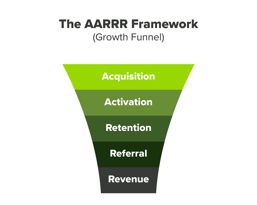
We had many problems scaling. I'll explain using the AARRR model.
Brand unfamiliarity or a novel product offering were the problems with awareness. Nobody knew what Freedo was or what it did.
Problem with awareness: Content and advertisements did a poor job of communicating the task at hand. The advertisements clashed with the white-collar part because they were too cheesy.
Retention Issue: We encountered issues, indicating that the product was insufficient. Problems with keyless entry, creating bills, stealing helmets, etc.
Retention/Revenue Issue: Costly compared to established rivals. Shared cars were 1/3 of our cost.
Referral Issue: Missing the opportunity to seize the AHA moment. After the ride, nobody remembered us.
Once you know where you're struggling with AARRR, iterative solutions are usually best.
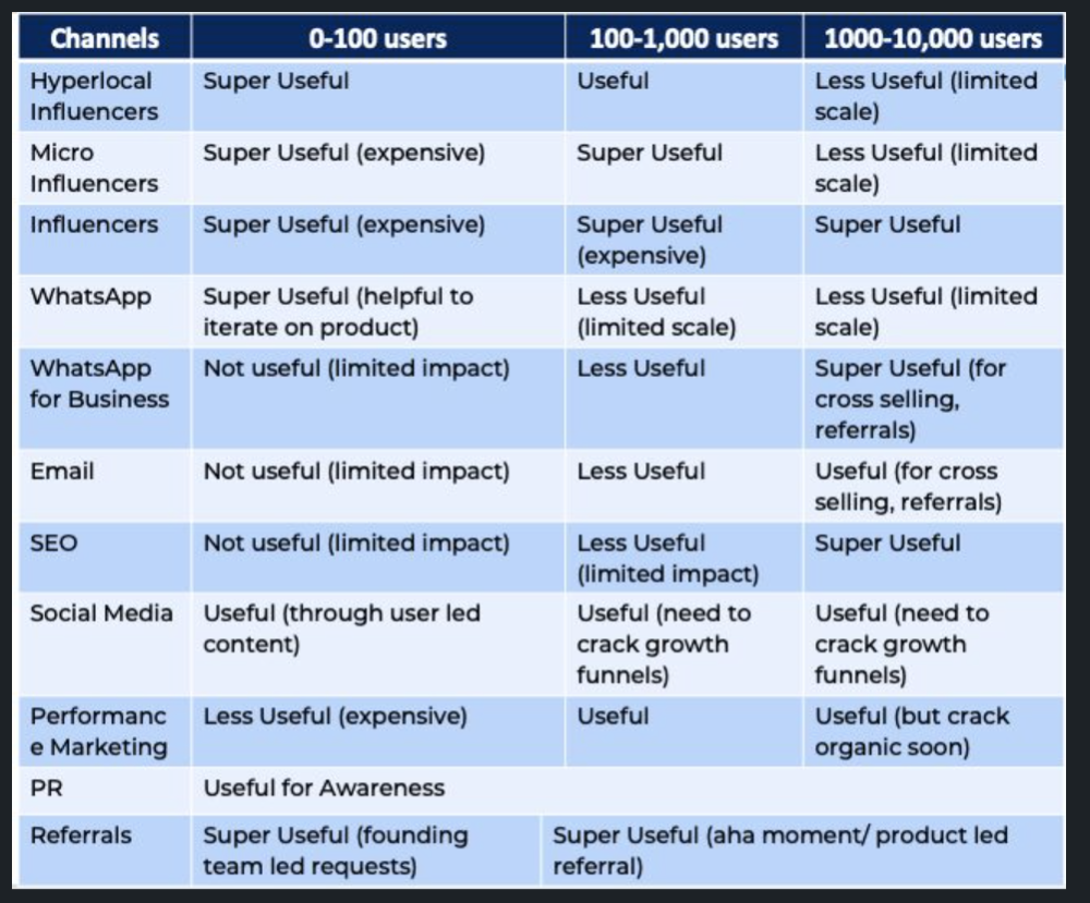
Once you have nailed the AARRR model, most startups use paid channels to scale. This dependence, on paid channels, increases with scale unless you crack your organic/inbound game.
Over-index growth loops. Growth loops increase inflow and customers as you scale.
When considering growth, ask yourself:
Who is the solution's ICP (Ideal Customer Profile)? (To whom are you selling)
What are the most important messages I should convey to customers? (This is an A/B test.)
Which marketing channels ought I prioritize? (Conduct analysis based on the startup's maturity/stage.)
Choose the important metrics to monitor for your AARRR funnel (not all metrics are equal)
Identify the Flywheel effect's growth loops (inertia matters)
My biggest mistakes:
not paying attention to consumer comments or satisfaction. It is the main cause of problems with referrals, retention, and acquisition for startups. Beyond your NPS, you should consider second-order consequences.
The tasks at hand should be quite clear.
Here's my scaling equation:
Growth = A x B x C
A = Funnel top (Traffic)
B = Product Valuation (Solving a real pain point)
C = Aha! (Emotional response)
Freedo's A, B, and C created a unique offering.
Freedo’s ABC:
A — Working or Studying population in NCR
B — Electric Vehicles provide last-mile mobility as a clean and affordable solution
C — One click booking with a no-noise scooter
Final outcome:
FWe scaled Freedo to Rs. 50 lakh MRR and were growing 60% month on month till the pandemic ceased our growth story.
How we did it?
We tried ambassadors and coupons. WhatsApp was our most successful A/B test.
We grew widespread adoption through college and society WhatsApp groups. We requested users for referrals in community groups.
What worked for us won't work for others. This scale underwent many revisions.
Every firm is different, thus you must know your customers. Needs to determine which channel to prioritize and when.
Users desired a safe, time-bound means to get there.
This (not mine) growth framework helped me a lot. You should follow suit.

Nick
3 years ago
This Is How Much Quora Paid Me For 23 Million Content Views
You’ll be surprised; I sure was

Blogging and writing online as a side income has now been around for a significant amount of time. Nowadays, it is a continuously rising moneymaker for prospective writers, with several writing platforms existing online. At the top of the list are Medium, Vocal Media, Newsbreak, and the biggest one of them, Quora, with 300 million active users.
Quora, unlike Medium, is a question-and-answer format platform. On Medium you are permitted to write what you want, while on Quora, you answer questions on topics that you have expertise about. Quora, like Medium, now compensates its authors for the answers they provide in comparison to the previous, in which you had to be admitted to the partner program and were paid to ask questions.
Quora just recently went live with this new partner program, Quora Plus, and the way it works is that it is a subscription for $5 a month which provides you access to metered/monetized stories, in turn compensating the writers for part of that subscription for their answers.
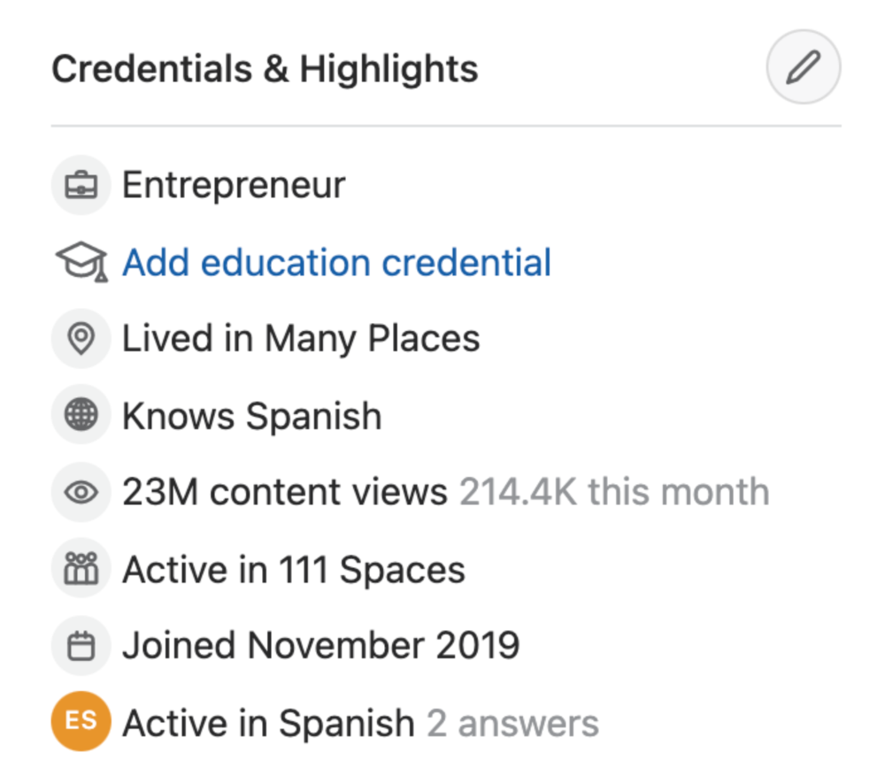
I too on Quora have found a lot of success on the platform, gaining 23 Million Content Views, and 300,000 followers for my space, which is kind of the Quora equivalent of a Medium article. The way in which I was able to do this was entirely thanks to a hack that I uncovered to the Quora algorithm.
In this article, I plan on discussing how much money I received from 23 million content views on Quora, and I bet you’ll be shocked; I know I was.
A Brief Explanation of How I Got 23 Million Views and How You Can Do It Too
On Quora, everything in terms of obtaining views is about finding the proper question, which I only understood quite late into the game. I published my first response in 2019 but never actually wrote on Quora until the summer of 2020, and about a month into posting consistently I found out how to find the perfect question. Here’s how:
The Process
Go to your Home Page and start scrolling… While browsing, check for the following things…
Answers from people you follow or your followers.
Advertisements
These two things are the two things you want to ignore, you don’t want to answer those questions or look at the ads. You should now be left with a couple of recommended answers. To discover which recommended answer is the best to answer as well, look at these three important aspects.
Date of the answer: Was it in the past few days, preferably 2–3 days, even better, past 24 hours?
Views: Are they in the ten thousands or hundred thousands?
Upvotes: Are they in the hundreds or thousands?
Now, choose an answer to a question which you think you could answer as well that satisfies the requirements above. Once you click on it, as all answers on Quora works, it will redirect you to the page for that question, in which you will have to select once again if you should answer the question.
Amount of answers: How many responses are there to the given question? This tells you how much competition you have. My rule is beyond 25 answers, you shouldn’t answer, but you can change it anyway you’d like.
Answerers: Who did the answering for the question? If the question includes a bunch of renowned, extremely well-known people on Quora, there’s a good possibility your essay is going to get drowned out.
Views: Check for a constant quantity of high views on each answer for the question; this is what will guarantee that your answer gets a lot of views!
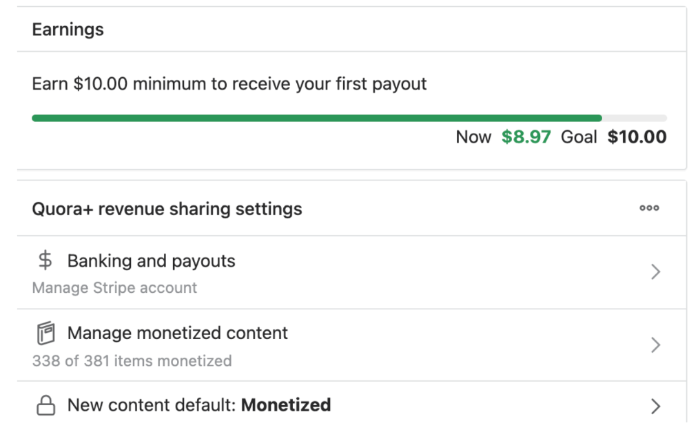
The Income Reveal! How Much I Made From 23 Million Content Views
DRUM ROLL, PLEASE!
8.97 USD. Yes, not even ten dollars, not even nine. Just eight dollars and ninety-seven cents.
Possible Reasons for My Low Earnings
Quora Plus and the answering partner program are newer than my Quora views.
Few people use Quora+, therefore revenues are low.
I haven't been writing much on Quora, so I'm only making money from old answers and a handful since Quora Plus launched.
Quora + pays poorly...
Should You Try Quora and Quora For Money?
My answer depends on your needs. I never got invited to Quora's question partner program due to my late start, but other writers have made hundreds. Due to Quora's new and competitive answering partner program, you may not make much money.
If you want a fun writing community, try Quora. Quora was fun when I only made money from my space. Quora +'s paywalls and new contributors eager to make money have made the platform less fun for me.
This article is a summary to save you time. You can read my full, more detailed article, here.
You might also like

Sam Warain
3 years ago
The Brilliant Idea Behind Kim Kardashian's New Private Equity Fund

Kim Kardashian created Skky Partners. Consumer products, internet & e-commerce, consumer media, hospitality, and luxury are company targets.
Some call this another Kardashian publicity gimmick.
This maneuver is brilliance upon closer inspection. Why?
1) Kim has amassed a sizable social media fan base:
Over 320 million Instagram and 70 million Twitter users follow Kim Kardashian.
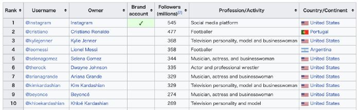
Kim Kardashian's Instagram account ranks 8th. Three Kardashians in top 10 is ridiculous.
This gives her access to consumer data. She knows what people are discussing. Investment firms need this data.
Quality, not quantity, of her followers matters. Studies suggest that her following are more engaged than Selena Gomez and Beyonce's.
Kim's followers are worth roughly $500 million to her brand, according to a research. They trust her and buy what she recommends.
2) She has a special aptitude for identifying trends.
Kim Kardashian can sense trends.
She's always ahead of fashion and beauty trends. She's always trying new things, too. She doesn't mind making mistakes when trying anything new. Her desire to experiment makes her a good business prospector.
Kim has also created a lifestyle brand that followers love. Kim is an entrepreneur, mom, and role model, not just a reality TV star or model. She's established a brand around her appearance, so people want to buy her things.
Her fragrance collection has sold over $100 million since its 2009 introduction, and her Sears apparel line did over $200 million in its first year.
SKIMS is her latest $3.2bn brand. She can establish multibillion-dollar firms with her enormous distribution platform.
Early founders would kill for Kim Kardashian's network.
Making great products is hard, but distribution is more difficult. — David Sacks, All-in-Podcast
3) She can delegate the financial choices to Jay Sammons, one of the greatest in the industry.
Jay Sammons is well-suited to develop Kim Kardashian's new private equity fund.
Sammons has 16 years of consumer investing experience at Carlyle. This will help Kardashian invest in consumer-facing enterprises.
Sammons has invested in Supreme and Beats Electronics, both of which have grown significantly. Sammons' track record and competence make him the obvious choice.
Kim Kardashian and Jay Sammons have joined forces to create a new business endeavor. The agreement will increase Kardashian's commercial empire. Sammons can leverage one of the world's most famous celebrities.
“Together we hope to leverage our complementary expertise to build the next generation consumer and media private equity firm” — Kim Kardashian
Kim Kardashian is a successful businesswoman. She developed an empire by leveraging social media to connect with fans. By developing a global lifestyle brand, she has sold things and experiences that have made her one of the world's richest celebrities.
She's a shrewd entrepreneur who knows how to maximize on herself and her image.
Imagine how much interest Kim K will bring to private equity and venture capital.
I'm curious about the company's growth.
James Brockbank
3 years ago
Canonical URLs for Beginners
Canonicalization and canonical URLs are essential for SEO, and improper implementation can negatively impact your site's performance.
Canonical tags were introduced in 2009 to help webmasters with duplicate or similar content on multiple URLs.
To use canonical tags properly, you must understand their purpose, operation, and implementation.
Canonical URLs and Tags
Canonical tags tell search engines that a certain URL is a page's master copy. They specify a page's canonical URL. Webmasters can avoid duplicate content by linking to the "canonical" or "preferred" version of a page.
How are canonical tags and URLs different? Can these be specified differently?
Tags
Canonical tags are found in an HTML page's head></head> section.
<link rel="canonical" href="https://www.website.com/page/" />These can be self-referencing or reference another page's URL to consolidate signals.
Canonical tags and URLs are often used interchangeably, which is incorrect.
The rel="canonical" tag is the most common way to set canonical URLs, but it's not the only way.
Canonical URLs
What's a canonical link? Canonical link is the'master' URL for duplicate pages.
In Google's own words:
A canonical URL is the page Google thinks is most representative of duplicate pages on your site.
— Google Search Console Help
You can indicate your preferred canonical URL. For various reasons, Google may choose a different page than you.
When set correctly, the canonical URL is usually your specified URL.
Canonical URLs determine which page will be shown in search results (unless a duplicate is explicitly better for a user, like a mobile version).
Canonical URLs can be on different domains.
Other ways to specify canonical URLs
Canonical tags are the most common way to specify a canonical URL.
You can also set canonicals by:
Setting the HTTP header rel=canonical.
All pages listed in a sitemap are suggested as canonicals, but Google decides which pages are duplicates.
Redirects 301.
Google recommends these methods, but they aren't all appropriate for every situation, as we'll see below. Each has its own recommended uses.
Setting canonical URLs isn't required; if you don't, Google will use other signals to determine the best page version.
To control how your site appears in search engines and to avoid duplicate content issues, you should use canonicalization effectively.
Why Duplicate Content Exists
Before we discuss why you should use canonical URLs and how to specify them in popular CMSs, we must first explain why duplicate content exists. Nobody intentionally duplicates website content.
Content management systems create multiple URLs when you launch a page, have indexable versions of your site, or use dynamic URLs.
Assume the following URLs display the same content to a user:
A search engine sees eight duplicate pages, not one.
URLs #1 and #2: the CMS saves product URLs with and without the category name.
#3, #4, and #5 result from the site being accessible via HTTP, HTTPS, www, and non-www.
#6 is a subdomain mobile-friendly URL.
URL #7 lacks URL #2's trailing slash.
URL #8 uses a capital "A" instead of a lowercase one.
Duplicate content may also exist in URLs like:
https://www.website.com
https://www.website.com/index.php
Duplicate content is easy to create.
Canonical URLs help search engines identify different page variations as a single URL on many sites.
SEO Canonical URLs
Canonical URLs help you manage duplicate content that could affect site performance.
Canonical URLs are a technical SEO focus area for many reasons.
Specify URL for search results
When you set a canonical URL, you tell Google which page version to display.
Which would you click?
https://www.domain.com/page-1/
https://www.domain.com/index.php?id=2
First, probably.
Canonicals tell search engines which URL to rank.
Consolidate link signals on similar pages
When you have duplicate or nearly identical pages on your site, the URLs may get external links.
Canonical URLs consolidate multiple pages' link signals into a single URL.
This helps your site rank because signals from multiple URLs are consolidated into one.
Syndication management
Content is often syndicated to reach new audiences.
Canonical URLs consolidate ranking signals to prevent duplicate pages from ranking and ensure the original content ranks.
Avoid Googlebot duplicate page crawling
Canonical URLs ensure that Googlebot crawls your new pages rather than duplicated versions of the same one across mobile and desktop versions, for example.
Crawl budgets aren't an issue for most sites unless they have 100,000+ pages.
How to Correctly Implement the rel=canonical Tag
Using the header tag rel="canonical" is the most common way to specify canonical URLs.
Adding tags and HTML code may seem daunting if you're not a developer, but most CMS platforms allow canonicals out-of-the-box.
These URLs each have one product.
How to Correctly Implement a rel="canonical" HTTP Header
A rel="canonical" HTTP header can replace canonical tags.
This is how to implement a canonical URL for PDFs or non-HTML documents.
You can specify a canonical URL in your site's.htaccess file using the code below.
<Files "file-to-canonicalize.pdf"> Header add Link "< http://www.website.com/canonical-page/>; rel=\"canonical\"" </Files>301 redirects for canonical URLs
Google says 301 redirects can specify canonical URLs.
Only the canonical URL will exist if you use 301 redirects. This will redirect duplicates.
This is the best way to fix duplicate content across:
HTTPS and HTTP
Non-WWW and WWW
Trailing-Slash and Non-Trailing Slash URLs
On a single page, you should use canonical tags unless you can confidently delete and redirect the page.
Sitemaps' canonical URLs
Google assumes sitemap URLs are canonical, so don't include non-canonical URLs.
This does not guarantee canonical URLs, but is a best practice for sitemaps.
Best-practice Canonical Tag
Once you understand a few simple best practices for canonical tags, spotting and cleaning up duplicate content becomes much easier.
Always include:
One canonical URL per page
If you specify multiple canonical URLs per page, they will likely be ignored.
Correct Domain Protocol
If your site uses HTTPS, use this as the canonical URL. It's easy to reference the wrong protocol, so check for it to catch it early.
Trailing slash or non-trailing slash URLs
Be sure to include trailing slashes in your canonical URL if your site uses them.
Specify URLs other than WWW
Search engines see non-WWW and WWW URLs as duplicate pages, so use the correct one.
Absolute URLs
To ensure proper interpretation, canonical tags should use absolute URLs.
So use:
<link rel="canonical" href="https://www.website.com/page-a/" />And not:
<link rel="canonical" href="/page-a/" />If not canonicalizing, use self-referential canonical URLs.
When a page isn't canonicalizing to another URL, use self-referencing canonical URLs.
Canonical tags refer to themselves here.
Common Canonical Tags Mistakes
Here are some common canonical tag mistakes.
301 Canonicalization
Set the canonical URL as the redirect target, not a redirected URL.
Incorrect Domain Canonicalization
If your site uses HTTPS, don't set canonical URLs to HTTP.
Irrelevant Canonicalization
Canonicalize URLs to duplicate or near-identical content only.
SEOs sometimes try to pass link signals via canonical tags from unrelated content to increase rank. This isn't how canonicalization should be used and should be avoided.
Multiple Canonical URLs
Only use one canonical tag or URL per page; otherwise, they may all be ignored.
When overriding defaults in some CMSs, you may accidentally include two canonical tags in your page's <head>.
Pagination vs. Canonicalization
Incorrect pagination can cause duplicate content. Canonicalizing URLs to the first page isn't always the best solution.
Canonicalize to a 'view all' page.
How to Audit Canonical Tags (and Fix Issues)
Audit your site's canonical tags to find canonicalization issues.
SEMrush Site Audit can help. You'll find canonical tag checks in your website's site audit report.
Let's examine these issues and their solutions.
No Canonical Tag on AMP
Site Audit will flag AMP pages without canonical tags.
Canonicalization between AMP and non-AMP pages is important.
Add a rel="canonical" tag to each AMP page's head>.
No HTTPS redirect or canonical from HTTP homepage
Duplicate content issues will be flagged in the Site Audit if your site is accessible via HTTPS and HTTP.
You can fix this by 301 redirecting or adding a canonical tag to HTTP pages that references HTTPS.
Broken canonical links
Broken canonical links won't be considered canonical URLs.
This error could mean your canonical links point to non-existent pages, complicating crawling and indexing.
Update broken canonical links to the correct URLs.
Multiple canonical URLs
This error occurs when a page has multiple canonical URLs.
Remove duplicate tags and leave one.
Canonicalization is a key SEO concept, and using it incorrectly can hurt your site's performance.
Once you understand how it works, what it does, and how to find and fix issues, you can use it effectively to remove duplicate content from your site.
Canonicalization SEO Myths

INTΞGRITY team
3 years ago
Terms of Service
Effective: August 31, 2022
These Terms of Service ("Terms") govern your access to and use of INTΞGRITY’s (or "we") websites, mobile applications, and other online products and services (collectively, the "Services"). By clicking your assent (e.g. "Continue," "Sign-in," or "Sign-up") or by utilizing our Services, you consent to these Terms, including the mandatory arbitration provision and class action waiver in the Resolving Disputes; Binding Arbitration Section.
Our Privacy Policy describes how we gather and utilize your information, while our Rules detail your duties when utilizing our Services. You agree to be bound by these Terms and our Rules by utilizing our Services. Please refer to our Privacy Statement for details on how we collect, utilize, disclose, and otherwise manage your information.
Please contact us at hello@int3grity.com if you have any queries regarding these Terms or our Services.
Account Details and Responsibilities
You are responsible for your use of the Services and any content you contribute, including compliance with all relevant laws. The Services may host content that is protected by the intellectual property rights of third parties. Please do not copy, post, download, or distribute content without permission.
You must adhere to our Rules when using the Services.
To use any or all of our services, you may need to register for an account. Contribute to the protection of your account. Protect your account's password, and maintain accurate account details. We advise you not to share your password with anyone else.
If you are accepting these Terms and using the Services on behalf of someone else (such as another person or entity), you confirm that you are allowed to do so, and the words "you" or "your" in these Terms refer to that other person or entity.
You must be at least 13 years old to access our services.
If you use the Services to access, collect, or otherwise utilize the personal information of other INTΞGRITY users ("Personal Information"), you agree to comply with all applicable laws. You also undertake not to sell any Personal Information, where "sell" has the meaning ascribed to it by relevant legislation.
For Personal Information you provide to us (as a Newsletter Editor, for example), you represent and warrant that you have lawfully collected the Personal Information and that you or a third party have provided all required notices and obtained all required consents prior to collecting the Personal Information. You further represent and warrant that INTΞGRITY’s use of such Personal Information in accordance with the purposes for which you provided the Personal Information will not violate, misappropriate, or infringe any rights of a third party (including intellectual property rights or privacy rights) or cause us to violate any applicable laws.
The Services' User Content
INTΞGRITY may monitor your conduct and material for compliance with these Terms and our Rules, and reserves the right to remove any content that violates these guidelines.
INTΞGRITY maintains the right to remove or disable content that is accused to violate the intellectual property rights of others, as well as to cancel the accounts of repeat infringers. We respond to notifications of alleged copyright violations if they comply with the law; please report such notices using our Copyright Policy.
Ownership and Rights
You maintain ownership of all content that you submit, upload, or display on or through the Services.
By submitting, posting, or displaying content on or through the Services, unless otherwise agreed in writing, you grant INTΞGRITY a nonexclusive, royalty-free, worldwide, fully paid, and sublicensable license to use, reproduce, modify, adapt, publish, translate, create derivative works from, distribute, publicly perform and display your content and any name, username or likeness provided in connection with your content in all media formats and distribution methods now known or later developed.
INTΞGRITY requires this license because you are the owner of your material, and INTΞGRITY cannot show it across its multiple platforms (mobile, online) without your consent.
This type of license is also required for content distribution throughout our Services. For example, you may publish a piece on INTΞGRITY. It is duplicated as versions on both our website and app, and distributed to many locations on INTΞGRITY, including the homepage and reading lists. A tweak could be that we display a fragment of your work as a preview (rather than the entire post), with attribution. An example of a derivative work might be a list of top authors or quotations on INTΞGRITY that includes chunks of your article, again with full attribution. This license solely applies to our Services and does not grant us permissions outside of our Services.
So long as you comply with these Terms, INTΞGRITY grants you a limited, non-exclusive, personal, and non-transferable license to access and utilize our Services.
Copyright, trademark, and other United States and international laws protect the Services. These Terms do not grant you any right, title, or interest in the Services, the material posted by other users on the Services, or INTΞGRITY’s trademarks, logos, or other brand characteristics.
In addition to the content you submit, post, or display on our Services, we appreciate your feedback, which may include your thoughts, ideas, and suggestions regarding our Services. This input may be used for any reason at our sole discretion and without obligation to you. We may treat your comments as non-confidential.
We reserve the right, at our sole discretion, to discontinue the Services or any of its features. In addition, we reserve the right to impose limits on use and storage, and to remove or restrict the distribution of content on the Services.
Termination
You are allowed to terminate your use of our services at any time. We have the right to stop or cancel your use of the Services with or without notice.
Moving and Processing Information
To enable us to deliver our Services, you accept that we may handle, transfer, and retain information about you in the United States and other countries, where you may not enjoy the same rights and protections as you do under local law.
Indemnification
To the maximum extent permitted by applicable law, you will indemnify, defend, and hold harmless INTΞGRITY, and our officers, directors, agents, partners, and employees (collectively, the "INTΞGRITY Parties"), from and against any losses, liabilities, claims, demands, damages, expenses or costs ("Claims") arising out of or relating to your violation, misappropriation, or infringement of any rights of another (including intellectual property rights or privacy rights). You undertake to promptly notify INTΞGRITY Parties of any third-party Claims, to assist INTΞGRITY Parties in fighting such Claims, and to pay any fees, charges, and expenses connected with defending such Claims (including attorneys' fees). You further agree that, at INTΞGRITY’s sole discretion, the INTΞGRITY Parties will govern the defense or settlement of any third-party Claims.
Disclaimers — Services Provided "As Is"
INTΞGRITY strives to provide you with excellent Services, but there are certain things we cannot guarantee. Utilization of our services is at your own risk. You acknowledge that our Services and any content uploaded or shared by users on the Services are given "as is" and "as available" without explicit or implied warranties of any kind, including warranties of merchantability, fitness for a particular purpose, title, and non-infringement. In addition, INTΞGRITY does not represent or promise that our Services are accurate, comprehensive, dependable, up-to-date, or error-free. No advice or information gained from INTΞGRITY or via the Services shall create any warranty or representation unless expressly set forth in this section. INTΞGRITY may provide information on third-party products, services, activities, or events, or we may permit third parties to make their material and information accessible via our Services (collectively, "Third-Party Content"). We neither control nor endorse any Third-Party Content, nor do we make any claims or warranties about it. Accessing and utilizing Third-Party Content is at your own risk. The disclaimers in this section may not apply to you if they are prohibited in your location.
Limitation of Liability
We do not exclude or limit our obligation to you where it would be unlawful to do so; this includes any liability for the gross negligence, fraud, or willful misconduct of INTΞGRITY or the other INTΞGRITY Parties in providing the Services. In jurisdictions where the foregoing exclusions are not permitted, our liability to you is limited to losses and damages that are reasonably foreseeable as a result of our failure to exercise reasonable care and skill or breach of contract with you. This paragraph does not impact consumer rights that cannot be waived or limited by contract.
In jurisdictions that permit liability exclusions or limits, INTΞGRITY and INTΞGRITY Parties will not be liable for:
(a) Any indirect, consequential, exemplary, incidental, punitive, or extraordinary damages, or any loss of use, data, or profits, based on any legal theory, even if INTΞGRITY or the other INTΞGRITY Parties were advised of the potential of such damages.
(b) Except for the types of liability we cannot limit by law (as described in this section), we limit the total liability of INTΞGRITY and the other INTΞGRITY Parties for any claim arising out of or related to these Terms or our Services, regardless of the form of action, to $100.00 USD.
Arbitration; Resolution of Disputes
We intend to address your concerns without filing a formal lawsuit. Before making a claim against INTΞGRITY, you agree to contact us and attempt to resolve the dispute informally by emailing hello@int3grity.com or by sending certified mail to INTΞGRITY, P.O. JOY, 479 Jessie St, San Francisco, CA 94103. The notice must (a) contain your name, address, email address, and telephone number; (b) identify the nature and grounds of the claim; and (c) detail the relief requested. Our notice to you will be sent to the email address linked with your online account and will contain the information specified in the preceding section. Any party may commence a formal procedure if we are unable to reach a resolution within thirty (30) days of the date of any notice.
Please read the following section carefully because it compels you to arbitrate certain claims and disputes with INTΞGRITY and limits the method in which you can seek redress from us, unless you opt out of arbitration by following the steps provided below. This arbitration provision does not permit class or representative lawsuits or arbitrations. In addition, arbitration prohibits you from filing a lawsuit or having a jury trial.
(a) Absence of Representative Actions You and INTΞGRITY agree that any dispute arising out of or relating to these Terms or our Services is personal to you and INTΞGRITY and will be resolved entirely via individual action, and not by class arbitration, class action, or other representative procedure.
(b) Dispute Arbitration. Except for small claims disputes in which you or INTΞGRITY seeks to bring an individual action in small claims court located in the county where you reside and disputes in which you or INTΞGRITY seeks injunctive or other equitable relief for the alleged infringement or misappropriation of intellectual property, you and INTΞGRITY waive your rights to a jury trial and to have any other dispute arising out of or relating to these Terms or our Services, including claims related to privity of contract, decided by a jury. All Disputes submitted to JAMS shall be decided by confidential, binding arbitration before a single arbitrator. If you are a consumer, you may choose to have the arbitration in your county of residence. A "consumer" is a person who uses the Services for personal, family, or household purposes for the purposes of this provision. You and INTΞGRITY agree that Disputes shall be resolved using the JAMS Streamlined Arbitration Rules and Procedures ("JAMS Rules"). The latest version of the JAMS Rules is accessible on the JAMS website and is incorporated herein by reference. Either you accept and agree that you have read and comprehended the JAMS Rules or you forfeit your right to read the JAMS Rules and any claim that the JAMS Rules are unreasonable or should not apply for any reason.
(c) You and INTΞGRITY agree that these Terms affect interstate commerce and that the enforceability of this provision is subject to the Federal Arbitration Act, 9 U.S.C. 1 et seq. (the "FAA"), to the maximum extent permissible by applicable law. As limited by the FAA, these Terms, and the JAMS Rules, the arbitrator will have sole authority to make all procedural and substantive judgments regarding any Dispute, and to grant any remedy that would otherwise be available in court, including the authority to determine arbitrability. The arbitrator may only conduct an individual arbitration and may not consolidate the claims of more than one party, preside over any sort of class or representative procedure, or preside over any proceeding involving more than one party.
d) The arbitration will permit the discovery or exchange of nonconfidential information pertinent to the Dispute. The arbitrator, INTΞGRITY, and you will maintain the confidentiality of all arbitration proceedings, judgments, and awards, as well as any information gathered, prepared, or presented for the purposes of the arbitration or relating to the Dispute(s) therein. Unless the law specifies otherwise, the arbitrator will have the right to make decisions that protect confidentiality. The duty of confidentiality does not apply where disclosure is required to prepare for or conduct the arbitration hearing on the merits, in connection with a court application for a preliminary remedy, in connection with a judicial challenge to an arbitration award or its enforcement, or where disclosure is otherwise required by law or judicial decision.
e) You and INTΞGRITY agree that for any arbitration you begin, you will pay the filing fee (up to $250 if you are a consumer) and INTΞGRITY will pay the remaining JAMS fees and costs. INTΞGRITY will pay all JAMS fees and costs for any and all arbitrations it initiates. You and INTΞGRITY agree that the state and federal courts of California and the United States located in San Francisco have exclusive jurisdiction over any appeals and the implementation of an arbitration award.
(f) Any Dispute must be filed within one year after the relevant claim arose; otherwise, the Dispute is permanently barred, meaning that neither you nor INTΞGRITY will be able to assert the claim.
(g) You have the right to opt-out of binding arbitration within 30 days of the date you initially accepted the terms of this section by sending an email to hello@int3grity.com. For the opt-out notification to be effective, it must include your full name and address and clearly explain your intent to opt out of binding arbitration. By declining binding arbitration, you consent to the resolution of Disputes in accordance with "Governing Law and Venue" below.
(h) If any portion of this section is found to be unenforceable or unlawful for any reason: (1) the unenforceable or unlawful provision shall be severed from these Terms; (2) the severance of the unenforceable or unlawful provision shall have no effect whatsoever on the remainder of this section or the parties' ability to compel arbitration of any remaining claims on an individual basis pursuant to this section; and (3) to the extent that any claims must therefore proceed on an individual basis, the parties agree to arbitrate those claims on an individual basis. In addition, if it is determined that any portion of this section prohibits an individual claim seeking public injunctive relief, that provision will be null and void to the extent that such relief may be sought outside of arbitration, and the balance of this section will be enforceable.
Statute and Location
These Terms and any dispute that may arise between you and INTΞGRITY are governed by California law, excluding its conflict of law provisions. Any issue between the parties that is not arbitrable or cannot be heard in small claims court will be determined by the state or federal courts of California and the United States, sitting in San Francisco, California.
Some nations have regulations that require agreements to be controlled by the consumer's country's laws. These statutes are not overridden by this paragraph.
Amendments
Periodically, we may make modifications to these Terms. If we make modifications, we will notify you by sending an email to the address connected with your account, providing an in-product message, or amending the date at the top of these Terms. Unless we specify otherwise in our notification, the modified Terms will take effect immediately, and your continued use of our Services after we issue such notice indicates your acceptance of the changes. If you do not accept the updated Terms, you must cease using our services.
Severability
If any section or portion of a provision of these Terms is determined to be unlawful, void, or unenforceable, that provision or part of the provision shall be deemed severable from these Terms and shall not affect the validity and enforceability of the other terms.
Miscellaneous INTΞGRITY’s omission to assert or enforce any right or term of these Terms is not a waiver of such right or provision. These Terms and the terms and policies specified in the Other Terms and Policies that May Apply to You Section constitute the complete agreement between the parties pertaining to the subject matter hereof and supersede all prior agreements, statements, and understandings between the parties. The section headings in these Terms are for convenience only and have no legal or contractual significance. The use of the word "including" shall be taken to mean "including without limitation." Unless otherwise specified, these Terms are intended solely for the benefit of the parties and are not intended to confer third-party beneficiary rights on any other person or entity. You consent to the use of electronic means for our communications and transactions.