


Yuga Labs’ Otherdeeds NFT mint triggers backlash from community
Unhappy community members accuse Yuga Labs of fraud, manipulation, and favoritism over Otherdeeds NFT mint.
Following the Otherdeeds NFT mint, disgruntled community members took to Twitter to criticize Yuga Labs' handling of the event.
Otherdeeds NFTs were a huge hit with the community, selling out almost instantly. Due to high demand, the launch increased Ethereum gas fees from 2.6 ETH to 5 ETH.
But the event displeased many people. Several users speculated that the mint was “planned to fail” so the group could advertise launching its own blockchain, as the team mentioned a chain migration in one tweet.
Others like Mark Beylin tweeted that he had "sold out" on all Ape-related NFT investments after Yuga Labs "revealed their true colors." Beylin also advised others to assume Yuga Labs' owners are “bad actors.”
Some users who failed to complete transactions claim they lost ETH. However, Yuga Labs promised to refund lost gas fees.
CryptoFinally, a Twitter user, claimed Yuga Labs gave BAYC members better land than non-members. Others who wanted to participate paid for shittier land, while BAYCS got the only worthwhile land.
The Otherdeed NFT drop also increased Ethereum's burn rate. Glassnode and Data Always reported nearly 70,000 ETH burned on mint day.
More on NFTs & Art

shivsak
3 years ago
A visual exploration of the REAL use cases for NFTs in the Future

In this essay, I studied REAL NFT use examples and their potential uses.
Knowledge of the Hype Cycle
Gartner's Hype Cycle.
It proposes 5 phases for disruptive technology.
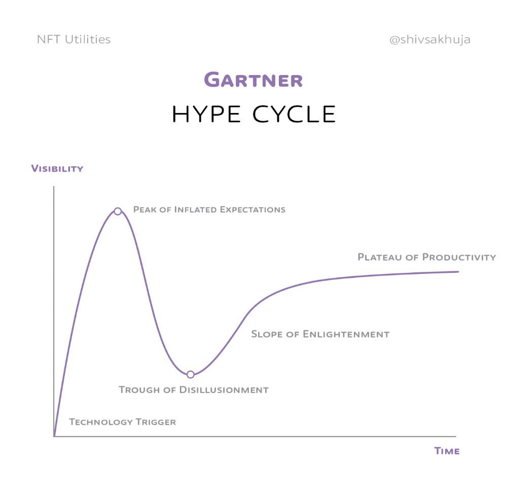
1. Technology Trigger: the emergence of potentially disruptive technology.
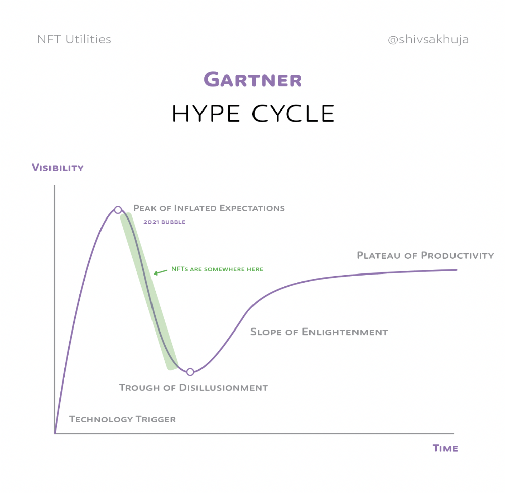
2. Peak of Inflated Expectations: Early publicity creates hype. (Ex: 2021 Bubble)
3. Trough of Disillusionment: Early projects fail to deliver on promises and the public loses interest. I suspect NFTs are somewhere around this trough of disillusionment now.
4. Enlightenment slope: The tech shows successful use cases.
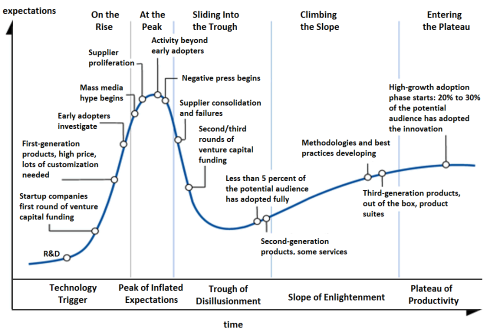
5. Plateau of Productivity: Mainstream adoption has arrived and broader market applications have proven themselves. Here’s a more detailed visual of the Gartner Hype Cycle from Wikipedia.
In the speculative NFT bubble of 2021, @beeple sold Everydays: the First 5000 Days for $69 MILLION in 2021's NFT bubble.
@nbatopshot sold millions in video collectibles.
This is when expectations peaked.
Let's examine NFTs' real-world applications.
Watch this video if you're unfamiliar with NFTs.
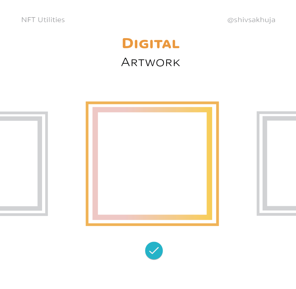
Online Art
Most people think NFTs are rich people buying worthless JPEGs and MP4s.
Digital artwork and collectibles are revolutionary for creators and enthusiasts.
NFT Profile Pictures
You might also have seen NFT profile pictures on Twitter.
My profile picture is an NFT I coined with @skogards factoria app, which helps me avoid bogus accounts.
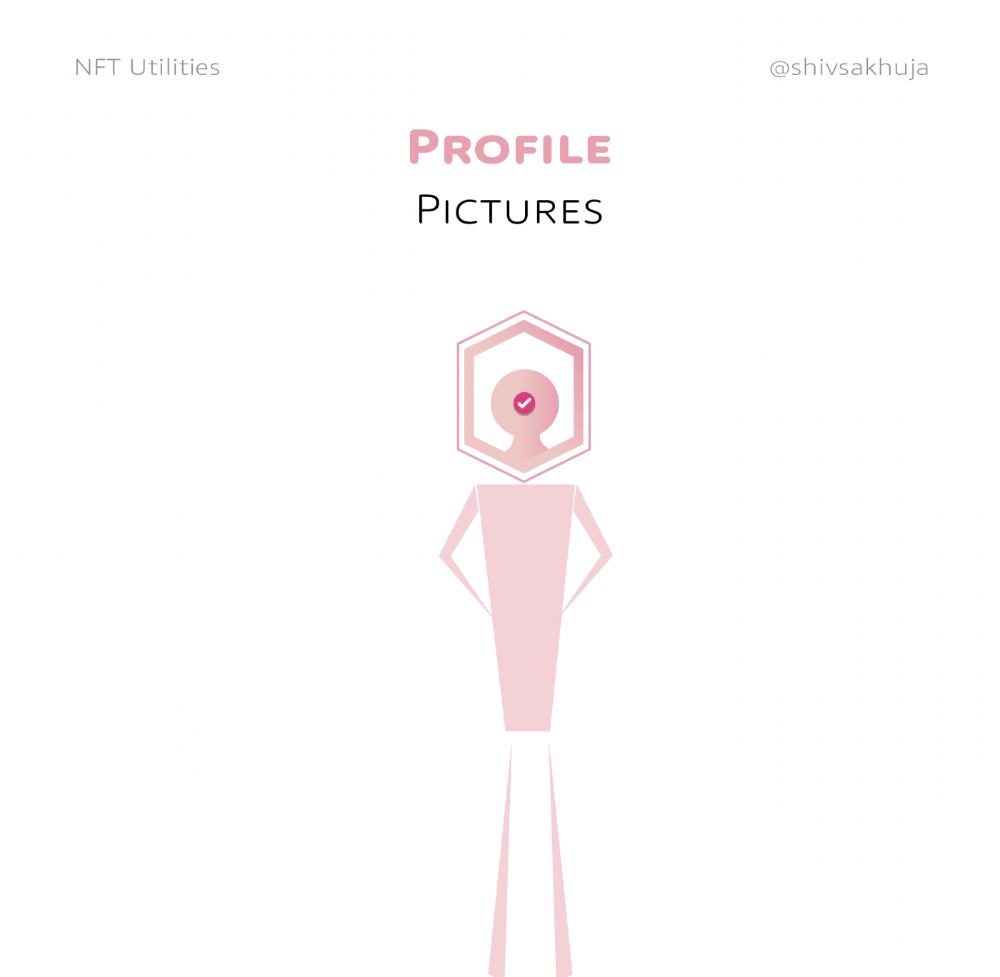
Profile pictures are a good beginning point because they're unique and clearly yours.
NFTs are a way to represent proof-of-ownership. It’s easier to prove ownership of digital assets than physical assets, which is why artwork and pfps are the first use cases.
They can do much more.
NFTs can represent anything with a unique owner and digital ownership certificate. Domains and usernames.
Usernames & Domains
@unstoppableweb, @ensdomains, @rarible sell NFT domains.
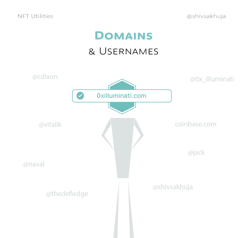
NFT domains are transferable, which is a benefit.
Godaddy and other web2 providers have difficult-to-transfer domains. Domains are often leased instead of purchased.
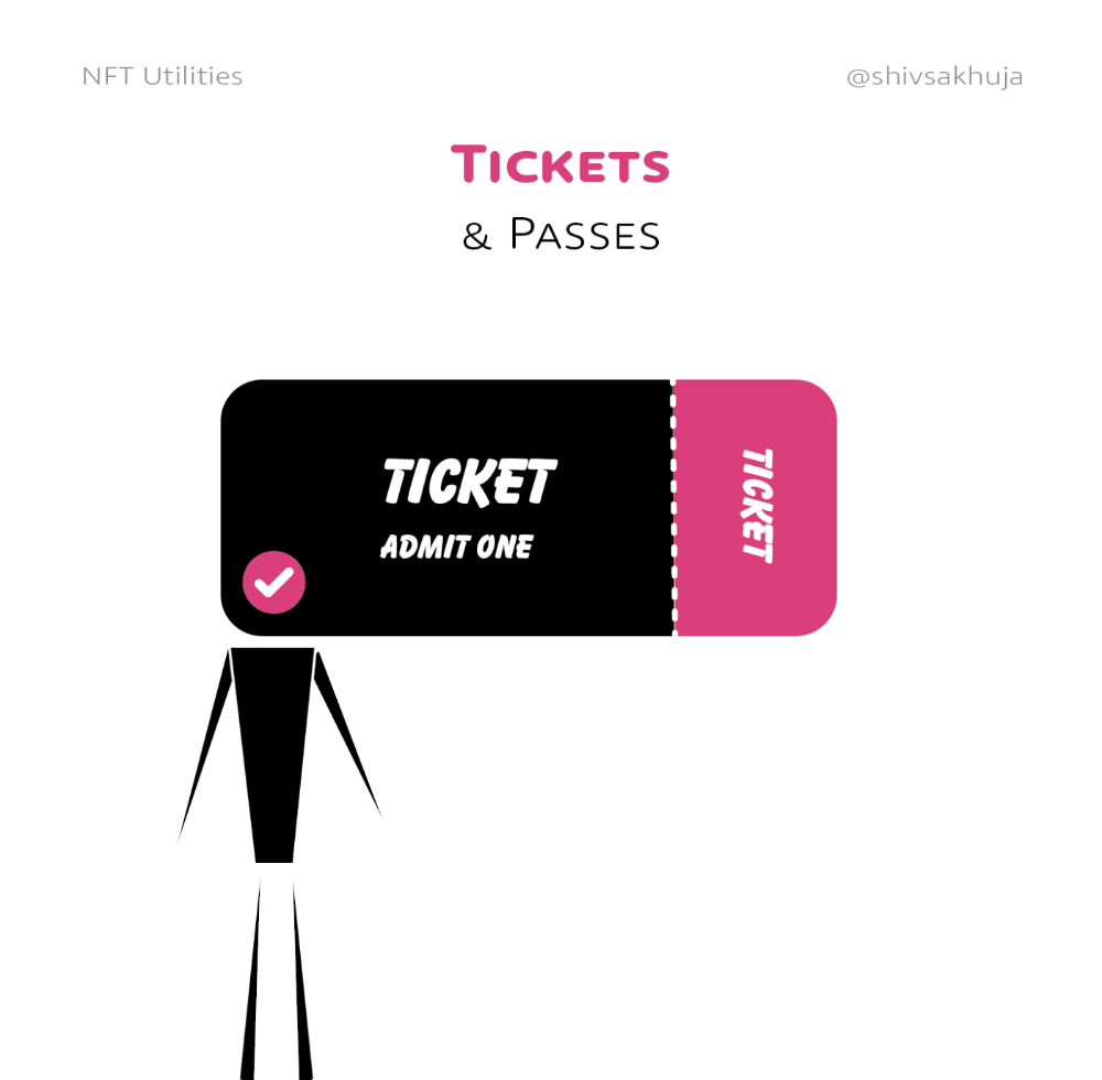
Tickets
NFTs can also represent concert tickets and event passes.
There's a limited number, and entry requires proof.
NFTs can eliminate the problem of forgery and make it easy to verify authenticity and ownership.
NFT tickets can be traded on the secondary market, which allows for:
marketplaces that are uniform and offer the seller and buyer security (currently, tickets are traded on inefficient markets like FB & craigslist)
unbiased pricing
Payment of royalties to the creator
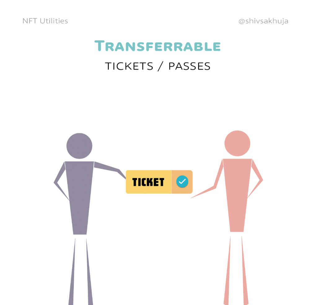
4. Historical ticket ownership data implies performers can airdrop future passes, discounts, etc.
5. NFT passes can be a fandom badge.
The $30B+ online tickets business is increasing fast.
NFT-based ticketing projects:
Gaming Assets
NFTs also help in-game assets.
Imagine someone spending five years collecting a rare in-game blade, then outgrowing or quitting the game. Gamers value that collectible.
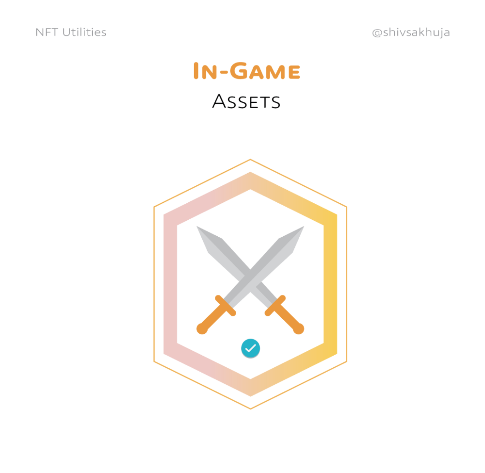
The gaming industry is expected to make $200 BILLION in revenue this year, a significant portion of which comes from in-game purchases.
Royalties on secondary market trading of gaming assets encourage gaming businesses to develop NFT-based ecosystems.
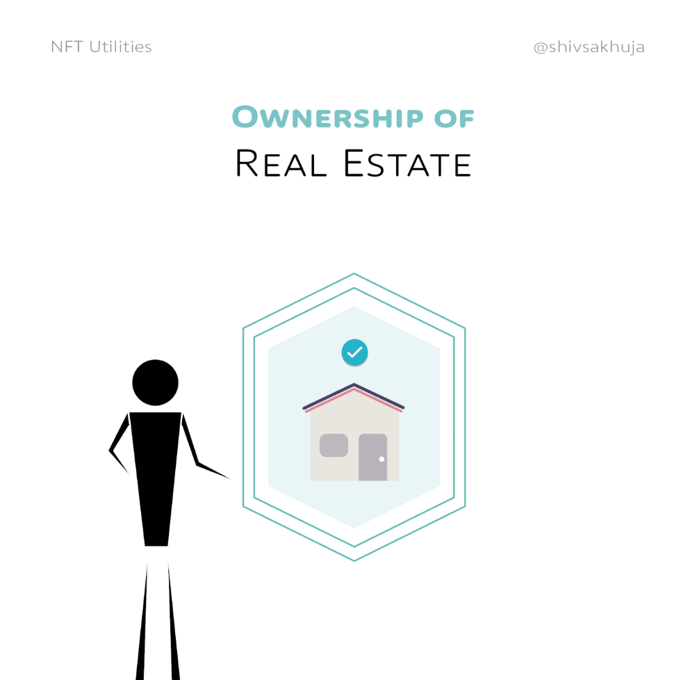
Digital assets are the start. On-chain NFTs can represent real-world assets effectively.
Real estate has a unique owner and requires ownership confirmation.
Real Estate
Tokenizing property has many benefits.
1. Can be fractionalized to increase access, liquidity
2. Can be collateralized to increase capital efficiency and access to loans backed by an on-chain asset
3. Allows investors to diversify or make bets on specific neighborhoods, towns or cities +++
I've written about this thought exercise before.
I made an animated video explaining this.
We've just explored NFTs for transferable assets. But what about non-transferrable NFTs?
SBTs are Soul-Bound Tokens. Vitalik Buterin (Ethereum co-founder) blogged about this.
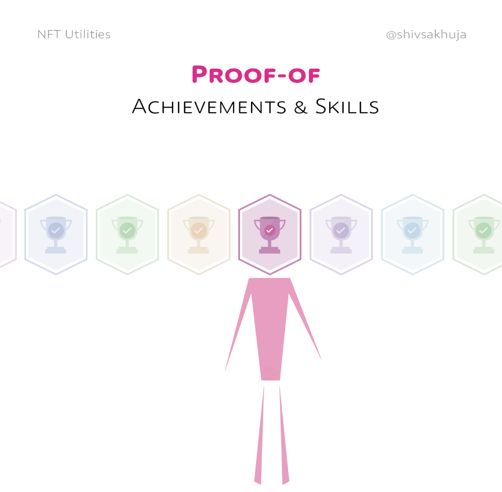
NFTs are basically verifiable digital certificates.
Diplomas & Degrees
That fits Degrees & Diplomas. These shouldn't be marketable, thus they can be non-transferable SBTs.
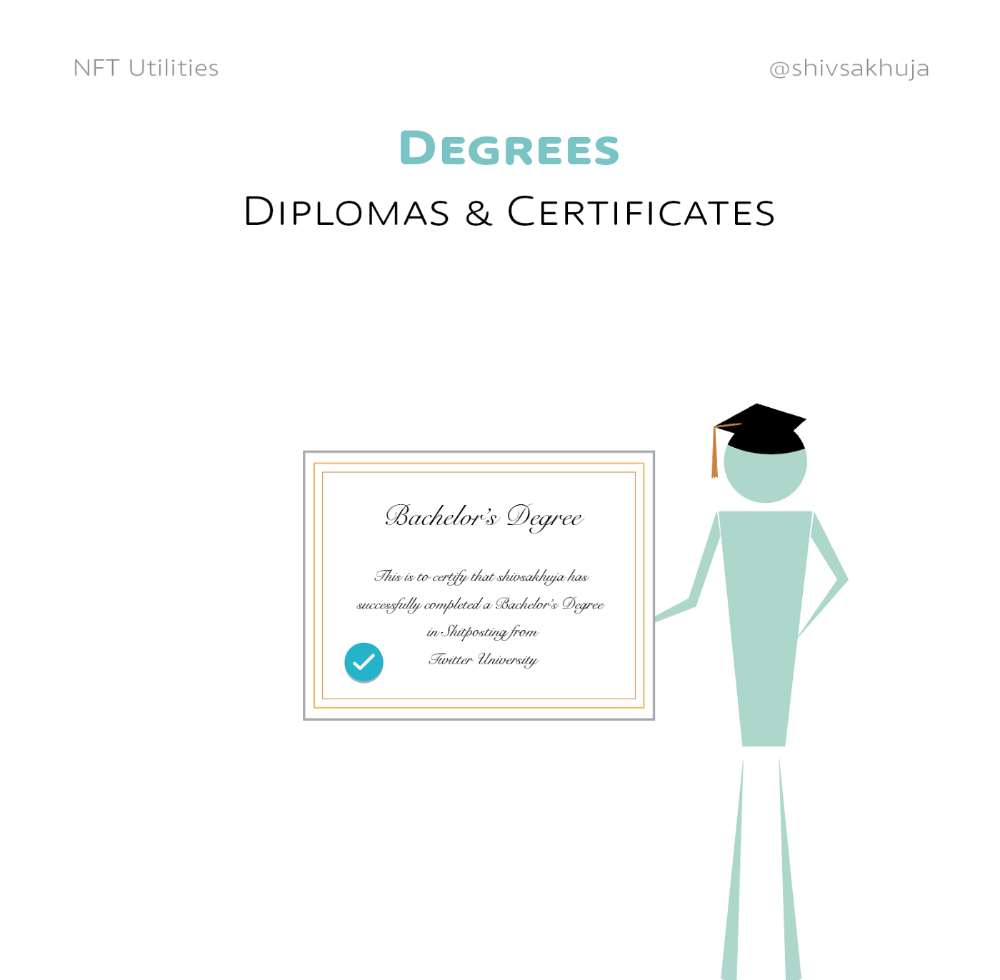
Anyone can verify the legitimacy of on-chain credentials, degrees, abilities, and achievements.
The same goes for other awards.
For example, LinkedIn could give you a verified checkmark for your degree or skills.
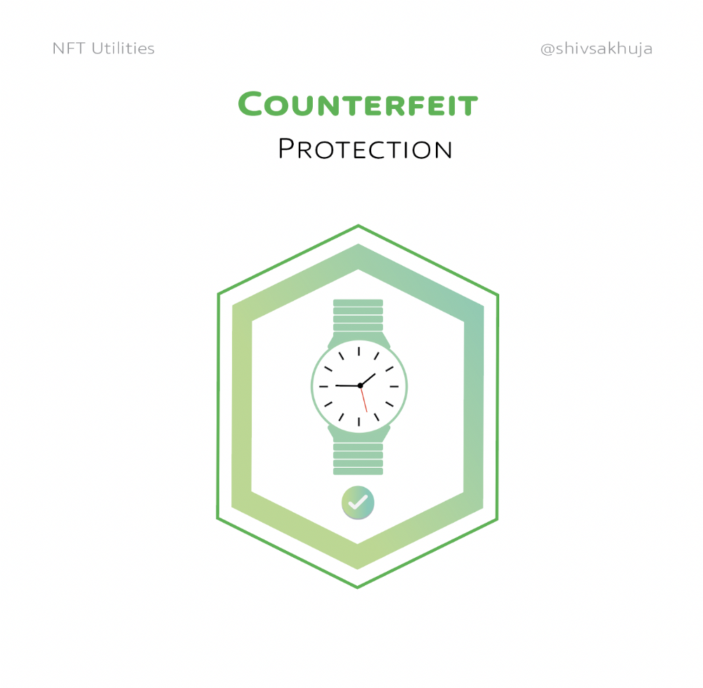
Authenticity Protection
NFTs can also safeguard against counterfeiting.
Counterfeiting is the largest criminal enterprise in the world, estimated to be $2 TRILLION a year and growing.
Anti-counterfeit tech is valuable.
This is one of @ORIGYNTech's projects.
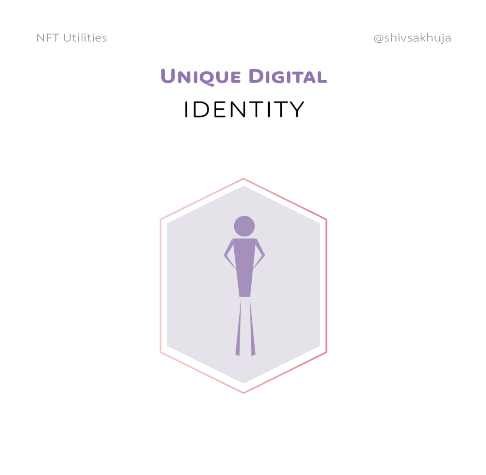
Identity
Identity theft/verification is another real-world problem NFTs can handle.
In the US, 15 million+ citizens face identity theft every year, suffering damages of over $50 billion a year.
This isn't surprising considering all you need for US identity theft is a 9-digit number handed around in emails, documents, on the phone, etc.
Identity NFTs can fix this.
NFTs are one-of-a-kind and unforgeable.
NFTs offer a universal standard.
NFTs are simple to verify.
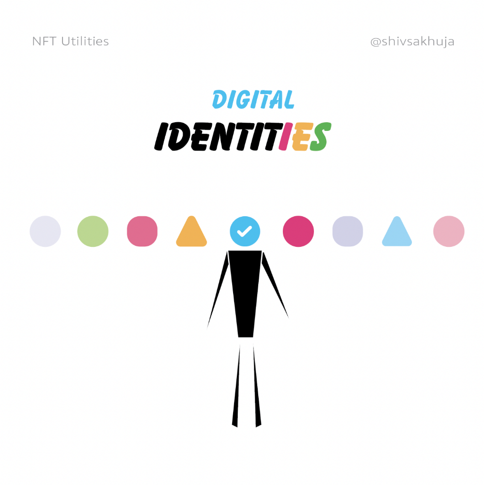
SBTs, or non-transferrable NFTs, are tied to a particular wallet.
In the event of wallet loss or theft, NFTs may be revoked.
This could be one of the biggest use cases for NFTs.
Imagine a global identity standard that is standardized across countries, cannot be forged or stolen, is digital, easy to verify, and protects your private details.
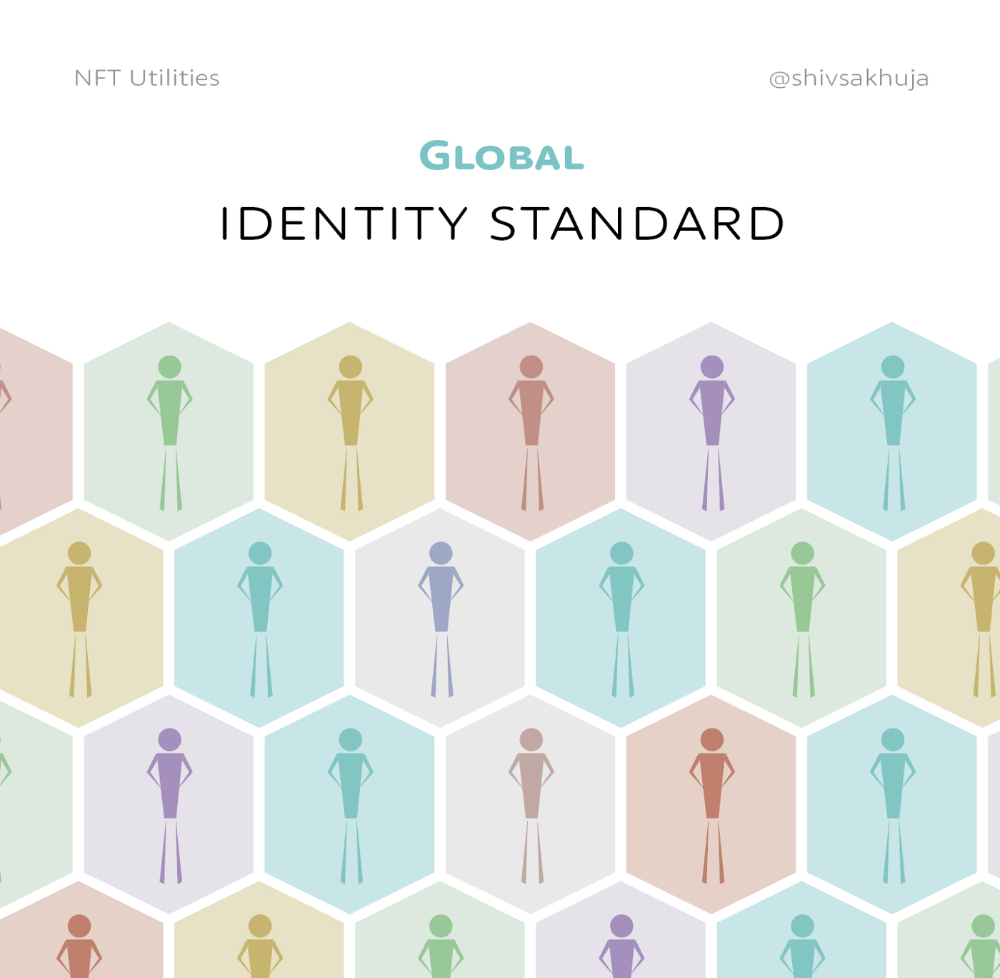
Since your identity is more than your government ID, you may have many NFTs.
@0xPolygon and @civickey are developing on-chain identity.
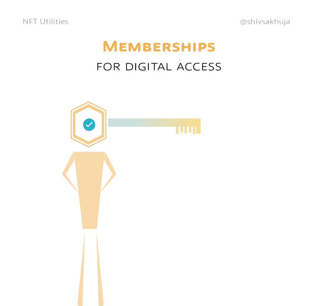
Memberships
NFTs can authenticate digital and physical memberships.
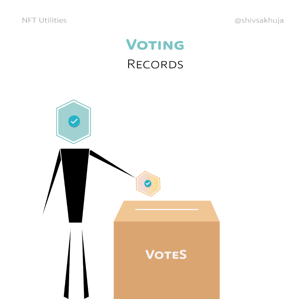
Voting
NFT IDs can verify votes.
If you remember 2020, you'll know why this is an issue.
Online voting's ease can boost turnout.
Informational property
NFTs can protect IP.
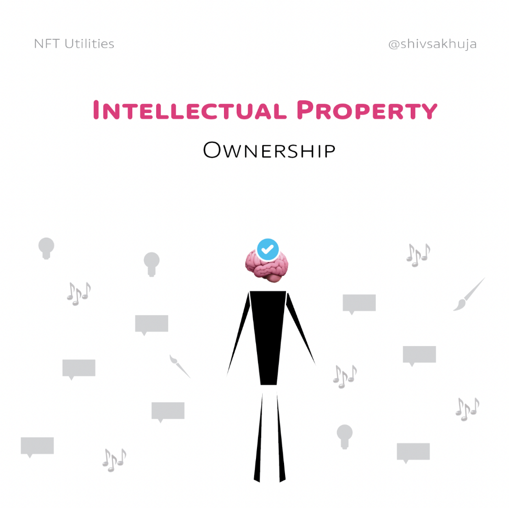
This can earn creators royalties.
NFTs have 2 important properties:
Verifiability IP ownership is unambiguously stated and publicly verified.
Platforms that enable authors to receive royalties on their IP can enter the market thanks to standardization.
Content Rights
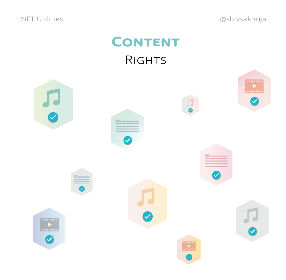
Monetization without copyrighting = more opportunities for everyone.
This works well with the music.
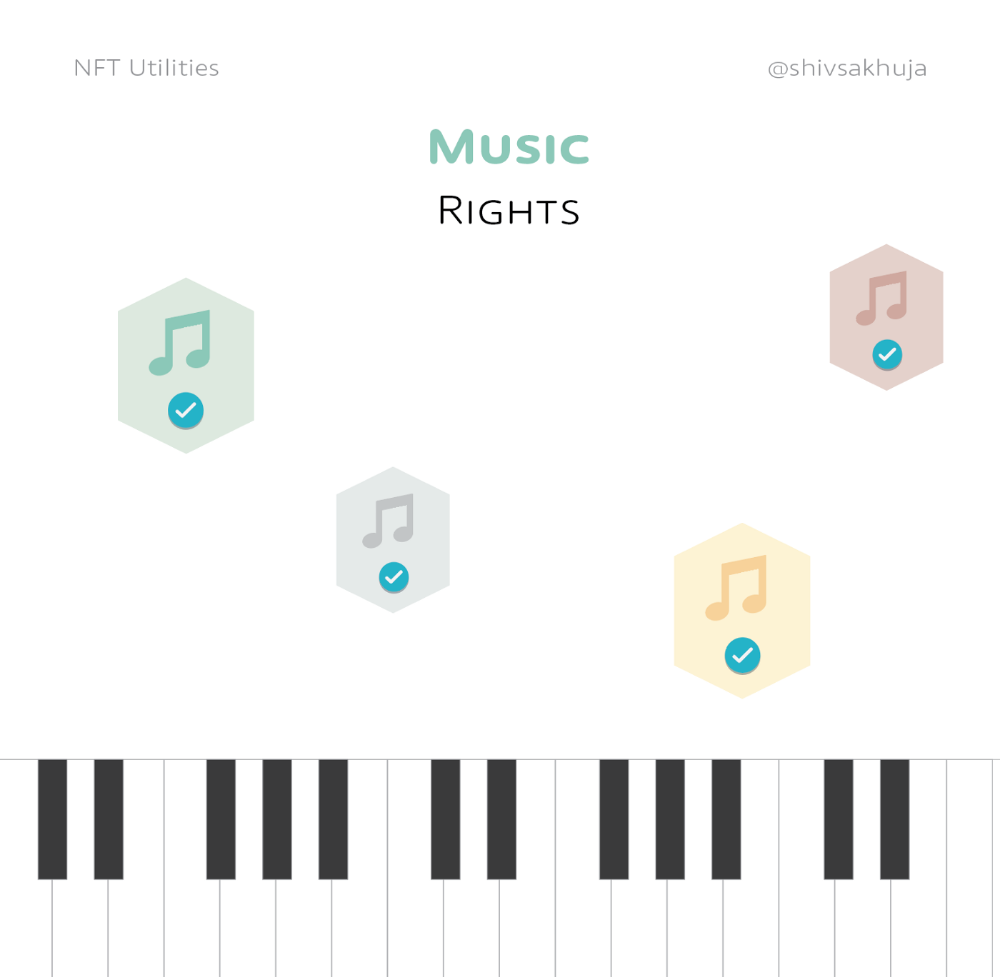
Spotify and Apple Music pay creators very little.
Crowdfunding
Creators can crowdfund with NFTs.
NFTs can represent future royalties for investors.
This is particularly useful for fields where people who are not in the top 1% can’t make money. (Example: Professional sports players)
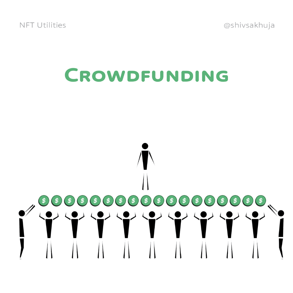
Mirror.xyz allows blog-based crowdfunding.
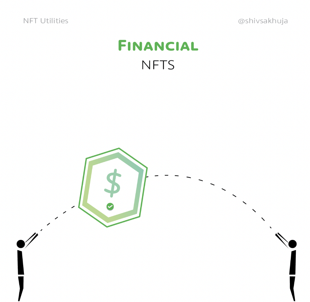
Financial NFTs
This introduces Financial NFTs (fNFTs). Unique financial contracts abound.
Examples:
a person's collection of assets (unique portfolio)
A loan contract that has been partially repaid with a lender
temporal tokens (ex: veCRV)
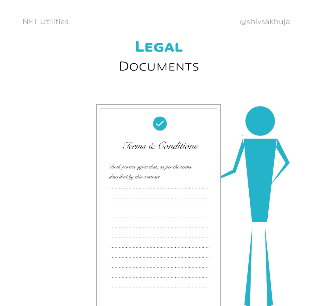
Legal Agreements
Not just financial contracts.
NFT can represent any legal contract or document.
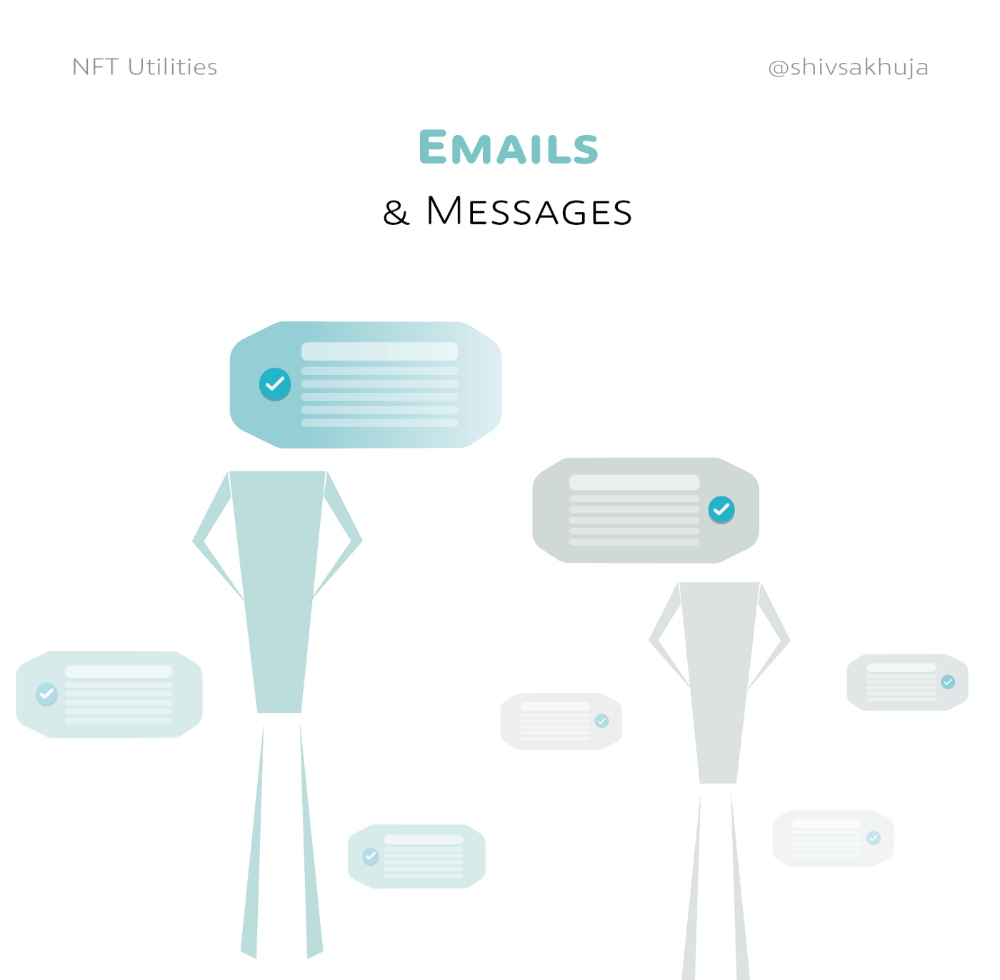
Messages & Emails
What about other agreements? Verbal agreements through emails and messages are likewise unique, but they're easily lost and fabricated.
Health Records
Medical records or prescriptions are another types of documentation that has to be verified but isn't.
Medical NFT examples:
Immunization records
Covid test outcomes
Prescriptions
health issues that may affect one's identity
Observations made via health sensors

Existing systems of proof by paper / PDF have photoshop-risk.
I tried to include most use scenarios, but this is just the beginning.
NFTs have many innovative uses.
For example: @ShaanVP minted an NFT called “5 Minutes of Fame” 👇
Here are 2 Twitter threads about NFTs:
This piece of gold by @chriscantino
2. This conversation between @punk6529 and @RaoulGMI on @RealVision“The World According to @punk6529”
If you're wondering why NFTs are better than web2 databases for these use scenarios, see this Twitter thread I wrote:
If you liked this, please share it.

nft now
3 years ago
Instagram NFTs Are Here… How does this affect artists?
Instagram (IG) is officially joining NFT. With the debut of new in-app NFT functionalities, influential producers can interact with blockchain tech on the social media platform.
Meta unveiled intentions for an Instagram NFT marketplace in March, but these latest capabilities focus more on content sharing than commerce. And why shouldn’t they? IG's entry into the NFT market is overdue, given that Twitter and Discord are NFT hotspots.
The NFT marketplace/Web3 social media race has continued to expand, with the expected Coinbase NFT Beta now live and blazing a trail through the NFT ecosystem.
IG's focus is on visual art. It's unlike any NFT marketplace or platform. IG NFTs and artists: what's the deal? Let’s take a look.
What are Instagram’s NFT features anyways?
As said, not everyone has Instagram's new features. 16 artists, NFT makers, and collectors can now post NFTs on IG by integrating third-party digital wallets (like Rainbow or MetaMask) in-app. IG doesn't charge to publish or share digital collectibles.
NFTs displayed on the app have a "shimmer" aesthetic effect. NFT posts also have a "digital collectable" badge that lists metadata such as the creator and/or owner, the platform it was created on, a brief description, and a blockchain identification.
Meta's social media NFTs have launched on Instagram, but the company is also preparing to roll out digital collectibles on Facebook, with more on the way for IG. Currently, only Ethereum and Polygon are supported, but Flow and Solana will be added soon.
How will artists use these new features?
Artists are publishing NFTs they developed or own on IG by linking third-party digital wallets. These features have no NFT trading aspects built-in, but are aimed to let authors share NFTs with IG audiences.
Creators, like IG-native aerial/street photographer Natalie Amrossi (@misshattan), are discovering novel uses for IG NFTs.
Amrossi chose to not only upload his own NFTs but also encourage other artists in the field. "That's the beauty of connecting your wallet and sharing NFTs. It's not just what you make, but also what you accumulate."
Amrossi has been producing and posting Instagram art for years. With IG's NFT features, she can understand Instagram's importance in supporting artists.
Web2 offered Amrossi the tools to become an artist and make a life. "Before 'influencer' existed, I was just making art. Instagram helped me reach so many individuals and brands, giving me a living.
Even artists without millions of viewers are encouraged to share NFTs on IG. Wilson, a relatively new name in the NFT space, seems to have already gone above and beyond the scope of these new IG features. By releasing "Losing My Mind" via IG NFT posts, she has evaded the lack of IG NFT commerce by using her network to market her multi-piece collection.
"'Losing My Mind' is a long-running photo series. Wilson was preparing to release it as NFTs before IG approached him, so it was a perfect match.
Wilson says the series is about Black feminine figures and media depiction. Respectable effort, given POC artists have been underrepresented in NFT so far.
“Over the past year, I've had mental health concerns that made my emotions so severe it was impossible to function in daily life, therefore that prompted this photo series. Every Wednesday and Friday for three weeks, I'll release a new Meta photo for sale.
Wilson hopes these new IG capabilities will help develop a connection between the NFT community and other internet subcultures that thrive on Instagram.
“NFTs can look scary as an outsider, but seeing them on your daily IG feed makes it less foreign,” adds Wilson. I think Instagram might become a hub for NFT aficionados, making them more accessible to artists and collectors.
What does it all mean for the NFT space?
Meta's NFT and metaverse activities will continue to impact Instagram's NFT ecosystem. Many think it will be for the better, as IG NFT frauds are another problem hurting the NFT industry.
IG's new NFT features seem similar to Twitter's PFP NFT verifications, but Instagram's tools should help cut down on scams as users can now verify the creation and ownership of whole NFT collections included in IG posts.
Given the number of visual artists and NFT creators on IG, it might become another hub for NFT fans, as Wilson noted. If this happens, it raises questions about Instagram success. Will artists be incentivized to distribute NFTs? Or will those with a large fanbase dominate?
Elise Swopes (@swopes) believes these new features should benefit smaller artists. Swopes was one of the first profiles placed to Instagram's original suggested user list in 2012.
Swopes says she wants IG to be a magnet for discovery and understands the value of NFT artists and producers.
"I'd love to see IG become a focus of discovery for everyone, not just the Beeples and Apes and PFPs. That's terrific for them, but [IG NFT features] are more about using new technology to promote emerging artists, Swopes added.
“Especially music artists. It's everywhere. Dancers, writers, painters, sculptors, musicians. My element isn't just for digital artists; it can be anything. I'm delighted to witness people's creativity."
Swopes, Wilson, and Amrossi all believe IG's new features can help smaller artists. It remains to be seen how these new features will effect the NFT ecosystem once unlocked for the rest of the IG NFT community, but we will likely see more social media NFT integrations in the months and years ahead.
Read the full article here

Adrien Book
3 years ago
What is Vitalik Buterin's newest concept, the Soulbound NFT?
Decentralizing Web3's soul
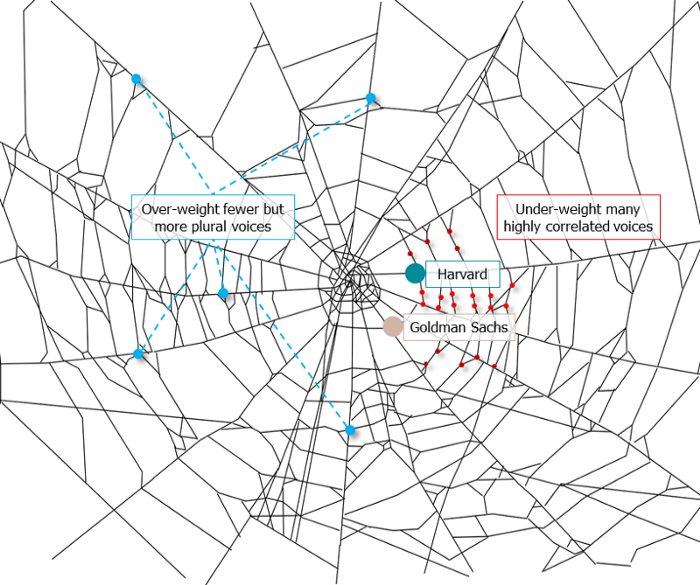
Our tech must reflect our non-transactional connections. Web3 arose from a lack of social links. It must strengthen these linkages to get widespread adoption. Soulbound NFTs help.
This NFT creates digital proofs of our social ties. It embodies G. Simmel's idea of identity, in which individuality emerges from social groups, just as social groups evolve from people.
It's multipurpose. First, gather online our distinctive social features. Second, highlight and categorize social relationships between entities and people to create a spiderweb of networks.
1. 🌐 Reducing online manipulation: Only socially rich or respectable crypto wallets can participate in projects, ensuring that no one can create several wallets to influence decentralized project governance.
2. 🤝 Improving social links: Some sectors of society lack social context. Racism, sexism, and homophobia do that. Public wallets can help identify and connect distinct social groupings.
3. 👩❤️💋👨 Increasing pluralism: Soulbound tokens can ensure that socially connected wallets have less voting power online to increase pluralism. We can also overweight a minority of numerous voices.
4. 💰Making more informed decisions: Taking out an insurance policy requires a life review. Why not loans? Character isn't limited by income, and many people need a chance.
5. 🎶 Finding a community: Soulbound tokens are accessible to everyone. This means we can find people who are like us but also different. This is probably rare among your friends and family.
NFTs are dangerous, and I don't like them. Social credit score, privacy, lost wallet. We must stay informed and keep talking to innovators.
E. Glen Weyl, Puja Ohlhaver and Vitalik Buterin get all the credit for these ideas, having written the very accessible white paper “Decentralized Society: Finding Web3’s Soul”.
You might also like
Isobel Asher Hamilton
3 years ago
$181 million in bitcoin buried in a dump. $11 million to get them back
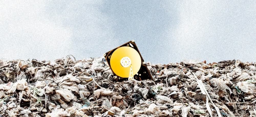
James Howells lost 8,000 bitcoins. He has $11 million to get them back.
His life altered when he threw out an iPhone-sized hard drive.
Howells, from the city of Newport in southern Wales, had two identical laptop hard drives squirreled away in a drawer in 2013. One was blank; the other had 8,000 bitcoins, currently worth around $181 million.
He wanted to toss out the blank one, but the drive containing the Bitcoin went to the dump.
He's determined to reclaim his 2009 stash.
Howells, 36, wants to arrange a high-tech treasure hunt for bitcoins. He can't enter the landfill.

Newport's city council has rebuffed Howells' requests to dig for his hard drive for almost a decade, stating it would be expensive and environmentally destructive.
I got an early look at his $11 million idea to search 110,000 tons of trash. He expects submitting it to the council would convince it to let him recover the hard disk.
110,000 tons of trash, 1 hard drive
Finding a hard disk among heaps of trash may seem Herculean.
Former IT worker Howells claims it's possible with human sorters, robot dogs, and an AI-powered computer taught to find hard drives on a conveyor belt.
His idea has two versions, depending on how much of the landfill he can search.
His most elaborate solution would take three years and cost $11 million to sort 100,000 metric tons of waste. Scaled-down version costs $6 million and takes 18 months.
He's created a team of eight professionals in AI-powered sorting, landfill excavation, garbage management, and data extraction, including one who recovered Columbia's black box data.
The specialists and their companies would be paid a bonus if they successfully recovered the bitcoin stash.
Howells: "We're trying to commercialize this project."
Howells claimed rubbish would be dug up by machines and sorted near the landfill.
Human pickers and a Max-AI machine would sort it. The machine resembles a scanner on a conveyor belt.
Remi Le Grand of Max-AI told us it will train AI to recognize Howells-like hard drives. A robot arm would select candidates.
Howells has added security charges to his scheme because he fears people would steal the hard drive.
He's budgeted for 24-hour CCTV cameras and two robotic "Spot" canines from Boston Dynamics that would patrol at night and look for his hard drive by day.
Howells said his crew met in May at the Celtic Manor Resort outside Newport for a pitch rehearsal.
Richard Hammond's narrative swings from banal to epic.
Richard Hammond filmed the meeting and created a YouTube documentary on Howells.
Hammond said of Howells' squad, "They're committed and believe in him and the idea."
Hammond: "It goes from banal to gigantic." "If I were in his position, I wouldn't have the strength to answer the door."
Howells said trash would be cleaned and repurposed after excavation. Reburying the rest.
"We won't pollute," he declared. "We aim to make everything better."
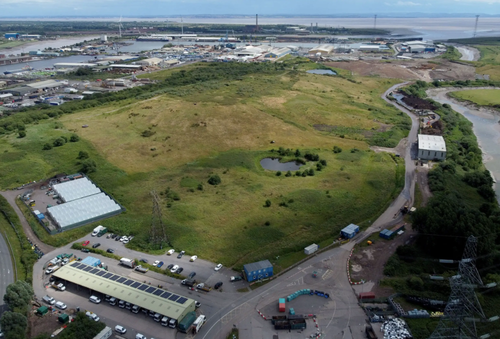
After the project is finished, he hopes to develop a solar or wind farm on the dump site. The council is unlikely to accept his vision soon.
A council representative told us, "Mr. Howells can't convince us of anything." "His suggestions constitute a significant ecological danger, which we can't tolerate and are forbidden by our permit."
Will the recovered hard drive work?
The "platter" is a glass or metal disc that holds the hard drive's data. Howells estimates 80% to 90% of the data will be recoverable if the platter isn't damaged.
Phil Bridge, a data-recovery expert who consulted Howells, confirmed these numbers.

If the platter is broken, Bridge adds, data recovery is unlikely.
Bridge says he was intrigued by the proposal. "It's an intriguing case," he added. Helping him get it back and proving everyone incorrect would be a great success story.
Who'd pay?
Swiss and German venture investors Hanspeter Jaberg and Karl Wendeborn told us they would fund the project if Howells received council permission.
Jaberg: "It's a needle in a haystack and a high-risk investment."
Howells said he had no contract with potential backers but had discussed the proposal in Zoom meetings. "Until Newport City Council gives me something in writing, I can't commit," he added.
Suppose he finds the bitcoins.
Howells said he would keep 30% of the data, worth $54 million, if he could retrieve it.
A third would go to the recovery team, 30% to investors, and the remainder to local purposes, including gifting £50 ($61) in bitcoin to each of Newport's 150,000 citizens.
Howells said he opted to spend extra money on "professional firms" to help convince the council.
What if the council doesn't approve?
If Howells can't win the council's support, he'll sue, claiming its actions constitute a "illegal embargo" on the hard drive. "I've avoided that path because I didn't want to cause complications," he stated. I wanted to cooperate with Newport's council.
Howells never met with the council face-to-face. He mentioned he had a 20-minute Zoom meeting in May 2021 but thought his new business strategy would help.
He met with Jessica Morden on June 24. Morden's office confirmed meeting.
After telling the council about his proposal, he can only wait. "I've never been happier," he said. This is our most professional operation, with the best employees.
The "crypto proponent" buys bitcoin every month and sells it for cash.
Howells tries not to think about what he'd do with his part of the money if the hard disk is found functional. "Otherwise, you'll go mad," he added.
This post is a summary. Read the full article here.

John Rampton
3 years ago
Ideas for Samples of Retirement Letters

Ready to quit full-time? No worries.
Baby Boomer retirement has accelerated since COVID-19 began. In 2020, 29 million boomers retire. Over 3 million more than in 2019. 75 million Baby Boomers will retire by 2030.
First, quit your work to enjoy retirement. Leave a professional legacy. Your retirement will start well. It all starts with a retirement letter.
Retirement Letter
Retirement letters are formal resignation letters. Different from other resignation letters, these don't tell your employer you're leaving. Instead, you're quitting.
Since you're not departing over grievances or for a better position or higher income, you may usually terminate the relationship amicably. Consulting opportunities are possible.
Thank your employer for their support and give them transition information.
Resignation letters aren't merely a formality. This method handles wages, insurance, and retirement benefits.
Retirement letters often accompany verbal notices to managers. Schedule a meeting before submitting your retirement letter to discuss your plans. The letter will be stored alongside your start date, salary, and benefits in your employee file.
Retirement is typically well-planned. Employers want 6-12 months' notice.
Summary
Guidelines for Giving Retirement Notice
Components of a Successful Retirement Letter
Template for Retirement Letter
Ideas for Samples of Retirement Letters
First Example of Retirement Letter
Second Example of Retirement Letter
Third Example of Retirement Letter
Fourth Example of Retirement Letter
Fifth Example of Retirement Letter
Sixth Example of Retirement Letter
Seventh Example of Retirement Letter
Eighth Example of Retirement Letter
Ninth Example of Retirement Letter
Tenth Example of Retirement Letter
Frequently Asked Questions
1. What is a letter of retirement?
2. Why should you include a letter of retirement?
3. What information ought to be in your retirement letter?
4. Must I provide notice?
5. What is the ideal retirement age?
Guidelines for Giving Retirement Notice
While starting a new phase, you're also leaving a job you were qualified for. You have years of experience. So, it may not be easy to fill a retirement-related vacancy.
Talk to your boss in person before sending a letter. Notice is always appreciated. Properly announcing your retirement helps you and your organization transition.
How to announce retirement:
Learn about the retirement perks and policies offered by the company. The first step in figuring out whether you're eligible for retirement benefits is to research your company's retirement policy.
Don't depart without providing adequate notice. You should give the business plenty of time to replace you if you want to retire in a few months.
Help the transition by offering aid. You could be a useful resource if your replacement needs training.
Contact the appropriate parties. The original copy should go to your boss. Give a copy to HR because they will manage your 401(k), pension, and health insurance.
Investigate the option of working as a consultant or part-time. If you desire, you can continue doing some limited work for the business.
Be nice to others. Describe your achievements and appreciation. Additionally, express your gratitude for giving you the chance to work with such excellent coworkers.
Make a plan for your future move. Simply updating your employer on your goals will help you maintain a good working relationship.
Use a formal letter or email to formalize your plans. The initial step is to speak with your supervisor and HR in person, but you must also give written notice.
Components of a Successful Retirement Letter
To write a good retirement letter, keep in mind the following:
A formal salutation. Here, the voice should be deliberate, succinct, and authoritative.
Be specific about your intentions. The key idea of your retirement letter is resignation. Your decision to depart at this time should be reflected in your letter. Remember that your intention must be clear-cut.
Your deadline. This information must be in resignation letters. Laws and corporate policies may both stipulate a minimum amount of notice.
A kind voice. Your retirement letter shouldn't contain any resentments, insults, or other unpleasantness. Your letter should be a model of professionalism and grace. A straightforward thank you is a terrific approach to accomplish that.
Your ultimate goal. Chaos may start to happen as soon as you turn in your resignation letter. Your position will need to be filled. Additionally, you will have to perform your obligations up until a successor is found. Your availability during the interim period should be stated in your resignation letter.
Give us a way to reach you. Even if you aren't consulting, your company will probably get in touch with you at some point. They might send you tax documents and details on perks. By giving your contact information, you can make this process easier.
Template for Retirement Letter
Identify
Title you held
Address
Supervisor's name
Supervisor’s position
Company name
HQ address
Date
[SUPERVISOR],
1.
Inform that you're retiring. Include your last day worked.
2.
Employer thanks. Mention what you're thankful for. Describe your accomplishments and successes.
3.
Helping moves things ahead. Plan your retirement. Mention your consultancy interest.
Sincerely,
[Signature]
First and last name
Phone number
Personal Email
Ideas for Samples of Retirement Letters
First Example of Retirement Letter
Martin D. Carey
123 Fleming St
Bloomfield, New Jersey 07003
(555) 555-1234
June 6th, 2022
Willie E. Coyote
President
Acme Co
321 Anvil Ave
Fairfield, New Jersey 07004
Dear Mr. Coyote,
This letter notifies Acme Co. of my retirement on August 31, 2022.
There has been no other organization that has given me that sense of belonging and purpose.
My fifteen years at the helm of the Structural Design Division have given me a strong sense of purpose. I’ve been fortunate to have your support, and I’ll be always grateful for the opportunity you offered me.
I had a difficult time making this decision. As a result of finding a small property in Arizona where we will be able to spend our remaining days together, my wife and I have decided to officially retire.
In spite of my regret at being unable to contribute to the firm we’ve built, I believe it is wise to move on.
My heart will always belong to Acme Co. Thank you for the opportunity and best of luck in the years to come.
Sincerely,
Martin D. Carey
Second Example of Retirement Letter
Gustavo Fring
Los Pollas Hermanos
12000–12100 Coors Rd SW,
Albuquerque, New Mexico 87045
Dear Mr. Fring,
I write this letter to announce my formal retirement from Los Pollas Hermanos as manager, effective October 15.
As an employee at Los Pollas Hermanos, I appreciate all the great opportunities you have given me. It has been a pleasure to work with and learn from my colleagues for the past 10 years, and I am looking forward to my next challenge.
If there is anything I can do to assist during this time, please let me know.
Sincerely,
Linda T. Crespo
Third Example of Retirement Letter
William M. Arviso
4387 Parkview Drive
Tustin, CA 92680
May 2, 2023
Tony Stark
Owner
Stark Industries
200 Industrial Avenue
Long Beach, CA 90803
Dear Tony:
I’m writing to inform you that my final day of work at Stark Industries will be May14, 2023. When that time comes, I intend to retire.
As I embark on this new chapter in my life, I would like to thank you and the entire Stark Industries team for providing me with so many opportunities. You have all been a pleasure to work with and I will miss you all when I retire.
I am glad to assist you with the transition in any way I can to ensure your new hire has a seamless experience. All ongoing projects will be completed until my retirement date, and all key information will be handed over to the team.
Once again, thank you for the opportunity to be part of the Stark Industries team. All the best to you and the team in the days to come.
Please do not hesitate to contact me if you require any additional information. In order to finalize my retirement plans, I’ll meet with HR and can provide any details that may be necessary.
Sincerely,
(Signature)
William M. Arviso
Fourth Example of Retirement Letter
Garcia, Barbara
First Street, 5432
New York City, NY 10001
(1234) (555) 123–1234
1 October 2022
Gunther
Owner
Central Perk
199 Lafayette St.
New York City, NY 10001
Mr. Gunther,
The day has finally arrived. As I never imagined, I will be formally retiring from Central Perk on November 1st, 2022.
Considering how satisfied I am with my current position, this may surprise you. It would be best if I retired now since my health has deteriorated, so I think this is a good time to do so.
There is no doubt that the past two decades have been wonderful. Over the years, I have seen a small coffee shop grow into one of the city’s top destinations.
It will be hard for me to leave this firm without wondering what more success we could have achieved. But I’m confident that you and the rest of the Central Perk team will achieve great things.
My family and I will never forget what you’ve done for us, and I am grateful for the chance you’ve given me. My house is always open to you.
Sincerely Yours
Garcia, Barbara
Fifth Example of Retirement Letter
Pat Williams
618 Spooky Place
Monstropolis, 23221
123–555–0031
pwilliams@email.com
Feb. 16, 2022
Mike Wazowski
Co-CEO
Monters, Inc.
324 Scare Road
Monstropolis
Dear Mr. Wazowski,
As a formal notice of my upcoming retirement, I am submitting this letter. I will be leaving Monters, Inc. on April 13.
These past 10 years as a marketing associate have provided me with many opportunities. Since we started our company a decade ago, we have seen the face of harnessing screams change dramatically into harnessing laughter. During my time working with this dynamic marketing team, I learned a lot about customer behavior and marketing strategies. Working closely with some of our long-standing clients, such as Boo, was a particular pleasure.
I would be happy to assist with the transition following my retirement. It would be my pleasure to assist in the hiring or training of my replacement. In order to spend more time with my family, I will also be able to offer part-time consulting services.
After I retire, I plan to cash out the eight unused vacation days I’ve accumulated and take my pension as a lump sum.
Thank you for the opportunity to work with Monters, Inc. In the years to come, I wish you all the best!
Sincerely,
Paul Williams
Sixth Example of Retirement Letter
Dear Micheal,
As In my tenure at Dunder Mifflin Paper Company, I have given everything I had. It has been an honor to work here. But I have decided to move on to new challenges and retire from my position — mainly bears, beets, and Battlestar Galactia.
I appreciate the opportunity to work here and learn so much. During my time at this company, I will always remember the good times and memories we shared. Wishing you all the best in the future.
Sincerely,
Dwight K. Shrute
Your signature
May 16
Seventh Example of Retirement Letter
Greetings, Bill
I am announcing my retirement from Initech, effective March 15, 2023.
Over the course of my career here, I’ve had the privilege of working with so many talented and inspiring people.
In 1999, when I began working as a customer service representative, we were a small organization located in a remote office park.
The fact that we now occupy a floor of the Main Street office building with over 150 employees continues to amaze me.
I am looking forward to spending more time with family and traveling the country in our RV. Although I will be sad to leave.
Please let me know if there are any extra steps I can take to facilitate this transfer.
Sincerely,
Frankin, RenitaEighth Example of Retirement Letter
Height Example of Retirement Letter
Bruce,
Please accept my resignation from Wayne Enterprises as Marketing Communications Director. My last day will be August 1, 2022.
The decision to retire has been made after much deliberation. Now that I have worked in the field for forty years, I believe it is a good time to begin completing my bucket list.
It was not easy for me to decide to leave the company. Having worked at Wayne Enterprises has been rewarding both professionally and personally. There are still a lot of memories associated with my first day as a college intern.
My intention was not to remain with such an innovative company, as you know. I was able to see the big picture with your help, however. Today, we are a force that is recognized both nationally and internationally.
In addition to your guidance, the bold, visionary leadership of our company contributed to the growth of our company.
My departure from the company coincides with a particularly hectic time. Despite my best efforts, I am unable to postpone my exit.
My position would be well served by an internal solution. I have a more than qualified marketing manager in Caroline Crown. It would be a pleasure to speak with you about this.
In case I can be of assistance during the switchover, please let me know. Contact us at (555)555–5555. As part of my responsibilities, I am responsible for making sure all work is completed to Wayne Enterprise’s stringent requirements. Having the opportunity to work with you has been a pleasure. I wish you continued success with your thriving business.
Sincerely,
Cash, Cole
Marketing/Communications
Ninth Example of Retirement Letter
Norman, Jamie
2366 Hanover Street
Whitestone, NY 11357
555–555–5555
15 October 2022
Mr. Lippman
Head of Pendant Publishing
600 Madison Ave.
New York, New York
Respected Mr. Lippman,
Please accept my resignation effective November 1, 2022.
Over the course of my ten years at Pendant Publishing, I’ve had a great deal of fun and I’m quite grateful for all the assistance I’ve received.
It was a pleasure to wake up and go to work every day because of our outstanding corporate culture and the opportunities for promotion and professional advancement available to me.
While I am excited about retiring, I am going to miss being part of our team. It’s my hope that I’ll be able to maintain the friendships I’ve formed here for a long time to come.
In case I can be of assistance prior to or following my departure, please let me know. If I can assist in any way to ensure a smooth transfer to my successor, I would be delighted to do so.
Sincerely,
Signed (hard copy letter)
Norman, Jamie
Tenth Example of Retirement Letter
17 January 2023
Greg S. Jackson
Cyberdyne Systems
18144 El Camino Real,
Sunnyvale, CA
Respected Mrs. Duncan,
I am writing to inform you that I will be resigning from Cyberdyne Systems as of March 1, 2023. I’m grateful to have had this opportunity, and it was a difficult decision to make.
My development as a programmer and as a more seasoned member of the organization has been greatly assisted by your coaching.
I have been proud of Cyberdyne Systems’ ethics and success throughout my 25 years at the company. Starting as a mailroom clerk and currently serving as head programmer.
The portfolios of our clients have always been handled with the greatest care by my colleagues. It is our employees and services that have made Cyberdyne Systems the success it is today.
During my tenure as head of my division, I’ve increased our overall productivity by 800 percent, and I expect that trend to continue after I retire.
In light of the fact that the process of replacing me may take some time, I would like to offer my assistance in any way I can.
The greatest contender for this job is Troy Ledford, my current assistant.
Also, before I leave, I would be willing to teach any partners how to use the programmer I developed to track and manage the development of Skynet.
Over the next few months, I’ll be enjoying vacations with my wife as well as my granddaughter moving to college.
If Cyberdyne Systems has any openings for consultants, please let me know. It has been a pleasure working with you over the last 25 years. I appreciate your concern and care.
Sincerely,
Greg S, Jackson
Questions and Answers
1. What is a letter of retirement?
Retirement letters tell your supervisor you're retiring. This informs your employer that you're departing, like a letter. A resignation letter also requests retirement benefits.
Supervisors frequently receive retirement letters and verbal resignations. Before submitting your retirement letter, meet to discuss your plans. This letter will be filed with your start date, salary, and benefits.
2. Why should you include a letter of retirement?
Your retirement letter should explain why you're leaving. When you quit, your manager and HR department usually know. Regardless, a retirement letter might help you leave on a positive tone. It ensures they have the necessary papers.
In your retirement letter, you tell the firm your plans so they can find your replacement. You may need to stay in touch with your company after sending your retirement letter until a successor is identified.
3. What information ought to be in your retirement letter?
Format it like an official letter. Include your retirement plans and retirement-specific statistics. Date may be most essential.
In some circumstances, benefits depend on when you resign and retire. A date on the letter helps HR or senior management verify when you gave notice and how long.
In addition to your usual salutation, address your letter to your manager or supervisor.
The letter's body should include your retirement date and transition arrangements. Tell them whether you plan to help with the transition or train a new employee. You may have a three-month time limit.
Tell your employer your job title, how long you've worked there, and your biggest successes. Personalize your letter by expressing gratitude for your career and outlining your retirement intentions. Finally, include your contact info.
4. Must I provide notice?
Two-week notice isn't required. Your company may require it. Some state laws contain exceptions.
Check your contract, company handbook, or HR to determine your retirement notice. Resigning may change the policy.
Regardless of your company's policy, notification is standard. Entry-level or junior jobs can be let go so the corporation can replace them.
Middle managers, high-level personnel, and specialists may take months to replace. Two weeks' notice is a courtesy. Start planning months ahead.
You can finish all jobs at that period. Prepare transition documents for coworkers and your replacement.
5. What is the ideal retirement age?
Depends on finances, state, and retirement plan. The average American retires at 62. The average retirement age is 66, according to Gallup's 2021 Economy and Personal Finance Survey.
Remember:
Before the age of 59 1/2, withdrawals from pre-tax retirement accounts, such as 401(k)s and IRAs, are subject to a penalty.
Benefits from Social Security can be accessed as early as age 62.
Medicare isn't available to you till you're 65,
Depending on the year of your birth, your Full Retirement Age (FRA) will be between 66 and 67 years old.
If you haven't taken them already, your Social Security benefits increase by 8% annually between ages 6 and 77.

Mickey Mellen
3 years ago
Shifting from Obsidian to Tana?
I relocated my notes database from Roam Research to Obsidian earlier this year expecting to stay there for a long. Obsidian is a terrific tool, and I explained my move in that post.
Moving everything to Tana faster than intended. Tana? Why?
Tana is just another note-taking app, but it does it differently. Three note-taking apps existed before Tana:
simple note-taking programs like Apple Notes and Google Keep.
Roam Research and Obsidian are two graph-style applications that assisted connect your notes.
You can create effective tables and charts with data-focused tools like Notion and Airtable.
Tana is the first great software I've encountered that combines graph and data notes. Google Keep will certainly remain my rapid notes app of preference. This Shu Omi video gives a good overview:
Tana handles everything I did in Obsidian with books, people, and blog entries, plus more. I can find book quotes, log my workouts, and connect my thoughts more easily. It should make writing blog entries notes easier, so we'll see.
Tana is now invite-only, but if you're interested, visit their site and sign up. As Shu noted in the video above, the product hasn't been published yet but seems quite polished.
Whether I stay with Tana or not, I'm excited to see where these apps are going and how they can benefit us all.