


More on NFTs & Art

Yuga Labs
3 years ago
Yuga Labs (BAYC and MAYC) buys CryptoPunks and Meebits and gives them commercial rights
Yuga has acquired the CryptoPunks and Meebits NFT IP from Larva Labs. These include 423 CryptoPunks and 1711 Meebits.
We set out to create in the NFT space because we admired CryptoPunks and the founders' visionary work. A lot of their work influenced how we built BAYC and NFTs. We're proud to lead CryptoPunks and Meebits into the future as part of our broader ecosystem.
"Yuga Labs invented the modern profile picture project and are the best in the world at operating these projects. They are ideal CrytoPunk and Meebit stewards. We are confident that in their hands, these projects will thrive in the emerging decentralized web.”
–The founders of Larva Labs, CryptoPunks, and Meebits
This deal grew out of discussions between our partner Guy Oseary and the Larva Labs founders. One call led to another, and now we're here. This does not mean Matt and John will join Yuga. They'll keep running Larva Labs and creating awesome projects that help shape the future of web3.
Next steps
Here's what we plan to do with CryptoPunks and Meebits now that we own the IP. Owners of CryptoPunks and Meebits will soon receive commercial rights equal to those of BAYC and MAYC holders. Our legal teams are working on new terms and conditions for both collections, which we hope to share with the community soon. We expect a wide range of third-party developers and community creators to incorporate CryptoPunks and Meebits into their web3 projects. We'll build the brand alongside them.
We don't intend to cram these NFT collections into the BAYC club model. We see BAYC as the hub of the Yuga universe, and CryptoPunks as a historical collection. We will work to improve the CryptoPunks and Meebits collections as good stewards. We're not in a hurry. We'll consult the community before deciding what to do next.
For us, NFTs are about culture. We're deeply invested in the BAYC community, and it's inspiring to see them grow, collaborate, and innovate. We're excited to see what CryptoPunks and Meebits do with IP rights. Our goal has always been to create a community-owned brand that goes beyond NFTs, and now we can include CryptoPunks and Meebits.

Jayden Levitt
3 years ago
Starbucks' NFT Project recently defeated its rivals.
The same way Amazon killed bookstores. You just can’t see it yet.

Shultz globalized coffee. Before Starbucks, coffee sucked.
All accounts say 1970s coffee was awful.
Starbucks had three stores selling ground Indonesian coffee in the 1980s.
What a show!
A year after joining the company at 29, Shultz traveled to Italy for R&D.
He noticed the coffee shops' sense of theater and community and realized Starbucks was in the wrong business.
Integrating coffee and destination created a sense of community in the store.
Brilliant!
He told Starbucks' founders about his experience.
They disapproved.
For two years.
Shultz left and opened an Italian coffee shop chain like any good entrepreneur.
Starbucks ran into financial trouble, so the founders offered to sell to Shultz.
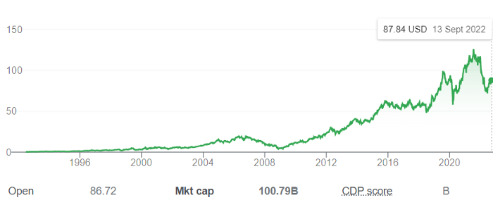
Shultz bought Starbucks in 1987 for $3.8 million, including six stores and a payment plan.
Starbucks is worth $100.79Billion, per Google Finance.
26,500 times Shultz's initial investment
Starbucks is releasing its own NFT Platform under Shultz and his early Vision.
This year, Starbucks Odyssey launches. The new digital experience combines a Loyalty Rewards program with NFT.
The side chain Polygon-based platform doesn't require a Crypto Wallet. Customers can earn and buy digital assets to unlock incentives and experiences.
They've removed all friction, making it more immersive and convenient than a coffee shop.
Brilliant!
NFTs are the access coupon to their digital community, but they don't highlight the technology.
They prioritize consumer experience by adding non-technical users to Web3. Their collectables are called journey stamps, not NFTs.
No mention of bundled gas fees.
Brady Brewer, Starbucks' CMO, said;
“It happens to be built on blockchain and web3 technologies, but the customer — to be honest — may very well not even know that what they’re doing is interacting with blockchain technology. It’s just the enabler,”
Rewards members will log into a web app using their loyalty program credentials to access Starbucks Odyssey. They won't know about blockchain transactions.
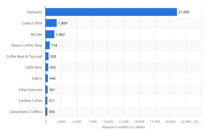
Starbucks has just dealt its rivals a devastating blow.
It generates more than ten times the revenue of its closest competitor Costa Coffee.
The coffee giant is booming.
Starbucks is ahead of its competitors. No wonder.
They have an innovative, adaptable leadership team.
Starbucks' DNA challenges the narrative, especially when others reject their ideas.
I’m off for a cappuccino.

Boris Müller
3 years ago
Why Do Websites Have the Same Design?
My kids redesigned the internet because it lacks inventiveness.

Internet today is bland. Everything is generic: fonts, layouts, pages, and visual language. Microtypography is messy.
Web design today seems dictated by technical and ideological constraints rather than creativity and ideas. Text and graphics are in containers on every page. All design is assumed.
Ironically, web technologies can design a lot. We can execute most designs. We make shocking, evocative websites. Experimental typography, generating graphics, and interactive experiences are possible.
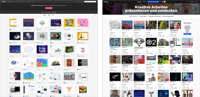
Even designer websites use containers in containers. Dribbble and Behance, the two most popular creative websites, are boring. Lead image.
How did this happen?
Several reasons. WordPress and other blogging platforms use templates. These frameworks build web pages by combining graphics, headlines, body content, and videos. Not designs, templates. These rules combine related data types. These platforms don't let users customize pages beyond the template. You filled the template.
Templates are content-neutral. Thus, the issue.
Form should reflect and shape content, which is a design principle. Separating them produces content containers. Templates have no design value.
One of the fundamental principles of design is a deep and meaningful connection between form and content.
Web design lacks imagination for many reasons. Most are pragmatic and economic. Page design takes time. Large websites lack the resources to create a page from scratch due to the speed of internet news and the frequency of new items. HTML, JavaScript, and CSS continue to challenge web designers. Web design can't match desktop publishing's straightforward operations.
Designers may also be lazy. Mobile-first, generic, framework-driven development tends to ignore web page visual and contextual integrity.
How can we overcome this? How might expressive and avant-garde websites look today?
Rediscovering the past helps design the future.
'90s-era web design
At the University of the Arts Bremen's research and development group, I created my first website 23 years ago. Web design was trendy. Young web. Pages inspired me.
We struggled with HTML in the mid-1990s. Arial, Times, and Verdana were the only web-safe fonts. Anything exciting required table layouts, monospaced fonts, or GIFs. HTML was originally content-driven, thus we had to work against it to create a page.
Experimental typography was booming. Designers challenged the established quo from Jan Tschichold's Die Neue Typographie in the twenties to April Greiman's computer-driven layouts in the eighties. By the mid-1990s, an uncommon confluence of technological and cultural breakthroughs enabled radical graphic design. Irma Boom, David Carson, Paula Scher, Neville Brody, and others showed it.
Early web pages were dull compared to graphic design's aesthetic explosion. The Web Design Museum shows this.
Nobody knew how to conduct browser-based graphic design. Web page design was undefined. No standards. No CMS (nearly), CSS, JS, video, animation.
Now is as good a time as any to challenge the internet’s visual conformity.
In 2018, everything is browser-based. Massive layouts to micro-typography, animation, and video. How do we use these great possibilities? Containerized containers. JavaScript-contaminated mobile-first pages. Visually uniform templates. Web design 23 years later would disappoint my younger self.
Our imagination, not technology, restricts web design. We're too conformist to aesthetics, economics, and expectations.
Crisis generates opportunity. Challenge online visual conformity now. I'm too old and bourgeois to develop a radical, experimental, and cutting-edge website. I can ask my students.
I taught web design at the Potsdam Interface Design Programme in 2017. Each team has to redesign a website. Create expressive, inventive visual experiences on the browser. Create with contemporary web technologies. Avoid usability, readability, and flexibility concerns. Act. Ignore Erwartungskonformität.
The class outcome pleased me. This overview page shows all results. Four diverse projects address the challenge.
1. ZKM by Frederic Haase and Jonas Köpfer
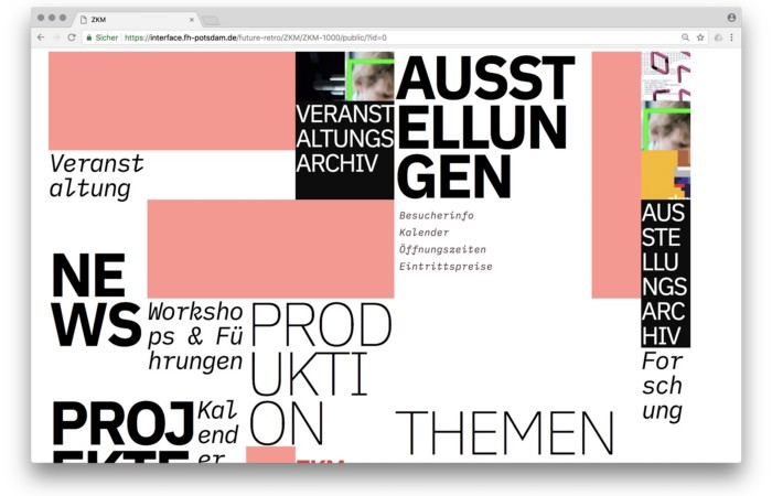
Frederic and Jonas began their experiments on the ZKM website. The ZKM is Germany's leading media art exhibition location, but its website remains conventional. It's useful but not avant-garde like the shows' art.
Frederic and Jonas designed the ZKM site's concept, aesthetic language, and technical configuration to reflect the museum's progressive approach. A generative design engine generates new layouts for each page load.
ZKM redesign.
2. Streem by Daria Thies, Bela Kurek, and Lucas Vogel
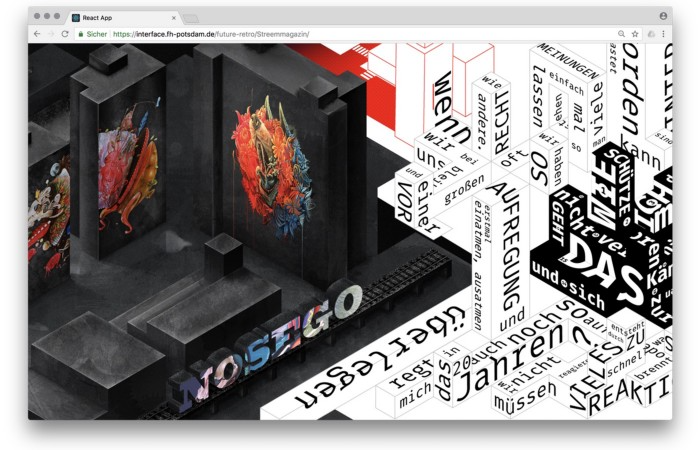
Street art magazine Streem. It promotes new artists and societal topics. Streem includes artwork, painting, photography, design, writing, and journalism. Daria, Bela, and Lucas used these influences to develop a conceptual metropolis. They designed four neighborhoods to reflect magazine sections for their prototype. For a legible city, they use powerful illustrative styles and spatial typography.
Streem makeover.
3. Medium by Amelie Kirchmeyer and Fabian Schultz
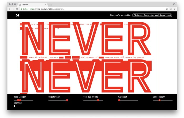
Amelie and Fabian structured. Instead of developing a form for a tale, they dissolved a web page into semantic, syntactical, and statistical aspects. HTML's flexibility was their goal. They broke Medium posts into experimental typographic space.
Medium revamp.
4. Hacker News by Fabian Dinklage and Florian Zia
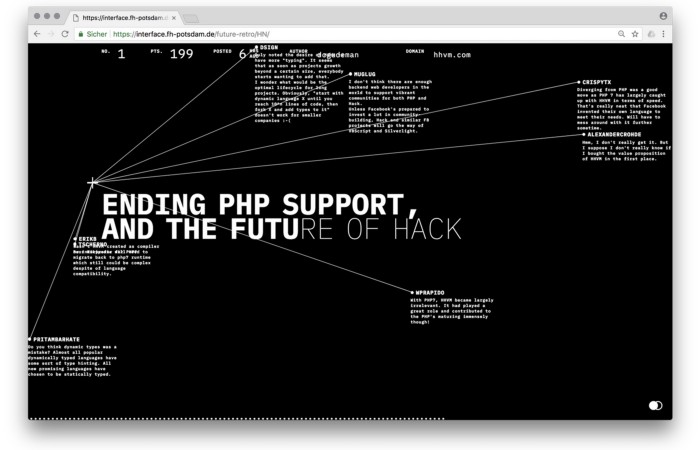
Florian and Fabian made Hacker News interactive. The social networking site aggregates computer science and IT news. Its voting and debate features are extensive despite its simple style. Fabian and Florian transformed the structure into a typographic timeline and network area. News and comments sequence and connect the visuals. To read Hacker News, they connected their design to the API. Hacker News makeover.
Communication is not legibility, said Carson. Apply this to web design today. Modern websites must be legible, usable, responsive, and accessible. They shouldn't limit its visual palette. Visual and human-centered design are not stereotypes.
I want radical, generative, evocative, insightful, adequate, content-specific, and intelligent site design. I want to rediscover web design experimentation. More surprises please. I hope the web will appear different in 23 years.
Update: this essay has sparked a lively discussion! I wrote a brief response to the debate's most common points: Creativity vs. Usability
You might also like

Scott Galloway
3 years ago
First Health
ZERO GRACE/ZERO MALICE
Amazon's purchase of One Medical could speed up American healthcare
The U.S. healthcare industry is a 7-ton seal bleeding at sea. Predators are circling. Unearned margin: price increases relative to inflation without quality improvements. Amazon is the 11-foot megalodon with 7-inch teeth. Amazon is no longer circling... but attacking.
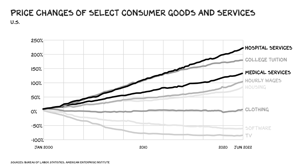
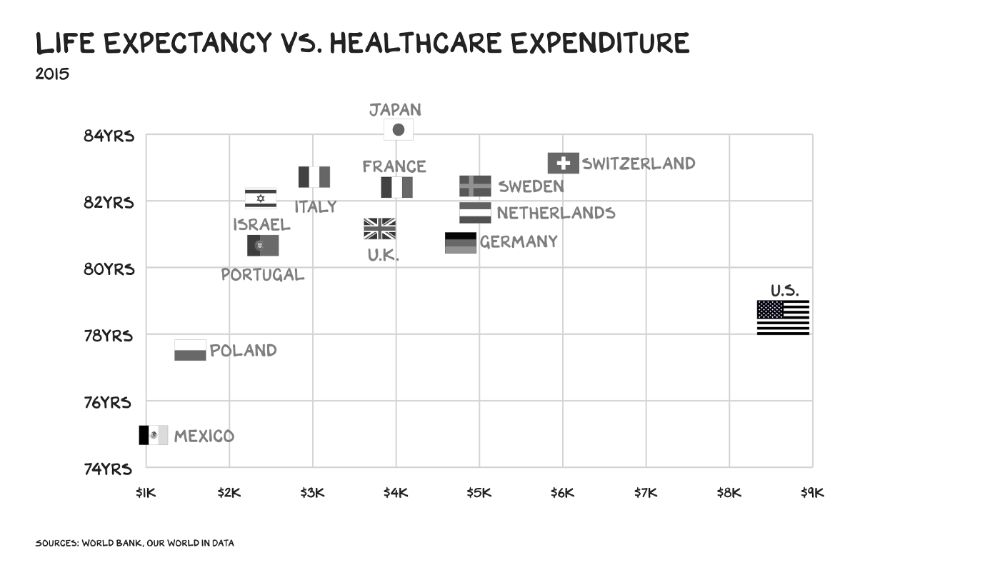
In 2020 dollars, per capita U.S. healthcare spending increased from $2,968 in 1980 to $12,531. The result is a massive industry with 13% of the nation's workers and a fifth of GDP.
Doctor No
In 40 years, healthcare has made progress. From 73.7 in 1980 to 78.8 in 2019, life expectancy rose (before Covid knocked it back down a bit). Pharmacological therapies have revolutionized, and genetic research is paying off. The financial return, improvement split by cost increases, is terrible. No country has expense rises like the U.S., and no one spends as much per capita as we do. Developed countries have longer life expectancies, healthier populations, and less economic hardship.
Two-thirds of U.S. personal bankruptcies are due to medical expenses and/or missed work. Mom or Dad getting cancer could bankrupt many middle-class American families. 40% of American adults delayed or skipped needed care due to cost. Every healthcare improvement seems to have a downside. Same pharmacological revolution that helped millions caused opioid epidemic. Our results are poor in many areas: The U.S. has a high infant mortality rate.
Healthcare is the second-worst retail industry in the country. Gas stations are #1. Imagine walking into a Best Buy to buy a TV and a Blue Shirt associate requests you fill out the same 14 pages of paperwork you filled out yesterday. Then you wait in a crowded room until they call you, 20 minutes after the scheduled appointment you were asked to arrive early for, to see the one person in the store who can talk to you about TVs, who has 10 minutes for you. The average emergency room wait time in New York is 6 hours and 10 minutes.
If it's bad for the customer, it's worse for the business. Physicians spend 27% of their time helping patients; 49% on EHRs. Documentation, order entry, billing, and inbox management. Spend a decade getting an M.D., then become a bureaucrat.
No industry better illustrates scale diseconomies. If we got the same return on healthcare spending as other countries, we'd all live to 100. We could spend less, live longer and healthier, and pay off the national debt in 15 years. U.S. healthcare is the worst ever.
What now? Competition is at the heart of capitalism, the worst system of its kind.
Priority Time
Amazon is buying One Medical for $3.9 billion. I think this deal will liberate society. Two years in, I think One Medical is great. When I got Covid, I pressed the One Medical symbol on my phone; a nurse practitioner prescribed Paxlovid and told me which pharmacies had it in stock.
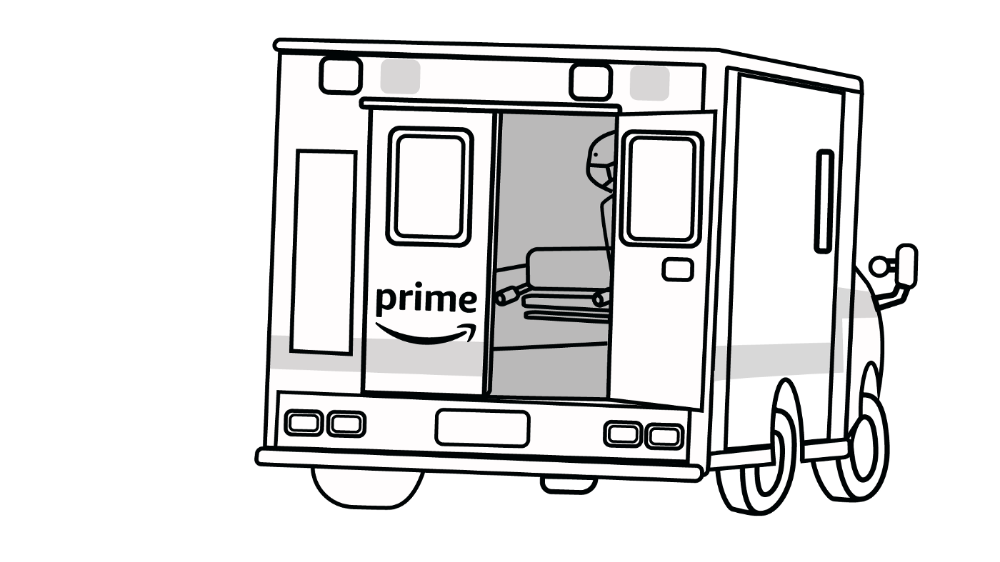
Amazon enables the company's vision. One Medical's stock is down to $10 from $40 at the start of 2021. Last year, it lost $250 million and needs cash (Amazon has $60 billion). ONEM must grow. The service has 736,000 members. Half of U.S. households have Amazon Prime. Finally, delivery. One Medical is a digital health/physical office hybrid, but you must pick up medication at the pharmacy. Upgrade your Paxlovid delivery time after a remote consultation. Amazon's core competency means it'll happen. Healthcare speed and convenience will feel alien.
It's been a long, winding road to disruption. Amazon, JPMorgan, and Berkshire Hathaway formed Haven four years ago to provide better healthcare for their 1.5 million employees. It rocked healthcare stocks the morning of the press release, but folded in 2021.
Amazon Care is an employee-focused service. Home-delivered virtual health services and nurses. It's doing well, expanding nationwide, and providing healthcare for other companies. Hilton is Amazon Care's biggest customer. The acquisition of One Medical will bring 66 million Prime households capital, domain expertise, and billing infrastructure. Imagine:
"Alexa, I'm hot and my back hurts."
"Connecting you to a Prime doctor now."
Want to vs. Have to
I predicted Amazon entering healthcare years ago. Why? For the same reason Apple is getting into auto. Amazon's P/E is 56, double Walmart's. The corporation must add $250 billion in revenue over the next five years to retain its share price. White-label clothes or smart home products won't generate as much revenue. It must enter a huge market without scale, operational competence, and data skills.
Current Situation
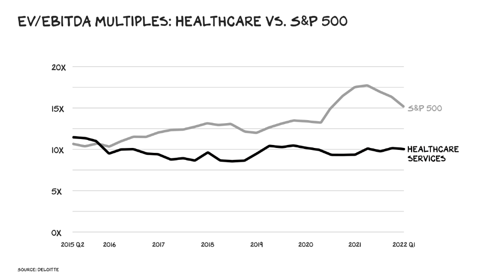
Healthcare reform benefits both consumers and investors. In 2015, healthcare services had S&P 500-average multiples. The market is losing faith in public healthcare businesses' growth. Healthcare services have lower EV/EBITDA multiples than the S&P 500.
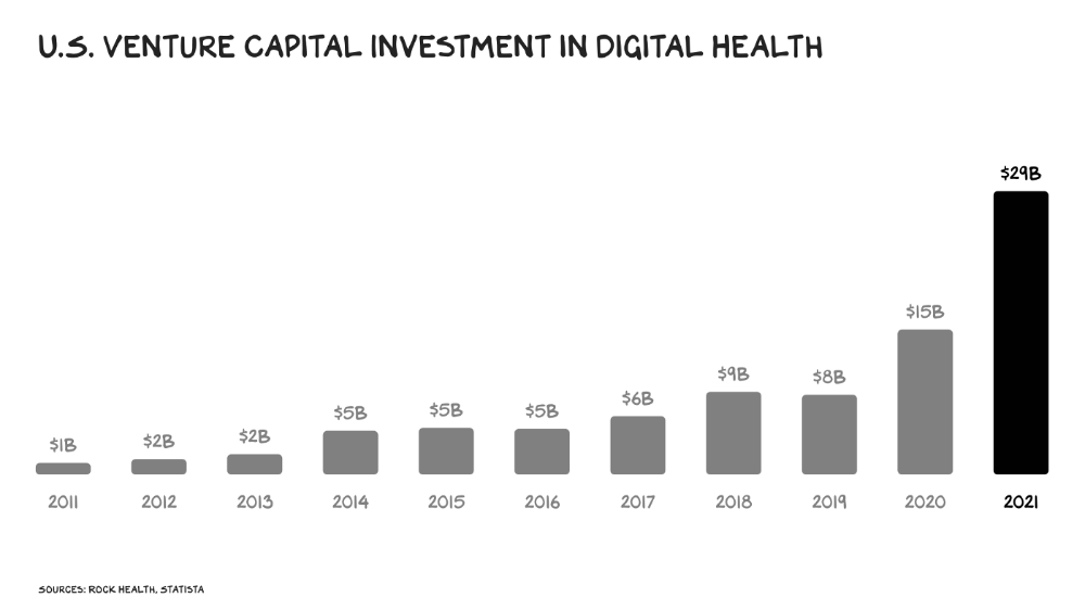
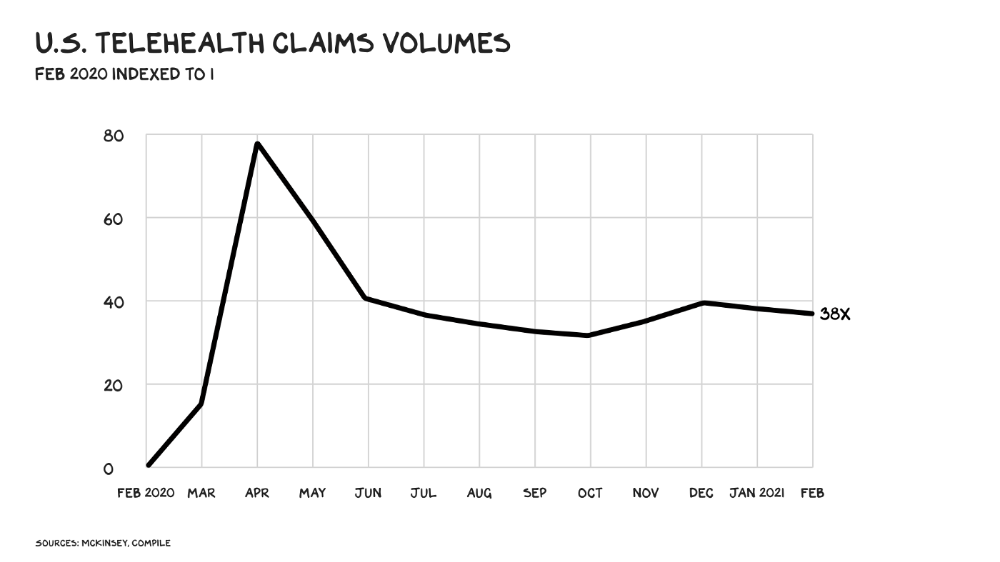
Amazon isn't the only prey-hunter. Walmart and Alibaba are starting pharmacies. Uber is developing medical transportation. Private markets invested $29 billion in telehealth last year, up 95% from 2020.
The pandemic accelerated telehealth, the immediate unlock. After the first positive Covid case in the U.S., services that had to be delivered in person shifted to Zoom... We lived. We grew. Video house calls continued after in-person visits were allowed. McKinsey estimates telehealth visits are 38 times pre-pandemic levels. Doctors adopted the technology, regulators loosened restrictions, and patients saved time. We're far from remote surgery, but many patient visits are unnecessary. A study of 40 million patients during lockdown found that for chronic disease patients, online visits didn't affect outcomes. This method of care will only improve.
Amazon's disruption will be significant and will inspire a flood of capital, startups, and consumer brands. Mark Cuban launched a pharmacy that eliminates middlemen in January. Outcome? A 90-day supply of acid-reflux medication costs $17. Medicare could have saved $3.6 billion by buying generic drugs from Cuban's pharmacy. Other apex predators will look at different limbs of the carcass for food. Nike could enter healthcare via orthopedics, acupuncture, and chiropractic. LVMH, L'Oréal, and Estée Lauder may launch global plastic surgery brands. Hilton and Four Seasons may open hospitals. Lennar and Pulte could build "Active Living" communities that Nana would leave feet first, avoiding the expense and tragedy of dying among strangers.
Risks
Privacy matters: HIV status is different from credit card and billing address. Most customers (60%) feel fine sharing personal health data via virtual technologies, though. Unavoidable. 85% of doctors believe data-sharing and interoperability will become the norm. Amazon is the most trusted tech company for handling personal data. Not Meta: Amazon.
What about antitrust, then?
Amazon should be required to spin off AWS and/or Amazon Fulfillment and banned from promoting its own products. It should be allowed to acquire hospitals. One Medical's $3.9 billion acquisition is a drop in the bucket compared to UnitedHealth's $498 billion market valuation.
Antitrust enforcement shouldn't assume some people/firms are good/bad. It should recognize that competition is good and focus on making markets more competitive in each deal. The FTC should force asset divestitures in e-commerce, digital marketing, and social media. These companies can also promote competition in a social ill.
U.S. healthcare makes us fat, depressed, and broke. Competition has produced massive value and prosperity across most of our economy.
Dear Amazon … bring it.

Charlie Brown
3 years ago
What Happens When You Sell Your House, Never Buying It Again, Reverse the American Dream
Homeownership isn't the only life pattern.
Want to irritate people?
My party trick is to say I used to own a house but no longer do.
I no longer wish to own a home, not because I lost it or because I'm moving.
It was a long-term plan. It was more deliberate than buying a home. Many people are committed for this reason.
Poppycock.
Anyone who told me that owning a house (or striving to do so) is a must is wrong.
Because, URGH.
One pattern for life is to own a home, but there are millions of others.
You can afford to buy a home? Go, buddy.
You think you need 1,000 square feet (or more)? You think it's non-negotiable in life?
Nope.
It's insane that society forces everyone to own real estate, regardless of income, wants, requirements, or situation. As if this trade brings happiness, stability, and contentment.
Take it from someone who thought this for years: drywall isn't happy. Living your way brings contentment.
That's in real estate. It may also be renting a small apartment in a city that makes your soul sing, but you can't afford the downpayment or mortgage payments.
Living or traveling abroad is difficult when your life savings are connected to something that eats your money the moment you sign.
#vanlife, which seems like torment to me, makes some people feel alive.
I've seen co-living, vacation rental after holiday rental, living with family, and more work.
Insisting that home ownership is the only path in life is foolish and reduces alternative options.
How little we question homeownership is a disgrace.
No one challenges a homebuyer's motives. We congratulate them, then that's it.
When you offload one, you must answer every question, even if you have a loose screw.
Why do you want to sell?
Do you have any concerns about leaving the market?
Why would you want to renounce what everyone strives for?
Why would you want to abandon a beautiful place like that?
Why would you mismanage your cash in such a way?
But surely it's only temporary? RIGHT??
Incorrect questions. Buying a property requires several inquiries.
The typical American has $4500 saved up. When something goes wrong with the house (not if, it’s never if), can you actually afford the repairs?
Are you certain that you can examine a home in less than 15 minutes before committing to buying it outright and promising to pay more than twice the asking price on a 30-year 7% mortgage?
Are you certain you're ready to leave behind friends, family, and the services you depend on in order to acquire something?
Have you thought about the connotation that moving to a suburb, which more than half of Americans do, means you will be dependent on a car for the rest of your life?
Plus:
Are you sure you want to prioritize home ownership over debt, employment, travel, raising kids, and daily routines?
Homeownership entails that. This ex-homeowner says it will rule your life from the time you put the key in the door.
This isn't questioned. We don't question enough. The holy home-ownership grail was set long ago, and we don't challenge it.
Many people question after signing the deeds. 70% of homeowners had at least one regret about buying a property, including the expense.
Exactly. Tragic.
Homes are different from houses
We've been fooled into thinking home ownership will make us happy.
Some may agree. No one.
Bricks and brick hindered me from living the version of my life that made me most comfortable, happy, and steady.
I'm spending the next month in a modest apartment in southern Spain. Even though it's late November, today will be 68 degrees. My spouse and I will soon meet his visiting parents. We'll visit a Sherry store. We'll eat, nap, walk, and drink Sherry. Writing. Jerez means flamenco.
That's my home. This is such a privilege. Living a fulfilling life brings me the contentment that buying a home never did.
I'm happy and comfortable knowing I can make almost all of my days good. Rejecting home ownership is partly to blame.
I'm broke like most folks. I had to choose between home ownership and comfort. I said, I didn't find them together.
Feeling at home trumps owning brick-and-mortar every day.
The following is the reality of what it's like to turn the American Dream around.
Leaving the housing market.
Sometimes I wish I owned a home.
I miss having my own yard and bed. My kitchen, cookbooks, and pizza oven are missed.
But I rarely do.
Someone else's life plan pushed home ownership on me. I'm grateful I figured it out at 35. Many take much longer, and some never understand homeownership stinks (for them).
It's confusing. People will think you're dumb or suicidal.
If you read what I write, you'll know. You'll realize that all you've done is choose to live intentionally. Find a home beyond four walls and a picket fence.
Miss? As I said, they're not home. If it were, a pizza oven, a good mattress, and a well-stocked kitchen would bring happiness.
No.
If you can afford a house and desire one, more power to you.
There are other ways to discover home. Find calm and happiness. For fun.
For it, look deeper than your home's foundation.

Muthinja
3 years ago
Why don't you relaunch my startup projects?
Open to ideas or acquisitions
Failure is an unavoidable aspect of life, yet many recoil at the word.

I've worked on unrelated startup projects. This is a list of products I developed (often as the tech lead or co-founder) and why they failed to launch.
Chess Bet (Betting)
As a chess player who plays 5 games a day and has an ELO rating of 2100, I tried to design a chess engine to rival stockfish and Houdini.
While constructing my chess engine, my cofounder asked me about building a p2p chess betting app. Chess Bet. There couldn't be a better time.
Two people in different locations could play a staked game. The winner got 90% of the bet and we got 10%. The business strategy was clear, but our mini-launch was unusual.
People started employing the same cheat engines I mentioned, causing user churn and defaming our product.
It was the first programming problem I couldn't solve after building a cheat detection system based on player move strengths and prior games. Chess.com, the most famous online chess software, still suffers from this.
We decided to pivot because we needed an expensive betting license.
We relaunched as Chess MVP after deciding to focus on chess learning. A platform for teachers to create chess puzzles and teach content. Several chess students used our product, but the target market was too tiny.
We chose to quit rather than persevere or pivot.
BodaCare (Insure Tech)
‘BodaBoda’ in Swahili means Motorcycle. My Dad approached me in 2019 (when I was working for a health tech business) about establishing an Insurtech/fintech solution for motorbike riders to pay for insurance using SNPL.
We teamed up with an underwriter to market motorcycle insurance. Once they had enough premiums, they'd get an insurance sticker in the mail. We made it better by splitting the cover in two, making it more reasonable for motorcyclists struggling with lump-sum premiums.
Lack of capital and changing customer behavior forced us to close, with 100 motorcyclists paying 0.5 USD every day. Our unit econ didn't make sense, and CAC and retention capital only dug us deeper.
Circle (Social Networking)
Having learned from both product failures, I began to understand what worked and what didn't. While reading through Instagram, an idea struck me.
Suppose social media weren't virtual.
Imagine meeting someone on your way home. Like-minded person
People were excited about social occasions after covid restrictions were eased. Anything to escape. I just built a university student-popular experiences startup. Again, there couldn't be a better time.
I started the Android app. I launched it on Google Beta and oh my! 200 people joined in two days.
It works by signaling if people are in a given place and allowing users to IM in hopes of meeting up in near real-time. Playstore couldn't deploy the app despite its success in beta for unknown reasons. I appealed unsuccessfully.
My infrastructure quickly lost users because I lacked funding.
In conclusion
This essay contains many failures, some of which might have been avoided and others not, but they were crucial learning points in my startup path.
If you liked any idea, I have the source code on Github.
Happy reading until then!