


More on Leadership

Christian Soschner
3 years ago
Steve Jobs' Secrets Revealed
From 1984 until 2011, he ran Apple using the same template.

What is a founder CEO's most crucial skill?
Presentation, communication, and sales
As a Business Angel Investor, I saw many pitch presentations and met with investors one-on-one to promote my companies.
There is always the conception of “Investors have to invest,” so there is no need to care about the presentation.
It's false. Nobody must invest. Many investors believe that entrepreneurs must convince them to invest in their business.
Sometimes — like in 2018–2022 — too much money enters the market, and everyone makes good money.
Do you recall the Buy Now, Pay Later Movement? This amazing narrative had no return potential. Only buyers who couldn't acquire financing elsewhere shopped at these companies.
Klarna's failing business concept led to high valuations.
Investors become more cautious when the economy falters. 2022 sees rising inflation, interest rates, wars, and civil instability. It's like the apocalypse's four horsemen have arrived.
Storytelling is important in rough economies.
When investors draw back, how can entrepreneurs stand out?
In Q2/2022, every study I've read said:
Investors cease investing
Deals are down in almost all IT industries from previous quarters.
What do founders need to do?
Differentiate yourself.
Storytelling talents help.
The Steve Jobs Way
Every time I watch a Steve Jobs presentation, I'm enthralled.
I'm a techie. Everything technical interests me. But, I skim most presentations.
What's Steve Jobs's secret?
Steve Jobs created Apple in 1976 and made it a profitable software and hardware firm in the 1980s. Macintosh goods couldn't beat IBM's. This mistake sacked him in 1985.
Before rejoining Apple in 1997, Steve Jobs founded Next Inc. and Pixar.
From then on, Apple became America's most valuable firm.
Steve Jobs understood people's needs. He said:
“People don’t know what they want until you show it to them. That’s why I never rely on market research. Our task is to read things that are not yet on the page.”
In his opinion, people talk about problems. A lot. Entrepreneurs must learn what the population's pressing problems are and create a solution.
Steve Jobs showed people what they needed before they realized it.
I'll explain:
Present a Big Vision
Steve Jobs starts every presentation by describing his long-term goals for Apple.
1984's Macintosh presentation set up David vs. Goliath. In a George Orwell-style dystopia, IBM computers were bad. It was 1984.
Apple will save the world, like Jedis.
Why do customers and investors like Big Vision?
People want a wider perspective, I think. Humans love improving the planet.
Apple users often cite emotional reasons for buying the brand.
Revolutionizing several industries with breakthrough inventions
Establish Authority
Everyone knows Apple in 2022. It's hard to find folks who confuse Apple with an apple around the world.
Apple wasn't as famous as it is today until Steve Jobs left in 2011.
Most entrepreneurs lack experience. They may market their company or items to folks who haven't heard of it.
Steve Jobs presented the company's historical accomplishments to overcome opposition.
In his presentation of the first iPhone, he talked about the Apple Macintosh, which altered the computing sector, and the iPod, which changed the music industry.
People who have never heard of Apple feel like they're seeing a winner. It raises expectations that the new product will be game-changing and must-have.
The Big Reveal
A pitch or product presentation always has something new.
Steve Jobs doesn't only demonstrate the product. I don't think he'd skip the major point of a company presentation.
He consistently discusses present market solutions, their faults, and a better consumer solution.
No solution exists yet.
It's a multi-faceted play:
It's comparing the new product to something familiar. This makes novelty and the product more relatable.
Describe a desirable solution.
He's funny. He demonstrated an iPod with an 80s phone dial in his iPhone presentation.
Then he reveals the new product. Macintosh presented itself.
Show the benefits
He outlines what Apple is doing differently after demonstrating the product.
How do you distinguish from others? The Big Breakthrough Presentation.
A few hundred slides might list all benefits.
Everyone would fall asleep. Have you ever had similar presentations?
When the brain is overloaded with knowledge, the limbic system changes to other duties, like lunch planning.
What should a speaker do? There's a classic proverb:
“Tell me and I forget, teach me and I may remember, involve me and I learn” (— Not Benjamin Franklin).
Steve Jobs showcased the product live.
Again, using ordinary scenarios to highlight the product's benefits makes it relatable.
The 2010 iPad Presentation uses this technique.
Invite the Team and Let Them Run the Presentation
CEOs spend most time outside the organization. Many companies elect to have only one presenter.
It sends the incorrect message to investors. Product presentations should always include the whole team.
Let me explain why.
Companies needing investment money frequently have shaky business strategies or no product-market fit or robust corporate structure.
Investors solely bet on a team's ability to implement ideas and make a profit.
Early team involvement helps investors understand the company's drivers. Travel costs are worthwhile.
But why for product presentations?
Presenters of varied ages, genders, social backgrounds, and skillsets are relatable. CEOs want relatable products.
Some customers may not believe a white man's message. A black woman's message may be more accepted.
Make the story relatable when you have the best product that solves people's concerns.
Best example: 1984 Macintosh presentation with development team panel.
What is the largest error people make when companies fail?
Saving money on the corporate and product presentation.
Invite your team to five partner meetings when five investors are shortlisted.
Rehearse the presentation till it's natural. Let the team speak.
Successful presentations require structure, rehearsal, and a team. Steve Jobs nailed it.

Florian Wahl
3 years ago
An Approach to Product Strategy
I've been pondering product strategy and how to articulate it. Frameworks helped guide our thinking.
If your teams aren't working together or there's no clear path to victory, your product strategy may not be well-articulated or communicated (if you have one).
Before diving into a product strategy's details, it's important to understand its role in the bigger picture — the pieces that move your organization forward.
the overall picture
A product strategy is crucial, in my opinion. It's part of a successful product or business. It's the showpiece.
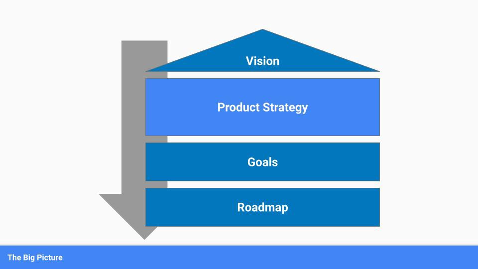
To simplify, we'll discuss four main components:
Vision
Product Management
Goals
Roadmap
Vision
Your company's mission? Your company/product in 35 years? Which headlines?
The vision defines everything your organization will do in the long term. It shows how your company impacted the world. It's your organization's rallying cry.
An ambitious but realistic vision is needed.
Without a clear vision, your product strategy may be inconsistent.
Product Management
Our main subject. Product strategy connects everything. It fulfills the vision.
In Part 2, we'll discuss product strategy.
Goals
This component can be goals, objectives, key results, targets, milestones, or whatever goal-tracking framework works best for your organization.
These product strategy metrics will help your team prioritize strategies and roadmaps.
Your company's goals should be unified. This fuels success.
Roadmap
The roadmap is your product strategy's timeline. It provides a prioritized view of your team's upcoming deliverables.
A roadmap is time-bound and includes measurable goals for your company. Your team's steps and capabilities for executing product strategy.
If your team has trouble prioritizing or defining a roadmap, your product strategy or vision is likely unclear.
Formulation of a Product Strategy
Now that we've discussed where your product strategy fits in the big picture, let's look at a framework.
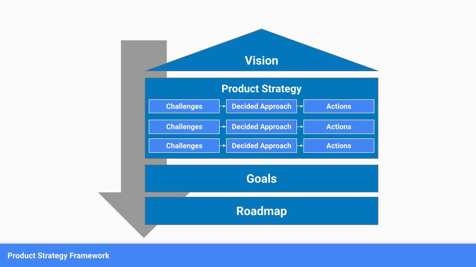
A product strategy should include challenges, an approach, and actions.
Challenges
First, analyze the problems/situations you're solving. It can be customer- or company-focused.
The analysis should explain the problems and why they're important. Try to simplify the situation and identify critical aspects.
Some questions:
What issues are we attempting to resolve?
What obstacles—internal or otherwise—are we attempting to overcome?
What is the opportunity, and why should we pursue it, in your opinion?
Decided Method
Second, describe your approach. This can be a set of company policies for handling the challenge. It's the overall approach to the first part's analysis.
The approach can be your company's bets, the solutions you've found, or how you'll solve the problems you've identified.
Again, these questions can help:
What is the value that we hope to offer to our clients?
Which market are we focusing on first?
What makes us stand out? Our benefit over rivals?
Actions
Third, identify actions that result from your approach. Second-part actions should be these.
Coordinate these actions. You may need to add products or features to your roadmap, acquire new capabilities through partnerships, or launch new marketing campaigns. Whatever fits your challenges and strategy.
Final questions:
What skills do we need to develop or obtain?
What is the chosen remedy? What are the main outputs?
What else ought to be added to our road map?
Put everything together
… and iterate!
Strategy isn't one-and-done. Changes occur. Economies change. Competitors emerge. Customer expectations change.
One unexpected event can make strategies obsolete quickly. Muscle it. Review, evaluate, and course-correct your strategies with your teams. Quarterly works. In a new or unstable industry, more often.

Caspar Mahoney
3 years ago
Changing Your Mindset From a Project to a Product
Product game mindsets? How do these vary from Project mindset?

1950s spawned the Iron Triangle. Project people everywhere know and live by it. In stakeholder meetings, it is used to stretch the timeframe, request additional money, or reduce scope.
Quality was added to this triangle as things matured.
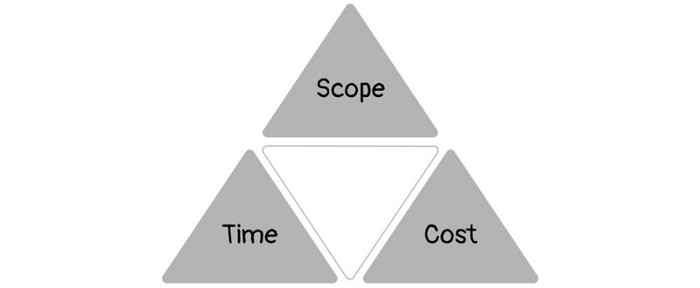
Quality was intended to be transformative, but none of these principles addressed why we conduct projects.
Value and benefits are key.
Product value is quantified by ROI, revenue, profit, savings, or other metrics. For me, every project or product delivery is about value.
Most project managers, especially those schooled 5-10 years or more ago (thousands working in huge corporations worldwide), understand the world in terms of the iron triangle. What does that imply? They worry about:
a) enough time to get the thing done.
b) have enough resources (budget) to get the thing done.
c) have enough scope to fit within (a) and (b) >> note, they never have too little scope, not that I have ever seen! although, theoretically, this could happen.
Boom—iron triangle.
To make the triangle function, project managers will utilize formal governance (Steering) to move those things. Increase money, scope, or both if time is short. Lacking funds? Increase time, scope, or both.
In current product development, shifting each item considerably may not yield value/benefit.
Even terrible. This approach will fail because it deprioritizes Value/Benefit by focusing the major stakeholders (Steering participants) and delivery team(s) on Time, Scope, and Budget restrictions.
Pre-agile, this problem was terrible. IT projects failed wildly. History is here.
Value, or benefit, is central to the product method. Product managers spend most of their time planning value-delivery paths.
Product people consider risk, schedules, scope, and budget, but value comes first. Let me illustrate.
Imagine managing internal products in an enterprise. Your core customer team needs a rapid text record of a chat to fix a problem. The consumer wants a feature/features added to a product you're producing because they think it's the greatest spot.
Project-minded, I may say;
Ok, I have budget as this is an existing project, due to run for a year. This is a new requirement to add to the features we’re already building. I think I can keep the deadline, and include this scope, as it sounds related to the feature set we’re building to give the desired result”.
This attitude repeats Scope, Time, and Budget.
Since it meets those standards, a project manager will likely approve it. If they have a backlog, they may add it and start specking it out assuming it will be built.
Instead, think like a product;
What problem does this feature idea solve? Is that problem relevant to the product I am building? Can that problem be solved quicker/better via another route ? Is it the most valuable problem to solve now? Is the problem space aligned to our current or future strategy? or do I need to alter/update the strategy?
A product mindset allows you to focus on timing, resource/cost, feasibility, feature detail, and so on after answering the aforementioned questions.
The above oversimplifies because
Leadership in discovery

Project managers are facilitators of ideas. This is as far as they normally go in the ‘idea’ space.
Business Requirements collection in classic project delivery requires extensive upfront documentation.
Agile project delivery analyzes requirements iteratively.
However, the project manager is a facilitator/planner first and foremost, therefore topic knowledge is not expected.
I mean business domain, not technical domain (to confuse matters, it is true that in some instances, it can be both technical and business domains that are important for a single individual to master).
Product managers are domain experts. They will become one if they are training/new.
They lead discovery.
Product Manager-led discovery is much more than requirements gathering.
Requirements gathering involves a Business Analyst interviewing people and documenting their requests.
The project manager calculates what fits and what doesn't using their Iron Triangle (presumably in their head) and reports back to Steering.
If this requirements-gathering exercise failed to identify requirements, what would a project manager do? or bewildered by project requirements and scope?
They would tell Steering they need a Business SME or Business Lead assigning or more of their time.
Product discovery requires the Product Manager's subject knowledge and a new mindset.
How should a Product Manager handle confusing requirements?
Product Managers handle these challenges with their talents and tools. They use their own knowledge to fill in ambiguity, but they have the discipline to validate those assumptions.
To define the problem, they may perform qualitative or quantitative primary research.
They might discuss with UX and Engineering on a whiteboard and test assumptions or hypotheses.
Do Product Managers escalate confusing requirements to Steering/Senior leaders? They would fix that themselves.
Product managers raise unclear strategy and outcomes to senior stakeholders. Open talks, soft skills, and data help them do this. They rarely raise requirements since they have their own means of handling them without top stakeholder participation.
Discovery is greenfield, exploratory, research-based, and needs higher-order stakeholder management, user research, and UX expertise.
Product Managers also aid discovery. They lead discovery. They will not leave customer/user engagement to a Business Analyst. Administratively, a business analyst could aid. In fact, many product organizations discourage business analysts (rely on PM, UX, and engineer involvement with end-users instead).
The Product Manager must drive user interaction, research, ideation, and problem analysis, therefore a Product professional must be skilled and confident.
Creating vs. receiving and having an entrepreneurial attitude

Product novices and project managers focus on details rather than the big picture. Project managers prefer spreadsheets to strategy whiteboards and vision statements.
These folks ask their manager or senior stakeholders, "What should we do?"
They then elaborate (in Jira, in XLS, in Confluence or whatever).
They want that plan populated fast because it reduces uncertainty about what's going on and who's supposed to do what.
Skilled Product Managers don't only ask folks Should we?
They're suggesting this, or worse, Senior stakeholders, here are some options. After asking and researching, they determine what value this product adds, what problems it solves, and what behavior it changes.
Therefore, to move into Product, you need to broaden your view and have courage in your ability to discover ideas, find insightful pieces of information, and collate them to form a valuable plan of action. You are constantly defining RoI and building Business Cases, so much so that you no longer create documents called Business Cases, it is simply ingrained in your work through metrics, intelligence, and insights.
Product Management is not a free lunch.
Plateless.
Plates and food must be prepared.
In conclusion, Product Managers must make at least three mentality shifts:
You put value first in all things. Time, money, and scope are not as important as knowing what is valuable.
You have faith in the field and have the ability to direct the search. YYou facilitate, but you don’t just facilitate. You wouldn't want to limit your domain expertise in that manner.
You develop concepts, strategies, and vision. You are not a waiter or an inbox where other people can post suggestions; you don't merely ask folks for opinion and record it. However, you excel at giving things that aren't clearly spoken or written down physical form.
You might also like

Glorin Santhosh
3 years ago
Start organizing your ideas by using The Second Brain.

Building A Second Brain helps us remember connections, ideas, inspirations, and insights. Using contemporary technologies and networks increases our intelligence.
This approach makes and preserves concepts. It's a straightforward, practical way to construct a second brain—a remote, centralized digital store for your knowledge and its sources.
How to build ‘The Second Brain’
Have you forgotten any brilliant ideas? What insights have you ignored?
We're pressured to read, listen, and watch informative content. Where did the data go? What happened?
Our brains can store few thoughts at once. Our brains aren't idea banks.
Building a Second Brain helps us remember thoughts, connections, and insights. Using digital technologies and networks expands our minds.
Ten Rules for Creating a Second Brain
1. Creative Stealing
Instead of starting from scratch, integrate other people's ideas with your own.
This way, you won't waste hours starting from scratch and can focus on achieving your goals.
Users of Notion can utilize and customize each other's templates.
2. The Habit of Capture
We must record every idea, concept, or piece of information that catches our attention since our minds are fragile.
When reading a book, listening to a podcast, or engaging in any other topic-related activity, save and use anything that resonates with you.
3. Recycle Your Ideas
Reusing our own ideas across projects might be advantageous since it helps us tie new information to what we already know and avoids us from starting a project with no ideas.
4. Projects Outside of Category
Instead of saving an idea in a folder, group it with documents for a project or activity.
If you want to be more productive, gather suggestions.
5. Burns Slowly
Even if you could finish a job, work, or activity if you focused on it, you shouldn't.
You'll get tired and can't advance many projects. It's easier to divide your routine into daily tasks.
Few hours of daily study is more productive and healthier than entire nights.
6. Begin with a surplus
Instead of starting with a blank sheet when tackling a new subject, utilise previous articles and research.
You may have read or saved related material.
7. Intermediate Packets
A bunch of essay facts.
You can utilize it as a document's section or paragraph for different tasks.
Memorize useful information so you can use it later.
8. You only know what you make
We can see, hear, and read about anything.
What matters is what we do with the information, whether that's summarizing it or writing about it.
9. Make it simpler for yourself in the future.
Create documents or files that your future self can easily understand. Use your own words, mind maps, or explanations.
10. Keep your thoughts flowing.
If you don't employ the knowledge in your second brain, it's useless.
Few people exercise despite knowing its benefits.
Conclusion:
You may continually move your activities and goals closer to completion by organizing and applying your information in a way that is results-focused.
Profit from the information economy's explosive growth by turning your specialized knowledge into cash.
Make up original patterns and linkages between topics.
You may reduce stress and information overload by appropriately curating and managing your personal information stream.
Learn how to apply your significant experience and specific knowledge to a new job, business, or profession.
Without having to adhere to tight, time-consuming constraints, accumulate a body of relevant knowledge and concepts over time.
Take advantage of all the learning materials that are at your disposal, including podcasts, online courses, webinars, books, and articles.

Aaron Dinin, PhD
3 years ago
I put my faith in a billionaire, and he destroyed my business.
How did his money blind me?

Like most fledgling entrepreneurs, I wanted a mentor. I met as many nearby folks with "entrepreneur" in their LinkedIn biographies for coffee.
These meetings taught me a lot, and I'd suggest them to any new creator. Attention! Meeting with many experienced entrepreneurs means getting contradictory advice. One entrepreneur will tell you to do X, then the next one you talk to may tell you to do Y, which are sometimes opposites. You'll have to chose which suggestion to take after the chats.
I experienced this. Same afternoon, I had two coffee meetings with experienced entrepreneurs. The first meeting was with a billionaire entrepreneur who took his company public.
I met him in a swanky hotel lobby and ordered a drink I didn't pay for. As a fledgling entrepreneur, money was scarce.
During the meeting, I demoed the software I'd built, he liked it, and we spent the hour discussing what features would make it a success. By the end of the meeting, he requested I include a killer feature we both agreed would attract buyers. The feature was complex and would require some time. The billionaire I was sipping coffee with in a beautiful hotel lobby insisted people would love it, and that got me enthusiastic.
The second meeting was with a young entrepreneur who had recently raised a small amount of investment and looked as eager to pitch me as I was to pitch him. I forgot his name. I mostly recall meeting him in a filthy coffee shop in a bad section of town and buying his pricey cappuccino. Water for me.
After his pitch, I demoed my app. When I was done, he barely noticed. He questioned my customer acquisition plan. Who was my client? What did they offer? What was my plan? Etc. No decent answers.
After our meeting, he insisted I spend more time learning my market and selling. He ignored my questions about features. Don't worry about features, he said. Customers will request features. First, find them.
Putting your faith in results over relevance
Problems plagued my afternoon. I met with two entrepreneurs who gave me differing advice about how to proceed, and I had to decide which to pursue. I couldn't decide.
Ultimately, I followed the advice of the billionaire.
Obviously.
Who wouldn’t? That was the guy who clearly knew more.
A few months later, I constructed the feature the billionaire said people would line up for.
The new feature was unpopular. I couldn't even get the billionaire to answer an email showing him what I'd done. He disappeared.
Within a few months, I shut down the company, wasting all the time and effort I'd invested into constructing the killer feature the billionaire said I required.
Would follow the struggling entrepreneur's advice have saved my company? It would have saved me time in retrospect. Potential consumers would have told me they didn't want what I was producing, and I could have shut down the company sooner or built something they did want. Both outcomes would have been better.
Now I know, but not then. I favored achievement above relevance.
Success vs. relevance
The millionaire gave me advice on building a large, successful public firm. A successful public firm is different from a startup. Priorities change in the last phase of business building, which few entrepreneurs reach. He gave wonderful advice to founders trying to double their stock values in two years, but it wasn't beneficial for me.
The other failing entrepreneur had relevant, recent experience. He'd recently been in my shoes. We still had lots of problems. He may not have achieved huge success, but he had valuable advice on how to pass the closest hurdle.
The money blinded me at the moment. Not alone So much of company success is defined by money valuations, fundraising, exits, etc., so entrepreneurs easily fall into this trap. Money chatter obscures the value of knowledge.
Don't base startup advice on a person's income. Focus on what and when the person has learned. Relevance to you and your goals is more important than a person's accomplishments when considering advice.

Karo Wanner
3 years ago
This is how I started my Twitter account.
My 12-day results look good.
Twitter seemed for old people and politicians.
I thought the platform would die soon like Facebook.
The platform's growth stalled around 300m users between 2015 and 2019.
In 2020, Twitter grew and now has almost 400m users.
Niharikaa Kaur Sodhi built a business on Twitter while I was away, despite its low popularity.
When I read about the success of Twitter users in the past 2 years, I created an account and a 3-month strategy.
I'll see if it's worth starting Twitter in 2022.
Late or perfect? I'll update you. Track my Twitter growth. You can find me here.
My Twitter Strategy
My Twitter goal is to build a community and recruit members for Mindful Monday.
I believe mindfulness is the only way to solve problems like poverty, inequality, and the climate crisis.
The power of mindfulness is my mission.
Mindful Monday is your weekly reminder to live in the present moment. I send mindfulness tips every Monday.
My Twitter profile promotes Mindful Monday and encourages people to join.
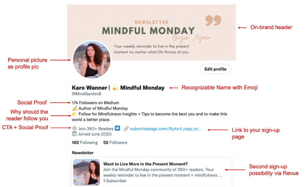
What I paid attention to:
I designed a brand-appropriate header to promote Mindful Monday.
Choose a profile picture. People want to know who you are.
I added my name as I do on Medium, Instagram, and emails. To stand out and be easily recognized, add an emoji if appropriate. Add what you want to be known for, such as Health Coach, Writer, or Newsletter.
People follow successful, trustworthy people. Describe any results you have. This could be views, followers, subscribers, or major news outlets. Create!
Tell readers what they'll get by following you. Can you help?
Add CTA to your profile. Your Twitter account's purpose. Give instructions. I placed my sign-up link next to the CTA to promote Mindful Monday. Josh Spector recommended this. (Thanks! Bonus tip: If you don't want the category to show in your profile, e.g. Entrepreneur, go to edit profile, edit professional profile, and choose 'Other'
Here's my Twitter:
I'm no expert, but I tried. Please share any additional Twitter tips and suggestions in the comments.
To hide your Revue newsletter subscriber count:
Join Revue. Select 'Hide Subscriber Count' in Account settings > Settings > Subscriber Count. Voila!
How frequently should you tweet?
1 to 20 Tweets per day, but consistency is key.
Stick to a daily tweet limit. Start with less and be consistent than the opposite.
I tweet 3 times per day. That's my comfort zone. Larger accounts tweet 5–7 times daily.
Do what works for you and that is the right amount.
Twitter is a long-term game, so plan your tweets for a year.
How to Batch Your Tweets?
Sunday batchs.
Sunday evenings take me 1.5 hours to create all my tweets for the week.
Use a word document and write down your posts. Podcasts, books, my own articles inspire me.
When I have a good idea or see a catchy Tweet, I take a screenshot.
To not copy but adapt.
Two pillars support my content:
(90% ~ 29 tweets per week) Inspirational quotes, mindfulness tips, zen stories, mistakes, myths, book recommendations, etc.
(10% 2 tweets per week) I share how I grow Mindful Monday with readers. This pillar promotes MM and behind-the-scenes content.
Second, I schedule all my Tweets using TweetDeck. I tweet at 7 a.m., 5 p.m., and 6 p.m.
Include Twitter Threads in your content strategy
Tweets are blog posts. In your first tweet, you include a headline, then tweet your content.
That’s how you create a series of connected Tweets.
What’s the point? You have more room to convince your reader you're an expert.
Add a call-to-action to your thread.
Follow for more like this
Newsletter signup (share your link)
Ask for retweet
One thread per week is my goal.
I'll schedule threads with Typefully. In the free version, you can schedule one Tweet, but that's fine.
Pin a thread to the top of your profile if it leads to your newsletter. So new readers see your highest-converting content first.
Tweet Medium posts
I also tweet Medium articles.
I schedule 1 weekly repost for 5 weeks after each publication. I share the same article daily for 5 weeks.
Every time I tweet, I include a different article quote, so even if the link is the same, the quote adds value.
Engage Other Experts
When you first create your account, few people will see it. Normal.
If you comment on other industry accounts, you can reach their large audience.
First, you need 50 to 100 followers. Here's my beginner tip.
15 minutes a day or when I have downtime, I comment on bigger accounts in my niche.
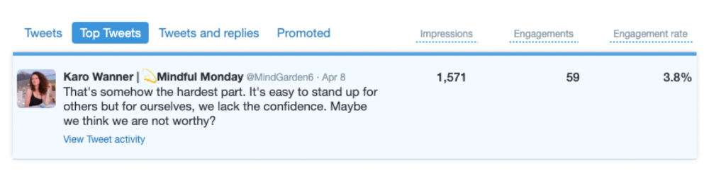
My 12-Day Results
Now let's look at the first data.
I had 32 followers on March 29. 12 followers in 11 days. I have 52 now.
Not huge, but growing rapidly.
Let's examine impressions/views.
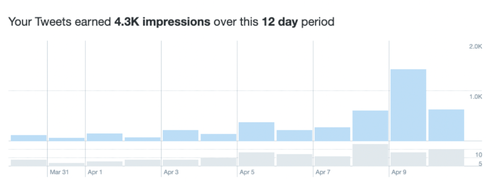
As a newbie, I gained 4,300 impressions/views in 12 days. On Medium, I got fewer views.
The 1,6k impressions per day spike comes from a larger account I mentioned the day before. First, I was shocked to see the spike and unsure of its origin.
These results are promising given the effort required to be consistent on Twitter.
Let's see how my journey progresses. I'll keep you posted.
Tweeters, Does this content strategy make sense? What's wrong? Comment below.
Let's support each other on Twitter. Here's me.
Which Twitter strategy works for you in 2022?
This post is a summary. Read the full article here