

How We Just Raised $6M At An $80M Valuation From 100+ Investors Using A Link (Without Pitching)
Lawtrades nearly failed three years ago.
We couldn't raise Series A or enthusiasm from VCs.
We raised $6M (at a $80M valuation) from 100 customers and investors using a link and no pitching.
Step-by-step:
We refocused our business first.
Lawtrades raised $3.7M while Atrium raised $75M. By comparison, we seemed unimportant.
We had to close the company or try something new.
As I've written previously, a pivot saved us. Our initial focus on SMBs attracted many unprofitable customers. SMBs needed one-off legal services, meaning low fees and high turnover.
Tech startups were different. Their General Councels (GCs) needed near-daily support, resulting in higher fees and lower churn than SMBs.
We stopped unprofitable customers and focused on power users. To avoid dilution, we borrowed against receivables. We scaled our revenue 10x, from $70k/mo to $700k/mo.
Then, we reconsidered fundraising (and do it differently)
This time was different. Lawtrades was cash flow positive for most of last year, so we could dictate our own terms. VCs were still wary of legaltech after Atrium's shutdown (though they were thinking about the space).
We neither wanted to rely on VCs nor dilute more than 10% equity. So we didn't compete for in-person pitch meetings.
AngelList Roll-Up Vehicle (RUV). Up to 250 accredited investors can invest in a single RUV. First, we emailed customers the RUV. Why? Because I wanted to help the platform's users.
Imagine if Uber or Airbnb let all drivers or Superhosts invest in an RUV. Humans make the platform, theirs and ours. Giving people a chance to invest increases their loyalty.
We expanded after initial interest.
We created a Journey link, containing everything that would normally go in an investor pitch:
- Slides
- Trailer (from me)
- Testimonials
- Product demo
- Financials
We could also link to our AngelList RUV and send the pitch to an unlimited number of people. Instead of 1:1, we had 1:10,000 pitches-to-investors.
We posted Journey's link in RUV Alliance Discord. 600 accredited investors noticed it immediately. Within days, we raised $250,000 from customers-turned-investors.
Stonks, which live-streamed our pitch to thousands of viewers, was interested in our grassroots enthusiasm. We got $1.4M from people I've never met.
These updates on Pump generated more interest. Facebook, Uber, Netflix, and Robinhood executives all wanted to invest. Sahil Lavingia, who had rejected us, gave us $100k.
We closed the round with public support.
Without a single pitch meeting, we'd raised $2.3M. It was a result of natural enthusiasm: taking care of the people who made us who we are, letting them move first, and leveraging their enthusiasm with VCs, who were interested.
We used network effects to raise $3.7M from a founder-turned-VC, bringing the total to $6M at a $80M valuation (which, by the way, I set myself).
What flipping the fundraising script allowed us to do:
We started with private investors instead of 2–3 VCs to show VCs what we were worth. This gave Lawtrades the ability to:
- Without meetings, share our vision. Many people saw our Journey link. I ended up taking meetings with people who planned to contribute $50k+, but still, the ratio of views-to-meetings was outrageously good for us.
- Leverage ourselves. Instead of us selling ourselves to VCs, they did. Some people with large checks or late arrivals were turned away.
- Maintain voting power. No board seats were lost.
- Utilize viral network effects. People-powered.
- Preemptively halt churn by turning our users into owners. People are more loyal and respectful to things they own. Our users make us who we are — no matter how good our tech is, we need human beings to use it. They deserve to be owners.
I don't blame founders for being hesitant about this approach. Pump and RUVs are new and scary. But it won’t be that way for long. Our approach redistributed some of the power that normally lies entirely with VCs, putting it into our hands and our network’s hands.
This is the future — another way power is shifting from centralized to decentralized.
More on Entrepreneurship/Creators
Evgenii Nelepko
3 years ago
My 3 biggest errors as a co-founder and CEO
Reflections on the closed company Hola! Dating app
I'll discuss my fuckups as an entrepreneur and CEO. All of them refer to the dating app Hola!, which I co-founded and starred in.
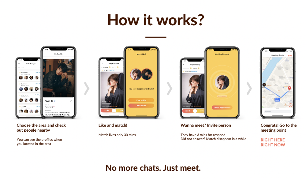
Spring 2021 was when we started. Two techies and two non-techies created a dating app. Pokemon Go and Tinder were combined.
Online dating is a business, and it takes two weeks from a like to a date. We questioned online dating app users if they met anyone offline last year.
75% replied yes, 50% sometimes, 25% usually.
Offline dating is popular, yet people have concerns.
Men are reluctant to make mistakes in front of others.
Women are curious about the background of everyone who approaches them.
We designed unique mechanics that let people date after a match. No endless chitchat. Women would be safe while men felt like cowboys.
I wish to emphasize three faults that lead to founders' estrangement.
This detachment ultimately led to us shutting down the company.
The wrong technology stack
Situation
Instead of generating a faster MVP and designing an app in a universal stack for iOS and Android, I argued we should pilot the app separately for iOS and Android. Technical founders' expertise made this possible.
Self-reflection
Mistaken strategy. We lost time and resources developing two apps at once. We chose iOS since it's more profitable. Apple took us out after the release, citing Guideline 4.3 Spam. After 4 months, we had nothing. We had a long way to go to get the app on Android and the Store.
I suggested creating a uniform platform for the company's growth. This makes parallel product development easier. The strategist's lack of experience and knowledge made it a piece of crap.
What would I have changed if I could?
We should have designed an Android universal stack. I expected Apple to have issues with a dating app.
Our approach should have been to launch something and subsequently improve it, but prejudice won.
The lesson
Discuss the IT stack with your CTO. It saves time and money. Choose the easiest MVP method.
2. A tardy search for investments
Situation
Though the universe and other founders encouraged me to locate investors first, I started pitching when we almost had an app.
When angels arrived, it was time to close. The app was banned, war broke out, I left the country, and the other co-founders stayed. We had no savings.
Self-reflection
I loved interviewing users. I'm proud of having done 1,000 interviews. I wanted to understand people's pain points and improve the product.
Interview results no longer affected the product. I was terrified to start pitching. I filled out accelerator applications and redid my presentation. You must go through that so you won't be terrified later.
What would I have changed if I could?
Get an external or internal mentor to help me with my first pitch as soon as possible. I'd be supported if criticized. He'd cheer with me if there was enthusiasm.
In 99% of cases, I'm comfortable jumping into the unknown, but there are exceptions. The mentor's encouragement would have prompted me to act sooner.
The lesson
Begin fundraising immediately. Months may pass. Show investors your pre-MVP project. Draw inferences from feedback.
3. Role ambiguity
Situation
My technical co-founders were also part-time lead developers, which produced communication issues. As co-founders, we communicated well and recognized the problems. Stakes, vesting, target markets, and approach were agreed upon.
We were behind schedule. Technical debt and strategic gap grew.
Bi-daily and weekly reviews didn't help. Each time, there were explanations. Inside, I was freaking out.
Self-reflection
I am a fairly easy person to talk to. I always try to stick to agreements; otherwise, my head gets stuffed with unnecessary information, interpretations, and emotions.
Sit down -> talk -> decide -> do -> evaluate the results. Repeat it.
If I don't get detailed comments, I start ruining everyone's mood. If there's a systematic violation of agreements without a good justification, I won't join the project or I'll end the collaboration.
What would I have done otherwise?
This is where it’s scariest to draw conclusions. Probably the most logical thing would have been not to start the project as we started it. But that was already a completely different project. So I would not have done anything differently and would have failed again.
But I drew conclusions for the future.
The lesson
First-time founders should find an adviser or team coach for a strategic session. It helps split the roles and responsibilities.

Esteban
3 years ago
The Berkus Startup Valuation Method: What Is It?
What Is That?
Berkus is a pre-revenue valuation method based exclusively on qualitative criteria, like Scorecard.
Few firms match their financial estimates, especially in the early stages, so valuation methodologies like the Berkus method are a good way to establish a valuation when the economic measures are not reliable.
How does it work?
This technique evaluates five key success factors.
Fundamental principle
Technology
Execution
Strategic alliances in its primary market
Production, followed by sales
The Berkus technique values the business idea and four success factors. As seen in the matrix below, each of these dimensions poses a danger to the startup's success.
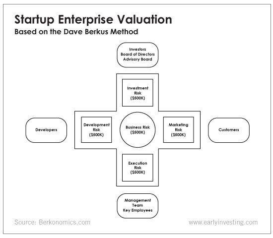
It assigns $0-$500,000 to each of these beginning regions. This approach enables a maximum $2.5M pre-money valuation.
This approach relies significantly on geography and uses the US as a baseline, as it differs in every country in Europe.
A set of standards for analyzing each dimension individually
Fundamental principle (or strength of the idea)
Ideas are worthless; execution matters. Most of us can relate to seeing a new business open in our area or a startup get funded and thinking, "I had this concept years ago!" Someone did it.
The concept remains. To assess the idea's viability, we must consider several criteria.
The concept's exclusivity It is necessary to protect a product or service's concept using patents and copyrights. Additionally, it must be capable of generating large profits.
Planned growth and growth that goes in a specific direction have a lot of potential, therefore incorporating them into a business is really advantageous.
The ability of a concept to grow A venture's ability to generate scalable revenue is a key factor in its emergence and continuation. A startup needs a scalable idea in order to compete successfully in the market.
The attraction of a business idea to a broad spectrum of people is significantly influenced by the current socio-political climate. Thus, the requirement for the assumption of conformity.
Concept Validation Ideas must go through rigorous testing with a variety of audiences in order to lower risk during the implementation phase.
Technology (Prototype)
This aspect reduces startup's technological risk. How good is the startup prototype when facing cyber threats, GDPR compliance (in Europe), tech stack replication difficulty, etc.?
Execution
Check the management team's efficacy. A potential angel investor must verify the founders' experience and track record with previous ventures. Good leadership is needed to chart a ship's course.
Strategic alliances in its primary market
Existing and new relationships will play a vital role in the development of both B2B and B2C startups. What are the startup's synergies? potential ones?
Production, followed by sales (product rollout)
Startup success depends on its manufacturing and product rollout. It depends on the overall addressable market, the startup's ability to market and sell their product, and their capacity to provide consistent, high-quality support.
Example
We're now founders of EyeCaramba, a machine vision-assisted streaming platform. My imagination always goes to poor puns when naming a startup.
Since we're first-time founders and the Berkus technique depends exclusively on qualitative methods and the evaluator's skill, we ask our angel-investor acquaintance for a pre-money appraisal of EyeCaramba.
Our friend offers us the following table:
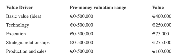
Because we're first-time founders, our pal lowered our Execution score. He knows the idea's value and that the gaming industry is red-hot, with worse startup ideas getting funded, therefore he gave the Basic value the highest value (idea).
EyeCaramba's pre-money valuation is $400,000 + $250,000 + $75,000 + $275,000 + $164,000 (1.16M). Good.
References
https://medium.com/humble-ventures/how-angel-investors-value-pre-revenue-startups-part-iii-8271405f0774#:~:text=pre%2Drevenue%20startups.-,Berkus%20Method,potential%20of%20the%20idea%20itself.%E2%80%9D
https://eqvista.com/berkus-valuation-method-for-startups/
https://www.venionaire.com/early-stage-startup-valuation-part-2-the-berkus-method/

Jenn Leach
3 years ago
I created a faceless TikTok account. Six months later.
Follower count, earnings, and more

I created my 7th TikTok account six months ago. TikTok's great. I've developed accounts for Amazon products, content creators/brand deals education, website flipping, and more.
Introverted or shy people use faceless TikTok accounts.
Maybe they don't want millions of people to see their face online, or they want to remain anonymous so relatives and friends can't locate them.
Going faceless on TikTok can help you grow a following, communicate your message, and make money online.
Here are 6 steps I took to turn my Tik Tok account into a $60,000/year side gig.
From nothing to $60K in 6 months
It's clickbait, but it’s true. Here’s what I did to get here.
Quick context:
I've used social media before. I've spent years as a social creator and brand.
I've built Instagram, TikTok, and YouTube accounts to nearly 100K.
How I did it
First, select a niche.
If you can focus on one genre on TikTok, you'll have a better chance of success, however lifestyle creators do well too.
Niching down is easier, in my opinion.
Examples:
Travel
Food
Kids
Earning cash
Finance
You can narrow these niches if you like.
During the pandemic, a travel blogger focused on Texas-only tourism and gained 1 million subscribers.
Couponing might be a finance specialization.
One of my finance TikTok accounts gives credit tips and grants and has 23K followers.
Tons of ways you can get more specific.
Consider how you'll monetize your TikTok account. I saw many enormous TikTok accounts that lose money.
Why?
They can't monetize their niche. Not impossible to commercialize, but tough enough to inhibit action.
First, determine your goal.
In this first step, consider what your end goal is.
Are you trying to promote your digital products or social media management services?
You want brand deals or e-commerce sales.
This will affect your TikTok specialty.
This is the first step to a TikTok side gig.
Step 2: Pick a content style
Next, you want to decide on your content style.
Do you do voiceover and screenshots?
You'll demonstrate a product?
Will you faceless vlog?
Step 3: Look at the competition
Find anonymous accounts and analyze what content works, where they thrive, what their audience wants, etc.
This can help you make better content.
Like the skyscraper method for TikTok.
Step 4: Create a content strategy.
Your content plan is where you sit down and decide:
How many videos will you produce each day or each week?
Which links will you highlight in your biography?
What amount of time can you commit to this project?
You may schedule when to post videos on a calendar. Make videos.
5. Create videos.
No video gear needed.
Using a phone is OK, and I think it's preferable than posting drafts from a computer or phone.
TikTok prefers genuine material.
Use their app, tools, filters, and music to make videos.
And imperfection is preferable. Tik okers like to see videos made in a bedroom, not a film studio.
Make sense?
When making videos, remember this.
I personally use my phone and tablet.
Step 6: Monetize
Lastly, it’s time to monetize How will you make money? You decided this in step 1.
Time to act!
For brand agreements
Include your email in the bio.
Share several sites and use a beacons link in your bio.
Make cold calls to your favorite companies to get them to join you in a TikTok campaign.
For e-commerce
Include a link to your store's or a product's page in your bio.
For client work
Include your email in the bio.
Use a beacons link to showcase your personal website, portfolio, and other resources.
For affiliate marketing
Include affiliate product links in your bio.
Join the Amazon Influencer program and provide a link to your storefront in your bio.
$60,000 per year from Tik Tok?
Yes, and some creators make much more.
Tori Dunlap (herfirst100K) makes $100,000/month on TikTok.
My TikTok adventure took 6 months, but by month 2 I was making $1,000/month (or $12K/year).
By year's end, I want this account to earn $100K/year.
Imagine if my 7 TikTok accounts made $100K/year.
7 Tik Tok accounts X $100K/yr = $700,000/year
You might also like

Jayden Levitt
3 years ago
Starbucks' NFT Project recently defeated its rivals.
The same way Amazon killed bookstores. You just can’t see it yet.

Shultz globalized coffee. Before Starbucks, coffee sucked.
All accounts say 1970s coffee was awful.
Starbucks had three stores selling ground Indonesian coffee in the 1980s.
What a show!
A year after joining the company at 29, Shultz traveled to Italy for R&D.
He noticed the coffee shops' sense of theater and community and realized Starbucks was in the wrong business.
Integrating coffee and destination created a sense of community in the store.
Brilliant!
He told Starbucks' founders about his experience.
They disapproved.
For two years.
Shultz left and opened an Italian coffee shop chain like any good entrepreneur.
Starbucks ran into financial trouble, so the founders offered to sell to Shultz.
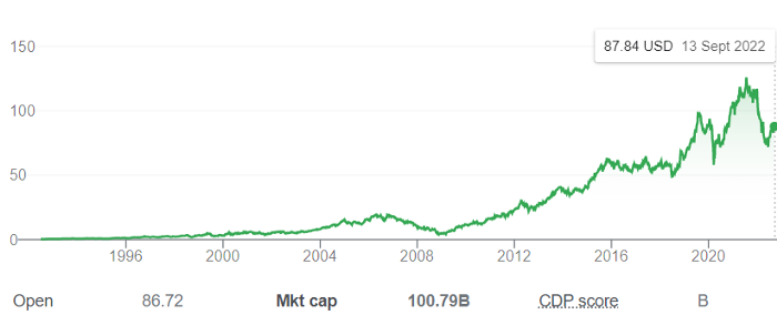
Shultz bought Starbucks in 1987 for $3.8 million, including six stores and a payment plan.
Starbucks is worth $100.79Billion, per Google Finance.
26,500 times Shultz's initial investment
Starbucks is releasing its own NFT Platform under Shultz and his early Vision.
This year, Starbucks Odyssey launches. The new digital experience combines a Loyalty Rewards program with NFT.
The side chain Polygon-based platform doesn't require a Crypto Wallet. Customers can earn and buy digital assets to unlock incentives and experiences.
They've removed all friction, making it more immersive and convenient than a coffee shop.
Brilliant!
NFTs are the access coupon to their digital community, but they don't highlight the technology.
They prioritize consumer experience by adding non-technical users to Web3. Their collectables are called journey stamps, not NFTs.
No mention of bundled gas fees.
Brady Brewer, Starbucks' CMO, said;
“It happens to be built on blockchain and web3 technologies, but the customer — to be honest — may very well not even know that what they’re doing is interacting with blockchain technology. It’s just the enabler,”
Rewards members will log into a web app using their loyalty program credentials to access Starbucks Odyssey. They won't know about blockchain transactions.
Starbucks has just dealt its rivals a devastating blow.
It generates more than ten times the revenue of its closest competitor Costa Coffee.
The coffee giant is booming.
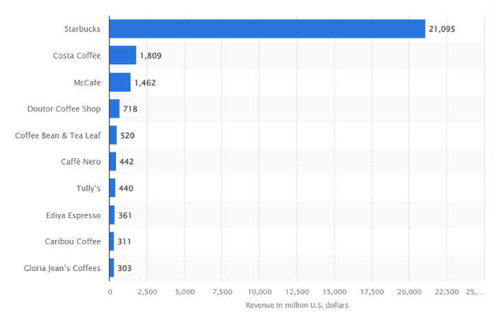
Starbucks is ahead of its competitors. No wonder.
They have an innovative, adaptable leadership team.
Starbucks' DNA challenges the narrative, especially when others reject their ideas.
I’m off for a cappuccino.

Scott Galloway
3 years ago
Attentive
From oil to attention.
Oil has been the most important commodity for a century. It's sparked wars. Pearl Harbor was a preemptive strike to guarantee Japanese access to Indonesian oil, and it made desert tribes rich. Oil's heyday is over. From oil to attention.
We talked about an information economy. In an age of abundant information, what's scarce? Attention. Scale of the world's largest enterprises, wealth of its richest people, and power of governments all stem from attention extraction, monetization, and custody.
Attention-grabbing isn't new. Humans have competed for attention and turned content into wealth since Aeschylus' Oresteia. The internal combustion engine, industrial revolutions in mechanization and plastics, and the emergence of a mobile Western lifestyle boosted oil. Digitization has put wells in pockets, on automobile dashboards, and on kitchen counters, drilling for attention.
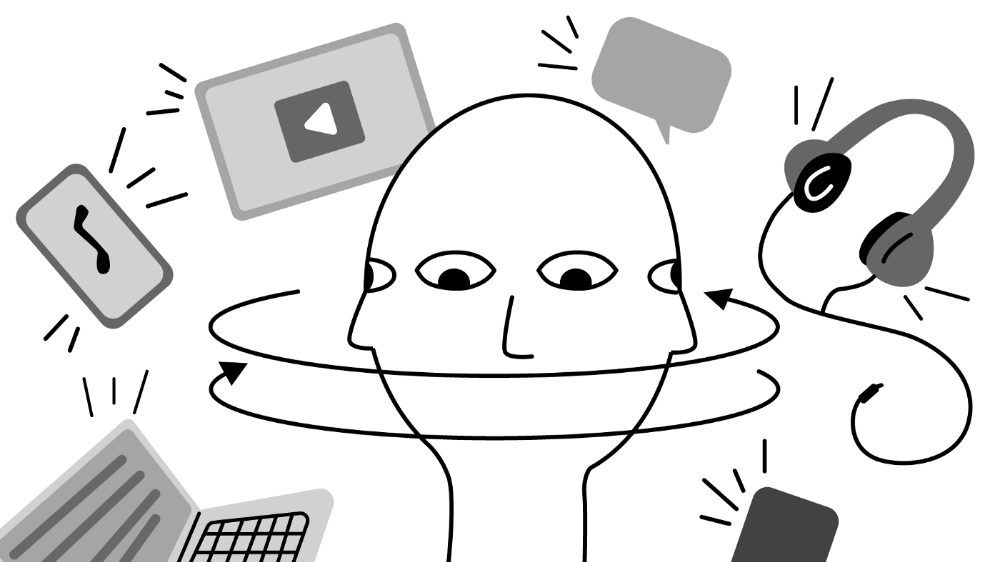
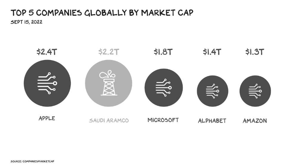
The most valuable firms are attention-seeking enterprises, not oil companies. Big Tech dominates the top 4. Tech and media firms are the sheikhs and wildcatters who capture our attention. Blood will flow as the oil economy rises.
Attention to Detail
More than IT and media companies compete for attention. Podcasting is a high-growth, low-barrier-to-entry chance for newbies to gain attention and (for around 1%) make money. Conferences are good for capturing in-person attention. Salesforce paid $30 billion for Slack's dominance of workplace attention, while Spotify is transforming music listening attention into a media platform.
Conferences, newsletters, and even music streaming are artisan projects. Even 130,000-person Comic Con barely registers on the attention economy's Richter scale. Big players have hundreds of millions of monthly users.
Supermajors
Even titans can be disrupted in the attention economy. TikTok is fracking king Chesapeake Energy, a rule-breaking insurgent with revolutionary extraction technologies. Attention must be extracted, processed, and monetized. Innovators disrupt the attention economy value chain.
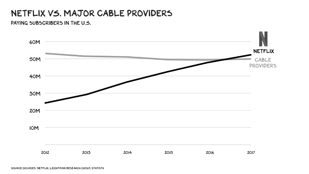
Attention pre-digital Entrepreneurs commercialized intriguing or amusing stuff like a newspaper or TV show through subscriptions and ads. Digital storage and distribution's limitless capacity drove the initial wave of innovation. Netflix became dominant by releasing old sitcoms and movies. More ad-free content gained attention. By 2016, Netflix was greater than cable TV. Linear scale, few network effects.
Social media introduced two breakthroughs. First, users produced and paid for content. Netflix's economics are dwarfed by TikTok and YouTube, where customers create the content drill rigs that the platforms monetize.
Next, social media businesses expanded content possibilities. Twitter, Facebook, and Reddit offer traditional content, but they transform user comments into more valuable (addictive) emotional content. By emotional resonance, I mean they satisfy a craving for acceptance or anger us. Attention and emotion are mined from comments/replies, piss-fights, and fast-brigaded craziness. Exxon has turned exhaust into heroin. Should we be so linked without a commensurate presence? You wouldn't say this in person. Anonymity allows fraudulent accounts and undesirable actors, which platforms accept to profit from more pollution.
FrackTok
A new entrepreneur emerged as ad-driven social media anger contaminated the water table. TikTok is remaking the attention economy. Short-form video platform relies on user-generated content, although delivery is narrower and less social.
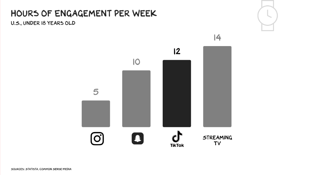
Netflix grew on endless options. Choice requires cognitive effort. TikTok is the least demanding platform since TV. App video plays when opened. Every video can be skipped with a swipe. An algorithm watches how long you watch, what you finish, and whether you like or follow to create a unique streaming network. You can follow creators and respond, but the app is passive. TikTok's attention economy recombination makes it apex predator. The app has more users than Facebook and Instagram combined. Among teens, it's overtaking the passive king, TV.
Externalities
Now we understand fossil fuel externalities. A carbon-based economy has harmed the world. Fracking brought large riches and rebalanced the oil economy, but at a cost: flammable water, earthquakes, and chemical leaks.
TikTok has various concerns associated with algorithmically generated content and platforms. A Wall Street Journal analysis discovered new accounts listed as belonging to 13- to 15-year-olds would swerve into rabbitholes of sex- and drug-related films in mere days. TikTok has a unique externality: Chinese Communist Party ties. Our last two presidents realized the relationship's perils. Concerned about platform's propaganda potential.
No evidence suggests the CCP manipulated information to harm American interests. A headjack implanted on America's youth, who spend more time on TikTok than any other network, connects them to a neural network that may be modified by the CCP. If the product and ownership can't be separated, the app should be banned. Putting restrictions near media increases problems. We should have a reciprocal approach with China regarding media firms. Ban TikTok
It was a conference theme. I anticipated Axel Springer CEO Mathias Döpfner to say, "We're watching them." (That's CEO protocol.) TikTok should be outlawed in every democracy as an espionage tool. Rumored regulations could lead to a ban, and FCC Commissioner Brendan Carr pushes for app store prohibitions. Why not restrict Chinese propaganda? Some disagree: Several renowned tech writers argued my TikTok diatribe last week distracted us from privacy and data reform. The situation isn't zero-sum. I've warned about Facebook and other tech platforms for years. Chewing gum while walking is possible.
The Future
Is TikTok the attention-economy titans' final evolution? The attention economy acts like it. No original content. CNN+ was unplugged, Netflix is losing members and has lost 70% of its market cap, and households are canceling cable and streaming subscriptions in historic numbers. Snap Originals closed in August after YouTube Originals in January.
Everyone is outTik-ing the Tok. Netflix debuted Fast Laughs, Instagram Reels, YouTube Shorts, Snap Spotlight, Roku The Buzz, Pinterest Watch, and Twitter is developing a TikTok-like product. I think they should call it Vine. Just a thought.
Meta's internal documents show that users spend less time on Instagram Reels than TikTok. Reels engagement is dropping, possibly because a third of the videos were generated elsewhere (usually TikTok, complete with watermark). Meta has tried to downrank these videos, but they persist. Users reject product modifications. Kim Kardashian and Kylie Jenner posted a meme urging Meta to Make Instagram Instagram Again, resulting in 312,000 signatures. Mark won't hear the petition. Meta is the fastest follower in social (see Oculus and legless hellscape fever nightmares). Meta's stock is at a five-year low, giving those who opposed my demands to break it up a compelling argument.
Blue Pill
TikTok's short-term dominance in attention extraction won't be stopped by anyone who doesn't hear Hail to the Chief every time they come in. Will TikTok still be a supermajor in five years? If not, YouTube will likely rule and protect Kings Landing.
56% of Americans regularly watch YouTube. Compared to Facebook and TikTok, 95% of teens use Instagram. YouTube users upload more than 500 hours of video per minute, a number that's likely higher today. Last year, the platform garnered $29 billion in advertising income, equivalent to Netflix's total.
Business and biology both value diversity. Oil can be found in the desert, under the sea, or in the Arctic. Each area requires a specific ability. Refiners turn crude into gas, lubricants, and aspirin. YouTube's variety is unmatched. One-second videos to 12-hour movies. Others are studio-produced. (My Bill Maher appearance was edited for YouTube.)
You can dispute in the comment section or just stream videos. YouTube is used for home improvement, makeup advice, music videos, product reviews, etc. You can load endless videos on a topic or creator, subscribe to your favorites, or let the suggestion algo take over. YouTube relies on user content, but it doesn't wait passively. Strategic partners advise 12,000 creators. According to a senior director, if a YouTube star doesn’t post once week, their manager is “likely to know why.”
YouTube's kevlar is its middle, especially for creators. Like TikTok, users can start with low-production vlogs and selfie videos. As your following expands, so does the scope of your production, bringing longer videos, broadcast-quality camera teams and performers, and increasing prices. MrBeast, a YouTuber, is an example. MrBeast made gaming videos and YouTube drama comments.
Donaldson's YouTube subscriber base rose. MrBeast invests earnings to develop impressive productions. His most popular video was a $3.5 million Squid Game reenactment (the cost of an episode of Mad Men). 300 million people watched. TikTok's attention-grabbing tech is too limiting for this type of material. Now, Donaldson is focusing on offline energy with a burger restaurant and cloud kitchen enterprise.
Steps to Take
Rapid wealth growth has externalities. There is no free lunch. OK, maybe caffeine. The externalities are opaque, and the parties best suited to handle them early are incentivized to construct weapons of mass distraction to postpone and obfuscate while achieving economic security for themselves and their families. The longer an externality runs unchecked, the more damage it causes and the more it costs to fix. Vanessa Pappas, TikTok's COO, didn't shine before congressional hearings. Her comms team over-consulted her and said ByteDance had no headquarters because it's scattered. Being full of garbage simply promotes further anger against the company and the awkward bond it's built between the CCP and a rising generation of American citizens.
This shouldn't distract us from the (still existent) harm American platforms pose to our privacy, teenagers' mental health, and civic dialogue. Leaders of American media outlets don't suffer from immorality but amorality, indifference, and dissonance. Money rain blurs eyesight.
Autocratic governments that undermine America's standing and way of life are immoral. The CCP has and will continue to use all its assets to harm U.S. interests domestically and abroad. TikTok should be spun to Western investors or treated the way China treats American platforms: kicked out.
So rich,
Colin Faife
3 years ago
The brand-new USB Rubber Ducky is much riskier than before.
The brand-new USB Rubber Ducky is much riskier than before.
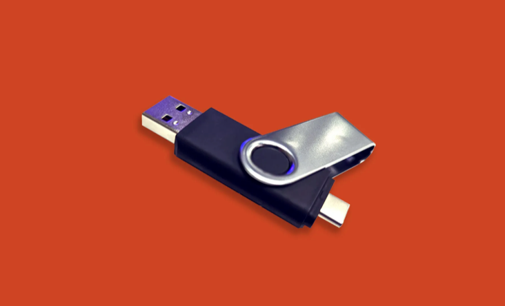
With its own programming language, the well-liked hacking tool may now pwn you.
With a vengeance, the USB Rubber Ducky is back.
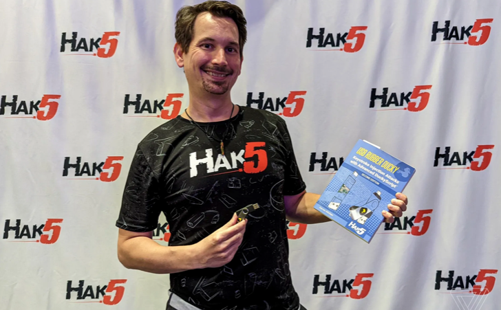
This year's Def Con hacking conference saw the release of a new version of the well-liked hacking tool, and its author, Darren Kitchen, was on hand to explain it. We put a few of the new features to the test and discovered that the most recent version is riskier than ever.
WHAT IS IT?
The USB Rubber Ducky seems to the untrained eye to be an ordinary USB flash drive. However, when you connect it to a computer, the computer recognizes it as a USB keyboard and will accept keystroke commands from the device exactly like a person would type them in.
Kitchen explained to me, "It takes use of the trust model built in, where computers have been taught to trust a human, in that anything it types is trusted to the same degree as the user is trusted. And a computer is aware that clicks and keystrokes are how people generally connect with it.
Over ten years ago, the first Rubber Ducky was published, quickly becoming a hacker favorite (it was even featured in a Mr. Robot scene). Since then, there have been a number of small upgrades, but the most recent Rubber Ducky takes a giant step ahead with a number of new features that significantly increase its flexibility and capability.
WHERE IS ITS USE?
The options are nearly unlimited with the proper strategy.
The Rubber Ducky has already been used to launch attacks including making a phony Windows pop-up window to collect a user's login information or tricking Chrome into sending all saved passwords to an attacker's web server. However, these attacks lacked the adaptability to operate across platforms and had to be specifically designed for particular operating systems and software versions.
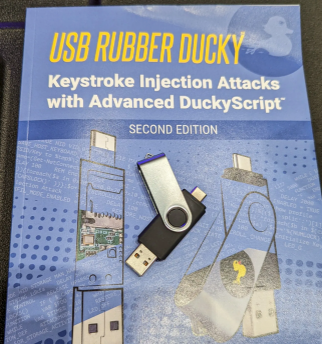
The nuances of DuckyScript 3.0 are described in a new manual.
The most recent Rubber Ducky seeks to get around these restrictions. The DuckyScript programming language, which is used to construct the commands that the Rubber Ducky will enter into a target machine, receives a significant improvement with it. DuckyScript 3.0 is a feature-rich language that allows users to write functions, store variables, and apply logic flow controls, in contrast to earlier versions that were primarily limited to scripting keystroke sequences (i.e., if this... then that).
This implies that, for instance, the new Ducky can check to see if it is hooked into a Windows or Mac computer and then conditionally run code specific to each one, or it can disable itself if it has been attached to the incorrect target. In order to provide a more human effect, it can also generate pseudorandom numbers and utilize them to add a configurable delay between keystrokes.
The ability to steal data from a target computer by encoding it in binary code and transferring it through the signals intended to instruct a keyboard when the CapsLock or NumLock LEDs should light up is perhaps its most astounding feature. By using this technique, a hacker may plug it in for a brief period of time, excuse themselves by saying, "Sorry, I think that USB drive is faulty," and then take it away with all the credentials stored on it.
HOW SERIOUS IS THE RISK?
In other words, it may be a significant one, but because physical device access is required, the majority of people aren't at risk of being a target.
The 500 or so new Rubber Duckies that Hak5 brought to Def Con, according to Kitchen, were his company's most popular item at the convention, and they were all gone on the first day. It's safe to suppose that hundreds of hackers already possess one, and demand is likely to persist for some time.
Additionally, it has an online development toolkit that can be used to create attack payloads, compile them, and then load them onto the target device. A "payload hub" part of the website makes it simple for hackers to share what they've generated, and the Hak5 Discord is also busy with conversation and helpful advice. This makes it simple for users of the product to connect with a larger community.
It's too expensive for most individuals to distribute in volume, so unless your favorite cafe is renowned for being a hangout among vulnerable targets, it's doubtful that someone will leave a few of them there. To that end, if you intend to plug in a USB device that you discovered outside in a public area, pause to consider your decision.
WOULD IT WORK FOR ME?
Although the device is quite straightforward to use, there are a few things that could cause you trouble if you have no prior expertise writing or debugging code. For a while, during testing on a Mac, I was unable to get the Ducky to press the F4 key to activate the launchpad, but after forcing it to identify itself using an alternative Apple keyboard device ID, the problem was resolved.
From there, I was able to create a script that, when the Ducky was plugged in, would instantly run Chrome, open a new browser tab, and then immediately close it once more without requiring any action from the laptop user. Not bad for only a few hours of testing, and something that could be readily changed to perform duties other than reading technology news.