

This Month Will See The Release Of Travis Scott x Nike Footwear
Following the catastrophes at Astroworld, Travis Scott was swiftly vilified by both media outlets and fans alike, and the names who had previously supported him were quickly abandoned. Nike, on the other hand, remained silent, only delaying the release of La Flame's planned collaborations, such as the Air Max 1 and Air Trainer 1, indefinitely. While some may believe it is too soon for the artist to return to the spotlight, the Swoosh has other ideas, as Nice Kicks reveals that these exact sneakers will be released in May.
Both the Travis Scott x Nike Air Max 1 and the Travis Scott x Nike Air Trainer 1 are set to come in two colorways this month. Tinker Hatfield's renowned runner will meet La Flame's "Baroque Brown" and "Saturn Gold" make-ups, which have been altered with backwards Swooshes and outdoors-themed webbing. The high-top trainer is being customized with Hatfield's "Wheat" and "Grey Haze" palettes, both of which include zippers across the heel, co-branded patches, and other details.
See below for a closer look at the four footwear. TravisScott.com is expected to release the shoes on May 20th, according to Nice Kicks. Following that, on May 27th, Nike SNKRS will release the shoe.
Travis Scott x Nike Air Max 1 "Baroque Brown"
Release Date: 2022
Color: Baroque Brown/Lemon Drop/Wheat/Chile Red
Mens: $160
Style Code: DO9392-200
Pre-School: $85
Style Code: DN4169-200
Infant & Toddler: $70
Style Code: DN4170-200
Travis Scott x Nike Air Max 1 "Saturn Gold"
Release Date: 2022
Color: N/A
Mens: $160
Style Code: DO9392-700
Travis Scott x Nike Air Trainer 1 "Wheat"
Restock Date: May 27th, 2022 (Friday)
Original Release Date: May 20th, 2022 (Friday)
Color: N/A
Mens: $140
Style Code: DR7515-200
Travis Scott x Nike Air Trainer 1 "Grey Haze"
Restock Date: May 27th, 2022 (Friday)
Original Release Date: May 20th, 2022 (Friday)
Color: N/A
Mens: $140
Style Code: DR7515-001
More on Lifestyle

Michael Le
3 years ago
Union LA x Air Jordan 2 “Future Is Now” PREVIEW
With the help of Virgil Abloh and Union LA‘s Chris Gibbs, it's now clear that Jordan Brand intended to bring the Air Jordan 2 back in 2022.
The “Future Is Now” collection includes two colorways of MJ's second signature as well as an extensive range of apparel and accessories.
“We wanted to juxtapose what some futuristic gear might look like after being worn and patina'd,”
Union stated on the collaboration's landing page.
“You often see people's future visions that are crisp and sterile. We thought it would be cool to wear it in and make it organic...”
The classic co-branding appears on short-sleeve tees, hoodies, and sweat shorts/sweat pants, all lightly distressed at the hems and seams.
Also, a filtered black-and-white photo of MJ graces the adjacent long sleeves, labels stitch into the socks, and the Jumpman logo adorns the four caps.
Liner jackets and flight pants will also be available, adding reimagined militaria to a civilian ensemble.
The Union LA x Air Jordan 2 (Grey Fog and Rattan) shares many of the same beats. Vintage suedes show age, while perforations and detailing reimagine Bruce Kilgore's design for the future.
The “UN/LA” tag across the modified eye stays, the leather patch across the tongue, and the label that wraps over the lateral side of the collar complete the look.
The footwear will also include a Crater Slide in the “Grey Fog” color scheme.
BUYING
On 4/9 and 4/10 from 9am-3pm, Union LA will be giving away a pair of Air Jordan 2s at their La Brea storefront (110 S. LA BREA AVE. LA, CA 90036). The raffle is only open to LA County residents with a valid CA ID. You must enter by 11:59pm on 4/10 to win. Winners will be notified via email.
Hannah Elliott
3 years ago
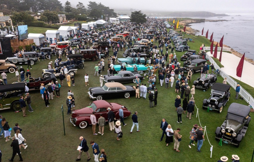
Pebble Beach Auto Auctions Set $469M Record
The world's most prestigious vintage vehicle show included amazing autos and record-breaking sums.

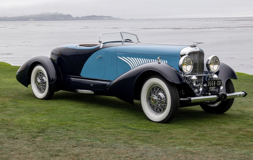
This 1932 Duesenberg J Figoni Sports Torpedo earned Best of Show in 2022.
David Paul Morris (DPM)/Bloomberg
2022 Pebble Beach Concours d'Elegance winner was a pre-war roadster.
Lee Anderson's 1932 Duesenberg J Figoni Sports Torpedo won Best of Show at Pebble Beach Golf Links near Carmel, Calif., on Sunday. First American win since 2013.
Sandra Button, chairperson of the annual concours, said the car, whose chassis and body had been separated for years, "marries American force with European style." "Its resurrection story is passionate."
Pebble Beach Concours d'Elegance Auction
Since 1950, the Pebble Beach Concours d'Elegance has welcomed the world's most costly collectable vehicles for a week of parties, auctions, rallies, and high-roller meetings. The cold, dreary weather highlighted the automobiles' stunning lines and hues.
DPM/Bloomberg
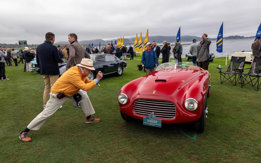
A visitor photographs a 1948 Ferrari 166 MM Touring Barchetta. This is one of 25 Ferraris manufactured in the years after World War II. First shown at the 1948 Turin Salon. Others finished Mille Miglia and Le Mans, which set the tone for Ferrari racing for years.
DPM/Bloomberg
This year's frontrunners were ultra-rare pre-war and post-war automobiles with long and difficult titles, such a 1937 Talbot-Lago T150C-SS Figoni & Falaschi Teardrop Coupe and a 1951 Talbot-Lago T26 Grand Sport Stabilimenti Farina Cabriolet.
The hefty, enormous coaches inspire visions of golden pasts when mysterious saloons swept over the road with otherworldly style, speed, and grace. Only the richest and most powerful people, like Indian maharaja and Hollywood stars, owned such vehicles.
Antonio Chopitea, a Peruvian sugar tycoon, ordered a new Duesenberg in Paris. Hemmings says the two-tone blue beauty was moved to the US and dismantled in the 1960s. Body and chassis were sold separately and rejoined decades later in a three-year, prize-winning restoration.
The concours is the highlight of Monterey Car Week, a five-day Super Bowl for car enthusiasts. Early events included Porsche and Ferrari displays, antique automobile races, and new-vehicle debuts. Many auto executives call Monterey Car Week the "new auto show."
Many visitors were drawn to the record-breaking auctions.

A 1969 Porsche 908/02 auctioned for $4.185 million. Flat-eight air-cooled engine, 90.6-inch wheelbase, 1,320-pound weight. Vic Elford, Richard Attwood, Rudi Lins, Gérard Larrousse, Kurt Ahrens Jr., Masten Gregory, and Pedro Rodriguez drove it, according to Gooding.
DPM/Bloomberg
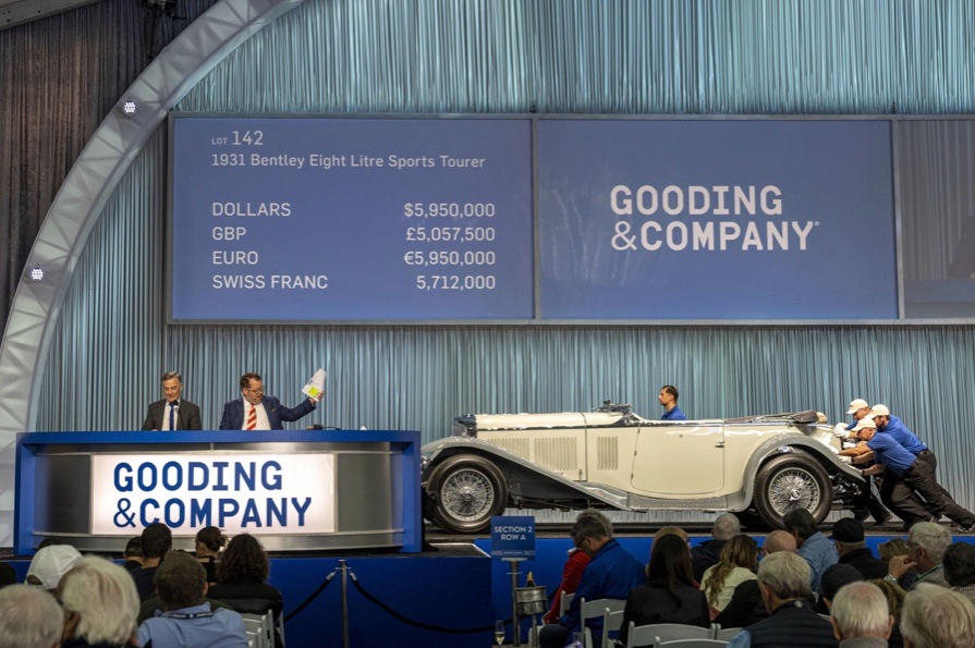
The 1931 Bentley Eight Liter Sports Tourer doesn't meet its reserve. Gooding & Co., the official auction house of the concours, made more than $105 million and had an 82% sell-through rate. This powerful open-top tourer is one of W.O. Bentley's 100 automobiles. Only 80 remain.
DPM/Bloomberg
The final auction on Aug. 21 brought in $456.1 million, breaking the previous high of $394.48 million established in 2015 in Monterey. “The week put an exclamation point on what has been an exceptional year for the collector automobile market,” Hagerty analyst John Wiley said.
Many cars that go unsold at public auction are sold privately in the days after. After-sales pushed the week's haul to $469 million on Aug. 22, up 18.9% from 2015's record.
In today's currencies, 2015's record sales amount to $490 million, Wiley noted. The dollar is degrading faster than old autos.
Still, 113 million-dollar automobiles sold. The average car sale price was $583,211, up from $446,042 last year, while multimillion-dollar hammer prices made up around 75% of total sales.
Industry insiders and market gurus expected that stock market volatility, the crisis in Ukraine, and the dollar-euro exchange rate wouldn't influence the world's biggest spenders.
Classic.com's CEO said there's no hint of a recession in an e-mail. Big sales and crowds.

Ticket-holders wore huge hats, flowery skirts, and other Kentucky Derby-esque attire. Coffee, beverages, and food are extra.
DPM/Bloomberg
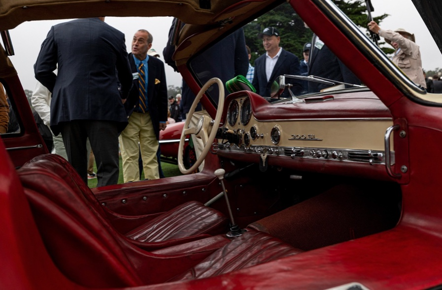
Mercedes-Benz 300 SL Gullwing, 1955. Mercedes produced the two-seat gullwing coupe from 1954–1957 and the roadster from 1957–1963. It was once West Germany's fastest and most powerful automobile. You'd be hard-pressed to locate one for less $1 million.
DPM/Bloomberg
1955 Ferrari 410 Sport sold for $22 million at RM Sotheby's. It sold a 1937 Mercedes-Benz 540K Sindelfingen Roadster for $9.9 million and a 1924 Hispano-Suiza H6C Transformable Torpedo for $9.245 million. The family-run mansion sold $221.7 million with a 90% sell-through rate, up from $147 million in 2021. This year, RM Sotheby's cars averaged $1.3 million.
Not everyone saw such great benefits.
Gooding & Co., the official auction house of the concours, made more than $105 million and had an 82% sell-through rate. 1937 Bugatti Type 57SC Atalante, 1990 Ferrari F40, and 1994 Bugatti EB110 Super Sport were top sellers.
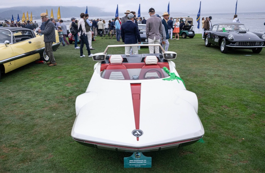
The 1969 Autobianchi A112 Bertone. This idea two-seater became a Hot Wheels toy but was never produced. It has a four-speed manual drive and an inline-four mid-engine arrangement like the Lamborghini Miura.
DPM/Bloomberg
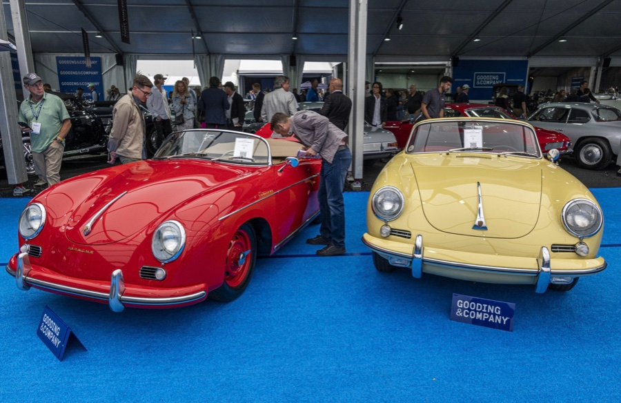
1956 Porsche 356 A Speedster at Gooding & Co. The Porsche 356 is a lightweight, rear-engine, rear-wheel drive vehicle that lacks driving power but is loved for its rounded, Beetle-like hardtop coupé and open-top versions.
DPM/Bloomberg
Mecum sold $50.8 million with a 64% sell-through rate, down from $53.8 million and 77% in 2021. Its top lot, a 1958 Ferrari 250 GT 'Tour de France' Alloy Coupe, sold for $2.86 million, but its average price was $174,016.
Bonhams had $27.8 million in sales with an 88% sell-through rate. The same sell-through generated $35.9 million in 2021.
Gooding & Co. and RM Sotheby's posted all 10 top sales, leaving Bonhams, Mecum, and Hagerty-owned Broad Arrow fighting for leftovers. Six of the top 10 sellers were Ferraris, which remain the gold standard for collectable automobiles. Their prices have grown over decades.
Classic.com's Calle claimed RM Sotheby's "stole the show," but "BroadArrow will be a force to reckon with."
Although pre-war cars were hot, '80s and '90s cars showed the most appreciation and attention. Generational transition and new buyer profile."
2022 Pebble Beach Concours d'Elegance judges inspect 1953 Siata 208. The rounded coupe was introduced at the 1952 Turin Auto Show in Italy and is one of 18 ever produced. It sports a 120hp Fiat engine, five-speed manual transmission, and alloy drum brakes. Owners liked their style, but not their reliability.
DPM/Bloomberg
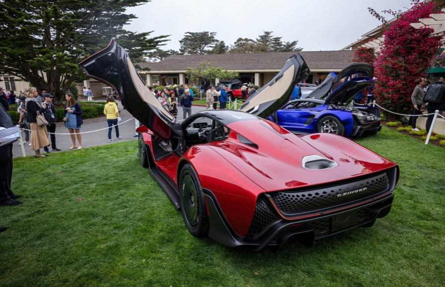
The Czinger 21 CV Max at Pebble Beach. Monterey Car Week concentrates on historic and classic automobiles, but modern versions like this Czinger hypercar also showed.
DPM/Bloomberg
The 1932 Duesenberg J Figoni Sports Torpedo won Best in Show in 2022. Lee and Penny Anderson of Naples, Fla., own the once-separate-chassis-from-body automobile.
DPM/Bloomberg

Will Lockett
2 years ago
There Is A New EV King in Town

McMurtry Spéirling outperforms Tesla in speed and efficiency.
EVs were ridiculously slow for decades. However, the 2008 Tesla Roadster revealed that EVs might go extraordinarily fast. The Tesla Model S Plaid and Rimac Nevera are the fastest-accelerating road vehicles, despite combustion-engined road cars dominating the course. A little-known firm beat Tesla and Rimac in the 0-60 race, beat F1 vehicles on a circuit, and boasts a 350-mile driving range. The McMurtry Spéirling is completely insane.
Mat Watson of CarWow, a YouTube megastar, was recently handed a Spéirling and access to Silverstone Circuit (view video above). Mat ran a quarter-mile on Silverstone straight with former F1 driver Max Chilton. The little pocket-rocket automobile touched 100 mph in 2.7 seconds, completed the quarter mile in 7.97 seconds, and hit 0-60 in 1.4 seconds. When looking at autos quickly, 0-60 times can seem near. The Tesla Model S Plaid does 0-60 in 1.99 seconds, which is comparable to the Spéirling. Despite the meager statistics, the Spéirling is nearly 30% faster than Plaid!
My vintage VW Golf 1.4s has an 8.8-second 0-60 time, whereas a BMW Z4 3.0i is 30% faster (with a 0-60 time of 6 seconds). I tried to beat a Z4 off the lights in my Golf, but the Beamer flew away. If they challenge the Spéirling in a Model S Plaid, they'll feel as I did. Fast!
Insane quarter-mile drag time. Its road car record is 7.97 seconds. A Dodge Demon, meant to run extremely fast quarter miles, finishes so in 9.65 seconds, approximately 20% slower. The Rimac Nevera's 8.582-second quarter-mile record was miles behind drag racing. This run hampered the Spéirling. Because it was employing gearing that limited its top speed to 150 mph, it reached there in a little over 5 seconds without accelerating for most of the quarter mile! McMurtry can easily change the gearing, making the Spéirling run quicker.
McMurtry did this how? First, the Spéirling is a tiny single-seater EV with a 60 kWh battery pack, making it one of the lightest EVs ever. The 1,000-hp Spéirling has more than one horsepower per kg. The Nevera has 0.84 horsepower per kg and the Plaid 0.44.
However, you cannot simply construct a car light and power it. Instead of accelerating, it would spin. This makes the Spéirling a fan car. Its huge fans create massive downforce. These fans provide the Spéirling 2 tonnes of downforce while stationary, so you could park it on the ceiling. Its fast 0-60 time comes from its downforce, which lets it deliver all that power without wheel spin.
It also possesses complete downforce at all speeds, allowing it to tackle turns faster than even race vehicles. Spéirlings overcame VW IDRs and F1 cars to set the Goodwood Hill Climb record (read more here). The Spéirling is a dragstrip winner and track dominator, unlike the Plaid and Nevera.
The Spéirling is astonishing for a single-seater. Fan-generated downforce is more efficient than wings and splitters. It also means the vehicle has very minimal drag without the fan. The Spéirling can go 350 miles per charge (WLTP) or 20-30 minutes at full speed on a track despite its 60 kWh battery pack. The G-forces would hurt your neck before the battery died if you drove around a track for longer. The Spéirling can charge at over 200 kW in about 30 minutes. Thus, driving to track days, having fun, and returning is possible. Unlike other high-performance EVs.
Tesla, Rimac, or Lucid will struggle to defeat the Spéirling. They would need to build a fan automobile because adding power to their current vehicle would make it uncontrollable. The EV and automobile industries now have a new, untouchable performance king.
You might also like

Ben "The Hosk" Hosking
3 years ago
The Yellow Cat Test Is Typically Failed by Software Developers.
Believe what you see, what people say
It’s sad that we never get trained to leave assumptions behind. - Sebastian Thrun
Many problems in software development are not because of code but because developers create the wrong software. This isn't rare because software is emergent and most individuals only realize what they want after it's built.
Inquisitive developers who pass the yellow cat test can improve the process.
Carpenters measure twice and cut the wood once. Developers are rarely so careful.
The Yellow Cat Test
Game of Thrones made dragons cool again, so I am reading The Game of Thrones book.
The yellow cat exam is from Syrio Forel, Arya Stark's fencing instructor.
Syrio tells Arya he'll strike left when fencing. He hits her after she dodges left. Arya says “you lied”. Syrio says his words lied, but his eyes and arm told the truth.
Arya learns how Syrio became Bravos' first sword.
“On the day I am speaking of, the first sword was newly dead, and the Sealord sent for me. Many bravos had come to him, and as many had been sent away, none could say why. When I came into his presence, he was seated, and in his lap was a fat yellow cat. He told me that one of his captains had brought the beast to him, from an island beyond the sunrise. ‘Have you ever seen her like?’ he asked of me.
“And to him I said, ‘Each night in the alleys of Braavos I see a thousand like him,’ and the Sealord laughed, and that day I was named the first sword.”
Arya screwed up her face. “I don’t understand.”
Syrio clicked his teeth together. “The cat was an ordinary cat, no more. The others expected a fabulous beast, so that is what they saw. How large it was, they said. It was no larger than any other cat, only fat from indolence, for the Sealord fed it from his own table. What curious small ears, they said. Its ears had been chewed away in kitten fights. And it was plainly a tomcat, yet the Sealord said ‘her,’ and that is what the others saw. Are you hearing?” Reddit discussion.
Development teams should not believe what they are told.
We created an appointment booking system. We thought it was an appointment-booking system. Later, we realized the software's purpose was to book the right people for appointments and discourage the unneeded ones.
The first 3 months of the project had half-correct requirements and software understanding.
Open your eyes
“Open your eyes is all that is needed. The heart lies and the head plays tricks with us, but the eyes see true. Look with your eyes, hear with your ears. Taste with your mouth. Smell with your nose. Feel with your skin. Then comes the thinking afterwards, and in that way, knowing the truth” Syrio Ferel
We must see what exists, not what individuals tell the development team or how developers think the software should work. Initial criteria cover 50/70% and change.
Developers build assumptions problems by assuming how software should work. Developers must quickly explain assumptions.
When a development team's assumptions are inaccurate, they must alter the code, DevOps, documentation, and tests.
It’s always faster and easier to fix requirements before code is written.
First-draft requirements can be based on old software. Development teams must grasp corporate goals and consider needs from many angles.
Testers help rethink requirements. They look at how software requirements shouldn't operate.
Technical features and benefits might misdirect software projects.
The initiatives that focused on technological possibilities developed hard-to-use software that needed extensive rewriting following user testing.
Software development
High-level criteria are different from detailed ones.
The interpretation of words determines their meaning.
Presentations are lofty, upbeat, and prejudiced.
People's perceptions may be unclear, incorrect, or just based on one perspective (half the story)
Developers can be misled by requirements, circumstances, people, plans, diagrams, designs, documentation, and many other things.
Developers receive misinformation, misunderstandings, and wrong assumptions. The development team must avoid building software with erroneous specifications.
Once code and software are written, the development team changes and fixes them.
Developers create software with incomplete information, they need to fill in the blanks to create the complete picture.
Conclusion
Yellow cats are often inaccurate when communicating requirements.
Before writing code, clarify requirements, assumptions, etc.
Everyone will pressure the development team to generate code rapidly, but this will slow down development.
Code changes are harder than requirements.
Blake Montgomery
3 years ago
Explaining Twitter Files
Elon Musk, Matt Taibbi, the 'Twitter Files,' and Hunter Biden's laptop: what gives?
Explaining Twitter Files
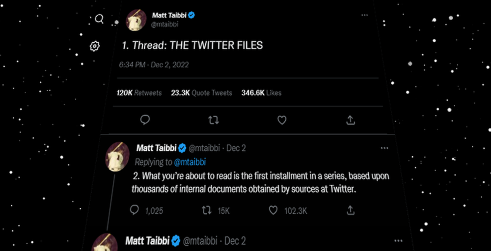
Matt Taibbi released "The Twitter Files," a batch of emails sent by Twitter executives discussing the company's decision to stop an October 2020 New York Post story online.
What's on Twitter? New York Post and Fox News call them "bombshell" documents. Or, as a Post columnist admitted, are they "not the smoking gun"? Onward!
What started this?
The New York Post published an exclusive, potentially explosive story in October 2020: Biden's Secret Emails: Ukrainian executive thanks Hunter Biden for'meeting' veep dad. The story purported to report the contents of a laptop brought to the tabloid by a Delaware computer repair shop owner who said it belonged to President Biden's second son, Hunter Biden. Emails and files on the laptop allegedly showed how Hunter peddled influence with Ukranian businessmen and included a "raunchy 12-minute video" of Hunter smoking crack and having sex.
Twitter banned links to the Post story after it was published, calling it "hacked material." The Post's Twitter account was suspended for multiple days.
Why? Yoel Roth, Twitter's former head of trust and safety, said the company couldn't verify the story, implying they didn't trust the Post.
Twitter's stated purpose rarely includes verifying news stories. This seemed like intentional political interference. This story was hard to verify because the people who claimed to have found the laptop wouldn't give it to other newspapers. (Much of the story, including Hunter's business dealings in Ukraine and China, was later confirmed.)
Roth: "It looked like a hack and leak."
So what are the “Twitter Files?”
Twitter's decision to bury the story became a political scandal, and new CEO Elon Musk promised an explanation. The Twitter Files, named after Facebook leaks.
Musk promised exclusive details of "what really happened" with Hunter Biden late Friday afternoon. The tweet was punctuated with a popcorn emoji.
Explaining Twitter Files
Three hours later, journalist Matt Taibbi tweeted more than three dozen tweets based on internal Twitter documents that revealed "a Frankensteinian tale of a human-built mechanism grown out of its designer's control."
Musk sees this release as a way to shape Twitter's public perception and internal culture in his image. We don't know if the CEO gave Taibbi the documents. Musk hyped the document dump before and during publication, but Taibbi cited "internal sources."
Taibbi shares email screenshots showing Twitter execs discussing the Post story and blocking its distribution. Taibbi says the emails show Twitter's "extraordinary steps" to bury the story.
Twitter communications chief Brandon Borrman has the most damning quote in the Files. Can we say this is policy? The story seemed unbelievable. It seemed like a hack... or not? Could Twitter, which ex-CEO Dick Costolo called "the free speech wing of the free speech party," censor a news story?
Many on the right say the Twitter Files prove the company acted at the behest of Democrats. Both parties had these tools, writes Taibbi. In 2020, both the Trump White House and Biden campaign made requests. He says the system for reporting tweets for deletion is unbalanced because Twitter employees' political donations favor Democrats. Perhaps. These donations may have helped Democrats connect with Twitter staff, but it's also possible they didn't. No emails in Taibbi's cache show these alleged illicit relations or any actions Twitter employees took as a result.
Even Musk's supporters were surprised by the drop. Miranda Devine of the New York Post told Tucker Carlson the documents weren't "the smoking gun we'd hoped for." Sebastian Gorka said on Truth Social, "So far, I'm deeply underwhelmed." DC Democrats collude with Palo Alto Democrats. Whoop!” The Washington Free Beacon's Joe Simonson said the Twitter files are "underwhelming." Twitter was staffed by Democrats who did their bidding. (Why?)
If "The Twitter Files" matter, why?
These emails led Twitter to suppress the Hunter Biden laptop story has real news value. It's rare for a large and valuable company like Twitter to address wrongdoing so thoroughly. Emails resemble FOIA documents. They describe internal drama at a company with government-level power. Katie Notopoulos tweeted, "Any news outlet would've loved this scoop!" It's not a'scandal' as teased."
Twitter's new owner calls it "the de facto public town square," implying public accountability. Like a government agency. Though it's exciting to receive once-hidden documents in response to a FOIA, they may be boring and tell you nothing new. Like Twitter files. We learned how Twitter blocked the Post's story, but not why. Before these documents were released, we knew Twitter had suppressed the story and who was involved.
These people were disciplined and left Twitter. Musk fired Vijaya Gadde, the former CLO who reportedly played a "key role" in the decision. Roth quit over Musk's "dictatorship." Musk arrived after Borrman left. Jack Dorsey, then-CEO, has left. Did those who digitally quarantined the Post's story favor Joe Biden and the Democrats? Republican Party opposition and Trump hatred? New York Post distaste? According to our documents, no. Was there political and press interference? True. We knew.
Taibbi interviewed anonymous ex-Twitter employees about the decision; all expressed shock and outrage. One source said, "Everyone knew this was fucked." Since Taibbi doesn't quote that expletive, we can assume the leaked emails contained few or no sensational quotes. These executives said little to support nefarious claims.
Outlets more invested in the Hunter Biden story than Gizmodo seem vexed by the release and muted headlines. The New York Post, which has never shied away from a blaring headline in its 221-year history, owns the story of Hunter Biden's laptop. Two Friday-night Post alerts about Musk's actions were restrained. Elon Musk will drop Twitter files on NY Post-Hunter Biden laptop censorship today. Elon Musk's Twitter dropped Post censorship details from Biden's laptop. Fox News' Apple News push alert read, "Elon Musk drops Twitter censorship documents."
Bombshell, bombshell, bombshell… what, exactly, is the bombshell? Maybe we've heard this story too much and are missing the big picture. Maybe these documents detail a well-documented decision.
The Post explains why on its website. "Hunter Biden laptop bombshell: Twitter invented reason to censor Post's reporting," its headline says.
Twitter's ad hoc decision to moderate a tabloid's content is not surprising. The social network had done this for years as it battled toxic users—violent white nationalists, virulent transphobes, harassers and bullies of all political stripes, etc. No matter how much Musk crows, the company never had content moderation under control. Buzzfeed's 2016 investigation showed how Twitter has struggled with abusive posters since 2006. Jack Dorsey and his executives improvised, like Musk.
Did the US government interfere with the ex-social VP's media company? That's shocking, a bombshell. Musk said Friday, "Twitter suppressing free speech by itself is not a 1st amendment violation, but acting under government orders with no judicial review is." Indeed! Taibbi believed this. August 2022: "The laptop is secondary." Zeynep Tufecki, a Columbia professor and New York Times columnist, says the FBI is cutting true story distribution. Taibbi retracted the claim Friday night: "I've seen no evidence of government involvement in the laptop story."
What’s the bottom line?
I'm still not sure what's at stake in the Hunter Biden scandal after dozens of New York Post articles, hundreds of hours of Fox News airtime, and thousands of tweets. Briefly: Joe Biden's son left his laptop with a questionable repairman. FBI confiscated it? The repairman made a copy and gave it to Rudy Giuliani's lawyer. The Post got it from Steve Bannon. On that laptop were videos of Hunter Biden smoking crack, cavorting with prostitutes, and emails about introducing his father to a Ukrainian businessman for $50,000 a month. Joe Biden urged Ukraine to fire a prosecutor investigating the company. What? The story seems to be about Biden family business dealings, right?
The discussion has moved past that point anyway. Now, the story is the censorship of it. Adrienne Rich wrote in "Diving Into the Wreck" that she came for "the wreck and not the story of the wreck" No matter how far we go, Hunter Biden's laptop is done. Now, the crash's story matters.
I'm dizzy. Katherine Miller of BuzzFeed wrote, "I know who I believe, and you probably do, too. To believe one is to disbelieve the other, which implicates us in the decision; we're stuck." I'm stuck. Hunter Biden's laptop is a political fabrication. You choose. I've decided.
This could change. Twitter Files drama continues. Taibbi said, "Much more to come." I'm dizzy.

Theo Seeds
3 years ago
The nine novels that have fundamentally altered the way I view the world
I read 53 novels last year and hope to do so again.
Books are best if you love learning. You get a range of perspectives, unlike podcasts and YouTube channels where you get the same ones.
Book quality varies. I've read useless books. Most books teach me something.
These 9 novels have changed my outlook in recent years. They've made me rethink what I believed or introduced me to a fresh perspective that changed my worldview.
You can order these books yourself. Or, read my summaries to learn what I've synthesized.
Enjoy!
Fooled By Randomness
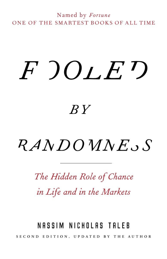
Nassim Taleb worked as a Wall Street analyst. He used options trading to bet on unlikely events like stock market crashes.
Using financial models, investors predict stock prices. The models assume constant, predictable company growth.
These models base their assumptions on historical data, so they assume the future will be like the past.
Fooled By Randomness argues that the future won't be like the past. We often see impossible market crashes like 2008's housing market collapse. The world changes too quickly to use historical data: by the time we understand how it works, it's changed.
Most people don't live to see history unfold. We think our childhood world will last forever. That goes double for stable societies like the U.S., which hasn't seen major turbulence in anyone's lifetime.
Fooled By Randomness taught me to expect the unexpected. The world is deceptive and rarely works as we expect. You can't always trust your past successes or what you've learned.
Antifragile
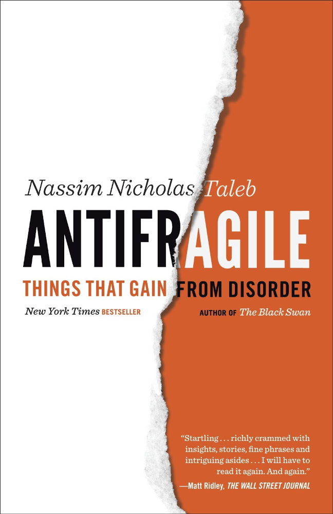
More Taleb. Some things, like the restaurant industry and the human body, improve under conditions of volatility and turbulence.
We didn't have a word for this counterintuitive concept until Taleb wrote Antifragile. The human body (which responds to some stressors, like exercise, by getting stronger) and the restaurant industry both benefit long-term from disorder (when economic turbulence happens, bad restaurants go out of business, improving the industry as a whole).
Many human systems are designed to minimize short-term variance because humans don't understand it. By eliminating short-term variation, we increase the likelihood of a major disaster.
Once, we put out every forest fire we found. Then, dead wood piled up in forests, causing catastrophic fires.
We don't like price changes, so politicians prop up markets with stimulus packages and printing money. This leads to a bigger crash later. Two years ago, we printed a ton of money for stimulus checks, and now we have double-digit inflation.
Antifragile taught me how important Plan B is. A system with one or two major weaknesses will fail. Make large systems redundant, foolproof, and change-responsive.
Reality is broken
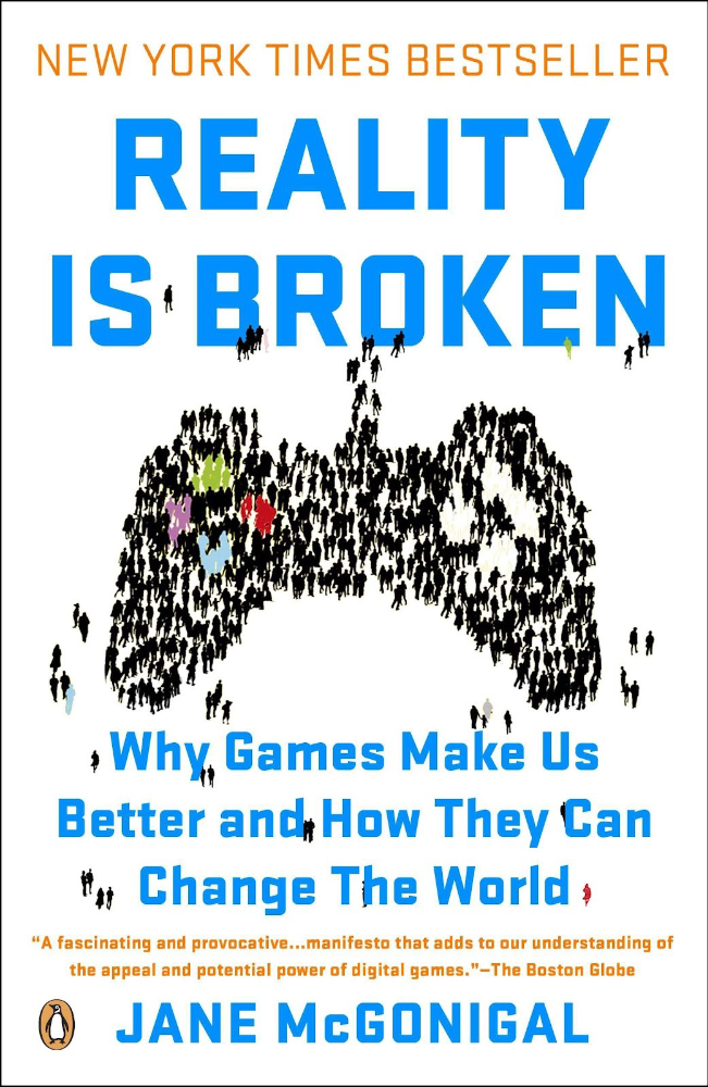
We dread work. Work is tedious. Right?
Wrong. Work gives many people purpose. People are happiest when working. (That's why some are workaholics.)
Factory work saps your soul, office work is boring, and working for a large company you don't believe in and that operates unethically isn't satisfying.
Jane McGonigal says in Reality Is Broken that meaningful work makes us happy. People love games because they simulate good work. McGonigal says work should be more fun.
Some think they'd be happy on a private island sipping cocktails all day. That's not true. Without anything to do, most people would be bored. Unemployed people are miserable. Many retirees die within 2 years, much more than expected.
Instead of complaining, find meaningful work. If you don't like your job, it's because you're in the wrong environment. Find the right setting.
The Lean Startup
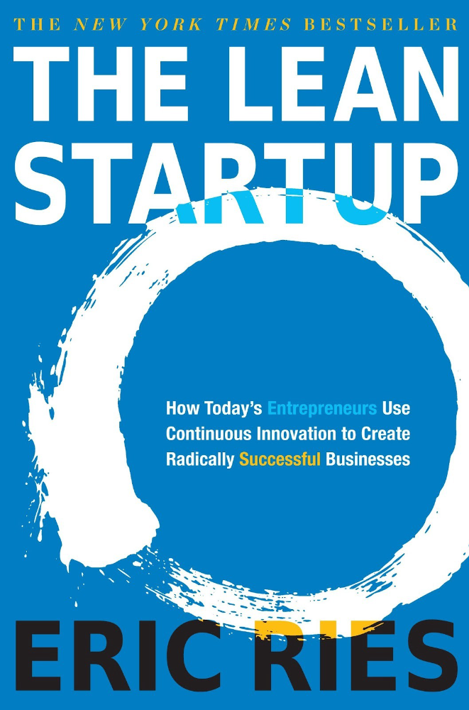
Before the airplane was invented, Harvard scientists researched flying machines. Who knew two North Carolina weirdos would beat them?
The Wright Brothers' plane design was key. Harvard researchers were mostly theoretical, designing an airplane on paper and trying to make it fly in theory. They'd build it, test it, and it wouldn't fly.
The Wright Brothers were different. They'd build a cheap plane, test it, and it'd crash. Then they'd learn from their mistakes, build another plane, and it'd crash.
They repeated this until they fixed all the problems and one of their planes stayed aloft.
Mistakes are considered bad. On the African savannah, one mistake meant death. Even today, if you make a costly mistake at work, you'll be fired as a scapegoat. Most people avoid failing.
In reality, making mistakes is the best way to learn.
Eric Reis offers an unintuitive recipe in The Lean Startup: come up with a hypothesis, test it, and fail. Then, try again with a new hypothesis. Keep trying, learning from each failure.
This is a great startup strategy. Startups are new businesses. Startups face uncertainty. Run lots of low-cost experiments to fail, learn, and succeed.
Don't fear failing. Low-cost failure is good because you learn more from it than you lose. As long as your worst-case scenario is acceptable, risk-taking is good.
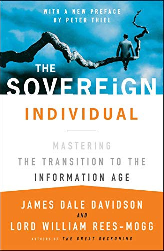
The Sovereign Individual
Today, nation-states rule the world. The UN recognizes 195 countries, and they claim almost all land outside of Antarctica.
We agree. For the past 2,000 years, much of the world's territory was ungoverned.
Why today? Because technology has created incentives for nation-states for most of the past 500 years. The logic of violence favors nation-states, according to James Dale Davidson, author of the Sovereign Individual. Governments have a lot to gain by conquering as much territory as possible, so they do.
Not always. During the Dark Ages, Europe was fragmented and had few central governments. Partly because of armor. With armor, a sword, and a horse, you couldn't be stopped. Large states were hard to form because they rely on the threat of violence.
When gunpowder became popular in Europe, violence changed. In a world with guns, assembling large armies and conquest are cheaper.
James Dale Davidson says the internet will make nation-states obsolete. Most of the world's wealth will be online and in people's heads, making capital mobile.
Nation-states rely on predatory taxation of the rich to fund large militaries and welfare programs.
When capital is mobile, people can live anywhere in the world, Davidson says, making predatory taxation impossible. They're not bound by their job, land, or factory location. Wherever they're treated best.
Davidson says that over the next century, nation-states will collapse because they won't have enough money to operate as they do now. He imagines a world of small city-states, like Italy before 1900. (or Singapore today).
We've already seen some movement toward a more Sovereign Individual-like world. The pandemic proved large-scale remote work is possible, freeing workers from their location. Many cities and countries offer remote workers incentives to relocate.
Many Western businesspeople live in tax havens, and more people are renouncing their US citizenship due to high taxes. Increasing globalization has led to poor economic conditions and resentment among average people in the West, which is why politicians like Trump and Sanders rose to popularity with angry rhetoric, even though Obama rose to popularity with a more hopeful message.
The Sovereign Individual convinced me that the future will be different than Nassim Taleb's. Large countries like the U.S. will likely lose influence in the coming decades, while Portugal, Singapore, and Turkey will rise. If the trend toward less freedom continues, people may flee the West en masse.
So a traditional life of college, a big firm job, hard work, and corporate advancement may not be wise. Young people should learn as much as possible and develop flexible skills to adapt to the future.
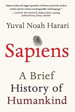
Sapiens
Sapiens is a history of humanity, from proto-humans in Ethiopia to our internet society today, with some future speculation.
Sapiens views humans (and Homo sapiens) as a unique species on Earth. We were animals 100,000 years ago. We're slowly becoming gods, able to affect the climate, travel to every corner of the Earth (and the Moon), build weapons that can kill us all, and wipe out thousands of species.
Sapiens examines what makes Homo sapiens unique. Humans can believe in myths like religion, money, and human-made entities like countries and LLCs.
These myths facilitate large-scale cooperation. Ants from the same colony can cooperate. Any two humans can trade, though. Even if they're not genetically related, large groups can bond over religion and nationality.
Combine that with intelligence, and you have a species capable of amazing feats.
Sapiens may make your head explode because it looks at the world without presupposing values, unlike most books. It questions things that aren't usually questioned and says provocative things.
It also shows how human history works. It may help you understand and predict the world. Maybe.
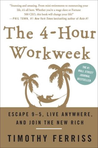
The 4-hour Workweek
Things can be done better.
Tradition, laziness, bad bosses, or incentive structures cause complacency. If you're willing to make changes and not settle for the status quo, you can do whatever you do better and achieve more in less time.
The Four-Hour Work Week advocates this. Tim Ferriss explains how he made more sales in 2 hours than his 8-hour-a-day colleagues.
By firing 2 of his most annoying customers and empowering his customer service reps to make more decisions, he was able to leave his business and travel to Europe.
Ferriss shows how to escape your 9-to-5, outsource your life, develop a business that feeds you with little time, and go on mini-retirement adventures abroad.
Don't accept the status quo. Instead, level up. Find a way to improve your results. And try new things.
Why Nations Fail
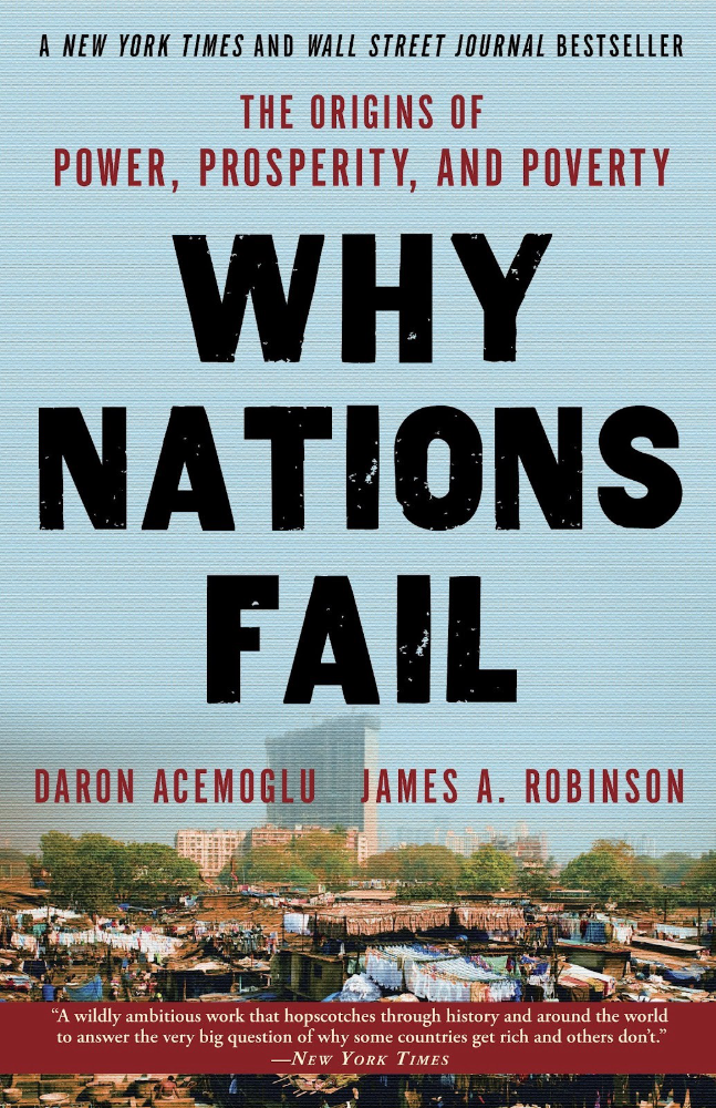
Nogales, Arizona and Mexico were once one town. The US/Mexico border was arbitrarily drawn.
Both towns have similar cultures and populations. Nogales, Arizona is well-developed and has a high standard of living. Nogales, Mexico is underdeveloped and has a low standard of living. Whoa!
Why Nations Fail explains how government-created institutions affect country development. Strong property rights, capitalism, and non-corrupt governments promote development. Countries without capitalism, strong property rights, or corrupt governments don't develop.
Successful countries must also embrace creative destruction. They must offer ordinary citizens a way to improve their lot by creating value for others, not reducing them to slaves, serfs, or peasants. Authors say that ordinary people could get rich on trading expeditions in 11th-century Venice.
East and West Germany and North and South Korea have different economies because their citizens are motivated differently. It explains why Chile, China, and Singapore grow so quickly after becoming market economies.
People have spent a lot of money on third-world poverty. According to Why Nations Fail, education and infrastructure aren't the answer. Developing nations must adopt free-market economic policies.
Elon Musk
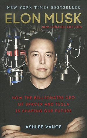
Elon Musk is the world's richest man, but that’s not a good way to describe him. Elon Musk is the world's richest man, which is like calling Steve Jobs a turtleneck-wearer or Benjamin Franklin a printer.
Elon Musk does cool sci-fi stuff to help humanity avoid existential threats.
Oil will run out. We've delayed this by developing better extraction methods. We only have so much nonrenewable oil.
Our society is doomed if it depends on oil. Elon Musk invested heavily in Tesla and SolarCity to speed the shift to renewable energy.
Musk worries about AI: we'll build machines smarter than us. We won't be able to stop these machines if something goes wrong, just like cows can't fight humans. Neuralink: we need to be smarter to compete with AI when the time comes.
If Earth becomes uninhabitable, we need a backup plan. Asteroid or nuclear war could strike Earth at any moment. We may not have much time to react if it happens in a few days. We must build a new civilization while times are good and resources are plentiful.
Short-term problems dominate our politics, but long-term issues are more important. Long-term problems can cause mass casualties and homelessness. Musk demonstrates how to think long-term.
The main reason people are impressed by Elon Musk, and why Ashlee Vances' biography influenced me so much, is that he does impossible things.
Electric cars were once considered unprofitable, but Tesla has made them mainstream. SpaceX is the world's largest private space company.
People lack imagination and dismiss ununderstood ideas as impossible. Humanity is about pushing limits. Don't worry if your dreams seem impossible. Try it.
Thanks for reading.