This Month Will See The Release Of Travis Scott x Nike Footwear
Following the catastrophes at Astroworld, Travis Scott was swiftly vilified by both media outlets and fans alike, and the names who had previously supported him were quickly abandoned. Nike, on the other hand, remained silent, only delaying the release of La Flame's planned collaborations, such as the Air Max 1 and Air Trainer 1, indefinitely. While some may believe it is too soon for the artist to return to the spotlight, the Swoosh has other ideas, as Nice Kicks reveals that these exact sneakers will be released in May.
Both the Travis Scott x Nike Air Max 1 and the Travis Scott x Nike Air Trainer 1 are set to come in two colorways this month. Tinker Hatfield's renowned runner will meet La Flame's "Baroque Brown" and "Saturn Gold" make-ups, which have been altered with backwards Swooshes and outdoors-themed webbing. The high-top trainer is being customized with Hatfield's "Wheat" and "Grey Haze" palettes, both of which include zippers across the heel, co-branded patches, and other details.
See below for a closer look at the four footwear. TravisScott.com is expected to release the shoes on May 20th, according to Nice Kicks. Following that, on May 27th, Nike SNKRS will release the shoe.
Travis Scott x Nike Air Max 1 "Baroque Brown"
Release Date: 2022
Color: Baroque Brown/Lemon Drop/Wheat/Chile Red
Mens: $160
Style Code: DO9392-200
Pre-School: $85
Style Code: DN4169-200
Infant & Toddler: $70
Style Code: DN4170-200
Travis Scott x Nike Air Max 1 "Saturn Gold"
Release Date: 2022
Color: N/A
Mens: $160
Style Code: DO9392-700
Travis Scott x Nike Air Trainer 1 "Wheat"
Restock Date: May 27th, 2022 (Friday)
Original Release Date: May 20th, 2022 (Friday)
Color: N/A
Mens: $140
Style Code: DR7515-200
Travis Scott x Nike Air Trainer 1 "Grey Haze"
Restock Date: May 27th, 2022 (Friday)
Original Release Date: May 20th, 2022 (Friday)
Color: N/A
Mens: $140
Style Code: DR7515-001
More on Lifestyle

Peter Steven Ho
3 years ago
Thank You for 21 Fantastic Years, iPod
Apple's latest revelation may shock iPod fans and former owners.
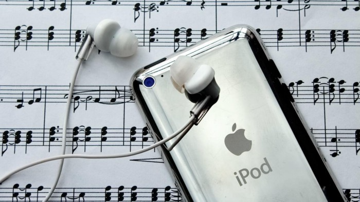
Apple discontinued the iPod touch on May 11, 2022. After 21 years, Apple killed the last surviving iPod, a device Steve Jobs believed would revolutionize the music industry.
Jobs was used to making bold predictions, but few expected Apple's digital music player to change the music industry. It did.
This chaos created new business opportunities. Spotify, YouTube, and Amazon are products of that chaotic era.
As the digital landscape changes, so do consumers, and the iPod has lost favor. I'm sure Apple realizes the importance of removing an icon. The iPod was Apple like the Mac and iPhone. I think it's bold to retire such a key Apple cornerstone. What would Jobs do?
iPod evolution across the ages
Here's an iPod family tree for all you enthusiasts.
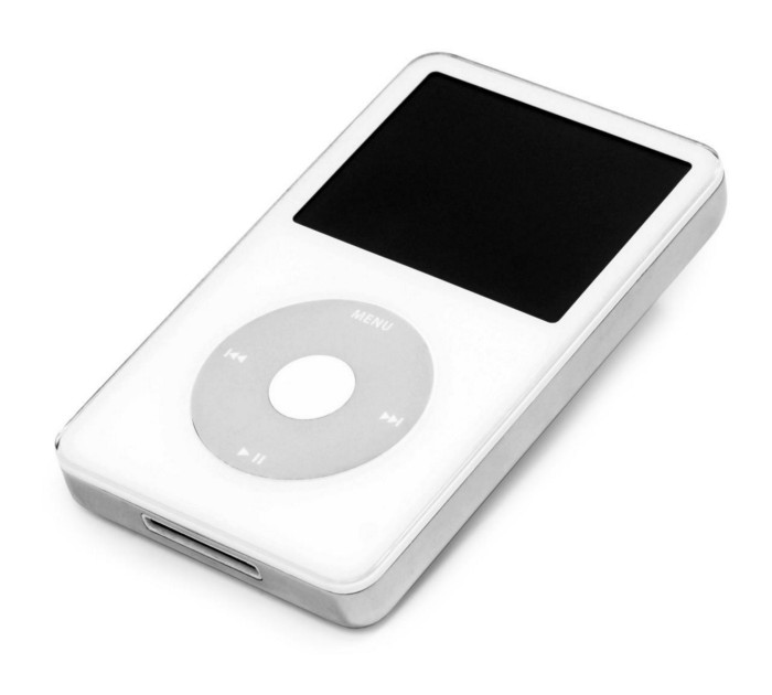
iPod vintage (Oct 2001 to Sep 2014, 6 generations)
The original iPod had six significant upgrades since 2001. Apple announced an 80 GB ($249) and 160 GB ($349) iPod classic in 2007.
Apple updated the 80 GB model with a 120 GB device in September 2008. Apple upgraded the 120 GB model with a 160 GB variant a year later (2009). This was the last iteration, and Apple discontinued the classic in September 2014.
iPod nano (Jan 2004 to Sep 2005, 2 generations)
Apple debuted a smaller, brightly-colored iPod in 2004. The first model featured 4 GB, enough for 1,000 songs.
Apple produced a new 4 GB or 6 GB iPod mini in February 2005 and discontinued it in September when they released a better-looking iPod nano.
iTouch nano (Sep 2005 to July 2017, 7 generations)
I loved the iPod nano. It was tiny and elegant with enough tech to please most music aficionados, unless you carry around your complete music collection.
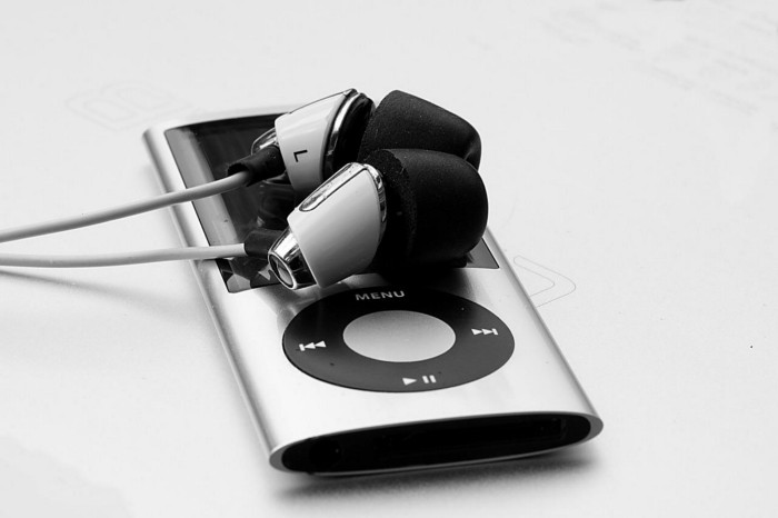
Apple owed much of the iPod nano's small form and success to solid-state flash memory. Flash memory doesn't need power because it has no moving parts. This makes the iPod nano more durable than the iPod classic and mini, which employ hard drives.
Apple manufactured seven generations of the iPod nano, improving its design, display screen, memory, battery, and software, but abandoned it in July 2017 due to dwindling demand.
Shuffle iPod (Jan 2005 to Jul 2017, 4 generations)
The iPod shuffle was entry-level. It was a simple, lightweight, tiny music player. The iPod shuffle was perfect for lengthy bike trips, runs, and hikes.

Apple sold 10 million iPod shuffles in the first year and kept making them for 12 years, through four significant modifications.
iOS device (Sep 2007 to May 2022, 7 generations)
The iPod touch's bigger touchscreen interface made it a curious addition to the iPod family. The iPod touch resembled an iPhone more than the other iPods, making them hard to tell apart.
Many were dissatisfied that Apple removed functionality from the iPod touch to avoid making it too similar to the iPhone. Seven design improvements over 15 years brought the iPod touch closer to the iPhone, but not completely.
The iPod touch uses the same iOS operating system as the iPhone, giving it access to many apps, including handheld games.
The iPod touch's long production run is due to the next generation of music-loving gamers.
What made the iPod cool
iPod revolutionized music listening. It was the first device to store and play MP3 music, allowing you to carry over 1,000 songs anywhere.
The iPod changed consumer electronics with its scroll wheel and touchscreen. Jobs valued form and function equally. He showed people that a product must look good to inspire an emotional response and ignite passion.
The elegant, tiny iPod was a tremendous sensation when it arrived for $399 in October 2001. Even at this price, it became a must-have for teens to CEOs.
It's hard to identify any technology that changed how music was downloaded and played like the iPod. Apple iPod and iTunes had 63% of the paid music download market in the fourth quarter of 2012.
The demise of the iPod was inevitable
Apple discontinuing the iPod touch after 21 years is sad. This ends a 00s music icon.
Jobs was a genius at anticipating market needs and opportunities, and Apple launched the iPod at the correct time.
Few consumer electronics items have had such a lasting impact on music lovers and the music industry as the iPod.
Smartphones and social media have contributed to the iPod's decline. Instead of moving to the music, the new generation of consumers is focused on social media. They're no longer passive content consumers; they're active content creators seeking likes and followers. Here, the smartphone has replaced the iPod.
It's hard not to feel a feeling of loss, another part of my adolescence now forgotten by the following generation.
So, if you’re lucky enough to have a working iPod, hang on to that relic and enjoy the music and the nostalgia.

Stephen Rivers
3 years ago
Because of regulations, the $3 million Mercedes-AMG ONE will not (officially) be available in the United States or Canada.
We asked Mercedes to clarify whether "customers" refers to people who have expressed interest in buying the AMG ONE but haven't made a down payment or paid in full for a production slot, and a company spokesperson told that it's the latter – "Actual customers for AMG ONE in the United States and Canada."
The Mercedes-AMG ONE has finally arrived in manufacturing form after numerous delays. This may be the most complicated and magnificent hypercar ever created, but according to Mercedes, those roads will not be found in the United States or Canada.
Despite all of the well-deserved excitement around the gorgeous AMG ONE, there was no word on when US customers could expect their cars. Our Editor-in-Chief became aware of this and contacted Mercedes to clarify the matter. Mercedes-hypercar AMG's with the F1-derived 1,049 HP 1.6-liter V6 engine will not be homologated for the US market, they've confirmed.
Mercedes has informed its customers in the United States and Canada that the ONE will not be arriving to North America after all, as of today, June 1, 2022. The whole text of the letter is included below, so sit back and wait for Mercedes to explain why we (or they) won't be getting (or seeing) the hypercar. Mercedes claims that all 275 cars it wants to produce have already been reserved, with net pricing in Europe starting at €2.75 million (about US$2.93 million at today's exchange rates), before country-specific taxes.
"The AMG-ONE was created with one purpose in mind: to provide a straight technology transfer of the World Championship-winning Mercedes-AMG Petronas Formula 1 E PERFORMANCE drive unit to the road." It's the first time a complete Formula 1 drive unit has been integrated into a road car.
Every component of the AMG ONE has been engineered to redefine high performance, with 1,000+ horsepower, four electric motors, and a blazing top speed of more than 217 mph. While the engine's beginnings are in competition, continuous research and refinement has left us with a difficult choice for the US market.
We determined that following US road requirements would considerably damage its performance and overall driving character in order to preserve the distinctive nature of its F1 powerplant. We've made the strategic choice to make the automobile available for road use in Europe, where it complies with all necessary rules."
If this is the first time US customers have heard about it, which it shouldn't be, we understand if it's a bit off-putting. The AMG ONE could very probably be Mercedes' final internal combustion hypercar of this type.
Nonetheless, we wouldn't be surprised if a few make their way to the United States via the federal government's "Show and Display" exemption provision. This legislation permits the importation of automobiles such as the AMG ONE, but only for a total of 2,500 miles per year.
The McLaren Speedtail, the Koenigsegg One:1, and the Bugatti EB110 are among the automobiles that have been imported under this special rule. We just hope we don't have to wait too long to see the ONE in the United States.

Michael Le
4 years ago
Union LA x Air Jordan 2 “Future Is Now” PREVIEW
With the help of Virgil Abloh and Union LA‘s Chris Gibbs, it's now clear that Jordan Brand intended to bring the Air Jordan 2 back in 2022.
The “Future Is Now” collection includes two colorways of MJ's second signature as well as an extensive range of apparel and accessories.
“We wanted to juxtapose what some futuristic gear might look like after being worn and patina'd,”
Union stated on the collaboration's landing page.
“You often see people's future visions that are crisp and sterile. We thought it would be cool to wear it in and make it organic...”
The classic co-branding appears on short-sleeve tees, hoodies, and sweat shorts/sweat pants, all lightly distressed at the hems and seams.
Also, a filtered black-and-white photo of MJ graces the adjacent long sleeves, labels stitch into the socks, and the Jumpman logo adorns the four caps.
Liner jackets and flight pants will also be available, adding reimagined militaria to a civilian ensemble.
The Union LA x Air Jordan 2 (Grey Fog and Rattan) shares many of the same beats. Vintage suedes show age, while perforations and detailing reimagine Bruce Kilgore's design for the future.
The “UN/LA” tag across the modified eye stays, the leather patch across the tongue, and the label that wraps over the lateral side of the collar complete the look.
The footwear will also include a Crater Slide in the “Grey Fog” color scheme.
BUYING
On 4/9 and 4/10 from 9am-3pm, Union LA will be giving away a pair of Air Jordan 2s at their La Brea storefront (110 S. LA BREA AVE. LA, CA 90036). The raffle is only open to LA County residents with a valid CA ID. You must enter by 11:59pm on 4/10 to win. Winners will be notified via email.
You might also like

Techletters
3 years ago
Using Synthesia, DALL-E 2, and Chat GPT-3, create AI news videos
Combining AIs creates realistic AI News Videos.

Powerful AI tools like Chat GPT-3 are trending. Have you combined AIs?
The 1-minute fake news video below is startlingly realistic. Artificial Intelligence developed NASA's Mars exploration breakthrough video (AI). However, integrating the aforementioned AIs generated it.
AI-generated text for the Chat GPT-3 based on a succinct tagline
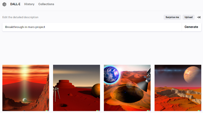
DALL-E-2 AI generates an image from a brief slogan.
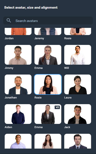
Artificial intelligence-generated avatar and speech
This article shows how to use and mix the three AIs to make a realistic news video. First, watch the video (1 minute).
Talk GPT-3
Chat GPT-3 is an OpenAI NLP model. It can auto-complete text and produce conversational responses.
Try it at the playground. The AI will write a comprehensive text from a brief tagline. Let's see what the AI generates with "Breakthrough in Mars Project" as the headline.
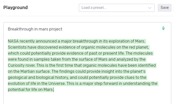
Amazing. Our tagline matches our complete and realistic text. Fake news can start here.
DALL-E-2
OpenAI's huge transformer-based language model DALL-E-2. Its GPT-3 basis is geared for image generation. It can generate high-quality photos from a brief phrase and create artwork and images of non-existent objects.
DALL-E-2 can create a news video background. We'll use "Breakthrough in Mars project" again. Our AI creates four striking visuals. Last.
Synthesia
Synthesia lets you quickly produce videos with AI avatars and synthetic vocals.
Avatars are first. Rosie it is.
Upload and select DALL-backdrop. E-2's
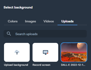
Copy the Chat GPT-3 content and choose a synthetic voice.

Voice: English (US) Professional.
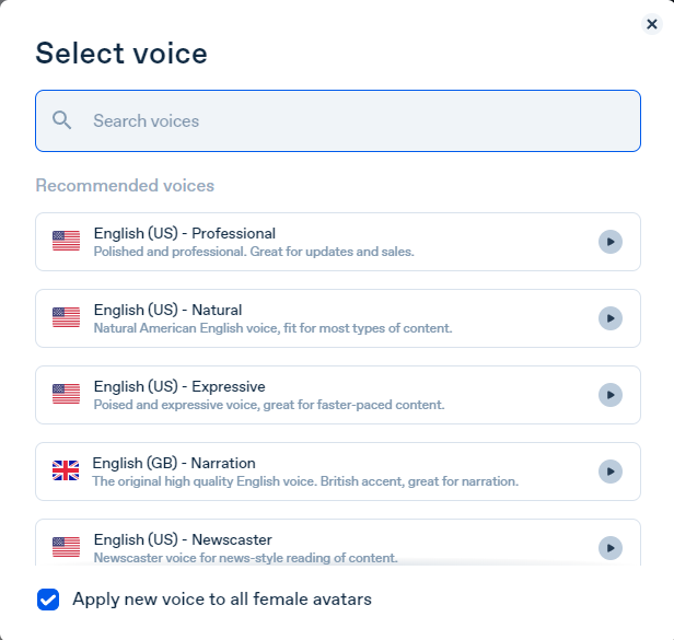
Finally, we generate and watch or download our video.
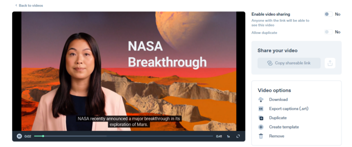
Synthesia AI completes the AI video.
Overview & Resources
We used three AIs to make surprisingly realistic NASA Mars breakthrough fake news in this post. Synthesia generates an avatar and a synthetic voice, therefore it may be four AIs.
These AIs created our fake news.
AI-generated text for the Chat GPT-3 based on a succinct tagline
DALL-E-2 AI generates an image from a brief slogan.
Artificial intelligence-generated avatar and speech

ANTHONY P.
3 years ago
Startups are difficult. Streamlining the procedure for creating the following unicorn.
New ventures are exciting. It's fun to imagine yourself rich, successful, and famous (if that's your thing). How you'll help others and make your family proud. This excitement can pull you forward for years, even when you intuitively realize that the path you're on may not lead to your desired success.
Know when to change course. Switching course can mean pivoting or changing direction.
In this not-so-short blog, I'll describe the journey of building your dream. And how the journey might look when you think you're building your dream, but fall short of that vision. Both can feel similar in the beginning, but there are subtle differences.
Let’s dive in.
How an exciting journey to a dead end looks and feels.
You want to help many people. You're business-minded, creative, and ambitious. You jump into entrepreneurship. You're excited, free, and in control.
I'll use tech as an example because that's what I know best, but this applies to any entrepreneurial endeavor.
So you start learning the basics of your field, say coding/software development. You read books, take courses, and may even join a bootcamp. You start practicing, and the journey begins. Once you reach a certain level of skill (which can take months, usually 12-24), you gain the confidence to speak with others in the field and find common ground. You might attract a co-founder this way with time. You and this person embark on a journey (Tip: the idea you start with is rarely the idea you end with).
Amateur mistake #1: You spend months building a product before speaking to customers.
Building something pulls you forward blindly. You make mistakes, avoid customers, and build with your co-founder or small team in the dark for months, usually 6-12 months.
You're excited when the product launches. We'll be billionaires! The market won't believe it. This excites you and the team. Launch.
….
Nothing happens.
Some people may sign up out of pity, only to never use the product or service again.
You and the team are confused, discouraged and in denial. They don't get what we've built yet. We need to market it better, we need to talk to more investors, someone will understand our vision.
This is a hopeless path, and your denial could last another 6 months. If you're lucky, while talking to consumers and investors (which you should have done from the start), someone who has been there before would pity you and give you an idea to pivot into that can create income.
Suppose you get this idea and pivot your business. Again, you've just pivoted into something limited by what you've already built. It may be a revenue-generating idea, but it's rarely new. Now you're playing catch-up, doing something others are doing but you can do better. (Tip #2: Don't be late.) Your chances of winning are slim, and you'll likely never catch up.
You're finally seeing revenue and feel successful. You can compete, but if you're not a first mover, you won't earn enough over time. You'll get by or work harder than ever to earn what a skilled trade could provide. You didn't go into business to stress out and make $100,000 or $200,000 a year. When you can make the same amount by becoming a great software developer, electrician, etc.
You become stuck. Either your firm continues this way for years until you realize there isn't enough growth to recruit a strong team and remove yourself from day-to-day operations due to competition. Or a catastrophic economic event forces you to admit that what you were building wasn't new and unique and wouldn't get you where you wanted to be.
This realization could take 6-10 years. No kidding.
The good news is, you’ve learned a lot along the way and this information can be used towards your next venture (if you have the energy).
Key Lesson: Don’t build something if you aren’t one of the first in the space building it just for the sake of building something.
-
Let's discuss what it's like to build something that can make your dream come true.
Case 2: Building something the market loves is difficult but rewarding.
It starts with a problem that hasn't been adequately solved for a long time but is now solvable due to technology. Or a new problem due to a change in how things are done.
Let's examine each example.
Example #1: Mass communication. The problem is now solvable due to some technological breakthrough.
Twitter — One of the first web 2 companies that became successful with the rise of smart mobile computing.
People can share their real-time activities via mobile device with friends, family, and strangers. Web 2 and smartphones made it easy and fun.
Example #2: A new problem has emerged due to some change in the way things are conducted.
Zoom- A web-conferencing company that reached massive success due to the movement towards “work from home”, remote/hybrid work forces.
Online web conferencing allows for face-to-face communication.
-
These two examples show how to build a unicorn-type company. It's a mix of solving the right problem at the right time, either through a technological breakthrough that opens up new opportunities or by fundamentally changing how people do things.
Let's find these opportunities.
Start by examining problems, such as how the world has changed and how we can help it adapt. It can also be both. Start team brainstorming. Research technologies, current world-trends, use common sense, and make a list. Then, choose the top 3 that you're most excited about and seem most workable based on your skillsets, values, and passion.
Once you have this list, create the simplest MVP you can and test it with customers. The prototype can be as simple as a picture or diagram of user flow and end-user value. No coding required. Market-test. Twitter's version 1 was simple. It was a web form that asked, "What are you doing?" Then publish it from your phone. A global status update, wherever you are. Currently, this company has a $50 billion market cap.
Here's their MVP screenshot.
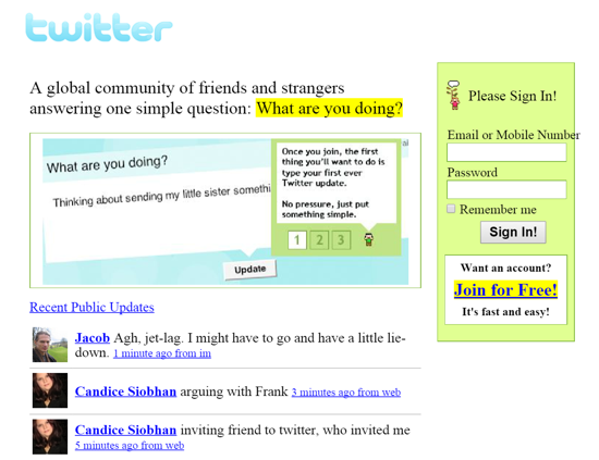
Small things grow. Tiny. Simplify.
Remember Frequency and Value when brainstorming. Your product is high frequency (Twitter, Instagram, Snapchat, TikTok) or high value (Airbnb for renting travel accommodations), or both (Gmail).
Once you've identified product ideas that meet the above criteria, they're simple, have a high frequency of use, or provide deep value. You then bring it to market in the simplest, most cost-effective way. You can sell a half-working prototype with imagination and sales skills. You need just enough of a prototype to convey your vision to a user or customer.
With this, you can approach real people. This will do one of three things: give you a green light to continue on your vision as is, show you that there is no opportunity and people won't use it, or point you in a direction that is a blend of what you've come up with and what the customer / user really wants, and you update the prototype and go back to the maze. Repeat until you have enough yeses and conviction to build an MVP.

Katrine Tjoelsen
3 years ago
8 Communication Hacks I Use as a Young Employee
Learn these subtle cues to gain influence.
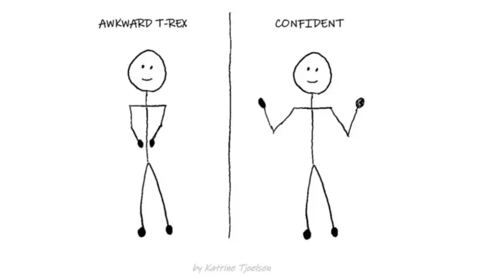
Hate being ignored?
As a 24-year-old, I struggled at work. Attention-getting tips How to avoid being judged by my size, gender, and lack of wrinkles or gray hair?
I've learned seniority hacks. Influence. Within two years as a product manager, I led a team. I'm a Stanford MBA student.
These communication hacks can make you look senior and influential.
1. Slowly speak
We speak quickly because we're afraid of being interrupted.
When I doubt my ideas, I speak quickly. How can we slow down? Jamie Chapman says speaking slowly saps our energy.
Chapman suggests emphasizing certain words and pausing.
2. Interrupted? Stop the stopper
Someone interrupt your speech?
Don't wait. "May I finish?" No pause needed. Stop interrupting. I first tried this in Leadership Laboratory at Stanford. How quickly I gained influence amazed me.
Next time, try “May I finish?” If that’s not enough, try these other tips from Wendy R.S. O’Connor.
3. Context
Others don't always see what's obvious to you.
Through explanation, you help others see the big picture. If a senior knows it, you help them see where your work fits.
4. Don't ask questions in statements
“Your statement lost its effect when you ended it on a high pitch,” a group member told me. Upspeak, it’s called. I do it when I feel uncertain.
Upspeak loses influence and credibility. Unneeded. When unsure, we can say "I think." We can even ask a proper question.
Someone else's boasting is no reason to be dismissive. As leaders and colleagues, we should listen to our colleagues even if they use this speech pattern.
Give your words impact.
5. Signpost structure
Signposts improve clarity by providing structure and transitions.
Communication coach Alexander Lyon explains how to use "first," "second," and "third" He explains classic and summary transitions to help the listener switch topics.
Signs clarify. Clarity matters.
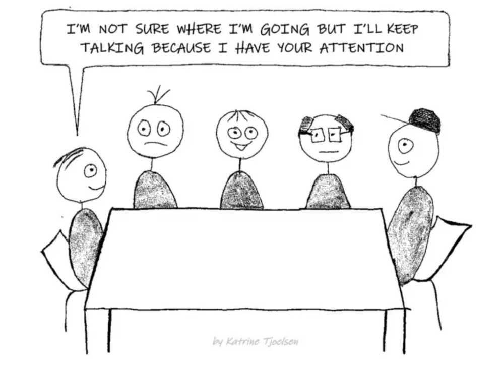
6. Eliminate email fluff
“Fine. When will the report be ready? — Jeff.”
Notice how senior leaders write short, direct emails? I often use formalities like "dear," "hope you're well," and "kind regards"
Formality is (usually) unnecessary.
7. Replace exclamation marks with periods
See how junior an exclamation-filled email looks:
Hi, all!
Hope you’re as excited as I am for tomorrow! We’re celebrating our accomplishments with cake! Join us tomorrow at 2 pm!
See you soon!
Why the exclamation points? Why not just one?
Hi, all.
Hope you’re as excited as I am for tomorrow. We’re celebrating our accomplishments with cake. Join us tomorrow at 2 pm!
See you soon.
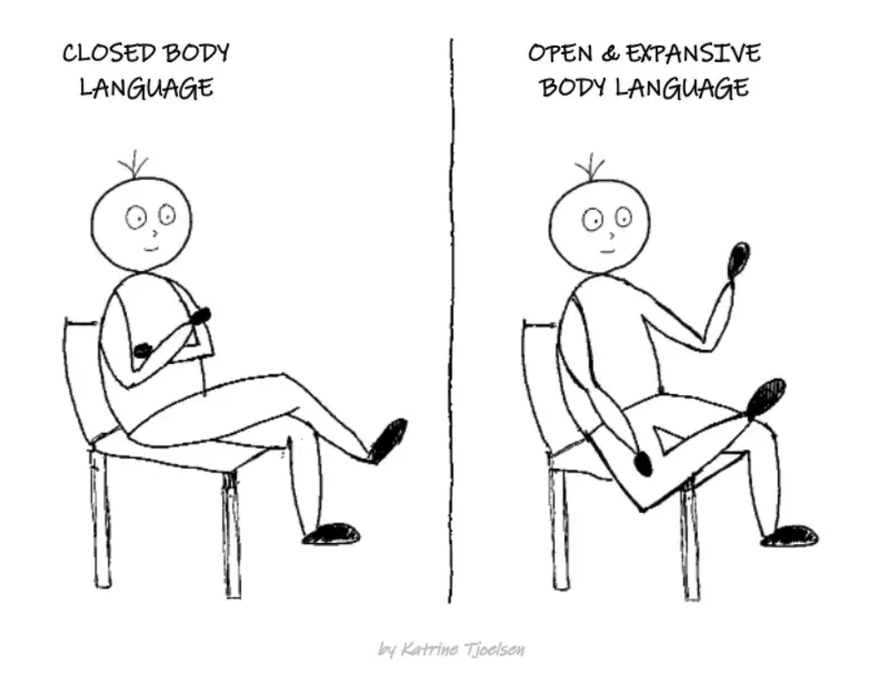
8. Take space
"Playing high" means having an open, relaxed body, says Stanford professor and author Deborah Gruenfield.
Crossed legs or looking small? Relax. Get bigger.
