


More on Marketing

Emma Jade
3 years ago
6 hacks to create content faster
Content gurus' top time-saving hacks.

I'm a content strategist, writer, and graphic designer. Time is more valuable than money.
Money is always available. Even if you're poor. Ways exist.
Time is passing, and one day we'll run out.
Sorry to be morbid.
In today's digital age, you need to optimize how you create content for your organization. Here are six content creation hacks.
1. Use templates
Use templates to streamline your work whether generating video, images, or documents.
Setup can take hours. Using a free resource like Canva, you can create templates for any type of material.
This will save you hours each month.
2. Make a content calendar
You post without a plan? A content calendar solves 50% of these problems.
You can prepare, organize, and plan your material ahead of time so you're not scrambling when you remember, "Shit, it's Mother's Day!"
3. Content Batching
Batching content means creating a lot in one session. This is helpful for video content that requires a lot of setup time.
Batching monthly content saves hours. Time is a valuable resource.
When working on one type of task, it's easy to get into a flow state. This saves time.
4. Write Caption
On social media, we generally choose the image first and then the caption. Writing captions first sometimes work better, though.
Writing the captions first can allow you more creative flexibility and be easier if you're not excellent with language.
Say you want to tell your followers something interesting.
Writing a caption first is easier than choosing an image and then writing a caption to match.
Not everything works. You may have already-created content that needs captioning. When you don't know what to share, think of a concept, write the description, and then produce a video or graphic.
Cats can be skinned in several ways..
5. Repurpose
Reuse content when possible. You don't always require new stuff. In fact, you’re pretty stupid if you do #SorryNotSorry.
Repurpose old content. All those blog entries, videos, and unfinished content on your desk or hard drive.
This blog post can be turned into a social media infographic. Canva's motion graphic function can animate it. I can record a YouTube video regarding this issue for a podcast. I can make a post on each point in this blog post and turn it into an eBook or paid course.
And it doesn’t stop there.
My point is, to think outside the box and really dig deep into ways you can leverage the content you’ve already created.
6. Schedule Them
If you're still manually posting content, get help. When you batch your content, schedule it ahead of time.
Some scheduling apps are free or cheap. No excuses.
Don't publish and ghost.
Scheduling saves time by preventing you from doing it manually. But if you never engage with your audience, the algorithm won't reward your material.
Be online and engage your audience.
Content Machine
Use these six content creation hacks. They help you succeed and save time.

Yucel F. Sahan
3 years ago
How I Created the Day's Top Product on Product Hunt
In this article, I'll describe a weekend project I started to make something. It was Product Hunt's #1 of the Day, #2 Weekly, and #4 Monthly product.
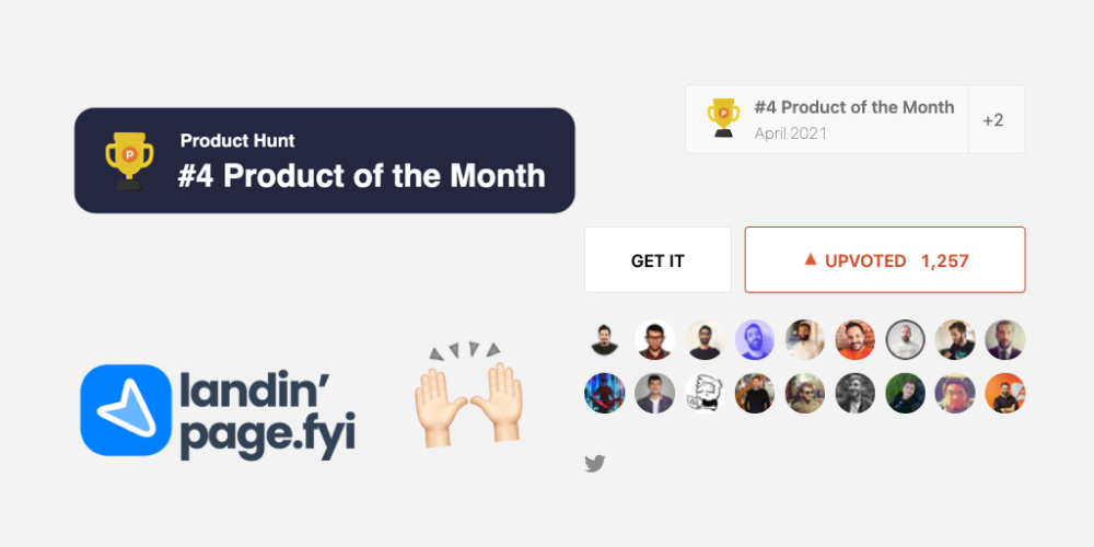

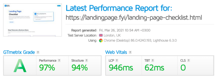
How did I make Landing Page Checklist so simple? Building and launching took 3 weeks. I worked 3 hours a day max. Weekends were busy.
It's sort of a long story, so scroll to the bottom of the page to see what tools I utilized to create Landing Page Checklist :x
As a matter of fact, it all started with the startups-investments blog; Startup Bulletin, that I started writing in 2018. No, don’t worry, I won’t be going that far behind. The twitter account where I shared the blog posts of this newsletter was inactive for a looong time. I was holding this Twitter account since 2009, I couldn’t bear to destroy it. At the same time, I was thinking how to evaluate this account.
So I looked for a weekend assignment.
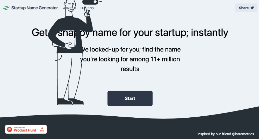
Weekend undertaking: Generate business names
Barash and I established a weekend effort to stay current. Building things helped us learn faster.
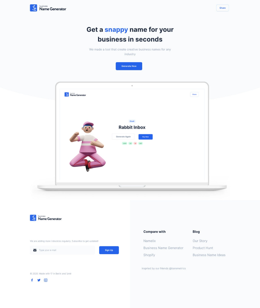
Simple. Startup Name Generator The utility generated random startup names. After market research for SEO purposes, we dubbed it Business Name Generator.
Backend developer Barash dislikes frontend work. He told me to write frontend code. Chakra UI and Tailwind CSS were recommended.
It was the first time I have heard about Tailwind CSS.
Before this project, I made mobile-web app designs in Sketch and shared them via Zeplin. I can read HTML-CSS or React code, but not write it. I didn't believe myself but followed Barash's advice.
My home page wasn't responsive when I started. Here it was:)
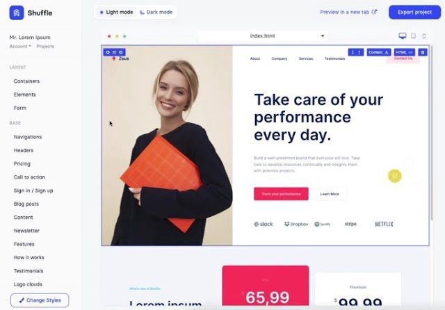
And then... Product Hunt had something I needed. Me-only! A website builder that gives you clean Tailwind CSS code and pre-made web components (like Elementor). Incredible.
I bought it right away because it was so easy to use. Best part: It's not just index.html. It includes all needed files. Like
postcss.config.js
README.md
package.json
among other things, tailwind.config.js
This is for non-techies.
Tailwind.build; which is Shuffle now, allows you to create and export projects for free (with limited features). You can try it by visiting their website.
After downloading the project, you can edit the text and graphics in Visual Studio (or another text editor). This HTML file can be hosted whenever.
Github is an easy way to host a landing page.
your project via Shuffle for export
your website's content, edit
Create a Gitlab, Github, or Bitbucket account.
to Github, upload your project folder.
Integrate Vercel with your Github account (or another platform below)
Allow them to guide you in steps.
Finally. If you push your code to Github using Github Desktop, you'll do it quickly and easily.
Speaking of; here are some hosting and serverless backend services for web applications and static websites for you host your landing pages for FREE!
I host landingpage.fyi on Vercel but all is fine. You can choose any platform below with peace in mind.
Vercel
Render
Netlify
After connecting your project/repo to Vercel, you don’t have to do anything on Vercel. Vercel updates your live website when you update Github Desktop. Wow!
Tails came out while I was using tailwind.build. Although it's prettier, tailwind.build is more mobile-friendly. I couldn't resist their lovely parts. Tails :)
Tails have several well-designed parts. Some components looked awful on mobile, but this bug helped me understand Tailwind CSS.
Unlike Shuffle, Tails does not include files when you export such as config.js, main.js, README.md. It just gives you the HTML code. Suffle.dev is a bit ahead in this regard and with mobile-friendly blocks if you ask me. Of course, I took advantage of both.
creativebusinessnames.co is inactive, but I'll leave a deployment link :)
Adam Wathan's YouTube videos and Tailwind's official literature helped me, but I couldn't have done it without Tails and Shuffle. These tools helped me make landing pages. I shouldn't have started over.
So began my Tailwind CSS adventure. I didn't build landingpage. I didn't plan it to be this long; sorry.
I learnt a lot while I was playing around with Shuffle and Tails Builders.
Long story short I built landingpage.fyi with the help of these tools;
Learning, building, and distribution
Shuffle (Started with a Shuffle Template)
Tails (Used components from here)
Sketch (to handle icons, logos, and .svg’s)
metatags.io (Auto Generator Meta Tags)
Vercel (Hosting)
Github Desktop (Pushing code to Github -super easy-)
Visual Studio Code (Edit my code)
Mailerlite (Capture Emails)
Jarvis / Conversion.ai (%90 of the text on website written by AI 😇 )
CookieHub (Consent Management)
That's all. A few things:
The Outcome
.fyi Domain: Why?

I'm often asked this.
I don't know, but I wanted to include the landing page term. Popular TLDs are gone. I saw my alternatives. brief and catchy.
CSS Tailwind Resources
I'll share project resources like Tails and Shuffle.
Beginner Tailwind (I lately enrolled in this course but haven’t completed it yet.)
Thanks for reading my blog's first post. Please share if you like it.
Matthew Royse
3 years ago
5 Tips for Concise Writing
Here's how to be clear.
“I have only made this letter longer because I have not had the time to make it shorter.” — French mathematician, physicist, inventor, philosopher, and writer Blaise Pascal
Concise.
People want this. We tend to repeat ourselves and use unnecessary words.
Being vague frustrates readers. It focuses their limited attention span on figuring out what you're saying rather than your message.
Edit carefully.
“Examine every word you put on paper. You’ll find a surprising number that don’t serve any purpose.” — American writer, editor, literary critic, and teacher William Zinsser
How do you write succinctly?
Here are three ways to polish your writing.
1. Delete
Your readers will appreciate it if you delete unnecessary words. If a word or phrase is essential, keep it. Don't force it.
Many readers dislike bloated sentences. Ask yourself if cutting a word or phrase will change the meaning or dilute your message.
For example, you could say, “It’s absolutely essential that I attend this meeting today, so I know the final outcome.” It’s better to say, “It’s critical I attend the meeting today, so I know the results.”
Key takeaway
Delete actually, completely, just, full, kind of, really, and totally. Keep the necessary words, cut the rest.
2. Just Do It
Don't tell readers your plans. Your readers don't need to know your plans. Who are you?
Don't say, "I want to highlight our marketing's problems." Our marketing issues are A, B, and C. This cuts 5–7 words per sentence.
Keep your reader's attention on the essentials, not the fluff. What are you doing? You won't lose readers because you get to the point quickly and don't build up.
Key takeaway
Delete words that don't add to your message. Do something, don't tell readers you will.
3. Cut Overlap
You probably repeat yourself unintentionally. You may add redundant sentences when brainstorming. Read aloud to detect overlap.
Remove repetition from your writing. It's important to edit our writing and thinking to avoid repetition.
Key Takeaway
If you're repeating yourself, combine sentences to avoid overlap.
4. Simplify
Write as you would to family or friends. Communicate clearly. Don't use jargon. These words confuse readers.
Readers want specifics, not jargon. Write simply. Done.
Most adults read at 8th-grade level. Jargon and buzzwords make speech fluffy. This confuses readers who want simple language.
Key takeaway
Ensure all audiences can understand you. USA Today's 5th-grade reading level is intentional. They want everyone to understand.
5. Active voice
Subjects perform actions in active voice. When you write in passive voice, the subject receives the action.
For example, “the board of directors decided to vote on the topic” is an active voice, while “a decision to vote on the topic was made by the board of directors” is a passive voice.
Key takeaway
Active voice clarifies sentences. Active voice is simple and concise.
Bringing It All Together
Five tips help you write clearly. Delete, just do it, cut overlap, use simple language, and write in an active voice.
Clear writing is effective. It's okay to occasionally use unnecessary words or phrases. Realizing it is key. Check your writing.
Adding words costs.
Write more concisely. People will appreciate it and read your future articles, emails, and messages. Spending extra time will increase trust and influence.
“Not that the story need be long, but it will take a long while to make it short.” — Naturalist, essayist, poet, and philosopher Henry David Thoreau
You might also like

Sanjay Priyadarshi
3 years ago
Meet a Programmer Who Turned Down Microsoft's $10,000,000,000 Acquisition Offer
Failures inspire young developers
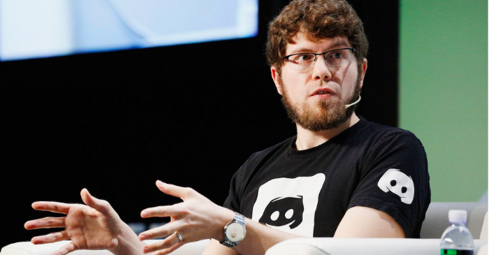
Jason citron created many products.
These products flopped.
Microsoft offered $10 billion for one of these products.
He rejected the offer since he was so confident in his success.
Let’s find out how he built a product that is currently valued at $15 billion.
Early in his youth, Jason began learning to code.
Jason's father taught him programming and IT.
His father wanted to help him earn money when he needed it.
Jason created video games and websites in high school.
Jason realized early on that his IT and programming skills could make him money.
Jason's parents misjudged his aptitude for programming.
Jason frequented online programming communities.
He looked for web developers. He created websites for those people.
His parents suspected Jason sold drugs online. When he said he used programming to make money, they were shocked.
They helped him set up a PayPal account.
Florida higher education to study video game creation
Jason never attended an expensive university.
He studied game design in Florida.
“Higher Education is an interesting part of society… When I work with people, the school they went to never comes up… only thing that matters is what can you do…At the end of the day, the beauty of silicon valley is that if you have a great idea and you can bring it to the life, you can convince a total stranger to give you money and join your project… This notion that you have to go to a great school didn’t end up being a thing for me.”
Jason's life was altered by Steve Jobs' keynote address.
After graduating, Jason joined an incubator.
Jason created a video-dating site first.
Bad idea.
Nobody wanted to use it when it was released, so they shut it down.
He made a multiplayer game.
It was released on Bebo. 10,000 people played it.
When Steve Jobs unveiled the Apple app store, he stopped playing.
The introduction of the app store resembled that of a new gaming console.
Jason's life altered after Steve Jobs' 2008 address.
“Whenever a new video game console is launched, that’s the opportunity for a new video game studio to get started, it’s because there aren’t too many games available…When a new PlayStation comes out, since it’s a new system, there’s only a handful of titles available… If you can be a launch title you can get a lot of distribution.”
Apple's app store provided a chance to start a video game company.
They released an app after 5 months of work.
Aurora Feint is the game.
Jason believed 1000 players in a week would be wonderful. A thousand players joined in the first hour.
Over time, Aurora Feints' game didn't gain traction. They don't make enough money to keep playing.
They could only make enough for one month.
Instead of buying video games, buy technology
Jason saw that they established a leaderboard, chat rooms, and multiplayer capabilities and believed other developers would want to use these.
They opted to sell the prior game's technology.
OpenFeint.
Assisting other game developers
They had no money in the bank to create everything needed to make the technology user-friendly.
Jason and Daniel designed a website saying:
“If you’re making a video game and want to have a drop in multiplayer support, you can use our system”
TechCrunch covered their website launch, and they gained a few hundred mailing list subscribers.
They raised seed funding with the mailing list.
Nearly all iPhone game developers started adopting the Open Feint logo.
“It was pretty wild… It was really like a whole social platform for people to play with their friends.”
What kind of a business model was it?
OpenFeint originally planned to make the software free for all games. As the game gained popularity, they demanded payment.
They later concluded it wasn't a good business concept.
It became free eventually.
Acquired for $104 million
Open Feint's users and employees grew tremendously.
GREE bought OpenFeint for $104 million in April 2011.
GREE initially committed to helping Jason and his team build a fantastic company.
Three or four months after the acquisition, Jason recognized they had a different vision.
He quit.
Jason's Original Vision for the iPad
Jason focused on distribution in 2012 to help businesses stand out.
The iPad market and user base were growing tremendously.
Jason said the iPad may replace mobile gadgets.
iPad gamers behaved differently than mobile gamers.
People sat longer and experienced more using an iPad.
“The idea I had was what if we built a gaming business that was more like traditional video games but played on tablets as opposed to some kind of mobile game that I’ve been doing before.”
Unexpected insight after researching the video game industry
Jason learned from studying the gaming industry that long-standing companies had advantages beyond a single release.
Previously, long-standing video game firms had their own distribution system. This distribution strategy could buffer time between successful titles.
Sony, Microsoft, and Valve all have gaming consoles and online stores.
So he built a distribution system.
He created a group chat app for gamers.
He envisioned a team-based multiplayer game with text and voice interaction.
His objective was to develop a communication network, release more games, and start a game distribution business.
Remaking the video game League of Legends
Jason and his crew reimagined a League of Legends game mode for 12-inch glass.
They adapted the game for tablets.
League of Legends was PC-only.
So they rebuilt it.
They overhauled the game and included native mobile experiences to stand out.
Hammer and Chisel was the company's name.
18 people worked on the game.
The game was funded. The game took 2.5 years to make.
Was the game a success?
July 2014 marked the game's release. The team's hopes were dashed.
Critics initially praised the game.
Initial installation was widespread.
The game failed.
As time passed, the team realized iPad gaming wouldn't increase much and mobile would win.
Jason was given a fresh idea by Stan Vishnevskiy.
Stan Vishnevskiy was a corporate engineer.
He told Jason about his plan to design a communication app without a game.
This concept seeded modern strife.
“The insight that he really had was to put a couple of dots together… we’re seeing our customers communicating around our own game with all these different apps and also ourselves when we’re playing on PC… We should solve that problem directly rather than needing to build a new game…we should start making it on PC.”
So began Discord.
Online socializing with pals was the newest trend.
Jason grew up playing video games with his friends.
He never played outside.
Jason had many great moments playing video games with his closest buddy, wife, and brother.
Discord was about providing a location for you and your group to speak and hang out.
Like a private cafe, bedroom, or living room.
Discord was developed for you and your friends on computers and phones.
You can quickly call your buddies during a game to conduct a conference call. Put the call on speaker and talk while playing.
Discord wanted to give every player a unique experience. Because coordinating across apps was a headache.
The entire team started concentrating on Discord.
Jason decided Hammer and Chisel would focus on their chat app.
Jason didn't want to make a video game.
How Discord attracted the appropriate attention
During the first five months, the entire team worked on the game and got feedback from friends.
This ensures product improvement. As a result, some teammates' buddies started utilizing Discord.
The team knew it would become something, but the result was buggy. App occasionally crashed.
Jason persuaded a gamer friend to write on Reddit about the software.
New people would find Discord. Why not?
Reddit users discovered Discord and 50 started using it frequently.
Discord was launched.
Rejecting the $10 billion acquisition proposal
Discord has increased in recent years.
It sends billions of messages.
Discord's users aren't tracked. They're privacy-focused.
Purchase offer
Covid boosted Discord's user base.
Weekly, billions of messages were transmitted.
Microsoft offered $10 billion for Discord in 2021.
Jason sold Open Feint for $104m in 2011.
This time, he believed in the product so much that he rejected Microsoft's offer.
“I was talking to some people in the team about which way we could go… The good thing was that most of the team wanted to continue building.”
Last time, Discord was valued at $15 billion.
Discord raised money on March 12, 2022.
The $15 billion corporation raised $500 million in 2021.
Thomas Smith
3 years ago
ChatGPT Is Experiencing a Lightbulb Moment
Why breakthrough technologies must be accessible

ChatGPT has exploded. Over 1 million people have used the app, and coding sites like Stack Overflow have banned its answers. It's huge.
I wouldn't have called that as an AI researcher. ChatGPT uses the same GPT-3 technology that's been around for over two years.
More than impressive technology, ChatGPT 3 shows how access makes breakthroughs usable. OpenAI has finally made people realize the power of AI by packaging GPT-3 for normal users.
We think of Thomas Edison as the inventor of the lightbulb, not because he invented it, but because he popularized it.
Going forward, AI companies that make using AI easy will thrive.
Use-case importance
Most modern AI systems use massive language models. These language models are trained on 6,000+ years of human text.
GPT-3 ate 8 billion pages, almost every book, and Wikipedia. It created an AI that can write sea shanties and solve coding problems.
Nothing new. I began beta testing GPT-3 in 2020, but the system's basics date back further.
Tools like GPT-3 are hidden in many apps. Many of the AI writing assistants on this platform are just wrappers around GPT-3.
Lots of online utilitarian text, like restaurant menu summaries or city guides, is written by AI systems like GPT-3. You've probably read GPT-3 without knowing it.
Accessibility
Why is ChatGPT so popular if the technology is old?
ChatGPT makes the technology accessible. Free to use, people can sign up and text with the chatbot daily. ChatGPT isn't revolutionary. It does it in a way normal people can access and be amazed by.
Accessibility isn't easy. OpenAI's Sam Altman tweeted that opening ChatGPT to the public increased computing costs.
Each chat costs "low-digit cents" to process. OpenAI probably spends several hundred thousand dollars a day to keep ChatGPT running, with no immediate business case.
Academic researchers and others who developed GPT-3 couldn't afford it. Without resources to make technology accessible, it can't be used.
Retrospective
This dynamic is old. In the history of science, a researcher with a breakthrough idea was often overshadowed by an entrepreneur or visionary who made it accessible to the public.
We think of Thomas Edison as the inventor of the lightbulb. But really, Vasilij Petrov, Thomas Wright, and Joseph Swan invented the lightbulb. Edison made technology visible and accessible by electrifying public buildings, building power plants, and wiring.
Edison probably lost a ton of money on stunts like building a power plant to light JP Morgan's home, the NYSE, and several newspaper headquarters.
People wanted electric lights once they saw their benefits. By making the technology accessible and visible, Edison unlocked a hugely profitable market.
Similar things are happening in AI. ChatGPT shows that developing breakthrough technology in the lab or on B2B servers won't change the culture.
AI must engage people's imaginations to become mainstream. Before the tech impacts the world, people must play with it and see its revolutionary power.
As the field evolves, companies that make the technology widely available, even at great cost, will succeed.
OpenAI's compute fees are eye-watering. Revolutions are costly.

Katherine Kornei
3 years ago
The InSight lander from NASA has recorded the greatest tremor ever felt on Mars.
The magnitude 5 earthquake was responsible for the discharge of energy that was 10 times greater than the previous record holder.
Any Martians who happen to be reading this should quickly learn how to duck and cover.
NASA's Jet Propulsion Laboratory in Pasadena, California, reported that on May 4, the planet Mars was shaken by an earthquake of around magnitude 5, making it the greatest Marsquake ever detected to this point. The shaking persisted for more than six hours and unleashed more than ten times as much energy as the earthquake that had previously held the record for strongest.
The event was captured on record by the InSight lander, which is operated by the United States Space Agency and has been researching the innards of Mars ever since it touched down on the planet in 2018 (SN: 11/26/18). The epicenter of the earthquake was probably located in the vicinity of Cerberus Fossae, which is located more than 1,000 kilometers away from the lander.
The surface of Cerberus Fossae is notorious for being broken up and experiencing periodic rockfalls. According to geophysicist Philippe Lognonné, who is the lead investigator of the Seismic Experiment for Interior Structure, the seismometer that is onboard the InSight lander, it is reasonable to assume that the ground is moving in that area. "This is an old crater from a volcanic eruption."
Marsquakes, which are similar to earthquakes in that they give information about the interior structure of our planet, can be utilized to investigate what lies beneath the surface of Mars (SN: 7/22/21). And according to Lognonné, who works at the Institut de Physique du Globe in Paris, there is a great deal that can be gleaned from analyzing this massive earthquake. Because the quality of the signal is so high, we will be able to focus on the specifics.