


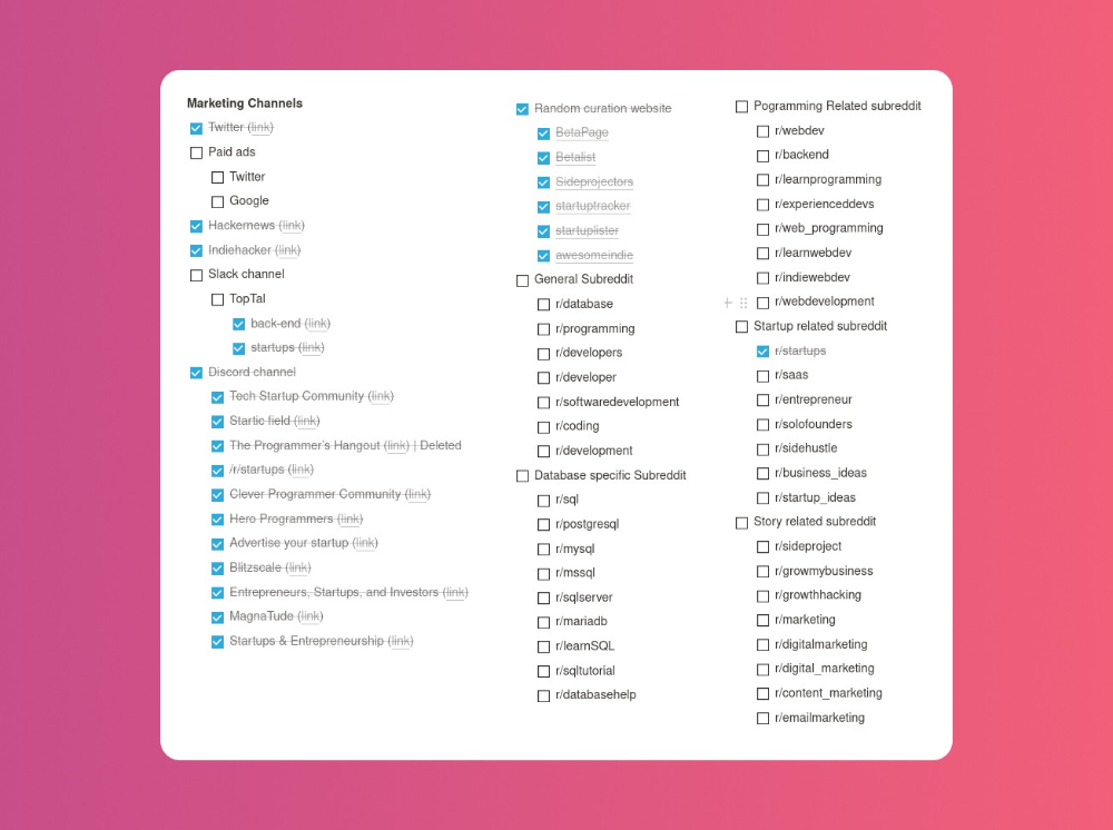
More on Marketing

Camilla Dudley
3 years ago
How to gain Twitter followers: A 101 Guide

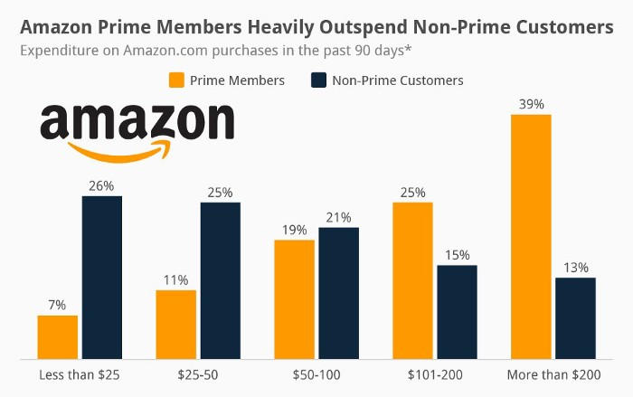
No wonder brands use Twitter to reach their audience. 53% of Twitter users buy new products first.
Twitter growth does more than make your brand look popular. It helps clients trust your business. It boosts your industry standing. It shows clients, prospects, and even competitors you mean business.
How can you naturally gain Twitter followers?
Share useful information
Post visual content
Tweet consistently
Socialize
Spread your @name everywhere.
Use existing customers
Promote followers
Share useful information
Twitter users join conversations and consume material. To build your followers, make sure your material appeals to them and gives value, whether it's sales, product lessons, or current events.
Use Twitter Analytics to learn what your audience likes.
Explore popular topics by utilizing relevant keywords and hashtags. Check out this post on how to use Twitter trends.
Post visual content
97% of Twitter users focus on images, so incorporating media can help your Tweets stand out. Visuals and videos make content more engaging and memorable.
Tweet often
Your audience should expect regular content updates. Plan your ideas and tweet during crucial seasons and events with a content calendar.
Socialize
Twitter connects people. Do more than tweet. Follow industry leaders. Retweet influencers, engage with thought leaders, and reply to mentions and customers to boost engagement.
Micro-influencers can promote your brand or items. They can help you gain new audiences' trust.
Spread your @name everywhere.
Maximize brand exposure. Add a follow button on your website, link to it in your email signature and newsletters, and promote it on business cards or menus.
Use existing customers
Emails can be used to find existing Twitter clients. Upload your email contacts and follow your customers on Twitter to start a dialogue.
Promote followers
Run a followers campaign to boost your organic growth. Followers campaigns promote your account to a particular demographic, and you only pay when someone follows you.
Consider short campaigns to enhance momentum or an always-on campaign to gain new followers.
Increasing your brand's Twitter followers takes effort and experimentation, but the payback is huge.
👋 Follow me on twitter

Guillaume Dumortier
2 years ago
Mastering the Art of Rhetoric: A Guide to Rhetorical Devices in Successful Headlines and Titles
Unleash the power of persuasion and captivate your audience with compelling headlines.
As the old adage goes, "You never get a second chance to make a first impression."
In the world of content creation and social ads, headlines and titles play a critical role in making that first impression.
A well-crafted headline can make the difference between an article being read or ignored, a video being clicked on or bypassed, or a product being purchased or passed over.
To make an impact with your headlines, mastering the art of rhetoric is essential. In this post, we'll explore various rhetorical devices and techniques that can help you create headlines that captivate your audience and drive engagement.
tl;dr : Headline Magician will help you craft the ultimate headline titles powered by rhetoric devices
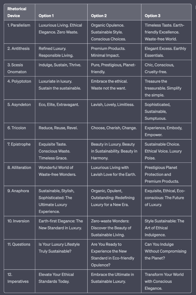
Example with a high-end luxury organic zero-waste skincare brand
✍️ The Power of Alliteration
Alliteration is the repetition of the same consonant sound at the beginning of words in close proximity. This rhetorical device lends itself well to headlines, as it creates a memorable, rhythmic quality that can catch a reader's attention.
By using alliteration, you can make your headlines more engaging and easier to remember.
Examples:
"Crafting Compelling Content: A Comprehensive Course"
"Mastering the Art of Memorable Marketing"
🔁 The Appeal of Anaphora
Anaphora is the repetition of a word or phrase at the beginning of successive clauses. This rhetorical device emphasizes a particular idea or theme, making it more memorable and persuasive.
In headlines, anaphora can be used to create a sense of unity and coherence, which can draw readers in and pique their interest.
Examples:
"Create, Curate, Captivate: Your Guide to Social Media Success"
"Innovation, Inspiration, and Insight: The Future of AI"
🔄 The Intrigue of Inversion
Inversion is a rhetorical device where the normal order of words is reversed, often to create an emphasis or achieve a specific effect.
In headlines, inversion can generate curiosity and surprise, compelling readers to explore further.
Examples:
"Beneath the Surface: A Deep Dive into Ocean Conservation"
"Beyond the Stars: The Quest for Extraterrestrial Life"
⚖️ The Persuasive Power of Parallelism
Parallelism is a rhetorical device that involves using similar grammatical structures or patterns to create a sense of balance and symmetry.
In headlines, parallelism can make your message more memorable and impactful, as it creates a pleasing rhythm and flow that can resonate with readers.
Examples:
"Eat Well, Live Well, Be Well: The Ultimate Guide to Wellness"
"Learn, Lead, and Launch: A Blueprint for Entrepreneurial Success"
⏭️ The Emphasis of Ellipsis
Ellipsis is the omission of words, typically indicated by three periods (...), which suggests that there is more to the story.
In headlines, ellipses can create a sense of mystery and intrigue, enticing readers to click and discover what lies behind the headline.
Examples:
"The Secret to Success... Revealed"
"Unlocking the Power of Your Mind... A Step-by-Step Guide"
🎭 The Drama of Hyperbole
Hyperbole is a rhetorical device that involves exaggeration for emphasis or effect.
In headlines, hyperbole can grab the reader's attention by making bold, provocative claims that stand out from the competition. Be cautious with hyperbole, however, as overuse or excessive exaggeration can damage your credibility.
Examples:
"The Ultimate Guide to Mastering Any Skill in Record Time"
"Discover the Revolutionary Technique That Will Transform Your Life"
❓The Curiosity of Questions
Posing questions in your headlines can be an effective way to pique the reader's curiosity and encourage engagement.
Questions compel the reader to seek answers, making them more likely to click on your content. Additionally, questions can create a sense of connection between the content creator and the audience, fostering a sense of dialogue and discussion.
Examples:
"Are You Making These Common Mistakes in Your Marketing Strategy?"
"What's the Secret to Unlocking Your Creative Potential?"
💥 The Impact of Imperatives
Imperatives are commands or instructions that urge the reader to take action. By using imperatives in your headlines, you can create a sense of urgency and importance, making your content more compelling and actionable.
Examples:
"Master Your Time Management Skills Today"
"Transform Your Business with These Innovative Strategies"
💢 The Emotion of Exclamations
Exclamations are powerful rhetorical devices that can evoke strong emotions and convey a sense of excitement or urgency.
Including exclamations in your headlines can make them more attention-grabbing and shareable, increasing the chances of your content being read and circulated.
Examples:
"Unlock Your True Potential: Find Your Passion and Thrive!"
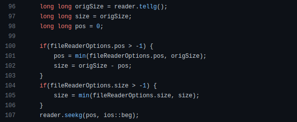
"Experience the Adventure of a Lifetime: Travel the World on a Budget!"
🎀 The Effectiveness of Euphemisms
Euphemisms are polite or indirect expressions used in place of harsher, more direct language.
In headlines, euphemisms can make your message more appealing and relatable, helping to soften potentially controversial or sensitive topics.
Examples:
"Navigating the Challenges of Modern Parenting"
"Redefining Success in a Fast-Paced World"
⚡Antithesis: The Power of Opposites
Antithesis involves placing two opposite words side-by-side, emphasizing their contrasts. This device can create a sense of tension and intrigue in headlines.
Examples:
"Once a day. Every day"
"Soft on skin. Kill germs"
"Mega power. Mini size."
To utilize antithesis, identify two opposing concepts related to your content and present them in a balanced manner.
🎨 Scesis Onomaton: The Art of Verbless Copy
Scesis onomaton is a rhetorical device that involves writing verbless copy, which quickens the pace and adds emphasis.
Example:
"7 days. 7 dollars. Full access."
To use scesis onomaton, remove verbs and focus on the essential elements of your headline.
🌟 Polyptoton: The Charm of Shared Roots
Polyptoton is the repeated use of words that share the same root, bewitching words into memorable phrases.
Examples:
"Real bread isn't made in factories. It's baked in bakeries"
"Lose your knack for losing things."
To employ polyptoton, identify words with shared roots that are relevant to your content.
✨ Asyndeton: The Elegance of Omission
Asyndeton involves the intentional omission of conjunctions, adding crispness, conviction, and elegance to your headlines.
Examples:
"You, Me, Sushi?"
"All the latte art, none of the environmental impact."
To use asyndeton, eliminate conjunctions and focus on the core message of your headline.
🔮 Tricolon: The Magic of Threes
Tricolon is a rhetorical device that uses the power of three, creating memorable and impactful headlines.
Examples:
"Show it, say it, send it"
"Eat Well, Live Well, Be Well."
To use tricolon, craft a headline with three key elements that emphasize your content's main message.
🔔 Epistrophe: The Chime of Repetition
Epistrophe involves the repetition of words or phrases at the end of successive clauses, adding a chime to your headlines.
Examples:
"Catch it. Bin it. Kill it."
"Joint friendly. Climate friendly. Family friendly."
To employ epistrophe, repeat a key phrase or word at the end of each clause.

Tim Denning
3 years ago
I Posted Six Times a Day for 210 Days on Twitter. Here's What Happened.
I'd spend hours composing articles only to find out they were useless. Twitter solved the problem.

Twitter is wrinkled, say critics.
Nope. Writing is different. It won't make sense until you write there.
Twitter is resurgent. People are reading again. 15-second TikToks overloaded our senses.
After nuking my 20,000-follower Twitter account and starting again, I wrote every day for 210 days.
I'll explain.
I came across the strange world of microblogging.
Traditional web writing is filler-heavy.
On Twitter, you must be brief. I played Wordle.
Twitter Threads are the most popular writing format. Like a blog post. It reminds me of the famous broetry posts on LinkedIn a few years ago.
Threads combine tweets into an article.
Sharp, concise sentences
No regard for grammar
As important as the information is how the text looks.
Twitter Threads are like Michael Angelo's David monument. He chipped away at an enormous piece of marble until a man with a big willy appeared.
That's Twitter Threads.
I tried to remove unnecessary layers from several of my Wordpress blog posts. Then I realized something.
Tweeting from scratch is easier and more entertaining. It's quicker and makes you think more concisely.
Superpower: saying much with little words. My long-form writing has improved. My article sentences resemble tweets.
You never know what will happen.
Twitter's subcultures are odd. Best-performing tweets are strange.
Unusual trend: working alone and without telling anyone. It's a rebellion against Instagram influencers who share their every moment.
Early on, random thoughts worked:
My friend’s wife is Ukrainian. Her family are trapped in the warzone. He is devastated. And here I was complaining about my broken garage door. War puts everything in perspective. Today is a day to be grateful for peace.
Documenting what's happening triggers writing. It's not about viral tweets. Helping others matters.
There are numerous anonymous users.
Twitter uses pseudonyms.
You don't matter. On sites like LinkedIn, you must use your real name. Welcome to the Cyberpunk metaverse of Twitter :)
One daily piece of writing is a powerful habit.
Habits build creator careers. Read that again.
Twitter is an easy habit to pick up. If you can't tweet in one sentence, something's wrong. Easy-peasy-japanese.
Not what I tweeted, but my constancy, made the difference.
Daily writing is challenging, especially if your supervisor is on your back. Twitter encourages writing.
Tweets evolved as the foundation of all other material.
During my experiment, I enjoyed Twitter's speed.
Tweets get immediate responses, comments, and feedback. My popular tweets become newspaper headlines. I've also written essays from tweet discussions.
Sometimes the tweet and article were clear. Twitter sometimes helped me overcome writer's block.
I used to spend hours composing big things that had little real-world use.
Twitter helped me. No guessing. Data guides my coverage and validates concepts.
Test ideas on Twitter.
It took some time for my email list to grow.
Subscribers are a writer's lifeblood.
Without them, you're broke and homeless when Mark Zuckerberg tweaks the algorithms for ad dollars. Twitter has three ways to obtain email subscribers:
1. Add a link to your bio.
Twitter allows bio links (LinkedIn now does too). My eBook's landing page is linked. I collect emails there.
2. Start an online newsletter.
Twitter bought newsletter app Revue. They promote what they own.
I just established up a Revue email newsletter. I imported them weekly into my ConvertKit email list.
3. Create Twitter threads and include a link to your email list in the final tweet.
Write Twitter Threads and link the last tweet to your email list (example below).
Initial email subscribers were modest.
Numbers are growing. Twitter provides 25% of my new email subscribers. Some days, 50 people join.
Without them, my writing career is over. I'd be back at a 9-5 job begging for time off to spend with my newborn daughter. Nope.
Collect email addresses or die trying.
As insurance against unsubscribes and Zucks, use a second email list or Discord community.
What I still need to do
Twitter's fun. I'm wiser. I need to enable auto-replies and auto-DMs (direct messages).
This adds another way to attract subscribers. I schedule tweets with Tweet Hunter.
It’s best to go slow. People assume you're an internet marketer if you spam them with click requests.
A human internet marketer is preferable to a robot. My opinion.
210 days on Twitter taught me that. I plan to use the platform until I'm a grandfather unless Elon ruins it.
You might also like

Liz Martin
3 years ago
What Motivated Amazon to Spend $1 Billion for The Rings of Power?
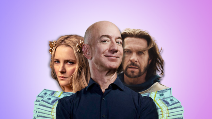
Amazon's Rings of Power is the most costly TV series ever made. This is merely a down payment towards Amazon's grand goal.
Here's a video:
Amazon bought J.R.R. Tolkien's fantasy novels for $250 million in 2017. This agreement allows Amazon to create a Tolkien series for Prime Video.
The business spent years developing and constructing a Lord of the Rings prequel. Rings of Power premiered on September 2, 2022.
It drew 25 million global viewers in 24 hours. Prime Video's biggest debut.
An Exorbitant Budget
The most expensive. First season cost $750 million to $1 billion, making it the most costly TV show ever.
Jeff Bezos has spent years looking for the next Game of Thrones, a critically and commercially successful original series. Rings of Power could help.
Why would Amazon bet $1 billion on one series?
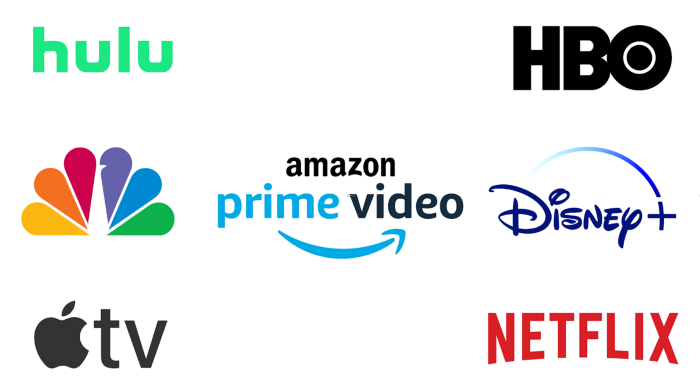
It's Not Just About the Streaming War
It's simple to assume Amazon just wants to win. Since 2018, the corporation has been fighting Hulu, Netflix, HBO, Apple, Disney, and NBC. Each wants your money, talent, and attention. Amazon's investment goes beyond rivalry.
Subscriptions Are the Bait
Audible, Amazon Music, and Prime Video are subscription services, although the company's fundamental business is retail. Amazon's online stores contribute over 50% of company revenue. Subscription services contribute 6.8%. The company's master plan depends on these subscriptions.
Streaming videos on Prime increases membership renewals. Free trial participants are more likely to join. Members buy twice as much as non-members.
Amazon Studios doesn't generate original programming to earn from Prime Video subscriptions. It aims to retain and attract clients.
Amazon can track what you watch and buy. Its algorithm recommends items and services. Mckinsey says you'll use more Amazon products, shop at Amazon stores, and watch Amazon entertainment.
In 2015, the firm launched the first season of The Man in the High Castle, a dystopian alternate history TV series depicting a world ruled by Nazi Germany and Japan after World War II.

This $72 million production earned two Emmys. It garnered 1.15 million new Prime users globally.
When asked about his Hollywood investment, Bezos said, "A Golden Globe helps us sell more shoes."
Selling more footwear
Amazon secured a deal with DirecTV to air Thursday Night Football in restaurants and bars. First streaming service to have exclusive NFL games.
This isn't just about Thursday night football, says media analyst Ritchie Greenfield. This sells t-shirts. This may be a ticket. Amazon does more than stream games.
The Rings of Power isn't merely a production showcase, either. This sells Tolkien's fantasy novels such Lord of the Rings, The Hobbit, and The Silmarillion.
This tiny commitment keeps you in Amazon's ecosystem.

Shalitha Suranga
3 years ago
The Top 5 Mathematical Concepts Every Programmer Needs to Know
Using math to write efficient code in any language
Programmers design, build, test, and maintain software. Employ cases and personal preferences determine the programming languages we use throughout development. Mobile app developers use JavaScript or Dart. Some programmers design performance-first software in C/C++.
A generic source code includes language-specific grammar, pre-implemented function calls, mathematical operators, and control statements. Some mathematical principles assist us enhance our programming and problem-solving skills.
We all use basic mathematical concepts like formulas and relational operators (aka comparison operators) in programming in our daily lives. Beyond these mathematical syntaxes, we'll see discrete math topics. This narrative explains key math topics programmers must know. Master these ideas to produce clean and efficient software code.
Expressions in mathematics and built-in mathematical functions
A source code can only contain a mathematical algorithm or prebuilt API functions. We develop source code between these two ends. If you create code to fetch JSON data from a RESTful service, you'll invoke an HTTP client and won't conduct any math. If you write a function to compute the circle's area, you conduct the math there.
When your source code gets more mathematical, you'll need to use mathematical functions. Every programming language has a math module and syntactical operators. Good programmers always consider code readability, so we should learn to write readable mathematical expressions.
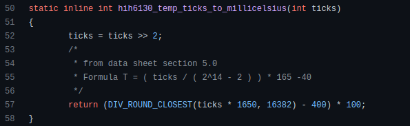
Linux utilizes clear math expressions.
Inbuilt max and min functions can minimize verbose if statements.
How can we compute the number of pages needed to display known data? In such instances, the ceil function is often utilized.
import math as m
results = 102
items_per_page = 10
pages = m.ceil(results / items_per_page)
print(pages)
Learn to write clear, concise math expressions.
Combinatorics in Algorithm Design
Combinatorics theory counts, selects, and arranges numbers or objects. First, consider these programming-related questions. Four-digit PIN security? what options exist? What if the PIN has a prefix? How to locate all decimal number pairs?
Combinatorics questions. Software engineering jobs often require counting items. Combinatorics counts elements without counting them one by one or through other verbose approaches, therefore it enables us to offer minimum and efficient solutions to real-world situations. Combinatorics helps us make reliable decision tests without missing edge cases. Write a program to see if three inputs form a triangle. This is a question I commonly ask in software engineering interviews.
Graph theory is a subfield of combinatorics. Graph theory is used in computerized road maps and social media apps.
Logarithms and Geometry Understanding
Geometry studies shapes, angles, and sizes. Cartesian geometry involves representing geometric objects in multidimensional planes. Geometry is useful for programming. Cartesian geometry is useful for vector graphics, game development, and low-level computer graphics. We can simply work with 2D and 3D arrays as plane axes.
GetWindowRect is a Windows GUI SDK geometric object.
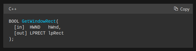
High-level GUI SDKs and libraries use geometric notions like coordinates, dimensions, and forms, therefore knowing geometry speeds up work with computer graphics APIs.
How does exponentiation's inverse function work? Logarithm is exponentiation's inverse function. Logarithm helps programmers find efficient algorithms and solve calculations. Writing efficient code involves finding algorithms with logarithmic temporal complexity. Programmers prefer binary search (O(log n)) over linear search (O(n)). Git source specifies O(log n):
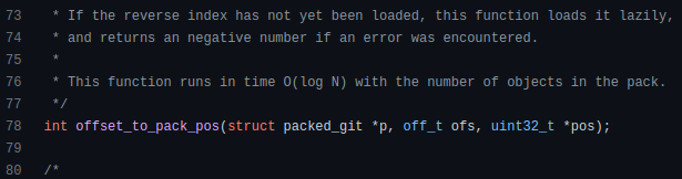
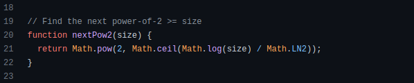
Logarithms aid with programming math. Metas Watchman uses a logarithmic utility function to find the next power of two.
Employing Mathematical Data Structures
Programmers must know data structures to develop clean, efficient code. Stack, queue, and hashmap are computer science basics. Sets and graphs are discrete arithmetic data structures. Most computer languages include a set structure to hold distinct data entries. In most computer languages, graphs can be represented using neighboring lists or objects.
Using sets as deduped lists is powerful because set implementations allow iterators. Instead of a list (or array), store WebSocket connections in a set.
Most interviewers ask graph theory questions, yet current software engineers don't practice algorithms. Graph theory challenges become obligatory in IT firm interviews.
Recognizing Applications of Recursion
A function in programming isolates input(s) and output(s) (s). Programming functions may have originated from mathematical function theories. Programming and math functions are different but similar. Both function types accept input and return value.
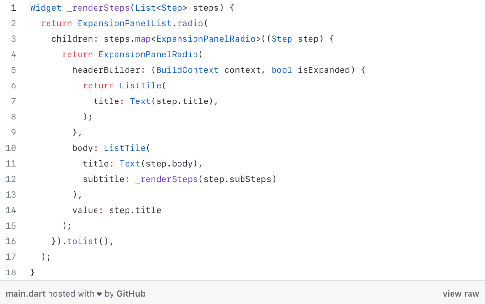
Recursion involves calling the same function inside another function. In its implementation, you'll call the Fibonacci sequence. Recursion solves divide-and-conquer software engineering difficulties and avoids code repetition. I recently built the following recursive Dart code to render a Flutter multi-depth expanding list UI:
Recursion is not the natural linear way to solve problems, hence thinking recursively is difficult. Everything becomes clear when a mathematical function definition includes a base case and recursive call.
Conclusion
Every codebase uses arithmetic operators, relational operators, and expressions. To build mathematical expressions, we typically employ log, ceil, floor, min, max, etc. Combinatorics, geometry, data structures, and recursion help implement algorithms. Unless you operate in a pure mathematical domain, you may not use calculus, limits, and other complex math in daily programming (i.e., a game engine). These principles are fundamental for daily programming activities.
Master the above math fundamentals to build clean, efficient code.

Suzie Glassman
3 years ago
How I Stay Fit Despite Eating Fast Food and Drinking Alcohol
Here's me. Perfectionism is unnecessary.
This post isn't for people who gag at the prospect of eating french fries. I've been ridiculed for stating you can lose weight eating carbs and six-pack abs aren't good.
My family eats frozen processed meals and quick food most weeks (sometimes more). Clean eaters may think I'm unqualified to give fitness advice. I get it.
Hear me out, though. I’m a 44-year-old raising two busy kids with a weekly-traveling husband. Tutoring, dance, and guitar classes fill weeknights. I'm also juggling my job and freelancing.
I'm as worried and tired as my clients. I wish I ate only kale smoothies and salads. I can’t. Despite my mistakes, I'm fit. I won't promise you something just because it worked for me. But here’s a look at how I manage.
What I largely get right about eating
I have a flexible diet and track my daily intake. I count protein, fat, and carbs. Only on vacation or exceptional occasions do I not track.
My protein goal is 1 g per lb. I consume a lot of chicken breasts, eggs, turkey, and lean ground beef. I also occasionally drink protein shakes.
I eat 220–240 grams of carbs daily. My carb count depends on training volume and goals. I'm trying to lose weight slowly. If I want to lose weight faster, I cut carbs to 150-180.
My carbs include white rice, Daves Killer Bread, fruit, pasta, and veggies. I don't eat enough vegetables, so I take Athletic Greens. Also, V8.
Fat grams over 50 help me control my hormones. Recently, I've reached 70-80 grams. Cooking with olive oil. I eat daily dark chocolate. Eggs, butter, milk, and cheese contribute to the rest.
Those frozen meals? What can I say? Stouffer’s lasagna is sometimes needed. I order the healthiest fast food I can find (although I can never bring myself to order the salad). That's a chicken sandwich or a kid's hamburger. I rarely order fries. I eat slowly and savor each bite to feel full.
Potato chips and sugary cereals are in the pantry, but I'm not tempted. My kids eat them because I'd rather teach them moderation than total avoidance. If I eat them, I only eat one portion.
If you're not hungry and eating enough protein and fat, you won't want to eat everything in sight.
I drink once or twice a week. As a result, I rarely overdo it.
Food tracking is tedious and frustrating for many. Taking breaks and using estimates when eating out help. Not perfect, but realistic.
I practice a prolonged fast to enhance metabolic adaptability
Metabolic flexibility is the ability to switch between fuel sources (fat and carbs) based on activity intensity and time since eating. At rest or during low to moderate exertion, your body burns fat. Your body burns carbs after eating and during intense exercise.
Our metabolic flexibility can be hampered by lack of exercise, overeating, and stress. Our bodies become lousy fat burners, making weight loss difficult.
Once a week, I skip dinner (usually around 24 hours). Long-term fasting teaches my body to burn fat. It provides me one low-calorie day a week (I break the fast with a normal-sized dinner).
Fasting day helps me maintain my weight on weekends, when I typically overeat and drink.
Try an extended fast slowly. Delay breakfast by two hours. Next week, add two hours, etc. It takes practice to go that long without biting off your arm. I also suggest consulting your doctor.
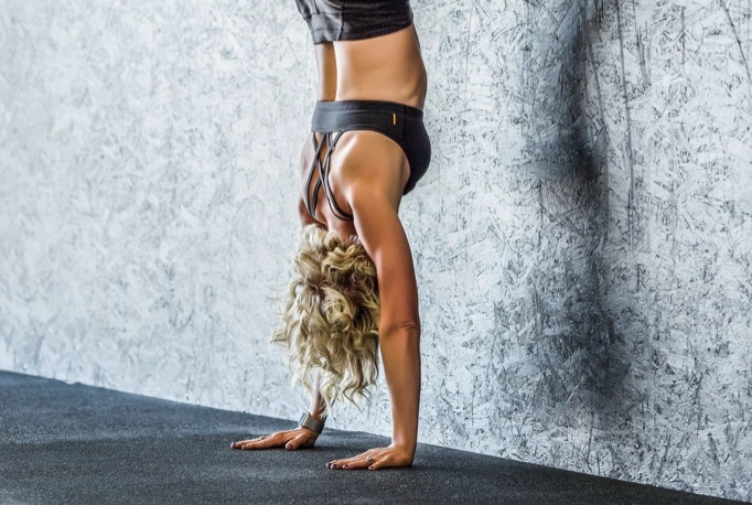
I stay active.
I've always been active. As a child, I danced many nights a week, was on the high school dance team, and ran marathons in my 20s.
Often, I feel driven by an internal engine. Working from home makes it easy to exercise. If that’s not you, I get it. Everyone can benefit from raising their baseline.
After taking the kids to school, I walk two miles around the neighborhood. When I need to think, I switch off podcasts. First thing in the morning, I go for a walk.
I lift weights Monday, Wednesday, and Friday. 45 minutes is typical. I run 45-90 minutes on Tuesday and Thursday. I'm slow but reliable. On Saturdays and Sundays, I walk and add a short spin class if I'm not too tired.
I almost never forgo sleep.
I rarely stay up past 10 p.m., much to my night-owl husband's dismay. My 7-8-hour nights help me recover from workouts and handle stress. Without it, I'm grumpy.
I suppose sleep duration matters more than bedtime. Some people just can't fall asleep early. Internal clock and genetics determine sleep and wake hours.
Prioritize sleep.
Last thoughts
Fitness and diet advice is often useless. Some of the advice is inaccurate, dangerous, or difficult to follow if you have a life. I want to throw a shoe at my screen when I see headlines promising to speed up my metabolism or help me lose fat.
I studied exercise physiology for years. No shortcuts exist. No medications or cleanses reset metabolism. I play the hand I'm dealt. I realize that just because something works for me, it won't for you.
If I wanted 15% body fat and ripped abs, I'd have to be stricter. I occasionally think I’d like to get there. But then I remember I’m happy with my life. I like fast food and beer. Pizza and margaritas are favorites (not every day).
You can get it mostly right and live a healthy life.