


More on Society & Culture

Hector de Isidro
3 years ago
Why can't you speak English fluently even though you understand it?
Many of us have struggled for years to master a second language (in my case, English). Because (at least in my situation) we've always used an input-based system or method.
I'll explain in detail, but briefly: We can understand some conversations or sentences (since we've trained), but we can't give sophisticated answers or speak fluently (because we have NOT trained at all).
What exactly is input-based learning?
Reading, listening, writing, and speaking are key language abilities (if you look closely at that list, it seems that people tend to order them in this way: inadvertently giving more priority to the first ones than to the last ones).
These talents fall under two learning styles:
Reading and listening are input-based activities (sometimes referred to as receptive skills or passive learning).
Writing and speaking are output-based tasks (also known as the productive skills and/or active learning).
What's the best learning style? To learn a language, we must master four interconnected skills. The difficulty is how much time and effort we give each.
According to Shion Kabasawa's books The Power of Input: How to Maximize Learning and The Power of Output: How to Change Learning to Outcome (available only in Japanese), we spend 7:3 more time on Input Based skills than Output Based skills when we should be doing the opposite, leaning more towards Output (Input: Output->3:7).
I can't tell you how he got those numbers, but I think he's not far off because, for example, think of how many people say they're learning a second language and are satisfied bragging about it by only watching TV, series, or movies in VO (and/or reading a book or whatever) their Input is: 7:0 output!
You can't be good at a sport by watching TikTok videos about it; you must play.
“being pushed to produce language puts learners in a better position to notice the ‘gaps’ in their language knowledge”, encouraging them to ‘upgrade’ their existing interlanguage system. And, as they are pushed to produce language in real time and thereby forced to automate low-level operations by incorporating them into higher-level routines, it may also contribute to the development of fluency. — Scott Thornbury (P is for Push)
How may I practice output-based learning more?
I know that listening or reading is easy and convenient because we can do it on our own in a wide range of situations, even during another activity (although, as you know, it's not ideal), writing can be tedious/boring (it's funny that we almost always excuse ourselves in the lack of ideas), and speaking requires an interlocutor. But we must leave our comfort zone and modify our thinking to go from 3:7 to 7:3. (or at least balance it better to something closer). Gradually.
“You don’t have to do a lot every day, but you have to do something. Something. Every day.” — Callie Oettinger (Do this every day)
We can practice speaking like boxers shadow box.
Speaking out loud strengthens the mind-mouth link (otherwise, you will still speak fluently in your mind but you will choke when speaking out loud). This doesn't mean we should talk to ourselves on the way to work, while strolling, or on public transportation. We should try to do it without disturbing others, such as explaining what we've heard, read, or seen (the list is endless: you can TALK about what happened yesterday, your bedtime book, stories you heard at the office, that new kitten video you saw on Instagram, an experience you had, some new fact, that new boring episode you watched on Netflix, what you ate, what you're going to do next, your upcoming vacation, what’s trending, the news of the day)
Who will correct my grammar, vocabulary, or pronunciation with an imagined friend? We can't have everything, but tools and services can help [1].
Lack of bravery
Fear of speaking a language different than one's mother tongue in front of native speakers is global. It's easier said than done, because strangers, not your friends, will always make fun of your accent or faults. Accept it and try again. Karma will prevail.
Perfectionism is a trap. Stop self-sabotaging. Communication is key (and for that you have to practice the Output too ).
“Don’t forget to have fun and enjoy the process.” — Ruri Ohama
[1] Grammarly, Deepl, Google Translate, etc.

Mike Meyer
3 years ago
Reality Distortion
Old power paradigm blocks new planetary paradigm
The difference between our reality and the media's reality is like a tale of two worlds. The greatest and worst of times, really.
Expanding information demands complex skills and understanding to separate important information from ignorance and crap. And that's just the start of determining the source's aim.
Trust who? We see people trust liars in public and then be destroyed by their decisions. Mistakes may be devastating.
Many give up and don't trust anyone. Reality is a choice, though. Same risks.
We must separate our needs and wants from reality. Needs and wants have rules. Greed and selfishness create an unlivable planet.
Culturally, we know this, but we ignore it as foolish. Selfish and greedy people obtain what they want, while others suffer.
We invade, plunder, rape, and burn. We establish civilizations by institutionalizing an exploitable underclass and denying its existence. These cultural lies promote greed and selfishness despite their destructiveness.
Controlling parts of society institutionalize these lies as fact. Many of each age are willing to gamble on greed because they were taught to see greed and selfishness as principles justified by prosperity.
Our cultural understanding recognizes the long-term benefits of collaboration and sharing. This older understanding generates an increasing tension between greedy people and those who see its planetary effects.
Survival requires distinguishing between global and regional realities. Simple, yet many can't do it. This is the first time human greed has had a global impact.
In the past, conflict stories focused on regional winners and losers. Losers lose, winners win, etc. Powerful people see potential decades of nuclear devastation as local, overblown, and not personally dangerous.
Mutually Assured Destruction (MAD) was a human choice that required people to acquiesce to irrational devastation. This prevented nuclear destruction. Most would refuse.
A dangerous “solution” relies on nuclear trigger-pullers not acting irrationally. Since then, we've collected case studies of sane people performing crazy things in experiments. We've been lucky, but the climate apocalypse could be different.
Climate disaster requires only continuing current behavior. These actions already cause global harm, but that's not a threat. These activities must be viewed differently.
Once grasped, denying planetary facts is hard to accept. Deniers can't think beyond regional power. Seeing planet-scale is unusual.
Decades of indoctrination defining any planetary perspective as un-American implies communal planetary assets are for plundering. The old paradigm limits any other view.
In the same way, the new paradigm sees the old regional power paradigm as a threat to planetary civilization and lifeforms. Insane!
While MAD relied on leaders not acting stupidly to trigger a nuclear holocaust, the delayed climatic holocaust needs correcting centuries of lunacy. We must stop allowing craziness in global leadership.
Nothing in our acknowledged past provides a paradigm for such. Only primitive people have failed to reach our level of sophistication.
Before European colonization, certain North American cultures built sophisticated regional nations but abandoned them owing to authoritarian cruelty and destruction. They were overrun by societies that saw no wrong in perpetual exploitation. David Graeber's The Dawn of Everything is an example of historical rediscovery, which is now crucial.
From the new paradigm's perspective, the old paradigm is irrational, yet it's too easy to see those in it as ignorant or malicious, if not both. These people are both, but the collapsing paradigm they promote is older or more ingrained than we think.
We can't shift that paradigm's view of a dead world. We must eliminate this mindset from our nations' leadership. No other way will preserve the earth.
Change is occurring. As always with tremendous transition, younger people are building the new paradigm.
The old paradigm's disintegration is insane. The ability to detect errors and abandon their sources is more important than age. This is gaining recognition.
The breakdown of the previous paradigm is not due to senile leadership, but to systemic problems that the current, conservative leadership cannot recognize.
Stop following the old paradigm.

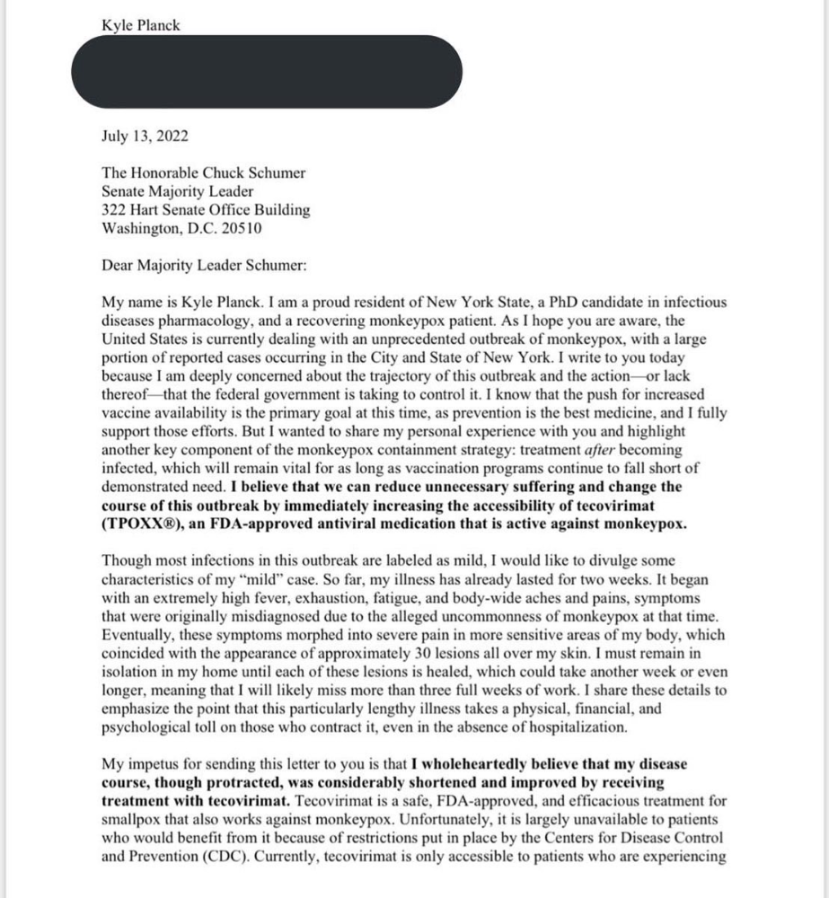
Kyle Planck
3 years ago
The chronicles of monkeypox.
or, how I spread monkeypox and got it myself.
This story contains nsfw (not safe for wife) stuff and shouldn't be read if you're under 18 or think I'm a newborn angel. After the opening, it's broken into three sections: a chronological explanation of my disease course, my ideas, and what I plan to do next.
Your journey awaits.
As early as mid-may, I was waltzing around the lab talking about monkeypox, a rare tropical disease with an inaccurate name. Monkeys are not its primary animal reservoir. It caused an outbreak among men who have sex with men across Europe, with unprecedented levels of person-to-person transmission. European health authorities speculated that the virus spread at raves and parties and was easily transferred through intimate, mainly sexual, contact. I had already read the nejm article about the first confirmed monkeypox patient in the u.s. and shared the photos on social media so people knew what to look for. The cdc information page only included 4 photographs of monkeypox lesions that looked like they were captured on a motorola razr.
I warned my ex-boyfriend about monkeypox. Monkeypox? responded.
Mom, I'm afraid about monkeypox. What's monkeypox?
My therapist is scared about monkeypox. What's monkeypox?
Was I alone? A few science gays on Twitter didn't make me feel overreacting.
This information got my gay head turning. The incubation period for the sickness is weeks. Many of my social media contacts are traveling to Europe this summer. What is pride? Travel, parties, and sex. Many people may become infected before attending these activities. Monkeypox will affect the lgbtq+ community.
Being right always stinks. My young scientist brain was right, though. Someone who saw this coming is one of the early victims. I'll talk about my feelings publicly, and trust me, I have many concerning what's occurring.
Part 1 is the specifics.
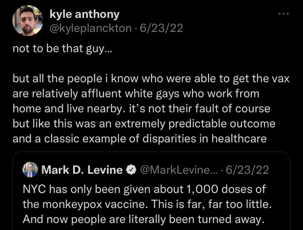
Wednesday nights are never smart but always entertaining. I didn't wake up until noon on june 23 and saw gay twitter blazing. Without warning, the nyc department of health announced a pop-up monkeypox immunization station in chelsea. Some days would be 11am-7pm. Walk-ins were welcome, however appointments were preferred. I tried to arrange an appointment after rubbing my eyes, but they were all taken. I got out of bed, washed my face, brushed my teeth, and put on short shorts because I wanted to get a walk-in dose and show off my legs. I got a 20-oz. cold brew on the way to the train and texted a chelsea-based acquaintance for help.
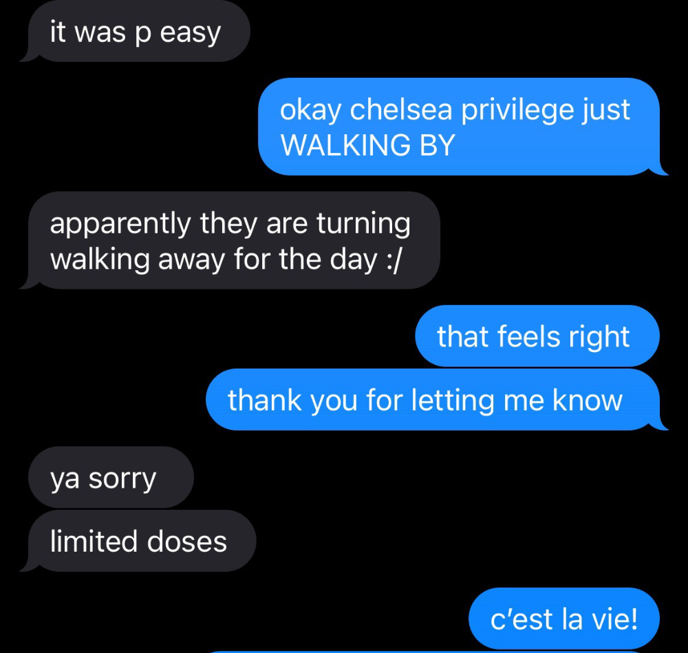
Clinic closed at 2pm. No more doses. Hundreds queued up. The government initially gave them only 1,000 dosages. For a city with 500,000 LGBT people, c'mon. What more could I do? I was upset by how things were handled. The evidence speaks for itself.
I decided to seek an appointment when additional doses were available and continued my weekend. I was celebrating nyc pride with pals. Fun! sex! *
On tuesday after that, I felt a little burn. This wasn't surprising because I'd been sexually active throughout the weekend, so I got a sti panel the next day. I expected to get results in a few days, take antibiotics, and move on.
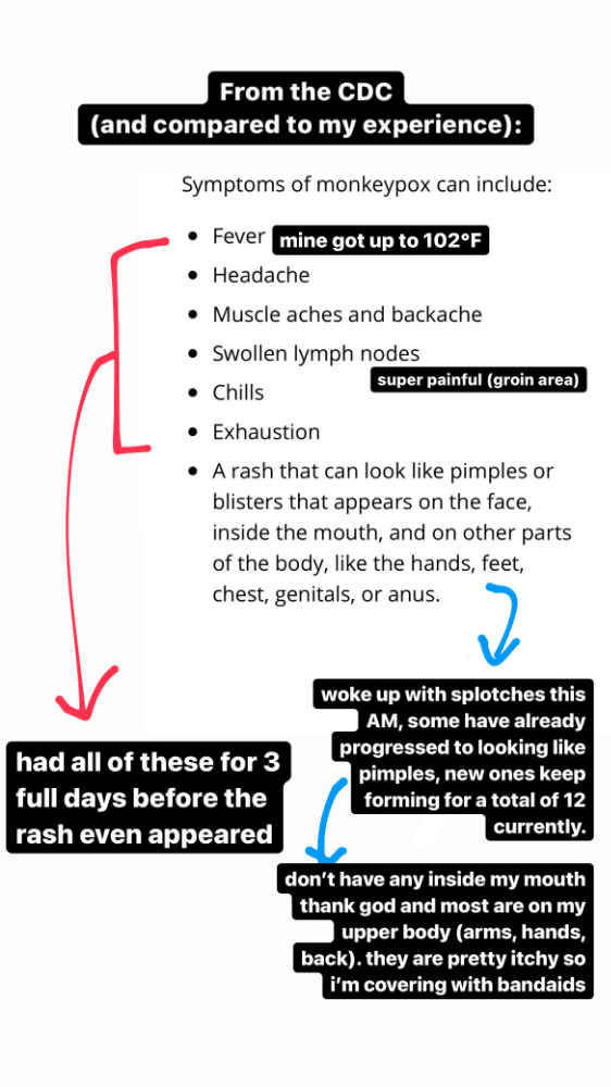
Emerging germs had other intentions. Wednesday night, I felt sore, and thursday morning, I had a blazing temperature and had sweat through my bedding. I had fever, chills, and body-wide aches and pains for three days. I reached 102 degrees. I believed I had covid over pride weekend, but I tested negative for three days straight.
STDs don't induce fevers or other systemic symptoms. If lymphogranuloma venereum advances, it can cause flu-like symptoms and swollen lymph nodes. I was suspicious and desperate for answers, so I researched monkeypox on the cdc website (for healthcare professionals). Much of what I saw on screen about monkeypox prodrome matched my symptoms. Multiple-day fever, headache, muscle aches, chills, tiredness, enlarged lymph nodes. Pox were lacking.
I told my doctor my concerns pre-medically. I'm occasionally annoying.
On saturday night, my fever broke and I felt better. Still burning, I was optimistic till sunday, when I woke up with five red splotches on my arms and fingertips.
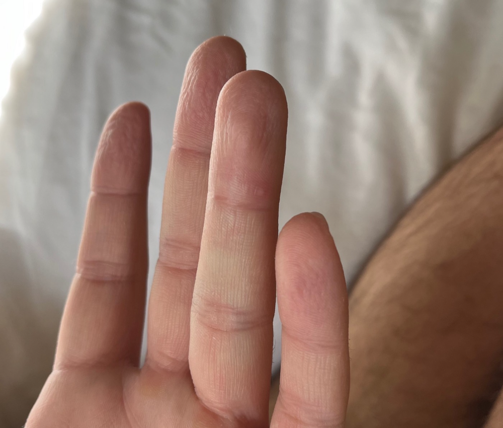
As spots formed, burning became pain. I observed as spots developed on my body throughout the day. I had more than a dozen by the end of the day, and the early spots were pustular. I had monkeypox, as feared.
Fourth of July weekend limited my options. I'm well-connected in my school's infectious disease academic community, so I texted a coworker for advice. He agreed it was likely monkeypox and scheduled me for testing on tuesday.
nyc health could only perform 10 monkeypox tests every day. Before doctors could take swabs and send them in, each test had to be approved by the department. Some commercial labs can now perform monkeypox testing, but the backlog is huge. I still don't have a positive orthopoxvirus test five days after my test. *My 12-day-old case may not be included in the official monkeypox tally. This outbreak is far wider than we first thought, therefore I'm attempting to spread the information and help contain it.
*Update, 7/11: I have orthopoxvirus.
I spent all day in the bathtub because of the agony. Warm lavender epsom salts helped me feel better. I can't stand lavender anymore. I brought my laptop into the bathroom and viewed everything everywhere at once (2022). If my ex and I hadn't recently broken up, I wouldn't have monkeypox. All of these things made me cry, and I sat in the bathtub on the 4th of July sobbing. I thought, Is this it? I felt like Bridesmaids' Kristen Wiig (2011). I'm a flop. From here, things can only improve.
Later that night, I wore a mask and went to my roof to see the fireworks. Even though I don't like fireworks, there was something wonderful about them this year: the colors, how they illuminated the black surfaces around me, and their transient beauty. Joyful moments rarely linger long in our life. We must enjoy them now.

Several roofs away, my neighbors gathered. Happy 4th! I heard a woman yell. Why is this godforsaken country so happy? Instead of being rude, I replied. I didn't tell them I had monkeypox. I thought that would kill the mood.
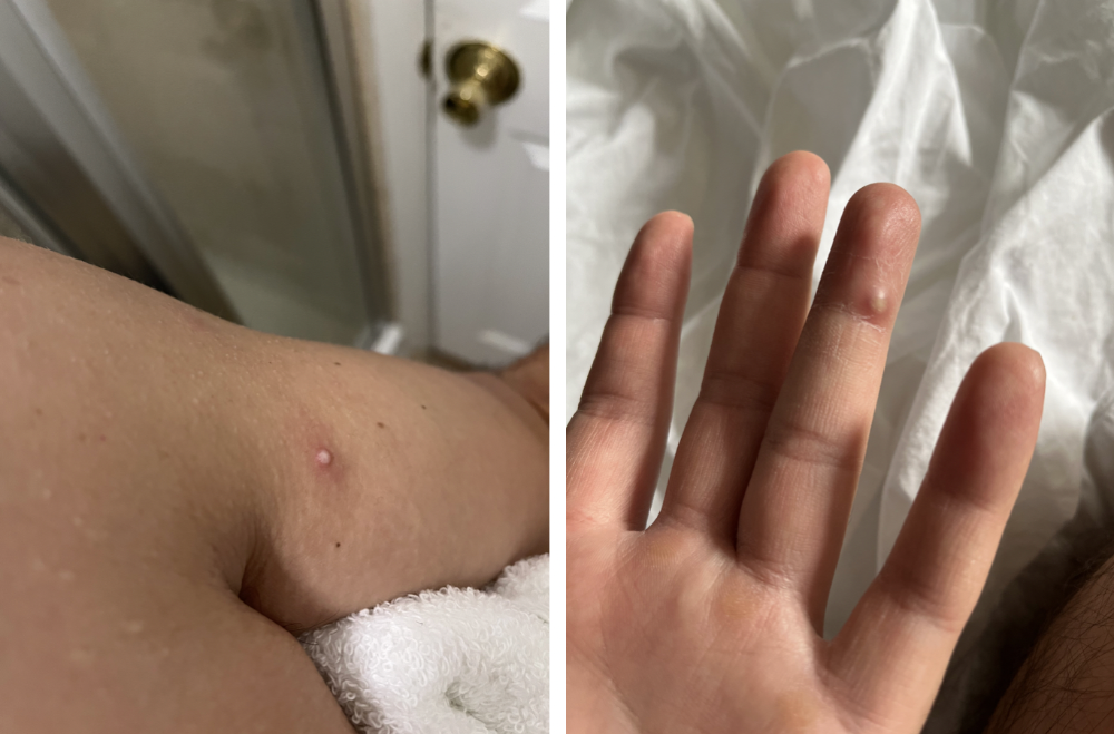
By the time I went to the hospital the next day to get my lesions swabbed, wearing long sleeves, pants, and a mask, they looked like this:
I had 30 lesions on my arms, hands, stomach, back, legs, buttcheeks, face, scalp, and right eyebrow. I had some in my mouth, gums, and throat. Current medical thought is that lesions on mucous membranes cause discomfort in sensitive places. Internal lesions are a new feature of this outbreak of monkeypox. Despite being unattractive, the other sores weren't unpleasant or bothersome.
I had a bacterial sti with the pox. Who knows if that would've created symptoms (often it doesn't), but different infections can happen at once. My care team remembered that having a sti doesn't exclude out monkeypox. doxycycline rocks!
The coworker who introduced me to testing also offered me his home. We share a restroom, and monkeypox can be spread through surfaces. (Being a dna virus gives it environmental hardiness that rna viruses like sars-cov-2 lack.) I disinfected our bathroom after every usage, but I was apprehensive. My friend's place has a guest room and second bathroom, so no cross-contamination. It was the ideal monkeypox isolation environment, so I accepted his offer and am writing this piece there. I don't know what I would have done without his hospitality and attention.
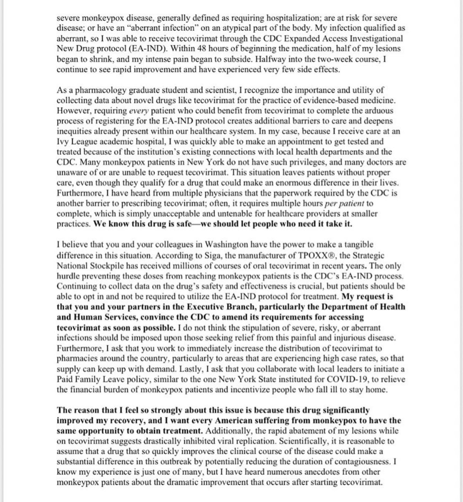
The next day, I started tecovirimat, or tpoxx, for 14 days. Smallpox has been eradicated worldwide since the 1980s but remains a bioterrorism concern. Tecovirimat has a unique, orthopoxvirus-specific method of action, which reduces side effects to headache and nausea. It hasn't been used in many people, therefore the cdc is encouraging patients who take it for monkeypox to track their disease and symptoms.

Tpoxx's oral absorption requires a fatty meal. The hospital ordered me to take the medication after a 600-calorie, 25-gram-fat meal every 12 hours. The coordinator joked, "Don't diet for the next two weeks." I wanted to get peanut butter delivered, but jif is recalling their supply due to salmonella. Please give pathogens a break. I got almond butter.
Tpoxx study enrollment was documented. After signing consent documents, my lesions were photographed and measured during a complete physical exam. I got bloodwork to assess my health. My medication delivery was precise; every step must be accounted for. I got a two-week supply and started taking it that night. I rewarded myself with McDonald's. I'd been hungry for a week. I was also prescribed ketorolac (aka toradol), a stronger ibuprofen, for my discomfort.
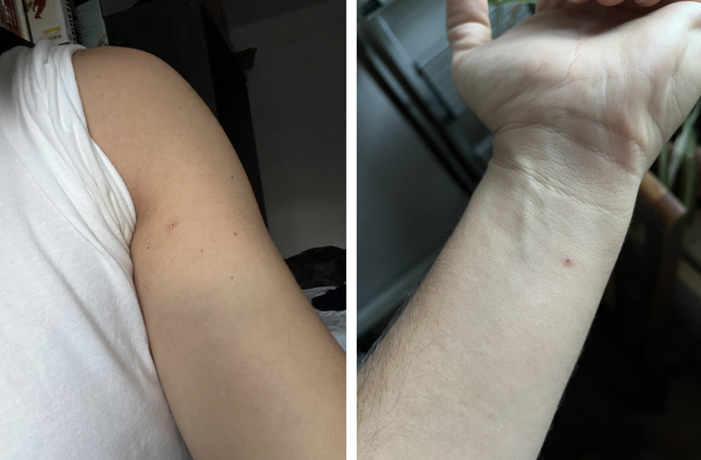
I thought tpoxx was a wonder medicine by day two of treatment. Early lesions looked like this.
however, They vanished. The three largest lesions on my back flattened and practically disappeared into my skin. Some pustular lesions were diminishing. Tpoxx+toradol has helped me sleep, focus, and feel human again. I'm down to twice-daily baths and feeling hungrier than ever in this illness. On day five of tpoxx, some of the lesions look like this:
I have a ways to go. We must believe I'll be contagious until the last of my patches scabs over, falls off, and sprouts new skin. There's no way to tell. After a week and a half of tremendous pain and psychological stress, any news is good news. I'm grateful for my slow but steady development.
Part 2 of the rant.
Being close to yet not in the medical world is interesting. It lets me know a lot about it without being persuaded by my involvement. Doctors identify and treat patients using a tool called differential diagnosis.
A doctor interviews a patient to learn about them and their symptoms. More is better. Doctors may ask, "Have you traveled recently?" sex life? Have pets? preferred streaming service? (No, really. (Hbomax is right.) After the inquisition, the doctor will complete a body exam ranging from looking in your eyes, ears, and throat to a thorough physical.
After collecting data, the doctor makes a mental (or physical) inventory of all the conceivable illnesses that could cause or explain the patient's symptoms. Differential diagnosis list. After establishing the differential, the clinician can eliminate options. The doctor will usually conduct nucleic acid tests on swab samples or bloodwork to learn more. This helps eliminate conditions from the differential or boosts a condition's likelihood. In an ideal circumstance, the doctor can eliminate all but one reason of your symptoms, leaving your formal diagnosis. Once diagnosed, treatment can begin. yay! Love medicine.
My symptoms two weeks ago did not suggest monkeypox. Fever, pains, weariness, and swollen lymph nodes are caused by several things. My scandalous symptoms weren't linked to common ones. My instance shows the importance of diversity and representation in healthcare. My doctor isn't gay, but he provides culturally sensitive care. I'd heard about monkeypox as a gay man in New York. I was hyper-aware of it and had heard of friends of friends who had contracted it the week before, even though the official case count in the US was 40. My physicians weren't concerned, but I was. How would it appear on his mental differential if it wasn't on his radar? Mental differential rhymes! I'll trademark it to prevent theft. differential!
I was in a rare position to recognize my condition and advocate for myself. I study infections. I'd spent months researching monkeypox. I work at a university where I rub shoulders with some of the country's greatest doctors. I'm a gay dude who follows nyc queer social networks online. All of these variables positioned me to think, "Maybe this is monkeypox," and to explain why.
This outbreak is another example of privilege at work. The brokenness of our healthcare system is once again exposed by the inequities produced by the vaccination rollout and the existence of people like myself who can pull strings owing to their line of work. I can't cure this situation on my own, but I can be a strong voice demanding the government do a better job addressing the outbreak and giving resources and advice to everyone I can.
lgbtqia+ community members' support has always impressed me in new york. The queer community has watched out for me and supported me in ways I never dreamed were possible.
Queer individuals are there for each other when societal structures fail. People went to the internet on the first day of the vaccine rollout to share appointment information and the vaccine clinic's message. Twitter timelines were more effective than marketing campaigns. Contrary to widespread anti-vaccine sentiment, the LGBT community was eager to protect themselves. Smallpox vaccination? sure. gimme. whether I'm safe. I credit the community's sex positivity. Many people are used to talking about STDs, so there's a reduced barrier to saying, "I think I have something, you should be on the watch too," and taking steps to protect our health.
Once I got monkeypox, I posted on Twitter and Instagram. Besides fueling my main character syndrome, I felt like I wasn't alone. My dc-based friend had monkeypox within hours. He told me about his experience and gave me ideas for managing the discomfort. I can't imagine life without him.
My buddy and colleague organized my medical care and let me remain in his home. His and his husband's friendliness and attention made a world of difference in my recovery. All of my friends and family who helped me, whether by venmo, doordash, or moral support, made me feel cared about. I don't deserve the amazing people in my life.
Finally, I think of everyone who commented on my social media posts regarding my trip. Friends from all sectors of my life and all sexualities have written me well wishes and complimented me for my vulnerability, but I feel the most gravitas from fellow lgbtq+ persons. They're learning to spot. They're learning where to go ill. They're learning self-advocacy. I'm another link in our network of caretaking. I've been cared for, therefore I want to do the same. Community and knowledge are powerful.
You're probably wondering where the diatribe is. You may believe he's gushing about his loved ones, and you'd be right. I say that just because the queer community can take care of itself doesn't mean we should.
Even when caused by the same pathogen, comparing health crises is risky. Aids is unlike covid-19 or monkeypox, yet all were caused by poorly understood viruses. The lgbtq+ community has a history of self-medicating. Queer people (and their supporters) have led the charge to protect themselves throughout history when the government refused. Surreal to experience this in real time.
First, vaccination access is a government failure. The strategic national stockpile contains tens of thousands of doses of jynneos, the newest fda-approved smallpox vaccine, and millions of doses of acam2000, an older vaccine for immunocompetent populations. Despite being a monkeypox hotspot and international crossroads, new york has only received 7,000 doses of the jynneos vaccine. Vaccine appointments are booked within minutes. It's showing Hunger Games, which bothers me.
Second, I think the government failed to recognize the severity of the european monkeypox outbreak. We saw abroad reports in may, but the first vaccines weren't available until june. Why was I a 26-year-old pharmacology grad student, able to see a monkeypox problem in europe but not the u.s. public health agency? Or was there too much bureaucracy and politicking, delaying action?
Lack of testing infrastructure for a known virus with vaccinations and therapies is appalling. More testing would have helped understand the problem's breadth. Many homosexual guys, including myself, didn't behave like monkeypox was a significant threat because there were only a dozen instances across the country. Our underestimating of the issue, spurred by a story of few infections, was huge.
Public health officials' response to infectious diseases frustrates me. A wait-and-see approach to infectious diseases is unsatisfactory. Before a sick person is recognized, they've exposed and maybe contaminated numerous others. Vaccinating susceptible populations before a disease becomes entrenched prevents disease. CDC might operate this way. When it was easier, they didn't control or prevent monkeypox. We'll learn when. Sometimes I fear never. Emerging viral infections are a menace in the era of climate change and globalization, and I fear our government will repeat the same mistakes. I don't work at the cdc, thus I have no idea what they do. As a scientist, a homosexual guy, and a citizen of this country, I feel confident declaring that the cdc has not done enough about monkeypox. Will they do enough about monkeypox? The strategic national stockpile can respond to a bioterrorism disaster in 12 hours. I'm skeptical following this outbreak.
It's simple to criticize the cdc, but they're not to blame. Underfunding public health services, especially the cdc, is another way our government fails to safeguard its citizens. I may gripe about the vaccination rollout all I want, but local health departments are doing their best with limited resources. They may not have enough workers to keep up with demand and run a contact-tracing program. Since my orthopoxvirus test is still negative, the doh hasn't asked about my close contacts. By then, my illness will be two weeks old, too long to do anything productive. Not their fault. They're functioning in a broken system that's underfunded for the work it does.
*Update, 7/11: I have orthopoxvirus.
Monkeypox is slow, so i've had time to contemplate. Now that I'm better, I'm angry. furious and sad I want to help. I wish to spare others my pain. This was preventable and solvable, I hope. HOW?
Third, the duty.
Family, especially selected family, helps each other. So many people have helped me throughout this difficult time. How can I give back? I have ideas.
1. Education. I've already started doing this by writing incredibly detailed posts on Instagram about my physical sickness and my thoughts on the entire scandal. via tweets. by producing this essay. I'll keep doing it even if people start to resent me! It's crucial! On my Instagram profile (@kyleplanckton), you may discover a story highlight with links to all of my bizarre yet educational posts.
2. Resources. I've forwarded the contact information for my institution's infectious diseases clinic to several folks who will hopefully be able to get tpoxx under the expanded use policy. Through my social networks, I've learned of similar institutions. I've also shared crowdsourced resources about symptom relief and vaccine appointment availability on social media. DM me or see my Instagram highlight for more.
3. Community action. During my illness, my friends' willingness to aid me has meant the most. It was nice to know I had folks on my side. One of my pals (thanks, kenny) snagged me a mcgriddle this morning when seamless canceled my order. This scenario has me thinking about methods to help people with monkeypox isolation. A two-week isolation period is financially damaging for many hourly workers. Certain governments required paid sick leave for covid-19 to allow employees to recover and prevent spread. No comparable program exists for monkeypox, and none seems to be planned shortly.
I want to aid monkeypox patients in severe financial conditions. I'm willing to pick up and bring groceries or fund meals/expenses for sick neighbors. I've seen several GoFundMe accounts, but I wish there was a centralized mechanism to link those in need with those who can help. Please contact me if you have expertise with mutual aid organizations. I hope we can start this shortly.
4. lobbying. Personal narratives are powerful. My narrative is only one, but I think it's compelling. Over the next day or so, i'll write to local, state, and federal officials about monkeypox. I wanted a vaccine but couldn't acquire one, and I feel tpoxx helped my disease. As a pharmacologist-in-training, I believe collecting data on a novel medicine is important, and there are ethical problems when making a drug with limited patient data broadly available. Many folks I know can't receive tpoxx due of red tape and a lack of contacts. People shouldn't have to go to an ivy league hospital to obtain the greatest care. Based on my experience and other people's tales, I believe tpoxx can drastically lessen monkeypox patients' pain and potentially curb transmission chains if administered early enough. This outbreak is manageable. It's not too late if we use all the instruments we have (diagnostic, vaccine, treatment).
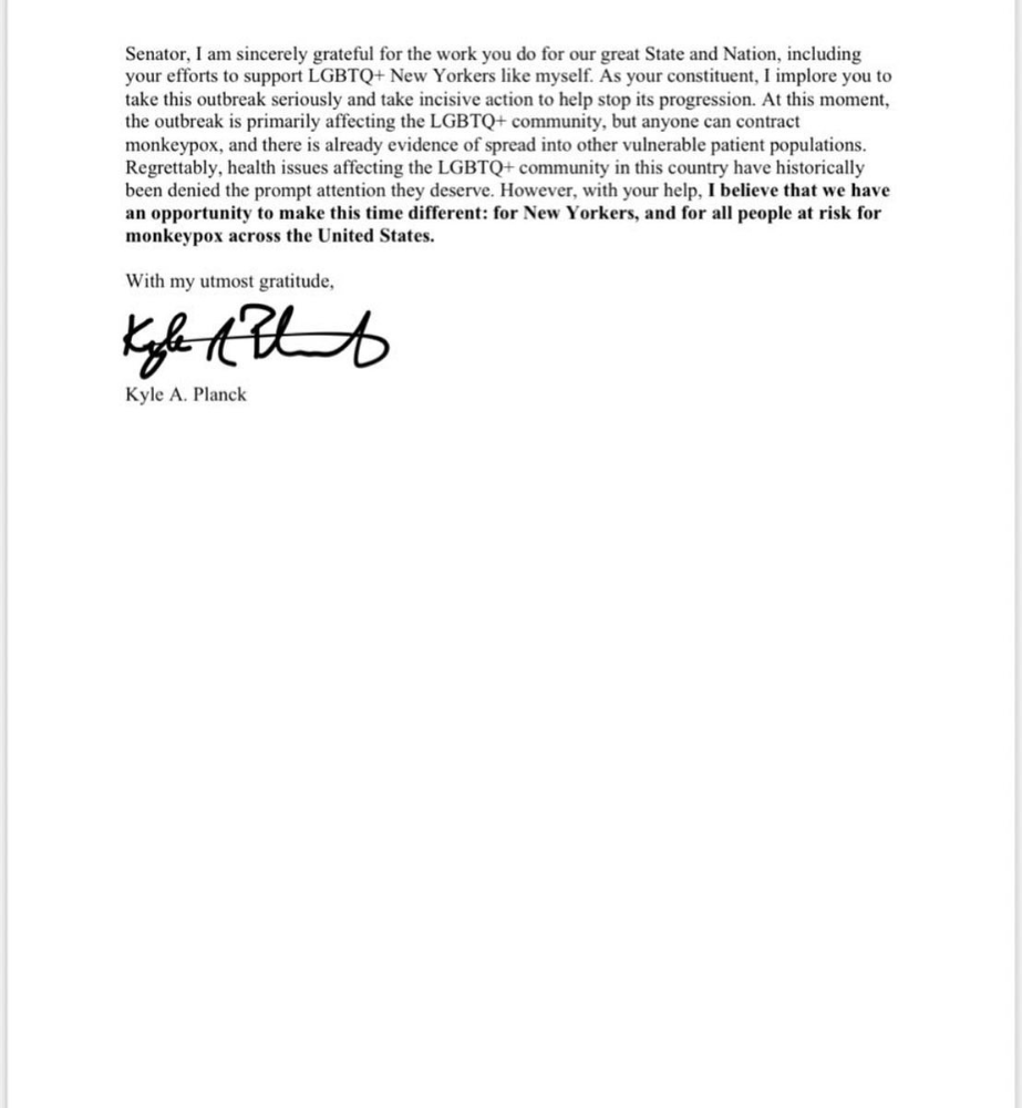
*UPDATE 7/15: I submitted the following letter to Chuck Schumer and Kirsten Gillibrand. I've addressed identical letters to local, state, and federal officials, including the CDC and HHS.
I hope to join RESPND-MI, an LGBTQ+ community-led assessment of monkeypox symptoms and networks in NYC. Visit their website to learn more and give to this community-based charity.
How I got monkeypox is a mystery. I received it through a pride physical interaction, but i'm not sure which one. This outbreak will expand unless leaders act quickly. Until then, I'll keep educating and connecting people to care in my neighborhood.
Despite my misgivings, I see some optimism. Health department social media efforts are underway. During the outbreak, the CDC provided nonjudgmental suggestions for safer social and sexual activity. There's additional information regarding the disease course online, including how to request tpoxx for sufferers. These materials can help people advocate for themselves if they're sick. Importantly, homosexual guys are listening when they discuss about monkeypox online and irl. Learners They're serious.
The government has a terrible track record with lgtbq+ health issues, and they're not off to a good start this time. I hope this time will be better. If I can aid even one individual, I'll do so.
Thanks for reading, supporting me, and spreading awareness about the 2022 monkeypox outbreak. My dms are accessible if you want info, resources, queries, or to chat.
y'all well
kyle
You might also like

Jano le Roux
3 years ago
Quit worrying about Twitter: Elon moves quickly before refining
Elon's rides start rough, but then...
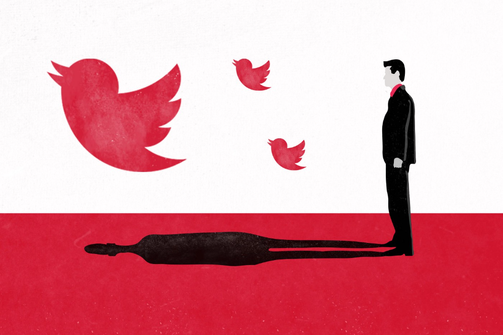
Elon Musk has never been so hated.
They don’t get Elon.
He began using PayPal in this manner.
He began with SpaceX in a similar manner.
He began with Tesla in this manner.
Disruptive.
Elon had rocky starts. His creativity requires it. Just like writing a first draft.
His fastest way to find the way is to avoid it.
PayPal's pricey launch
PayPal was a 1999 business flop.
They were considered insane.
Elon and his co-founders had big plans for PayPal. They adopted the popular philosophy of the time, exchanging short-term profit for growth, and pulled off a miracle just before the bubble burst.
PayPal was created as a dollar alternative. Original PayPal software allowed PalmPilot money transfers. Unfortunately, there weren't enough PalmPilot users.
Since everyone had email, the company emailed payments. Costs rose faster than sales.
The startup wanted to get a million subscribers by paying $10 to sign up and $10 for each referral. Elon thought the price was fair because PayPal made money by charging transaction fees. They needed to make money quickly.
A Wall Street Journal article valuing PayPal at $500 million attracted investors. The dot-com bubble burst soon after they rushed to get financing.
Musk and his partners sold PayPal to eBay for $1.5 billion in 2002. Musk's most successful company was PayPal.
SpaceX's start-up error
Elon and his friends bought a reconditioned ICBM in Russia in 2002.
He planned to invest much of his wealth in a stunt to promote NASA and space travel.
Many called Elon crazy.
The goal was to buy a cheap Russian rocket to launch mice or plants to Mars and return them. He thought SpaceX would revive global space interest. After a bad meeting in Moscow, Elon decided to build his own rockets to undercut launch contracts.
Then SpaceX was founded.
Elon’s plan was harder than expected.
Explosions followed explosions.
Millions lost on cargo.
Millions lost on the rockets.
Investors thought Elon was crazy, but he wasn't.
NASA's biggest competitor became SpaceX. NASA hired SpaceX to handle many of its missions.
Tesla's shaky beginning
Tesla began shakily.
Clients detested their roadster.
They continued to miss deadlines.
Lotus would handle the car while Tesla focused on the EV component, easing Tesla's entry. The business experienced elegance creep. Modifying specific parts kept the car from getting worse.
Cost overruns, delays, and other factors changed the Elise-like car's appearance. Only 7% of the Tesla Roadster's parts matched its Lotus twin.
Tesla was about to die.
Elon saved the mess as CEO.
He fired 25% of the workforce to reduce costs.
Elon Musk transformed Tesla into the world's most valuable automaker by running it like a startup.
Tesla hasn't spent a dime on advertising. They let the media do the talking by investing in innovation.
Elon sheds. Elon tries. Elon learns. Elon refines.
Twitter doesn't worry me.
The media is shocked. I’m not.
This is just Elon being Elon.
Elon makes lean.
Elon tries new things.
Elon listens to feedback.
Elon refines.
Besides Twitter will always be Twitter.

Percy Bolmér
3 years ago
Ethereum No Longer Consumes A Medium-Sized Country's Electricity To Run
The Merge cut Ethereum's energy use by 99.5%.
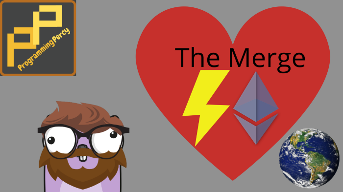
The Crypto community celebrated on September 15, 2022. This day, Ethereum Merged. The entire blockchain successfully merged with the Beacon chain, and it was so smooth you barely noticed.
Many have waited, dreaded, and longed for this day.
Some investors feared the network would break down, while others envisioned a seamless merging.
Speculators predict a successful Merge will lead investors to Ethereum. This could boost Ethereum's popularity.
What Has Changed Since The Merge
The merging transitions Ethereum mainnet from PoW to PoS.
PoW sends a mathematical riddle to computers worldwide (miners). First miner to solve puzzle updates blockchain and is rewarded.
The puzzles sent are power-intensive to solve, so mining requires a lot of electricity. It's sent to every miner competing to solve it, requiring duplicate computation.
PoS allows investors to stake their coins to validate a new transaction. Instead of validating a whole block, you validate a transaction and get the fees.
You can validate instead of mine. A validator stakes 32 Ethereum. After staking, the validator can validate future blocks.
Once a validator validates a block, it's sent to a randomly selected group of other validators. This group verifies that a validator is not malicious and doesn't validate fake blocks.
This way, only one computer needs to solve or validate the transaction, instead of all miners. The validated block must be approved by a small group of validators, causing duplicate computation.
PoS is more secure because validating fake blocks results in slashing. You lose your bet tokens. If a validator signs a bad block or double-signs conflicting blocks, their ETH is burned.
Theoretically, Ethereum has one block every 12 seconds, so a validator forging a block risks burning 1 Ethereum for 12 seconds of transactions. This makes mistakes expensive and risky.
What Impact Does This Have On Energy Use?
Cryptocurrency is a natural calamity, sucking electricity and eating away at the earth one transaction at a time.
Many don't know the environmental impact of cryptocurrencies, yet it's tremendous.
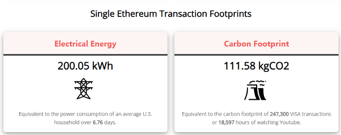
A single Ethereum transaction used to use 200 kWh and leave a large carbon imprint. This update reduces global energy use by 0.2%.
Ethereum will submit a challenge to one validator, and that validator will forward it to randomly selected other validators who accept it.
This reduces the needed computing power.
They expect a 99.5% reduction, therefore a single transaction should cost 1 kWh.
Carbon footprint is 0.58 kgCO2, or 1,235 VISA transactions.
This is a big Ethereum blockchain update.
I love cryptocurrency and Mother Earth.
Patryk Nawrocki
3 years ago
7 things a new UX/UI designer should know

If I could tell my younger self a few rules, they would boost my career.
1. Treat design like medicine; don't get attached.

If it doesn't help, you won't be angry, but you'll try to improve it. Designers blame others if they don't like the design, but the rule is the same: we solve users' problems. You're not your design, and neither are they. Be humble with your work because your assumptions will often be wrong and users will behave differently.
2. Consider your design flawed.

Disagree with yourself, then defend your ideas. Most designers forget to dig deeper into a pattern, screen, button, or copywriting. If someone asked, "Have you considered alternatives? How does this design stack up? Here's a functional UX checklist to help you make design decisions.
3. Codeable solutions.
If your design requires more developer time, consider whether it's worth spending more money to code something with a small UX impact. Overthinking problems and designing abstract patterns is easy. Sometimes you see something on dribbble or bechance and try to recreate it, but it's not worth it. Here's my article on it.
4. Communication changes careers
Designers often talk with users, clients, companies, developers, and other designers. How you talk and present yourself can land you a job. Like driving or swimming, practice it. Success requires being outgoing and friendly. If I hadn't said "hello" to a few people, I wouldn't be where I am now.
5. Ignorance of the law is not an excuse.

Copyright, taxation How often have you used an icon without checking its license? If you use someone else's work in your project, the owner can cause you a lot of problems — paying a lot of money isn't worth it. Spend a few hours reading about copyrights, client agreements, and taxes.
6. Always test your design

If nobody has seen or used my design, it's not finished. Ask friends about prototypes. Testing reveals how wrong your assumptions were. Steve Krug, one of the authorities on this topic will tell you more about how to do testing.
7. Run workshops
A UX designer's job involves talking to people and figuring out what they need, which is difficult because they usually don't know. Organizing teamwork sessions is a powerful skill, but you must also be a good listener. Your job is to help a quiet, introverted developer express his solution and control the group. AJ Smart has more on workshops here.