


More on NFTs & Art

middlemarch.eth
4 years ago
ERC721R: A new ERC721 contract for random minting so people don’t snipe all the rares!
That is, how to snipe all the rares without using ERC721R!
Introduction: Blessed and Lucky
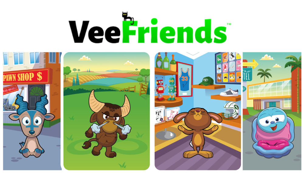
Mphers was the first mfers derivative, and as a Phunks derivative, I wanted one.
I wanted an alien. And there are only 8 in the 6,969 collection. I got one!
In case it wasn't clear from the tweet, I meant that I was lucky to have figured out how to 100% guarantee I'd get an alien without any extra luck.
Read on to find out how I did it, how you can too, and how developers can avoid it!
How to make rare NFTs without luck.
# How to mint rare NFTs without needing luck
The key to minting a rare NFT is knowing the token's id ahead of time.
For example, once I knew my alien was #4002, I simply refreshed the mint page until #3992 was minted, and then mint 10 mphers.
How did I know #4002 was extraterrestrial? Let's go back.
First, go to the mpher contract's Etherscan page and look up the tokenURI of a previously issued token, token #1:
As you can see, mphers creates metadata URIs by combining the token id and an IPFS hash.
This method gives you the collection's provenance in every URI, and while that URI can be changed, it affects everyone and is public.
Consider a token URI without a provenance hash, like https://mphers.art/api?tokenId=1.
As a collector, you couldn't be sure the devs weren't changing #1's metadata at will.
The API allows you to specify “if #4002 has not been minted, do not show any information about it”, whereas IPFS does not allow this.
It's possible to look up the metadata of any token, whether or not it's been minted.
Simply replace the trailing “1” with your desired id.
Mpher #4002
These files contain all the information about the mpher with the specified id. For my alien, we simply search all metadata files for the string “alien mpher.”
Take a look at the 6,969 meta-data files I'm using OpenSea's IPFS gateway, but you could use ipfs.io or something else.
Use curl to download ten files at once. Downloading thousands of files quickly can lead to duplicates or errors. But with a little tweaking, you should be able to get everything (and dupes are fine for our purposes).
Now that you have everything in one place, grep for aliens:
The numbers are the file names that contain “alien mpher” and thus the aliens' ids.
The entire process takes under ten minutes. This technique works on many NFTs currently minting.
In practice, manually minting at the right time to get the alien is difficult, especially when tokens mint quickly. Then write a bot to poll totalSupply() every second and submit the mint transaction at the exact right time.
You could even look for the token you need in the mempool before it is minted, and get your mint into the same block!
However, in my experience, the “big” approach wins 95% of the time—but not 100%.
“Am I being set up all along?”
Is a question you might ask yourself if you're new to this.
It's disheartening to think you had no chance of minting anything that someone else wanted.
But, did you have no opportunity? You had an equal chance as everyone else!
Take me, for instance: I figured this out using open-source tools and free public information. Anyone can do this, and not understanding how a contract works before minting will lead to much worse issues.
The mpher mint was fair.
While a fair game, “snipe the alien” may not have been everyone's cup of tea.
People may have had more fun playing the “mint lottery” where tokens were distributed at random and no one could gain an advantage over someone simply clicking the “mint” button.
How might we proceed?
Minting For Fashion Hats Punks, I wanted to create a random minting experience without sacrificing fairness. In my opinion, a predictable mint beats an unfair one. Above all, participants must be equal.
Sadly, the most common method of creating a random experience—the post-mint “reveal”—is deeply unfair. It works as follows:
- During the mint, token metadata is unavailable. Instead, tokenURI() returns a blank JSON file for each id.
- An IPFS hash is updated once all tokens are minted.
- You can't tell how the contract owner chose which token ids got which metadata, so it appears random.
Because they alone decide who gets what, the person setting the metadata clearly has a huge unfair advantage over the people minting. Unlike the mpher mint, you have no chance of winning here.
But what if it's a well-known, trusted, doxxed dev team? Are reveals okay here?
No! No one should be trusted with such power. Even if someone isn't consciously trying to cheat, they have unconscious biases. They might also make a mistake and not realize it until it's too late, for example.
You should also not trust yourself. Imagine doing a reveal, thinking you did it correctly (nothing is 100%! ), and getting the rarest NFT. Isn't that a tad odd Do you think you deserve it? An NFT developer like myself would hate to be in this situation.
Reveals are bad*
UNLESS they are done without trust, meaning everyone can verify their fairness without relying on the developers (which you should never do).
An on-chain reveal powered by randomness that is verifiably outside of anyone's control is the most common way to achieve a trustless reveal (e.g., through Chainlink).
Tubby Cats did an excellent job on this reveal, and I highly recommend their contract and launch reflections. Their reveal was also cool because it was progressive—you didn't have to wait until the end of the mint to find out.
In his post-launch reflections, @DefiLlama stated that he made the contract as trustless as possible, removing as much trust as possible from the team.
In my opinion, everyone should know the rules of the game and trust that they will not be changed mid-stream, while trust minimization is critical because smart contracts were designed to reduce trust (and it makes it impossible to hack even if the team is compromised). This was a huge mistake because it limited our flexibility and our ability to correct mistakes.
And @DefiLlama is a superstar developer. Imagine how much stress maximizing trustlessness will cause you!
That leaves me with a bad solution that works in 99 percent of cases and is much easier to implement: random token assignments.
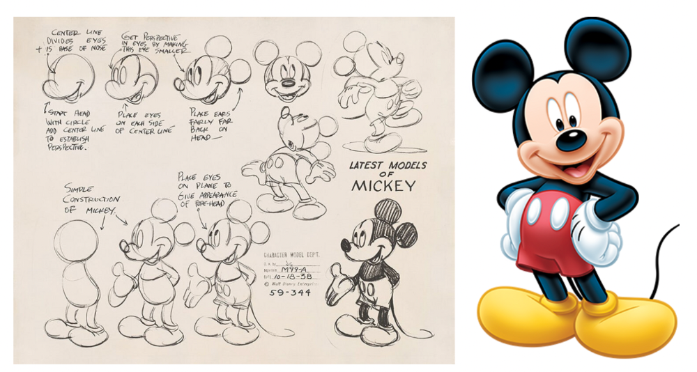
Introducing ERC721R: A fully compliant IERC721 implementation that picks token ids at random.
ERC721R implements the opposite of a reveal: we mint token ids randomly and assign metadata deterministically.
This allows us to reveal all metadata prior to minting while reducing snipe chances.
Then import the contract and use this code:
What is ERC721R and how does it work
First, a disclaimer: ERC721R isn't truly random. In this sense, it creates the same “game” as the mpher situation, where minters compete to exploit the mint. However, ERC721R is a much more difficult game.
To game ERC721R, you need to be able to predict a hash value using these inputs:
This is impossible for a normal person because it requires knowledge of the block timestamp of your mint, which you do not have.
To do this, a miner must set the timestamp to a value in the future, and whatever they do is dependent on the previous block's hash, which expires in about ten seconds when the next block is mined.
This pseudo-randomness is “good enough,” but if big money is involved, it will be gamed. Of course, the system it replaces—predictable minting—can be manipulated.
The token id is chosen in a clever implementation of the Fisher–Yates shuffle algorithm that I copied from CryptoPhunksV2.
Consider first the naive solution: (a 10,000 item collection is assumed):
- Make an array with 0–9999.
- To create a token, pick a random item from the array and use that as the token's id.
- Remove that value from the array and shorten it by one so that every index corresponds to an available token id.
This works, but it uses too much gas because changing an array's length and storing a large array of non-zero values is expensive.
How do we avoid them both? What if we started with a cheap 10,000-zero array? Let's assign an id to each index in that array.
Assume we pick index #6500 at random—#6500 is our token id, and we replace the 0 with a 1.
But what if we chose #6500 again? A 1 would indicate #6500 was taken, but then what? We can't just "roll again" because gas will be unpredictable and high, especially later mints.
This allows us to pick a token id 100% of the time without having to keep a separate list. Here's how it works:
- Make a 10,000 0 array.
- Create a 10,000 uint numAvailableTokens.
- Pick a number between 0 and numAvailableTokens. -1
- Think of #6500—look at index #6500. If it's 0, the next token id is #6500. If not, the value at index #6500 is your next token id (weird!)
- Examine the array's last value, numAvailableTokens — 1. If it's 0, move the value at #6500 to the end of the array (#9999 if it's the first token). If the array's last value is not zero, update index #6500 to store it.
- numAvailableTokens is decreased by 1.
- Repeat 3–6 for the next token id.
So there you go! The array stays the same size, but we can choose an available id reliably. The Solidity code is as follows:
Unfortunately, this algorithm uses more gas than the leading sequential mint solution, ERC721A.
This is most noticeable when minting multiple tokens in one transaction—a 10 token mint on ERC721R costs 5x more than on ERC721A. That said, ERC721A has been optimized much further than ERC721R so there is probably room for improvement.
Conclusion
Listed below are your options:
- ERC721A: Minters pay lower gas but must spend time and energy devising and executing a competitive minting strategy or be comfortable with worse minting results.
- ERC721R: Higher gas, but the easy minting strategy of just clicking the button is optimal in all but the most extreme cases. If miners game ERC721R it’s the worst of both worlds: higher gas and a ton of work to compete.
- ERC721A + standard reveal: Low gas, but not verifiably fair. Please do not do this!
- ERC721A + trustless reveal: The best solution if done correctly, highly-challenging for dev, potential for difficult-to-correct errors.
Did I miss something? Comment or tweet me @dumbnamenumbers.
Check out the code on GitHub to learn more! Pull requests are welcome—I'm sure I've missed many gas-saving opportunities.
Thanks!
Read the original post here

xuanling11
3 years ago
Reddit NFT Achievement

Reddit's NFT market is alive and well.
NFT owners outnumber OpenSea on Reddit.
Reddit NFTs flip in OpenSea in days:
Fast-selling.
NFT sales will make Reddit's current communities more engaged.
I don't think NFTs will affect existing groups, but they will build hype for people to acquire them.
The first season of Collectibles is unique, but many missed the first season.
Second-season NFTs are less likely to be sold for a higher price than first-season ones.
If you use Reddit, it's fun to own NFTs.

Ezra Reguerra
4 years ago
Yuga Labs’ Otherdeeds NFT mint triggers backlash from community
Unhappy community members accuse Yuga Labs of fraud, manipulation, and favoritism over Otherdeeds NFT mint.
Following the Otherdeeds NFT mint, disgruntled community members took to Twitter to criticize Yuga Labs' handling of the event.
Otherdeeds NFTs were a huge hit with the community, selling out almost instantly. Due to high demand, the launch increased Ethereum gas fees from 2.6 ETH to 5 ETH.
But the event displeased many people. Several users speculated that the mint was “planned to fail” so the group could advertise launching its own blockchain, as the team mentioned a chain migration in one tweet.
Others like Mark Beylin tweeted that he had "sold out" on all Ape-related NFT investments after Yuga Labs "revealed their true colors." Beylin also advised others to assume Yuga Labs' owners are “bad actors.”
Some users who failed to complete transactions claim they lost ETH. However, Yuga Labs promised to refund lost gas fees.
CryptoFinally, a Twitter user, claimed Yuga Labs gave BAYC members better land than non-members. Others who wanted to participate paid for shittier land, while BAYCS got the only worthwhile land.
The Otherdeed NFT drop also increased Ethereum's burn rate. Glassnode and Data Always reported nearly 70,000 ETH burned on mint day.
You might also like

The Mystique
3 years ago
Four Shocking Dark Web Incidents that Should Make You Avoid It
Dark Web activity? Is it as horrible as they say?

We peruse our phones for hours. Internet has improved our worldview.
However, the world's harshest realities remain buried on the internet and unattainable by everyone.
Browsers cannot access the Dark Web. Browse it with high-security authentication and exclusive access. There are compelling reasons to avoid the dark web at all costs.
1. The Dark Web and I

Darius wrote My Dark Web Story on reddit two years ago. The user claimed to have shared his dark web experience. DaRealEddyYT wanted to surf the dark web after hearing several stories.
He curiously downloaded Tor Browser, which provides anonymity and security.
In the Dark Room, bound
As Darius logged in, a text popped up: “Want a surprise? Click on this link.”
The link opened to a room with a chair. Only one light source illuminated the room. The chair held a female tied.
As the screen read "Let the game begin," a man entered the room and was paid in bitcoins to torment the girl.
The man dragged and tortured the woman.
A danger to safety
Leaving so soon, Darius, disgusted Darius tried to leave the stream. The anonymous user then sent Darius his personal information, including his address, which frightened him because he didn't know Tor was insecure.
After deleting the app, his phone camera was compromised.
He also stated that he left his residence and returned to find it unlocked and a letter saying, Thought we wouldn't find you? Reddit never updated the story.
The story may have been a fake, but a much scarier true story about the dark side of the internet exists.
2. The Silk Road Market

The dark web is restricted for a reason. The dark web has everything illicit imaginable. It's awful central.
The dark web has everything, from organ sales to drug trafficking to money laundering to human trafficking. Illegal drugs, pirated software, credit card, bank, and personal information can be found in seconds.
The dark web has reserved websites like Google. The Silk Road Website, which operated from 2011 to 2013, was a leading digital black market.
The FBI grew obsessed with site founder and processor Ross William Ulbricht.
The site became a criminal organization as money laundering and black enterprises increased. Bitcoin was utilized for credit card payment.
The FBI was close to arresting the site's administrator. Ross was detained after the agency closed Silk Road in 2013.
Two years later, in 2015, he was convicted and sentenced to two consecutive life terms and forty years. He appealed in 2016 but was denied, thus he is currently serving time.
The hefty sentence was for more than running a black marketing site. He was also convicted of murder-for-hire, earning about $730,000 in a short time.
3. Person-buying auctions
Bidding on individuals is another weird internet activity. After a Milan photo shoot, 20-year-old British model Chloe Ayling was kidnapped.
An ad agency in Milan made a bogus offer to shoot with the mother of a two-year-old boy. Four men gave her anesthetic and put her in a duffel bag when she arrived.
She was held captive for several days, and her images and $300,000 price were posted on the dark web. Black Death Trafficking Group kidnapped her to sell her for sex.
She was told two black death foot warriors abducted her. The captors released her when they found she was a mother because mothers were less desirable to sex slave buyers.
In July 2018, Lukasz Pawel Herba was arrested and sentenced to 16 years and nine months in prison. Being a young mother saved Chloe from creepy bidding.
However, it exceeds expectations of how many more would be in such danger daily without their knowledge.
4. Organ sales

Many are unaware of dark web organ sales. Patients who cannot acquire organs often turn to dark web brokers.
Brokers handle all transactions between donors and customers.
Bitcoins are used for dark web transactions, and the Tor server permits personal data on the web.
The WHO reports approximately 10,000 unlawful organ transplants annually. The black web sells kidneys, hearts, even eyes.
To protect our lives and privacy, we should manage our curiosity and never look up dangerous stuff.
While it's fascinating and appealing to know what's going on in the world we don't know about, it's best to prioritize our well-being because one never knows how bad it might get.
Sources

Solomon Ayanlakin
3 years ago
Metrics for product management and being a good leader
Never design a product without explicit metrics and tracking tools.
Imagine driving cross-country without a dashboard. How do you know your school zone speed? Low gas? Without a dashboard, you can't monitor your car. You can't improve what you don't measure, as Peter Drucker said. Product managers must constantly enhance their understanding of their users, how they use their product, and how to improve it for optimum value. Customers will only pay if they consistently acquire value from your product.
I’m Solomon Ayanlakin. I’m a product manager at CredPal, a financial business that offers credit cards and Buy Now Pay Later services. Before falling into product management (like most PMs lol), I self-trained as a data analyst, using Alex the Analyst's YouTube playlists and DannyMas' virtual data internship. This article aims to help product managers, owners, and CXOs understand product metrics, give a methodology for creating them, and execute product experiments to enhance them.
☝🏽Introduction
Product metrics assist companies track product performance from the user's perspective. Metrics help firms decide what to construct (feature priority), how to build it, and the outcome's success or failure. To give the best value to new and existing users, track product metrics.
Why should a product manager monitor metrics?
to assist your users in having a "aha" moment
To inform you of which features are frequently used by users and which are not
To assess the effectiveness of a product feature
To aid in enhancing client onboarding and retention
To assist you in identifying areas throughout the user journey where customers are satisfied or dissatisfied
to determine the percentage of returning users and determine the reasons for their return
📈 What Metrics Ought a Product Manager to Monitor?
What indicators should a product manager watch to monitor product health? The metrics to follow change based on the industry, business stage (early, growth, late), consumer needs, and company goals. A startup should focus more on conversion, activation, and active user engagement than revenue growth and retention. The company hasn't found product-market fit or discovered what features drive customer value.
Depending on your use case, company goals, or business stage, here are some important product metric buckets:
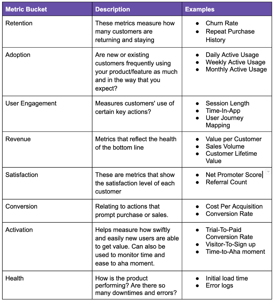
All measurements shouldn't be used simultaneously. It depends on your business goals and what value means for your users, then selecting what metrics to track to see if they get it.
Some KPIs are more beneficial to track, independent of industry or customer type. To prevent recording vanity metrics, product managers must clearly specify the types of metrics they should track. Here's how to segment metrics:
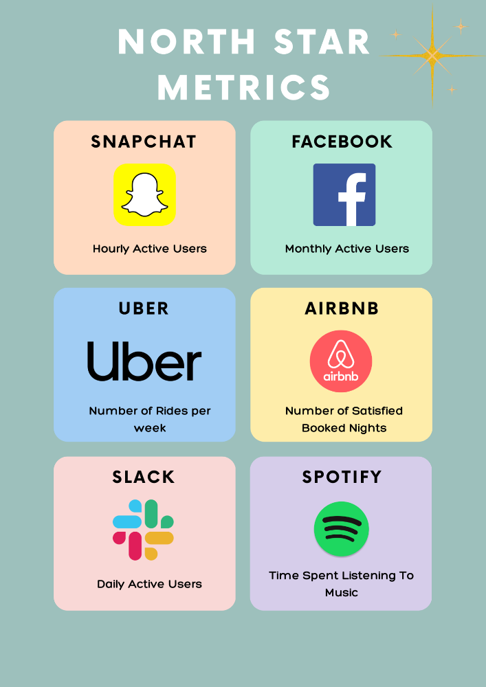
The North Star Metric, also known as the Focus Metric, is the indicator and aid in keeping track of the top value you provide to users.
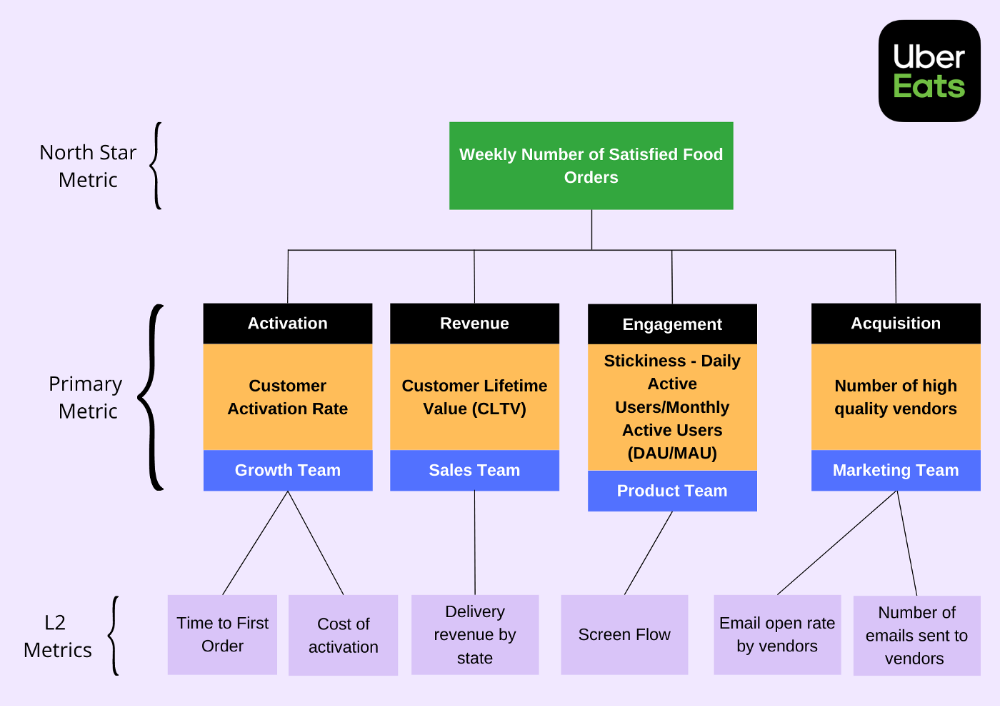
Primary/Level 1 Metrics: These metrics should either add to the north star metric or be used to determine whether it is moving in the appropriate direction. They are metrics that support the north star metric.
These measures serve as leading indications for your north star and Level 2 metrics. You ought to have been aware of certain problems with your L2 measurements prior to the North star metric modifications.
North Star Metric
This is the key metric. A good north star metric measures customer value. It emphasizes your product's longevity. Many organizations fail to grow because they confuse north star measures with other indicators. A good focus metric should touch all company teams and be tracked forever. If a company gives its customers outstanding value, growth and success are inevitable. How do we measure this value?
A north star metric has these benefits:
Customer Obsession: It promotes a culture of customer value throughout the entire organization.
Consensus: Everyone can quickly understand where the business is at and can promptly make improvements, according to consensus.
Growth: It provides a tool to measure the company's long-term success. Do you think your company will last for a long time?
How can I pick a reliable North Star Metric?
Some fear a single metric. Ensure product leaders can objectively determine a north star metric. Your company's focus metric should meet certain conditions. Here are a few:
A good focus metric should reflect value and, as such, should be closely related to the point at which customers obtain the desired value from your product. For instance, the quick delivery to your home is a value proposition of UberEats. The value received from a delivery would be a suitable focal metric to use. While counting orders is alluring, the quantity of successfully completed positive review orders would make a superior north star statistic. This is due to the fact that a client who placed an order but received a defective or erratic delivery is not benefiting from Uber Eats. By tracking core value gain, which is the number of purchases that resulted in satisfied customers, we are able to track not only the total number of orders placed during a specific time period but also the core value proposition.
Focus metrics need to be quantifiable; they shouldn't only be feelings or states; they need to be actionable. A smart place to start is by counting how many times an activity has been completed.
A great focus metric is one that can be measured within predetermined time limits; otherwise, you are not measuring at all. The company can improve that measure more quickly by having time-bound focus metrics. Measuring and accounting for progress over set time periods is the only method to determine whether or not you are moving in the right path. You can then evaluate your metrics for today and yesterday. It's generally not a good idea to use a year as a time frame. Ideally, depending on the nature of your organization and the measure you are focusing on, you want to take into account on a daily, weekly, or monthly basis.
Everyone in the firm has the potential to affect it: A short glance at the well-known AAARRR funnel, also known as the Pirate Metrics, reveals that various teams inside the organization have an impact on the funnel. Ideally, the NSM should be impacted if changes are made to one portion of the funnel. Consider how the growth team in your firm is enhancing customer retention. This would have a good effect on the north star indicator because at this stage, a repeat client is probably being satisfied on a regular basis. Additionally, if the opposite were true and a client churned, it would have a negative effect on the focus metric.
It ought to be connected to the business's long-term success: The direction of sustainability would be indicated by a good north star metric. A company's lifeblood is product demand and revenue, so it's critical that your NSM points in the direction of sustainability. If UberEats can effectively increase the monthly total of happy client orders, it will remain in operation indefinitely.
Many product teams make the mistake of focusing on revenue. When the bottom line is emphasized, a company's goal moves from giving value to extracting money from customers. A happy consumer will stay and pay for your service. Customer lifetime value always exceeds initial daily, monthly, or weekly revenue.
Great North Star Metrics Examples
🥇 Basic/L1 Metrics:
The NSM is broad and focuses on providing value for users, while the primary metric is product/feature focused and utilized to drive the focus metric or signal its health. The primary statistic is team-specific, whereas the north star metric is company-wide. For UberEats' NSM, the marketing team may measure the amount of quality food vendors who sign up using email marketing. With quality vendors, more orders will be satisfied. Shorter feedback loops and unambiguous team assignments make L1 metrics more actionable and significant in the immediate term.
🥈 Supporting L2 metrics:
These are supporting metrics to the L1 and focus metrics. Location, demographics, or features are examples of L1 metrics. UberEats' supporting metrics might be the number of sales emails sent to food vendors, the number of opens, and the click-through rate. Secondary metrics are low-level and evident, and they relate into primary and north star measurements. UberEats needs a high email open rate to attract high-quality food vendors. L2 is a leading sign for L1.
Where can I find product metrics?
How can I measure in-app usage and activity now that I know what metrics to track? Enter product analytics. Product analytics tools evaluate and improve product management parameters that indicate a product's health from a user's perspective.
Various analytics tools on the market supply product insight. From page views and user flows through A/B testing, in-app walkthroughs, and surveys. Depending on your use case and necessity, you may combine tools to see how users engage with your product. Gainsight, MixPanel, Amplitude, Google Analytics, FullStory, Heap, and Pendo are product tools.
This article isn't sponsored and doesn't market product analytics tools. When choosing an analytics tool, consider the following:
Tools for tracking your Focus, L1, and L2 measurements
Pricing
Adaptations to include external data sources and other products
Usability and the interface
Scalability
Security
An investment in the appropriate tool pays off. To choose the correct metrics to track, you must first understand your business need and what value means to your users. Metrics and analytics are crucial for any tech product's growth. It shows how your business is doing and how to best serve users.

Aaron Dinin, PhD
3 years ago
I'll Never Forget the Day a Venture Capitalist Made Me Feel Like a Dunce
Are you an idiot at fundraising?

Humans undervalue what they don't grasp. Consider NASCAR. How is that a sport? ask uneducated observers. Circular traffic. Driving near a car's physical limits is different from daily driving. When driving at 200 mph, seemingly simple things like changing gas weight or asphalt temperature might be life-or-death.
Venture investors do something similar in entrepreneurship. Most entrepreneurs don't realize how complex venture finance is.
In my early startup days, I didn't comprehend venture capital's intricacy. I thought VCs were rich folks looking for the next Mark Zuckerberg. I was meant to be a sleek, enthusiastic young entrepreneur who could razzle-dazzle investors.
Finally, one of the VCs I was trying to woo set me straight. He insulted me.
How I learned that I was approaching the wrong investor
I was constructing a consumer-facing, pre-revenue marketplace firm. I looked for investors in my old university's alumni database. My city had one. After some research, I learned he was a partner at a growth-stage, energy-focused VC company with billions under management.
Billions? I thought. Surely he can write a million-dollar cheque. He'd hardly notice.
I emailed the VC about our shared alumni status, explaining that I was building a startup in the area and wanted advice. When he agreed to meet the next week, I prepared my pitch deck.
First error.
The meeting seemed like a funding request. Imagine the awkwardness.
His assistant walked me to the firm's conference room and told me her boss was running late. While waiting, I prepared my pitch. I connected my computer to the projector, queued up my PowerPoint slides, and waited for the VC.
He didn't say hello or apologize when he entered a few minutes later. What are you doing?
Hi! I said, Confused but confident. Dinin Aaron. My startup's pitch.
Who? Suspicious, he replied. Your email says otherwise. You wanted help.
I said, "Isn't that a euphemism for contacting investors?" Fundraising I figured I should pitch you.
As he sat down, he smiled and said, "Put away your computer." You need to study venture capital.
Recognizing the business aspects of venture capital
The VC taught me venture capital in an hour. Young entrepreneur me needed this lesson. I assume you need it, so I'm sharing it.
Most people view venture money from an entrepreneur's perspective, he said. They envision a world where venture capital serves entrepreneurs and startups.
As my VC indicated, VCs perceive their work differently. Venture investors don't serve entrepreneurs. Instead, they run businesses. Their product doesn't look like most products. Instead, the VCs you're proposing have recognized an undervalued market segment. By investing in undervalued companies, they hope to profit. It's their investment thesis.
Your company doesn't fit my investment thesis, the venture capitalist told me. Your pitch won't beat my investing theory. I invest in multimillion-dollar clean energy companies. Asking me to invest in you is like ordering a breakfast burrito at a fancy steakhouse. They could, but why? They don't do that.
Yeah, I’m not a fine steak yet, I laughed, feeling like a fool for pitching a growth-stage VC used to looking at energy businesses with millions in revenues on my pre-revenue, consumer startup.
He stressed that it's not necessary. There are investors targeting your company. Not me. Find investors and pitch them.
Remember this when fundraising. Your investors aren't philanthropists who want to help entrepreneurs realize their company goals. Venture capital is a sophisticated investment strategy, and VC firm managers are industry experts. They're looking for companies that meet their investment criteria. As a young entrepreneur, I didn't grasp this, which is why I struggled to raise money. In retrospect, I probably seemed like an idiot. Hopefully, you won't after reading this.