


More on Entrepreneurship/Creators

SAHIL SAPRU
3 years ago
Growth tactics that grew businesses from 1 to 100
Everyone wants a scalable startup.
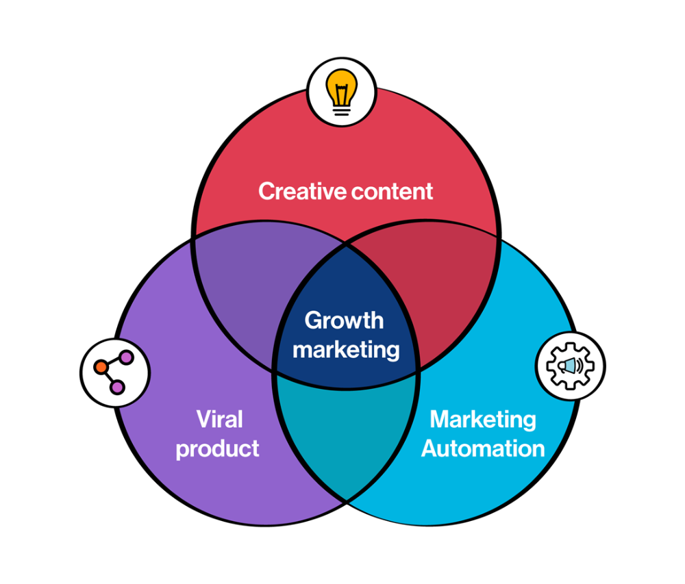
Innovation helps launch a startup. The secret to a scalable business is growth trials (from 1 to 100).
Growth marketing combines marketing and product development for long-term growth.
Today, I'll explain growth hacking strategies popular startups used to scale.
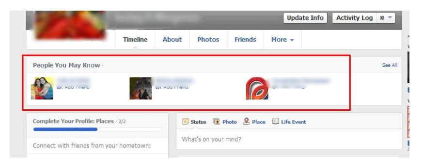
1/ A Facebook user's social value is proportional to their friends.
Facebook built its user base using content marketing and paid ads. Mark and his investors feared in 2007 when Facebook's growth stalled at 90 million users.
Chamath Palihapitiya was brought in by Mark.
The team tested SEO keywords and MAU chasing. The growth team introduced “people you may know”
This feature reunited long-lost friends and family. Casual users became power users as the retention curve flattened.
Growth Hack Insights: With social network effect the value of your product or platform increases exponentially if you have users you know or can relate with.
2/ Airbnb - Focus on your value propositions
Airbnb nearly failed in 2009. The company's weekly revenue was $200 and they had less than 2 months of runway.
Enter Paul Graham. The team noticed a pattern in 40 listings. Their website's property photos sucked.
Why?
Because these photos were taken with regular smartphones. Users didn't like the first impression.
Graham suggested traveling to New York to rent a camera, meet with property owners, and replace amateur photos with high-resolution ones.
A week later, the team's weekly revenue doubled to $400, indicating they were on track.
Growth Hack Insights: When selling an “online experience” ensure that your value proposition is aesthetic enough for users to enjoy being associated with them.

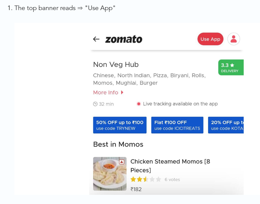
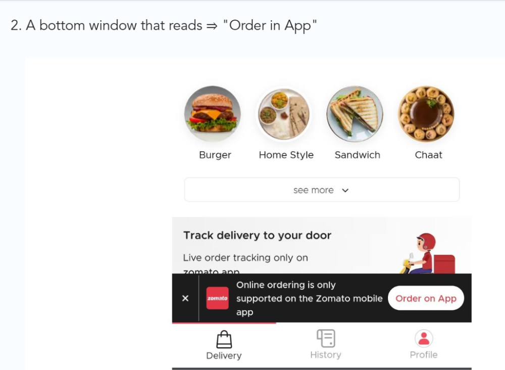
3/ Zomato - A company's smartphone push ensured growth.
Zomato delivers food. User retention was a challenge for the founders. Indian food customers are notorious for switching brands at the drop of a hat.
Zomato wanted users to order food online and repeat orders throughout the week.
Zomato created an attractive website with “near me” keywords for SEO indexing.
Zomato gambled to increase repeat orders. They only allowed mobile app food orders.
Zomato thought mobile apps were stickier. Product innovations in search/discovery/ordering or marketing campaigns like discounts/in-app notifications/nudges can improve user experience.
Zomato went public in 2021 after users kept ordering food online.
Growth Hack Insights: To improve user retention try to build platforms that build user stickiness. Your product and marketing team will do the rest for them.
4/ Hotmail - Signaling helps build premium users.
Ever sent or received an email or tweet with a sign — sent from iPhone?
Hotmail did it first! One investor suggested Hotmail add a signature to every email.
Overnight, thousands joined the company. Six months later, the company had 1 million users.
When serving an existing customer, improve their social standing. Signaling keeps the top 1%.
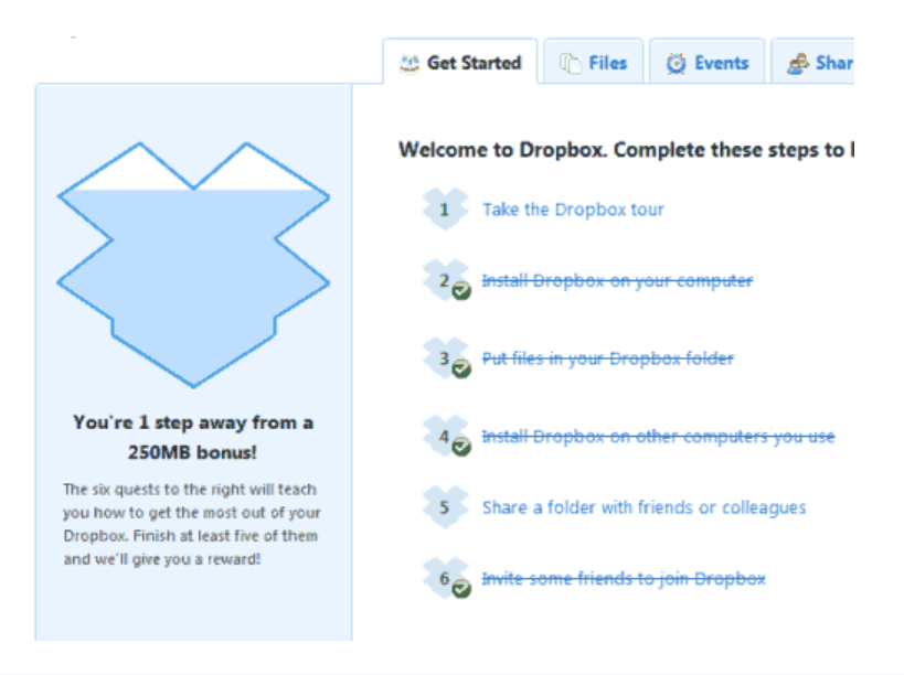
5/ Dropbox - Respect loyal customers
Dropbox is a company that puts people over profits. The company prioritized existing users.
Dropbox rewarded loyal users by offering 250 MB of free storage to anyone who referred a friend. The referral hack helped Dropbox get millions of downloads in its first few months.
Growth Hack Insights: Think of ways to improve the social positioning of your end-user when you are serving an existing customer. Signaling goes a long way in attracting the top 1% to stay.
These experiments weren’t hacks. Hundreds of failed experiments and user research drove these experiments. Scaling up experiments is difficult.
Contact me if you want to grow your startup's user base.
SAHIL SAPRU
3 years ago
How I grew my business to a $5 million annual recurring revenue
Scaling your startup requires answering customer demands, not growth tricks.
I cofounded Freedo Rentals in 2019. I reached 50 lakh+ ARR in 6 months before quitting owing to the epidemic.
Freedo aimed to solve 2 customer pain points:
Users lacked a reliable last-mile transportation option.
The amount that Auto walas charge for unmetered services
Solution?
Effectively simple.
Build ports at high-demand spots (colleges, residential societies, metros). Electric ride-sharing can meet demand.
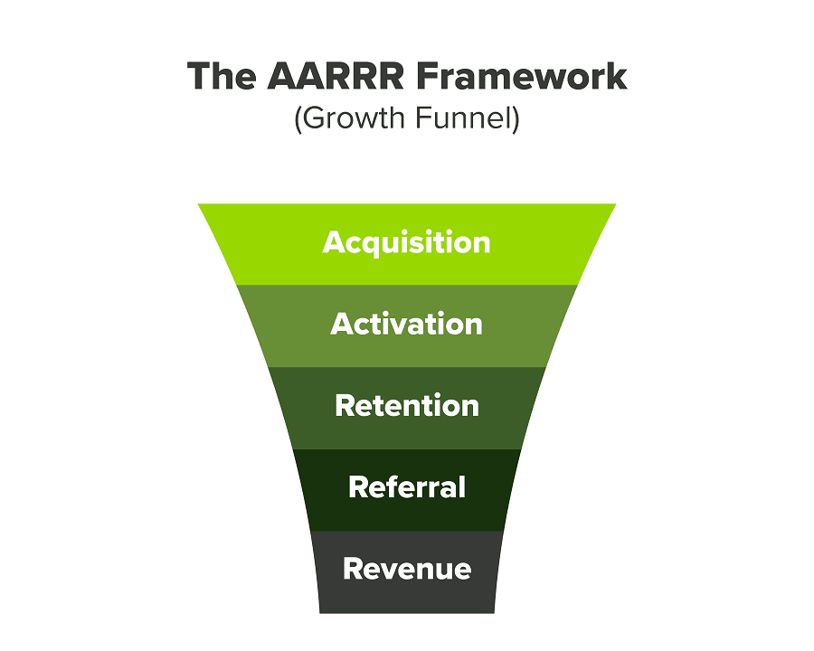
We had many problems scaling. I'll explain using the AARRR model.
Brand unfamiliarity or a novel product offering were the problems with awareness. Nobody knew what Freedo was or what it did.
Problem with awareness: Content and advertisements did a poor job of communicating the task at hand. The advertisements clashed with the white-collar part because they were too cheesy.
Retention Issue: We encountered issues, indicating that the product was insufficient. Problems with keyless entry, creating bills, stealing helmets, etc.
Retention/Revenue Issue: Costly compared to established rivals. Shared cars were 1/3 of our cost.
Referral Issue: Missing the opportunity to seize the AHA moment. After the ride, nobody remembered us.
Once you know where you're struggling with AARRR, iterative solutions are usually best.
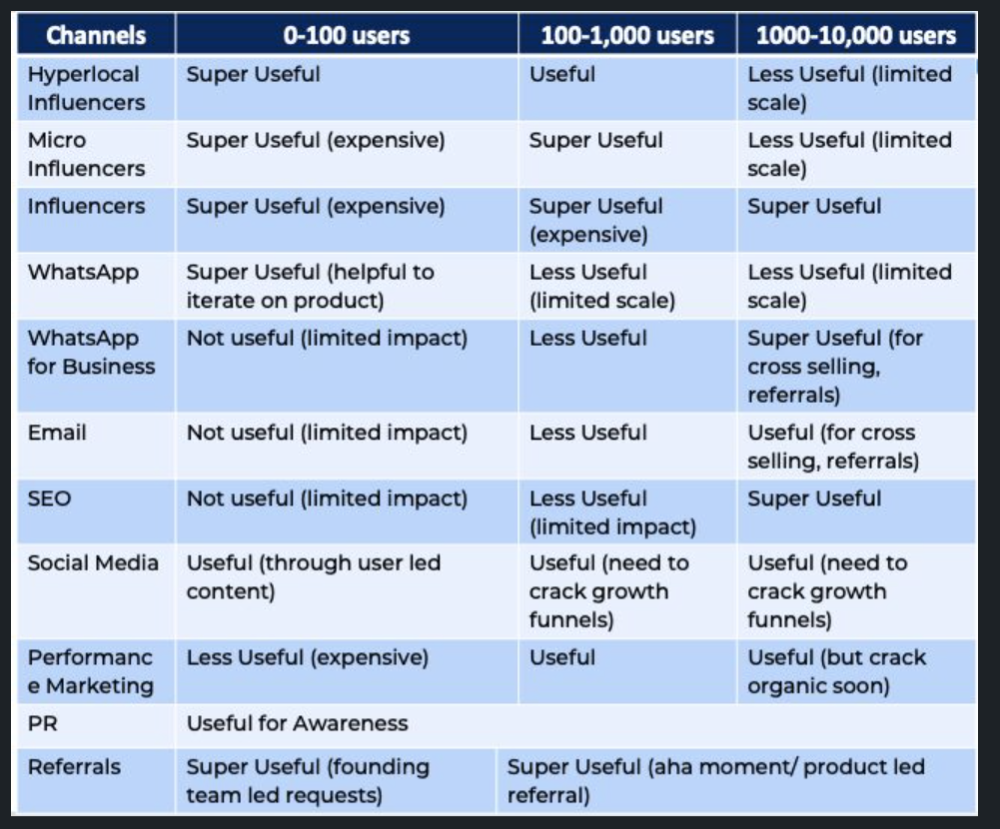
Once you have nailed the AARRR model, most startups use paid channels to scale. This dependence, on paid channels, increases with scale unless you crack your organic/inbound game.
Over-index growth loops. Growth loops increase inflow and customers as you scale.
When considering growth, ask yourself:
Who is the solution's ICP (Ideal Customer Profile)? (To whom are you selling)
What are the most important messages I should convey to customers? (This is an A/B test.)
Which marketing channels ought I prioritize? (Conduct analysis based on the startup's maturity/stage.)
Choose the important metrics to monitor for your AARRR funnel (not all metrics are equal)
Identify the Flywheel effect's growth loops (inertia matters)
My biggest mistakes:
not paying attention to consumer comments or satisfaction. It is the main cause of problems with referrals, retention, and acquisition for startups. Beyond your NPS, you should consider second-order consequences.
The tasks at hand should be quite clear.
Here's my scaling equation:
Growth = A x B x C
A = Funnel top (Traffic)
B = Product Valuation (Solving a real pain point)
C = Aha! (Emotional response)
Freedo's A, B, and C created a unique offering.
Freedo’s ABC:
A — Working or Studying population in NCR
B — Electric Vehicles provide last-mile mobility as a clean and affordable solution
C — One click booking with a no-noise scooter
Final outcome:
FWe scaled Freedo to Rs. 50 lakh MRR and were growing 60% month on month till the pandemic ceased our growth story.
How we did it?
We tried ambassadors and coupons. WhatsApp was our most successful A/B test.
We grew widespread adoption through college and society WhatsApp groups. We requested users for referrals in community groups.
What worked for us won't work for others. This scale underwent many revisions.
Every firm is different, thus you must know your customers. Needs to determine which channel to prioritize and when.
Users desired a safe, time-bound means to get there.
This (not mine) growth framework helped me a lot. You should follow suit.

Esteban
3 years ago
The Berkus Startup Valuation Method: What Is It?
What Is That?
Berkus is a pre-revenue valuation method based exclusively on qualitative criteria, like Scorecard.
Few firms match their financial estimates, especially in the early stages, so valuation methodologies like the Berkus method are a good way to establish a valuation when the economic measures are not reliable.
How does it work?
This technique evaluates five key success factors.
Fundamental principle
Technology
Execution
Strategic alliances in its primary market
Production, followed by sales
The Berkus technique values the business idea and four success factors. As seen in the matrix below, each of these dimensions poses a danger to the startup's success.
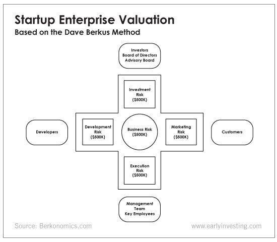
It assigns $0-$500,000 to each of these beginning regions. This approach enables a maximum $2.5M pre-money valuation.
This approach relies significantly on geography and uses the US as a baseline, as it differs in every country in Europe.
A set of standards for analyzing each dimension individually
Fundamental principle (or strength of the idea)
Ideas are worthless; execution matters. Most of us can relate to seeing a new business open in our area or a startup get funded and thinking, "I had this concept years ago!" Someone did it.
The concept remains. To assess the idea's viability, we must consider several criteria.
The concept's exclusivity It is necessary to protect a product or service's concept using patents and copyrights. Additionally, it must be capable of generating large profits.
Planned growth and growth that goes in a specific direction have a lot of potential, therefore incorporating them into a business is really advantageous.
The ability of a concept to grow A venture's ability to generate scalable revenue is a key factor in its emergence and continuation. A startup needs a scalable idea in order to compete successfully in the market.
The attraction of a business idea to a broad spectrum of people is significantly influenced by the current socio-political climate. Thus, the requirement for the assumption of conformity.
Concept Validation Ideas must go through rigorous testing with a variety of audiences in order to lower risk during the implementation phase.
Technology (Prototype)
This aspect reduces startup's technological risk. How good is the startup prototype when facing cyber threats, GDPR compliance (in Europe), tech stack replication difficulty, etc.?
Execution
Check the management team's efficacy. A potential angel investor must verify the founders' experience and track record with previous ventures. Good leadership is needed to chart a ship's course.
Strategic alliances in its primary market
Existing and new relationships will play a vital role in the development of both B2B and B2C startups. What are the startup's synergies? potential ones?
Production, followed by sales (product rollout)
Startup success depends on its manufacturing and product rollout. It depends on the overall addressable market, the startup's ability to market and sell their product, and their capacity to provide consistent, high-quality support.
Example
We're now founders of EyeCaramba, a machine vision-assisted streaming platform. My imagination always goes to poor puns when naming a startup.
Since we're first-time founders and the Berkus technique depends exclusively on qualitative methods and the evaluator's skill, we ask our angel-investor acquaintance for a pre-money appraisal of EyeCaramba.
Our friend offers us the following table:
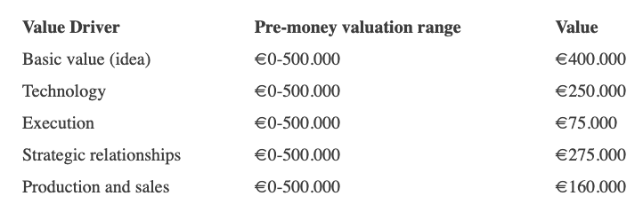
Because we're first-time founders, our pal lowered our Execution score. He knows the idea's value and that the gaming industry is red-hot, with worse startup ideas getting funded, therefore he gave the Basic value the highest value (idea).
EyeCaramba's pre-money valuation is $400,000 + $250,000 + $75,000 + $275,000 + $164,000 (1.16M). Good.
References
https://medium.com/humble-ventures/how-angel-investors-value-pre-revenue-startups-part-iii-8271405f0774#:~:text=pre%2Drevenue%20startups.-,Berkus%20Method,potential%20of%20the%20idea%20itself.%E2%80%9D
https://eqvista.com/berkus-valuation-method-for-startups/
https://www.venionaire.com/early-stage-startup-valuation-part-2-the-berkus-method/
You might also like

Henrique Centieiro
3 years ago
DAO 101: Everything you need to know
Maybe you'll work for a DAO next! Over $1 Billion in NFTs in the Flamingo DAO Another DAO tried to buy the NFL team Denver Broncos. The UkraineDAO raised over $7 Million for Ukraine. The PleasrDAO paid $4m for a Wu-Tang Clan album that belonged to the “pharma bro.”
DAOs move billions and employ thousands. So learn what a DAO is, how it works, and how to create one!
DAO? So, what? Why is it better?
A Decentralized Autonomous Organization (DAO). Some people like to also refer to it as Digital Autonomous Organization, but I prefer the former.
They are virtual organizations. In the real world, you have organizations or companies right? These firms have shareholders and a board. Usually, anyone with authority makes decisions. It could be the CEO, the Board, or the HIPPO. If you own stock in that company, you may also be able to influence decisions. It's now possible to do something similar but much better and more equitable in the cryptocurrency world.
This article informs you:
DAOs- What are the most common DAOs, their advantages and disadvantages over traditional companies? What are they if any?
Is a DAO legally recognized?
How secure is a DAO?
I’m ready whenever you are!
A DAO is a type of company that is operated by smart contracts on the blockchain. Smart contracts are computer code that self-executes our commands. Those contracts can be any. Most second-generation blockchains support smart contracts. Examples are Ethereum, Solana, Polygon, Binance Smart Chain, EOS, etc. I think I've gone off topic. Back on track. Now let's go!
Unlike traditional corporations, DAOs are governed by smart contracts. Unlike traditional company governance, DAO governance is fully transparent and auditable. That's one of the things that sets it apart. The clarity!
A DAO, like a traditional company, has one major difference. In other words, it is decentralized. DAOs are more ‘democratic' than traditional companies because anyone can vote on decisions. Anyone! In a DAO, we (you and I) make the decisions, not the top-shots. We are the CEO and investors. A DAO gives its community members power. We get to decide.
As long as you are a stakeholder, i.e. own a portion of the DAO tokens, you can participate in the DAO. Tokens are open to all. It's just a matter of exchanging it. Ownership of DAO tokens entitles you to exclusive benefits such as governance, voting, and so on. You can vote for a move, a plan, or the DAO's next investment. You can even pitch for funding. Any ‘big' decision in a DAO requires a vote from all stakeholders. In this case, ‘token-holders'! In other words, they function like stock.
What are the 5 DAO types?
Different DAOs exist. We will categorize decentralized autonomous organizations based on their mode of operation, structure, and even technology. Here are a few. You've probably heard of them:
1. DeFi DAO
These DAOs offer DeFi (decentralized financial) services via smart contract protocols. They use tokens to vote protocol and financial changes. Uniswap, Aave, Maker DAO, and Olympus DAO are some examples. Most DAOs manage billions.
Maker DAO was one of the first protocols ever created. It is a decentralized organization on the Ethereum blockchain that allows cryptocurrency lending and borrowing without a middleman.
Maker DAO issues DAI, a stable coin. DAI is a top-rated USD-pegged stable coin.
Maker DAO has an MKR token. These token holders are in charge of adjusting the Dai stable coin policy. Simply put, MKR tokens represent DAO “shares”.
2. Investment DAO
Investors pool their funds and make investment decisions. Investing in new businesses or art is one example. Investment DAOs help DeFi operations pool capital. The Meta Cartel DAO is a community of people who want to invest in new projects built on the Ethereum blockchain. Instead of investing one by one, they want to pool their resources and share ideas on how to make better financial decisions.
Other investment DAOs include the LAO and Friends with Benefits.
3. DAO Grant/Launchpad
In a grant DAO, community members contribute funds to a grant pool and vote on how to allocate and distribute them. These DAOs fund new DeFi projects. Those in need only need to apply. The Moloch DAO is a great Grant DAO. The tokens are used to allocate capital. Also see Gitcoin and Seedify.
4. DAO Collector
I debated whether to put it under ‘Investment DAO' or leave it alone. It's a subset of investment DAOs. This group buys non-fungible tokens, artwork, and collectibles. The market for NFTs has recently exploded, and it's time to investigate. The Pleasr DAO is a collector DAO. One copy of Wu-Tang Clan's "Once Upon a Time in Shaolin" cost the Pleasr DAO $4 million. Pleasr DAO is known for buying Doge meme NFT. Collector DAOs include the Flamingo, Mutant Cats DAO, and Constitution DAOs. Don't underestimate their websites' "childish" style. They have millions.
5. Social DAO
These are social networking and interaction platforms. For example, Decentraland DAO and Friends With Benefits DAO.
What are the DAO Benefits?
Here are some of the benefits of a decentralized autonomous organization:
- They are trustless. You don’t need to trust a CEO or management team
- It can’t be shut down unless a majority of the token holders agree. The government can't shut - It down because it isn't centralized.
- It's fully democratic
- It is open-source and fully transparent.
What about DAO drawbacks?
We've been saying DAOs are the bomb? But are they really the shit? What could go wrong with DAO?
DAOs may contain bugs. If they are hacked, the results can be catastrophic.
No trade secrets exist. Because the smart contract is transparent and coded on the blockchain, it can be copied. It may be used by another organization without credit. Maybe DAOs should use Secret, Oasis, or Horizen blockchain networks.
Are DAOs legally recognized??
In most counties, DAO regulation is inexistent. It's unclear. Most DAOs don’t have a legal personality. The Howey Test and the Securities Act of 1933 determine whether DAO tokens are securities. Although most countries follow the US, this is only considered for the US. Wyoming became the first state to recognize DAOs as legal entities in July 2021 after passing a DAO bill. DAOs registered in Wyoming are thus legally recognized as business entities in the US and thus receive the same legal protections as a Limited Liability Company.
In terms of cyber-security, how secure is a DAO?
Blockchains are secure. However, smart contracts may have security flaws or bugs. This can be avoided by third-party smart contract reviews, testing, and auditing
Finally, Decentralized Autonomous Organizations are timeless. Let us examine the current situation: Ukraine's invasion. A DAO was formed to help Ukrainian troops fighting the Russians. It was named Ukraine DAO. Pleasr DAO, NFT studio Trippy Labs, and Russian art collective Pussy Riot organized this fundraiser. Coindesk reports that over $3 million has been raised in Ethereum-based tokens. AidForUkraine, a DAO aimed at supporting Ukraine's defense efforts, has launched. Accepting Solana token donations. They are fully transparent, uncensorable, and can’t be shut down or sanctioned.
DAOs are undeniably the future of blockchain. Everyone is paying attention. Personally, I believe traditional companies will soon have to choose between adapting or being left behind.
Long version of this post: https://medium.datadriveninvestor.com/dao-101-all-you-need-to-know-about-daos-275060016663

Dylan Smyth
4 years ago
10 Ways to Make Money Online in 2022
As a tech-savvy person (and software engineer) or just a casual technology user, I'm sure you've had this same question countless times: How do I make money online? and how do I make money with my PC/Mac?
You're in luck! Today, I will list the top 5 easiest ways to make money online. Maybe a top ten in the future? Top 5 tips for 2022.
1. Using the gig economy
There are many websites on the internet that allow you to earn extra money using skills and equipment that you already own.
I'm referring to the gig economy. It's a great way to earn a steady passive income from the comfort of your own home. For some sites, premium subscriptions are available to increase sales and access features like bidding on more proposals.
Some of these are:
- Freelancer
- Upwork
- Fiverr (⭐ my personal favorite)
- TaskRabbit
2. Mineprize
MINEPRIZE is a great way to make money online. What's more, You need not do anything! You earn money by lending your idle CPU power to MINEPRIZE.
To register with MINEPRIZE, all you need is an email address and a password. Let MINEPRIZE use your resources, and watch the money roll in! You can earn up to $100 per month by letting your computer calculate. That's insane.
3. Writing
“O Romeo, Romeo, why art thou Romeo?” Okay, I admit that not all writing is Shakespearean. To be a copywriter, you'll need to be fluent in English. Thankfully, we don't have to use typewriters anymore.
Writing is a skill that can earn you a lot of money (claps for the rhyme).
Here are a few ways you can make money typing on your fancy keyboard:
Self-publish a book
Write scripts for video creators
Write for social media
Book-checking
Content marketing help
What a list within a list!
4. Coding
Yes, kids. You've probably coded before if you understand
You've probably coded before if you understand
print("hello world");
Computational thinking (or coding) is one of the most lucrative ways to earn extra money, or even as a main source of income.
Of course, there are hardcode coders (like me) who write everything line by line, binary di — okay, that last part is a bit exaggerated.
But you can also make money by writing websites or apps or creating low code or no code platforms.
But you can also make money by writing websites or apps or creating low code or no code platforms.
Some low-code platforms
Sheet : spreadsheets to apps :
Loading... We'll install your new app... No-Code Your team can create apps and automate tasks. Agile…
www.appsheet.com
Low-code platform | Business app creator - Zoho Creator
Work is going digital, and businesses of all sizes must adapt quickly. Zoho Creator is a...
www.zoho.com
Sell your data with TrueSource. NO CODE NEEDED
Upload data, configure your product, and earn in minutes.
www.truesource.io
Cool, huh?
5. Created Content
If we use the internet correctly, we can gain unfathomable wealth and extra money. But this one is a bit more difficult. Unlike some of the other items on this list, it takes a lot of time up front.
I'm referring to sites like YouTube and Medium. It's a great way to earn money both passively and actively. With the likes of Jake- and Logan Paul, PewDiePie (a.k.a. Felix Kjellberg) and others, it's never too late to become a millionaire on YouTube. YouTubers are always rising to the top with great content.
6. NFTs and Cryptocurrency
It is now possible to amass large sums of money by buying and selling digital assets on NFTs and cryptocurrency exchanges. Binance's Initial Game Offer rewards early investors who produce the best results.
One awesome game sold a piece of its plot for US$7.2 million! It's Axie Infinity. It's free and available on Google Play and Apple Store.
7. Affiliate Marketing
Affiliate marketing is a form of advertising where businesses pay others (like bloggers) to promote their goods and services. Here's an example. I write a blog (like this one) and post an affiliate link to an item I recommend buying — say, a camera — and if you buy the camera, I get a commission!
These programs pay well:
- Elementor
- AWeber
- Sendinblue
- ConvertKit\sLeadpages
- GetResponse
- SEMRush\sFiverr
- Pabbly
8. Start a blog
Now, if you're a writer or just really passionate about something or a niche, blogging could potentially monetize that passion!
Create a blog about anything you can think of. It's okay to start right here on Medium, as I did.
9. Dropshipping
And I mean that in the best possible way — drop shopping is ridiculously easy to set up, but difficult to maintain for some.
Luckily, Shopify has made setting up an online store a breeze. Drop-shipping from Alibaba and DHGate is quite common. You've got a winner if you can find a local distributor willing to let you drop ship their product!
10. Set up an Online Course
If you have a skill and can articulate it, online education is for you.
Skillshare, Pluralsight, and Coursera have all made inroads in recent years, upskilling people with courses that YOU can create and earn from.
That's it for today! Please share if you liked this post. If not, well —

The woman
3 years ago
The renowned and highest-paid Google software engineer
His story will inspire you.
“Google search went down for a few hours in 2002; Jeff Dean handled all the queries by hand and checked quality doubled.”- Jeff Dean Facts.
One of many Jeff Dean jokes, but you get the idea.
Google's top six engineers met in a war room in mid-2000. Google's crawling system, which indexed the Web, stopped working. Users could still enter queries, but results were five months old.
Google just signed a deal with Yahoo to power a ten-times-larger search engine. Tension rose. It was crucial. If they failed, the Yahoo agreement would likely fall through, risking bankruptcy for the firm. Their efforts could be lost.
A rangy, tall, energetic thirty-one-year-old man named Jeff dean was among those six brilliant engineers in the makeshift room. He had just left D. E. C. a couple of months ago and started his career in a relatively new firm Google, which was about to change the world. He rolled his chair over his colleague Sanjay and sat right next to him, cajoling his code like a movie director. The history started from there.
When you think of people who shaped the World Wide Web, you probably picture founders and CEOs like Larry Page and Sergey Brin, Marc Andreesen, Tim Berners-Lee, Bill Gates, and Mark Zuckerberg. They’re undoubtedly the brightest people on earth.
Under these giants, legions of anonymous coders work at keyboards to create the systems and products we use. These computer workers are irreplaceable.
Let's get to know him better.
It's possible you've never heard of Jeff Dean. He's American. Dean created many behind-the-scenes Google products. Jeff, co-founder and head of Google's deep learning research engineering team, is a popular technology, innovation, and AI keynote speaker.
While earning an MS and Ph.D. in computer science at the University of Washington, he was a teaching assistant, instructor, and research assistant. Dean joined the Compaq Computer Corporation Western Research Laboratory research team after graduating.
Jeff co-created ProfileMe and the Continuous Profiling Infrastructure for Digital at Compaq. He co-designed and implemented Swift, one of the fastest Java implementations. He was a senior technical staff member at mySimon Inc., retrieving and caching electronic commerce content.
Dean, a top young computer scientist, joined Google in mid-1999. He was always trying to maximize a computer's potential as a child.
An expert
His high school program for processing massive epidemiological data was 26 times faster than professionals'. Epi Info, in 13 languages, is used by the CDC. He worked on compilers as a computer science Ph.D. These apps make source code computer-readable.
Dean never wanted to work on compilers forever. He left Academia for Google, which had less than 20 employees. Dean helped found Google News and AdSense, which transformed the internet economy. He then addressed Google's biggest issue, scaling.
Growing Google faced a huge computing challenge. They developed PageRank in the late 1990s to return the most relevant search results. Google's popularity slowed machine deployment.
Dean solved problems, his specialty. He and fellow great programmer Sanjay Ghemawat created the Google File System, which distributed large data over thousands of cheap machines.
These two also created MapReduce, which let programmers handle massive data quantities on parallel machines. They could also add calculations to the search algorithm. A 2004 research article explained MapReduce, which became an industry sensation.
Several revolutionary inventions
Dean's other initiatives were also game-changers. BigTable, a petabyte-capable distributed data storage system, was based on Google File. The first global database, Spanner, stores data on millions of servers in dozens of data centers worldwide.
It underpins Gmail and AdWords. Google Translate co-founder Jeff Dean is surprising. He contributes heavily to Google News. Dean is Senior Fellow of Google Research and Health and leads Google AI.
Recognitions
The National Academy of Engineering elected Dean in 2009. He received the 2009 Association for Computing Machinery fellowship and the 2016 American Academy of Arts and Science fellowship. He received the 2007 ACM-SIGOPS Mark Weiser Award and the 2012 ACM-Infosys Foundation Award. Lists could continue.
A sneaky question may arrive in your mind: How much does this big brain earn? Well, most believe he is one of the highest-paid employees at Google. According to a survey, he is paid $3 million a year.
He makes espresso and chats with a small group of Googlers most mornings. Dean steams milk, another grinds, and another brews espresso. They discuss families and technology while making coffee. He thinks this little collaboration and idea-sharing keeps Google going.
“Some of us have been working together for more than 15 years,” Dean said. “We estimate that we’ve collectively made more than 20,000 cappuccinos together.”
We all know great developers and software engineers. It may inspire many.