


More on NFTs & Art

Jennifer Tieu
3 years ago
Why I Love Azuki
Azuki Banner (www.azuki.com)
Disclaimer: This is my personal viewpoint. I'm not on the Azuki team. Please keep in mind that I am merely a fan, community member, and holder. Please do your own research and pardon my grammar. Thanks!
Azuki has changed my view of NFTs.
When I first entered the NFT world, I had no idea what to expect. I liked the idea. So I invested in some projects, fought for whitelists, and discovered some cool NFTs projects (shout-out to CATC). I lost more money than I earned at one point, but I hadn't invested excessively (only put in what you can afford to lose). Despite my losses, I kept looking. I almost waited for the “ah-ha” moment. A NFT project that changed my perspective on NFTs. What makes an NFT project more than a work of art?
Answer: Azuki.
The Art
The Azuki art drew me in as an anime fan. It looked like something out of an anime, and I'd never seen it before in NFT.
The project was still new. The first two animated teasers were released with little fanfare, but I was impressed with their quality. You can find them on Instagram or in their earlier Tweets.
The teasers hinted that this project could be big and that the team could deliver. It was amazing to see Shao cut the Azuki posters with her katana. Especially at the end when she sheaths her sword and the music cues. Then the live action video of the young boy arranging the Azuki posters seemed movie-like. I felt like I was entering the Azuki story, brand, and dope theme.
The team did not disappoint with the Azuki NFTs. The level of detail in the art is stunning. There were Azukis of all genders, skin and hair types, and more. These 10,000 Azukis have so much representation that almost anyone can find something that resonates. Rather than me rambling on, I suggest you visit the Azuki gallery
The Team
If the art is meant to draw you in and be the project's face, the team makes it more. The NFT would be a JPEG without a good team leader. Not that community isn't important, but no community would rally around a bad team.
Because I've been rugged before, I'm very focused on the team when considering a project. While many project teams are anonymous, I try to find ones that are doxxed (public) or at least appear to be established. Unlike Azuki, where most of the Azuki team is anonymous, Steamboy is public. He is (or was) Overwatch's character art director and co-creator of Azuki. I felt reassured and could trust the project after seeing someone from a major game series on the team.
Then I tried to learn as much as I could about the team. Following everyone on Twitter, reading their tweets, and listening to recorded AMAs. I was impressed by the team's professionalism and dedication to their vision for Azuki, led by ZZZAGABOND.
I believe the phrase “actions speak louder than words” applies to Azuki. I can think of a few examples of what the Azuki team has done, but my favorite is ERC721A.
With ERC721A, Azuki has created a new algorithm that allows minting multiple NFTs for essentially the same cost as minting one NFT.
I was ecstatic when the dev team announced it. This fascinates me as a self-taught developer. Azuki released a product that saves people money, improves the NFT space, and is open source. It showed their love for Azuki and the NFT community.
The Community
Community, community, community. It's almost a chant in the NFT space now. A community, like a team, can make or break a project. We are the project's consumers, shareholders, core, and lifeblood. The team builds the house, and we fill it. We stay for the community.
When I first entered the Azuki Discord, I was surprised by the calm atmosphere. There was no news about the project. No release date, no whitelisting requirements. No grinding or spamming either. People just wanted to hangout, get to know each other, and talk. It was nice. So the team could pick genuine people for their mintlist (aka whitelist).
But nothing fundamental has changed since the release. It has remained an authentic, fun, and helpful community. I'm constantly logging into Discord to chat with others or follow conversations. I see the community's openness to newcomers. Everyone respects each other (barring a few bad apples) and the variety of people passing through is fascinating. This human connection and interaction is what I enjoy about this place. Being a part of a group that supports a cause.
Finally, I want to thank the amazing Azuki mod team and the kissaten channel for their contributions.
The Brand
So, what sets Azuki apart from other projects? They are shaping a brand or identity. The Azuki website, I believe, best captures their vision. (This is me gushing over the site.)
If you go to the website, turn on the dope playlist in the bottom left. The playlist features a mix of Asian and non-Asian hip-hop and rap artists, with some lo-fi thrown in. The songs on the playlist change, but I think you get the vibe Azuki embodies just by turning on the music.
The Garden is our next stop where we are introduced to Azuki.
A brand.
We're creating a new brand together.
A metaverse brand. By the people.
A collection of 10,000 avatars that grant Garden membership. It starts with exclusive streetwear collabs, NFT drops, live events, and more. Azuki allows for a new media genre that the world has yet to discover. Let's build together an Azuki, your metaverse identity.
The Garden is a magical internet corner where art, community, and culture collide. The boundaries between the physical and digital worlds are blurring.
Try a Red Bean.
The text begins with Azuki's intention in the space. It's a community-made metaverse brand. Then it goes into more detail about Azuki's plans. Initiation of a story or journey. "Would you like to take the red bean and jump down the rabbit hole with us?" I love the Matrix red pill or blue pill play they used. (Azuki in Japanese means red bean.)
Morpheus, the rebel leader, offers Neo the choice of a red or blue pill in The Matrix. “You take the blue pill... After the story, you go back to bed and believe whatever you want. Your red pill... Let me show you how deep the rabbit hole goes.” Aware that the red pill will free him from the enslaving control of the machine-generated dream world and allow him to escape into the real world, he takes it. However, living the “truth of reality” is harsher and more difficult.
It's intriguing and draws you in. Taking the red bean causes what? Where am I going? I think they did well in piqueing a newcomer's interest.
Not convinced by the Garden? Read the Manifesto. It reinforces Azuki's role.
Here comes a new wave…
And surfing here is different.
Breaking down barriers.
Building open communities.
Creating magic internet money with our friends.
To those who don’t get it, we tell them: gm.
They’ll come around eventually.
Here’s to the ones with the courage to jump down a peculiar rabbit hole.
One that pulls you away from a world that’s created by many and owned by few…
To a world that’s created by more and owned by all.
From The Garden come the human beans that sprout into your family.
We rise together.
We build together.
We grow together.
Ready to take the red bean?
Not to mention the Mindmap, it sets Azuki apart from other projects and overused Roadmaps. I like how the team recognizes that the NFT space is not linear. So many of us are still trying to figure it out. It is Azuki's vision to adapt to changing environments while maintaining their values. I admire their commitment to long-term growth.
Conclusion
To be honest, I have no idea what the future holds. Azuki is still new and could fail. But I'm a long-term Azuki fan. I don't care about quick gains. The future looks bright for Azuki. I believe in the team's output. I love being an Azuki.
Thank you! IKUZO!
Full post here

Steffan Morris Hernandez
3 years ago
10 types of cognitive bias to watch out for in UX research & design
10 biases in 10 visuals
Cognitive biases are crucial for UX research, design, and daily life. Our biases distort reality.
After learning about biases at my UX Research bootcamp, I studied Erika Hall's Just Enough Research and used the Nielsen Norman Group's wealth of information. 10 images show my findings.
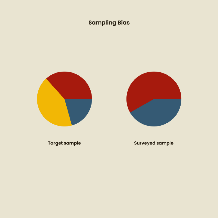
1. Bias in sampling
Misselection of target population members causes sampling bias. For example, you are building an app to help people with food intolerances log their meals and are targeting adult males (years 20-30), adult females (ages 20-30), and teenage males and females (ages 15-19) with food intolerances. However, a sample of only adult males and teenage females is biased and unrepresentative.
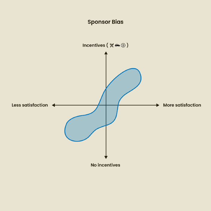
2. Sponsor Disparity
Sponsor bias occurs when a study's findings favor an organization's goals. Beware if X organization promises to drive you to their HQ, compensate you for your time, provide food, beverages, discounts, and warmth. Participants may endeavor to be neutral, but incentives and prizes may bias their evaluations and responses in favor of X organization.
In Just Enough Research, Erika Hall suggests describing the company's aims without naming it.
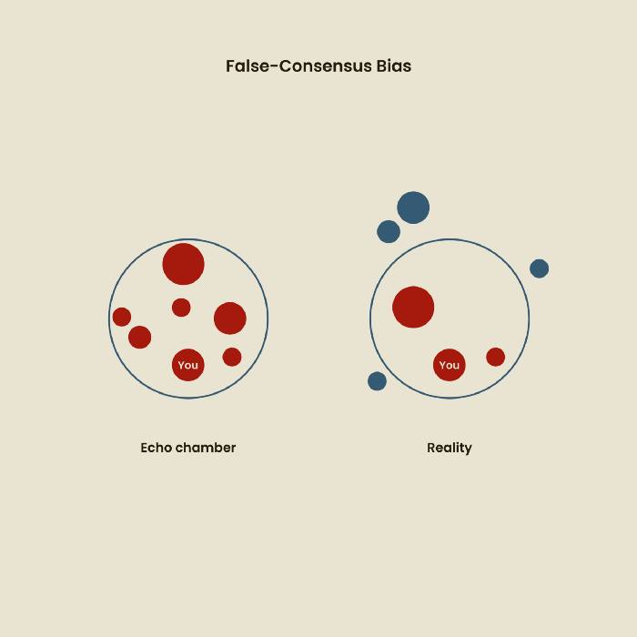
Third, False-Consensus Bias
False-consensus bias is when a person thinks others think and act the same way. For instance, if a start-up designs an app without researching end users' needs, it could fail since end users may have different wants. https://www.nngroup.com/videos/false-consensus-effect/
Working directly with the end user and employing many research methodologies to improve validity helps lessen this prejudice. When analyzing data, triangulation can boost believability.
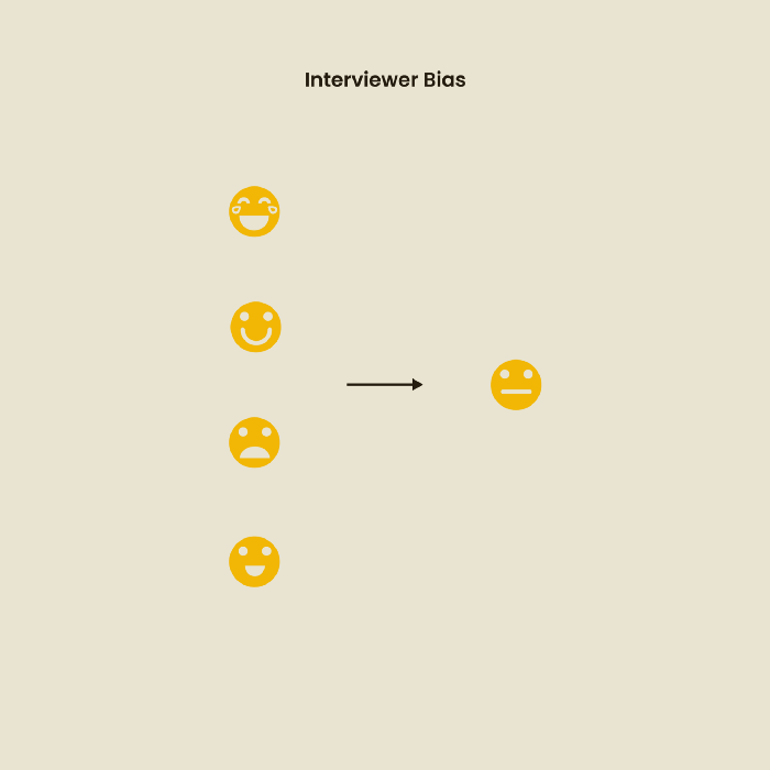
Bias of the interviewer
I struggled with this bias during my UX research bootcamp interviews. Interviewing neutrally takes practice and patience. Avoid leading questions that structure the story since the interviewee must interpret them. Nodding or smiling throughout the interview may subconsciously influence the interviewee's responses.
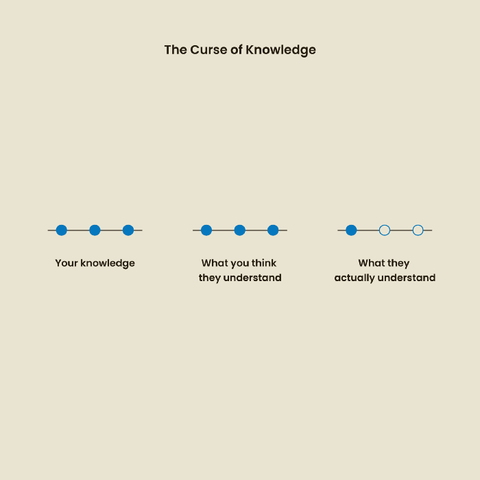
The Curse of Knowledge
The curse of knowledge occurs when someone expects others understand a subject as well as they do. UX research interviews and surveys should reduce this bias because technical language might confuse participants and harm the research. Interviewing participants as though you are new to the topic may help them expand on their replies without being influenced by the researcher's knowledge.
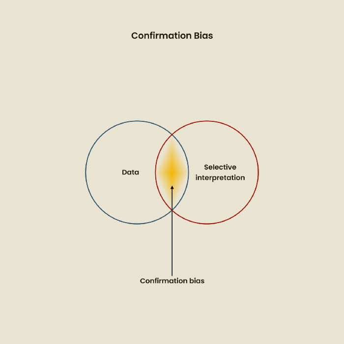
Confirmation Bias
Most prevalent bias. People highlight evidence that supports their ideas and ignore data that doesn't. The echo chamber of social media creates polarization by promoting similar perspectives.
A researcher with confirmation bias may dismiss data that contradicts their research goals. Thus, the research or product may not serve end users.
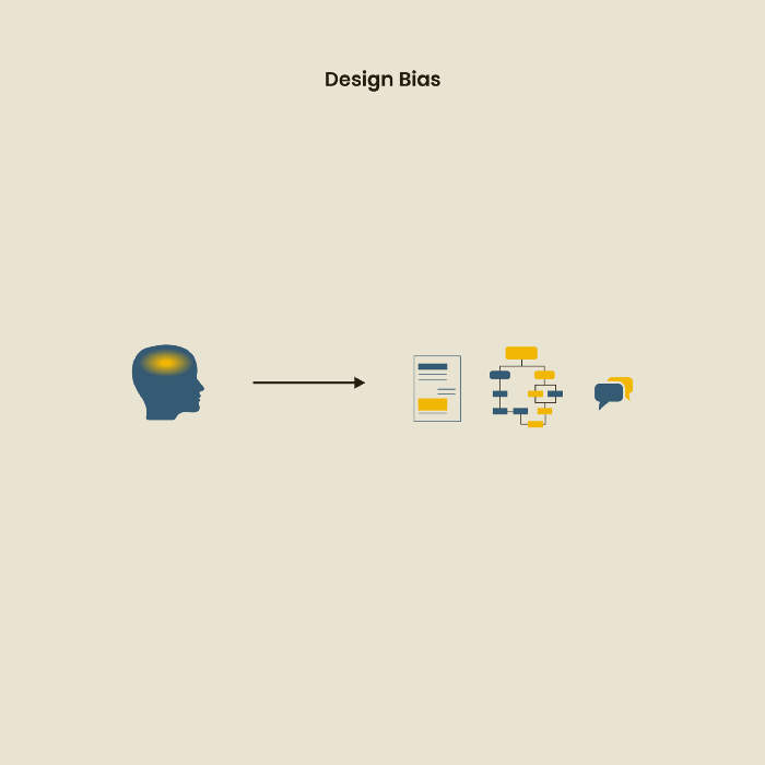
Design biases
UX Research design bias pertains to study construction and execution. Design bias occurs when data is excluded or magnified based on human aims, assumptions, and preferences.
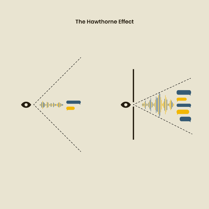
The Hawthorne Impact
Remember when you behaved differently while the teacher wasn't looking? When you behaved differently without your parents watching? A UX research study's Hawthorne Effect occurs when people modify their behavior because you're watching. To escape judgment, participants may act and speak differently.
To avoid this, researchers should blend into the background and urge subjects to act alone.
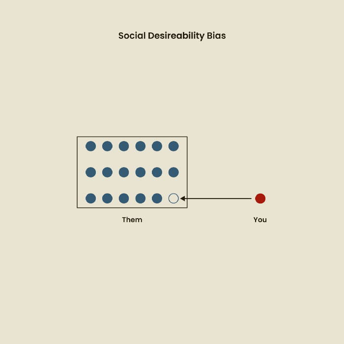
The bias against social desire
People want to belong to escape rejection and hatred. Research interviewees may mislead or slant their answers to avoid embarrassment. Researchers should encourage honesty and confidentiality in studies to address this. Observational research may reduce bias better than interviews because participants behave more organically.
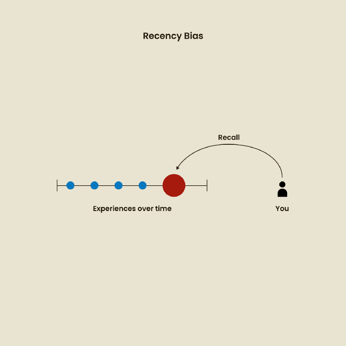
Relative Time Bias
Humans tend to appreciate recent experiences more. Consider school. Say you failed a recent exam but did well in the previous 7 exams. Instead, you may vividly recall the last terrible exam outcome.
If a UX researcher relies their conclusions on the most recent findings instead of all the data and results, recency bias might occur.
I hope you liked learning about UX design, research, and real-world biases.

Tora Northman
3 years ago
Pixelmon NFTs are so bad, they are almost good!
Bored Apes prices continue to rise, HAPEBEAST launches, Invisible Friends hype continues to grow. Sadly, not all projects are as successful.
Of course, there are many factors to consider when buying an NFT. Is the project a scam? Will the reveal derail the project? Possibly, but when Pixelmon first teased its launch, it generated a lot of buzz.
With a primary sale mint price of 3 ETH ($8,100 USD), it started as an expensive project, with plenty of fans willing to invest in what was sold as a game. After it was revealed, it fell rapidly.
Why? It was overpromised and under delivered.
According to the project's creator[^1], the funds generated will be used to develop the artwork. "The Pixelmon reveal was wrong. This is what our Pixelmon look like in-game. "Despite the fud, I will not go anywhere," he wrote on Twitter. The goal remains. The funds will still be used to build our game. I will finish this project."
The project raised $70 million USD, but the NFTs buyers received were not the project's original teasers. Some call it "the worst NFT project ever," while others call it a complete scam.
But there's hope for some buyers. Kevin emerged from the ashes as the project was roasted over the fire.
A Minecraft character meets Salad Fingers - that's Kevin. He's a frog-like creature whose reveal was such a terrible NFT that it became part of history – and a meme.
If you're laughing at people paying $8K for a silly pixelated image, you might need to take it back. Precisely because of this, lucky holders who minted Kevin have been able to sell the now-memed NFT for over 8 ETH (around $24,000 USD), with some currently listed for 100 ETH.
Of course, Twitter has been awash in memes mocking those who invested in the project, because what else can you do when so many people lose money?
It's still unclear if the NFT project is a scam, but the team behind it was hired on Upwork. There's still hope for redemption, but Kevin's rise to fame appears to be the only positive outcome so far.
[^1] This is not the first time the creator (A 20-yo New Zealanders) has sought money via an online platform and had people claiming he under-delivered. He raised $74,000 on Kickstarter for a card game called Psycho Chicken. There are hundreds of comments on the Kickstarter project saying they haven't received the product and pleading for a refund or an update.
You might also like

Scott Galloway
3 years ago
Don't underestimate the foolish
ZERO GRACE/ZERO MALICE
Big companies and wealthy people make stupid mistakes too.
Your ancestors kept snakes and drank bad water. You (probably) don't because you've learnt from their failures via instinct+, the ultimate life-lessons streaming network in your head. Instincts foretell the future. If you approach a lion, it'll eat you. Our society's nuanced/complex decisions have surpassed instinct. Human growth depends on how we handle these issues. 80% of people believe they are above-average drivers, yet few believe they make many incorrect mistakes that make them risky. Stupidity hurts others like death. Basic Laws of Human Stupidity by Carlo Cipollas:
Everyone underestimates the prevalence of idiots in our society.
Any other trait a person may have has no bearing on how likely they are to be stupid.
A dumb individual is one who harms someone without benefiting themselves and may even lose money in the process.
Non-dumb people frequently underestimate how destructively powerful stupid people can be.
The most dangerous kind of person is a moron.
Professor Cippola defines stupid as bad for you and others. We underestimate the corporate world's and seemingly successful people's ability to make bad judgments that harm themselves and others. Success is an intoxication that makes you risk-aggressive and blurs your peripheral vision.
Stupid companies and decisions:
Big Dumber
Big-company bad ideas have more bulk and inertia. The world's most valuable company recently showed its board a VR headset. Jony Ive couldn't destroy Apple's terrible idea in 2015. Mr. Ive said that VR cut users off from the outer world, made them seem outdated, and lacked practical uses. Ives' design team doubted users would wear headsets for lengthy periods.
VR has cost tens of billions of dollars over a decade to prove nobody wants it. The next great SaaS startup will likely come from Florence, not Redmond or San Jose.
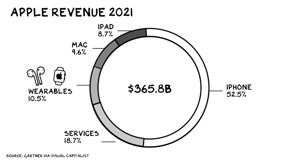
Apple Watch and Airpods have made the Cupertino company the world's largest jewelry maker. 10.5% of Apple's income, or $38 billion, comes from wearables in 2021. (seven times the revenue of Tiffany & Co.). Jewelry makes you more appealing and useful. Airpods and Apple Watch do both.
Headsets make you less beautiful and useful and promote isolation, loneliness, and unhappiness among American teenagers. My sons pretend they can't hear or see me when on their phones. VR headsets lack charisma.
Coinbase disclosed a plan to generate division and tension within its workplace weeks after Apple was pitched $2,000 smokes. The crypto-trading platform is piloting a program that rates staff after every interaction. If a coworker says anything you don't like, you should tell them how to improve. Everyone gets a 110-point scorecard. Coworkers should evaluate a person's rating while deciding whether to listen to them. It's ridiculous.
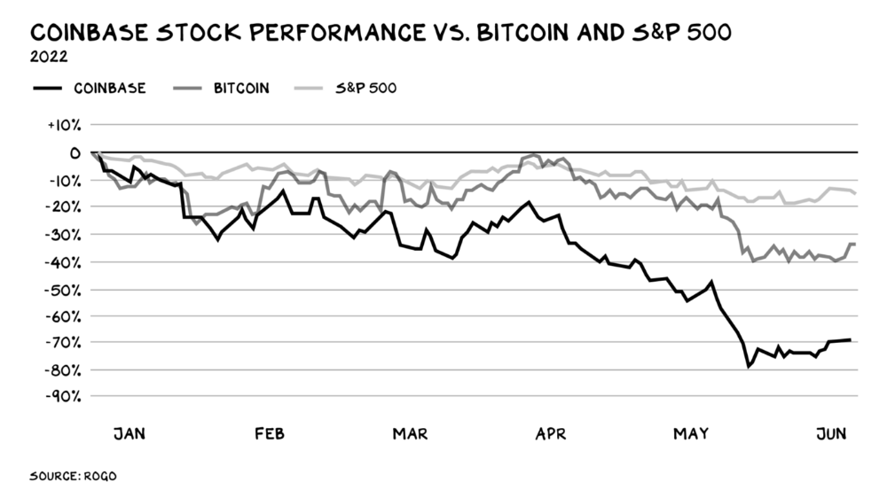
Organizations leverage our superpower of cooperation. This encourages non-cooperation, period. Bridgewater's founder Ray Dalio designed the approach to promote extreme transparency. Dalio has 223 billion reasons his managerial style works. There's reason to suppose only a small group of people, largely traders, will endure a granular scorecard. Bridgewater has 20% first-year turnover. Employees cry in bathrooms, and sex scandals are settled by ignoring individuals with poor believability levels. Coinbase might take solace that the stock is 80% below its initial offering price.
Poor Stupid
Fools' ledgers are valuable. More valuable are lists of foolish rich individuals.
Robinhood built a $8 billion corporation on financial ignorance. The firm's median account value is $240, and its stock has dropped 75% since last summer. Investors, customers, and society lose. Stupid. Luna published a comparable list on the blockchain, grew to $41 billion in market cap, then plummeted.
A podcast presenter is recruiting dentists and small-business owners to invest in Elon Musk's Twitter takeover. Investors pay a 7% fee and 10% of the upside for the chance to buy Twitter at a 35% premium to the current price. The proposal legitimizes CNBC's Trade Like Chuck advertising (Chuck made $4,600 into $460,000 in two years). This is stupid because it adds to the Twitter deal's desperation. Mr. Musk made an impression when he urged his lawyers to develop a legal rip-cord (There are bots on the platform!) to abandon the share purchase arrangement (for less than they are being marketed by the podcaster). Rolls-Royce may pay for this list of the dumb affluent because it includes potential Cullinan buyers.
Worst company? Flowcarbon, founded by WeWork founder Adam Neumann, operates at the convergence of carbon and crypto to democratize access to offsets and safeguard the earth's natural carbon sinks. Can I get an ayahuasca Big Gulp?
Neumann raised $70 million with their yogababble drink. More than half of the consideration came from selling GNT. Goddess Nature Token. I hope the company gets an S-1. Or I'll start a decentralized AI Meta Renewable NFTs company. My Community Based Ebitda coin will fund the company. Possible.
Stupidity inside oneself
This weekend, I was in NYC with my boys. My 14-year-old disappeared. He's realized I'm not cool and is mad I let the charade continue. When out with his dad, he likes to stroll home alone and depart before me. Friends told me hell would return, but I was surprised by how fast the eye roll came.
Not so with my 11-year-old. We went to The Edge, a Hudson Yards observation platform where you can see the city from 100 storeys up for $38. This is hell's seventh ring. Leaning into your boys' interests is key to engaging them (dad tip). Neither loves Crossfit, WW2 history, or antitrust law.
We take selfies on the Thrilling Glass Floor he spots. Dad, there's a bar! Coke? I nod, he rushes to the bar, stops, runs back for money, and sprints back. Sitting on stone seats, drinking Atlanta Champagne, he turns at me and asks, Isn't this amazing? I'll never reach paradise.
Later that night, the lads are asleep and I've had two Zacapas and Cokes. I SMS some friends about my day and how I feel about sons/fatherhood/etc. How I did. They responded and approached. The next morning, I'm sober, have distance from my son, and feel ashamed by my texts. Less likely to impulsively share my emotions with others. Stupid again.

Steve QJ
3 years ago
Putin's War On Reality
The dictator's playbook.
Stalin's successor, Nikita Khrushchev, delivered a speech titled "On The Cult Of Personality And Its Consequences" in 1956, three years after Stalin’s death.
It was Stalin's grave abuse of power that caused untold harm to our party.
Stalin acted not by persuasion, explanation, or patient cooperation, but by imposing his ideas and demanding absolute obedience. […]
See where Stalin's mania for greatness led? He had lost all sense of reality.
The speech, which was never made public, shook the Soviet Union and the Soviet Bloc. After Stalin's "cult of personality" was exposed as a lie, only reality remained.
As I've watched the nightmare unfold in Ukraine, I'm reminded of that question. Primarily by Putin's repeated denials.
His odd claim that Ukraine is run by drug addicts and Nazis (especially strange given that Volodymyr Zelenskyy, the Ukrainian president, is Jewish). Others attempt to portray Russia as liberators rather than occupiers. For example, he portrays Luhansk and Donetsk as plucky, newly independent states when they have been totalitarian statelets for 8 years.
Putin seemed to have lost all sense of reality.
Maybe that's why his remarks to an oligarchs' gathering stood out:
Everything is a desperate measure. They gave us no choice. We couldn't do anything about their security risks. […] They could have put the country in jeopardy.
This is almost certainly true from Putin's perspective. Even for Putin, a military invasion seems unlikely. So, what exactly is putting Russia's security in jeopardy? How could Ukraine's independence endanger Russia's existence?
The truth is the only thing that truly terrifies leaders like these.
Trump, the president of “alternative facts,” "and “fake news” praised Putin's fabricated justifications for the Ukraine invasion. Russia tightened news censorship as news of their losses came in. It's no accident that modern dictatorships like Russia (and China and North Korea) restrict citizens' access to information.
Controlling what people see, hear, and think is the simplest method. And Ukraine's recent efforts to join the European Union showed a country whose thoughts Putin couldn't control. With the Russian and Ukrainian peoples so close, he could not control their reality.
He appears to think this is a threat worth fighting NATO over.
It's easy to disown history's great dictators. By the magnitude of their harm. But the strategy they used is still in use today, albeit not to the same devastating effect.
The Kim dynasty in North Korea has ruled for 74 years, Putin has ruled Russia for 19 years (using loopholes and even rewriting the constitution).
“Politicians and diapers must be changed frequently,” said Mark Twain. "And for the same reason.”
When their egos are threatened, they sabre-rattle, as in Kim Jong-un and Donald Trump's famous spat about the size of their...ahem, “nuclear buttons”." Or Putin's threats of mutual destruction this weekend.
Most importantly, they have cult-like control over their followers.
When a leader whose power is built on lies feels he is losing control of the narrative, things like Trump's Jan. 6 meltdown and Putin's current actions in Ukraine are unavoidable.
Leaders who try to control their people's reality will have to die to keep the illusion alive.
Long version of this post available here

Tom Smykowski
3 years ago
CSS Scroll-linked Animations Will Transform The Web's User Experience
We may never tap again in ten years.
I discussed styling websites and web apps on smartwatches in my earlier article on W3C standardization.
The Parallax Chronicles
Section containing examples and flying objects
Another intriguing Working Draft I found applies to all devices, including smartphones.
These pages may have something intriguing. Take your time. Return after scrolling:
What connects these three pages?
JustinWick at English Wikipedia • CC-BY-SA-3.0
Scroll-linked animation, commonly called parallax, is the effect.
WordPress theme developers' quick setup and low-code tools made the effect popular around 2014.
Parallax: Why Designers Love It
The chapter that your designer shouldn't read
Online video playback required searching, scrolling, and clicking ten years ago. Scroll and click four years ago.
Some video sites let you swipe to autoplay the next video from an endless list.
UI designers create scrollable pages and apps to accommodate the behavioral change.
Web interactivity used to be mouse-based. Clicking a button opened a help drawer, and hovering animated it.
However, a large page with more material requires fewer buttons and less interactiveness.
Designers choose scroll-based effects. Design and frontend developers must fight the trend but prepare for the worst.
How to Create Parallax
The component that you might want to show the designer
JavaScript-based effects track page scrolling and apply animations.
Javascript libraries like lax.js simplify it.
Using it needs a lot of human mathematical and physical computations.
Your asset library must also be prepared to display your website on a laptop, television, smartphone, tablet, foldable smartphone, and possibly even a microwave.
Overall, scroll-based animations can be solved better.
CSS Scroll-linked Animations
CSS makes sense since it's presentational. A Working Draft has been laying the groundwork for the next generation of interactiveness.
The new CSS property scroll-timeline powers the feature, which MDN describes well.
Before testing it, you should realize it is poorly supported:
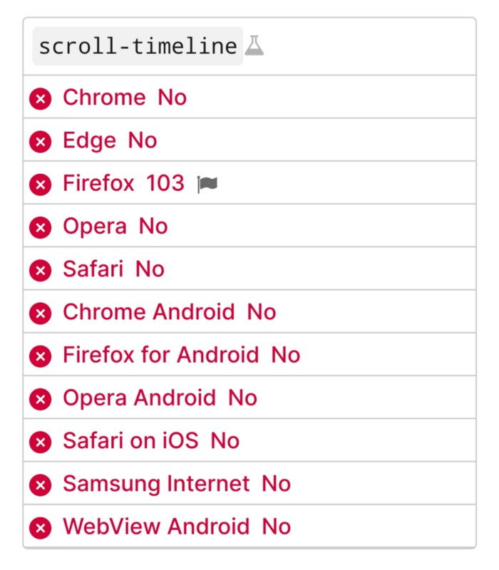
Firefox 103 currently supports it.
There is also a polyfill, with some demo examples to explore.
Summary
Web design was a protracted process. Started with pages with static backdrop images and scrollable text. Artists and designers may use the scroll-based animation CSS API to completely revamp our web experience.
It's a promising frontier. This post may attract a future scrollable web designer.
Ps. I have created flashcards for HTML, Javascript etc. Check them out!