


More on Entrepreneurship/Creators

Stephen Moore
3 years ago
Adam Neumanns is working to create the future of living in a classic example of a guy failing upward.
The comeback tour continues…
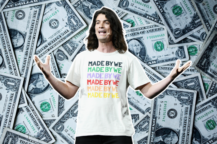
First, he founded a $47 billion co-working company (sorry, a “tech company”).
He established WeLive to disrupt apartment life.
Then he created WeGrow, a school that tossed aside the usual curriculum to feed children's souls and release their potential.
He raised the world’s consciousness.
Then he blew it all up (without raising the world’s consciousness). (He bought a wave pool.)
Adam Neumann's WeWork business burned investors' money. The founder sailed off with unimaginable riches, leaving long-time employees with worthless stocks and the company bleeding money. His track record, which includes a failing baby clothing company, should have stopped investors cold.
Once the dust settled, folks went on. We forgot about the Neumanns! We forgot about the private jets, company retreats, many houses, and WeWork's crippling. In that moment, the prodigal son of entrepreneurship returned, choosing the blockchain as his industry. His homecoming tour began with Flowcarbon, which sold Goddess Nature Tokens to lessen companies' carbon footprints.
Did it work?
Of course not.
Despite receiving $70 million from Andreessen Horowitz's a16z, the project has been halted just two months after its announcement.
This triumph should lower his grade.
Neumann seems to have moved on and has another revolutionary idea for the future of living. Flow (not Flowcarbon) aims to help people live in flow and will launch in 2023. It's the classic Neumann pitch: lofty goals, yogababble, and charisma to attract investors.
It's a winning formula for one investment fund. a16z has backed the project with its largest single check, $350 million. It has a splash page and 3,000 rental units, but is valued at over $1 billion. The blog post praised Neumann for reimagining the office and leading a paradigm-shifting global company.

Flow's mission is to solve the nation's housing crisis. How? Idk. It involves offering community-centric services in apartment properties to the same remote workforce he once wooed with free beer and a pingpong table. Revolutionary! It seems the goal is to apply WeWork's goals of transforming physical spaces and building community to apartments to solve many of today's housing problems.
The elevator pitch probably sounded great.
At least a16z knows it's a near-impossible task, calling it a seismic shift. Marc Andreessen opposes affordable housing in his wealthy Silicon Valley town. As details of the project emerge, more investors will likely throw ethics and morals out the window to go with the flow, throwing money at a man known for burning through it while building toxic companies, hoping he can bank another fantasy valuation before it all crashes.
Insanity is repeating the same action and expecting a different result. Everyone on the Neumann hype train needs to sober up.
Like WeWork, this venture Won’tWork.
Like before, it'll cause a shitstorm.

Alex Mathers
3 years ago
400 articles later, nobody bothered to read them.
Writing for readers:
14 years of daily writing.
I post practically everything on social media. I authored hundreds of articles, thousands of tweets, and numerous volumes to almost no one.
Tens of thousands of readers regularly praise me.
I despised writing. I'm stuck now.
I've learned what readers like and what doesn't.
Here are some essential guidelines for writing with impact:
Readers won't understand your work if you can't.
Though obvious, this slipped me up. Share your truths.
Stories engage human brains.
Showing the journey of a person from worm to butterfly inspires the human spirit.
Overthinking hinders powerful writing.
The best ideas come from inner understanding in between thoughts.
Avoid writing to find it. Write.
Writing a masterpiece isn't motivating.
Write for five minutes to simplify. Step-by-step, entertaining, easy steps.
Good writing requires a willingness to make mistakes.
So write loads of garbage that you can edit into a good piece.
Courageous writing.
A courageous story will move readers. Personal experience is best.
Go where few dare.
Templates, outlines, and boundaries help.
Limitations enhance writing.
Excellent writing is straightforward and readable, removing all the unnecessary fat.
Use five words instead of nine.
Use ordinary words instead of uncommon ones.
Readers desire relatability.
Too much perfection will turn it off.
Write to solve an issue if you can't think of anything to write.
Instead, read to inspire. Best authors read.
Every tweet, thread, and novel must have a central idea.
What's its point?
This can make writing confusing.
️ Don't direct your reader.
Readers quit reading. Demonstrate, describe, and relate.
Even if no one responds, have fun. If you hate writing it, the reader will too.

SAHIL SAPRU
3 years ago
How I grew my business to a $5 million annual recurring revenue
Scaling your startup requires answering customer demands, not growth tricks.
I cofounded Freedo Rentals in 2019. I reached 50 lakh+ ARR in 6 months before quitting owing to the epidemic.
Freedo aimed to solve 2 customer pain points:
Users lacked a reliable last-mile transportation option.
The amount that Auto walas charge for unmetered services
Solution?
Effectively simple.
Build ports at high-demand spots (colleges, residential societies, metros). Electric ride-sharing can meet demand.
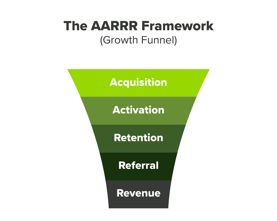
We had many problems scaling. I'll explain using the AARRR model.
Brand unfamiliarity or a novel product offering were the problems with awareness. Nobody knew what Freedo was or what it did.
Problem with awareness: Content and advertisements did a poor job of communicating the task at hand. The advertisements clashed with the white-collar part because they were too cheesy.
Retention Issue: We encountered issues, indicating that the product was insufficient. Problems with keyless entry, creating bills, stealing helmets, etc.
Retention/Revenue Issue: Costly compared to established rivals. Shared cars were 1/3 of our cost.
Referral Issue: Missing the opportunity to seize the AHA moment. After the ride, nobody remembered us.
Once you know where you're struggling with AARRR, iterative solutions are usually best.
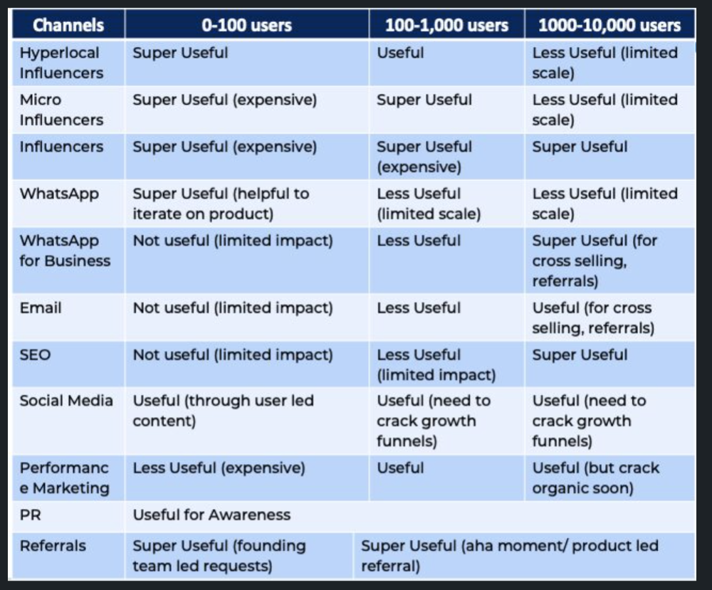
Once you have nailed the AARRR model, most startups use paid channels to scale. This dependence, on paid channels, increases with scale unless you crack your organic/inbound game.
Over-index growth loops. Growth loops increase inflow and customers as you scale.
When considering growth, ask yourself:
Who is the solution's ICP (Ideal Customer Profile)? (To whom are you selling)
What are the most important messages I should convey to customers? (This is an A/B test.)
Which marketing channels ought I prioritize? (Conduct analysis based on the startup's maturity/stage.)
Choose the important metrics to monitor for your AARRR funnel (not all metrics are equal)
Identify the Flywheel effect's growth loops (inertia matters)
My biggest mistakes:
not paying attention to consumer comments or satisfaction. It is the main cause of problems with referrals, retention, and acquisition for startups. Beyond your NPS, you should consider second-order consequences.
The tasks at hand should be quite clear.
Here's my scaling equation:
Growth = A x B x C
A = Funnel top (Traffic)
B = Product Valuation (Solving a real pain point)
C = Aha! (Emotional response)
Freedo's A, B, and C created a unique offering.
Freedo’s ABC:
A — Working or Studying population in NCR
B — Electric Vehicles provide last-mile mobility as a clean and affordable solution
C — One click booking with a no-noise scooter
Final outcome:
FWe scaled Freedo to Rs. 50 lakh MRR and were growing 60% month on month till the pandemic ceased our growth story.
How we did it?
We tried ambassadors and coupons. WhatsApp was our most successful A/B test.
We grew widespread adoption through college and society WhatsApp groups. We requested users for referrals in community groups.
What worked for us won't work for others. This scale underwent many revisions.
Every firm is different, thus you must know your customers. Needs to determine which channel to prioritize and when.
Users desired a safe, time-bound means to get there.
This (not mine) growth framework helped me a lot. You should follow suit.
You might also like

Jan-Patrick Barnert
4 years ago
Wall Street's Bear Market May Stick Around
If history is any guide, this bear market might be long and severe.
This is the S&P 500 Index's fourth such incident in 20 years. The last bear market of 2020 was a "shock trade" caused by the Covid-19 pandemic, although earlier ones in 2000 and 2008 took longer to bottom out and recover.
Peter Garnry, head of equities strategy at Saxo Bank A/S, compares the current selloff to the dotcom bust of 2000 and the 1973-1974 bear market marked by soaring oil prices connected to an OPEC oil embargo. He blamed high tech valuations and the commodity crises.
"This drop might stretch over a year and reach 35%," Garnry wrote.
Here are six bear market charts.
Time/depth
The S&P 500 Index plummeted 51% between 2000 and 2002 and 58% during the global financial crisis; it took more than 1,000 trading days to recover. The former took 638 days to reach a bottom, while the latter took 352 days, suggesting the present selloff is young.
Valuations
Before the tech bubble burst in 2000, valuations were high. The S&P 500's forward P/E was 25 times then. Before the market fell this year, ahead values were near 24. Before the global financial crisis, stocks were relatively inexpensive, but valuations dropped more than 40%, compared to less than 30% now.
Earnings
Every stock crash, especially earlier bear markets, returned stocks to fundamentals. The S&P 500 decouples from earnings trends but eventually recouples.
Support
Central banks won't support equity investors just now. The end of massive monetary easing will terminate a two-year bull run that was among the strongest ever, and equities may struggle without cheap money. After years of "don't fight the Fed," investors must embrace a new strategy.
Bear Haunting Bear
If the past is any indication, rising government bond yields are bad news. After the financial crisis, skyrocketing rates and a falling euro pushed European stock markets back into bear territory in 2011.
Inflation/rates
The current monetary policy climate differs from past bear markets. This is the first time in a while that markets face significant inflation and rising rates.
This post is a summary. Read full article here

Sam Hickmann
4 years ago
What is this Fed interest rate everybody is talking about that makes or breaks the stock market?
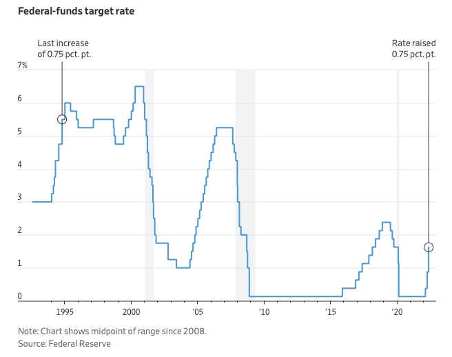
The Federal Funds Rate (FFR) is the target interest rate set by the Federal Reserve System (Fed)'s policy-making body (FOMC). This target is the rate at which the Fed suggests commercial banks borrow and lend their excess reserves overnight to each other.
The FOMC meets 8 times a year to set the target FFR. This is supposed to promote economic growth. The overnight lending market sets the actual rate based on commercial banks' short-term reserves. If the market strays too far, the Fed intervenes.
Banks must keep a certain percentage of their deposits in a Federal Reserve account. A bank's reserve requirement is a percentage of its total deposits. End-of-day bank account balances averaged over two-week reserve maintenance periods are used to determine reserve requirements.
If a bank expects to have end-of-day balances above what's needed, it can lend the excess to another institution.
The FOMC adjusts interest rates based on economic indicators that show inflation, recession, or other issues that affect economic growth. Core inflation and durable goods orders are indicators.
In response to economic conditions, the FFR target has changed over time. In the early 1980s, inflation pushed it to 20%. During the Great Recession of 2007-2009, the rate was slashed to 0.15 percent to encourage growth.
Inflation picked up in May 2022 despite earlier rate hikes, prompting today's 0.75 percent point increase. The largest increase since 1994. It might rise to around 3.375% this year and 3.1% by the end of 2024.

Will Leitch
3 years ago
Don't treat Elon Musk like Trump.
He’s not the President. Stop treating him like one.
Elon Musk tweeted from Qatar, where he was watching the World Cup Final with Jared Kushner.
Musk's subsequent Tweets were as normal, basic, and bland as anyone's from a World Cup Final: It's depressing to see the world's richest man looking at his phone during a grand ceremony. Rich guy goes to rich guy event didn't seem important.
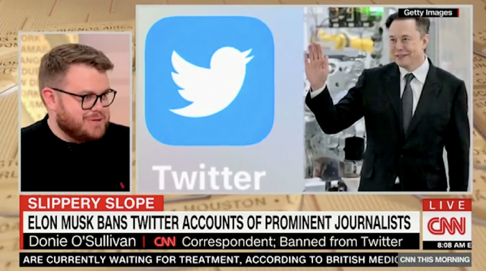
Before Musk posted his should-I-step-down-at-Twitter poll, CNN ran a long segment asking if it was hypocritical for him to reveal his real-time location after defending his (very dumb) suspension of several journalists for (supposedly) revealing his assassination coordinates by linking to a site that tracks Musks private jet. It was hard to ignore CNN's hypocrisy: It covered Musk as Twitter CEO like President Trump. EVERY TRUMP STORY WAS BASED ON HIM SAYING X, THEN DOING Y. Trump would do something horrific, lie about it, then pretend it was fine, then condemn a political rival who did the same thing, be called hypocritical, and so on. It lasted four years. Exhausting.
It made sense because Trump was the President of the United States. The press's main purpose is to relentlessly cover and question the president.
It's strange to say this out. Twitter isn't America. Elon Musk isn't a president. He maintains a money-losing social media service to harass and mock people he doesn't like. Treating Musk like Trump, as if he should be held accountable like Trump, shows a startling lack of perspective. Some journalists treat Twitter like a country.
The compulsive, desperate way many journalists utilize the site suggests as much. Twitter isn't the town square, despite popular belief. It's a place for obsessives to meet and converse. Journalists say they're breaking news. Their careers depend on it. They can argue it's a public service. Nope. It's a place lonely people go to speak all day. Twitter. So do journalists, Trump, and Musk. Acting as if it has a greater purpose, as if it's impossible to break news without it, or as if the republic is in peril is ludicrous. Only 23% of Americans are on Twitter, while 25% account for 97% of Tweets. I'd think a large portion of that 25% are journalists (or attention addicts) chatting to other journalists. Their loudness makes Twitter seem more important than it is. Nope. It's another stupid website. They were there before Twitter; they will be there after Twitter. It’s just a website. We can all get off it if we want. Most of us aren’t even on it in the first place.
Musk is a website-owner. No world leader. He's not as accountable as Trump was. Musk is cable news's primary character now that Trump isn't (at least for now). Becoming a TV news anchor isn't as significant as being president. Elon Musk isn't as important as we all pretend, and Twitter isn't even close. Twitter is a dumb website, Elon Musk is a rich guy going through a midlife crisis, and cable news is lazy because its leaders thought the entire world was on Twitter and are now freaking out that their playground is being disturbed.
I’ve said before that you need to leave Twitter, now. But even if you’re still on it, we need to stop pretending it matters more than it does. It’s a site for lonely attention addicts, from the man who runs it to the journalists who can’t let go of it. It’s not a town square. It’s not a country. It’s not even a successful website. Let’s stop pretending any of it’s real. It’s not.