


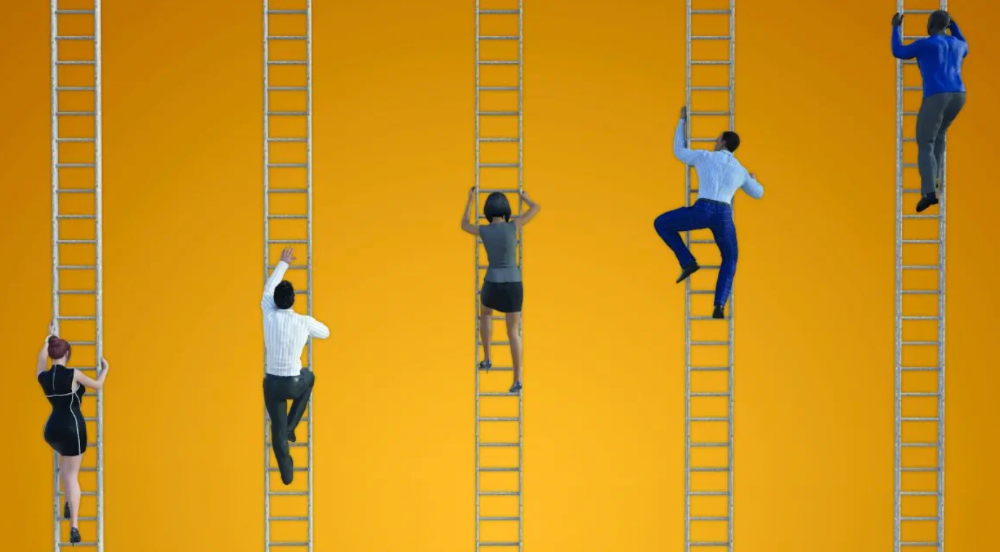
More on Marketing

Jano le Roux
3 years ago
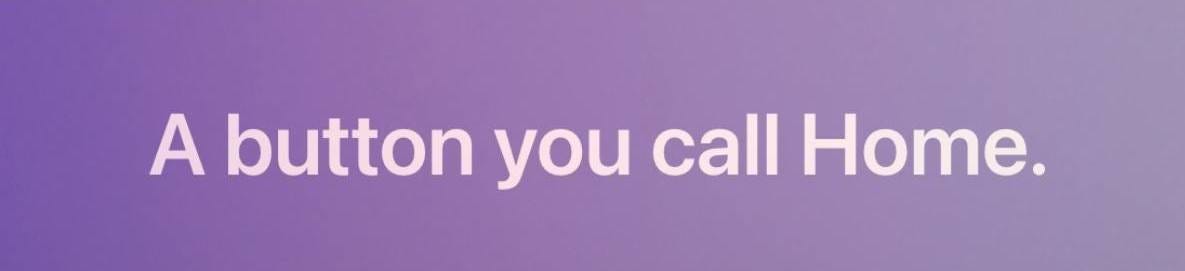
Here's What I Learned After 30 Days Analyzing Apple's Microcopy
Move people with tiny words.
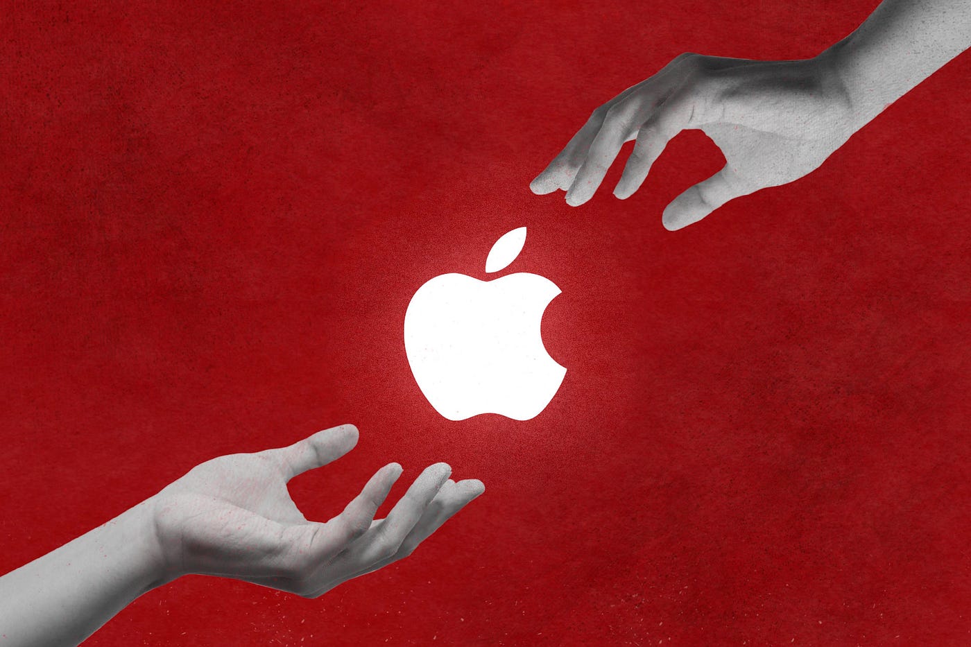
Apple fanboy here.
Macs are awesome.
Their iPhones rock.
$19 cloths are great.
$999 stands are amazing.
I love Apple's microcopy even more.
It's like the marketing goddess bit into the Apple logo and blessed the world with microcopy.
I took on a 30-day micro-stalking mission.
Every time I caught myself wasting time on YouTube, I had to visit Apple’s website to learn the secrets of the marketing goddess herself.
We've learned. Golden apples are calling.
Cut the friction
Benefit-first, not commitment-first.
Brands lose customers through friction.
Most brands don't think like customers.
Brands want sales.
Brands want newsletter signups.
Here's their microcopy:
“Buy it now.”
“Sign up for our newsletter.”
Both are difficult. They ask for big commitments.
People are simple creatures. Want pleasure without commitment.
Apple nails this.
So, instead of highlighting the commitment, they highlight the benefit of the commitment.
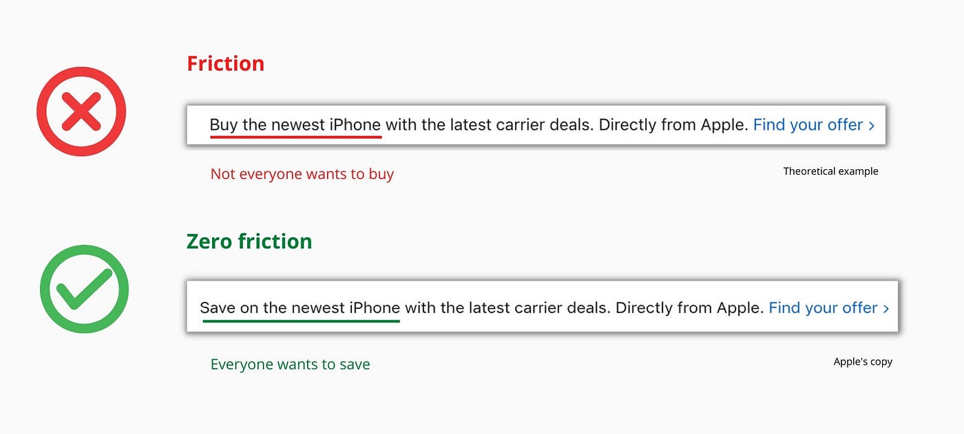
Saving on the latest iPhone sounds easier than buying it. Everyone saves, but not everyone buys.
A subtle change in framing reduces friction.
Apple eliminates customer objections to reduce friction.
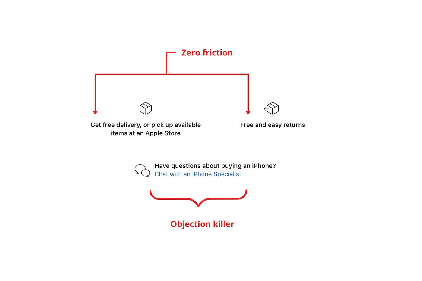
Less customer friction means simpler processes.
Apple's copy expertly reassures customers about shipping fees and not being home. Apple assures customers that returning faulty products is easy.
Apple knows that talking to a real person is the best way to reduce friction and improve their copy.
Always rhyme
Learn about fine rhyme.
Poets make things beautiful with rhyme.
Copywriters use rhyme to stand out.
Apple’s copywriters have mastered the art of corporate rhyme.
Two techniques are used.
1. Perfect rhyme
Here, rhymes are identical.

2. Imperfect rhyme
Here, rhyming sounds vary.

Apple prioritizes meaning over rhyme.
Apple never forces rhymes that don't fit.
It fits so well that the copy seems accidental.
Add alliteration
Alliteration always entertains.
Alliteration repeats initial sounds in nearby words.
Apple's copy uses alliteration like no other brand I've seen to create a rhyming effect or make the text more fun to read.
For example, in the sentence "Sam saw seven swans swimming," the initial "s" sound is repeated five times. This creates a pleasing rhythm.
Microcopy overuse is like pouring ketchup on a Michelin-star meal.
Alliteration creates a memorable phrase in copywriting. It's subtler than rhyme, and most people wouldn't notice; it simply resonates.
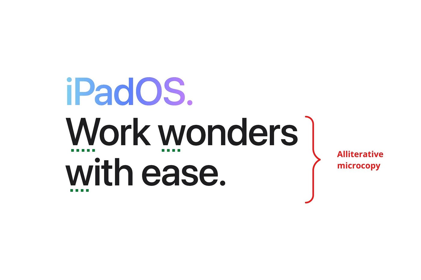
I love how Apple uses alliteration and contrast between "wonders" and "ease".
Assonance, or repeating vowels, isn't Apple's thing.
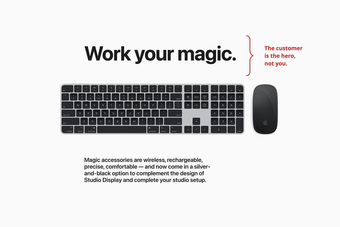
You ≠ Hero, Customer = Hero
Your brand shouldn't be the hero.
Because they'll be using your product or service, your customer should be the hero of your copywriting. With your help, they should feel like they can achieve their goals.
I love how Apple emphasizes what you can do with the machine in this microcopy.

It's divine how they position their tools as sidekicks to help below.
This one takes the cake:
Dialogue-style writing
Conversational copy engages.
Excellent copy Like sharing gum with a friend.
This helps build audience trust.
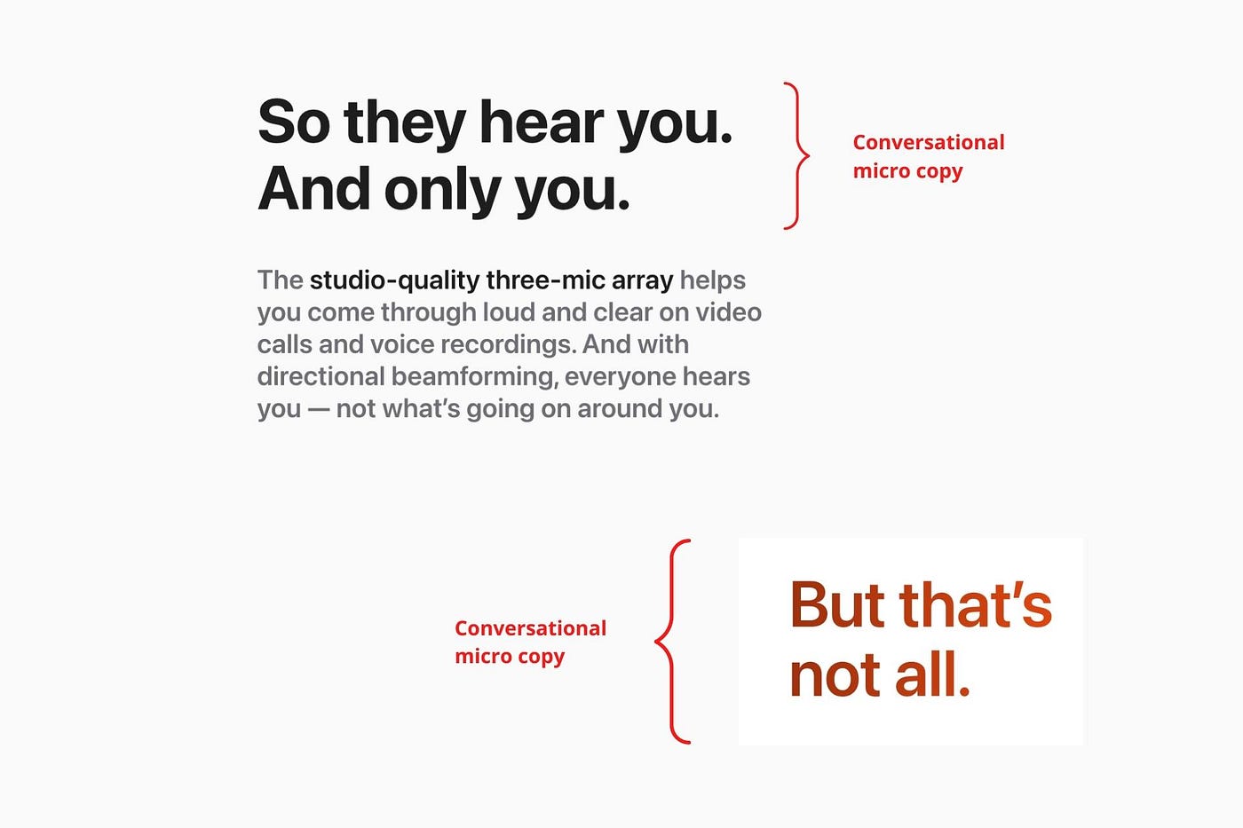
Apple does this by using natural connecting words like "so" and phrases like "But that's not all."
Snowclone-proof
The mother of all microcopy techniques.
A snowclone uses an existing phrase or sentence to create a new one. The new phrase or sentence uses the same structure but different words.
It’s usually a well know saying like:
To be or not to be.
This becomes a formula:
To _ or not to _.
Copywriters fill in the blanks with cause-related words. Example:
To click or not to click.

Apple turns "survival of the fittest" into "arrival of the fittest."
It's unexpected and surprises the reader.
So this was fun.
But my fun has just begun.
Microcopy is 21st-century poetry.
I came as an Apple fanboy.
I leave as an Apple fanatic.
Now I’m off to find an apple tree.
Cause you know how it goes.
(Apples, trees, etc.)
This post is a summary. Original post available here.

Jenn Leach
3 years ago
This clever Instagram marketing technique increased my sales to $30,000 per month.
No Paid Ads Required

I had an online store. After a year of running the company alongside my 9-to-5, I made enough to resign.
That day was amazing.
This Instagram marketing plan helped the store succeed.
How did I increase my sales to five figures a month without using any paid advertising?
I used customer event marketing.
I'm not sure this term exists. I invented it to describe what I was doing.
Instagram word-of-mouth, fan engagement, and interaction drove sales.
If a customer liked or disliked a product, the buzz would drive attention to the store.
I used customer-based events to increase engagement and store sales.
Success!
Here are the weekly Instagram customer events I coordinated while running my business:
Be the Buyer Days
Flash sales
Mystery boxes
Be the Buyer Days: How do they work?
Be the Buyer Days are exactly that.
You choose a day to share stock selections with social media followers.
This is an easy approach to engaging customers and getting fans enthusiastic about new releases.
First, pick a handful of items you’re considering ordering. I’d usually pick around 3 for Be the Buyer Day.
Then I'd poll the crowd on Instagram to vote on their favorites.
This was before Instagram stories, polls, and all the other cool features Instagram offers today. I think using these tools now would make this event even better.
I'd ask customers their favorite back then.
The growing comments excited customers.
Then I'd declare the winner, acquire the products, and start selling it.
How do flash sales work?
I mostly ran flash sales.
You choose a limited number of itemsdd for a few-hour sale.
We wanted most sales to result in sold-out items.
When an item sells out, it contributes to the sensation of scarcity and can inspire customers to visit your store to buy a comparable product, join your email list, become a fan, etc.
We hoped they'd act quickly.
I'd hold flash deals twice a week, which generated scarcity and boosted sales.
The store had a few thousand Instagram followers when I started flash deals.
Each flash sale item would make $400 to $600.
$400 x 3= $1,200
That's $1,200 on social media!
Twice a week, you'll make roughly $10K a month from Instagram.
$1,200/day x 8 events/month=$9,600
Flash sales did great.
We held weekly flash deals and sent social media and email reminders. That’s about it!
How are mystery boxes put together?
All you do is package a box of store products and sell it as a mystery box on TikTok or retail websites.
A $100 mystery box would cost $30.
You're discounting high-value boxes.
This is a clever approach to get rid of excess inventory and makes customers happy.
It worked!
Be the Buyer Days, flash deals, and mystery boxes helped build my company without paid advertisements.
All companies can use customer event marketing. Involving customers and providing an engaging environment can boost sales.
Try it!

Jon Brosio
3 years ago
This Landing Page is a (Legal) Money-Printing Machine
and it’s easy to build.
A landing page with good copy is a money-maker.
Let's be honest, page-builder templates are garbage.
They can help you create a nice-looking landing page, but not persuasive writing.
Over the previous 90 days, I've examined 200+ landing pages.
What's crazy?
Top digital entrepreneurs use a 7-part strategy to bring in email subscribers, generate prospects, and (passively) sell their digital courses.
Steal this 7-part landing page architecture to maximize digital product sales.
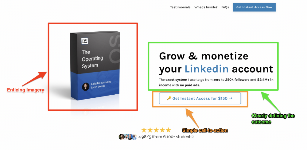
The offer
Landing pages require offers.
Newsletter, cohort, or course offer.
Your reader should see this offer first. Includind:
Headline
Imagery
Call-to-action
Clear, persuasive, and simplicity are key. Example: the Linkedin OS course home page of digital entrepreneur Justin Welsh offers:
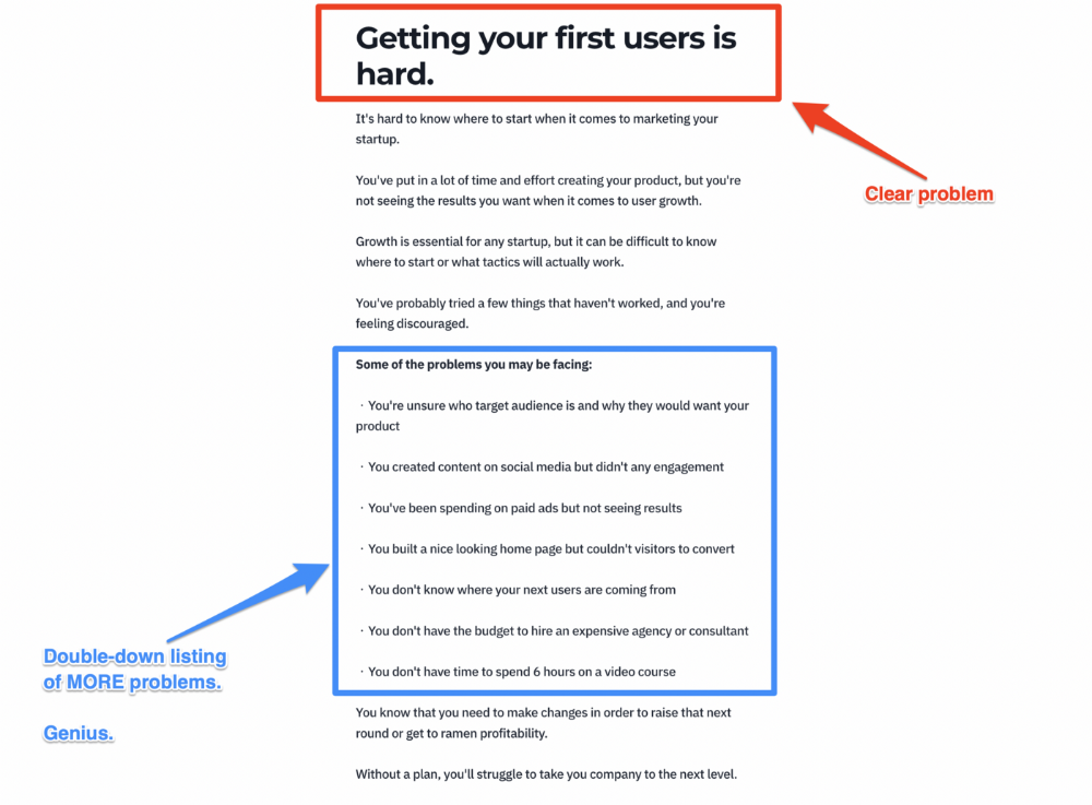
A distinctly defined problem
Everyone needs an enemy.
You need an opponent on your landing page. Problematic.
Next, employ psychology to create a struggle in your visitor's thoughts.
Don't be clever here; label your customer's problem. The more particular you are, the bigger the situation will seem.
When you build a clear monster, you invite defeat. I appreciate Theo Ohene's Growth Roadmaps landing page.
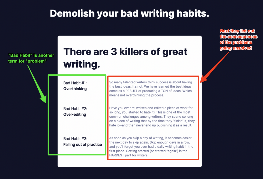
Exacerbation of the effects
Problem identification doesn't motivate action.
What would an unresolved problem mean?
This is landing page copy. When you describe the unsolved problem's repercussions, you accomplish several things:
You write a narrative (and stories are remembered better than stats)
You cause the reader to feel something.
You help the reader relate to the issue
Important!
My favorite script is:
"Sure, you can let [problem] go untreated. But what will happen if you do? Soon, you'll begin to notice [new problem 1] will start to arise. That might bring up [problem 2], etc."
Take the copywriting course, digital writer and entrepreneur Dickie Bush illustrates below when he labels the problem (see: "poor habit") and then illustrates the repercussions.
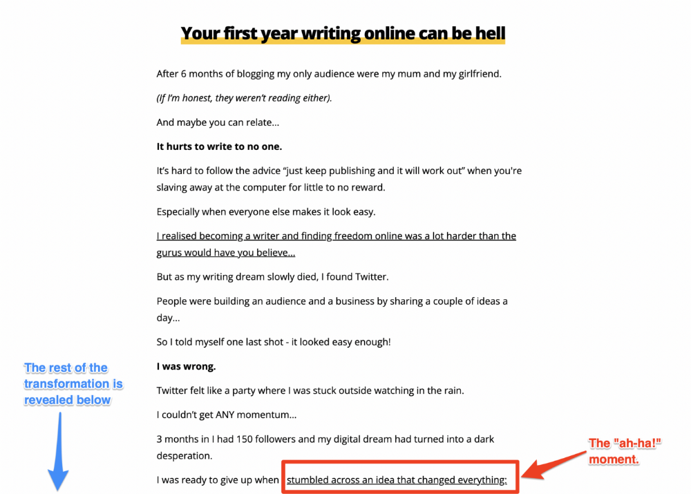
The tale of transformation
Every landing page needs that "ah-ha!" moment.
Transformation stories do this.
Did you find a solution? Someone else made the discovery? Have you tested your theory?
Next, describe your (or your subject's) metamorphosis.
Kieran Drew nails his narrative (and revelation) here. Right before the disclosure, he introduces his "ah-ha!" moment:
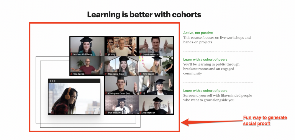
Testimonials
Social proof completes any landing page.
Social proof tells the reader, "If others do it, it must be worthwhile."
This is your argument.
Positive social proof helps (obviously).
Offer "free" training in exchange for a testimonial if you need social evidence. This builds social proof.
Most social proof is testimonies (recommended). Kurtis Hanni's creative take on social proof (using a screenshot of his colleague) is entertaining.
Bravo.
Reveal your offer
Now's the moment to act.
Describe the "bundle" that provides the transformation.
Here's:
Course
Cohort
Ebook
Whatever you're selling.
Include a product or service image, what the consumer is getting ("how it works"), the price, any "free" bonuses (preferred), and a CTA ("buy now").
Clarity is key. Don't make a cunning offer. Make sure your presentation emphasizes customer change (benefits). Dan Koe's Modern Mastery landing page makes an offer. Consider:
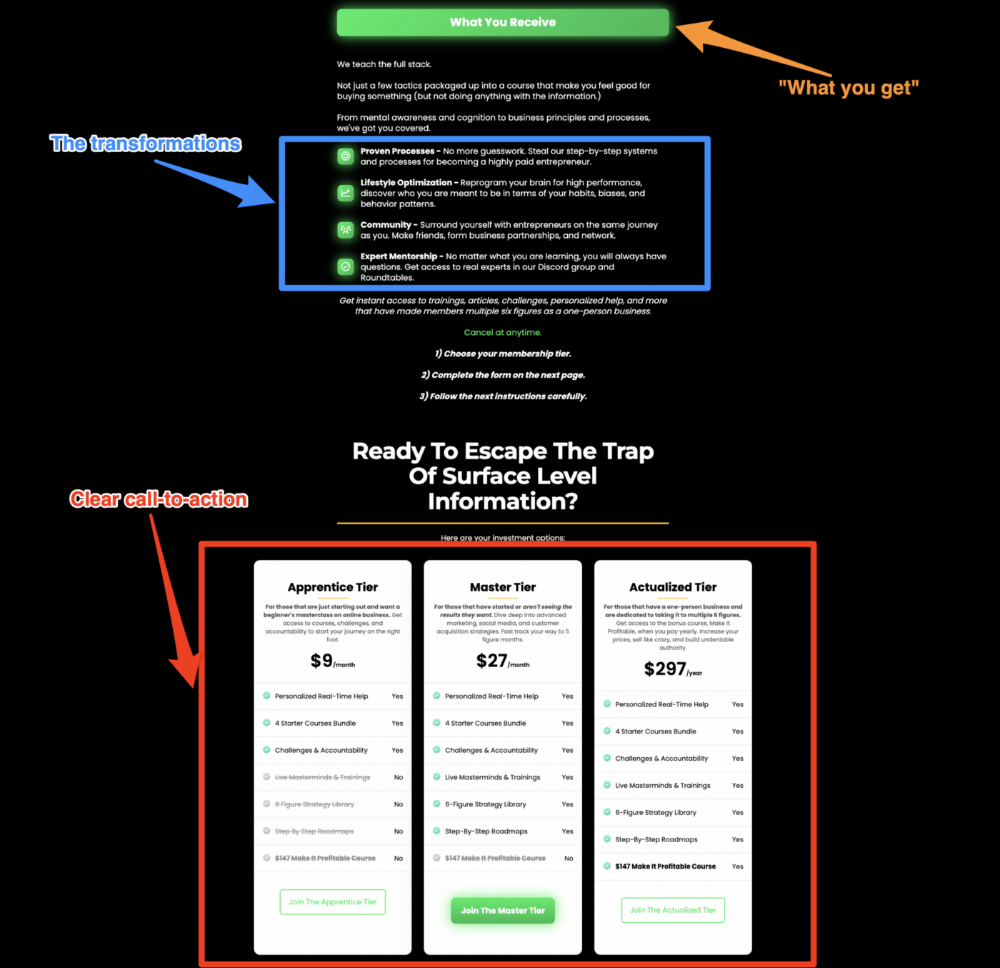
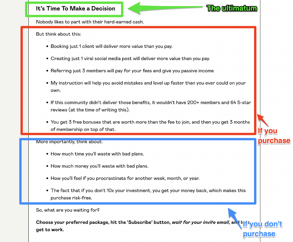
An ultimatum
Offering isn't enough.
You must give your prospect an ultimatum.
They can buy your merchandise from you.
They may exit the webpage.
That’s it.
It's crucial to show what happens if the reader does either. Stress the consequences of not buying (again, a little consequence amplification). Remind them of the benefits of buying.
I appreciate Charles Miller's product offer ending:
The top online creators use a 7-part landing page structure:
Offer the service
Describe the problem
Amplify the consequences
Tell the transformational story
Include testimonials and social proof.
Reveal the offer (with any bonuses if applicable)
Finally, give the reader a deadline to encourage them to take action.
Sequence these sections to develop a landing page that (essentially) prints money.
You might also like

Dr. Linda Dahl
3 years ago
We eat corn in almost everything. Is It Important?
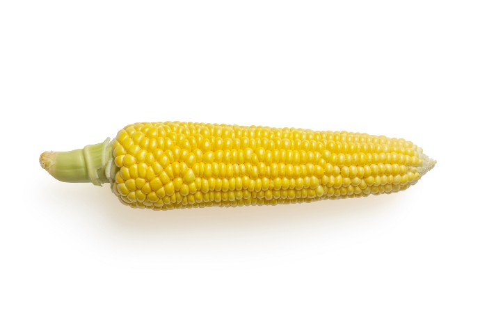
Corn Kid got viral on TikTok after being interviewed by Recess Therapy. Tariq, called the Corn Kid, ate a buttery ear of corn in the video. He's corn crazy. He thinks everyone just has to try it. It turns out, whether we know it or not, we already have.
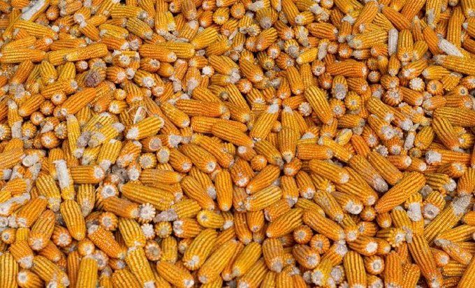
Corn is a fruit, veggie, and grain. It's the second-most-grown crop. Corn makes up 36% of U.S. exports. In the U.S., it's easy to grow and provides high yields, as proven by the vast corn belt spanning the Midwest, Great Plains, and Texas panhandle. Since 1950, the corn crop has doubled to 10 billion bushels.
You say, "Fine." We shouldn't just grow because we can. Why so much corn? What's this corn for?
Why is practical and political. Michael Pollan's The Omnivore's Dilemma has the full narrative. Early 1970s food costs increased. Nixon subsidized maize to feed the public. Monsanto genetically engineered corn seeds to make them hardier, and soon there was plenty of corn. Everyone ate. Woot! Too much corn followed. The powers-that-be had to decide what to do with leftover corn-on-the-cob.
They are fortunate that corn has a wide range of uses.
First, the edible variants. I divide corn into obvious and stealth.
Obvious corn includes popcorn, canned corn, and corn on the cob. This form isn't always digested and often comes out as entire, polka-dotting poop. Cornmeal can be ground to make cornbread, polenta, and corn tortillas. Corn provides antioxidants, minerals, and vitamins in moderation. Most synthetic Vitamin C comes from GMO maize.
Corn oil, corn starch, dextrose (a sugar), and high-fructose corn syrup are often overlooked. They're stealth corn because they sneak into practically everything. Corn oil is used for frying, baking, and in potato chips, mayonnaise, margarine, and salad dressing. Baby food, bread, cakes, antibiotics, canned vegetables, beverages, and even dairy and animal products include corn starch. Dextrose appears in almost all prepared foods, excluding those with high-fructose corn syrup. HFCS isn't as easily digested as sucrose (from cane sugar). It can also cause other ailments, which we'll discuss later.
Most foods contain corn. It's fed to almost all food animals. 96% of U.S. animal feed is corn. 39% of U.S. corn is fed to livestock. But animals prefer other foods. Omnivore chickens prefer insects, worms, grains, and grasses. Captive cows are fed a total mixed ration, which contains corn. These animals' products, like eggs and milk, are also corn-fed.
There are numerous non-edible by-products of corn that are employed in the production of items like:
fuel-grade ethanol
plastics
batteries
cosmetics
meds/vitamins binder
carpets, fabrics
glutathione
crayons
Paint/glue
How does corn influence you? Consider quick food for dinner. You order a cheeseburger, fries, and big Coke at the counter (or drive-through in the suburbs). You tell yourself, "No corn." All that contains corn. Deconstruct:
Cows fed corn produce meat and cheese. Meat and cheese were bonded with corn syrup and starch (same). The bun (corn flour and dextrose) and fries were fried in maize oil. High fructose corn syrup sweetens the drink and helps make the cup and straw.
Just about everything contains corn. Then what? A cornspiracy, perhaps? Is eating too much maize an issue, or should we strive to stay away from it whenever possible?
As I've said, eating some maize can be healthy. 92% of U.S. corn is genetically modified, according to the Center for Food Safety. The adjustments are expected to boost corn yields. Some sweet corn is genetically modified to produce its own insecticide, a protein deadly to insects made by Bacillus thuringiensis. It's safe to eat in sweet corn. Concerns exist about feeding agricultural animals so much maize, modified or not.
High fructose corn syrup should be consumed in moderation. Fructose, a sugar, isn't easily metabolized. Fructose causes diabetes, fatty liver, obesity, and heart disease. It causes inflammation, which might aggravate gout. Candy, packaged sweets, soda, fast food, juice drinks, ice cream, ice cream topping syrups, sauces & condiments, jams, bread, crackers, and pancake syrup contain the most high fructose corn syrup. Everyday foods with little nutrients. Check labels and choose cane sugar or sucrose-sweetened goods. Or, eat corn like the Corn Kid.

James White
3 years ago
I read three of Elon Musk's suggested books (And His Taste Is Incredible)
A reading list for successful people

Elon Musk reads and talks. So, one learns. Many brilliant individuals & amazing literature.
This article recommends 3 Elon Musk novels. All of them helped me succeed. Hope they'll help you.
Douglas Adams's The Hitchhiker's Guide to the Galaxy
Page Count: 193
Rating on Goodreads: 4.23
Arthur Dent is pulled off Earth by a buddy seconds before it's razed for a cosmic motorway. The trio hitchhikes through space and gets into problems.
I initially read Hitchhiker's as a child. To evade my mum, I'd read with a flashlight under the covers. She'd scold at me for not sleeping on school nights when she found out. Oops.
The Hitchhiker's Guide to the Galaxy is lighthearted science fiction.
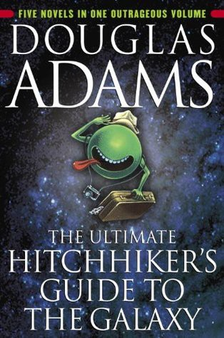
My favorite book quotes are:
“Space is big. You won’t believe how vastly, hugely, mind-bogglingly big it is. I mean, you may think it’s a long way down the road to the chemist’s, but that’s just peanuts to space.”
“Far out in the uncharted backwaters of the unfashionable end of the western spiral arm of the Galaxy lies a small unregarded yellow sun. Orbiting this at a distance of roughly ninety-two million miles is an utterly insignificant little blue-green planet whose ape-descended life forms are so amazingly primitive that they still think digital watches are a pretty neat idea.”
“On planet Earth, man had always assumed that he was more intelligent than dolphins because he had achieved so much — the wheel, New York, wars, and so on — whilst all the dolphins had ever done was muck about in the water having a good time. But conversely, the dolphins had always believed that they were far more intelligent than man — for precisely the same reasons.”
the Sun Tzu book The Art Of War
Page Count: 273
Rating on Goodreads: 3.97
It's a classic. You may apply The Art of War's ideas to (nearly) every facet of life. Ex:
Pick your fights.
Keep in mind that timing is crucial.
Create a backup plan in case something goes wrong.
Obstacles provide us a chance to adapt and change.
This book was my first. Since then, I'm a more strategic entrepreneur. Excellent book. And read it ASAP!
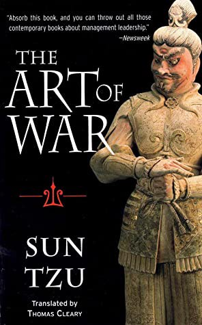
My favorite book quotes are:
“Victorious warriors win first and then go to war, while defeated warriors go to war first and then seek to win.”
“Engage people with what they expect; it is what they are able to discern and confirms their projections. It settles them into predictable patterns of response, occupying their minds while you wait for the extraordinary moment — that which they cannot anticipate.”
“If you know the enemy and know yourself, you need not fear the result of a hundred battles. If you know yourself but not the enemy, for every victory gained, you will also suffer a defeat. If you know neither the enemy nor yourself, you will succumb in every battle.”
Peter Thiel's book Zero to One
Page Count: 195
Rating on Goodreads: 4.18
Peter argues the best money-making strategies are typically unproven. Entrepreneurship should never have a defined path to success. Whoever says differently is lying.
Zero to One explores technology and society. Peter is a philosophy major and law school graduate, which informs the work.
Peters' ideas, depth, and intellect stood out in Zero to One. It's a top business book.
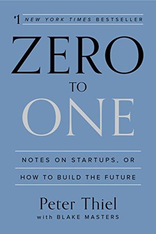
My favorite book quotes are:
“The most valuable businesses of coming decades will be built by entrepreneurs who seek to empower people rather than try to make them obsolete.”
“The next Bill Gates will not build an operating system. The next Larry Page or Sergey Brin won’t make a search engine. And the next Mark Zuckerberg won’t create a social network. If you are copying these guys, you aren’t learning from them.”
“If your goal is to never make a mistake in your life, you shouldn’t look for secrets. The prospect of being lonely but right — dedicating your life to something that no one else believes in — is already hard. The prospect of being lonely and wrong can be unbearable.”

Akshad Singi
3 years ago
Four obnoxious one-minute habits that help me save more than 30 hours each week
These four, when combined, destroy procrastination.
You're not rushed. You waste it on busywork.
You'll accept this eventually.
In 2022, the daily average usage of a user on social media is 2.5 hours.
By 2020, 6 billion hours of video were watched each month by Netflix's customers, who used the service an average of 3.2 hours per day.
When we see these numbers, we think "Wow!" People squander so much time as though they don't contribute. True. These are yours. Likewise.
We don't lack time; we just waste it. Once you realize this, you can change your habits to save time. This article explains. If you adopt ALL 4 of these simple behaviors, you'll see amazing benefits.
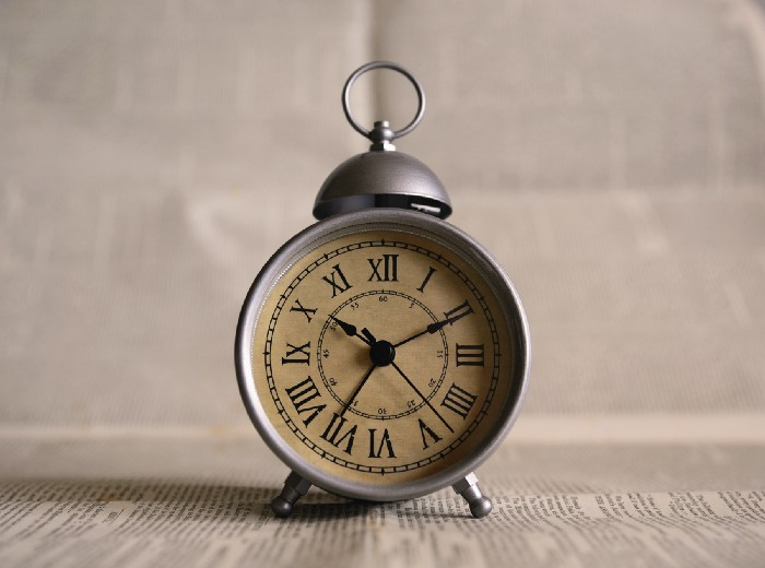
Time-blocking
Cal Newport's time-blocking trick takes a minute but improves your day's clarity.
Divide the next day into 30-minute (or 5-minute, if you're Elon Musk) segments and assign responsibilities. As seen.
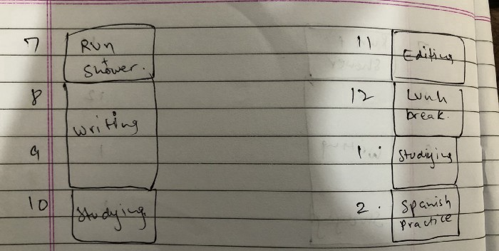
Here's why:
The procrastination that results from attempting to determine when to begin working is eliminated. Procrastination is a given if you choose when to begin working in real-time. Even if you may assume you'll start working in five minutes, it won't take you long to realize that five minutes have turned into an hour. But if you've already determined to start working at 2:00 the next day, your odds of procrastinating are greatly decreased, if not eliminated altogether.
You'll also see that you have a lot of time in a day when you plan your day out on paper and assign chores to each hour. Doing this daily will permanently eliminate the lack of time mindset.
5-4-3-2-1: Have breakfast with the frog!
“If it’s your job to eat a frog, it’s best to do it first thing in the morning. And If it’s your job to eat two frogs, it’s best to eat the biggest one first.”
Eating the frog means accomplishing the day's most difficult chore. It's better to schedule it first thing in the morning when time-blocking the night before. Why?
The day's most difficult task is also the one that causes the most postponement. Because of the stress it causes, the later you schedule it, the more time you risk wasting by procrastinating.
However, if you do it right away in the morning, you'll feel good all day. This is the reason it was set for the morning.
Mel Robbins' 5-second rule can help. Start counting backward 54321 and force yourself to start at 1. If you acquire the urge to work on a goal, you must act within 5 seconds or your brain will destroy it. If you're scheduled to eat your frog at 9, eat it at 8:59. Start working.
Micro-visualisation
You've heard of visualizing to enhance the future. Visualizing a bright future won't do much if you're not prepared to focus on the now and develop the necessary habits. Alexander said:
People don’t decide their futures. They decide their habits and their habits decide their future.
I visualize the next day's schedule every morning. My day looks like this
“I’ll start writing an article at 7:30 AM. Then, I’ll get dressed up and reach the medicine outpatient department by 9:30 AM. After my duty is over, I’ll have lunch at 2 PM, followed by a nap at 3 PM. Then, I’ll go to the gym at 4…”
etc.
This reinforces the day you planned the night before. This makes following your plan easy.
Set the timer.
It's the best iPhone productivity app. A timer is incredible for increasing productivity.
Set a timer for an hour or 40 minutes before starting work. Your call. I don't believe in techniques like the Pomodoro because I can focus for varied amounts of time depending on the time of day, how fatigued I am, and how cognitively demanding the activity is.
I work with a timer. A timer keeps you focused and prevents distractions. Your mind stays concentrated because of the timer. Timers generate accountability.
To pee, I'll pause my timer. When I sit down, I'll continue. Same goes for bottle refills. To use Twitter, I must pause the timer. This creates accountability and focuses work.
Connecting everything
If you do all 4, you won't be disappointed. Here's how:
Plan out your day's schedule the night before.
Next, envision in your mind's eye the same timetable in the morning.
Speak aloud 54321 when it's time to work: Eat the frog! In the morning, devour the largest frog.
Then set a timer to ensure that you remain focused on the task at hand.