


A guide to NFT pre-sales and whitelists
Before we dig through NFT whitelists and pre-sales, if you know absolutely nothing about NFTs, check our NFT Glossary.
What are pre-sales and whitelists on NFTs?
An NFT pre-sale, as the name implies, allows community members or early supporters of an NFT project to mint before the public, usually via a whitelist or mint pass.
Coin collectors can use mint passes to claim NFTs during the public sale. Because the mint pass is executed by “burning” an NFT into a specific crypto wallet, the collector is not concerned about gas price spikes.
A whitelist is used to approve a crypto wallet address for an NFT pre-sale. In a similar way to an early access list, it guarantees a certain number of crypto wallets can mint one (or more) NFT.
New NFT projects can do a pre-sale without a whitelist, but whitelists are good practice to avoid gas wars and a fair shot at minting an NFT before launching in competitive NFT marketplaces like Opensea, Magic Eden, or CNFT.
Should NFT projects do pre-sales or whitelists? 👇
The reasons to do pre-sales or a whitelist for NFT creators:
Time the market and gain traction.
Pre-sale or whitelists can help NFT projects gauge interest early on.
Whitelist spots filling up quickly is usually a sign of a successful launch, though it does not guarantee NFT longevity (more on that later). Also, full whitelists create FOMO and momentum for the public sale among non-whitelisted NFT collectors.
If whitelist signups are low or slow, projects may need to work on their vision, community, or product. Or the market is in a bear cycle. In either case, it aids NFT projects in market timing.
Reward the early NFT Community members.
Pre-sale and whitelists can help NFT creators reward early supporters.
First, by splitting the minting process into two phases, early adopters get a chance to mint one or more NFTs from their collection at a discounted or even free price.
Did you know that BAYC started at 0.08 eth each? A serum that allowed you to mint a Mutant Ape has become as valuable as the original BAYC.
(2) Whitelists encourage early supporters to help build a project's community in exchange for a slot or status. If you invite 10 people to the NFT Discord community, you get a better ranking or even a whitelist spot.
Pre-sale and whitelisting have become popular ways for new projects to grow their communities and secure future buyers.
Prevent gas wars.
Most new NFTs are created on the Ethereum blockchain, which has the highest transaction fees (also known as gas) (Solana, Cardano, Polygon, Binance Smart Chain, etc).
An NFT public sale is a gas war when a large number of NFT collectors (or bots) try to mint an NFT at the same time.
Competing collectors are willing to pay higher gas fees to prioritize their transaction and out-price others when upcoming NFT projects are hyped and very popular.
Pre-sales and whitelisting prevent gas wars by breaking the minting process into smaller batches of members or season launches.
The reasons to do pre-sales or a whitelists for NFT collectors:
How do I get on an NFT whitelist?
- Popular NFT collections act as a launchpad for other new or hyped NFT collections.
Example: Interfaces NFTs gives out 100 whitelist spots to Deadfellaz NFTs holders. Both NFT projects win. Interfaces benefit from Deadfellaz's success and brand equity.
In this case, to get whitelisted NFT collectors need to hold that specific NFT that is acting like a launchpad.
- A NFT studio or collection that launches a new NFT project and rewards previous NFT holders with whitelist spots or pre-sale access.
The whitelist requires previous NFT holders or community members.
NFT Alpha Groups are closed, small, tight-knit Discord servers where members share whitelist spots or giveaways from upcoming NFTs.
The benefit of being in an alpha group is getting information about new NFTs first and getting in on pre-sale/whitelist before everyone else.
There are some entry barriers to alpha groups, but if you're active in the NFT community, you'll eventually bump into, be invited to, or form one.
- A whitelist spot is awarded to members of an NFT community who are the most active and engaged.
This participation reward is the most democratic. To get a chance, collectors must work hard and play to their strengths.
Whitelisting participation examples:
- Raffle, games and contest: NFT Community raffles, games, and contests. To get a whitelist spot, invite 10 people to X NFT Discord community.
- Fan art: To reward those who add value and grow the community by whitelisting the best fan art and/or artists is only natural.
- Giveaways: Lucky number crypto wallet giveaways promoted by an NFT community. To grow their communities and for lucky collectors, NFT projects often offer free NFT.
- Activate your voice in the NFT Discord Community. Use voice channels to get NFT teams' attention and possibly get whitelisted.
The advantage of whitelists or NFT pre-sales.
Chainalysis's NFT stats quote is the best answer:
“Whitelisting isn’t just some nominal reward — it translates to dramatically better investing results. OpenSea data shows that users who make the whitelist and later sell their newly-minted NFT gain a profit 75.7% of the time, versus just 20.8% for users who do so without being whitelisted. Not only that, but the data suggests it’s nearly impossible to achieve outsized returns on minting purchases without being whitelisted.” Full report here.
Sure, it's not all about cash. However, any NFT collector should feel secure in their investment by owning a piece of a valuable and thriving NFT project. These stats help collectors understand that getting in early on an NFT project (via whitelist or pre-sale) will yield a better and larger return.
The downsides of pre-sales & whitelists for NFT creators.
Pre-sales and whitelist can cause issues for NFT creators and collectors.
NFT flippers
NFT collectors who only want to profit from early minting (pre-sale) or low mint cost (via whitelist). To sell the NFT in a secondary market like Opensea or Solanart, flippers go after the discounted price.
For example, a 1000 Solana NFT collection allows 100 people to mint 1 Solana NFT at 0.25 SOL. The public sale price for the remaining 900 NFTs is 1 SOL. If an NFT collector sells their discounted NFT for 0.5 SOL, the secondary market floor price is below the public mint.
This may deter potential NFT collectors. Furthermore, without a cap in the pre-sale minting phase, flippers can get as many NFTs as possible to sell for a profit, dumping them in secondary markets and driving down the floor price.
Hijacking NFT sites, communities, and pre-sales phase
People try to scam the NFT team and their community by creating oddly similar but fake websites, whitelist links, or NFT's Discord channel.
Established and new NFT projects must be vigilant to always make sure their communities know which are the official links, how a whitelist or pre-sale rules and how the team will contact (or not) community members.
Another way to avoid the scams around the pre-sale phase, NFT projects opt to create a separate mint contract for the whitelisted crypto wallets and then another for the public sale phase.
Scam NFT projects
We've seen a lot of mid-mint or post-launch rug pulls, indicating that some bad NFT projects are trying to scam NFT communities and marketplaces for quick profit. What happened to Magic Eden's launchpad recently will help you understand the scam.
We discussed the benefits and drawbacks of NFT pre-sales and whitelists for both projects and collectors.
Finally, some practical tools and tips for finding new NFTs 👇
Tools & resources to find new NFT on pre-sale or to get on a whitelist:
In order to never miss an update, important pre-sale dates, or a giveaway, create a Tweetdeck or Tweeten Twitter dashboard with hyped NFT project pages, hashtags ( #NFTGiveaways , #NFTCommunity), or big NFT influencers.
Search for upcoming NFT launches that have been vetted by the marketplace and try to get whitelisted before the public launch.
Save-timing discovery platforms like sealaunch.xyz for NFT pre-sales and upcoming launches. How can we help 100x NFT collectors get projects? A project's official social media links, description, pre-sale or public sale dates, price and supply. We're also working with Dune on NFT data analysis to help NFT collectors make better decisions.
Don't invest what you can't afford to lose because a) the project may fail or become rugged. Find NFTs projects that you want to be a part of and support.
Read original post here
More on NFTs & Art

Ezra Reguerra
3 years ago
Yuga Labs’ Otherdeeds NFT mint triggers backlash from community
Unhappy community members accuse Yuga Labs of fraud, manipulation, and favoritism over Otherdeeds NFT mint.
Following the Otherdeeds NFT mint, disgruntled community members took to Twitter to criticize Yuga Labs' handling of the event.
Otherdeeds NFTs were a huge hit with the community, selling out almost instantly. Due to high demand, the launch increased Ethereum gas fees from 2.6 ETH to 5 ETH.
But the event displeased many people. Several users speculated that the mint was “planned to fail” so the group could advertise launching its own blockchain, as the team mentioned a chain migration in one tweet.
Others like Mark Beylin tweeted that he had "sold out" on all Ape-related NFT investments after Yuga Labs "revealed their true colors." Beylin also advised others to assume Yuga Labs' owners are “bad actors.”
Some users who failed to complete transactions claim they lost ETH. However, Yuga Labs promised to refund lost gas fees.
CryptoFinally, a Twitter user, claimed Yuga Labs gave BAYC members better land than non-members. Others who wanted to participate paid for shittier land, while BAYCS got the only worthwhile land.
The Otherdeed NFT drop also increased Ethereum's burn rate. Glassnode and Data Always reported nearly 70,000 ETH burned on mint day.

Jake Prins
3 years ago
What are NFTs 2.0 and what issues are they meant to address?
New standards help NFTs reach their full potential.
NFTs lack interoperability and functionality. They have great potential but are mostly speculative. To maximize NFTs, we need flexible smart contracts.
Current requirements are too restrictive.
Most NFTs are based on ERC-721, which makes exchanging them easy. CryptoKitties, a popular online game, used the 2017 standard to demonstrate NFTs' potential.
This simple standard includes a base URI and incremental IDs for tokens. Add the tokenID to the base URI to get the token's metadata.
This let creators collect NFTs. Many NFT projects store metadata on IPFS, a distributed storage network, but others use Google Drive. NFT buyers often don't realize that if the creators delete or move the files, their NFT is just a pointer.
This isn't the standard's biggest issue. There's no way to validate NFT projects.
Creators are one of the most important aspects of art, but nothing is stored on-chain.
ERC-721 contracts only have a name and symbol.
Most of the data on OpenSea's collection pages isn't from the NFT's smart contract. It was added through a platform input field, so it's in the marketplace's database. Other websites may have different NFT information.
In five years, your NFT will be just a name, symbol, and ID.
Your NFT doesn't mention its creators. Although the smart contract has a public key, it doesn't reveal who created it.
The NFT's creators and their reputation are crucial to its value. Think digital fashion and big brands working with well-known designers when more professionals use NFTs. Don't you want them in your NFT?
Would paintings be as valuable if their artists were unknown? Would you believe it's real?
Buying directly from an on-chain artist would reduce scams. Current standards don't allow this data.
Most creator profiles live on centralized marketplaces and could disappear. Current platforms have outpaced underlying standards. The industry's standards are lagging.
For NFTs to grow beyond pointers to a monkey picture file, we may need to use new Web3-based standards.
Introducing NFTs 2.0
Fabian Vogelsteller, creator of ERC-20, developed new web3 standards. He proposed LSP7 Digital Asset and LSP8 Identifiable Digital Asset, also called NFT 2.0.
NFT and token metadata inputs are extendable. Changes to on-chain metadata inputs allow NFTs to evolve. Instead of public keys, the contract can have Universal Profile addresses attached. These profiles show creators' faces and reputations. NFTs can notify asset receivers, automating smart contracts.
LSP7 and LSP8 use ERC725Y. Using a generic data key-value store gives contracts much-needed features:
The asset can be customized and made to stand out more by allowing for unlimited data attachment.
Recognizing changes to the metadata
using a hash reference for metadata rather than a URL reference
This base will allow more metadata customization and upgradeability. These guidelines are:
Genuine and Verifiable Now, the creation of an NFT by a specific Universal Profile can be confirmed by smart contracts.
Dynamic NFTs can update Flexible & Updatable Metadata, allowing certain things to evolve over time.
Protected metadata Now, secure metadata that is readable by smart contracts can be added indefinitely.
Better NFTS prevent the locking of NFTs by only being sent to Universal Profiles or a smart contract that can interact with them.
Summary
NFTS standards lack standardization and powering features, limiting the industry.
ERC-721 is the most popular NFT standard, but it only represents incremental tokenIDs without metadata or asset representation. No standard sender-receiver interaction or security measures ensure safe asset transfers.
NFT 2.0 refers to the new LSP7-DigitalAsset and LSP8-IdentifiableDigitalAsset standards.
They have new standards for flexible metadata, secure transfers, asset representation, and interactive transfer.
With NFTs 2.0 and Universal Profiles, creators could build on-chain reputations.
NFTs 2.0 could bring the industry's needed innovation if it wants to move beyond trading profile pictures for speculation.

Adrien Book
3 years ago
What is Vitalik Buterin's newest concept, the Soulbound NFT?
Decentralizing Web3's soul
Our tech must reflect our non-transactional connections. Web3 arose from a lack of social links. It must strengthen these linkages to get widespread adoption. Soulbound NFTs help.
This NFT creates digital proofs of our social ties. It embodies G. Simmel's idea of identity, in which individuality emerges from social groups, just as social groups evolve from people.
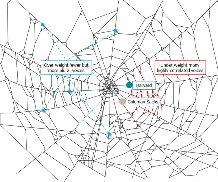
It's multipurpose. First, gather online our distinctive social features. Second, highlight and categorize social relationships between entities and people to create a spiderweb of networks.
1. 🌐 Reducing online manipulation: Only socially rich or respectable crypto wallets can participate in projects, ensuring that no one can create several wallets to influence decentralized project governance.
2. 🤝 Improving social links: Some sectors of society lack social context. Racism, sexism, and homophobia do that. Public wallets can help identify and connect distinct social groupings.
3. 👩❤️💋👨 Increasing pluralism: Soulbound tokens can ensure that socially connected wallets have less voting power online to increase pluralism. We can also overweight a minority of numerous voices.
4. 💰Making more informed decisions: Taking out an insurance policy requires a life review. Why not loans? Character isn't limited by income, and many people need a chance.
5. 🎶 Finding a community: Soulbound tokens are accessible to everyone. This means we can find people who are like us but also different. This is probably rare among your friends and family.
NFTs are dangerous, and I don't like them. Social credit score, privacy, lost wallet. We must stay informed and keep talking to innovators.
E. Glen Weyl, Puja Ohlhaver and Vitalik Buterin get all the credit for these ideas, having written the very accessible white paper “Decentralized Society: Finding Web3’s Soul”.
You might also like

Jari Roomer
3 years ago
5 ways to never run out of article ideas
“Perfectionism is the enemy of the idea muscle. " — James Altucher

Writer's block is a typical explanation for low output. Success requires productivity.
In four years of writing, I've never had writer's block. And you shouldn't care.
You'll never run out of content ideas if you follow a few tactics. No, I'm not overpromising.
Take Note of Ideas
Brains are strange machines. Blank when it's time to write. Idiot. Nothing. We get the best article ideas when we're away from our workstation.
In the shower
Driving
In our dreams
Walking
During dull chats
Meditating
In the gym
No accident. The best ideas come in the shower, in nature, or while exercising.
(Your workstation is the worst place for creativity.)
The brain has time and space to link 'dots' of information during rest. It's eureka! New idea.
If you're serious about writing, capture thoughts as they come.
Immediately write down a new thought. Capture it. Don't miss it. Your future self will thank you.
As a writer, entrepreneur, or creative, letting ideas slide is bad.
I recommend using Evernote, Notion, or your device's basic note-taking tool to capture article ideas.
It doesn't matter whatever app you use as long as you collect article ideas.
When you practice 'idea-capturing' enough, you'll have an unending list of article ideas when writer's block hits.
High-Quality Content
More books, films, Medium pieces, and Youtube videos I consume, the more I'm inspired to write.
What you eat shapes who you are.
Celebrity gossip and fear-mongering news won't help your writing. It won't help you write regularly.
Instead, read expert-written books. Watch documentaries to improve your worldview. Follow amazing people online.
Develop your 'idea muscle' Daily creativity takes practice. The more you exercise your 'idea muscles,' the easier it is to generate article ideas.
I've trained my 'concept muscle' using James Altucher's exercise.
Write 10 ideas daily.
Write ten book ideas every day if you're an author. Write down 10 business ideas per day if you're an entrepreneur. Write down 10 investing ideas per day.
Write 10 article ideas per day. You become a content machine.
It doesn't state you need ten amazing ideas. You don't need 10 ideas. Ten ideas, regardless of quality.
Like at the gym, reps are what matter. With each article idea, you gain creativity. Writer's block is no match for this workout.
Quit Perfectionism
Perfectionism is bad for writers. You'll have bad articles. You'll have bad ideas. OK. It's creative.
Writing success requires prolificacy. You can't have 'perfect' articles.
“Perfectionism is the enemy of the idea muscle. Perfectionism is your brain trying to protect you from harm.” — James Altucher
Vincent van Gogh painted 900 pieces. The Starry Night is the most famous.
Thomas Edison invented 1093 things, but not all were as important as the lightbulb or the first movie camera.
Mozart composed nearly 600 compositions, but only Serenade No13 became popular.
Always do your best. Perfectionism shouldn't stop you from working. Write! Publicize. Make. Even if imperfect.
Write Your Story
Living an interesting life gives you plenty to write about. If you travel a lot, share your stories or lessons learned.
Describe your business's successes and shortcomings.
Share your experiences with difficulties or addictions.
More experiences equal more writing material.
If you stay indoors, perusing social media, you won't be inspired to write.
Have fun. Travel. Strive. Build a business. Be bold. Live a life worth writing about, and you won't run out of material.

Jared Heyman
3 years ago
The survival and demise of Y Combinator startups
I've written a lot about Y Combinator's success, but as any startup founder or investor knows, many startups fail.
Rebel Fund invests in the top 5-10% of new Y Combinator startups each year, so we focus on identifying and supporting the most promising technology startups in our ecosystem. Given the power law dynamic and asymmetric risk/return profile of venture capital, we worry more about our successes than our failures. Since the latter still counts, this essay will focus on the proportion of YC startups that fail.
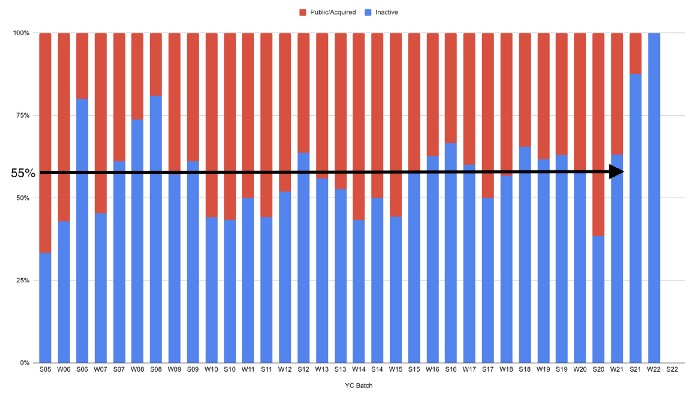
Since YC's launch in 2005, the figure below shows the percentage of active, inactive, and public/acquired YC startups by batch.
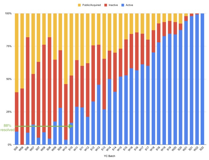
As more startups finish, the blue bars (active) decrease significantly. By 12 years, 88% of startups have closed or exited. Only 7% of startups reach resolution each year.
YC startups by status after 12 years:
Half the startups have failed, over one-third have exited, and the rest are still operating.
In venture investing, it's said that failed investments show up before successful ones. This is true for YC startups, but only in their early years.
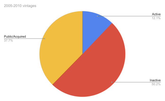
Below, we only present resolved companies from the first chart. Some companies fail soon after establishment, but after a few years, the inactive vs. public/acquired ratio stabilizes around 55:45. After a few years, a YC firm is roughly as likely to quit as fail, which is better than I imagined.
I prepared this post because Rebel investors regularly question me about YC startup failure rates and how long it takes for them to exit or shut down.
Early-stage venture investors can overlook it because 100x investments matter more than 0x investments.
YC founders can ignore it because it shouldn't matter if many of their peers succeed or fail ;)

Camilla Dudley
3 years ago
How to gain Twitter followers: A 101 Guide

No wonder brands use Twitter to reach their audience. 53% of Twitter users buy new products first.
Twitter growth does more than make your brand look popular. It helps clients trust your business. It boosts your industry standing. It shows clients, prospects, and even competitors you mean business.
How can you naturally gain Twitter followers?
Share useful information
Post visual content
Tweet consistently
Socialize
Spread your @name everywhere.
Use existing customers
Promote followers
Share useful information
Twitter users join conversations and consume material. To build your followers, make sure your material appeals to them and gives value, whether it's sales, product lessons, or current events.
Use Twitter Analytics to learn what your audience likes.
Explore popular topics by utilizing relevant keywords and hashtags. Check out this post on how to use Twitter trends.
Post visual content
97% of Twitter users focus on images, so incorporating media can help your Tweets stand out. Visuals and videos make content more engaging and memorable.
Tweet often
Your audience should expect regular content updates. Plan your ideas and tweet during crucial seasons and events with a content calendar.
Socialize
Twitter connects people. Do more than tweet. Follow industry leaders. Retweet influencers, engage with thought leaders, and reply to mentions and customers to boost engagement.
Micro-influencers can promote your brand or items. They can help you gain new audiences' trust.
Spread your @name everywhere.
Maximize brand exposure. Add a follow button on your website, link to it in your email signature and newsletters, and promote it on business cards or menus.
Use existing customers
Emails can be used to find existing Twitter clients. Upload your email contacts and follow your customers on Twitter to start a dialogue.
Promote followers
Run a followers campaign to boost your organic growth. Followers campaigns promote your account to a particular demographic, and you only pay when someone follows you.
Consider short campaigns to enhance momentum or an always-on campaign to gain new followers.
Increasing your brand's Twitter followers takes effort and experimentation, but the payback is huge.
👋 Follow me on twitter