


More on NFTs & Art

middlemarch.eth
3 years ago
ERC721R: A new ERC721 contract for random minting so people don’t snipe all the rares!
That is, how to snipe all the rares without using ERC721R!
Introduction: Blessed and Lucky
Mphers was the first mfers derivative, and as a Phunks derivative, I wanted one.
I wanted an alien. And there are only 8 in the 6,969 collection. I got one!
In case it wasn't clear from the tweet, I meant that I was lucky to have figured out how to 100% guarantee I'd get an alien without any extra luck.
Read on to find out how I did it, how you can too, and how developers can avoid it!
How to make rare NFTs without luck.
# How to mint rare NFTs without needing luck
The key to minting a rare NFT is knowing the token's id ahead of time.
For example, once I knew my alien was #4002, I simply refreshed the mint page until #3992 was minted, and then mint 10 mphers.
How did I know #4002 was extraterrestrial? Let's go back.
First, go to the mpher contract's Etherscan page and look up the tokenURI of a previously issued token, token #1:
As you can see, mphers creates metadata URIs by combining the token id and an IPFS hash.
This method gives you the collection's provenance in every URI, and while that URI can be changed, it affects everyone and is public.
Consider a token URI without a provenance hash, like https://mphers.art/api?tokenId=1.
As a collector, you couldn't be sure the devs weren't changing #1's metadata at will.
The API allows you to specify “if #4002 has not been minted, do not show any information about it”, whereas IPFS does not allow this.
It's possible to look up the metadata of any token, whether or not it's been minted.
Simply replace the trailing “1” with your desired id.
Mpher #4002
These files contain all the information about the mpher with the specified id. For my alien, we simply search all metadata files for the string “alien mpher.”
Take a look at the 6,969 meta-data files I'm using OpenSea's IPFS gateway, but you could use ipfs.io or something else.
Use curl to download ten files at once. Downloading thousands of files quickly can lead to duplicates or errors. But with a little tweaking, you should be able to get everything (and dupes are fine for our purposes).
Now that you have everything in one place, grep for aliens:
The numbers are the file names that contain “alien mpher” and thus the aliens' ids.
The entire process takes under ten minutes. This technique works on many NFTs currently minting.
In practice, manually minting at the right time to get the alien is difficult, especially when tokens mint quickly. Then write a bot to poll totalSupply() every second and submit the mint transaction at the exact right time.
You could even look for the token you need in the mempool before it is minted, and get your mint into the same block!
However, in my experience, the “big” approach wins 95% of the time—but not 100%.
“Am I being set up all along?”
Is a question you might ask yourself if you're new to this.
It's disheartening to think you had no chance of minting anything that someone else wanted.
But, did you have no opportunity? You had an equal chance as everyone else!
Take me, for instance: I figured this out using open-source tools and free public information. Anyone can do this, and not understanding how a contract works before minting will lead to much worse issues.
The mpher mint was fair.
While a fair game, “snipe the alien” may not have been everyone's cup of tea.
People may have had more fun playing the “mint lottery” where tokens were distributed at random and no one could gain an advantage over someone simply clicking the “mint” button.
How might we proceed?
Minting For Fashion Hats Punks, I wanted to create a random minting experience without sacrificing fairness. In my opinion, a predictable mint beats an unfair one. Above all, participants must be equal.
Sadly, the most common method of creating a random experience—the post-mint “reveal”—is deeply unfair. It works as follows:
- During the mint, token metadata is unavailable. Instead, tokenURI() returns a blank JSON file for each id.
- An IPFS hash is updated once all tokens are minted.
- You can't tell how the contract owner chose which token ids got which metadata, so it appears random.
Because they alone decide who gets what, the person setting the metadata clearly has a huge unfair advantage over the people minting. Unlike the mpher mint, you have no chance of winning here.
But what if it's a well-known, trusted, doxxed dev team? Are reveals okay here?
No! No one should be trusted with such power. Even if someone isn't consciously trying to cheat, they have unconscious biases. They might also make a mistake and not realize it until it's too late, for example.
You should also not trust yourself. Imagine doing a reveal, thinking you did it correctly (nothing is 100%! ), and getting the rarest NFT. Isn't that a tad odd Do you think you deserve it? An NFT developer like myself would hate to be in this situation.
Reveals are bad*
UNLESS they are done without trust, meaning everyone can verify their fairness without relying on the developers (which you should never do).
An on-chain reveal powered by randomness that is verifiably outside of anyone's control is the most common way to achieve a trustless reveal (e.g., through Chainlink).
Tubby Cats did an excellent job on this reveal, and I highly recommend their contract and launch reflections. Their reveal was also cool because it was progressive—you didn't have to wait until the end of the mint to find out.
In his post-launch reflections, @DefiLlama stated that he made the contract as trustless as possible, removing as much trust as possible from the team.
In my opinion, everyone should know the rules of the game and trust that they will not be changed mid-stream, while trust minimization is critical because smart contracts were designed to reduce trust (and it makes it impossible to hack even if the team is compromised). This was a huge mistake because it limited our flexibility and our ability to correct mistakes.
And @DefiLlama is a superstar developer. Imagine how much stress maximizing trustlessness will cause you!
That leaves me with a bad solution that works in 99 percent of cases and is much easier to implement: random token assignments.
Introducing ERC721R: A fully compliant IERC721 implementation that picks token ids at random.
ERC721R implements the opposite of a reveal: we mint token ids randomly and assign metadata deterministically.
This allows us to reveal all metadata prior to minting while reducing snipe chances.
Then import the contract and use this code:
What is ERC721R and how does it work
First, a disclaimer: ERC721R isn't truly random. In this sense, it creates the same “game” as the mpher situation, where minters compete to exploit the mint. However, ERC721R is a much more difficult game.
To game ERC721R, you need to be able to predict a hash value using these inputs:
This is impossible for a normal person because it requires knowledge of the block timestamp of your mint, which you do not have.
To do this, a miner must set the timestamp to a value in the future, and whatever they do is dependent on the previous block's hash, which expires in about ten seconds when the next block is mined.
This pseudo-randomness is “good enough,” but if big money is involved, it will be gamed. Of course, the system it replaces—predictable minting—can be manipulated.
The token id is chosen in a clever implementation of the Fisher–Yates shuffle algorithm that I copied from CryptoPhunksV2.
Consider first the naive solution: (a 10,000 item collection is assumed):
- Make an array with 0–9999.
- To create a token, pick a random item from the array and use that as the token's id.
- Remove that value from the array and shorten it by one so that every index corresponds to an available token id.
This works, but it uses too much gas because changing an array's length and storing a large array of non-zero values is expensive.
How do we avoid them both? What if we started with a cheap 10,000-zero array? Let's assign an id to each index in that array.
Assume we pick index #6500 at random—#6500 is our token id, and we replace the 0 with a 1.
But what if we chose #6500 again? A 1 would indicate #6500 was taken, but then what? We can't just "roll again" because gas will be unpredictable and high, especially later mints.
This allows us to pick a token id 100% of the time without having to keep a separate list. Here's how it works:
- Make a 10,000 0 array.
- Create a 10,000 uint numAvailableTokens.
- Pick a number between 0 and numAvailableTokens. -1
- Think of #6500—look at index #6500. If it's 0, the next token id is #6500. If not, the value at index #6500 is your next token id (weird!)
- Examine the array's last value, numAvailableTokens — 1. If it's 0, move the value at #6500 to the end of the array (#9999 if it's the first token). If the array's last value is not zero, update index #6500 to store it.
- numAvailableTokens is decreased by 1.
- Repeat 3–6 for the next token id.
So there you go! The array stays the same size, but we can choose an available id reliably. The Solidity code is as follows:
Unfortunately, this algorithm uses more gas than the leading sequential mint solution, ERC721A.
This is most noticeable when minting multiple tokens in one transaction—a 10 token mint on ERC721R costs 5x more than on ERC721A. That said, ERC721A has been optimized much further than ERC721R so there is probably room for improvement.
Conclusion
Listed below are your options:
- ERC721A: Minters pay lower gas but must spend time and energy devising and executing a competitive minting strategy or be comfortable with worse minting results.
- ERC721R: Higher gas, but the easy minting strategy of just clicking the button is optimal in all but the most extreme cases. If miners game ERC721R it’s the worst of both worlds: higher gas and a ton of work to compete.
- ERC721A + standard reveal: Low gas, but not verifiably fair. Please do not do this!
- ERC721A + trustless reveal: The best solution if done correctly, highly-challenging for dev, potential for difficult-to-correct errors.
Did I miss something? Comment or tweet me @dumbnamenumbers.
Check out the code on GitHub to learn more! Pull requests are welcome—I'm sure I've missed many gas-saving opportunities.
Thanks!
Read the original post here

nft now
3 years ago
A Guide to VeeFriends and Series 2
VeeFriends is one of the most popular and unique NFT collections. VeeFriends launched around the same time as other PFP NFTs like Bored Ape Yacht Club.
Vaynerchuk (GaryVee) took a unique approach to his large-scale project, which has influenced the NFT ecosystem. GaryVee's VeeFriends is one of the most successful NFT membership use-cases, allowing him to build a community around his creative and business passions.
What is VeeFriends?
GaryVee's NFT collection, VeeFriends, was released on May 11, 2021. VeeFriends [Mini Drops], Book Games, and a forthcoming large-scale "Series 2" collection all stem from the initial drop of 10,255 tokens.
In "Series 1," there are G.O.O. tokens (Gary Originally Owned). GaryVee reserved 1,242 NFTs (over 12% of the supply) for his own collection, so only 9,013 were available at the Series 1 launch.
Each Series 1 token represents one of 268 human traits hand-drawn by Vaynerchuk. Gary Vee's NFTs offer owners incentives.
Who made VeeFriends?
Gary Vaynerchuk, AKA GaryVee, is influential in NFT. Vaynerchuk is the chairman of New York-based communications company VaynerX. Gary Vee, CEO of VaynerMedia, VaynerSports, and bestselling author, is worth $200 million.
GaryVee went from NFT collector to creator, launching VaynerNFT to help celebrities and brands.
Vaynerchuk's influence spans the NFT ecosystem as one of its most prolific voices. He's one of the most influential NFT figures, and his VeeFriends ecosystem keeps growing.
Vaynerchuk, a trend expert, thinks NFTs will be around for the rest of his life and VeeFriends will be a landmark project.
Why use VeeFriends NFTs?
The first VeeFriends collection has sold nearly $160 million via OpenSea. GaryVee insisted that the first 10,255 VeeFriends were just the beginning.
Book Games were announced to the VeeFriends community in August 2021. Mini Drops joined VeeFriends two months later.
Book Games
GaryVee's book "Twelve and a Half: Leveraging the Emotional Ingredients for Business Success" inspired Book Games. Even prior to the announcement Vaynerchuk had mapped out the utility of the book on an NFT scale. Book Games tied his book to the VeeFriends ecosystem and solidified its place in the collection.
GaryVee says Book Games is a layer 2 NFT project with 125,000 burnable tokens. Vaynerchuk's NFT fans were incentivized to buy as many copies of his new book as possible to receive NFT rewards later.
First, a bit about “layer 2.”
Layer 2 blockchain solutions help scale applications by routing transactions away from Ethereum Mainnet (layer 1). These solutions benefit from Mainnet's decentralized security model but increase transaction speed and reduce gas fees.
Polygon (integrated into OpenSea) and Immutable X are popular Ethereum layer 2 solutions. GaryVee chose Immutable X to reduce gas costs (transaction fees). Given the large supply of Book Games tokens, this decision will likely benefit the VeeFriends community, especially if the games run forever.
What's the strategy?
The VeeFriends patriarch announced on Aug. 27, 2021, that for every 12 books ordered during the Book Games promotion, customers would receive one NFT via airdrop. After nearly 100 days, GV sold over a million copies and announced that Book Games would go gamified on Jan. 10, 2022.
Immutable X's trading options make Book Games a "game." Book Games players can trade NFTs for other NFTs, sports cards, VeeCon tickets, and other prizes. Book Games can also whitelist other VeeFirends projects, which we'll cover in Series 2.
VeeFriends Mini Drops
GaryVee launched VeeFriends Mini Drops two months after Book Games, focusing on collaboration, scarcity, and the characters' "cultural longevity."
Spooky Vees, a collection of 31 1/1 Halloween-themed VeeFriends, was released on Halloween. First-come, first-served VeeFriend owners could claim these NFTs.
Mini Drops includes Gift Goat NFTs. By holding the Gift Goat VeeFriends character, collectors will receive 18 exclusive gifts curated by GaryVee and the team. Each gifting experience includes one physical gift and one NFT out of 555, to match the 555 Gift Goat tokens.
Gift Goat holders have gotten NFTs from Danny Cole (Creature World), Isaac "Drift" Wright (Where My Vans Go), Pop Wonder, and more.
GaryVee is poised to release the largest expansion of the VeeFriends and VaynerNFT ecosystem to date with VeeFriends Series 2.
VeeCon 101
By owning VeeFriends NFTs, collectors can join the VeeFriends community and attend VeeCon in 2022. The conference is only open to VeeCon NFT ticket holders (VeeFreinds + possibly more TBA) and will feature Beeple, Steve Aoki, and even Snoop Dogg.
The VeeFreinds floor in 2022 Q1 has remained at 16 ETH ($52,000), making VeeCon unattainable for most NFT enthusiasts. Why would someone spend that much crypto on a Minneapolis "superconference" ticket? Because of Gary Vaynerchuk.
Everything to know about VeeFriends Series 2
Vaynerchuk revealed in April 2022 that the VeeFriends ecosystem will grow by 55,555 NFTs after months of teasing.
With VeeFriends Series 2, each token will cost $995 USD in ETH, allowing NFT enthusiasts to join at a lower cost. The new series will be released on multiple dates in April.
Book Games NFT holders on the Friends List (whitelist) can mint Series 2 NFTs on April 12. Book Games holders have 32,000 NFTs.
VeeFriends Series 1 NFT holders can claim Series 2 NFTs on April 12. This allotment's supply is 10,255, like Series 1's.
On April 25, the public can buy 10,000 Series 2 NFTs. Unminted Friends List NFTs will be sold on this date, so this number may change.
The VeeFriends ecosystem will add 15 new characters (220 tokens each) on April 27. One character will be released per day for 15 days, and the only way to get one is to enter a daily raffle with Book Games tokens.
Series 2 NFTs won't give owners VeeCon access, but they will offer other benefits within the VaynerNFT ecosystem. Book Games and Series 2 will get new token burn mechanics in the upcoming drop.
Visit the VeeFriends blog for the latest collection info.
Where can you buy Gary Vee’s NFTs?
Need a VeeFriend NFT? Gary Vee recommends doing "50 hours of homework" before buying. OpenSea sells VeeFriends NFTs.

Web3Lunch
3 years ago
An employee of OpenSea might get a 40-year prison sentence for insider trading using NFTs.

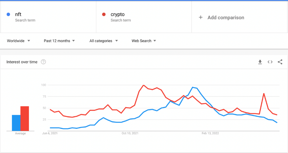
The space had better days. Those greenish spikes...oh wow, haven't felt that in ages. Cryptocurrencies and NFTs have lost popularity. Google agrees. Both are declining.
As seen below, crypto interest spiked in May because of the Luna fall. NFT interest is similar to early October last year.
This makes me think NFTs are mostly hype and FOMO. No art or community. I've seen enough initiatives to know that communities stick around if they're profitable. Once it starts falling, they move on to the next project. The space has no long-term investments. Flip everything.
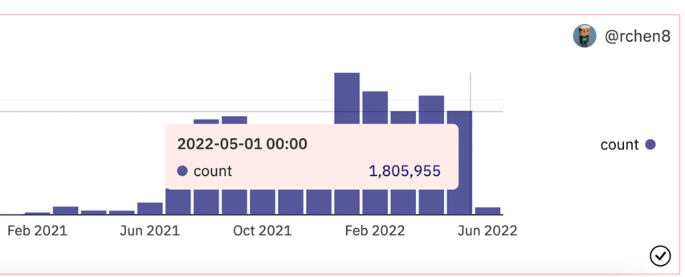
OpenSea trading volume has stayed steady for months. May's volume is 1.8 million ETH ($3.3 billion).
Despite this, I think NFTs and crypto will stick around. In bad markets, builders gain most.
Only 4k developers are active on Ethereum blockchain. It's low. A great chance for the space enthusiasts.
An employee of OpenSea might get a 40-year prison sentence for insider trading using NFTs.
Nathaniel Chastian, an OpenSea employee, traded on insider knowledge. He'll serve 40 years for that.
Here's what happened if you're unfamiliar.
OpenSea is a secondary NFT marketplace. Their homepage featured remarkable drops. Whatever gets featured there, NFT prices will rise 5x.
Chastian was at OpenSea. He chose forthcoming NFTs for OpenSeas' webpage.
Using anonymous digital currency wallets and OpenSea accounts, he would buy NFTs before promoting them on the homepage, showcase them, and then sell them for at least 25 times the price he paid.
From June through September 2021, this happened. Later caught, fired. He's charged with wire fraud and money laundering, each carrying a 20-year maximum penalty.
Although web3 space is all about decentralization, a step like this is welcomed since it restores faith in the area. We hope to see more similar examples soon.
Here's the press release.
Understanding smart contracts
@cantino.eth has a Twitter thread on smart contracts. Must-read. Also, he appears educated about the space, so follow him.

You might also like

Rishi Dean
3 years ago
Coinbase's web3 app
Use popular Ethereum dapps with Coinbase’s new dapp wallet and browser
Tl;dr: This post highlights the ability to access web3 directly from your Coinbase app using our new dapp wallet and browser.
Decentralized autonomous organizations (DAOs) and decentralized finance (DeFi) have gained popularity in the last year (DAOs). The total value locked (TVL) of DeFi investments on the Ethereum blockchain has grown to over $110B USD, while NFTs sales have grown to over $30B USD in the last 12 months (LTM). New innovative real-world applications are emerging every day.
Today, a small group of Coinbase app users can access Ethereum-based dapps. Buying NFTs on Coinbase NFT and OpenSea, trading on Uniswap and Sushiswap, and borrowing and lending on Curve and Compound are examples.
Our new dapp wallet and dapp browser enable you to access and explore web3 directly from your Coinbase app.
Web3 in the Coinbase app
Users can now access dapps without a recovery phrase. This innovative dapp wallet experience uses Multi-Party Computation (MPC) technology to secure your on-chain wallet. This wallet's design allows you and Coinbase to share the 'key.' If you lose access to your device, the key to your dapp wallet is still safe and Coinbase can help recover it.
Set up your new dapp wallet by clicking the "Browser" tab in the Android app's navigation bar. Once set up, the Coinbase app's new dapp browser lets you search, discover, and use Ethereum-based dapps.
Looking forward
We want to enable everyone to seamlessly and safely participate in web3, and today’s launch is another step on that journey. We're rolling out the new dapp wallet and browser in the US on Android first to a small subset of users and plan to expand soon. Stay tuned!

Sam Hickmann
3 years ago
Donor-Advised Fund Tax Benefits (DAF)
Giving through a donor-advised fund can be tax-efficient. Using a donor-advised fund can reduce your tax liability while increasing your charitable impact.
Grow Your Donations Tax-Free.
Your DAF's charitable dollars can be invested before being distributed. Your DAF balance can grow with the market. This increases grantmaking funds. The assets of the DAF belong to the charitable sponsor, so you will not be taxed on any growth.
Avoid a Windfall Tax Year.
DAFs can help reduce tax burdens after a windfall like an inheritance, business sale, or strong market returns. Contributions to your DAF are immediately tax deductible, lowering your taxable income. With DAFs, you can effectively pre-fund years of giving with assets from a single high-income event.
Make a contribution to reduce or eliminate capital gains.
One of the most common ways to fund a DAF is by gifting publicly traded securities. Securities held for more than a year can be donated at fair market value and are not subject to capital gains tax. If a donor liquidates assets and then donates the proceeds to their DAF, capital gains tax reduces the amount available for philanthropy. Gifts of appreciated securities, mutual funds, real estate, and other assets are immediately tax deductible up to 30% of Adjusted gross income (AGI), with a five-year carry-forward for gifts that exceed AGI limits.
Using Appreciated Stock as a Gift
Donating appreciated stock directly to a DAF rather than liquidating it and donating the proceeds reduces philanthropists' tax liability by eliminating capital gains tax and lowering marginal income tax.
In the example below, a donor has $100,000 in long-term appreciated stock with a cost basis of $10,000:
Using a DAF would allow this donor to give more to charity while paying less taxes. This strategy often allows donors to give more than 20% more to their favorite causes.
For illustration purposes, this hypothetical example assumes a 35% income tax rate. All realized gains are subject to the federal long-term capital gains tax of 20% and the 3.8% Medicare surtax. No other state taxes are considered.
The information provided here is general and educational in nature. It is not intended to be, nor should it be construed as, legal or tax advice. NPT does not provide legal or tax advice. Furthermore, the content provided here is related to taxation at the federal level only. NPT strongly encourages you to consult with your tax advisor or attorney before making charitable contributions.

James White
3 years ago
Ray Dalio suggests reading these three books in 2022.
An inspiring reading list
I'm no billionaire or hedge-fund manager. My bank account doesn't have millions. Ray Dalio's love of reading motivates me to think differently.
Here are some books recommended by Ray Dalio. Each influenced me. Hope they'll help you.
Sapiens by Yuval Noah Harari
Page Count: 512
Rating on Goodreads: 4.39
My favorite nonfiction book.
Sapiens explores human evolution. It explains how Homo Sapiens developed from hunter-gatherers to a dominant species. Amazing!
Sapiens will teach you about human history. Yuval Noah Harari has a follow-up book on human evolution.
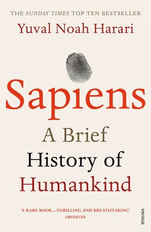
My favorite book quotes are:
The tendency for luxuries to turn into necessities and give rise to new obligations is one of history's few unbreakable laws.
Happiness is not dependent on material wealth, physical health, or even community. Instead, it depends on how closely subjective expectations and objective circumstances align.
The romantic comparison between today's industry, which obliterates the environment, and our forefathers, who coexisted well with nature, is unfounded. Homo sapiens held the record among all organisms for eradicating the most plant and animal species even before the Industrial Revolution. The unfortunate distinction of being the most lethal species in the history of life belongs to us.
The Power Of Habit by Charles Duhigg
Page Count: 375
Rating on Goodreads: 4.13
Great book: The Power Of Habit. It illustrates why habits are everything. The book explains how healthier habits can improve your life, career, and society.
The Power of Habit rocks. It's a great book on productivity. Its suggestions helped me build healthier behaviors (and drop bad ones).
Read ASAP!
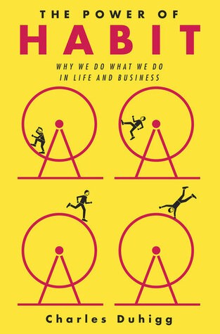
My favorite book quotes are:
Change may not occur quickly or without difficulty. However, almost any behavior may be changed with enough time and effort.
People who exercise begin to eat better and produce more at work. They are less smokers and are more patient with friends and family. They claim to feel less anxious and use their credit cards less frequently. A fundamental habit that sparks broad change is exercise.
Habits are strong but also delicate. They may develop independently of our awareness or may be purposefully created. They frequently happen without our consent, but they can be altered by changing their constituent pieces. They have a much greater influence on how we live than we realize; in fact, they are so powerful that they cause our brains to adhere to them above all else, including common sense.
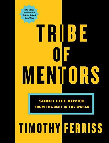
Tribe Of Mentors by Tim Ferriss
Page Count: 561
Rating on Goodreads: 4.06
Unusual book structure. It's worth reading if you want to learn from successful people.
The book is Q&A-style. Tim questions everyone. Each chapter features a different person's life-changing advice. In the book, Pressfield, Willink, Grylls, and Ravikant are interviewed.
Amazing!
My favorite book quotes are:
According to one's courage, life can either get smaller or bigger.
Don't engage in actions that you are aware are immoral. The reputation you have with yourself is all that constitutes self-esteem. Always be aware.
People mistakenly believe that focusing means accepting the task at hand. However, that is in no way what it represents. It entails rejecting the numerous other worthwhile suggestions that exist. You must choose wisely. Actually, I'm just as proud of the things we haven't accomplished as I am of what I have. Saying no to 1,000 things is what innovation is.