


More on Marketing

Francesca Furchtgott
3 years ago
Giving customers what they want or betraying the values of the brand?
A J.Crew collaboration for fashion label Eveliina Vintage is not a paradox; it is a solution.

Eveliina Vintage's capsule collection debuted yesterday at J.Crew. This J.Crew partnership stopped me in my tracks.
Eveliina Vintage sells vintage goods. Eeva Musacchia founded the shop in Finland in the 1970s. It's recognized for its one-of-a-kind slip dresses from the 1930s and 1940s.
I wondered why a vintage brand would partner with a mass shop. Fast fashion against vintage shopping? Will Eveliina Vintages customers be turned off?
But Eveliina Vintages customers don't care about sustainability. They want Eveliina's Instagram look. Eveliina Vintage collaborated with J.Crew to give customers what they wanted: more Eveliina at a lower price.
Vintage: A Fashion Option That Is Eco-Conscious
Secondhand shopping is a trendy response to quick fashion. J.Crew releases hundreds of styles annually. Waste and environmental damage have been criticized. A pair of jeans requires 1,800 gallons of water. J.Crew's limited-time deals promote more purchases. J.Crew items are likely among those Americans wear 7 times before discarding.
Consumers and designers have emphasized sustainability in recent years. Stella McCartney and Eileen Fisher are popular eco-friendly brands. They've also flocked to ThredUp and similar sites.
Gap, Levis, and Allbirds have listened to consumer requests. They promote recycling, ethical sourcing, and secondhand shopping.
Secondhand shoppers feel good about reusing and recycling clothing that might have ended up in a landfill.
Eco-conscious fashionistas shop vintage. These shoppers enjoy the thrill of the hunt (that limited-edition Chanel bag!) and showing off a unique piece (nobody will have my look!). They also reduce their environmental impact.
Is Eveliina Vintage capitalizing on an aesthetic or is it a sustainable brand?
Eveliina Vintage emphasizes environmental responsibility. Vogue's Amanda Musacchia emphasized sustainability. Amanda, founder Eeva's daughter, is a company leader.
But Eveliina's press message doesn't address sustainability, unlike Instagram. Scarcity and fame rule.
Eveliina Vintages Instagram has see-through dresses and lace-trimmed slip dresses. Celebrities and influencers are often photographed in Eveliina's apparel, which has 53,000+ followers. Vogue appreciates Eveliina's style. Multiple publications discuss Alexa Chung's Eveliina dress.
Eveliina Vintage markets its one-of-a-kind goods. It teases future content, encouraging visitors to return. Scarcity drives demand and raises clothing prices. One dress is $1,600+, but most are $500-$1,000.
The catch: Eveliina can't monetize its expanding popularity due to exorbitant prices and limited quantity. Why?
Most people struggle to pay for their clothing. But Eveliina Vintage lacks those more affordable entry-level products, in contrast to other luxury labels that sell accessories or perfume.
Many people have trouble fitting into their clothing. The bodies of most women in the past were different from those for which vintage clothing was designed. Each Eveliina dress's specific measurements are mentioned alongside it. Be careful, you can fall in love with an ill-fitting dress.
No matter how many people can afford it and fit into it, there is only one item to sell. To get the item before someone else does, those people must be on the Eveliina Vintage website as soon as it becomes available.
A Way for Eveliina Vintage to Make Money (and Expand) with J.Crew Its following
Eveliina Vintages' cooperation with J.Crew makes commercial sense.
This partnership spreads Eveliina's style. Slightly better pricing The $390 outfits have multicolored slips and gauzy cotton gowns. Sizes range from 00 to 24, which is wider than vintage racks.
Eveliina Vintage customers like the combination. Excited comments flood the brand's Instagram launch post. Nobody is mocking the 50-year-old vintage brand's fast-fashion partnership.
Vintage may be a sustainable fashion trend, but that's not why Eveliina's clients love the brand. They only care about the old look.
And that is a tale as old as fashion.

Victoria Kurichenko
3 years ago
What Happened After I Posted an AI-Generated Post on My Website
This could cost you.

Content creators may have heard about Google's "Helpful content upgrade."
This change is another Google effort to remove low-quality, repetitive, and AI-generated content.
Why should content creators care?
Because too much content manipulates search results.
My experience includes the following.
Website admins seek high-quality guest posts from me. They send me AI-generated text after I say "yes." My readers are irrelevant. Backlinks are needed.
Companies copy high-ranking content to boost their Google rankings. Unfortunately, it's common.
What does this content offer?
Nothing.
Despite Google's updates and efforts to clean search results, webmasters create manipulative content.
As a marketer, I knew about AI-powered content generation tools. However, I've never tried them.
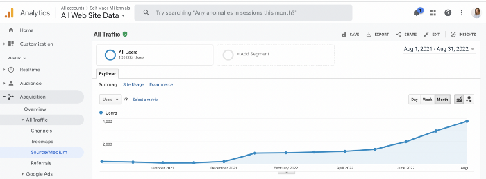
I use old-fashioned content creation methods to grow my website from 0 to 3,000 monthly views in one year.
Last year, I launched a niche website.
I do keyword research, analyze search intent and competitors' content, write an article, proofread it, and then optimize it.
This strategy is time-consuming.
But it yields results!
Here's proof from Google Analytics:
Proven strategies yield promising results.
To validate my assumptions and find new strategies, I run many experiments.
I tested an AI-powered content generator.
I used a tool to write this Google-optimized article about SEO for startups.
I wanted to analyze AI-generated content's Google performance.
Here are the outcomes of my test.
First, quality.
I dislike "meh" content. I expect articles to answer my questions. If not, I've wasted my time.
My essays usually include research, personal anecdotes, and what I accomplished and achieved.
AI-generated articles aren't as good because they lack individuality.
Read my AI-generated article about startup SEO to see what I mean.
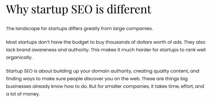
It's dry and shallow, IMO.
It seems robotic.
I'd use quotes and personal experience to show how SEO for startups is different.
My article paraphrases top-ranked articles on a certain topic.
It's readable but useless. Similar articles abound online. Why read it?
AI-generated content is low-quality.
Let me show you how this content ranks on Google.
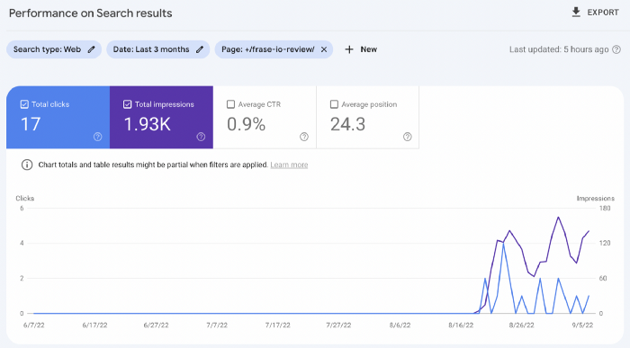
The Google Search Console report shows impressions, clicks, and average position.
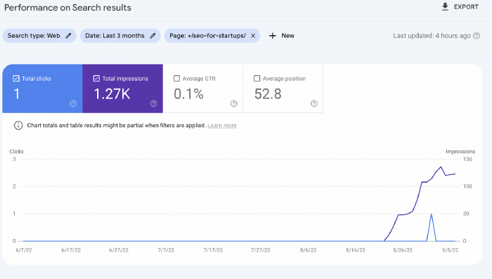
Low numbers.
No one opens the 5th Google search result page to read the article. Too far!
You may say the new article will improve.
Marketing-wise, I doubt it.
This article is shorter and less comprehensive than top-ranking pages. It's unlikely to win because of this.
AI-generated content's terrible reality.
I'll compare how this content I wrote for readers and SEO performs.
Both the AI and my article are fresh, but trends are emerging.
My article's CTR and average position are higher.
I spent a week researching and producing that piece, unlike AI-generated content. My expert perspective and unique consequences make it interesting to read.
Human-made.
In summary
No content generator can duplicate a human's tone, writing style, or creativity. Artificial content is always inferior.
Not "bad," but inferior.
Demand for content production tools will rise despite Google's efforts to eradicate thin content.
Most won't spend hours producing link-building articles. Costly.
As guest and sponsored posts, artificial content will thrive.
Before accepting a new arrangement, content creators and website owners should consider this.

Karo Wanner
3 years ago
This is how I started my Twitter account.
My 12-day results look good.
Twitter seemed for old people and politicians.
I thought the platform would die soon like Facebook.
The platform's growth stalled around 300m users between 2015 and 2019.
In 2020, Twitter grew and now has almost 400m users.
Niharikaa Kaur Sodhi built a business on Twitter while I was away, despite its low popularity.
When I read about the success of Twitter users in the past 2 years, I created an account and a 3-month strategy.
I'll see if it's worth starting Twitter in 2022.
Late or perfect? I'll update you. Track my Twitter growth. You can find me here.
My Twitter Strategy
My Twitter goal is to build a community and recruit members for Mindful Monday.
I believe mindfulness is the only way to solve problems like poverty, inequality, and the climate crisis.
The power of mindfulness is my mission.
Mindful Monday is your weekly reminder to live in the present moment. I send mindfulness tips every Monday.
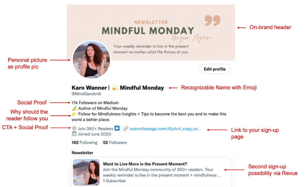
My Twitter profile promotes Mindful Monday and encourages people to join.
What I paid attention to:
I designed a brand-appropriate header to promote Mindful Monday.
Choose a profile picture. People want to know who you are.
I added my name as I do on Medium, Instagram, and emails. To stand out and be easily recognized, add an emoji if appropriate. Add what you want to be known for, such as Health Coach, Writer, or Newsletter.
People follow successful, trustworthy people. Describe any results you have. This could be views, followers, subscribers, or major news outlets. Create!
Tell readers what they'll get by following you. Can you help?
Add CTA to your profile. Your Twitter account's purpose. Give instructions. I placed my sign-up link next to the CTA to promote Mindful Monday. Josh Spector recommended this. (Thanks! Bonus tip: If you don't want the category to show in your profile, e.g. Entrepreneur, go to edit profile, edit professional profile, and choose 'Other'
Here's my Twitter:
I'm no expert, but I tried. Please share any additional Twitter tips and suggestions in the comments.
To hide your Revue newsletter subscriber count:
Join Revue. Select 'Hide Subscriber Count' in Account settings > Settings > Subscriber Count. Voila!
How frequently should you tweet?
1 to 20 Tweets per day, but consistency is key.
Stick to a daily tweet limit. Start with less and be consistent than the opposite.
I tweet 3 times per day. That's my comfort zone. Larger accounts tweet 5–7 times daily.
Do what works for you and that is the right amount.
Twitter is a long-term game, so plan your tweets for a year.
How to Batch Your Tweets?
Sunday batchs.
Sunday evenings take me 1.5 hours to create all my tweets for the week.
Use a word document and write down your posts. Podcasts, books, my own articles inspire me.
When I have a good idea or see a catchy Tweet, I take a screenshot.
To not copy but adapt.
Two pillars support my content:
(90% ~ 29 tweets per week) Inspirational quotes, mindfulness tips, zen stories, mistakes, myths, book recommendations, etc.
(10% 2 tweets per week) I share how I grow Mindful Monday with readers. This pillar promotes MM and behind-the-scenes content.
Second, I schedule all my Tweets using TweetDeck. I tweet at 7 a.m., 5 p.m., and 6 p.m.
Include Twitter Threads in your content strategy
Tweets are blog posts. In your first tweet, you include a headline, then tweet your content.
That’s how you create a series of connected Tweets.
What’s the point? You have more room to convince your reader you're an expert.
Add a call-to-action to your thread.
Follow for more like this
Newsletter signup (share your link)
Ask for retweet
One thread per week is my goal.
I'll schedule threads with Typefully. In the free version, you can schedule one Tweet, but that's fine.
Pin a thread to the top of your profile if it leads to your newsletter. So new readers see your highest-converting content first.
Tweet Medium posts
I also tweet Medium articles.
I schedule 1 weekly repost for 5 weeks after each publication. I share the same article daily for 5 weeks.
Every time I tweet, I include a different article quote, so even if the link is the same, the quote adds value.
Engage Other Experts
When you first create your account, few people will see it. Normal.
If you comment on other industry accounts, you can reach their large audience.
First, you need 50 to 100 followers. Here's my beginner tip.
15 minutes a day or when I have downtime, I comment on bigger accounts in my niche.
My 12-Day Results
Now let's look at the first data.
I had 32 followers on March 29. 12 followers in 11 days. I have 52 now.
Not huge, but growing rapidly.
Let's examine impressions/views.
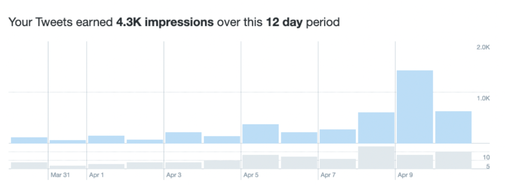
As a newbie, I gained 4,300 impressions/views in 12 days. On Medium, I got fewer views.
The 1,6k impressions per day spike comes from a larger account I mentioned the day before. First, I was shocked to see the spike and unsure of its origin.
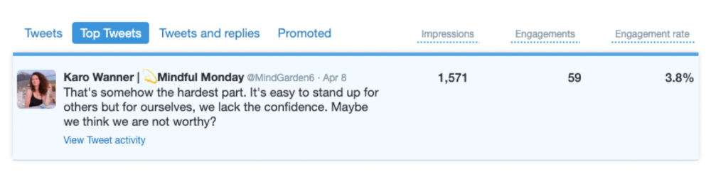
These results are promising given the effort required to be consistent on Twitter.
Let's see how my journey progresses. I'll keep you posted.
Tweeters, Does this content strategy make sense? What's wrong? Comment below.
Let's support each other on Twitter. Here's me.
Which Twitter strategy works for you in 2022?
This post is a summary. Read the full article here
You might also like

Jake Prins
3 years ago
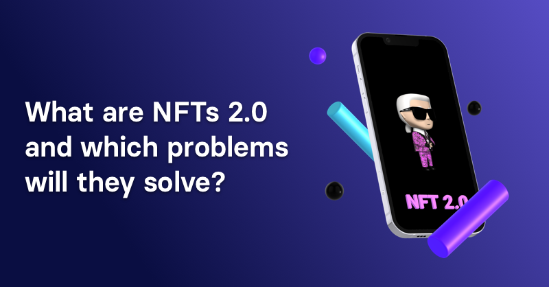
What are NFTs 2.0 and what issues are they meant to address?
New standards help NFTs reach their full potential.
NFTs lack interoperability and functionality. They have great potential but are mostly speculative. To maximize NFTs, we need flexible smart contracts.
Current requirements are too restrictive.
Most NFTs are based on ERC-721, which makes exchanging them easy. CryptoKitties, a popular online game, used the 2017 standard to demonstrate NFTs' potential.
This simple standard includes a base URI and incremental IDs for tokens. Add the tokenID to the base URI to get the token's metadata.
This let creators collect NFTs. Many NFT projects store metadata on IPFS, a distributed storage network, but others use Google Drive. NFT buyers often don't realize that if the creators delete or move the files, their NFT is just a pointer.
This isn't the standard's biggest issue. There's no way to validate NFT projects.
Creators are one of the most important aspects of art, but nothing is stored on-chain.
ERC-721 contracts only have a name and symbol.
Most of the data on OpenSea's collection pages isn't from the NFT's smart contract. It was added through a platform input field, so it's in the marketplace's database. Other websites may have different NFT information.
In five years, your NFT will be just a name, symbol, and ID.
Your NFT doesn't mention its creators. Although the smart contract has a public key, it doesn't reveal who created it.
The NFT's creators and their reputation are crucial to its value. Think digital fashion and big brands working with well-known designers when more professionals use NFTs. Don't you want them in your NFT?
Would paintings be as valuable if their artists were unknown? Would you believe it's real?
Buying directly from an on-chain artist would reduce scams. Current standards don't allow this data.
Most creator profiles live on centralized marketplaces and could disappear. Current platforms have outpaced underlying standards. The industry's standards are lagging.
For NFTs to grow beyond pointers to a monkey picture file, we may need to use new Web3-based standards.
Introducing NFTs 2.0
Fabian Vogelsteller, creator of ERC-20, developed new web3 standards. He proposed LSP7 Digital Asset and LSP8 Identifiable Digital Asset, also called NFT 2.0.
NFT and token metadata inputs are extendable. Changes to on-chain metadata inputs allow NFTs to evolve. Instead of public keys, the contract can have Universal Profile addresses attached. These profiles show creators' faces and reputations. NFTs can notify asset receivers, automating smart contracts.
LSP7 and LSP8 use ERC725Y. Using a generic data key-value store gives contracts much-needed features:
The asset can be customized and made to stand out more by allowing for unlimited data attachment.
Recognizing changes to the metadata
using a hash reference for metadata rather than a URL reference
This base will allow more metadata customization and upgradeability. These guidelines are:
Genuine and Verifiable Now, the creation of an NFT by a specific Universal Profile can be confirmed by smart contracts.
Dynamic NFTs can update Flexible & Updatable Metadata, allowing certain things to evolve over time.
Protected metadata Now, secure metadata that is readable by smart contracts can be added indefinitely.
Better NFTS prevent the locking of NFTs by only being sent to Universal Profiles or a smart contract that can interact with them.
Summary
NFTS standards lack standardization and powering features, limiting the industry.
ERC-721 is the most popular NFT standard, but it only represents incremental tokenIDs without metadata or asset representation. No standard sender-receiver interaction or security measures ensure safe asset transfers.
NFT 2.0 refers to the new LSP7-DigitalAsset and LSP8-IdentifiableDigitalAsset standards.
They have new standards for flexible metadata, secure transfers, asset representation, and interactive transfer.
With NFTs 2.0 and Universal Profiles, creators could build on-chain reputations.
NFTs 2.0 could bring the industry's needed innovation if it wants to move beyond trading profile pictures for speculation.

Tanya Aggarwal
3 years ago
What I learned from my experience as a recent graduate working in venture capital

Every week I meet many people interested in VC. Many of them ask me what it's like to be a junior analyst in VC or what I've learned so far.
Looking back, I've learned many things as a junior VC, having gone through an almost-euphoric peak bull market, failed tech IPOs of 2019 including WeWorks' catastrophic fall, and the beginnings of a bearish market.
1. Network, network, network!
VCs spend 80% of their time networking. Junior VCs source deals or manage portfolios. You spend your time bringing startups to your fund or helping existing portfolio companies grow. Knowing stakeholders (corporations, star talent, investors) in your particular areas of investment helps you develop your portfolio.
Networking was one of my strengths. When I first started in the industry, I'd go to startup events and meet 50 people a month. Over time, I realized these relationships were shallow and I was only getting business cards. So I stopped seeing networking as a transaction. VC is a long-term game, so you should work with people you like. Now I know who I click with and can build deeper relationships with them. My network is smaller but more valuable than before.
2. The Most Important Metric Is Founder
People often ask how we pick investments. Why some companies can raise money and others can't is a mystery. The founder is the most important metric for VCs. When a company is young, the product, environment, and team all change, but the founder remains constant. VCs bet on the founder, not the company.
How do we decide which founders are best after 2-3 calls? When looking at a founder's profile, ask why this person can solve this problem. The founders' track record will tell. If the founder is a serial entrepreneur, you know he/she possesses the entrepreneur DNA and will likely succeed again. If it's his/her first startup, focus on industry knowledge to deliver the best solution.
3. A company's fate can be determined by macrotrends.
Macro trends are crucial. A company can have the perfect product, founder, and team, but if it's solving the wrong problem, it won't succeed. I've also seen average companies ride the wave to success. When you're on the right side of a trend, there's so much demand that more companies can get a piece of the pie.
In COVID-19, macro trends made or broke a company. Ed-tech and health-tech companies gained unicorn status and raised funding at inflated valuations due to sudden demand. With the easing of pandemic restrictions and the start of a bear market, many of these companies' valuations are in question.
4. Look for methods to ACTUALLY add value.
You only need to go on VC twitter (read: @vcstartterkit and @vcbrags) for 5 minutes or look at fin-meme accounts on Instagram to see how much VCs claim to add value but how little they actually do. VC is a long-term game, though. Long-term, founders won't work with you if you don't add value.
How can we add value when we're young and have no network? Leaning on my strengths helped me. Instead of viewing my age and limited experience as a disadvantage, I realized that I brought a unique perspective to the table.
As a VC, you invest in companies that will be big in 5-7 years, and millennials and Gen Z will have the most purchasing power. Because you can relate to that market, you can offer insights that most Partners at 40 can't. I added value by helping with hiring because I had direct access to university talent pools and by finding university students for product beta testing.
5. Develop your personal brand.
Generalists or specialists run most funds. This means that funds either invest across industries or have a specific mandate. Most funds are becoming specialists, I've noticed. Top-tier founders don't lack capital, so funds must find other ways to attract them. Why would a founder work with a generalist fund when a specialist can offer better industry connections and partnership opportunities?
Same for fund members. Founders want quality investors. Become a thought leader in your industry to meet founders. Create content and share your thoughts on industry-related social media. When I first started building my brand, I found it helpful to interview industry veterans to create better content than I could on my own. Over time, my content attracted quality founders so I didn't have to look for them.
These are my biggest VC lessons. This list isn't exhaustive, but it's my industry survival guide.

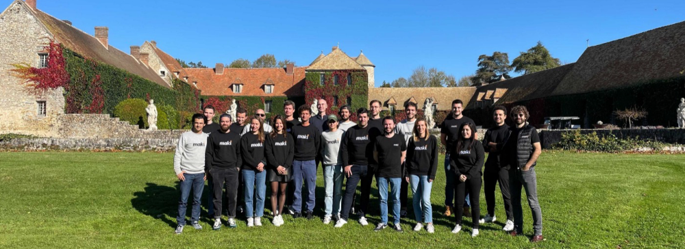
Ben Chino
3 years ago
100-day SaaS buildout.
We're opening up Maki through a series of Medium posts. We'll describe what Maki is building and how. We'll explain how we built a SaaS in 100 days. This isn't a step-by-step guide to starting a business, but a product philosophy to help you build quickly.

Focus on end-users.
This may seem obvious, but it's important to talk to users first. When we started thinking about Maki, we interviewed 100 HR directors from SMBs, Next40 scale-ups, and major Enterprises to understand their concerns. We initially thought about the future of employment, but most of their worries centered on Recruitment. We don't have a clear recruiting process, it's time-consuming, we recruit clones, we don't support diversity, etc. And as hiring managers, we couldn't help but agree.
Co-create your product with your end-users.
We went to the drawing board, read as many books as possible (here, here, and here), and when we started getting a sense for a solution, we questioned 100 more operational HR specialists to corroborate the idea and get a feel for our potential answer. This confirmed our direction to help hire more objectively and efficiently.
Back to the drawing board, we designed our first flows and screens. We organized sessions with certain survey respondents to show them our early work and get comments. We got great input that helped us build Maki, and we met some consumers. Obsess about users and execute alongside them.
Don’t shoot for the moon, yet. Make pragmatic choices first.
Once we were convinced, we began building. To launch a SaaS in 100 days, we needed an operating principle that allowed us to accelerate while still providing a reliable, secure, scalable experience. We focused on adding value and outsourced everything else. Example:
Concentrate on adding value. Reuse existing bricks.
When determining which technology to use, we looked at our strengths and the future to see what would last. Node.js for backend, React for frontend, both with typescript. We thought this technique would scale well since it would attract more talent and the surrounding mature ecosystem would help us go quicker.

We explored for ways to bootstrap services while setting down strong foundations that might support millions of users. We built our backend services on NestJS so we could extend into microservices later. Hasura, a GraphQL APIs engine, automates Postgres data exposing through a graphQL layer. MUI's ready-to-use components powered our design-system. We used well-maintained open-source projects to speed up certain tasks.
We outsourced important components of our platform (Auth0 for authentication, Stripe for billing, SendGrid for notifications) because, let's face it, we couldn't do better. We choose to host our complete infrastructure (SQL, Cloud run, Logs, Monitoring) on GCP to simplify our work between numerous providers.
Focus on your business, use existing bricks for the rest. For the curious, we'll shortly publish articles detailing each stage.
Most importantly, empower people and step back.
We couldn't have done this without the incredible people who have supported us from the start. Since Powership is one of our key values, we provided our staff the power to make autonomous decisions from day one. Because we believe our firm is its people, we hired smart builders and let them build.
Nicolas left Spendesk to create scalable interfaces using react-router, react-queries, and MUI. JD joined Swile and chose Hasura as our GraphQL engine. Jérôme chose NestJS to build our backend services. Since then, Justin, Ben, Anas, Yann, Benoit, and others have followed suit.
If you consider your team a collective brain, you should let them make decisions instead of directing them what to do. You'll make mistakes, but you'll go faster and learn faster overall.
Invest in great talent and develop a strong culture from the start. Here's how to establish a SaaS in 100 days.