


More on Marketing

Joseph Mavericks
3 years ago
You Don't Have to Spend $250 on TikTok Ads Because I Did
900K impressions, 8K clicks, and $$$ orders…
I recently started dropshipping. Now that I own my business and can charge it as a business expense, it feels less like money wasted if it doesn't work. I also made t-shirts to sell. I intended to open a t-shirt store and had many designs on a hard drive. I read that Tiktok advertising had a high conversion rate and low cost because they were new. According to many, the advertising' cost/efficiency ratio would plummet and become as bad as Google or Facebook Ads. Now felt like the moment to try Tiktok marketing and dropshipping. I work in marketing for a SaaS firm and have seen how poorly ads perform. I wanted to try it alone.
I set up $250 and ran advertising for a week. Before that, I made my own products, store, and marketing. In this post, I'll show you my process and results.
Setting up the store
Dropshipping is a sort of retail business in which the manufacturer ships the product directly to the client through an online platform maintained by a seller. The seller takes orders but has no stock. The manufacturer handles all orders. This no-stock concept increases profitability and flexibility.
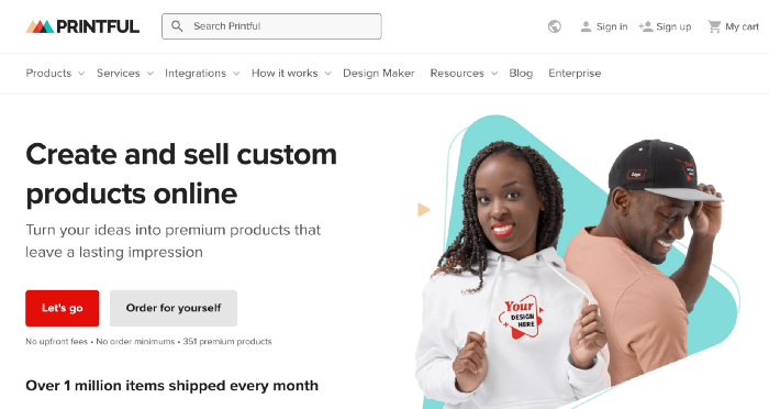
In my situation, I used previous t-shirt designs to make my own product. I didn't want to handle order fulfillment logistics, so I looked for a way to print my designs on demand, ship them, and handle order tracking/returns automatically. So I found Printful.
I needed to connect my backend and supplier to a storefront so visitors could buy. 99% of dropshippers use Shopify, but I didn't want to master the difficult application. I wanted a one-day project. I'd previously worked with Big Cartel, so I chose them.
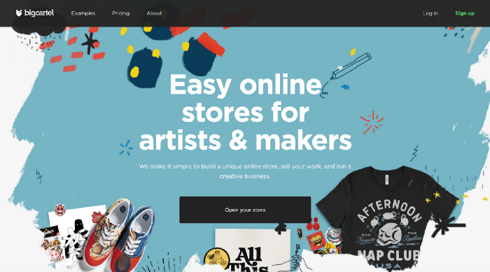
Big Cartel doesn't collect commissions on sales, simply a monthly flat price ($9.99 to $19.99 depending on your plan).
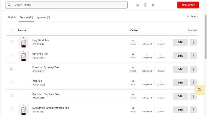
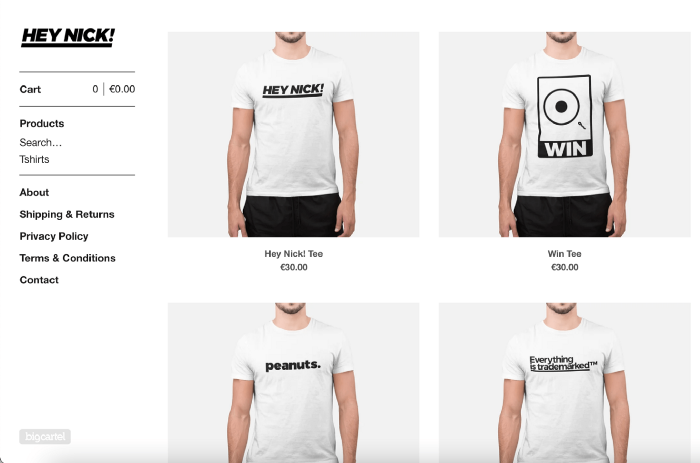
After opening a Big Cartel account, I uploaded 21 designs and product shots, then synced each product with Printful.
Developing the ads
I mocked up my designs on cool people photographs from placeit.net, a great tool for creating product visuals when you don't have a studio, camera gear, or models to wear your t-shirts.
I opened an account on the website and had advertising visuals within 2 hours.
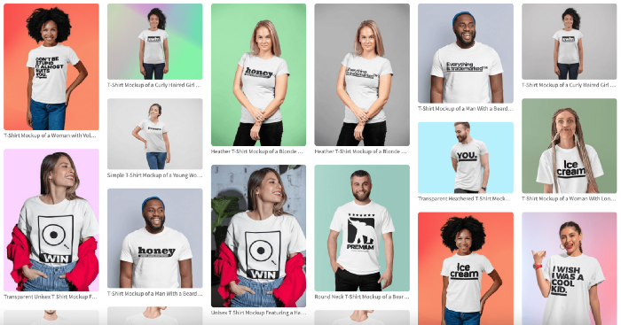
Because my designs are simple (black design on white t-shirt), I chose happy, stylish people on plain-colored backdrops. After that, I had to develop an animated slideshow.
Because I'm a graphic designer, I chose to use Adobe Premiere to create animated Tiktok advertising.
Premiere is a fancy video editing application used for more than advertisements. Premiere is used to edit movies, not social media marketing. I wanted this experiment to be quick, so I got 3 social media ad templates from motionarray.com and threw my visuals in. All the transitions and animations were pre-made in the files, so it only took a few hours to compile. The result:
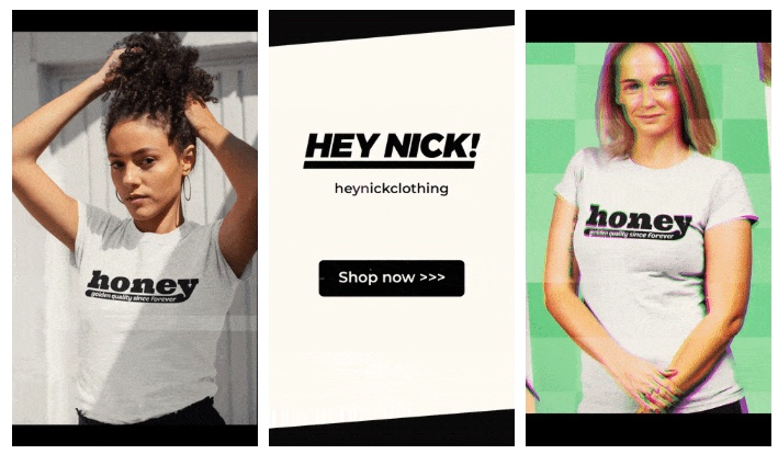
I downloaded 3 different soundtracks for the videos to determine which would convert best.
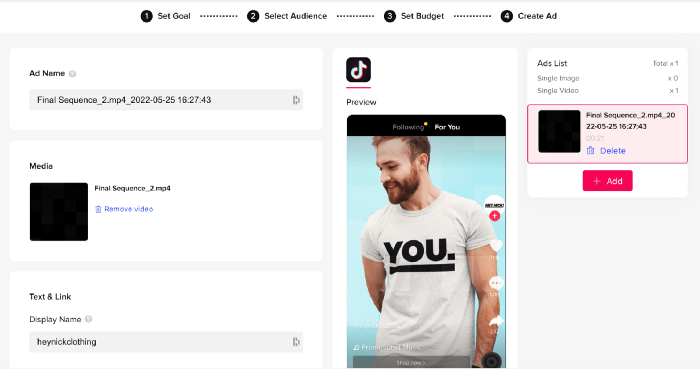
After that, I opened a Tiktok business account, uploaded my films, and inserted ad info. They went live within one hour.
The (poor) outcomes
As a European company, I couldn't deliver ads in the US. All of my advertisements' material (title, description, and call to action) was in English, hence they continued getting rejected in Europe for countries that didn't speak English. There are a lot of them:
I lost a lot of quality traffic, but I felt that if the images were engaging, people would check out the store and buy my t-shirts. I was wrong.
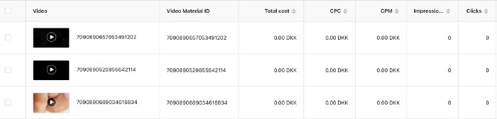
51,071 impressions on Day 1. 0 orders after 411 clicks
114,053 impressions on Day 2. 1.004 clicks and no orders
Day 3: 987 clicks, 103,685 impressions, and 0 orders
101,437 impressions on Day 4. 0 orders after 963 clicks
115,053 impressions on Day 5. 1,050 clicks and no purchases
125,799 impressions on day 6. 1,184 clicks, no purchases
115,547 impressions on Day 7. 1,050 clicks and no purchases
121,456 impressions on day 8. 1,083 clicks, no purchases
47,586 impressions on Day 9. 419 Clicks. No orders
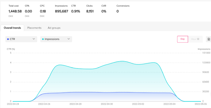
My overall conversion rate for video advertisements was 0.9%. TikTok's paid ad formats all result in strong engagement rates (ads average 3% to 12% CTR to site), therefore a 1 to 2% CTR should have been doable.
My one-week experiment yielded 8,151 ad clicks but no sales. Even if 0.1% of those clicks converted, I should have made 8 sales. Even companies with horrible web marketing would get one download or trial sign-up for every 8,151 clicks. I knew that because my advertising were in English, I had no impressions in the main EU markets (France, Spain, Italy, Germany), and that this impacted my conversion potential. I still couldn't believe my numbers.
I dug into the statistics and found that Tiktok's stats didn't match my store traffic data.
Looking more closely at the numbers
My ads were approved on April 26 but didn't appear until April 27. My store dashboard showed 440 visitors but 1,004 clicks on Tiktok. This happens often while tracking campaign results since different platforms handle comparable user activities (click, view) differently. In online marketing, residual data won't always match across tools.
My data gap was too large. Even if half of the 1,004 persons who clicked closed their browser or left before the store site loaded, I would have gained 502 visitors. The significant difference between Tiktok clicks and Big Cartel store visits made me suspicious. It happened all week:
Day 1: 440 store visits and 1004 ad clicks
Day 2: 482 store visits, 987 ad clicks
3rd day: 963 hits on ads, 452 store visits
443 store visits and 1,050 ad clicks on day 4.
Day 5: 459 store visits and 1,184 ad clicks
Day 6: 430 store visits and 1,050 ad clicks
Day 7: 409 store visits and 1,031 ad clicks
Day 8: 166 store visits and 418 ad clicks
The disparity wasn't related to residual data or data processing. The disparity between visits and clicks looked regular, but I couldn't explain it.
After the campaign concluded, I discovered all my creative assets (the videos) had a 0% CTR and a $0 expenditure in a separate dashboard. Whether it's a dashboard reporting issue or a budget allocation bug, online marketers shouldn't see this.
Tiktok can present any stats they want on their dashboard, just like any other platform that runs advertisements to promote content to its users. I can't verify that 895,687 individuals saw and clicked on my ad. I invested $200 for what appears to be around 900K impressions, which is an excellent ROI. No one bought a t-shirt, even an unattractive one, out of 900K people?
Would I do it again?
Nope. Whether I didn't make sales because Tiktok inflated the dashboard numbers or because I'm horrible at producing advertising and items that sell, I’ll stick to writing content and making videos. If setting up a business and ads in a few days was all it took to make money online, everyone would do it.
Video advertisements and dropshipping aren't dead. As long as the internet exists, people will click ads and buy stuff. Converting ads and selling stuff takes a lot of work, and I want to focus on other things.
I had always wanted to try dropshipping and I’m happy I did, I just won’t stick to it because that’s not something I’m interested in getting better at.
If I want to sell t-shirts again, I'll avoid Tiktok advertisements and find another route.

Shruti Mishra
3 years ago
How to get 100k profile visits on Twitter each month without spending a dime
As a marketer, I joined Twitter on August 31, 2022 to use it.
Growth has been volatile, causing up-and-down engagements. 500 followers in 11 days.
I met amazing content creators, marketers, and people.
Those who use Twitter may know that one-liners win the algorithm, especially if they're funny or humorous, but as a marketer I can't risk posting content that my audience won't like.
I researched, learned some strategies, and A/B tested; some worked, some didn't.
In this article, I share what worked for me so you can do the same.
Thanks for reading!
Let's check my Twitter stats.
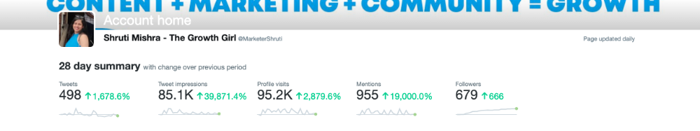
Tweets: how many tweets I sent in the first 28 days.
A user may be presented with a Tweet in their timeline or in search results.
In-person visits how many times my Twitter profile was viewed in the first 28 days.
Mentions: the number of times a tweet has mentioned my name.
Number of followers: People who were following me
Getting 500 Twitter followers isn't difficult.
Not easy, but doable.
Follow these steps to begin:
Determine your content pillars in step 1.
My formula is Growth = Content + Marketing + Community.
I discuss growth strategies.
My concept for growth is : 1. Content = creating / writing + sharing content in my niche. 2. Marketing = Marketing everything in business + I share my everyday learnings in business, marketing & entrepreneurship. 3. Community = Building community of like minded individuals (Also,I share how to’s) + supporting marketers to build & grow through community building.
Identify content pillars to create content for your audience.
2. Make your profile better
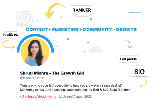
Create a profile picture. Your recognition factor is this.
Professional headshots are worthwhile.
This tool can help you create a free, eye-catching profile pic.
Use a niche-appropriate avatar if you don't want to show your face.
2. Create a bio that converts well mainly because first impressions count.
what you're sharing + why + +social proof what are you making
Be brief and precise. (155 characters)
3. Configure your banner
Banners complement profile pictures.
Use this space to explain what you do and how Twitter followers can benefit.
Canva's Twitter header maker is free.
Birdy can test multiple photo, bio, and banner combinations to optimize your profile.
Versions A and B of your profile should be completed.
Find the version that converts the best.
Use the profile that converts the best.
4. Special handle
If your username/handle is related to your niche, it will help you build authority and presence among your audience. Mine on Twitter is @marketershruti.
5. Participate expertly
Proficiently engage while you'll have no audience at first. Borrow your dream audience for free.
Steps:
Find a creator who has the audience you want.
Activate their post notifications and follow them.
Add a valuable comment first.
6. Create fantastic content
Use:
Medium (Read articles about your topic.)
Podcasts (Listen to experts on your topics)
YouTube (Follow channels in your niche)
Tweet what?
Listicle ( Hacks, Books, Tools, Podcasts)
Lessons (Teach your audience how to do 1 thing)
Inspirational (Inspire people to take action)
Consistent writing?
You MUST plan ahead and schedule your Tweets.
Use a scheduling tool that is effective for you; hypefury is mine.
Lastly, consistency is everything that attracts growth. After optimizing your profile, stay active to gain followers, engagements, and clients.
If you found this helpful, please like and comment below.

Rita McGrath
3 years ago
Flywheels and Funnels
Traditional sales organizations used the concept of a sales “funnel” to describe the process through which potential customers move, ending up with sales at the end. Winners today have abandoned that way of thinking in favor of building flywheels — business models in which every element reinforces every other.
Ah, the marketing funnel…
Prospective clients go through a predictable set of experiences, students learn in business school marketing classes. It looks like this:
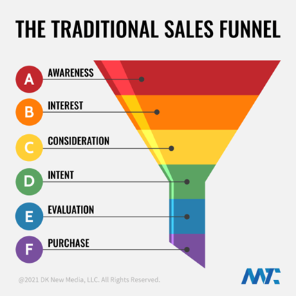
Understanding the funnel helps evaluate sales success indicators. Gail Goodwin, former CEO of small business direct mail provider Constant Contact, said managing the pipeline was key to escaping the sluggish SaaS ramp of death.
Like the funnel concept. To predict how well your business will do, measure how many potential clients are aware of it (awareness) and how many take the next step. If 1,000 people heard about your offering and 10% showed interest, you'd have 100 at that point. If 50% of these people made buyer-like noises, you'd know how many were, etc. It helped model buying trends.
TV, magazine, and radio advertising are pricey for B2C enterprises. Traditional B2B marketing involved armies of sales reps, which was expensive and a barrier to entry.
Cracks in the funnel model
Digital has exposed the funnel's limitations. Hubspot was born at a time when buyers and sellers had huge knowledge asymmetries, according to co-founder Brian Halligan. Those selling a product could use the buyer's lack of information to become a trusted partner.
As the world went digital, getting information and comparing offerings became faster, easier, and cheaper. Buyers didn't need a seller to move through a funnel. Interactions replaced transactions, and the relationship didn't end with a sale.
Instead, buyers and sellers interacted in a constant flow. In many modern models, the sale is midway through the process (particularly true with subscription and software-as-a-service models). Example:
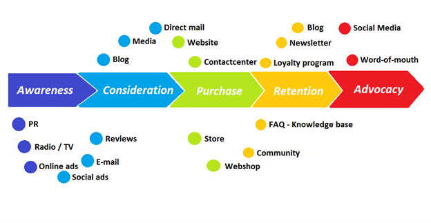
You're creating a winding journey with many touch points, not a funnel (and lots of opportunities for customers to get lost).
From winding journey to flywheel
Beyond this revised view of an interactive customer journey, a company can create what Jim Collins famously called a flywheel. Imagine rolling a heavy disc on its axis. The first few times you roll it, you put in a lot of effort for a small response. The same effort yields faster turns as it gains speed. Over time, the flywheel gains momentum and turns without your help.
Modern digital organizations have created flywheel business models, in which any additional force multiplies throughout the business. The flywheel becomes a force multiplier, according to Collins.
Amazon is a famous flywheel example. Collins explained the concept to Amazon CEO Jeff Bezos at a corporate retreat in 2001. In The Everything Store, Brad Stone describes in his book The Everything Store how he immediately understood Amazon's levers.
The result (drawn on a napkin):
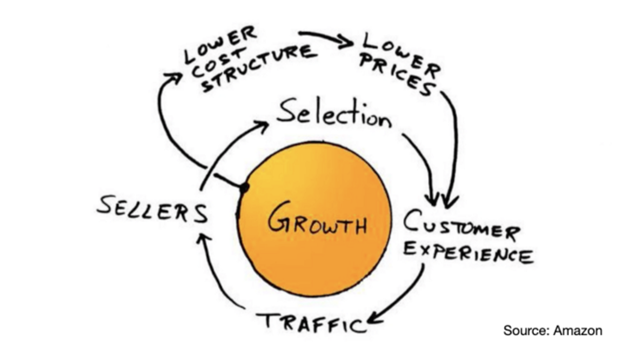
Low prices and a large selection of products attracted customers, while a focus on customer service kept them coming back, increasing traffic. Third-party sellers then increased selection. Low-cost structure supports low-price commitment. It's brilliant! Every wheel turn creates acceleration.
Where from here?
Flywheel over sales funnel! Consider these business terms.
You might also like

Aparna Jain
3 years ago
Negative Effects of Working for a FAANG Company
Consider yourself lucky if your last FAANG interview was rejected.

FAANG—Facebook, Apple, Amazon, Netflix, Google
(I know its manga now, but watch me not care)
These big companies offer many benefits.
large salaries and benefits
Prestige
high expectations for both you and your coworkers.
However, these jobs may have major drawbacks that only become apparent when you're thrown to the wolves, so it's up to you whether you see them as drawbacks or opportunities.
I know most college graduates start working at big tech companies because of their perceived coolness.
I've worked in these companies for years and can tell you what to expect if you get a job here.
Little fish in a vast ocean
The most obvious. Most billion/trillion-dollar companies employ thousands.
You may work on a small, unnoticed product part.
Directors and higher will sometimes make you redo projects they didn't communicate well without respecting your time, talent, or will to work on trivial stuff that doesn't move company needles.
Peers will only say, "Someone has to take out the trash," even though you know company resources are being wasted.
The power imbalance is frustrating.
What you can do about it
Know your WHY. Consider long-term priorities. Though riskier, I stayed in customer-facing teams because I loved building user-facing products.
This increased my impact. However, if you enjoy helping coworkers build products, you may be better suited for an internal team.
I told the Directors and Vice Presidents that their actions could waste Engineering time, even though it was unpopular. Some were receptive, some not.
I kept having tough conversations because they were good for me and the company.
However, some of my coworkers praised my candor but said they'd rather follow the boss.
An outdated piece of technology can take years to update.
Apple introduced Swift for iOS development in 2014. Most large tech companies adopted the new language after five years.
This is frustrating if you want to learn new skills and increase your market value.
Knowing that my lack of Swift practice could hurt me if I changed jobs made writing verbose Objective C painful.
What you can do about it
Work on the new technology in side projects; one engineer rewrote the Lyft app in Swift over the course of a weekend and promoted its adoption throughout the entire organization.
To integrate new technologies and determine how to combine legacy and modern code, suggest minor changes to the existing codebase.
Most managers spend their entire day in consecutive meetings.
After their last meeting, the last thing they want is another meeting to discuss your career goals.
Sometimes a manager has 15-20 reports, making it hard to communicate your impact.
Misunderstandings and stress can result.
Especially when the manager should focus on selfish parts of the team. Success won't concern them.
What you can do about it
Tell your manager that you are a self-starter and that you will pro-actively update them on your progress, especially if they aren't present at the meetings you regularly attend.
Keep being proactive and look for mentorship elsewhere if you believe your boss doesn't have enough time to work on your career goals.
Alternately, look for a team where the manager has more authority to assist you in making career decisions.
After a certain point, company loyalty can become quite harmful.
Because big tech companies create brand loyalty, too many colleagues stayed in unhealthy environments.
When you work for a well-known company and strangers compliment you, it's fun to tell your friends.
Work defines you. This can make you stay too long even though your career isn't progressing and you're unhappy.
Google may become your surname.
Workplaces are not families.
If you're unhappy, don't stay just because they gave you the paycheck to buy your first home and make you feel like you owe your life to them.
Many employees stayed too long. Though depressed and suicidal.
What you can do about it
Your life is not worth a company.
Do you want your job title and workplace to be listed on your gravestone? If not, leave if conditions deteriorate.
Recognize that change can be challenging. It's difficult to leave a job you've held for a number of years.
Ask those who have experienced this change how they handled it.
You still have a bright future if you were rejected from FAANG interviews.
Rejections only lead to amazing opportunities. If you're young and childless, work for a startup.
Companies may pay more than FAANGs. Do your research.
Ask recruiters and hiring managers tough questions about how the company and teams prioritize respectful working hours and boundaries for workers.
I know many 15-year-olds who have a lifelong dream of working at Google, and it saddens me that they're chasing a name on their resume instead of excellence.
This article is not meant to discourage you from working at these companies, but to share my experience about what HR/managers will never mention in interviews.
Read both sides before signing the big offer letter.

Miguel Saldana
3 years ago
Crypto Inheritance's Catch-22
Security, privacy, and a strategy!

How to manage digital assets in worst-case scenarios is a perennial crypto concern. Since blockchain and bitcoin technology is very new, this hasn't been a major issue. Many early developers are still around, and many groups created around this technology are young and feel they have a lot of life remaining. This is why inheritance and estate planning in crypto should be handled promptly. As cryptocurrency's intrinsic worth rises, many people in the ecosystem are holding on to assets that might represent generational riches. With that much value, it's crucial to have a plan. Creating a solid plan entails several challenges.
the initial hesitation in coming up with a plan
The technical obstacles to ensuring the assets' security and privacy
the passing of assets from a deceased or incompetent person
Legal experts' lack of comprehension and/or understanding of how to handle and treat cryptocurrency.
This article highlights several challenges, a possible web3-native solution, and how to learn more.

The Challenge of Inheritance:
One of the biggest hurdles to inheritance planning is starting the conversation. As humans, we don't like to think about dying. Early adopters will experience crazy gains as cryptocurrencies become more popular. Creating a plan is crucial if you wish to pass on your riches to loved ones. Without a plan, the technical and legal issues I barely mentioned above would erode value by requiring costly legal fees and/or taxes, and you could lose everything if wallets and assets are not distributed appropriately (associated with the private keys). Raising awareness of the consequences of not having a plan should motivate people to make one.

Controlling Change:
Having an inheritance plan for your digital assets is crucial, but managing the guts and bolts poses a new set of difficulties. Privacy and security provided by maintaining your own wallet provide different issues than traditional finances and assets. Traditional finance is centralized (say a stock brokerage firm). You can assign another person to handle the transfer of your assets. In crypto, asset transfer is reimagined. One may suppose future transaction management is doable, but the user must consent, creating an impossible loop.
I passed away and must send a transaction to the person I intended to deliver it to.
I have to confirm or authorize the transaction, but I'm dead.
In crypto, scheduling a future transaction wouldn't function. To transfer the wallet and its contents, we'd need the private keys and/or seed phrase. Minimizing private key exposure is crucial to protecting your crypto from hackers, social engineering, and phishing. People have lost private keys after utilizing Life Hack-type tactics to secure them. People that break and hide their keys, lose them, or make them unreadable won't help with managing and/or transferring. This will require a derived solution.

Legal Challenges and Implications
Unlike routine cryptocurrency transfers and transactions, local laws may require special considerations. Even in the traditional world, estate/inheritance taxes, how assets will be split, and who executes the will must be considered. Many lawyers aren't crypto-savvy, which complicates the matter. There will be many hoops to jump through to safeguard your crypto and traditional assets and give them to loved ones.
Knowing RUFADAA/UFADAA, depending on your state, is vital for Americans. UFADAA offers executors and trustees access to online accounts (which crypto wallets would fall into). RUFADAA was changed to limit access to the executor to protect assets. RUFADAA outlines how digital assets are administered following death and incapacity in the US.
A Succession Solution
Having a will and talking about who would get what is the first step to having a solution, but using a Dad Mans Switch is a perfect tool for such unforeseen circumstances. As long as the switch's controller has control, nothing happens. Losing control of the switch initiates a state transition.
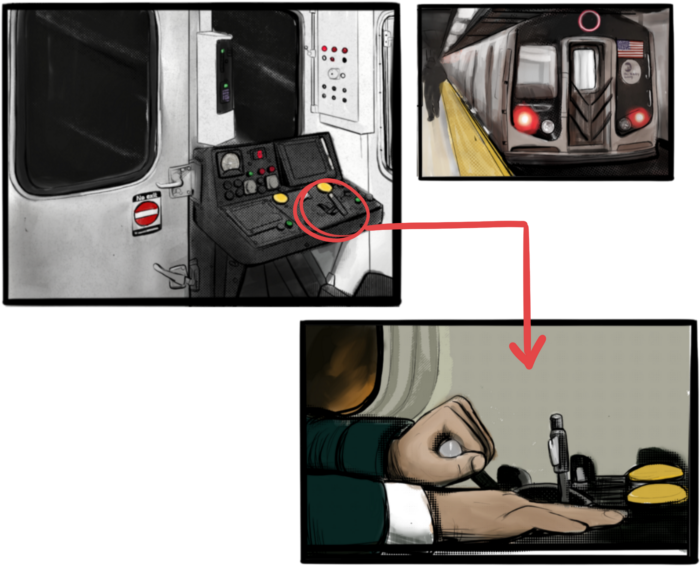
Subway or railway operations are examples. Modern control systems need the conductor to hold a switch to keep the train going. If they can't, the train stops.

Enter Sarcophagus
Sarcophagus is a decentralized dead man's switch built on Ethereum and Arweave. Sarcophagus allows actors to maintain control of their possessions even while physically unable to do so. Using a programmable dead man's switch and dual encryption, anything can be kept and passed on. This covers assets, secrets, seed phrases, and other use cases to provide authority and control back to the user and release trustworthy services from this work. Sarcophagus is built on a decentralized, transparent open source codebase. Sarcophagus is there if you're unprepared.

Sanjay Priyadarshi
3 years ago
Meet a Programmer Who Turned Down Microsoft's $10,000,000,000 Acquisition Offer
Failures inspire young developers
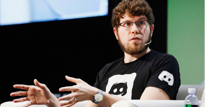
Jason citron created many products.
These products flopped.
Microsoft offered $10 billion for one of these products.
He rejected the offer since he was so confident in his success.
Let’s find out how he built a product that is currently valued at $15 billion.
Early in his youth, Jason began learning to code.
Jason's father taught him programming and IT.
His father wanted to help him earn money when he needed it.
Jason created video games and websites in high school.
Jason realized early on that his IT and programming skills could make him money.
Jason's parents misjudged his aptitude for programming.
Jason frequented online programming communities.
He looked for web developers. He created websites for those people.
His parents suspected Jason sold drugs online. When he said he used programming to make money, they were shocked.
They helped him set up a PayPal account.
Florida higher education to study video game creation
Jason never attended an expensive university.
He studied game design in Florida.
“Higher Education is an interesting part of society… When I work with people, the school they went to never comes up… only thing that matters is what can you do…At the end of the day, the beauty of silicon valley is that if you have a great idea and you can bring it to the life, you can convince a total stranger to give you money and join your project… This notion that you have to go to a great school didn’t end up being a thing for me.”
Jason's life was altered by Steve Jobs' keynote address.
After graduating, Jason joined an incubator.
Jason created a video-dating site first.
Bad idea.
Nobody wanted to use it when it was released, so they shut it down.
He made a multiplayer game.
It was released on Bebo. 10,000 people played it.
When Steve Jobs unveiled the Apple app store, he stopped playing.
The introduction of the app store resembled that of a new gaming console.
Jason's life altered after Steve Jobs' 2008 address.
“Whenever a new video game console is launched, that’s the opportunity for a new video game studio to get started, it’s because there aren’t too many games available…When a new PlayStation comes out, since it’s a new system, there’s only a handful of titles available… If you can be a launch title you can get a lot of distribution.”
Apple's app store provided a chance to start a video game company.
They released an app after 5 months of work.
Aurora Feint is the game.
Jason believed 1000 players in a week would be wonderful. A thousand players joined in the first hour.
Over time, Aurora Feints' game didn't gain traction. They don't make enough money to keep playing.
They could only make enough for one month.
Instead of buying video games, buy technology
Jason saw that they established a leaderboard, chat rooms, and multiplayer capabilities and believed other developers would want to use these.
They opted to sell the prior game's technology.
OpenFeint.
Assisting other game developers
They had no money in the bank to create everything needed to make the technology user-friendly.
Jason and Daniel designed a website saying:
“If you’re making a video game and want to have a drop in multiplayer support, you can use our system”
TechCrunch covered their website launch, and they gained a few hundred mailing list subscribers.
They raised seed funding with the mailing list.
Nearly all iPhone game developers started adopting the Open Feint logo.
“It was pretty wild… It was really like a whole social platform for people to play with their friends.”
What kind of a business model was it?
OpenFeint originally planned to make the software free for all games. As the game gained popularity, they demanded payment.
They later concluded it wasn't a good business concept.
It became free eventually.
Acquired for $104 million
Open Feint's users and employees grew tremendously.
GREE bought OpenFeint for $104 million in April 2011.
GREE initially committed to helping Jason and his team build a fantastic company.
Three or four months after the acquisition, Jason recognized they had a different vision.
He quit.
Jason's Original Vision for the iPad
Jason focused on distribution in 2012 to help businesses stand out.
The iPad market and user base were growing tremendously.
Jason said the iPad may replace mobile gadgets.
iPad gamers behaved differently than mobile gamers.
People sat longer and experienced more using an iPad.
“The idea I had was what if we built a gaming business that was more like traditional video games but played on tablets as opposed to some kind of mobile game that I’ve been doing before.”
Unexpected insight after researching the video game industry
Jason learned from studying the gaming industry that long-standing companies had advantages beyond a single release.
Previously, long-standing video game firms had their own distribution system. This distribution strategy could buffer time between successful titles.
Sony, Microsoft, and Valve all have gaming consoles and online stores.
So he built a distribution system.
He created a group chat app for gamers.
He envisioned a team-based multiplayer game with text and voice interaction.
His objective was to develop a communication network, release more games, and start a game distribution business.
Remaking the video game League of Legends
Jason and his crew reimagined a League of Legends game mode for 12-inch glass.
They adapted the game for tablets.
League of Legends was PC-only.
So they rebuilt it.
They overhauled the game and included native mobile experiences to stand out.
Hammer and Chisel was the company's name.
18 people worked on the game.
The game was funded. The game took 2.5 years to make.
Was the game a success?
July 2014 marked the game's release. The team's hopes were dashed.
Critics initially praised the game.
Initial installation was widespread.
The game failed.
As time passed, the team realized iPad gaming wouldn't increase much and mobile would win.
Jason was given a fresh idea by Stan Vishnevskiy.
Stan Vishnevskiy was a corporate engineer.
He told Jason about his plan to design a communication app without a game.
This concept seeded modern strife.
“The insight that he really had was to put a couple of dots together… we’re seeing our customers communicating around our own game with all these different apps and also ourselves when we’re playing on PC… We should solve that problem directly rather than needing to build a new game…we should start making it on PC.”
So began Discord.
Online socializing with pals was the newest trend.
Jason grew up playing video games with his friends.
He never played outside.
Jason had many great moments playing video games with his closest buddy, wife, and brother.
Discord was about providing a location for you and your group to speak and hang out.
Like a private cafe, bedroom, or living room.
Discord was developed for you and your friends on computers and phones.
You can quickly call your buddies during a game to conduct a conference call. Put the call on speaker and talk while playing.
Discord wanted to give every player a unique experience. Because coordinating across apps was a headache.
The entire team started concentrating on Discord.
Jason decided Hammer and Chisel would focus on their chat app.
Jason didn't want to make a video game.
How Discord attracted the appropriate attention
During the first five months, the entire team worked on the game and got feedback from friends.
This ensures product improvement. As a result, some teammates' buddies started utilizing Discord.
The team knew it would become something, but the result was buggy. App occasionally crashed.
Jason persuaded a gamer friend to write on Reddit about the software.
New people would find Discord. Why not?
Reddit users discovered Discord and 50 started using it frequently.
Discord was launched.
Rejecting the $10 billion acquisition proposal
Discord has increased in recent years.
It sends billions of messages.
Discord's users aren't tracked. They're privacy-focused.
Purchase offer
Covid boosted Discord's user base.
Weekly, billions of messages were transmitted.
Microsoft offered $10 billion for Discord in 2021.
Jason sold Open Feint for $104m in 2011.
This time, he believed in the product so much that he rejected Microsoft's offer.
“I was talking to some people in the team about which way we could go… The good thing was that most of the team wanted to continue building.”
Last time, Discord was valued at $15 billion.
Discord raised money on March 12, 2022.
The $15 billion corporation raised $500 million in 2021.