


More on NFTs & Art

Ezra Reguerra
3 years ago
Yuga Labs’ Otherdeeds NFT mint triggers backlash from community
Unhappy community members accuse Yuga Labs of fraud, manipulation, and favoritism over Otherdeeds NFT mint.
Following the Otherdeeds NFT mint, disgruntled community members took to Twitter to criticize Yuga Labs' handling of the event.
Otherdeeds NFTs were a huge hit with the community, selling out almost instantly. Due to high demand, the launch increased Ethereum gas fees from 2.6 ETH to 5 ETH.
But the event displeased many people. Several users speculated that the mint was “planned to fail” so the group could advertise launching its own blockchain, as the team mentioned a chain migration in one tweet.
Others like Mark Beylin tweeted that he had "sold out" on all Ape-related NFT investments after Yuga Labs "revealed their true colors." Beylin also advised others to assume Yuga Labs' owners are “bad actors.”
Some users who failed to complete transactions claim they lost ETH. However, Yuga Labs promised to refund lost gas fees.
CryptoFinally, a Twitter user, claimed Yuga Labs gave BAYC members better land than non-members. Others who wanted to participate paid for shittier land, while BAYCS got the only worthwhile land.
The Otherdeed NFT drop also increased Ethereum's burn rate. Glassnode and Data Always reported nearly 70,000 ETH burned on mint day.

Jayden Levitt
3 years ago
How to Explain NFTs to Your Grandmother, in Simple Terms

In simple terms, you probably don’t.
But try. Grandma didn't grow up with Facebook, but she eventually joined.
Perhaps the fear of being isolated outweighed the discomfort of learning the technology.
Grandmas are Facebook likers, sharers, and commenters.
There’s no stopping her.
Not even NFTs. Web3 is currently very complex.
It's difficult to explain what NFTs are, how they work, and why we might use them.
Three explanations.
1. Everything will be ours to own, both physically and digitally.
Why own something you can't touch? What's the point?
Blockchain technology proves digital ownership.
Untouchables need ownership proof. What?
Digital assets reduce friction, save time, and are better for the environment than physical goods.
Many valuable things are intangible. Feeling like your favorite brands. You'll pay obscene prices for clothing that costs pennies.
Secondly, NFTs Are Contracts. Agreements Have Value.
Blockchain technology will replace all contracts and intermediaries.
Every insurance contract, deed, marriage certificate, work contract, plane ticket, concert ticket, or sports event is likely an NFT.
We all have public wallets, like Grandma's Facebook page.
3. Your NFT Purchases Will Be Visible To Everyone.
Everyone can see your public wallet. What you buy says more about you than what you post online.
NFTs issued double as marketing collateral when seen on social media.
While I doubt Grandma knows who Snoop Dog is, imagine him or another famous person holding your NFT in his public wallet and the attention that could bring to you, your company, or brand.
This Technical Section Is For You
The NFT is a contract; its founders can add value through access, events, tuition, and possibly royalties.
Imagine Elon Musk releasing an NFT to his network. Or yearly business consultations for three years.
Christ-alive.
It's worth millions.
These determine their value.
No unsuspecting schmuck willing to buy your hot potato at zero. That's the trend, though.
Overpriced NFTs for low-effort projects created a bubble that has burst.
During a market bubble, you can make money by buying overvalued assets and selling them later for a profit, according to the Greater Fool Theory.
People are struggling. Some are ruined by collateralized loans and the gold rush.
Finances are ruined.
It's uncomfortable.
The same happened in 2018, during the ICO crash or in 1999/2000 when the dot com bubble burst. But the underlying technology hasn’t gone away.

middlemarch.eth
3 years ago
ERC721R: A new ERC721 contract for random minting so people don’t snipe all the rares!
That is, how to snipe all the rares without using ERC721R!
Introduction: Blessed and Lucky
Mphers was the first mfers derivative, and as a Phunks derivative, I wanted one.
I wanted an alien. And there are only 8 in the 6,969 collection. I got one!
In case it wasn't clear from the tweet, I meant that I was lucky to have figured out how to 100% guarantee I'd get an alien without any extra luck.
Read on to find out how I did it, how you can too, and how developers can avoid it!
How to make rare NFTs without luck.
# How to mint rare NFTs without needing luck
The key to minting a rare NFT is knowing the token's id ahead of time.
For example, once I knew my alien was #4002, I simply refreshed the mint page until #3992 was minted, and then mint 10 mphers.
How did I know #4002 was extraterrestrial? Let's go back.
First, go to the mpher contract's Etherscan page and look up the tokenURI of a previously issued token, token #1:
As you can see, mphers creates metadata URIs by combining the token id and an IPFS hash.
This method gives you the collection's provenance in every URI, and while that URI can be changed, it affects everyone and is public.
Consider a token URI without a provenance hash, like https://mphers.art/api?tokenId=1.
As a collector, you couldn't be sure the devs weren't changing #1's metadata at will.
The API allows you to specify “if #4002 has not been minted, do not show any information about it”, whereas IPFS does not allow this.
It's possible to look up the metadata of any token, whether or not it's been minted.
Simply replace the trailing “1” with your desired id.
Mpher #4002
These files contain all the information about the mpher with the specified id. For my alien, we simply search all metadata files for the string “alien mpher.”
Take a look at the 6,969 meta-data files I'm using OpenSea's IPFS gateway, but you could use ipfs.io or something else.
Use curl to download ten files at once. Downloading thousands of files quickly can lead to duplicates or errors. But with a little tweaking, you should be able to get everything (and dupes are fine for our purposes).
Now that you have everything in one place, grep for aliens:
The numbers are the file names that contain “alien mpher” and thus the aliens' ids.
The entire process takes under ten minutes. This technique works on many NFTs currently minting.
In practice, manually minting at the right time to get the alien is difficult, especially when tokens mint quickly. Then write a bot to poll totalSupply() every second and submit the mint transaction at the exact right time.
You could even look for the token you need in the mempool before it is minted, and get your mint into the same block!
However, in my experience, the “big” approach wins 95% of the time—but not 100%.
“Am I being set up all along?”
Is a question you might ask yourself if you're new to this.
It's disheartening to think you had no chance of minting anything that someone else wanted.
But, did you have no opportunity? You had an equal chance as everyone else!
Take me, for instance: I figured this out using open-source tools and free public information. Anyone can do this, and not understanding how a contract works before minting will lead to much worse issues.
The mpher mint was fair.
While a fair game, “snipe the alien” may not have been everyone's cup of tea.
People may have had more fun playing the “mint lottery” where tokens were distributed at random and no one could gain an advantage over someone simply clicking the “mint” button.
How might we proceed?
Minting For Fashion Hats Punks, I wanted to create a random minting experience without sacrificing fairness. In my opinion, a predictable mint beats an unfair one. Above all, participants must be equal.
Sadly, the most common method of creating a random experience—the post-mint “reveal”—is deeply unfair. It works as follows:
- During the mint, token metadata is unavailable. Instead, tokenURI() returns a blank JSON file for each id.
- An IPFS hash is updated once all tokens are minted.
- You can't tell how the contract owner chose which token ids got which metadata, so it appears random.
Because they alone decide who gets what, the person setting the metadata clearly has a huge unfair advantage over the people minting. Unlike the mpher mint, you have no chance of winning here.
But what if it's a well-known, trusted, doxxed dev team? Are reveals okay here?
No! No one should be trusted with such power. Even if someone isn't consciously trying to cheat, they have unconscious biases. They might also make a mistake and not realize it until it's too late, for example.
You should also not trust yourself. Imagine doing a reveal, thinking you did it correctly (nothing is 100%! ), and getting the rarest NFT. Isn't that a tad odd Do you think you deserve it? An NFT developer like myself would hate to be in this situation.
Reveals are bad*
UNLESS they are done without trust, meaning everyone can verify their fairness without relying on the developers (which you should never do).
An on-chain reveal powered by randomness that is verifiably outside of anyone's control is the most common way to achieve a trustless reveal (e.g., through Chainlink).
Tubby Cats did an excellent job on this reveal, and I highly recommend their contract and launch reflections. Their reveal was also cool because it was progressive—you didn't have to wait until the end of the mint to find out.
In his post-launch reflections, @DefiLlama stated that he made the contract as trustless as possible, removing as much trust as possible from the team.
In my opinion, everyone should know the rules of the game and trust that they will not be changed mid-stream, while trust minimization is critical because smart contracts were designed to reduce trust (and it makes it impossible to hack even if the team is compromised). This was a huge mistake because it limited our flexibility and our ability to correct mistakes.
And @DefiLlama is a superstar developer. Imagine how much stress maximizing trustlessness will cause you!
That leaves me with a bad solution that works in 99 percent of cases and is much easier to implement: random token assignments.
Introducing ERC721R: A fully compliant IERC721 implementation that picks token ids at random.
ERC721R implements the opposite of a reveal: we mint token ids randomly and assign metadata deterministically.
This allows us to reveal all metadata prior to minting while reducing snipe chances.
Then import the contract and use this code:
What is ERC721R and how does it work
First, a disclaimer: ERC721R isn't truly random. In this sense, it creates the same “game” as the mpher situation, where minters compete to exploit the mint. However, ERC721R is a much more difficult game.
To game ERC721R, you need to be able to predict a hash value using these inputs:
This is impossible for a normal person because it requires knowledge of the block timestamp of your mint, which you do not have.
To do this, a miner must set the timestamp to a value in the future, and whatever they do is dependent on the previous block's hash, which expires in about ten seconds when the next block is mined.
This pseudo-randomness is “good enough,” but if big money is involved, it will be gamed. Of course, the system it replaces—predictable minting—can be manipulated.
The token id is chosen in a clever implementation of the Fisher–Yates shuffle algorithm that I copied from CryptoPhunksV2.
Consider first the naive solution: (a 10,000 item collection is assumed):
- Make an array with 0–9999.
- To create a token, pick a random item from the array and use that as the token's id.
- Remove that value from the array and shorten it by one so that every index corresponds to an available token id.
This works, but it uses too much gas because changing an array's length and storing a large array of non-zero values is expensive.
How do we avoid them both? What if we started with a cheap 10,000-zero array? Let's assign an id to each index in that array.
Assume we pick index #6500 at random—#6500 is our token id, and we replace the 0 with a 1.
But what if we chose #6500 again? A 1 would indicate #6500 was taken, but then what? We can't just "roll again" because gas will be unpredictable and high, especially later mints.
This allows us to pick a token id 100% of the time without having to keep a separate list. Here's how it works:
- Make a 10,000 0 array.
- Create a 10,000 uint numAvailableTokens.
- Pick a number between 0 and numAvailableTokens. -1
- Think of #6500—look at index #6500. If it's 0, the next token id is #6500. If not, the value at index #6500 is your next token id (weird!)
- Examine the array's last value, numAvailableTokens — 1. If it's 0, move the value at #6500 to the end of the array (#9999 if it's the first token). If the array's last value is not zero, update index #6500 to store it.
- numAvailableTokens is decreased by 1.
- Repeat 3–6 for the next token id.
So there you go! The array stays the same size, but we can choose an available id reliably. The Solidity code is as follows:
Unfortunately, this algorithm uses more gas than the leading sequential mint solution, ERC721A.
This is most noticeable when minting multiple tokens in one transaction—a 10 token mint on ERC721R costs 5x more than on ERC721A. That said, ERC721A has been optimized much further than ERC721R so there is probably room for improvement.
Conclusion
Listed below are your options:
- ERC721A: Minters pay lower gas but must spend time and energy devising and executing a competitive minting strategy or be comfortable with worse minting results.
- ERC721R: Higher gas, but the easy minting strategy of just clicking the button is optimal in all but the most extreme cases. If miners game ERC721R it’s the worst of both worlds: higher gas and a ton of work to compete.
- ERC721A + standard reveal: Low gas, but not verifiably fair. Please do not do this!
- ERC721A + trustless reveal: The best solution if done correctly, highly-challenging for dev, potential for difficult-to-correct errors.
Did I miss something? Comment or tweet me @dumbnamenumbers.
Check out the code on GitHub to learn more! Pull requests are welcome—I'm sure I've missed many gas-saving opportunities.
Thanks!
Read the original post here
You might also like

MAJESTY AliNICOLE WOW!
3 years ago
YouTube's faceless videos are growing in popularity, but this is nothing new.
I've always bucked social media norms. YouTube doesn't compare. Traditional video made me zig when everyone zagged. Audio, picture personality animation, thought movies, and slide show videos are most popular and profitable.

YouTube's business is shifting. While most video experts swear by the idea that YouTube success is all about making personal and professional Face-Share-Videos, those who use YouTube for business know things are different.
In this article, I will share concepts from my mini master class Figures to Followers: Prioritizing Purposeful Profits Over Popularity on YouTube to Create the Win-Win for You, Your Audience & More and my forthcoming publication The WOWTUBE-PRENEUR FACTOR EVOLUTION: The Basics of Powerfully & Profitably Positioning Yourself as a Video Communications Authority to Broadcast Your WOW Effect as a Video Entrepreneur.
I've researched the psychology, anthropology, and anatomy of significant social media platforms as an entrepreneur and social media marketing expert. While building my YouTube empire, I've paid particular attention to what works for short, mid, and long-term success, whether it's a niche-focused, lifestyle, or multi-interest channel.
Most new, semi-new, and seasoned YouTubers feel vlog-style or live-on-camera videos are popular. Faceless, animated, music-text-based, and slideshow videos do well for businesses.
Buyer-consumer vs. content-consumer thinking is totally different when absorbing content. Profitability and popularity are closely related, however most people become popular with traditional means but not profitable.
In my experience, Faceless videos are more profitable, although it depends on the channel's style. Several professionals are now teaching in their courses that non-traditional films are making the difference in their business success and popularity.
Face-Share-Personal-Touch videos make audiences feel like they know the personality, but they're not profitable.
Most spend hours creating articles, videos, and thumbnails to seem good. That's how most YouTubers gained their success in the past, but not anymore.
Looking the part and performing a typical role in videos doesn't convert well, especially for newbie channels.
Working with video marketers and YouTubers for years, I've noticed that most struggle to be consistent with content publishing since they exclusively use formats that need extensive development. Camera and green screen set ups, shooting/filming, and editing for post productions require their time, making it less appealing to post consistently, especially if they're doing all the work themselves.
Because they won't make simple format videos or audio videos with an overlay image, they overcomplicate the procedure (even with YouTube Shorts), and they leave their channels for weeks or months. Again, they believe YouTube only allows specific types of videos. Even though this procedure isn't working, they plan to keep at it.
A successful YouTube channel needs multiple video formats to suit viewer needs, I teach. Face-Share-Personal Touch and Faceless videos are both useful.
How people engage with YouTube content has changed over the years, and the average customer is no longer interested in an all-video channel.
Face-Share-Personal-Touch videos are great
Google Live
Online training
Giving listeners a different way to access your podcast that is being broadcast on sites like Anchor, BlogTalkRadio, Spreaker, Google, Apple Store, and others Many people enjoy using a video camera to record themselves while performing the internet radio, Facebook, or Instagram Live versions of their podcasts.
Video Blog Updates
even more
Faceless videos are popular for business and benefit both entrepreneurs and audiences.
For the business owner/entrepreneur…
Less production time results in time dollar savings.
enables the business owner to demonstrate the diversity of content development
For the Audience…
The channel offers a variety of appealing content options.
The same format is not monotonous or overly repetitive for the viewers.
Below are a couple videos from YouTube guru Make Money Matt's channel, which has over 347K subscribers.
Enjoy
24 Best Niches to Make Money on YouTube Without Showing Your Face
Make Money on YouTube Without Making Videos (Free Course)
In conclusion, you have everything it takes to build your own YouTube brand and empire. Learn the rules, then adapt them to succeed.
Please reread this and the other suggested articles for optimal benefit.
I hope this helped. How has this article helped you? Follow me for more articles like this and more multi-mission expressions.

Francesca Furchtgott
3 years ago
Giving customers what they want or betraying the values of the brand?
A J.Crew collaboration for fashion label Eveliina Vintage is not a paradox; it is a solution.
Eveliina Vintage's capsule collection debuted yesterday at J.Crew. This J.Crew partnership stopped me in my tracks.
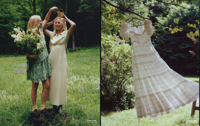
Eveliina Vintage sells vintage goods. Eeva Musacchia founded the shop in Finland in the 1970s. It's recognized for its one-of-a-kind slip dresses from the 1930s and 1940s.
I wondered why a vintage brand would partner with a mass shop. Fast fashion against vintage shopping? Will Eveliina Vintages customers be turned off?
But Eveliina Vintages customers don't care about sustainability. They want Eveliina's Instagram look. Eveliina Vintage collaborated with J.Crew to give customers what they wanted: more Eveliina at a lower price.
Vintage: A Fashion Option That Is Eco-Conscious
Secondhand shopping is a trendy response to quick fashion. J.Crew releases hundreds of styles annually. Waste and environmental damage have been criticized. A pair of jeans requires 1,800 gallons of water. J.Crew's limited-time deals promote more purchases. J.Crew items are likely among those Americans wear 7 times before discarding.
Consumers and designers have emphasized sustainability in recent years. Stella McCartney and Eileen Fisher are popular eco-friendly brands. They've also flocked to ThredUp and similar sites.
Gap, Levis, and Allbirds have listened to consumer requests. They promote recycling, ethical sourcing, and secondhand shopping.
Secondhand shoppers feel good about reusing and recycling clothing that might have ended up in a landfill.
Eco-conscious fashionistas shop vintage. These shoppers enjoy the thrill of the hunt (that limited-edition Chanel bag!) and showing off a unique piece (nobody will have my look!). They also reduce their environmental impact.
Is Eveliina Vintage capitalizing on an aesthetic or is it a sustainable brand?
Eveliina Vintage emphasizes environmental responsibility. Vogue's Amanda Musacchia emphasized sustainability. Amanda, founder Eeva's daughter, is a company leader.
But Eveliina's press message doesn't address sustainability, unlike Instagram. Scarcity and fame rule.
Eveliina Vintages Instagram has see-through dresses and lace-trimmed slip dresses. Celebrities and influencers are often photographed in Eveliina's apparel, which has 53,000+ followers. Vogue appreciates Eveliina's style. Multiple publications discuss Alexa Chung's Eveliina dress.
Eveliina Vintage markets its one-of-a-kind goods. It teases future content, encouraging visitors to return. Scarcity drives demand and raises clothing prices. One dress is $1,600+, but most are $500-$1,000.
The catch: Eveliina can't monetize its expanding popularity due to exorbitant prices and limited quantity. Why?
Most people struggle to pay for their clothing. But Eveliina Vintage lacks those more affordable entry-level products, in contrast to other luxury labels that sell accessories or perfume.
Many people have trouble fitting into their clothing. The bodies of most women in the past were different from those for which vintage clothing was designed. Each Eveliina dress's specific measurements are mentioned alongside it. Be careful, you can fall in love with an ill-fitting dress.
No matter how many people can afford it and fit into it, there is only one item to sell. To get the item before someone else does, those people must be on the Eveliina Vintage website as soon as it becomes available.
A Way for Eveliina Vintage to Make Money (and Expand) with J.Crew Its following
Eveliina Vintages' cooperation with J.Crew makes commercial sense.
This partnership spreads Eveliina's style. Slightly better pricing The $390 outfits have multicolored slips and gauzy cotton gowns. Sizes range from 00 to 24, which is wider than vintage racks.
Eveliina Vintage customers like the combination. Excited comments flood the brand's Instagram launch post. Nobody is mocking the 50-year-old vintage brand's fast-fashion partnership.
Vintage may be a sustainable fashion trend, but that's not why Eveliina's clients love the brand. They only care about the old look.
And that is a tale as old as fashion.

William Anderson
3 years ago
When My Remote Leadership Skills Took Off
4 Ways To Manage Remote Teams & Employees
The wheels hit the ground as I landed in Rochester.
Our six-person satellite office was now part of my team.
Their manager only reported to me the day before, but I had my ticket booked ahead of time.
I had managed remote employees before but this was different. Engineers dialed into headquarters for every meeting.
So when I learned about the org chart change, I knew a strong first impression would set the tone for everything else.
I was either their boss, or their boss's boss, and I needed them to know I was committed.
Managing a fleet of satellite freelancers or multiple offices requires treating others as more than just a face behind a screen.
You must comprehend each remote team member's perspective and daily interactions.
The good news is that you can start using these techniques right now to better understand and elevate virtual team members.
1. Make Visits To Other Offices
If budgeted, visit and work from offices where teams and employees report to you. Only by living alongside them can one truly comprehend their problems with communication and other aspects of modern life.
2. Have Others Come to You
• Having remote, distributed, or satellite employees and teams visit headquarters every quarter or semi-quarterly allows the main office culture to rub off on them.
When remote team members visit, more people get to meet them, which builds empathy.
If you can't afford to fly everyone, at least bring remote managers or leaders. Hopefully they can resurrect some culture.
3. Weekly Work From Home
No home office policy?
Make one.
WFH is a team-building, problem-solving, and office-viewing opportunity.
For dial-in meetings, I started working from home on occasion.
It also taught me which teams “forget” or “skip” calls.
As a remote team member, you experience all the issues first hand.
This isn't as accurate for understanding teams in other offices, but it can be done at any time.
4. Increase Contact Even If It’s Just To Chat
Don't underestimate office banter.
Sometimes it's about bonding and trust, other times it's about business.
If you get all this information in real-time, please forward it.
Even if nothing critical is happening, call remote team members to check in and chat.
I guarantee that building relationships and rapport will increase both their job satisfaction and yours.