



More on NFTs & Art

Yogita Khatri
3 years ago
Moonbirds NFT sells for $1 million in first week
On Saturday, Moonbird #2642, one of the collection's rarest NFTs, sold for a record 350 ETH (over $1 million) on OpenSea.
The Sandbox, a blockchain-based gaming company based in Hong Kong, bought the piece. The seller, "oscuranft" on OpenSea, made around $600,000 after buying the NFT for 100 ETH a week ago.
Owl avatars
Moonbirds is a 10,000 owl NFT collection. It is one of the quickest collections to achieve bluechip status. Proof, a media startup founded by renowned VC Kevin Rose, launched Moonbirds on April 16.
Rose is currently a partner at True Ventures, a technology-focused VC firm. He was a Google Ventures general partner and has 1.5 million Twitter followers.
Rose has an NFT podcast on Proof. It follows Proof Collective, a group of 1,000 NFT collectors and artists, including Beeple, who hold a Proof Collective NFT and receive special benefits.
These include early access to the Proof podcast and in-person events.
According to the Moonbirds website, they are "the official Proof PFP" (picture for proof).
Moonbirds NFTs sold nearly $360 million in just over a week, according to The Block Research and Dune Analytics. Its top ten sales range from $397,000 to $1 million.
In the current market, Moonbirds are worth 33.3 ETH. Each NFT is 2.5 ETH. Holders have gained over 12 times in just over a week.
Why was it so popular?
The Block Research's NFT analyst, Thomas Bialek, attributes Moonbirds' rapid rise to Rose's backing, the success of his previous Proof Collective project, and collectors' preference for proven NFT projects.
Proof Collective NFT holders have made huge gains. These NFTs were sold in a Dutch auction last December for 5 ETH each. According to OpenSea, the current floor price is 109 ETH.
According to The Block Research, citing Dune Analytics, Proof Collective NFTs have sold over $39 million to date.
Rose has bigger plans for Moonbirds. Moonbirds is introducing "nesting," a non-custodial way for holders to stake NFTs and earn rewards.
Holders of NFTs can earn different levels of status based on how long they keep their NFTs locked up.
"As you achieve different nest status levels, we can offer you different benefits," he said. "We'll have in-person meetups and events, as well as some crazy airdrops planned."
Rose went on to say that Proof is just the start of "a multi-decade journey to build a new media company."
Eric Esposito
3 years ago
$100M in NFT TV shows from Fox
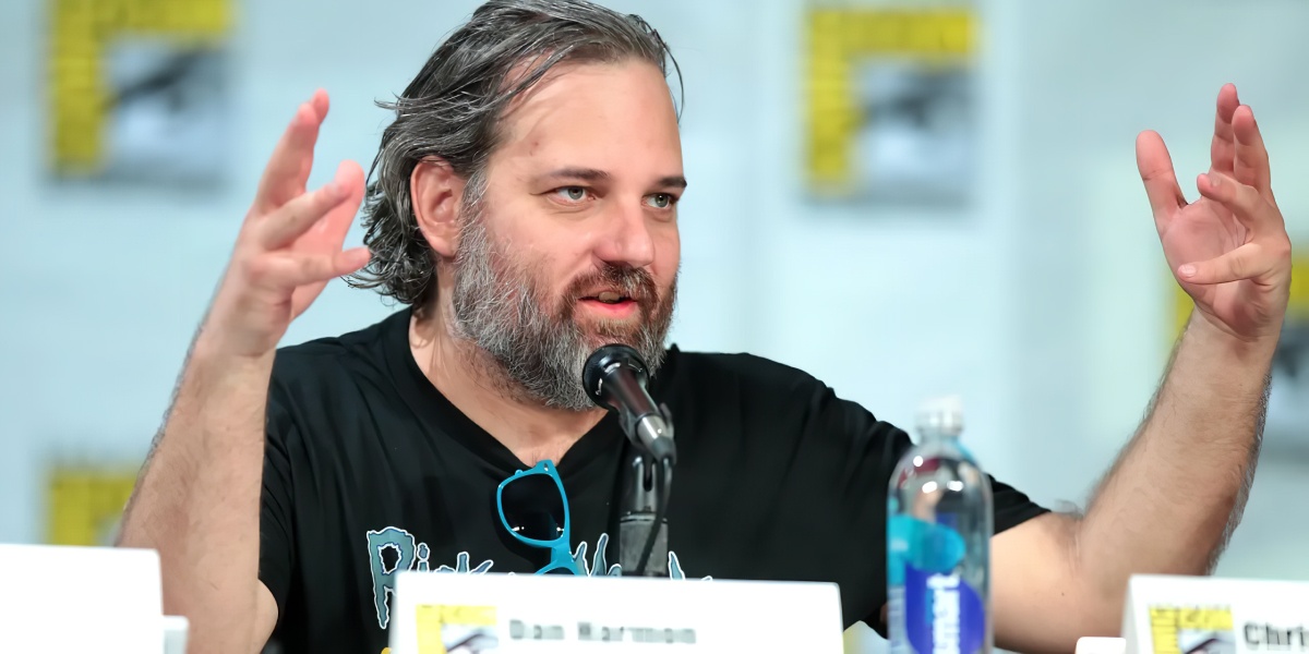
Fox executives will invest $100 million in NFT-based TV shows. Fox brought in "Rick and Morty" co-creator Dan Harmon to create "Krapopolis"
Fox's Blockchain Creative Labs (BCL) will develop these NFT TV shows with Bento Box Entertainment. BCL markets Fox's WWE "Moonsault" NFT.
Fox said it would use the $100 million to build a "creative community" and "brand ecosystem." The media giant mentioned using these funds for NFT "benefits."
"Krapopolis" will be a Greek-themed animated comedy, per Rarity Sniper. Initial reports said NFT buyers could collaborate on "character development" and get exclusive perks.
Fox Entertainment may drop "Krapopolis" NFTs on Ethereum, according to new reports. Fox says it will soon release more details on its NFT plans for "Krapopolis."
Media Giants Favor "NFT Storytelling"
"Krapopolis" is one of the largest "NFT storytelling" experiments due to Dan Harmon's popularity and Fox Entertainment's reach. Many celebrities have begun exploring Web3 for TV shows.
Mila Kunis' animated sitcom "The Gimmicks" lets fans direct the show. Any "Gimmick" NFT holder could contribute to episode plots.
"The Gimmicks" lets NFT holders write fan fiction about their avatars. If show producers like what they read, their NFT may appear in an episode.
Rob McElhenney recently launched "Adimverse," a Web3 writers' community. Anyone with a "Adimverse" NFT can collaborate on creative projects and share royalties.
Many blue-chip NFTs are appearing in movies and TV shows. Coinbase will release Bored Ape Yacht Club shorts at NFT. NYC. Reese Witherspoon is working on a World of Women NFT series.
PFP NFT collections have Hollywood media partners. Guy Oseary manages Madonna's World of Women and Bored Ape Yacht Club collections. The Doodles signed with Billboard's Julian Holguin and the Cool Cats with CAA.
Web3 and NFTs are changing how many filmmakers tell stories.

xuanling11
3 years ago
Reddit NFT Achievement

Reddit's NFT market is alive and well.
NFT owners outnumber OpenSea on Reddit.
Reddit NFTs flip in OpenSea in days:
Fast-selling.
NFT sales will make Reddit's current communities more engaged.
I don't think NFTs will affect existing groups, but they will build hype for people to acquire them.
The first season of Collectibles is unique, but many missed the first season.
Second-season NFTs are less likely to be sold for a higher price than first-season ones.
If you use Reddit, it's fun to own NFTs.
You might also like

Julie Plavnik
3 years ago
How to Become a Crypto Broker [Complying and Making Money]
Three options exist. The third one is the quickest and most fruitful.
You've mastered crypto trading and want to become a broker.
So you may wonder: Where to begin?
If so, keep reading.
Today I'll compare three different approaches to becoming a cryptocurrency trader.
What are cryptocurrency brokers, and how do they vary from stockbrokers?
A stockbroker implements clients' market orders (retail or institutional ones).
Brokerage firms are regulated, insured, and subject to regulatory monitoring.
Stockbrokers are required between buyers and sellers. They can't trade without a broker. To trade, a trader must open a broker account and deposit money. When a trader shops, he tells his broker what orders to place.
Crypto brokerage is trade intermediation with cryptocurrency.
In crypto trading, however, brokers are optional.
Crypto exchanges offer direct transactions. Open an exchange account (no broker needed) and make a deposit.
Question:
Since crypto allows DIY trading, why use a broker?
Let's compare cryptocurrency exchanges vs. brokers.
Broker versus cryptocurrency exchange
Most existing crypto exchanges are basically brokers.
Examine their primary services:
connecting purchasers and suppliers
having custody of clients' money (with the exception of decentralized cryptocurrency exchanges),
clearance of transactions.
Brokerage is comparable, don't you think?
There are exceptions. I mean a few large crypto exchanges that follow the stock exchange paradigm. They outsource brokerage, custody, and clearing operations. Classic exchange setups are rare in today's bitcoin industry.
Back to our favorite “standard” crypto exchanges. All-in-one exchanges and brokers. And usually, they operate under a broker or a broker-dealer license, save for the exchanges registered somewhere in a free-trade offshore paradise. Those don’t bother with any licensing.
What’s the sense of having two brokers at a time?
Better liquidity and trading convenience.
The crypto business is compartmentalized.
We have CEXs, DEXs, hybrid exchanges, and semi-exchanges (those that aggregate liquidity but do not execute orders on their sides). All have unique regulations and act as sovereign states.
There are about 18k coins and hundreds of blockchain protocols, most of which are heterogeneous (i.e., different in design and not interoperable).
A trader must register many accounts on different exchanges, deposit funds, and manage them all concurrently to access global crypto liquidity.
It’s extremely inconvenient.
Crypto liquidity fragmentation is the largest obstacle and bottleneck blocking crypto from mass adoption.
Crypto brokers help clients solve this challenge by providing one-gate access to deep and diverse crypto liquidity from numerous exchanges and suppliers. Professionals and institutions need it.
Another killer feature of a brokerage may be allowing clients to trade crypto with fiat funds exclusively, without fiat/crypto conversion. It is essential for professional and institutional traders.
Who may work as a cryptocurrency broker?
Apparently, not anyone. Brokerage requires high-powered specialists because it involves other people's money.
Here's the essentials:
excellent knowledge, skills, and years of trading experience
high-quality, quick, and secure infrastructure
highly developed team
outstanding trading capital
High-ROI network: long-standing, trustworthy connections with customers, exchanges, liquidity providers, payment gates, and similar entities
outstanding marketing and commercial development skills.
What about a license for a cryptocurrency broker? Is it necessary?
Complex question.
If you plan to play in white-glove jurisdictions, you may need a license. For example, in the US, as a “money transmitter” or as a CASSP (crypto asset secondary services provider) in Australia.
Even in these jurisdictions, there are no clear, holistic crypto brokerage and licensing policies.
Your lawyer will help you decide if your crypto brokerage needs a license.
Getting a license isn't quick. Two years of patience are needed.
How can you turn into a cryptocurrency broker?
Finally, we got there! 🎉
Three actionable ways exist:
To kickstart a regulated stand-alone crypto broker
To get a crypto broker franchise, and
To become a liquidity network broker.
Let's examine each.
1. Opening a regulated cryptocurrency broker
It's difficult. Especially If you're targeting first-world users.
You must comply with many regulatory, technical, financial, HR, and reporting obligations to keep your organization running. Some are mentioned above.
The licensing process depends on the products you want to offer (spots or derivatives) and the geographic areas you plan to service. There are no general rules for that.
In an overgeneralized way, here are the boxes you will have to check:
capital availability (usually a large amount of capital c is required)
You will have to move some of your team members to the nation providing the license in order to establish an office presence there.
the core team with the necessary professional training (especially applies to CEO, Head of Trading, Assistant to Head of Trading, etc.)
insurance
infrastructure that is trustworthy and secure
adopted proper AML/KYC/financial monitoring policies, etc.
Assuming you passed, what's next?
I bet it won’t be mind-blowing for you that the license is just a part of the deal. It won't attract clients or revenue.
To bring in high-dollar clientele, you must be a killer marketer and seller. It's not easy to convince people to give you money.
You'll need to be a great business developer to form successful, long-term agreements with exchanges (ideally for no fees), liquidity providers, banks, payment gates, etc. Persuade clients.
It's a tough job, isn't it?
I expect a Quora-type question here:
Can I start an unlicensed crypto broker?
Well, there is always a workaround with crypto!
You can register your broker in a free-trade zone like Seychelles to avoid US and other markets with strong watchdogs.
This is neither wise nor sustainable.
First, such experiments are illegal.
Second, you'll have trouble attracting clients and strategic partners.
A license equals trust. That’s it.
Even a pseudo-license from Mauritius matters.
Here are this method's benefits and downsides.
Cons first.
As you navigate this difficult and expensive legal process, you run the risk of missing out on business prospects. It's quite simple to become excellent compliance yet unable to work. Because your competitors are already courting potential customers while you are focusing all of your effort on paperwork.
Only God knows how long it will take you to pass the break-even point when everything with the license has been completed.
It is a money-burning business, especially in the beginning when the majority of your expenses will go toward marketing, sales, and maintaining license requirements. Make sure you have the fortitude and resources necessary to face such a difficult challenge.
Pros
It may eventually develop into a tool for making money. Because big guys who are professionals at trading require a white-glove regulated brokerage. You have every possibility if you work hard in the areas of sales, marketing, business development, and wealth. Simply put, everything must align.
Launching a regulated crypto broker is analogous to launching a crypto exchange. It's ROUGH. Sure you can take it?
2. Franchise for Crypto Broker (Crypto Sub-Brokerage)
A broker franchise is easier and faster than becoming a regulated crypto broker. Not a traditional brokerage.
A broker franchisee, often termed a sub-broker, joins with a broker (a franchisor) to bring them new clients. Sub-brokers market a broker's products and services to clients.
Sub-brokers are the middlemen between a broker and an investor.
Why is sub-brokering easier?
less demanding qualifications and legal complexity. All you need to do is keep a few certificates on hand (each time depends on the jurisdiction).
No significant investment is required
there is no demand that you be a trading member of an exchange, etc.
As a sub-broker, you can do identical duties without as many rights and certifications.
What about the crypto broker franchise?
Sub-brokers aren't common in crypto.
In most existing examples (PayBito, PCEX, etc.), franchises are offered by crypto exchanges, not brokers. Though we remember that crypto exchanges are, in fact, brokers, do we?
Similarly:
For a commission, a franchiser crypto broker receives new leads from a crypto sub-broker.
See above for why enrolling is easy.
Finding clients is difficult. Most crypto traders prefer to buy-sell on their own or through brokers over sub-broker franchises.
3. Broker of the Crypto Trading Network (or a Network Broker)
It's the greatest approach to execute crypto brokerage, based on effort/return.
Network broker isn't an established word. I wrote it for clarity.
Remember how we called crypto liquidity fragmentation the current crypto finance paradigm's main bottleneck?
Where there's a challenge, there's progress.
Several well-funded projects are aiming to fix crypto liquidity fragmentation. Instead of launching another crypto exchange with siloed trading, the greatest minds create trading networks that aggregate crypto liquidity from desynchronized sources and enable quick, safe, and affordable cross-blockchain transactions. Each project offers a distinct option for users.
Crypto liquidity implies:
One-account access to cryptocurrency liquidity pooled from network participants' exchanges and other liquidity sources
compiled price feeds
Cross-chain transactions that are quick and inexpensive, even for HFTs
link between participants of all kinds, and
interoperability among diverse blockchains
Fast, diversified, and cheap global crypto trading from one account.
How does a trading network help cryptocurrency brokers?
I’ll explain it, taking Yellow Network as an example.
Yellow provides decentralized Layer-3 peer-to-peer trading.
trade across chains globally with real-time settlement and
Between cryptocurrency exchanges, brokers, trading companies, and other sorts of network members, there is communication and the exchange of financial information.
Have you ever heard about ECN (electronic communication network)? If not, it's an automated system that automatically matches buy and sell orders. Yellow is a decentralized digital asset ECN.
Brokers can:
Start trading right now without having to meet stringent requirements; all you need to do is integrate with Yellow Protocol and successfully complete some KYC verification.
Access global aggregated crypto liquidity through a single point.
B2B (Broker to Broker) liquidity channels that provide peer liquidity from other brokers. Orders from the other broker will appear in the order book of a broker who is peering with another broker on the market. It will enable a broker to broaden his offer and raise the total amount of liquidity that is available to his clients.
Select a custodian or use non-custodial practices.
Comparing network crypto brokerage to other types:
A licensed stand-alone brokerage business is much more difficult and time-consuming to launch than network brokerage, and
Network brokerage, in contrast to crypto sub-brokerage, is scalable, independent, and offers limitless possibilities for revenue generation.
Yellow Network Whitepaper. has more details on how to start a brokerage business and what rewards you'll obtain.
Final thoughts
There are three ways to become a cryptocurrency broker, including the non-conventional liquidity network brokerage. The last option appears time/cost-effective.
Crypto brokerage isn't crowded yet. Act quickly to find your right place in this market.
Choose the way that works for you best and see you in crypto trading.
Discover Web3 & DeFi with Yellow Network!
Yellow, powered by Openware, is developing a cross-chain P2P liquidity aggregator to unite the crypto sector and provide global remittance services that aid people.
Join the Yellow Community and plunge into this decade's biggest product-oriented crypto project.
Observe Yellow Twitter
Enroll in Yellow Telegram
Visit Yellow Discord.
On Hacker Noon, look us up.
Yellow Network will expose development, technology, developer tools, crypto brokerage nodes software, and community liquidity mining.

Hudson Rennie
3 years ago
Meet the $5 million monthly controversy-selling King of Toxic Masculinity.
Trigger warning — Andrew Tate is running a genius marketing campaign
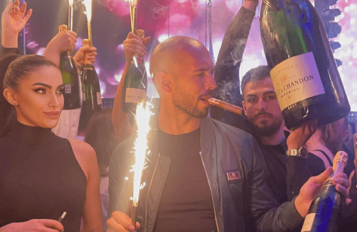
Andrew Tate is a 2022 internet celebrity.
Kickboxing world champion became rich playboy with controversial views on gender roles.
Andrew's get-rich-quick scheme isn't new. His social media popularity is impressive.
He’s currently running one of the most genius marketing campaigns in history.
He pulls society's pendulum away from diversity and inclusion and toward diversion and exclusion. He's unstoppable.
Here’s everything you need to know about Andrew Tate. And how he’s playing chess while the world plays checkers.
Cobra Tate is the name he goes by.
American-born, English-raised entrepreneur Andrew Tate lives in Romania.
Romania? Says Andrew,
“I prefer a country in which corruption is available to everyone.”
Andrew was a professional kickboxer with the ring moniker Cobra before starting Hustlers University.
Before that, he liked chess and worshipped his father.
Emory Andrew Tate III is named after his grandmaster chess player father.
Emory was the first black-American chess champion. He was military, martial arts-trained, and multilingual. A superhuman.
He lived in his car to make ends meet.
Andrew and Tristan relocated to England with their mother when their parents split.
It was there that Andrew began his climb toward becoming one of the internet’s greatest villains.
Andrew fell in love with kickboxing.
Andrew spent his 20s as a professional kickboxer and reality TV star, featuring on Big Brother UK and The Ultimate Traveller.
These 3 incidents, along with a chip on his shoulder, foreshadowed Andrews' social media breakthrough.
Chess
Combat sports
Reality television
A dangerous trio.
Andrew started making money online after quitting kickboxing in 2017 due to an eye issue.
Andrew didn't suddenly become popular.
Andrew's web work started going viral in 2022.
Due to his contentious views on patriarchy and gender norms, he's labeled the King of Toxic Masculinity. His most contentious views (trigger warning):
“Women are intrinsically lazy.”
“Female promiscuity is disgusting.”
“Women shouldn’t drive cars or fly planes.”
“A lot of the world’s problems would be solved if women had their body count tattooed on their foreheads.”
Andrew's two main beliefs are:
“These are my personal opinions based on my experiences.”
2. “I believe men are better at some things and women are better at some things. We are not equal.”
Andrew intentionally offends.
Andrew's thoughts began circulating online in 2022.
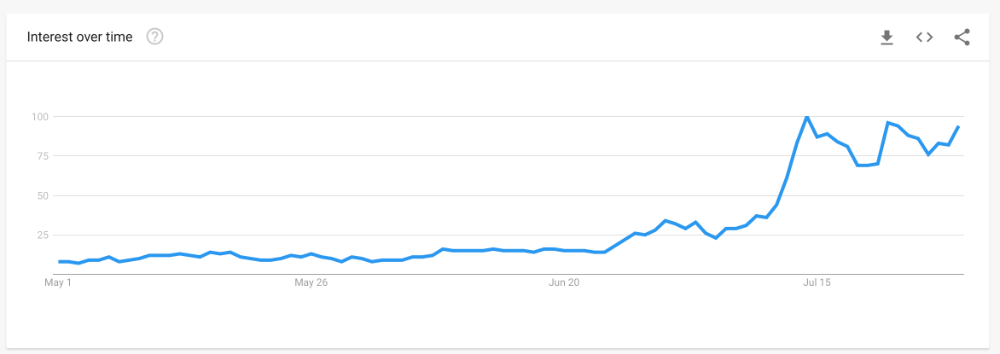
In July 2022, he was one of the most Googled humans, surpassing:
Joe Biden
Donald Trump
Kim Kardashian
Andrews' rise is a mystery since no one can censure or suppress him. This is largely because Andrew nor his team post his clips.
But more on that later.
Andrew's path to wealth.
Andrew Tate is a self-made millionaire. His morality is uncertain.
Andrew and Tristan needed money soon after retiring from kickboxing.
“I owed some money to some dangerous people. I had $70K and needed $100K to stay alive.”
Andrews lost $20K on roulette at a local casino.
Andrew had one week to make $50,000, so he started planning. Andrew locked himself in a chamber like Thomas Edison to solve an energy dilemma.
He listed his assets.
Physical strength (but couldn’t fight)
a BMW (worth around $20K)
Intelligence (but no outlet)
A lightbulb.
He had an epiphany after viewing a webcam ad. He sought aid from women, ironically. His 5 international girlfriends are assets.
Then, a lightbulb.
Andrew and Tristan messaged and flew 7 women to a posh restaurant. Selling desperation masked as opportunity, Andrew pitched his master plan:
A webcam business — with a 50/50 revenue split.
5 women left.
2 stayed.
Andrew Tate, a broke kickboxer, became Top G, Cobra Tate.
The business model was simple — yet sad.
Andrew's girlfriends moved in with him and spoke online for 15+ hours a day. Andrew handled ads and equipment as the women posed.
Andrew eventually took over their keyboards, believing he knew what men wanted more than women.
Andrew detailed on the Full Send Podcast how he emotionally manipulated men for millions. They sold houses, automobiles, and life savings to fuel their companionship addiction.
When asked if he felt bad, Andrew said,
“F*ck no.“
Andrew and Tristan wiped off debts, hired workers, and diversified.
Tristan supervised OnlyFans models.
Andrew bought Romanian casinos and MMA league RXF (Real Xtreme Fighting).
Pandemic struck suddenly.
Andrew couldn't run his 2 businesses without a plan. Another easy moneymaker.
He banked on Hustlers University.
The actual cause of Andrew's ubiquity.
On a Your Mom’s House episode Andrew's 4 main revenue sources:
Hustler’s University
2. Owning casinos in Romania
3. Owning 10% of the Romanian MMA league “RXF”
4. “The War Room” — a society of rich and powerful men
When the pandemic hit, 3/4 became inoperable.
So he expanded Hustlers University.
But what is Hustler’s University?
Andrew says Hustlers University teaches 18 wealth-building tactics online. Examples:
Real estate
Copywriting
Amazon FBA
Dropshipping
Flipping Cryptos
How to swiftly become wealthy.
Lessons are imprecise, rudimentary, and macro-focused, say reviews. Invest wisely, etc. Everything is free online.
You pay for community. One unique income stream.
The only money-making mechanism that keeps the course from being a scam.
The truth is, many of Andrew’s students are actually making money. Maybe not from the free YouTube knowledge Andrew and his professors teach in the course, but through Hustler’s University’s affiliate program.
Affiliates earn 10% commission for each new student = $5.
Students can earn $10 for each new referral in the first two months.
Andrew earns $50 per membership per month.
This affiliate program isn’t anything special — in fact, it’s on the lower end of affiliate payouts. Normally, it wouldn’t be very lucrative.
But it has one secret weapon— Andrew and his viral opinions.
Andrew is viral. Andrew went on a media tour in January 2022 after appearing on Your Mom's House.
And many, many more…
He chatted with Twitch streamers. Hustlers University wanted more controversy (and clips).
Here’s the strategy behind Hustler’s University that has (allegedly) earned students upwards of $10K per month:
Make a social media profile with Andrew Tates' name and photo.
Post any of the online videos of Andrews that have gone viral.
Include a referral link in your bio.
Effectively simple.
Andrew's controversy attracts additional students. More student clips circulate as more join. Andrew's students earn more and promote the product as he goes viral.
A brilliant plan that's functioning.
At the beginning of his media tour, Hustler’s University had 5,000 students. 6 months in, and he now has over 100,000.
One income stream generates $5 million every month.
Andrew's approach is not new.
But it is different.
In the early 2010s, Tai Lopez dominated the internet.
His viral video showed his house.
“Here in my garage. Just bought this new Lamborghini.”
Tais' marketing focused on intellect, not strength, power, and wealth to attract women.
How reading quicker leads to financial freedom in 67 steps.
Years later, it was revealed that Tai Lopez rented the mansion and Lamborghini as a marketing ploy to build social proof. Meanwhile, he was living in his friend’s trailer.
Faked success is an old tactic.
Andrew is doing something similar. But with one major distinction.
Andrew outsources his virality — making him nearly impossible to cancel.
In 2022, authorities searched Andrews' estate over human trafficking suspicions. Investigation continues despite withdrawn charges.
Andrew's divisive nature would normally get him fired. Andrew's enterprises and celebrity don't rely on social media.
He doesn't promote or pay for ads. Instead, he encourages his students and anyone wishing to get rich quick to advertise his work.
Because everything goes through his affiliate program. Old saying:
“All publicity is good publicity.”
Final thoughts: it’s ok to feel triggered.
Tate is divisive.
His emotionally charged words are human nature. Andrews created the controversy.
It's non-personal.
His opinions are those of one person. Not world nor generational opinion.
Briefly:
It's easy to understand why Andrews' face is ubiquitous. Money.
The world wide web is a chessboard. Misdirection is part of it.
It’s not personal, it’s business.
Controversy sells
Sometimes understanding the ‘why’, can help you deal with the ‘what.’

Faisal Khan
2 years ago
4 typical methods of crypto market manipulation
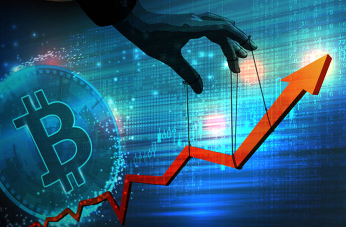
Market fraud
Due to its decentralized and fragmented character, the crypto market has integrity difficulties.
Cryptocurrencies are an immature sector, therefore market manipulation becomes a bigger issue. Many research have attempted to uncover these abuses. CryptoCompare's newest one highlights some of the industry's most typical scams.
Why are these concerns so common in the crypto market? First, even the largest centralized exchanges remain unregulated due to industry immaturity. A low-liquidity market segment makes an attack more harmful. Finally, market surveillance solutions not implemented reduce transparency.
In CryptoCompare's latest exchange benchmark, 62.4% of assessed exchanges had a market surveillance system, although only 18.1% utilised an external solution. To address market integrity, this measure must improve dramatically. Before discussing the report's malpractices, note that this is not a full list of attacks and hacks.
Clean Trading
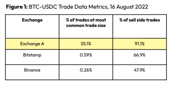
An investor buys and sells concurrently to increase the asset's price. Centralized and decentralized exchanges show this misconduct. 23 exchanges have a volume-volatility correlation < 0.1 during the previous 100 days, according to CryptoCompares. In August 2022, Exchange A reported $2.5 trillion in artificial and/or erroneous volume, up from $33.8 billion the month before.
Spoofing
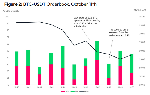
Criminals create and cancel fake orders before they can be filled. Since manipulators can hide in larger trading volumes, larger exchanges have more spoofing. A trader placed a 20.8 BTC ask order at $19,036 when BTC was trading at $19,043. BTC declined 0.13% to $19,018 in a minute. At 18:48, the trader canceled the ask order without filling it.
Front-Running
Most cryptocurrency front-running involves inside trading. Traditional stock markets forbid this. Since most digital asset information is public, this is harder. Retailers could utilize bots to front-run.
CryptoCompare found digital wallets of people who traded like insiders on exchange listings. The figure below shows excess cumulative anomalous returns (CAR) before a coin listing on an exchange.
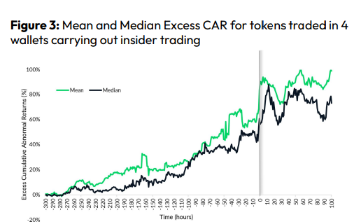
Finally, LAYERING is a sequence of spoofs in which successive orders are put along a ladder of greater (layering offers) or lower (layering bids) values. The paper concludes with recommendations to mitigate market manipulation. Exchange data transparency, market surveillance, and regulatory oversight could reduce manipulative tactics.