

What An Inverted Yield Curve Means For Investors
The yield spread between 10-year and 2-year US Treasury bonds has fallen below 0.2 percent, its lowest level since March 2020. A flattening or negative yield curve can be a bad sign for the economy.
What Is An Inverted Yield Curve?
In the yield curve, bonds of equal credit quality but different maturities are plotted. The most commonly used yield curve for US investors is a plot of 2-year and 10-year Treasury yields, which have yet to invert.
A typical yield curve has higher interest rates for future maturities. In a flat yield curve, short-term and long-term yields are similar. Inverted yield curves occur when short-term yields exceed long-term yields. Inversions of yield curves have historically occurred during recessions.
Inverted yield curves have preceded each of the past eight US recessions. The good news is they're far leading indicators, meaning a recession is likely not imminent.
Every US recession since 1955 has occurred between six and 24 months after an inversion of the two-year and 10-year Treasury yield curves, according to the San Francisco Fed. So, six months before COVID-19, the yield curve inverted in August 2019.
Looking Ahead
The spread between two-year and 10-year Treasury yields was 0.18 percent on Tuesday, the smallest since before the last US recession. If the graph above continues, a two-year/10-year yield curve inversion could occur within the next few months.
According to Bank of America analyst Stephen Suttmeier, the S&P 500 typically peaks six to seven months after the 2s-10s yield curve inverts, and the US economy enters recession six to seven months later.
Investors appear unconcerned about the flattening yield curve. This is in contrast to the iShares 20+ Year Treasury Bond ETF TLT +2.19% which was down 1% on Tuesday.
Inversion of the yield curve and rising interest rates have historically harmed stocks. Recessions in the US have historically coincided with or followed the end of a Federal Reserve rate hike cycle, not the start.
More on Economics & Investing

Quant Galore
3 years ago
I created BAW-IV Trading because I was short on money.
More retail traders means faster, more sophisticated, and more successful methods.
Tech specifications
Only requires a laptop and an internet connection.
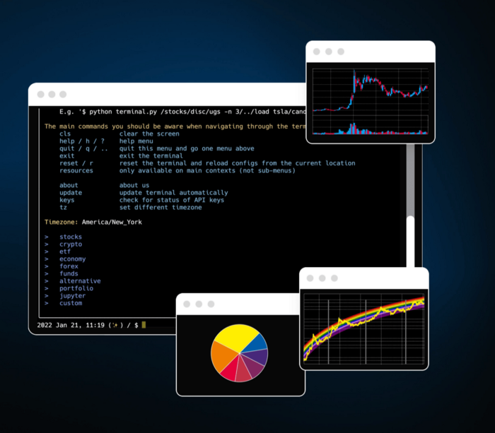
We'll use OpenBB's research platform for data/analysis.
Pricing and execution on Options-Quant

Background
You don't need to know the arithmetic details to use this method.
Black-Scholes is a popular option pricing model. It's best for pricing European options. European options are only exercisable at expiration, unlike American options. American options are always exercisable.
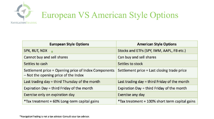
American options carry a premium to cover for the risk of early exercise. The Black-Scholes model doesn't account for this premium, hence it can't price genuine, traded American options.
Barone-Adesi-Whaley (BAW) model. BAW modifies Black-Scholes. It accounts for exercise risk premium and stock dividends. It adds the option's early exercise value to the Black-Scholes value.
The trader need not know the formulaic derivations of this model.
https://ir.nctu.edu.tw/bitstream/11536/14182/1/000264318900005.pdf
Strategy
This strategy targets implied volatility. First, we'll locate liquid options that expire within 30 days and have minimal implied volatility.
After selecting the option that meets the requirements, we price it to get the BAW implied volatility (we choose BAW because it's a more accurate Black-Scholes model). If estimated implied volatility is larger than market volatility, we'll capture the spread.
(Calculated IV — Market IV) = (Profit)
Some approaches to target implied volatility are pricey and inaccessible to individual investors. The best and most cost-effective alternative is to acquire a straddle and delta hedge. This may sound terrifying and pricey, but as shown below, it's much less so.
The Trade
First, we want to find our ideal option, so we use OpenBB terminal to screen for options that:
Have an IV at least 5% lower than the 20-day historical IV
Are no more than 5% out-of-the-money
Expire in less than 30 days
We query:
stocks/options/screen/set low_IV/scr --export Output.csv
This uses the screener function to screen for options that satisfy the above criteria, which we specify in the low IV preset (more on custom presets here). It then saves the matching results to a csv(Excel) file for viewing and analysis.
Stick to liquid names like SPY, AAPL, and QQQ since getting out of a position is just as crucial as getting in. Smaller, illiquid names have higher inefficiencies, which could restrict total profits.

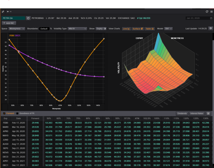
We calculate IV using the BAWbisection model (the bisection is a method of calculating IV, more can be found here.) We price the IV first.
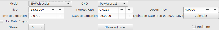
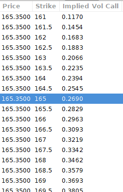
According to the BAW model, implied volatility at this level should be priced at 26.90%. When re-pricing the put, IV is 24.34%, up 3%.
Now it's evident. We must purchase the straddle (long the call and long the put) assuming the computed implied volatility is more appropriate and efficient than the market's. We just want to speculate on volatility, not price fluctuations, thus we delta hedge.
The Fun Starts
We buy both options for $7.65. (x100 multiplier). Initial delta is 2. For every dollar the stock price swings up or down, our position value moves $2.

We want delta to be 0 to avoid price vulnerability. A delta of 0 suggests our position's value won't change from underlying price changes. Being delta-hedged allows us to profit/lose from implied volatility. Shorting 2 shares makes us delta-neutral.
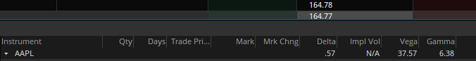
That's delta hedging. (Share price * shares traded) = $330.7 to become delta-neutral. You may have noted that delta is not truly 0.00. This is common since delta-hedging means getting as near to 0 as feasible, since it is rare for deltas to align at 0.00.
Now we're vulnerable to changes in Vega (and Gamma, but given we're dynamically hedging, it's not a big risk), or implied volatility. We wanted to gamble that the position's IV would climb by at least 2%, so we'll maintain it delta-hedged and watch IV.
Because the underlying moves continually, the option's delta moves continuously. A trader can short/long 5 AAPL shares at most. Paper trading lets you practice delta-hedging. Being quick-footed will help with this tactic.
Profit-Closing
As expected, implied volatility rose. By 10 minutes before market closure, the call's implied vol rose to 27% and the put's to 24%. This allowed us to sell the call for $4.95 and the put for $4.35, creating a profit of $165.

You may pull historical data to see how this trade performed. Note the implied volatility and pricing in the final options chain for August 5, 2022 (the position date).

Final Thoughts
Congratulations, that was a doozy. To reiterate, we identified tickers prone to increased implied volatility by screening OpenBB's low IV setting. We double-checked the IV by plugging the price into Options-BAW Quant's model. When volatility was off, we bought a straddle and delta-hedged it. Finally, implied volatility returned to a normal level, and we profited on the spread.
The retail trading space is very quickly catching up to that of institutions. Commissions and fees used to kill this method, but now they cost less than $5. Watching momentum, technical analysis, and now quantitative strategies evolve is intriguing.
I'm not linked with these sites and receive no financial benefit from my writing.
Tell me how your experience goes and how I helped; I love success tales.

Sofien Kaabar, CFA
3 years ago
How to Make a Trading Heatmap
Python Heatmap Technical Indicator
Heatmaps provide an instant overview. They can be used with correlations or to predict reactions or confirm the trend in trading. This article covers RSI heatmap creation.
The Market System
Market regime:
Bullish trend: The market tends to make higher highs, which indicates that the overall trend is upward.
Sideways: The market tends to fluctuate while staying within predetermined zones.
Bearish trend: The market has the propensity to make lower lows, indicating that the overall trend is downward.
Most tools detect the trend, but we cannot predict the next state. The best way to solve this problem is to assume the current state will continue and trade any reactions, preferably in the trend.
If the EURUSD is above its moving average and making higher highs, a trend-following strategy would be to wait for dips before buying and assuming the bullish trend will continue.
Indicator of Relative Strength
J. Welles Wilder Jr. introduced the RSI, a popular and versatile technical indicator. Used as a contrarian indicator to exploit extreme reactions. Calculating the default RSI usually involves these steps:
Determine the difference between the closing prices from the prior ones.
Distinguish between the positive and negative net changes.
Create a smoothed moving average for both the absolute values of the positive net changes and the negative net changes.
Take the difference between the smoothed positive and negative changes. The Relative Strength RS will be the name we use to describe this calculation.
To obtain the RSI, use the normalization formula shown below for each time step.
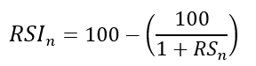
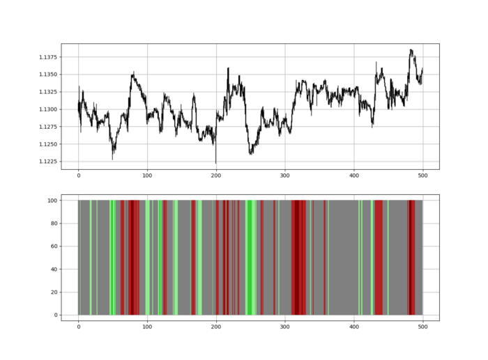
The 13-period RSI and black GBPUSD hourly values are shown above. RSI bounces near 25 and pauses around 75. Python requires a four-column OHLC array for RSI coding.
import numpy as np
def add_column(data, times):

    for i in range(1, times + 1):

        new = np.zeros((len(data), 1), dtype = float)

        data = np.append(data, new, axis = 1)
    return data
def delete_column(data, index, times):

    for i in range(1, times + 1):

        data = np.delete(data, index, axis = 1)
    return data
def delete_row(data, number):

    data = data[number:, ]

    return data
def ma(data, lookback, close, position):

    data = add_column(data, 1)

    for i in range(len(data)):

            try:

                data[i, position] = (data[i - lookback + 1:i + 1, close].mean())

            except IndexError:

                pass

    data = delete_row(data, lookback)

    return data
def smoothed_ma(data, alpha, lookback, close, position):

    lookback = (2 * lookback) - 1

    alpha = alpha / (lookback + 1.0)

    beta  = 1 - alpha

    data = ma(data, lookback, close, position)
    data[lookback + 1, position] = (data[lookback + 1, close] * alpha) + (data[lookback, position] * beta)
    for i in range(lookback + 2, len(data)):

            try:

                data[i, position] = (data[i, close] * alpha) + (data[i - 1, position] * beta)

            except IndexError:

                pass

    return data
def rsi(data, lookback, close, position):

    data = add_column(data, 5)

    for i in range(len(data)):

        data[i, position] = data[i, close] - data[i - 1, close]

    for i in range(len(data)):

        if data[i, position] > 0:

            data[i, position + 1] = data[i, position]

        elif data[i, position] < 0:

            data[i, position + 2] = abs(data[i, position])

    data = smoothed_ma(data, 2, lookback, position + 1, position + 3)
    data = smoothed_ma(data, 2, lookback, position + 2, position + 4)
    data[:, position + 5] = data[:, position + 3] / data[:, position + 4]

    data[:, position + 6] = (100 - (100 / (1 + data[:, position + 5])))
    data = delete_column(data, position, 6)
    data = delete_row(data, lookback)
    return data
Make sure to focus on the concepts and not the code. You can find the codes of most of my strategies in my books. The most important thing is to comprehend the techniques and strategies.
My weekly market sentiment report uses complex and simple models to understand the current positioning and predict the future direction of several major markets. Check out the report here:
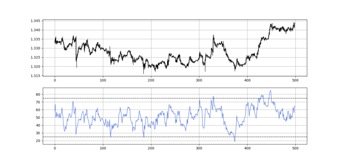
Using the Heatmap to Find the Trend
RSI trend detection is easy but useless. Bullish and bearish regimes are in effect when the RSI is above or below 50, respectively. Tracing a vertical colored line creates the conditions below. How:
When the RSI is higher than 50, a green vertical line is drawn.
When the RSI is lower than 50, a red vertical line is drawn.
Zooming out yields a basic heatmap, as shown below.
Plot code:
def indicator_plot(data, second_panel, window = 250):
    fig, ax = plt.subplots(2, figsize = (10, 5))
    sample = data[-window:, ]
    for i in range(len(sample)):
        ax[0].vlines(x = i, ymin = sample[i, 2], ymax = sample[i, 1], color = 'black', linewidth = 1)
        if sample[i, 3] > sample[i, 0]:
            ax[0].vlines(x = i, ymin = sample[i, 0], ymax = sample[i, 3], color = 'black', linewidth = 1.5)
        if sample[i, 3] < sample[i, 0]:
            ax[0].vlines(x = i, ymin = sample[i, 3], ymax = sample[i, 0], color = 'black', linewidth = 1.5)
        if sample[i, 3] == sample[i, 0]:
            ax[0].vlines(x = i, ymin = sample[i, 3], ymax = sample[i, 0], color = 'black', linewidth = 1.5)
    ax[0].grid()
    for i in range(len(sample)):
        if sample[i, second_panel] > 50:
            ax[1].vlines(x = i, ymin = 0, ymax = 100, color = 'green', linewidth = 1.5)
        if sample[i, second_panel] < 50:
            ax[1].vlines(x = i, ymin = 0, ymax = 100, color = 'red', linewidth = 1.5)
    ax[1].grid()
indicator_plot(my_data, 4, window = 500)
Call RSI on your OHLC array's fifth column. 4. Adjusting lookback parameters reduces lag and false signals. Other indicators and conditions are possible.
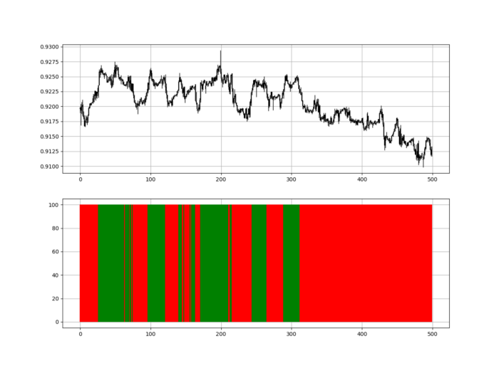
Another suggestion is to develop an RSI Heatmap for Extreme Conditions.
Contrarian indicator RSI. The following rules apply:
Whenever the RSI is approaching the upper values, the color approaches red.
The color tends toward green whenever the RSI is getting close to the lower values.
Zooming out yields a basic heatmap, as shown below.
Plot code:
import matplotlib.pyplot as plt
def indicator_plot(data, second_panel, window = 250):
    fig, ax = plt.subplots(2, figsize = (10, 5))
    sample = data[-window:, ]
    for i in range(len(sample)):
        ax[0].vlines(x = i, ymin = sample[i, 2], ymax = sample[i, 1], color = 'black', linewidth = 1)
        if sample[i, 3] > sample[i, 0]:
            ax[0].vlines(x = i, ymin = sample[i, 0], ymax = sample[i, 3], color = 'black', linewidth = 1.5)
        if sample[i, 3] < sample[i, 0]:
            ax[0].vlines(x = i, ymin = sample[i, 3], ymax = sample[i, 0], color = 'black', linewidth = 1.5)
        if sample[i, 3] == sample[i, 0]:
            ax[0].vlines(x = i, ymin = sample[i, 3], ymax = sample[i, 0], color = 'black', linewidth = 1.5)
    ax[0].grid()
    for i in range(len(sample)):
        if sample[i, second_panel] > 90:
            ax[1].vlines(x = i, ymin = 0, ymax = 100, color = 'red', linewidth = 1.5)
        if sample[i, second_panel] > 80 and sample[i, second_panel] < 90:
            ax[1].vlines(x = i, ymin = 0, ymax = 100, color = 'darkred', linewidth = 1.5)
        if sample[i, second_panel] > 70 and sample[i, second_panel] < 80:
            ax[1].vlines(x = i, ymin = 0, ymax = 100, color = 'maroon', linewidth = 1.5)
        if sample[i, second_panel] > 60 and sample[i, second_panel] < 70:
            ax[1].vlines(x = i, ymin = 0, ymax = 100, color = 'firebrick', linewidth = 1.5)
        if sample[i, second_panel] > 50 and sample[i, second_panel] < 60:
            ax[1].vlines(x = i, ymin = 0, ymax = 100, color = 'grey', linewidth = 1.5)
        if sample[i, second_panel] > 40 and sample[i, second_panel] < 50:
            ax[1].vlines(x = i, ymin = 0, ymax = 100, color = 'grey', linewidth = 1.5)
        if sample[i, second_panel] > 30 and sample[i, second_panel] < 40:
            ax[1].vlines(x = i, ymin = 0, ymax = 100, color = 'lightgreen', linewidth = 1.5)
        if sample[i, second_panel] > 20 and sample[i, second_panel] < 30:
            ax[1].vlines(x = i, ymin = 0, ymax = 100, color = 'limegreen', linewidth = 1.5)
        if sample[i, second_panel] > 10 and sample[i, second_panel] < 20:
            ax[1].vlines(x = i, ymin = 0, ymax = 100, color = 'seagreen', linewidth = 1.5)
        if sample[i, second_panel] > 0 and sample[i, second_panel] < 10:
            ax[1].vlines(x = i, ymin = 0, ymax = 100, color = 'green', linewidth = 1.5)
    ax[1].grid()
indicator_plot(my_data, 4, window = 500)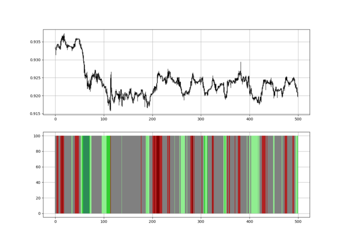
Dark green and red areas indicate imminent bullish and bearish reactions, respectively. RSI around 50 is grey.
Summary
To conclude, my goal is to contribute to objective technical analysis, which promotes more transparent methods and strategies that must be back-tested before implementation.
Technical analysis will lose its reputation as subjective and unscientific.
When you find a trading strategy or technique, follow these steps:
Put emotions aside and adopt a critical mindset.
Test it in the past under conditions and simulations taken from real life.
Try optimizing it and performing a forward test if you find any potential.
Transaction costs and any slippage simulation should always be included in your tests.
Risk management and position sizing should always be considered in your tests.
After checking the above, monitor the strategy because market dynamics may change and make it unprofitable.

Cody Collins
3 years ago
The direction of the economy is as follows.
What quarterly bank earnings reveal

Big banks know the economy best. Unless we’re talking about a housing crisis in 2007…
Banks are crucial to the U.S. economy. The Fed, communities, and investments exchange money.
An economy depends on money flow. Banks' views on the economy can affect their decision-making.
Most large banks released quarterly earnings and forward guidance last week. Others were pessimistic about the future.
What Makes Banks Confident
Bank of America's profit decreased 30% year-over-year, but they're optimistic about the economy. Comparatively, they're bullish.
Who banks serve affects what they see. Bank of America supports customers.
They think consumers' future is bright. They believe this for many reasons.
The average customer has decent credit, unless the system is flawed. Bank of America's new credit card and mortgage borrowers averaged 771. New-car loan and home equity borrower averages were 791 and 797.
2008's housing crisis affected people with scores below 620.
Bank of America and the economy benefit from a robust consumer. Major problems can be avoided if individuals maintain spending.
Reasons Other Banks Are Less Confident
Spending requires income. Many companies, mostly in the computer industry, have announced they will slow or freeze hiring. Layoffs are frequently an indication of poor times ahead.
BOA is positive, but investment banks are bearish.
Jamie Dimon, CEO of JPMorgan, outlined various difficulties our economy could confront.
But geopolitical tension, high inflation, waning consumer confidence, the uncertainty about how high rates have to go and the never-before-seen quantitative tightening and their effects on global liquidity, combined with the war in Ukraine and its harmful effect on global energy and food prices are very likely to have negative consequences on the global economy sometime down the road.
That's more headwinds than tailwinds.
JPMorgan, which helps with mergers and IPOs, is less enthusiastic due to these concerns. Incoming headwinds signal drying liquidity, they say. Less business will be done.
Final Reflections
I don't think we're done. Yes, stocks are up 10% from a month ago. It's a long way from old highs.
I don't think the stock market is a strong economic indicator.
Many executives foresee a 2023 recession. According to the traditional definition, we may be in a recession when Q2 GDP statistics are released next week.
Regardless of criteria, I predict the economy will have a terrible year.
Weekly layoffs are announced. Inflation persists. Will prices return to 2020 levels if inflation cools? Perhaps. Still expensive energy. Ukraine's war has global repercussions.
I predict BOA's next quarter earnings won't be as bullish about the consumer's strength.
You might also like

Enrique Dans
3 years ago
You may not know about The Merge, yet it could change society

Ethereum is the second-largest cryptocurrency. The Merge, a mid-September event that will convert Ethereum's consensus process from proof-of-work to proof-of-stake if all goes according to plan, will be a game changer.
Why is Ethereum ditching proof-of-work? Because it can. We're talking about a fully functioning, open-source ecosystem with a capacity for evolution that other cryptocurrencies lack, a change that would allow it to scale up its performance from 15 transactions per second to 100,000 as its blockchain is used for more and more things. It would reduce its energy consumption by 99.95%. Vitalik Buterin, the system's founder, would play a less active role due to decentralization, and miners, who validated transactions through proof of work, would be far less important.
Why has this conversion taken so long and been so cautious? Because it involves modifying a core process while it's running to boost its performance. It requires running the new mechanism in test chains on an ever-increasing scale, assessing participant reactions, and checking for issues or restrictions. The last big test was in early June and was successful. All that's left is to converge the mechanism with the Ethereum blockchain to conclude the switch.
What's stopping Bitcoin, the leader in market capitalization and the cryptocurrency that began blockchain's appeal, from doing the same? Satoshi Nakamoto, whoever he or she is, departed from public life long ago, therefore there's no community leadership. Changing it takes a level of consensus that is impossible to achieve without strong leadership, which is why Bitcoin's evolution has been sluggish and conservative, with few modifications.
Secondly, The Merge will balance the consensus mechanism (proof-of-work or proof-of-stake) and the system decentralization or centralization. Proof-of-work prevents double-spending, thus validators must buy hardware. The system works, but it requires a lot of electricity and, as it scales up, tends to re-centralize as validators acquire more hardware and the entire network activity gets focused in a few nodes. Larger operations save more money, which increases profitability and market share. This evolution runs opposed to the concept of decentralization, and some anticipate that any system that uses proof of work as a consensus mechanism will evolve towards centralization, with fewer large firms able to invest in efficient network nodes.
Yet radical bitcoin enthusiasts share an opposite argument. In proof-of-stake, transaction validators put their funds at stake to attest that transactions are valid. The algorithm chooses who validates each transaction, giving more possibilities to nodes that put more coins at stake, which could open the door to centralization and government control.
In both cases, we're talking about long-term changes, but Bitcoin's proof-of-work has been evolving longer and seems to confirm those fears, while proof-of-stake is only employed in coins with a minuscule volume compared to Ethereum and has no predictive value.
As of mid-September, we will have two significant cryptocurrencies, each with a different consensus mechanisms and equally different characteristics: one is intrinsically conservative and used only for economic transactions, while the other has been evolving in open source mode, and can be used for other types of assets, smart contracts, or decentralized finance systems. Some even see it as the foundation of Web3.
Many things could change before September 15, but The Merge is likely to be a turning point. We'll have to follow this closely.

OnChain Wizard
3 years ago
How to make a >800 million dollars in crypto attacking the once 3rd largest stablecoin, Soros style
Everyone is talking about the $UST attack right now, including Janet Yellen. But no one is talking about how much money the attacker made (or how brilliant it was). Lets dig in.
Our story starts in late March, when the Luna Foundation Guard (or LFG) starts buying BTC to help back $UST. LFG started accumulating BTC on 3/22, and by March 26th had a $1bn+ BTC position. This is leg #1 that made this trade (or attack) brilliant.
The second leg comes in the form of the 4pool Frax announcement for $UST on April 1st. This added the second leg needed to help execute the strategy in a capital efficient way (liquidity will be lower and then the attack is on).
We don't know when the attacker borrowed 100k BTC to start the position, other than that it was sold into Kwon's buying (still speculation). LFG bought 15k BTC between March 27th and April 11th, so lets just take the average price between these dates ($42k).
So you have a ~$4.2bn short position built. Over the same time, the attacker builds a $1bn OTC position in $UST. The stage is now set to create a run on the bank and get paid on your BTC short. In anticipation of the 4pool, LFG initially removes $150mm from 3pool liquidity.
The liquidity was pulled on 5/8 and then the attacker uses $350mm of UST to drain curve liquidity (and LFG pulls another $100mm of liquidity).
But this only starts the de-pegging (down to 0.972 at the lows). LFG begins selling $BTC to defend the peg, causing downward pressure on BTC while the run on $UST was just getting started.
With the Curve liquidity drained, the attacker used the remainder of their $1b OTC $UST position ($650mm or so) to start offloading on Binance. As withdrawals from Anchor turned from concern into panic, this caused a real de-peg as people fled for the exits
So LFG is selling $BTC to restore the peg while the attacker is selling $UST on Binance. Eventually the chain gets congested and the CEXs suspend withdrawals of $UST, fueling the bank run panic. $UST de-pegs to 60c at the bottom, while $BTC bleeds out.
The crypto community panics as they wonder how much $BTC will be sold to keep the peg. There are liquidations across the board and LUNA pukes because of its redemption mechanism (the attacker very well could have shorted LUNA as well). BTC fell 25% from $42k on 4/11 to $31.3k
So how much did our attacker make? There aren't details on where they covered obviously, but if they are able to cover (or buy back) the entire position at ~$32k, that means they made $952mm on the short.
On the $350mm of $UST curve dumps I don't think they took much of a loss, lets assume 3% or just $11m. And lets assume that all the Binance dumps were done at 80c, thats another $125mm cost of doing business. For a grand total profit of $815mm (bf borrow cost).
BTC was the perfect playground for the trade, as the liquidity was there to pull it off. While having LFG involved in BTC, and foreseeing they would sell to keep the peg (and prevent LUNA from dying) was the kicker.
Lastly, the liquidity being low on 3pool in advance of 4pool allowed the attacker to drain it with only $350mm, causing the broader panic in both BTC and $UST. Any shorts on LUNA would've added a lot of P&L here as well, with it falling -65% since 5/7.
And for the reply guys, yes I know a lot of this involves some speculation & assumptions. But a lot of money was made here either way, and I thought it would be cool to dive into how they did it.

Victoria Kurichenko
3 years ago
Here's what happened after I launched my second product on Gumroad.
One-hour ebook sales, affiliate relationships, and more.

If you follow me, you may know I started a new ebook in August 2022.
Despite publishing on this platform, my website, and Quora, I'm not a writer.
My writing speed is slow, 2,000 words a day, and I struggle to communicate cohesively.
In April 2022, I wrote a successful guide on How to Write Google-Friendly Blog Posts.
I had no email list or social media presence. I've made $1,600+ selling ebooks.
Evidence:
My first digital offering isn't a book.
It's an actionable guide with my tried-and-true process for writing Google-friendly content.
I'm not bragging.
Established authors like Tim Denning make more from my ebook sales with one newsletter.
This experience taught me writing isn't a privilege.
Writing a book and making money online doesn't require expertise.
Many don't consult experts. They want someone approachable.
Two years passed before I realized my own limits.
I have a brain, two hands, and Internet to spread my message.
I wrote and published a second ebook after the first's success.
On Gumroad, I released my second digital product.
Here's my complete Gumroad evaluation.
Gumroad is a marketplace for content providers to develop and sell sales pages.
Gumroad handles payments and client requests. It's helpful when someone sends a bogus payment receipt requesting an ebook (actual story!).
You'll forget administrative concerns after your first ebook sale.
After my first ebook sale, I did this: I made additional cash!
After every sale, I tell myself, "I built a new semi-passive revenue source."
This thinking shift helps me become less busy while increasing my income and quality of life.
Besides helping others, folks sell evergreen digital things to earn passive money.
It's in my second ebook.
I explain how I built and sold 50+ copies of my SEO writing ebook without being an influencer.
I show how anyone can sell ebooks on Gumroad and automate their sales process.
This is my ebook.

After publicizing the ebook release, I sold three copies within an hour.
Wow, or meh?
I don’t know.
The answer is different for everyone.
These three sales came from a small email list of 40 motivated fans waiting for my ebook release.
I had bigger plans.
I'll market my ebook on Medium, my website, Quora, and email.
I'm testing affiliate partnerships this time.
One of my ebook buyers is now promoting it for 40% commission.
Become my affiliate if you think your readers would like my ebook.
My ebook is a few days old, but I'm interested to see where it goes.
My SEO writing book started without an email list, affiliates, or 4,000 website visitors. I've made four figures.
I'm slowly expanding my communication avenues to have more impact.
Even a small project can open doors you never knew existed.
So began my writing career.
In summary
If you dare, every concept can become a profitable trip.
Before, I couldn't conceive of creating an ebook.
How to Sell eBooks on Gumroad is my second digital product.
Marketing and writing taught me that anything can be sold online.