

What An Inverted Yield Curve Means For Investors
The yield spread between 10-year and 2-year US Treasury bonds has fallen below 0.2 percent, its lowest level since March 2020. A flattening or negative yield curve can be a bad sign for the economy.
What Is An Inverted Yield Curve?
In the yield curve, bonds of equal credit quality but different maturities are plotted. The most commonly used yield curve for US investors is a plot of 2-year and 10-year Treasury yields, which have yet to invert.
A typical yield curve has higher interest rates for future maturities. In a flat yield curve, short-term and long-term yields are similar. Inverted yield curves occur when short-term yields exceed long-term yields. Inversions of yield curves have historically occurred during recessions.
Inverted yield curves have preceded each of the past eight US recessions. The good news is they're far leading indicators, meaning a recession is likely not imminent.
Every US recession since 1955 has occurred between six and 24 months after an inversion of the two-year and 10-year Treasury yield curves, according to the San Francisco Fed. So, six months before COVID-19, the yield curve inverted in August 2019.
Looking Ahead
The spread between two-year and 10-year Treasury yields was 0.18 percent on Tuesday, the smallest since before the last US recession. If the graph above continues, a two-year/10-year yield curve inversion could occur within the next few months.
According to Bank of America analyst Stephen Suttmeier, the S&P 500 typically peaks six to seven months after the 2s-10s yield curve inverts, and the US economy enters recession six to seven months later.
Investors appear unconcerned about the flattening yield curve. This is in contrast to the iShares 20+ Year Treasury Bond ETF TLT +2.19% which was down 1% on Tuesday.
Inversion of the yield curve and rising interest rates have historically harmed stocks. Recessions in the US have historically coincided with or followed the end of a Federal Reserve rate hike cycle, not the start.
More on Economics & Investing

Arthur Hayes
3 years ago
Contagion
(The author's opinions should not be used to make investment decisions or as a recommendation to invest.)
The pandemic and social media pseudoscience have made us all epidemiologists, for better or worse. Flattening the curve, social distancing, lockdowns—remember? Some of you may remember R0 (R naught), the number of healthy humans the average COVID-infected person infects. Thankfully, the world has moved on from Greater China's nightmare. Politicians have refocused their talent for misdirection on getting their constituents invested in the war for Russian Reunification or Russian Aggression, depending on your side of the iron curtain.
Humanity battles two fronts. A war against an invisible virus (I know your Commander in Chief might have told you COVID is over, but viruses don't follow election cycles and their economic impacts linger long after the last rapid-test clinic has closed); and an undeclared World War between US/NATO and Eurasia/Russia/China. The fiscal and monetary authorities' current policies aim to mitigate these two conflicts' economic effects.
Since all politicians are short-sighted, they usually print money to solve most problems. Printing money is the easiest and fastest way to solve most problems because it can be done immediately without much discussion. The alternative—long-term restructuring of our global economy—would hurt stakeholders and require an honest discussion about our civilization's state. Both of those requirements are non-starters for our short-sighted political friends, so whether your government practices capitalism, communism, socialism, or fascism, they all turn to printing money-ism to solve all problems.
Free money stimulates demand, so people buy crap. Overbuying shit raises prices. Inflation. Every nation has food, energy, or goods inflation. The once-docile plebes demand action when the latter two subsets of inflation rise rapidly. They will be heard at the polls or in the streets. What would you do to feed your crying hungry child?
Global central banks During the pandemic, the Fed, PBOC, BOJ, ECB, and BOE printed money to aid their governments. They worried about inflation and promised to remove fiat liquidity and tighten monetary conditions.
Imagine Nate Diaz's round-house kick to the face. The financial markets probably felt that way when the US and a few others withdrew fiat wampum. Sovereign debt markets suffered a near-record bond market rout.
The undeclared WW3 is intensifying, with recent gas pipeline attacks. The global economy is already struggling, and credit withdrawal will worsen the situation. The next pandemic, the Yield Curve Control (YCC) virus, is spreading as major central banks backtrack on inflation promises. All central banks eventually fail.
Here's a scorecard.
In order to save its financial system, BOE recently reverted to Quantitative Easing (QE).
BOJ Continuing YCC to save their banking system and enable affordable government borrowing.
ECB printing money to buy weak EU member bonds, but will soon start Quantitative Tightening (QT).
PBOC Restarting the money printer to give banks liquidity to support the falling residential property market.
Fed raising rates and QT-shrinking balance sheet.
80% of the world's biggest central banks are printing money again. Only the Fed has remained steadfast in the face of a financial market bloodbath, determined to end the inflation for which it is at least partially responsible—the culmination of decades of bad economic policies and a world war.
YCC printing is the worst for fiat currency and society. Because it necessitates central banks fixing a multi-trillion-dollar bond market. YCC central banks promise to infinitely expand their balance sheets to keep a certain interest rate metric below an unnatural ceiling. The market always wins, crushing humanity with inflation.
BOJ's YCC policy is longest-standing. The BOE joined them, and my essay this week argues that the ECB will follow. The ECB joining YCC would make 60% of major central banks follow this terrible policy. Since the PBOC is part of the Chinese financial system, the number could be 80%. The Chinese will lend any amount to meet their economic activity goals.
The BOE committed to a 13-week, GBP 65bn bond price-fixing operation. However, BOEs YCC may return. If you lose to the market, you're stuck. Since the BOE has announced that it will buy your Gilt at inflated prices, why would you not sell them all? Market participants taking advantage of this policy will only push the bank further into the hole it dug itself, so I expect the BOE to re-up this program and count them as YCC.
In a few trading days, the BOE went from a bank determined to slay inflation by raising interest rates and QT to buying an unlimited amount of UK Gilts. I expect the ECB to be dragged kicking and screaming into a similar policy. Spoiler alert: big daddy Fed will eventually die from the YCC virus.
Threadneedle St, London EC2R 8AH, UK
Before we discuss the BOE's recent missteps, a chatroom member called the British royal family the Kardashians with Crowns, which made me laugh. I'm sad about royal attention. If the public was as interested in energy and economic policies as they are in how the late Queen treated Meghan, Duchess of Sussex, UK politicians might not have been able to get away with energy and economic fairy tales.
The BOE printed money to recover from COVID, as all good central banks do. For historical context, this chart shows the BOE's total assets as a percentage of GDP since its founding in the 18th century.
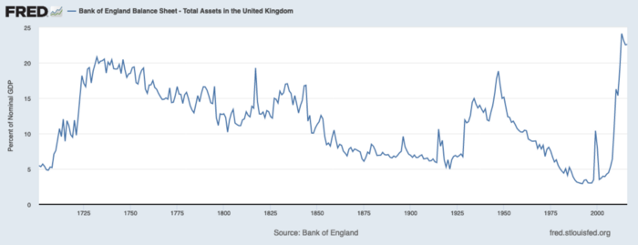
The UK has had a rough three centuries. Pandemics, empire wars, civil wars, world wars. Even so, the BOE's recent money printing was its most aggressive ever!
BOE Total Assets as % of GDP (white) vs. UK CPI
Now, inflation responded slowly to the bank's most aggressive monetary loosening. King Charles wishes the gold line above showed his popularity, but it shows his subjects' suffering.
The BOE recognized early that its money printing caused runaway inflation. In its August 2022 report, the bank predicted that inflation would reach 13% by year end before aggressively tapering in 2023 and 2024.
Aug 2022 BOE Monetary Policy Report
The BOE was the first major central bank to reduce its balance sheet and raise its policy rate to help.
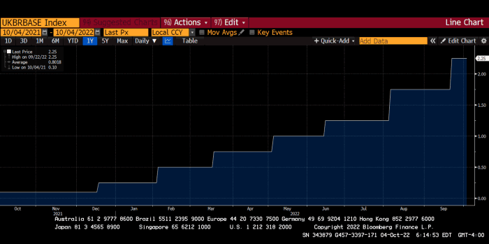
The BOE first raised rates in December 2021. Back then, JayPow wasn't even considering raising rates.
UK policymakers, like most developed nations, believe in energy fairy tales. Namely, that the developed world, which grew in lockstep with hydrocarbon use, could switch to wind and solar by 2050. The UK's energy import bill has grown while coal, North Sea oil, and possibly stranded shale oil have been ignored.
WW3 is an economic war that is balkanizing energy markets, which will continue to inflate. A nation that imports energy and has printed the most money in its history cannot avoid inflation.
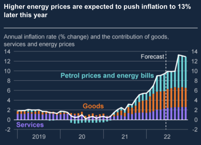
The chart above shows that energy inflation is a major cause of plebe pain.
The UK is hit by a double whammy: the BOE must remove credit to reduce demand, and energy prices must rise due to WW3 inflation. That's not economic growth.
Boris Johnson was knocked out by his country's poor economic performance, not his lockdown at 10 Downing St. Prime Minister Truss and her merry band of fools arrived with the tried-and-true government remedy: goodies for everyone.
She released a budget full of economic stimulants. She cut corporate and individual taxes for the rich. She plans to give poor people vouchers for higher energy bills. Woohoo! Margret Thatcher's new pants suit.
My buddy Jim Bianco said Truss budget's problem is that it works. It will boost activity at a time when inflation is over 10%. Truss' budget didn't include austerity measures like tax increases or spending cuts, which the bond market wanted. The bond market protested.
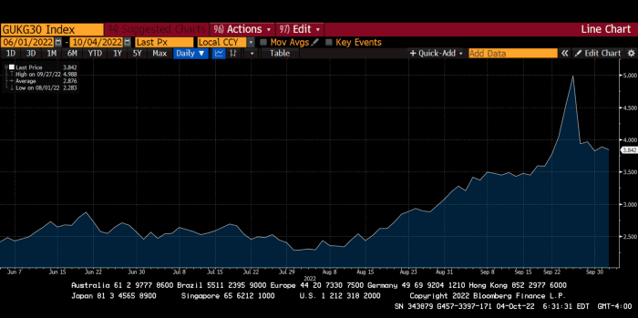
30-year Gilt yield chart. Yields spiked the most ever after Truss announced her budget, as shown. The Gilt market is the longest-running bond market in the world.
The Gilt market showed the pole who's boss with Cardi B.
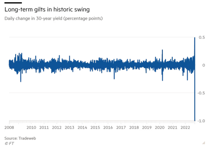
Before this, the BOE was super-committed to fighting inflation. To their credit, they raised short-term rates and shrank their balance sheet. However, rapid yield rises threatened to destroy the entire highly leveraged UK financial system overnight, forcing them to change course.
Accounting gimmicks allowed by regulators for pension funds posed a systemic threat to the UK banking system. UK pension funds could use interest rate market levered derivatives to match liabilities. When rates rise, short rate derivatives require more margin. The pension funds spent all their money trying to pick stonks and whatever else their sell side banker could stuff them with, so the historic rate spike would have bankrupted them overnight. The FT describes BOE-supervised chicanery well.
To avoid a financial apocalypse, the BOE in one morning abandoned all their hard work and started buying unlimited long-dated Gilts to drive prices down.
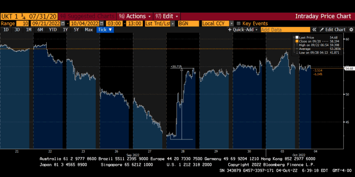
Another reminder to never fight a central bank. The 30-year Gilt is shown above. After the BOE restarted the money printer on September 28, this bond rose 30%. Thirty-fucking-percent! Developed market sovereign bonds rarely move daily. You're invested in His Majesty's government obligations, not a Chinese property developer's offshore USD bond.
The political need to give people goodies to help them fight the terrible economy ran into a financial reality. The central bank protected the UK financial system from asset-price deflation because, like all modern economies, it is debt-based and highly levered. As bad as it is, inflation is not their top priority. The BOE example demonstrated that. To save the financial system, they abandoned almost a year of prudent monetary policy in a few hours. They also started the endgame.
Let's play Central Bankers Say the Darndest Things before we go to the continent (and sorry if you live on a continent other than Europe, but you're not culturally relevant).
Pre-meltdown BOE output:
FT, October 17, 2021 On Sunday, the Bank of England governor warned that it must act to curb inflationary pressure, ignoring financial market moves that have priced in the first interest rate increase before the end of the year.
On July 19, 2022, Gov. Andrew Bailey spoke. Our 2% inflation target is unwavering. We'll do our job.
August 4th 2022 MPC monetary policy announcement According to its mandate, the MPC will sustainably return inflation to 2% in the medium term.
Catherine Mann, MPC member, September 5, 2022 speech. Fast and forceful monetary tightening, possibly followed by a hold or reversal, is better than gradualism because it promotes inflation expectations' role in bringing inflation back to 2% over the medium term.
When their financial system nearly collapsed in one trading session, they said:
The Bank of England's Financial Policy Committee warned on 28 September that gilt market dysfunction threatened UK financial stability. It advised action and supported the Bank's urgent gilt market purchases for financial stability.
It works when the price goes up but not down. Is my crypto portfolio dysfunctional enough to get a BOE bailout?
Next, the EU and ECB. The ECB is also fighting inflation, but it will also succumb to the YCC virus for the same reasons as the BOE.
Frankfurt am Main, ECB Tower, Sonnemannstraße 20, 60314
Only France and Germany matter economically in the EU. Modern European history has focused on keeping Germany and Russia apart. German manufacturing and cheap Russian goods could change geopolitics.
France created the EU to keep Germany down, and the Germans only cooperated because of WWII guilt. France's interests are shared by the US, which lurks in the shadows to prevent a Germany-Russia alliance. A weak EU benefits US politics. Avoid unification of Eurasia. (I paraphrased daddy Felix because I thought quoting a large part of his most recent missive would get me spanked.)
As with everything, understanding Germany's energy policy is the best way to understand why the German economy is fundamentally fucked and why that spells doom for the EU. Germany, the EU's main economic engine, is being crippled by high energy prices, threatening a depression. This economic downturn threatens the union. The ECB may have to abandon plans to shrink its balance sheet and switch to YCC to save the EU's unholy political union.
France did the smart thing and went all in on nuclear energy, which is rare in geopolitics. 70% of electricity is nuclear-powered. Their manufacturing base can survive Russian gas cuts. Germany cannot.
My boy Zoltan made this great graphic showing how screwed Germany is as cheap Russian gas leaves the industrial economy.
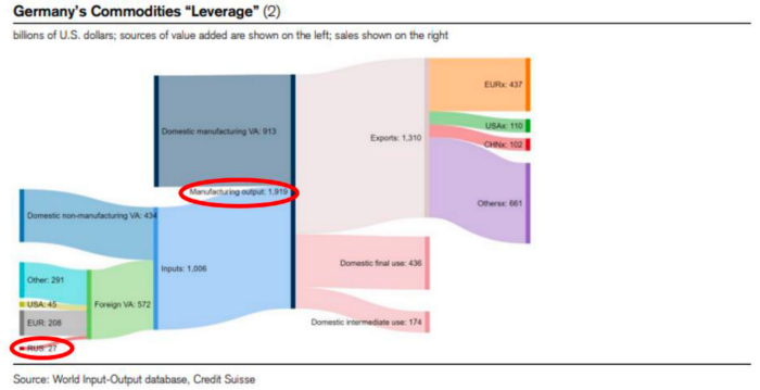
$27 billion of Russian gas powers almost $2 trillion of German economic output, a 75x energy leverage. The German public was duped into believing the same energy fairy tales as their politicians, and they overwhelmingly allowed the Green party to dismantle any efforts to build a nuclear energy ecosystem over the past several decades. Germany, unlike France, must import expensive American and Qatari LNG via supertankers due to Nordstream I and II pipeline sabotage.
American gas exports to Europe are touted by the media. Gas is cheap because America isn't the Western world's swing producer. If gas prices rise domestically in America, the plebes would demand the end of imports to avoid paying more to heat their homes.
German goods would cost much more in this scenario. German producer prices rose 46% YoY in August. The German current account is rapidly approaching zero and will soon be negative.
German PPI Change YoY
German Current Account
The reason this matters is a curious construction called TARGET2. Let’s hear from the horse’s mouth what exactly this beat is:
TARGET2 is the real-time gross settlement (RTGS) system owned and operated by the Eurosystem. Central banks and commercial banks can submit payment orders in euro to TARGET2, where they are processed and settled in central bank money, i.e. money held in an account with a central bank.
Source: ECB
Let me explain this in plain English for those unfamiliar with economic dogma.
This chart shows intra-EU credits and debits. TARGET2. Germany, Europe's powerhouse, is owed money. IOU-buying Greeks buy G-wagons. The G-wagon pickup truck is badass.

If all EU countries had fiat currencies, the Deutsche Mark would be stronger than the Italian Lira, according to the chart above. If Europe had to buy goods from non-EU countries, the Euro would be much weaker. Credits and debits between smaller political units smooth out imbalances in other federal-provincial-state political systems. Financial and fiscal unions allow this. The EU is financial, so the centre cannot force the periphery to settle their imbalances.
Greece has never had to buy Fords or Kias instead of BMWs, but what if Germany had to shut down its auto manufacturing plants due to energy shortages?
Italians have done well buying ammonia from Germany rather than China, but what if BASF had to close its Ludwigshafen facility due to a lack of affordable natural gas?
I think you're seeing the issue.
Instead of Germany, EU countries would owe foreign producers like America, China, South Korea, Japan, etc. Since these countries aren't tied into an uneconomic union for politics, they'll demand hard fiat currency like USD instead of Euros, which have become toilet paper (or toilet plastic).
Keynesian economists have a simple solution for politicians who can't afford market prices. Government debt can maintain production. The debt covers the difference between what a business can afford and the international energy market price.
Germans are monetary policy conservative because of the Weimar Republic's hyperinflation. The Bundesbank is the only thing preventing ECB profligacy. Germany must print its way out without cheap energy. Like other nations, they will issue more bonds for fiscal transfers.
More Bunds mean lower prices. Without German monetary discipline, the Euro would have become a trash currency like any other emerging market that imports energy and food and has uncompetitive labor.
Bunds price all EU country bonds. The ECB's money printing is designed to keep the spread of weak EU member bonds vs. Bunds low. Everyone falls with Bunds.
Like the UK, German politicians seeking re-election will likely cause a Bunds selloff. Bond investors will understandably reject their promises of goodies for industry and individuals to offset the lack of cheap Russian gas. Long-dated Bunds will be smoked like UK Gilts. The ECB will face a wave of ultra-levered financial players who will go bankrupt if they mark to market their fixed income derivatives books at higher Bund yields.
Some treats People: Germany will spend 200B to help consumers and businesses cope with energy prices, including promoting renewable energy.
That, ladies and germs, is why the ECB will immediately abandon QT, move to a stop-gap QE program to normalize the Bund and every other EU bond market, and eventually graduate to YCC as the market vomits bonds of all stripes into Christine Lagarde's loving hands. She probably has soft hands.
The 30-year Bund market has noticed Germany's economic collapse. 2021 yields skyrocketed.
30-year Bund Yield
ECB Says the Darndest Things:
Because inflation is too high and likely to stay above our target for a long time, we took today's decision and expect to raise interest rates further.- Christine Lagarde, ECB Press Conference, Sept 8.
The Governing Council will adjust all of its instruments to stabilize inflation at 2% over the medium term. July 21 ECB Monetary Decision
Everyone struggles with high inflation. The Governing Council will ensure medium-term inflation returns to two percent. June 9th ECB Press Conference
I'm excited to read the after. Like the BOE, the ECB may abandon their plans to shrink their balance sheet and resume QE due to debt market dysfunction.
Eighty Percent
I like YCC like dark chocolate over 80%. ;).
Can 80% of the world's major central banks' QE and/or YCC overcome Sir Powell's toughness on fungible risky asset prices?
Gold and crypto are fungible global risky assets. Satoshis and gold bars are the same in New York, London, Frankfurt, Tokyo, and Shanghai.
As more Euros, Yen, Renminbi, and Pounds are printed, people will move their savings into Dollars or other stores of value. As the Fed raises rates and reduces its balance sheet, the USD will strengthen. Gold/EUR and BTC/JPY may also attract buyers.
Gold and crypto markets are much smaller than the trillions in fiat money that will be printed, so they will appreciate in non-USD currencies. These flows only matter in one instance because we trade the global or USD price. Arbitrage occurs when BTC/EUR rises faster than EUR/USD. Here is how it works:
An investor based in the USD notices that BTC is expensive in EUR terms.
Instead of buying BTC, this investor borrows USD and then sells it.
After that, they sell BTC and buy EUR.
Then they choose to sell EUR and buy USD.
The investor receives their profit after repaying the USD loan.
This triangular FX arbitrage will align the global/USD BTC price with the elevated EUR, JPY, CNY, and GBP prices.
Even if the Fed continues QT, which I doubt they can do past early 2023, small stores of value like gold and Bitcoin may rise as non-Fed central banks get serious about printing money.
“Arthur, this is just more copium,” you might retort.
Patience. This takes time. Economic and political forcing functions take time. The BOE example shows that bond markets will reject politicians' policies to appease voters. Decades of bad energy policy have no immediate fix. Money printing is the only politically viable option. Bond yields will rise as bond markets see more stimulative budgets, and the over-leveraged fiat debt-based financial system will collapse quickly, followed by a monetary bailout.
America has enough food, fuel, and people. China, Europe, Japan, and the UK suffer. America can be autonomous. Thus, the Fed can prioritize domestic political inflation concerns over supplying the world (and most of its allies) with dollars. A steady flow of dollars allows other nations to print their currencies and buy energy in USD. If the strongest player wins, everyone else loses.
I'm making a GDP-weighted index of these five central banks' money printing. When ready, I'll share its rate of change. This will show when the 80%'s money printing exceeds the Fed's tightening.

Sylvain Saurel
3 years ago
A student trader from the United States made $110 million in one month and rose to prominence on Wall Street.
Genius or lucky?
From the title, you might think I'm selling advertising for a financial influencer, a dubious trading site, or a training organization to attract clients. I'm suspicious. Better safe than sorry.
But not here.
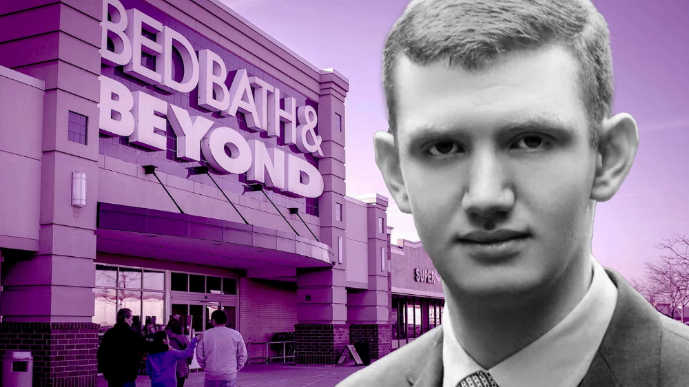
Jake Freeman, 20, made $110 million in a month, according to the Financial Times. At 18, he ran for president. He made his name in markets, not politics. Two years later, he's Wall Street's prince. Interview requests flood the prodigy.
Jake Freeman bought 5 million Bed Bath & Beyond Group shares for $5.5 in July 2022 and sold them for $27 a month later. He thought the stock might double. Since speculation died down, he sold well. The stock fell 40.5% to 11 dollars on Friday, 19 August 2022. On August 22, 2022, it fell 16% to $9.
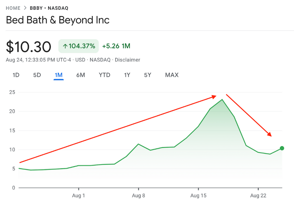
Smallholders have been buying the stock for weeks and will lose heavily if it falls further. Bed Bath & Beyond is the second most popular stock after Foot Locker, ahead of GameStop and Apple.
Jake Freeman earned $110 million thanks to a significant stock market flurry.
Online broker customers aren't the only ones with jitters. By June 2022, Ken Griffin's Citadel and Stephen Mandel's Lone Pine Capital held nearly a third of the company's capital. Did big managers sell before the stock plummeted?
Recent stock movements (derivatives) and rumors could prompt a SEC investigation.
Jake Freeman wrote to the board of directors after his investment to call for a turnaround, given the company's persistent problems and short sellers. The bathroom and kitchen products distribution group's stock soared in July 2022 due to renewed buying by private speculators, who made it one of their meme stocks with AMC and GameStop.
Second-quarter 2022 results and financial health worsened. He didn't celebrate his miraculous operation in a nightclub. He told a British newspaper, "I'm shocked." His parents dined in New York. He returned to Los Angeles to study math and economics.
Jake Freeman founded Freeman Capital Management with his savings and $25 million from family, friends, and acquaintances. They are the ones who are entitled to the $110 million he raised in one month. Will his investors pocket and withdraw all or part of their profits or will they trust the young prodigy for new stunts on Wall Street?
His operation should attract new clients. Well-known hedge funds may hire him.
Jake Freeman didn't listen to gurus or former traders. At 17, he interned at a quantitative finance and derivatives hedge fund, Volaris. At 13, he began investing with his pharmaceutical executive uncle. All countries have increased their Google searches for the young trader in the last week.
Naturally, his success has inspired resentment.
His success stirs jealousy, and he's attacked on social media. On Reddit, people who lost money on Bed Bath & Beyond, Jake Freeman's fortune, are mourning.
Several conspiracy theories circulate about him, including that he doesn't exist or is working for a Taiwanese amusement park.
If all 20 million American students had the same trading skills, they would have generated $1.46 trillion. Jake Freeman is unique. Apprentice traders' careers are often short, disillusioning, and tragic.
Two years ago, 20-year-old Robinhood client Alexander Kearns committed suicide after losing $750,000 trading options. Great traders start young. Michael Platt of BlueCrest invested in British stocks at age 12 under his grandmother's supervision and made a £30,000 fortune. Paul Tudor Jones started trading before he turned 18 with his uncle. Warren Buffett, at age 10, was discussing investments with Goldman Sachs' head. Oracle of Omaha tells all.

Sam Hickmann
3 years ago
What is this Fed interest rate everybody is talking about that makes or breaks the stock market?
The Federal Funds Rate (FFR) is the target interest rate set by the Federal Reserve System (Fed)'s policy-making body (FOMC). This target is the rate at which the Fed suggests commercial banks borrow and lend their excess reserves overnight to each other.
The FOMC meets 8 times a year to set the target FFR. This is supposed to promote economic growth. The overnight lending market sets the actual rate based on commercial banks' short-term reserves. If the market strays too far, the Fed intervenes.
Banks must keep a certain percentage of their deposits in a Federal Reserve account. A bank's reserve requirement is a percentage of its total deposits. End-of-day bank account balances averaged over two-week reserve maintenance periods are used to determine reserve requirements.
If a bank expects to have end-of-day balances above what's needed, it can lend the excess to another institution.
The FOMC adjusts interest rates based on economic indicators that show inflation, recession, or other issues that affect economic growth. Core inflation and durable goods orders are indicators.
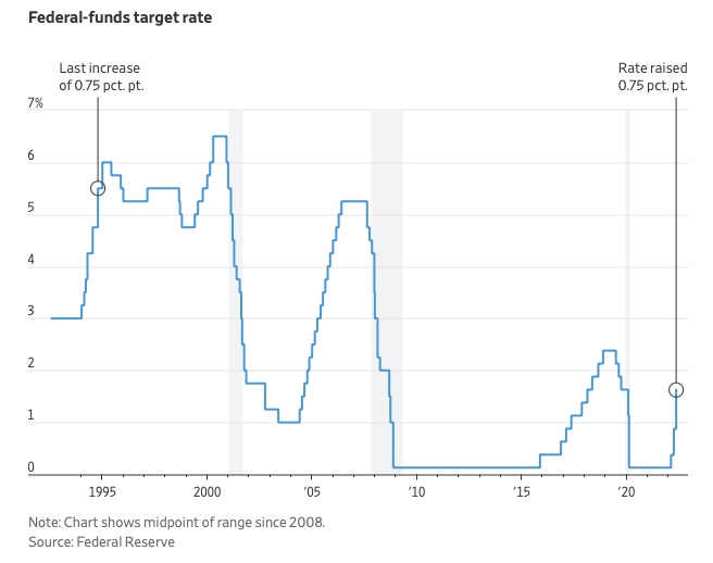
In response to economic conditions, the FFR target has changed over time. In the early 1980s, inflation pushed it to 20%. During the Great Recession of 2007-2009, the rate was slashed to 0.15 percent to encourage growth.
Inflation picked up in May 2022 despite earlier rate hikes, prompting today's 0.75 percent point increase. The largest increase since 1994. It might rise to around 3.375% this year and 3.1% by the end of 2024.
You might also like

Jano le Roux
3 years ago
Never Heard Of: The Apple Of Email Marketing Tools
Unlimited everything for $19 monthly!?

Even with pretty words, no one wants to read an ugly email.
Not Gen Z
Not Millennials
Not Gen X
Not Boomers
I am a minimalist.
I like Mozart. I like avos. I love Apple.
When I hear seamlessly, effortlessly, or Apple's new adverb fluidly, my toes curl.
No email marketing tool gave me that feeling.
As a marketing consultant helping high-growth brands create marketing that doesn't feel like marketing, I've worked with every email marketing platform imaginable, including that naughty monkey and the expensive platform whose sales teams don't stop calling.
Most email marketing platforms are flawed.
They are overpriced.
They use dreadful templates.
They employ a poor visual designer.
The user experience there is awful.
Too many useless buttons are present. (Similar to the TV remote!)
I may have finally found the perfect email marketing tool. It creates strong flows. It helps me focus on storytelling.
It’s called Flodesk.
It’s effortless. It’s seamless. It’s fluid.
Here’s why it excites me.
Unlimited everything for $19 per month
Sends unlimited. Emails unlimited. Signups unlimited.
Most email platforms penalize success.
Pay for performance?
$87 for 10k contacts
$605 for 100K contacts
$1,300+ for 200K contacts
In the 1990s, this made sense, but not now. It reminds me of when ISPs capped internet usage at 5 GB per month.
Flodesk made unlimited email for a low price a reality. Affordable, attractive email marketing isn't just for big companies.
Flodesk doesn't penalize you for growing your list. Price stays the same as lists grow.
Flodesk plans cost $38 per month, but I'll give you a 30-day trial for $19.
Amazingly strong flows
Foster different people's flows.
Email marketing isn't one-size-fits-all.
Different times require different emails.
People don't open emails because they're irrelevant, in my experience. A colder audience needs a nurturing sequence.
Flodesk automates your email funnels so top-funnel prospects fall in love with your brand and values before mid- and bottom-funnel email flows nudge them to take action.
I wish I could save more custom audience fields to further customize the experience.
Dynamic editor
Easy. Effortless.
Flodesk's editor is Apple-like.
You understand how it works almost instantly.
Like many Apple products, it's intentionally limited. No distractions. You can focus on emotional email writing.

Flodesk's inability to add inline HTML to emails is my biggest issue with larger projects. I wish I could upload HTML emails.
Simple sign-up procedures
Dream up joining.
I like how easy it is to create conversion-focused landing pages. Linkly lets you easily create 5 landing pages and A/B test messaging.

I like that you can use signup forms to ask people what they're interested in so they get relevant emails instead of mindless mass emails nobody opens.

I love how easy it is to embed in-line on a website.
Wonderful designer templates
Beautiful, connecting emails.
Flodesk has calm email templates. My designer's eye felt at rest when I received plain text emails with big impacts.

As a typography nerd, I love Flodesk's handpicked designer fonts. It gives emails a designer feel that is hard to replicate on other platforms without coding and custom font licenses.
Small adjustments can have a big impact
Details matter.
Flodesk remembers your brand colors. Flodesk automatically adds your logo and social handles to emails after signup.
Flodesk uses Zapier. This lets you send emails based on a user's action.
A bad live chat can trigger a series of emails to win back a customer.
Flodesk isn't for everyone.
Flodesk is great for Apple users like me.

ʟ ᴜ ᴄ ʏ
3 years ago
The Untapped Gold Mine of Inspiration and Startup Ideas
I joined the 1000 Digital Startups Movement (Gerakan 1000 Startup Digital) in 2017 and learned a lot about the startup sector. My previous essay outlined what a startup is and what must be prepared. Here I'll offer raw ideas for better products.

Intro
A good startup solves a problem. These can include environmental, economic, energy, transportation, logistics, maritime, forestry, livestock, education, tourism, legal, arts and culture, communication, and information challenges. Everything I wrote is simply a basic idea (as inspiration) and requires more mapping and validation. Learn how to construct a startup to maximize launch success.
Adrian Gunadi (Investree Co-Founder) taught me that a Founder or Co-Founder must be willing to be CEO (Chief Everything Officer). Everything is independent, including drafting a proposal, managing finances, and scheduling appointments. The best individuals will come to you if you're the best. It's easier than consulting Andy Zain (Kejora Capital Founder).
Description
To help better understanding from your idea, try to answer this following questions:
- Describe your idea/application
Maximum 1000 characters.
- Background
Explain the reasons that prompted you to realize the idea/application.
- Objective
Explain the expected goals of the creation of the idea/application.
- Solution
A solution that tells your idea can be the right solution for the problem at hand.
- Uniqueness
What makes your idea/app unique?
- Market share
Who are the people who need and are looking for your idea?
- Marketing Ways and Business Models
What is the best way to sell your idea and what is the business model?
Not everything here is a startup idea. It's meant to inspire creativity and new perspectives.
Ideas
#Application
1. Medical students can operate on patients or not. Applications that train prospective doctors to distinguish body organs and their placement are useful. In the advanced stage, the app can be built with numerous approaches so future doctors can practice operating on patients based on their ailments. If they made a mistake, they'd start over. Future doctors will be more assured and make fewer mistakes this way.
2. VR (virtual reality) technology lets people see 3D space from afar. Later, similar technology was utilized to digitally sell properties, so buyers could see the inside and room contents. Every gadget has flaws. It's like a gold mine for robbers. VR can let prospective students see a campus's facilities. This facility can also help hotels promote their products.
3. How can retail entrepreneurs maximize sales? Most popular goods' sales data. By using product and brand/type sales figures, entrepreneurs can avoid overstocking. Walmart computerized their procedures to track products from the manufacturer to the store. As Retail Link products sell out, suppliers can immediately step in.
4. Failing to marry is something to be avoided. But if it had to happen, the loss would be like the proverb “rub salt into the wound”. On the I do Now I dont website, Americans who don't marry can resell their jewelry to other brides-to-be. If some want to cancel the wedding and receive their down money and dress back, others want a wedding with particular criteria, such as a quick date and the expected building. Create a DP takeover marketplace for both sides.
#Games
1. Like in the movie, players must exit the maze they enter within 3 minutes or the shape will change, requiring them to change their strategy. The maze's transformation time will shorten after a few stages.
2. Treasure hunts involve following clues to uncover hidden goods. Here, numerous sponsors are combined in one boat, and participants can choose a game based on the prizes. Let's say X-mart is a sponsor and provides riddles or puzzles to uncover the prize in their store. After gathering enough points, the player can trade them for a gift utilizing GPS and AR (augmented reality). Players can collaborate to increase their chances of success.
3. Where's Wally? Where’s Wally displays a thick image with several things and various Wally-like characters. We must find the actual Wally, his companions, and the desired object. Make a game with a map where players must find objects for the next level. The player must find 5 artifacts randomly placed in an Egyptian-style mansion, for example. In the room, there are standard tickets, pass tickets, and gold tickets that can be removed for safekeeping, as well as a wall-mounted carpet that can be stored but not searched and turns out to be a flying rug that can be used to cross/jump to a different place. Regular tickets are spread out since they can buy life or stuff. At a higher level, a black ticket can lower your ordinary ticket. Objects can explode, scattering previously acquired stuff. If a player runs out of time, they can exchange a ticket for more.
#TVprogram
1. At the airport there are various visitors who come with different purposes. Asking tourists to live for 1 or 2 days in the city will be intriguing to witness.
2. Many professions exist. Carpenters, cooks, and lawyers must have known about job desks. Does HRD (Human Resource Development) only recruit new employees? Many don't know how to become a CEO, CMO, COO, CFO, or CTO. Showing young people what a Program Officer in an NGO does can help them choose a career.
#StampsCreations
Philatelists know that only the government can issue stamps. I hope stamps are creative so they have more worth.
1. Thermochromic pigments (leuco dyes) are well-known for their distinctive properties. By putting pigments to black and white batik stamps, for example, the black color will be translucent and display the basic color when touched (at a hot temperature).
2. In 2012, Liechtenstein Post published a laser-art Chinese zodiac stamp. Belgium (Bruges Market Square 2012), Taiwan (Swallow Tail Butterfly 2009), etc. Why not make a stencil of the president or king/queen?
3. Each country needs its unique identity, like Taiwan's silk and bamboo stamps. Create from your country's history. Using traditional paper like washi (Japan), hanji (Korea), and daluang/saeh (Indonesia) can introduce a country's culture.
4. Garbage has long been a problem. Bagasse, banana fronds, or corn husks can be used as stamp material.
5. Austria Post published a stamp containing meteor dust in 2006. 2004 meteorite found in Morocco produced the dust. Gibraltar's Rock of Gilbraltar appeared on stamps in 2002. What's so great about your country? East Java is muddy (Lapindo mud). Lapindo mud stamps will be popular. Red sand at Pink Beach, East Nusa Tenggara, could replace the mud.
#PostcardCreations
1. Map postcards are popular because they make searching easier. Combining laser-cut road map patterns with perforated 200-gram paper glued on 400-gram paper as a writing medium. Vision-impaired people can use laser-cut maps.
2. Regional art can be promoted by tucking traditional textiles into postcards.
3. A thin canvas or plain paper on the card's front allows the giver to be creative.
4. What is local crop residue? Cork lids, maize husks, and rice husks can be recycled into postcard materials.
5. Have you seen a dried-flower bookmark? Cover the postcard with mica and add dried flowers. If you're worried about losing the flowers, you can glue them or make a postcard envelope.
6. Wood may be ubiquitous; try a 0.2-mm copper plate engraved with an image and connected to a postcard as a writing medium.
7. Utilized paper pulp can be used to hold eggs, smartphones, and food. Form a smooth paper pulp on the plate with the desired image, the Golden Gate bridge, and paste it on your card.
8. Postcards can promote perfume. When customers rub their hands on the card with the perfume image, they'll smell the aroma.
#Tour #Travel
Tourism activities can be tailored to tourists' interests or needs. Each tourist benefits from tourism's distinct aim.
Let's define tourism's objective and purpose.
Holiday Tour is a tour that its participants plan and do in order to relax, have fun, and amuse themselves.
A familiarization tour is a journey designed to help travelers learn more about (survey) locales connected to their line of work.
An educational tour is one that aims to give visitors knowledge of the field of work they are visiting or an overview of it.
A scientific field is investigated and knowledge gained as the major goal of a scientific tour.
A pilgrimage tour is one designed to engage in acts of worship.
A special mission tour is one that has a specific goal, such a commerce mission or an artistic endeavor.
A hunting tour is a destination for tourists that plans organized animal hunting that is only allowed by local authorities for entertainment purposes.
Every part of life has tourism potential. Activities include:
1. Those who desire to volunteer can benefit from the humanitarian theme and collaboration with NGOs. This activity's profit isn't huge but consider the environmental impact.
2. Want to escape the city? Meditation travel can help. Beautiful spots around the globe can help people forget their concerns. A certified yoga/meditation teacher can help travelers release bad energy.
3. Any prison visitors? Some prisons, like those for minors under 17, are open to visitors. This type of tourism helps mental convicts reach a brighter future.
4. Who has taken a factory tour/study tour? Outside-of-school study tour (for ordinary people who have finished their studies). Not everyone in school could tour industries, workplaces, or embassies to learn and be inspired. Shoyeido (an incense maker) and Royce (a chocolate maker) offer factory tours in Japan.
5. Develop educational tourism like astronomy and archaeology. Until now, only a few astronomy enthusiasts have promoted astronomy tourism. In Indonesia, archaeology activities focus on site preservation, and to participate, office staff must undertake a series of training (not everyone can take a sabbatical from their routine). Archaeological tourist activities are limited, whether held by history and culture enthusiasts or in regional tours.
6. Have you ever longed to observe a film being made or your favorite musician rehearsing? Such tours can motivate young people to pursue entertainment careers.
7. Pamper your pets to reduce stress. Many pet owners don't have time for walks or treats. These premium services target the wealthy.
8. A quirky idea to provide tours for imaginary couples or things. Some people marry inanimate objects or animals and seek to make their lover happy; others cherish their ashes after death.
#MISCideas
1. Fashion is a lifestyle, thus people often seek fresh materials. Chicken claws, geckos, snake skin casings, mice, bats, and fish skins are also used. Needs some improvement, definitely.
2. As fuel supplies become scarcer, people hunt for other energy sources. Sound is an underutilized renewable energy. The Batechsant technology converts environmental noise into electrical energy, according to study (Battery Technology Of Sound Power Plant). South Korean researchers use Sound-Driven Piezoelectric Nanowire based on Nanogenerators to recharge cell phone batteries. The Batechsant system uses existing noise levels to provide electricity for street lamp lights, aviation, and ships. Using waterfall sound can also energize hard-to-reach locations.
3. A New York Times reporter said IQ doesn't ensure success. Our school system prioritizes IQ above EQ (Emotional Quotient). EQ is a sort of human intelligence that allows a person to perceive and analyze the dynamics of his emotions when interacting with others (and with himself). EQ is suspected of being a bigger source of success than IQ. EQ training can gain greater attention to help people succeed. Prioritize role models from school stakeholders, teachers, and parents to improve children' EQ.
4. Teaching focuses more on theory than practice, so students are less eager to explore and easily forget if they don't pay attention. Has an engineer ever made bricks from arid red soil? Morocco's non-college-educated builders can create weatherproof bricks from red soil without equipment. Can mechanical engineering grads create a water pump to solve water shortages in remote areas? Art graduates can innovate beyond only painting. Artists may create kinetic sculpture by experimenting so much. Young people should understand these sciences so they can be more creative with their potential. These might be extracurricular activities in high school and university.
5. People have been trying to recycle agricultural waste for a long time. Mycelium helps replace light, easily crushed tiles and bricks (a collection of hyphae like in the manufacture of tempe). Waste must contain lignocellulose. In this vein, anti-mainstream painting canvases can be made. The goal is to create the canvas uneven like an amoeba outline, not square or spherical. The resulting canvas is lightweight and needs no frame. Then what? Open source your idea like Precious Plastic to establish a community. By propagating this notion, many knowledgeable people will help improve your product's quality and impact.
6. As technology and humans adapt, fraud increases. Making phony doctor's letters to fool superiors, fake credentials to get hired, fraudulent land certificates to make money, and fake news (hoax). The existence of a Wikimedia can aid the community by comparing bogus and original information.
7. Do you often hit a problem-solving impasse? Since the Doraemon bag hasn't been made, construct an Idea Bank. Everyone can contribute to solving problems here. How do you recruit volunteers? Obviously, a reward is needed. Contributors can become moderators or gain complimentary tickets to TIA (Tech in Asia) conferences. Idea Bank-related concepts: the rise of startups without a solid foundation generates an age as old as corn that does not continue. Those with startup ideas should describe them here so they can be validated by other users. Other users can contribute input if a comparable notion is produced to improve the product or integrate it. Similar-minded users can become Co-Founders.
8. Why not invest in fruit/vegetables, inspired by digital farming? The landowner obtains free fruit without spending much money on maintenance. Investors can get fruits/vegetables in larger quantities, fresher, and cheaper during harvest. Fruits and vegetables are often harmed if delivered too slowly. Rich investors with limited land can invest in teak, agarwood, and other trees. When harvesting, investors might choose raw results or direct wood sales earnings. Teak takes at least 7 years to harvest, therefore long-term wood investments carry the risk of crop failure.
9. Teenagers in distant locations can't count, read, or write. Many factors hinder locals' success. Life's demands force them to work instead of study. Creating a learning playground may attract young people to learning. Make a skatepark at school. Skateboarders must learn in school. Donations buy skateboards.
10. Globally, online taxi-bike is known. By hiring a motorcycle/car online, people no longer bother traveling without a vehicle. What if you wish to cross the island or visit remote areas? Is online boat or helicopter rental possible like online taxi-bike? Such a renting process has been done independently thus far and cannot be done quickly.
11. What do startups need now? A startup or investor consultant. How many startups fail to become Unicorns? Many founders don't know how to manage investor money, therefore they waste it on promotions and other things. Many investors only know how to invest and can't guide a struggling firm.
“In times of crisis, the wise build bridges, while the foolish build barriers.” — T’Challa [Black Panther]
Don't chase cash. Money is a byproduct. Profit-seeking is stressful. Market requirements are opportunities. If you have something to say, please comment.
This is only informational. Before implementing ideas, do further study.

Aaron Dinin, PhD
3 years ago
There Are Two Types of Entrepreneurs in the World Make sure you are aware of your type!
Know why it's important.

The entrepreneur I was meeting with said, "I should be doing crypto, or maybe AI? Aren't those the hot spots? I should look there for a startup idea.”
I shook my head. Yes, they're exciting, but that doesn't mean they're best for you and your business.
“There are different types of entrepreneurs?” he asked.
I said "obviously." Two types, actually. Knowing what type of entrepreneur you are helps you build the right startup.
The two types of businesspeople
The best way for me to describe the two types of entrepreneurs is to start by telling you exactly the kinds of entrepreneurial opportunities I never get excited about: future opportunities.
In the early 1990s, my older brother showed me the World Wide Web and urged me to use it. Unimpressed, I returned to my Super Nintendo.
My roommate tried to get me to join Facebook as a senior in college. I remember thinking, This is dumb. Who'll use it?
In 2011, my best friend tried to convince me to buy bitcoin and I laughed.
Heck, a couple of years ago I had to buy a new car, and I never even considered buying something that didn’t require fossilized dinosaur bones.
I'm no visionary. I don't anticipate the future. I focus on the present.
This tendency makes me a problem-solving entrepreneur. I identify entrepreneurial opportunities by spotting flaws and/or inefficiencies in the world and devising solutions.
There are other ways to find business opportunities. Visionary entrepreneurs also exist. I don't mean visionary in the hyperbolic sense that implies world-changing impact. I mean visionary as an entrepreneur who identifies future technological shifts that will change how people work and live and create new markets.
Problem-solving and visionary entrepreneurs are equally good. But the two approaches to building companies are very different. Knowing the type of entrepreneur you are will help you build a startup that fits your worldview.
What is the distinction?
Let's use some simple hypotheticals to compare problem-solving and visionary entrepreneurship.
Imagine a city office building without nearby restaurants. Those office workers love to eat. Sometimes they'd rather eat out than pack a lunch. As an entrepreneur, you can solve the lack of nearby restaurants. You'd open a restaurant near that office, say a pizza parlor, and get customers because you solved the lack of nearby restaurants. Problem-solving entrepreneurship.
Imagine a new office building in a developing area with no residents or workers. In this scenario, a large office building is coming. The workers will need to eat then. As a visionary entrepreneur, you're excited about the new market and decide to open a pizzeria near the construction to meet demand.
Both possibilities involve the same product. You opened a pizzeria. How you launched that pizza restaurant and what will affect its success are different.
Why is the distinction important?
Let's say you opened a pizzeria near an office. You'll probably get customers. Because people are nearby and demand isn't being met, someone from a nearby building will stop in within the first few days of your pizzeria's grand opening. This makes solving the problem relatively risk-free. You'll get customers unless you're a fool.
The market you're targeting existed before you entered it, so you're not guaranteed success. This means people in that market solved the lack of nearby restaurants. Those office workers are used to bringing their own lunches. Why should your restaurant change their habits? Even when they eat out, they're used to traveling far. They've likely developed pizza preferences.
To be successful with your problem-solving startup, you must convince consumers to change their behavior, which is difficult.
Unlike opening a pizza restaurant near a construction site. Once the building opens, workers won't have many preferences or standardized food-getting practices. Your pizza restaurant can become the incumbent quickly. You'll be the first restaurant in the area, so you'll gain a devoted following that makes your food a routine.
Great, right? It's easier than changing people's behavior. The benefit comes with a risk. Opening a pizza restaurant near a construction site increases future risk. What if builders run out of money? No one moves in? What if the building's occupants are the National Association of Pizza Haters? Then you've opened a pizza restaurant next to pizza haters.
Which kind of businessperson are you?
This isn't to say one type of entrepreneur is better than another. Each type of entrepreneurship requires different skills.
As my simple examples show, a problem-solving entrepreneur must operate in markets with established behaviors and habits. To be successful, you must be able to teach a market a new way of doing things.
Conversely, the challenge of being a visionary entrepreneur is that you have to be good at predicting the future and getting in front of that future before other people.
Both are difficult in different ways. So, smart entrepreneurs don't just chase opportunities. Smart entrepreneurs pursue opportunities that match their skill sets.