


How Payment for Order Flow (PFOF) Works
What is PFOF?
PFOF is a brokerage firm's compensation for directing orders to different parties for trade execution. The brokerage firm receives fractions of a penny per share for directing the order to a market maker.
Each optionable stock could have thousands of contracts, so market makers dominate options trades. Order flow payments average less than $0.50 per option contract.
Order Flow Payments (PFOF) Explained
The proliferation of exchanges and electronic communication networks has complicated equity and options trading (ECNs) Ironically, Bernard Madoff, the Ponzi schemer, pioneered pay-for-order-flow.
In a December 2000 study on PFOF, the SEC said, "Payment for order flow is a method of transferring trading profits from market making to brokers who route customer orders to specialists for execution."
Given the complexity of trading thousands of stocks on multiple exchanges, market making has grown. Market makers are large firms that specialize in a set of stocks and options, maintaining an inventory of shares and contracts for buyers and sellers. Market makers are paid the bid-ask spread. Spreads have narrowed since 2001, when exchanges switched to decimals. A market maker's ability to play both sides of trades is key to profitability.
Benefits, requirements
A broker receives fees from a third party for order flow, sometimes without a client's knowledge. This invites conflicts of interest and criticism. Regulation NMS from 2005 requires brokers to disclose their policies and financial relationships with market makers.
Your broker must tell you if it's paid to send your orders to specific parties. This must be done at account opening and annually. The firm must disclose whether it participates in payment-for-order-flow and, upon request, every paid order. Brokerage clients can request payment data on specific transactions, but the response takes weeks.
Order flow payments save money. Smaller brokerage firms can benefit from routing orders through market makers and getting paid. This allows brokerage firms to send their orders to another firm to be executed with other orders, reducing costs. The market maker or exchange benefits from additional share volume, so it pays brokerage firms to direct traffic.
Retail investors, who lack bargaining power, may benefit from order-filling competition. Arrangements to steer the business in one direction invite wrongdoing, which can erode investor confidence in financial markets and their players.
Pay-for-order-flow criticism
It has always been controversial. Several firms offering zero-commission trades in the late 1990s routed orders to untrustworthy market makers. During the end of fractional pricing, the smallest stock spread was $0.125. Options spreads widened. Traders found that some of their "free" trades cost them a lot because they weren't getting the best price.
The SEC then studied the issue, focusing on options trades, and nearly decided to ban PFOF. The proliferation of options exchanges narrowed spreads because there was more competition for executing orders. Options market makers said their services provided liquidity. In its conclusion, the report said, "While increased multiple-listing produced immediate economic benefits to investors in the form of narrower quotes and effective spreads, these improvements have been muted with the spread of payment for order flow and internalization."
The SEC allowed payment for order flow to continue to prevent exchanges from gaining monopoly power. What would happen to trades if the practice was outlawed was also unclear. SEC requires brokers to disclose financial arrangements with market makers. Since then, the SEC has watched closely.
2020 Order Flow Payment
Rule 605 and Rule 606 show execution quality and order flow payment statistics on a broker's website. Despite being required by the SEC, these reports can be hard to find. The SEC mandated these reports in 2005, but the format and reporting requirements have changed over the years, most recently in 2018.
Brokers and market makers formed a working group with the Financial Information Forum (FIF) to standardize order execution quality reporting. Only one retail brokerage (Fidelity) and one market maker remain (Two Sigma Securities). FIF notes that the 605/606 reports "do not provide the level of information that allows a retail investor to gauge how well a broker-dealer fills a retail order compared to the NBBO (national best bid or offer’) at the time the order was received by the executing broker-dealer."
In the first quarter of 2020, Rule 606 reporting changed to require brokers to report net payments from market makers for S&P 500 and non-S&P 500 equity trades and options trades. Brokers must disclose payment rates per 100 shares by order type (market orders, marketable limit orders, non-marketable limit orders, and other orders).
Richard Repetto, Managing Director of New York-based Piper Sandler & Co., publishes a report on Rule 606 broker reports. Repetto focused on Charles Schwab, TD Ameritrade, E-TRADE, and Robinhood in Q2 2020. Repetto reported that payment for order flow was higher in the second quarter than the first due to increased trading activity, and that options paid more than equities.
Repetto says PFOF contributions rose overall. Schwab has the lowest options rates, while TD Ameritrade and Robinhood have the highest. Robinhood had the highest equity rating. Repetto assumes Robinhood's ability to charge higher PFOF reflects their order flow profitability and that they receive a fixed rate per spread (vs. a fixed rate per share by the other brokers).
Robinhood's PFOF in equities and options grew the most quarter-over-quarter of the four brokers Piper Sandler analyzed, as did their implied volumes. All four brokers saw higher PFOF rates.
TD Ameritrade took the biggest income hit when cutting trading commissions in fall 2019, and this report shows they're trying to make up the shortfall by routing orders for additional PFOF. Robinhood refuses to disclose trading statistics using the same metrics as the rest of the industry, offering only a vague explanation on their website.
Summary
Payment for order flow has become a major source of revenue as brokers offer no-commission equity (stock and ETF) orders. For retail investors, payment for order flow poses a problem because the brokerage may route orders to a market maker for its own benefit, not the investor's.
Infrequent or small-volume traders may not notice their broker's PFOF practices. Frequent traders and those who trade larger quantities should learn about their broker's order routing system to ensure they're not losing out on price improvement due to a broker prioritizing payment for order flow.
This post is a summary. Read full article here
More on Economics & Investing

Trevor Stark
3 years ago
Economics is complete nonsense.
Mainstream economics haven't noticed.

What come to mind when I say the word "economics"?
Probably GDP, unemployment, and inflation.
If you've ever watched the news or listened to an economist, they'll use data like these to defend a political goal.
The issue is that these statistics are total bunk.
I'm being provocative, but I mean it:
The economy is not measured by GDP.
How many people are unemployed is not counted in the unemployment rate.
Inflation is not measured by the CPI.
All orthodox economists' major economic statistics are either wrong or falsified.
Government institutions create all these stats. The administration wants to reassure citizens the economy is doing well.
GDP does not reflect economic expansion.
GDP measures a country's economic size and growth. It’s calculated by the BEA, a government agency.
The US has the world's largest (self-reported) GDP, growing 2-3% annually.
If GDP rises, the economy is healthy, say economists.
Why is the GDP flawed?
GDP measures a country's yearly spending.
The government may adjust this to make the economy look good.
GDP = C + G + I + NX
C = Consumer Spending
G = Government Spending
I = Investments (Equipment, inventories, housing, etc.)
NX = Exports minus Imports
GDP is a country's annual spending.
The government can print money to boost GDP. The government has a motive to increase and manage GDP.
Because government expenditure is part of GDP, printing money and spending it on anything will raise GDP.
They've done this. Since 1950, US government spending has grown 8% annually, faster than GDP.
In 2022, government spending accounted for 44% of GDP. It's the highest since WWII. In 1790-1910, it was 3% of GDP.
Who cares?
The economy isn't only spending. Focus on citizens' purchasing power or quality of life.
Since GDP just measures spending, the government can print money to boost GDP.
Even if Americans are poorer than last year, economists can say GDP is up and everything is fine.
How many people are unemployed is not counted in the unemployment rate.
The unemployment rate measures a country's labor market. If unemployment is high, people aren't doing well economically.
The BLS estimates the (self-reported) unemployment rate as 3-4%.
Why is the unemployment rate so high?
The US government surveys 100k persons to measure unemployment. They extrapolate this data for the country.
They come into 3 categories:
Employed
People with jobs are employed … duh.
Unemployed
People who are “jobless, looking for a job, and available for work” are unemployed
Not in the labor force
The “labor force” is the employed + the unemployed.
The unemployment rate is the percentage of unemployed workers.
Problem is unemployed definition. You must actively seek work to be considered unemployed.
You're no longer unemployed if you haven't interviewed in 4 weeks.
This shit makes no goddamn sense.
Why does this matter?
You can't interview if there are no positions available. You're no longer unemployed after 4 weeks.
In 1994, the BLS redefined "unemployed" to exclude discouraged workers.
If you haven't interviewed in 4 weeks, you're no longer counted in the unemployment rate.
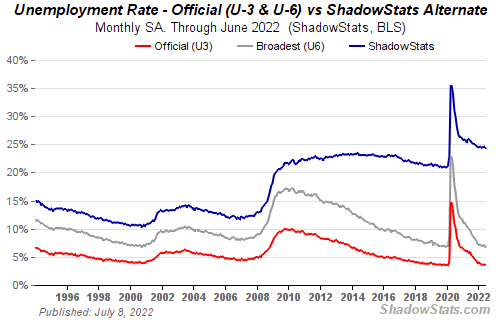
If unemployment were measured by total unemployed, it would be 25%.
Because the government wants to keep the unemployment rate low, they modify the definition.
If every US resident was unemployed and had no job interviews, economists would declare 0% unemployment. Excellent!
Inflation is not measured by the CPI.
The BLS measures CPI. This month was the highest since 1981.
CPI measures the cost of a basket of products across time. Food, energy, shelter, and clothes are included.
A 9.1% CPI means the basket of items is 9.1% more expensive.
What is the CPI problem?
Here's a more detailed explanation of CPI's flaws.
In summary, CPI is manipulated to be understated.
Housing costs are understated to manipulate CPI. Housing accounts for 33% of the CPI because it's the biggest expense for most people.
This signifies it's the biggest CPI weight.
Rather than using actual house prices, the Bureau of Labor Statistics essentially makes shit up. You can read more about the process here.
Surprise! It’s bullshit
The BLS stated Shelter's price rose 5.5% this month.
House prices are up 11-21%. (Source 1, Source 2, Source 3)
Rents are up 14-26%. (Source 1, Source 2)
Why is this important?
If CPI included housing prices, it would be 12-15 percent this month, not 9.1 percent.
9% inflation is nuts. Your money's value halves every 7 years at 9% inflation.
Worse is 15% inflation. Your money halves every 4 years at 15% inflation.
If everyone realized they needed to double their wage every 4-5 years to stay wealthy, there would be riots.
Inflation drains our money's value so the government can keep printing it.
The Solution
Most individuals know the existing system doesn't work, but can't explain why.
People work hard yet lag behind. The government lies about the economy's data.
In reality:
GDP has been down since 2008
25% of Americans are unemployed
Inflation is actually 15%
People might join together to vote out kleptocratic politicians if they knew the reality.
Having reliable economic data is the first step.
People can't understand the situation without sufficient information. Instead of immigrants or billionaires, people would blame liar politicians.
Here’s the vision:
A decentralized, transparent, and global dashboard that tracks economic data like GDP, unemployment, and inflation for every country on Earth.
Government incentives influence economic statistics.
ShadowStats has already started this effort, but the calculations must be transparent, decentralized, and global to be effective.
If interested, email me at trevorstark02@gmail.com.
Here are some links to further your research:

Cory Doctorow
3 years ago
The current inflation is unique.
New Stiglitz just dropped.
Here's the inflation story everyone believes (warning: it's false): America gave the poor too much money during the recession, and now the economy is awash with free money, which made them so rich they're refusing to work, meaning the economy isn't making anything. Prices are soaring due to increased cash and missing labor.
Lawrence Summers says there's only one answer. We must impoverish the poor: raise interest rates, cause a recession, and eliminate millions of jobs, until the poor are stripped of their underserved fortunes and return to work.
https://pluralistic.net/2021/11/20/quiet-part-out-loud/#profiteering
This is nonsense. Countries around the world suffered inflation during and after lockdowns, whether they gave out humanitarian money to keep people from starvation. America has slightly greater inflation than other OECD countries, but it's not due to big relief packages.
The Causes of and Responses to Today's Inflation, a Roosevelt Institute report by Nobel-winning economist Joseph Stiglitz and macroeconomist Regmi Ira, debunks this bogus inflation story and offers a more credible explanation for inflation.
https://rooseveltinstitute.org/wp-content/uploads/2022/12/RI CausesofandResponsestoTodaysInflation Report 202212.pdf
Sharp interest rate hikes exacerbate the slump and increase inflation, the authors argue. They compare monetary policy inflation cures to medieval bloodletting, where doctors repeated the same treatment until the patient recovered (for which they received credit) or died (which was more likely).
Let's discuss bloodletting. Inflation hawks warn of the wage price spiral, when inflation rises and powerful workers bargain for higher pay, driving up expenses, prices, and wages. This is the fairy-tale narrative of the 1970s, and it's true except that OPEC's embargo drove up oil prices, which produced inflation. Oh well.
Let's be generous to seventies-haunted inflation hawks and say we're worried about a wage-price spiral. Fantastic! No. Real wages are 2.3% lower than they were in Oct 2021 after peaking in June at 4.8%.
Why did America's powerful workers take a paycut rather than demand inflation-based pay? Weak unions, globalization, economic developments.
Workers don't expect inflation to rise, so they're not requesting inflationary hikes. Inflationary expectations have remained moderate, consistent with our data interpretation.
https://www.newyorkfed.org/microeconomics/sce#/
Neither are workers. Working people see surplus savings as wealth and spend it gradually over their lives, despite rising demand. People may have saved money by staying in during the lockdown, but they don't eat out every night to make up for it. Instead, they keep those savings as precautionary balances. This is why the economy is lagging.
People don't buy non-traded goods with pandemic savings (basically, imports). Imports don't multiply like domestic purchases. If you buy a loaf of bread from the corner baker for $1 and they spend it at the tavern across the street, that dollar generates $3 in economic activity. Spending a dollar on foreign goods leaves the country and any multiplier effect happens there, not in the US.
Only marginally higher wages. The ECI is up 1.6% from 2019. Almost all gains went to the 25% lowest-paid Americans. Contrary to the inflation worry about too much savings, these workers don't make enough to save, even post-pandemic.
Recreation and transit spending are at or below pre-pandemic levels. Higher food and hotel prices (which doesn’t mean we’re buying more food than we were in 2019, just that it costs more).
What causes inflation if not greedy workers, free money, and high demand? The most expensive domestic goods produce the biggest revenues for their manufacturers. They charge you more without paying their workers or suppliers more.
The largest price-gougers are funneling their earnings to rich people who store it offshore through stock buybacks and dividends. A $1 billion stock buyback doesn't buy $1 billion in bread.
Five factors influence US inflation today:
I. Price rises for energy and food
II. shifts in consumer tastes
III. supply interruptions (mainly autos);
IV. increased rents (due to telecommuting);
V. monopoly (AKA price-gouging).
None can be remedied by raising interest rates or laying off workers.
Russia's invasion of Ukraine, omicron, and China's Zero Covid policy all disrupted the flow of food, energy, and production inputs. The price went higher because we made less.
After Russia invaded Ukraine, oil prices spiked, and sanctions made it worse. But that was February. By October, oil prices had returned to pre-pandemic, 2015 levels attributable to global economic adjustments, including a shift to renewables. Every new renewable installation reduces oil consumption and affects oil prices.
High food prices have a simple solution. The US and EU have bribed farmers not to produce for 50 years. If the war continues, this program may end, and food prices may decline.
Demand changes. We want different things than in 2019, not more. During the lockdown, people substituted goods. Half of the US toilet-paper supply in 2019 was on commercial-sized rolls. This is created from different mills and stock than our toilet paper.
Lockdown pushed toilet paper demand to residential rolls, causing shortages (the TP hoarding story was just another pandemic urban legend). Because supermarket stores don't have accounts with commercial paper distributors, ordering from languishing stores was difficult. Kleenex and paper towel substitutions caused greater shortages.
All that drove increased costs in numerous product categories, and there were more cases. These increases are transient, caused by supply chain inefficiencies that are resolving.
Demand for frontline staff saw a one-time repricing of pay, which is being recouped as we speak.
Illnesses. Brittle, hollowed-out global supply chains aggravated this. The constant pursuit of cheap labor and minimal regulation by monopolies that dominate most sectors means things are manufactured in far-flung locations. Financialization means any surplus capital assets were sold off years ago, leaving firms with little production slack. After the epidemic, several of these systems took years to restart.
Automobiles are to blame. Financialization and monopolization consolidated microchip and auto production in Taiwan and China. When the lockdowns came, these worldwide corporations cancelled their chip orders, and when they placed fresh orders, they were at the back of the line.
That drove up car prices, which is why the US has slightly higher inflation than other wealthy countries: the economy is car-centric. Automobile prices account for 9% of the CPI. France: 3.6%
Rent shocks and telecommuting. After the epidemic, many professionals moved to exurbs, small towns, and the countryside to work from home. As commercial properties were vacated, it was impractical to adapt them for residential use due to planning restrictions. Addressing these restrictions will cut rent prices more than raising inflation rates, which halts housing construction.
Statistical mirages cause some rent inflation. The CPI estimates what homeowners would pay to rent their properties. When rents rise in your neighborhood, the CPI believes you're spending more on rent even if you have a 30-year fixed-rate mortgage.
Market dominance. Almost every area of the US economy is dominated by monopolies, whose CEOs disclose on investor calls that they use inflation scares to jack up prices and make record profits.
https://pluralistic.net/2022/02/02/its-the-economy-stupid/#overinflated
Long-term profit margins are rising. Markups averaged 26% from 1960-1980. 2021: 72%. Market concentration explains 81% of markup increases (e.g. monopolization). Profit margins reach a 70-year high in 2022. These elements interact. Monopolies thin out their sectors, making them brittle and sensitive to shocks.
If we're worried about a shrinking workforce, there are more humanitarian and sensible solutions than causing a recession and mass unemployment. Instead, we may boost US production capacity by easing workers' entry into the workforce.
https://pluralistic.net/2022/06/01/factories-to-condos-pipeline/#stuff-not-money
US female workforce participation ranks towards the bottom of developed countries. Many women can't afford to work due to America's lack of daycare, low earnings, and bad working conditions in female-dominated fields. If America doesn't have enough workers, childcare subsidies and minimum wages can help.
By contrast, driving the country into recession with interest-rate hikes will reduce employment, and the last recruited (women, minorities) are the first fired and the last to be rehired. Forcing America into recession won't enhance its capacity to create what its people want; it will degrade it permanently.
Nothing the Fed does can stop price hikes from international markets, lack of supply chain investment, COVID-19 disruptions, climate change, the Ukraine war, or market power. They can worsen it. When supply problems generate inflation, raising interest rates decreases investments that can remedy shortages.
Increasing interest rates won't cut rents since landlords pass on the expenses and high rates restrict investment in new dwellings where tenants could escape the costs.
Fixing the supply fixes supply-side inflation. Increase renewables investment (as the Inflation Reduction Act does). Monopolies can be busted (as the IRA does). Reshore key goods (as the CHIPS Act does). Better pay and child care attract employees.
Windfall taxes can claw back price-gouging corporations' monopoly earnings.
https://pluralistic.net/2022/03/15/sanctions-financing/#soak-the-rich
In 2008, we ruled out fiscal solutions (bailouts for debtors) and turned to monetary policy (bank bailouts). This preserved the economy but increased inequality and eroded public trust.
Monetary policy won't help. Even monetary policy enthusiasts recognize an 18-month lag between action and result. That suggests monetary tightening is unnecessary. Like the medieval bloodletter, central bankers whose interest rate hikes don't work swiftly may do more of the same, bringing the economy to its knees.
Interest rates must rise. Zero-percent interest fueled foolish speculation and financialization. Increasing rates will stop this. Increasing interest rates will destroy the economy and dampen inflation.
Then what? All recent evidence indicate to inflation decreasing on its own, as the authors argue. Supply side difficulties are finally being overcome, evidence shows. Energy and food prices are showing considerable mean reversion, which is disinflationary.
The authors don't recommend doing nothing. Best case scenario, they argue, is that the Fed won't keep raising interest rates until morale improves.

Desiree Peralta
3 years ago
How to Use the 2023 Recession to Grow Your Wealth Exponentially
This season's three best money moves.

“Millionaires are made in recessions.” — Time Capital
We're in a serious downturn, whether or not we're in a recession.
97% of business owners are decreasing costs by more than 10%, and all markets are down 30%.
If you know what you're doing and analyze the markets correctly, this is your chance to become a millionaire.
In any recession, there are always excellent possibilities to seize. Real estate, crypto, stocks, enterprises, etc.
What you do with your money could influence your future riches.
This article analyzes the three key markets, their circumstances for 2023, and how to profit from them.
Ways to make money on the stock market.
If you're conservative like me, you should invest in an index fund. Most of these funds are down 10-30% of ATH:
In earlier recessions, most money index funds lost 20%. After this downturn, they grew and passed the ATH in subsequent months.
Now is the greatest moment to invest in index funds to grow your money in a low-risk approach and make 20%.
If you want to be risky but wise, pick companies that will get better next year but are struggling now.
Even while we can't be 100% confident of a company's future performance, we know some are strong and will have a fantastic year.
Microsoft (down 22%), JPMorgan Chase (15.6%), Amazon (45%), and Disney (33.8%).
These firms give dividends, so you can earn passively while you wait.
So I consider that a good strategy to make wealth in the current stock market is to create two portfolios: one based on index funds to earn 10% to 20% profit when the corrections end, and the other based on individual stocks of popular and strong companies to earn 20%-30% return and dividends while you wait.
How to profit from the downturn in the real estate industry.
With rising mortgage rates, it's the worst moment to buy a home if you don't want to be eaten by banks. In the U.S., interest rates are double what they were three years ago, so buying now looks foolish.
Due to these rates, property prices are falling, but that won't last long since individuals will take advantage.
According to historical data, now is the ideal moment to buy a house for the next five years and perhaps forever.
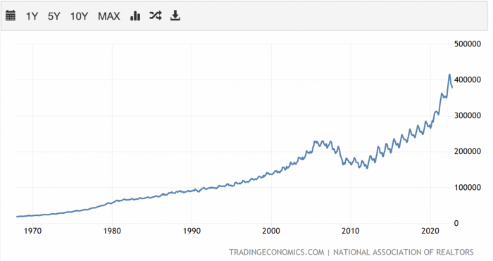
If you can buy a house, do it. You can refinance the interest at a lower rate with acceptable credit, but not the house price.
Take advantage of the housing market prices now because you won't find a decent deal when rates normalize.
How to profit from the cryptocurrency market.
This is the riskiest market to tackle right now, but it could offer the most opportunities if done appropriately.
The most powerful cryptocurrencies are down more than 60% from last year: $68,990 for BTC and $4,865 for ETH.
If you focus on those two coins, you can make 30%-60% without waiting for them to return to their ATH, and they're low enough to be a solid investment.
I don't encourage trying other altcoins because the crypto market is in crisis and you can lose everything if you're greedy.
Still, the main Cryptos are a good investment provided you store them in an external wallet and follow financial gurus' security advice.
Last thoughts
We can't anticipate a recession until it ends. We can't forecast a market or asset's lowest point, therefore waiting makes little sense.
If you want to develop your wealth, assess the money prospects on all the marketplaces and initiate long-term trades.
Many millionaires are made during recessions because they don't fear negative figures and use them to scale their money.
You might also like

Sean Bloomfield
3 years ago
How Jeff Bezos wins meetings over
We've all been there: You propose a suggestion to your team at a meeting, and most people appear on board, but a handful or small minority aren't. How can we achieve collective buy-in when we need to go forward but don't know how to deal with some team members' perceived intransigence?
Steps:
Investigate the divergent opinions: Begin by sincerely attempting to comprehend the viewpoint of your disagreeing coworkers. Maybe it makes sense to switch horses in the middle of the race. Have you completely overlooked a blind spot, such as a political concern that could arise as an unexpected result of proceeding? This is crucial to ensure that the person or people feel heard as well as to advance the goals of the team. Sometimes all individuals need is a little affirmation before they fully accept your point of view.
It says a lot about you as a leader to be someone who always lets the perceived greatest idea win, regardless of the originating channel, if after studying and evaluating you see the necessity to align with the divergent position.
If, after investigation and assessment, you determine that you must adhere to the original strategy, we go to Step 2.
2. Disagree and Commit: Jeff Bezos, CEO of Amazon, has had this experience, and Julie Zhuo describes how he handles it in her book The Making of a Manager.
It's OK to disagree when the team is moving in the right direction, but it's not OK to accidentally or purposefully damage the team's efforts because you disagree. Let the team know your opinion, but then help them achieve company goals even if they disagree. Unknown. You could be wrong in today's ever-changing environment.
So next time you have a team member who seems to be dissenting and you've tried the previous tactics, you may ask the individual in the meeting I understand you but I don't want us to leave without you on board I need your permission to commit to this approach would you give us your commitment?

Nitin Sharma
3 years ago
Web3 Terminology You Should Know
The easiest online explanation.

Web3 is growing. Crypto companies are growing.
Instagram, Adidas, and Stripe adopted cryptocurrency.

Bitcoin and other cryptocurrencies made web3 famous.
Most don't know where to start. Cryptocurrency, DeFi, etc. are investments.
Since we don't understand web3, I'll help you today.
Let’s go.
1. Web3
It is the third generation of the web, and it is built on the decentralization idea which means no one can control it.
There are static webpages that we can only read on the first generation of the web (i.e. Web 1.0).
Web 2.0 websites are interactive. Twitter, Medium, and YouTube.
Each generation controlled the website owner. Simply put, the owner can block us. However, data breaches and selling user data to other companies are issues.
They can influence the audience's mind since they have control.
Assume Twitter's CEO endorses Donald Trump. Result? Twitter would have promoted Donald Trump with tweets and graphics, enhancing his chances of winning.
We need a decentralized, uncontrollable system.
And then there’s Web3.0 to consider. As Bitcoin and Ethereum values climb, so has its popularity. Web3.0 is uncontrolled web evolution. It's good and bad.
Dapps, DeFi, and DAOs are here. It'll all be explained afterwards.
2. Cryptocurrencies:
No need to elaborate.
Bitcoin, Ethereum, Cardano, and Dogecoin are cryptocurrencies. It's digital money used for payments and other uses.
Programs must interact with cryptocurrencies.
3. Blockchain:
Blockchain facilitates bitcoin transactions, investments, and earnings.
This technology governs Web3. It underpins the web3 environment.
Let us delve much deeper.
Blockchain is simple. However, the name expresses the meaning.
Blockchain is a chain of blocks.
Let's use an image if you don't understand.

The graphic above explains blockchain. Think Blockchain. The block stores related data.
Here's more.
4. Smart contracts
Programmers and developers must write programs. Smart contracts are these blockchain apps.
That’s reasonable.
Decentralized web3.0 requires immutable smart contracts or programs.
5. NFTs
Blockchain art is NFT. Non-Fungible Tokens.
Explaining Non-Fungible Token may help.
Two sorts of tokens:
These tokens are fungible, meaning they can be changed. Think of Bitcoin or cash. The token won't change if you sell one Bitcoin and acquire another.
Non-Fungible Token: Since these tokens cannot be exchanged, they are exclusive. For instance, music, painting, and so forth.
Right now, Companies and even individuals are currently developing worthless NFTs.
The concept of NFTs is much improved when properly handled.
6. Dapp
Decentralized apps are Dapps. Instagram, Twitter, and Medium apps in the same way that there is a lot of decentralized blockchain app.
Curve, Yearn Finance, OpenSea, Axie Infinity, etc. are dapps.
7. DAOs
DAOs are member-owned and governed.
Consider it a company with a core group of contributors.
8. DeFi
We all utilize centrally regulated financial services. We fund these banks.
If you have $10,000 in your bank account, the bank can invest it and retain the majority of the profits.
We only get a penny back. Some banks offer poor returns. To secure a loan, we must trust the bank, divulge our information, and fill out lots of paperwork.
DeFi was built for such issues.
Decentralized banks are uncontrolled. Staking, liquidity, yield farming, and more can earn you money.
Web3 beginners should start with these resources.

OnChain Wizard
3 years ago
How to make a >800 million dollars in crypto attacking the once 3rd largest stablecoin, Soros style
Everyone is talking about the $UST attack right now, including Janet Yellen. But no one is talking about how much money the attacker made (or how brilliant it was). Lets dig in.
Our story starts in late March, when the Luna Foundation Guard (or LFG) starts buying BTC to help back $UST. LFG started accumulating BTC on 3/22, and by March 26th had a $1bn+ BTC position. This is leg #1 that made this trade (or attack) brilliant.
The second leg comes in the form of the 4pool Frax announcement for $UST on April 1st. This added the second leg needed to help execute the strategy in a capital efficient way (liquidity will be lower and then the attack is on).
We don't know when the attacker borrowed 100k BTC to start the position, other than that it was sold into Kwon's buying (still speculation). LFG bought 15k BTC between March 27th and April 11th, so lets just take the average price between these dates ($42k).
So you have a ~$4.2bn short position built. Over the same time, the attacker builds a $1bn OTC position in $UST. The stage is now set to create a run on the bank and get paid on your BTC short. In anticipation of the 4pool, LFG initially removes $150mm from 3pool liquidity.
The liquidity was pulled on 5/8 and then the attacker uses $350mm of UST to drain curve liquidity (and LFG pulls another $100mm of liquidity).
But this only starts the de-pegging (down to 0.972 at the lows). LFG begins selling $BTC to defend the peg, causing downward pressure on BTC while the run on $UST was just getting started.
With the Curve liquidity drained, the attacker used the remainder of their $1b OTC $UST position ($650mm or so) to start offloading on Binance. As withdrawals from Anchor turned from concern into panic, this caused a real de-peg as people fled for the exits
So LFG is selling $BTC to restore the peg while the attacker is selling $UST on Binance. Eventually the chain gets congested and the CEXs suspend withdrawals of $UST, fueling the bank run panic. $UST de-pegs to 60c at the bottom, while $BTC bleeds out.
The crypto community panics as they wonder how much $BTC will be sold to keep the peg. There are liquidations across the board and LUNA pukes because of its redemption mechanism (the attacker very well could have shorted LUNA as well). BTC fell 25% from $42k on 4/11 to $31.3k
So how much did our attacker make? There aren't details on where they covered obviously, but if they are able to cover (or buy back) the entire position at ~$32k, that means they made $952mm on the short.
On the $350mm of $UST curve dumps I don't think they took much of a loss, lets assume 3% or just $11m. And lets assume that all the Binance dumps were done at 80c, thats another $125mm cost of doing business. For a grand total profit of $815mm (bf borrow cost).
BTC was the perfect playground for the trade, as the liquidity was there to pull it off. While having LFG involved in BTC, and foreseeing they would sell to keep the peg (and prevent LUNA from dying) was the kicker.
Lastly, the liquidity being low on 3pool in advance of 4pool allowed the attacker to drain it with only $350mm, causing the broader panic in both BTC and $UST. Any shorts on LUNA would've added a lot of P&L here as well, with it falling -65% since 5/7.
And for the reply guys, yes I know a lot of this involves some speculation & assumptions. But a lot of money was made here either way, and I thought it would be cool to dive into how they did it.