


How Payment for Order Flow (PFOF) Works
What is PFOF?
PFOF is a brokerage firm's compensation for directing orders to different parties for trade execution. The brokerage firm receives fractions of a penny per share for directing the order to a market maker.
Each optionable stock could have thousands of contracts, so market makers dominate options trades. Order flow payments average less than $0.50 per option contract.
Order Flow Payments (PFOF) Explained
The proliferation of exchanges and electronic communication networks has complicated equity and options trading (ECNs) Ironically, Bernard Madoff, the Ponzi schemer, pioneered pay-for-order-flow.
In a December 2000 study on PFOF, the SEC said, "Payment for order flow is a method of transferring trading profits from market making to brokers who route customer orders to specialists for execution."
Given the complexity of trading thousands of stocks on multiple exchanges, market making has grown. Market makers are large firms that specialize in a set of stocks and options, maintaining an inventory of shares and contracts for buyers and sellers. Market makers are paid the bid-ask spread. Spreads have narrowed since 2001, when exchanges switched to decimals. A market maker's ability to play both sides of trades is key to profitability.
Benefits, requirements
A broker receives fees from a third party for order flow, sometimes without a client's knowledge. This invites conflicts of interest and criticism. Regulation NMS from 2005 requires brokers to disclose their policies and financial relationships with market makers.
Your broker must tell you if it's paid to send your orders to specific parties. This must be done at account opening and annually. The firm must disclose whether it participates in payment-for-order-flow and, upon request, every paid order. Brokerage clients can request payment data on specific transactions, but the response takes weeks.
Order flow payments save money. Smaller brokerage firms can benefit from routing orders through market makers and getting paid. This allows brokerage firms to send their orders to another firm to be executed with other orders, reducing costs. The market maker or exchange benefits from additional share volume, so it pays brokerage firms to direct traffic.
Retail investors, who lack bargaining power, may benefit from order-filling competition. Arrangements to steer the business in one direction invite wrongdoing, which can erode investor confidence in financial markets and their players.
Pay-for-order-flow criticism
It has always been controversial. Several firms offering zero-commission trades in the late 1990s routed orders to untrustworthy market makers. During the end of fractional pricing, the smallest stock spread was $0.125. Options spreads widened. Traders found that some of their "free" trades cost them a lot because they weren't getting the best price.
The SEC then studied the issue, focusing on options trades, and nearly decided to ban PFOF. The proliferation of options exchanges narrowed spreads because there was more competition for executing orders. Options market makers said their services provided liquidity. In its conclusion, the report said, "While increased multiple-listing produced immediate economic benefits to investors in the form of narrower quotes and effective spreads, these improvements have been muted with the spread of payment for order flow and internalization."
The SEC allowed payment for order flow to continue to prevent exchanges from gaining monopoly power. What would happen to trades if the practice was outlawed was also unclear. SEC requires brokers to disclose financial arrangements with market makers. Since then, the SEC has watched closely.
2020 Order Flow Payment
Rule 605 and Rule 606 show execution quality and order flow payment statistics on a broker's website. Despite being required by the SEC, these reports can be hard to find. The SEC mandated these reports in 2005, but the format and reporting requirements have changed over the years, most recently in 2018.
Brokers and market makers formed a working group with the Financial Information Forum (FIF) to standardize order execution quality reporting. Only one retail brokerage (Fidelity) and one market maker remain (Two Sigma Securities). FIF notes that the 605/606 reports "do not provide the level of information that allows a retail investor to gauge how well a broker-dealer fills a retail order compared to the NBBO (national best bid or offer’) at the time the order was received by the executing broker-dealer."
In the first quarter of 2020, Rule 606 reporting changed to require brokers to report net payments from market makers for S&P 500 and non-S&P 500 equity trades and options trades. Brokers must disclose payment rates per 100 shares by order type (market orders, marketable limit orders, non-marketable limit orders, and other orders).
Richard Repetto, Managing Director of New York-based Piper Sandler & Co., publishes a report on Rule 606 broker reports. Repetto focused on Charles Schwab, TD Ameritrade, E-TRADE, and Robinhood in Q2 2020. Repetto reported that payment for order flow was higher in the second quarter than the first due to increased trading activity, and that options paid more than equities.
Repetto says PFOF contributions rose overall. Schwab has the lowest options rates, while TD Ameritrade and Robinhood have the highest. Robinhood had the highest equity rating. Repetto assumes Robinhood's ability to charge higher PFOF reflects their order flow profitability and that they receive a fixed rate per spread (vs. a fixed rate per share by the other brokers).
Robinhood's PFOF in equities and options grew the most quarter-over-quarter of the four brokers Piper Sandler analyzed, as did their implied volumes. All four brokers saw higher PFOF rates.
TD Ameritrade took the biggest income hit when cutting trading commissions in fall 2019, and this report shows they're trying to make up the shortfall by routing orders for additional PFOF. Robinhood refuses to disclose trading statistics using the same metrics as the rest of the industry, offering only a vague explanation on their website.
Summary
Payment for order flow has become a major source of revenue as brokers offer no-commission equity (stock and ETF) orders. For retail investors, payment for order flow poses a problem because the brokerage may route orders to a market maker for its own benefit, not the investor's.
Infrequent or small-volume traders may not notice their broker's PFOF practices. Frequent traders and those who trade larger quantities should learn about their broker's order routing system to ensure they're not losing out on price improvement due to a broker prioritizing payment for order flow.
This post is a summary. Read full article here
More on Economics & Investing

Jan-Patrick Barnert
3 years ago
Wall Street's Bear Market May Stick Around
If history is any guide, this bear market might be long and severe.
This is the S&P 500 Index's fourth such incident in 20 years. The last bear market of 2020 was a "shock trade" caused by the Covid-19 pandemic, although earlier ones in 2000 and 2008 took longer to bottom out and recover.
Peter Garnry, head of equities strategy at Saxo Bank A/S, compares the current selloff to the dotcom bust of 2000 and the 1973-1974 bear market marked by soaring oil prices connected to an OPEC oil embargo. He blamed high tech valuations and the commodity crises.
"This drop might stretch over a year and reach 35%," Garnry wrote.
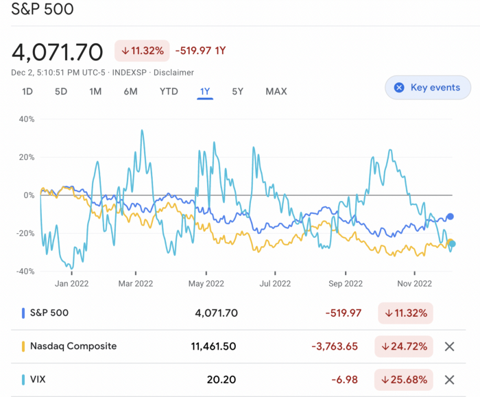
Here are six bear market charts.
Time/depth
The S&P 500 Index plummeted 51% between 2000 and 2002 and 58% during the global financial crisis; it took more than 1,000 trading days to recover. The former took 638 days to reach a bottom, while the latter took 352 days, suggesting the present selloff is young.
Valuations
Before the tech bubble burst in 2000, valuations were high. The S&P 500's forward P/E was 25 times then. Before the market fell this year, ahead values were near 24. Before the global financial crisis, stocks were relatively inexpensive, but valuations dropped more than 40%, compared to less than 30% now.
Earnings
Every stock crash, especially earlier bear markets, returned stocks to fundamentals. The S&P 500 decouples from earnings trends but eventually recouples.
Support
Central banks won't support equity investors just now. The end of massive monetary easing will terminate a two-year bull run that was among the strongest ever, and equities may struggle without cheap money. After years of "don't fight the Fed," investors must embrace a new strategy.
Bear Haunting Bear
If the past is any indication, rising government bond yields are bad news. After the financial crisis, skyrocketing rates and a falling euro pushed European stock markets back into bear territory in 2011.
Inflation/rates
The current monetary policy climate differs from past bear markets. This is the first time in a while that markets face significant inflation and rising rates.
This post is a summary. Read full article here

Desiree Peralta
3 years ago
How to Use the 2023 Recession to Grow Your Wealth Exponentially
This season's three best money moves.

“Millionaires are made in recessions.” — Time Capital
We're in a serious downturn, whether or not we're in a recession.
97% of business owners are decreasing costs by more than 10%, and all markets are down 30%.
If you know what you're doing and analyze the markets correctly, this is your chance to become a millionaire.
In any recession, there are always excellent possibilities to seize. Real estate, crypto, stocks, enterprises, etc.
What you do with your money could influence your future riches.
This article analyzes the three key markets, their circumstances for 2023, and how to profit from them.
Ways to make money on the stock market.
If you're conservative like me, you should invest in an index fund. Most of these funds are down 10-30% of ATH:
In earlier recessions, most money index funds lost 20%. After this downturn, they grew and passed the ATH in subsequent months.
Now is the greatest moment to invest in index funds to grow your money in a low-risk approach and make 20%.
If you want to be risky but wise, pick companies that will get better next year but are struggling now.
Even while we can't be 100% confident of a company's future performance, we know some are strong and will have a fantastic year.
Microsoft (down 22%), JPMorgan Chase (15.6%), Amazon (45%), and Disney (33.8%).
These firms give dividends, so you can earn passively while you wait.
So I consider that a good strategy to make wealth in the current stock market is to create two portfolios: one based on index funds to earn 10% to 20% profit when the corrections end, and the other based on individual stocks of popular and strong companies to earn 20%-30% return and dividends while you wait.
How to profit from the downturn in the real estate industry.
With rising mortgage rates, it's the worst moment to buy a home if you don't want to be eaten by banks. In the U.S., interest rates are double what they were three years ago, so buying now looks foolish.
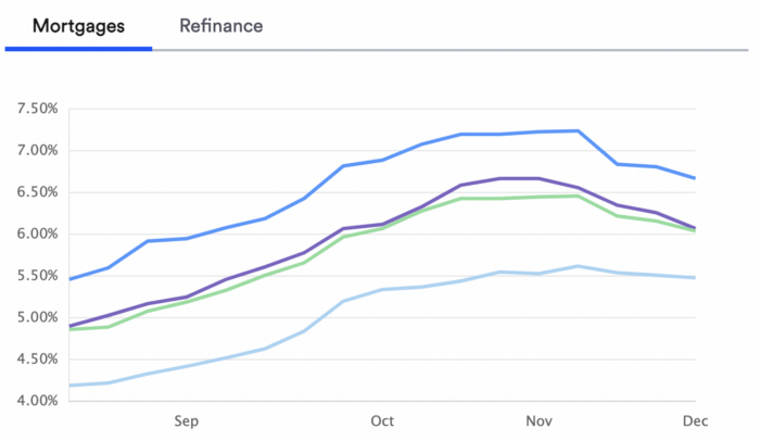
Due to these rates, property prices are falling, but that won't last long since individuals will take advantage.
According to historical data, now is the ideal moment to buy a house for the next five years and perhaps forever.
If you can buy a house, do it. You can refinance the interest at a lower rate with acceptable credit, but not the house price.
Take advantage of the housing market prices now because you won't find a decent deal when rates normalize.
How to profit from the cryptocurrency market.
This is the riskiest market to tackle right now, but it could offer the most opportunities if done appropriately.
The most powerful cryptocurrencies are down more than 60% from last year: $68,990 for BTC and $4,865 for ETH.
If you focus on those two coins, you can make 30%-60% without waiting for them to return to their ATH, and they're low enough to be a solid investment.
I don't encourage trying other altcoins because the crypto market is in crisis and you can lose everything if you're greedy.
Still, the main Cryptos are a good investment provided you store them in an external wallet and follow financial gurus' security advice.
Last thoughts
We can't anticipate a recession until it ends. We can't forecast a market or asset's lowest point, therefore waiting makes little sense.
If you want to develop your wealth, assess the money prospects on all the marketplaces and initiate long-term trades.
Many millionaires are made during recessions because they don't fear negative figures and use them to scale their money.
Wayne Duggan
4 years ago
What An Inverted Yield Curve Means For Investors
The yield spread between 10-year and 2-year US Treasury bonds has fallen below 0.2 percent, its lowest level since March 2020. A flattening or negative yield curve can be a bad sign for the economy.
What Is An Inverted Yield Curve?
In the yield curve, bonds of equal credit quality but different maturities are plotted. The most commonly used yield curve for US investors is a plot of 2-year and 10-year Treasury yields, which have yet to invert.
A typical yield curve has higher interest rates for future maturities. In a flat yield curve, short-term and long-term yields are similar. Inverted yield curves occur when short-term yields exceed long-term yields. Inversions of yield curves have historically occurred during recessions.
Inverted yield curves have preceded each of the past eight US recessions. The good news is they're far leading indicators, meaning a recession is likely not imminent.
Every US recession since 1955 has occurred between six and 24 months after an inversion of the two-year and 10-year Treasury yield curves, according to the San Francisco Fed. So, six months before COVID-19, the yield curve inverted in August 2019.
Looking Ahead
The spread between two-year and 10-year Treasury yields was 0.18 percent on Tuesday, the smallest since before the last US recession. If the graph above continues, a two-year/10-year yield curve inversion could occur within the next few months.
According to Bank of America analyst Stephen Suttmeier, the S&P 500 typically peaks six to seven months after the 2s-10s yield curve inverts, and the US economy enters recession six to seven months later.
Investors appear unconcerned about the flattening yield curve. This is in contrast to the iShares 20+ Year Treasury Bond ETF TLT +2.19% which was down 1% on Tuesday.
Inversion of the yield curve and rising interest rates have historically harmed stocks. Recessions in the US have historically coincided with or followed the end of a Federal Reserve rate hike cycle, not the start.
You might also like

Claire Berehova
4 years ago
There’s no manual for that
| Kyiv oblast in springtime. Photo by author. |
We’ve been receiving since the war began text messages from the State Emergency Service of Ukraine every few days. They’ve contained information on how to comfort a child and what to do in case of a water outage.
But a question that I struggle to suppress irks within me: How would we know if there really was a threat coming our away? So how can I happily disregard an air raid siren and continue singing to my three-month-old son when I feel like a World War II film became reality? There’s no manual for that.
Along with the anxiety, there’s the guilt that always seems to appear alongside dinner we’re fortunate to still have each evening while brave Ukrainian soldiers are facing serious food insecurity. There’s no manual for how to deal with this guilt.
When it comes to the enemy, there is no manual for how to react to the news of Russian casualties. Every dead Russian soldier weakens Putin, but I also know that many of these men had wives and girlfriends who are now living a nightmare.
So, I felt like I had to start writing my own manual.
The anxiety around the air raid siren? Only with time does it get easier to ignore it, but never completely.
The guilt? All we can do is pray.
That inner conflict? As Russia continues to stun the world with its war crimes, my emotions get less gray — I have to get used to accommodating absurd levels of hatred.
Sadness? It feels a bit more manageable when we laugh, and a little alcohol helps (as it usually does).
Cabin fever? Step outside in the yard when possible. At least the sunshine is becoming more fervent with spring approaching.
Slava Ukraini. Heroyam slava. (Glory to Ukraine. Glory to the heroes.)

Glorin Santhosh
3 years ago
Start organizing your ideas by using The Second Brain.

Building A Second Brain helps us remember connections, ideas, inspirations, and insights. Using contemporary technologies and networks increases our intelligence.
This approach makes and preserves concepts. It's a straightforward, practical way to construct a second brain—a remote, centralized digital store for your knowledge and its sources.
How to build ‘The Second Brain’
Have you forgotten any brilliant ideas? What insights have you ignored?
We're pressured to read, listen, and watch informative content. Where did the data go? What happened?
Our brains can store few thoughts at once. Our brains aren't idea banks.
Building a Second Brain helps us remember thoughts, connections, and insights. Using digital technologies and networks expands our minds.
Ten Rules for Creating a Second Brain
1. Creative Stealing
Instead of starting from scratch, integrate other people's ideas with your own.
This way, you won't waste hours starting from scratch and can focus on achieving your goals.
Users of Notion can utilize and customize each other's templates.
2. The Habit of Capture
We must record every idea, concept, or piece of information that catches our attention since our minds are fragile.
When reading a book, listening to a podcast, or engaging in any other topic-related activity, save and use anything that resonates with you.
3. Recycle Your Ideas
Reusing our own ideas across projects might be advantageous since it helps us tie new information to what we already know and avoids us from starting a project with no ideas.
4. Projects Outside of Category
Instead of saving an idea in a folder, group it with documents for a project or activity.
If you want to be more productive, gather suggestions.
5. Burns Slowly
Even if you could finish a job, work, or activity if you focused on it, you shouldn't.
You'll get tired and can't advance many projects. It's easier to divide your routine into daily tasks.
Few hours of daily study is more productive and healthier than entire nights.
6. Begin with a surplus
Instead of starting with a blank sheet when tackling a new subject, utilise previous articles and research.
You may have read or saved related material.
7. Intermediate Packets
A bunch of essay facts.
You can utilize it as a document's section or paragraph for different tasks.
Memorize useful information so you can use it later.
8. You only know what you make
We can see, hear, and read about anything.
What matters is what we do with the information, whether that's summarizing it or writing about it.
9. Make it simpler for yourself in the future.
Create documents or files that your future self can easily understand. Use your own words, mind maps, or explanations.
10. Keep your thoughts flowing.
If you don't employ the knowledge in your second brain, it's useless.
Few people exercise despite knowing its benefits.
Conclusion:
You may continually move your activities and goals closer to completion by organizing and applying your information in a way that is results-focused.
Profit from the information economy's explosive growth by turning your specialized knowledge into cash.
Make up original patterns and linkages between topics.
You may reduce stress and information overload by appropriately curating and managing your personal information stream.
Learn how to apply your significant experience and specific knowledge to a new job, business, or profession.
Without having to adhere to tight, time-consuming constraints, accumulate a body of relevant knowledge and concepts over time.
Take advantage of all the learning materials that are at your disposal, including podcasts, online courses, webinars, books, and articles.

TheRedKnight
3 years ago
Say goodbye to Ponzi yields - A new era of decentralized perpetual
Decentralized perpetual may be the next crypto market boom; with tons of perpetual popping up, let's look at two protocols that offer organic, non-inflationary yields.
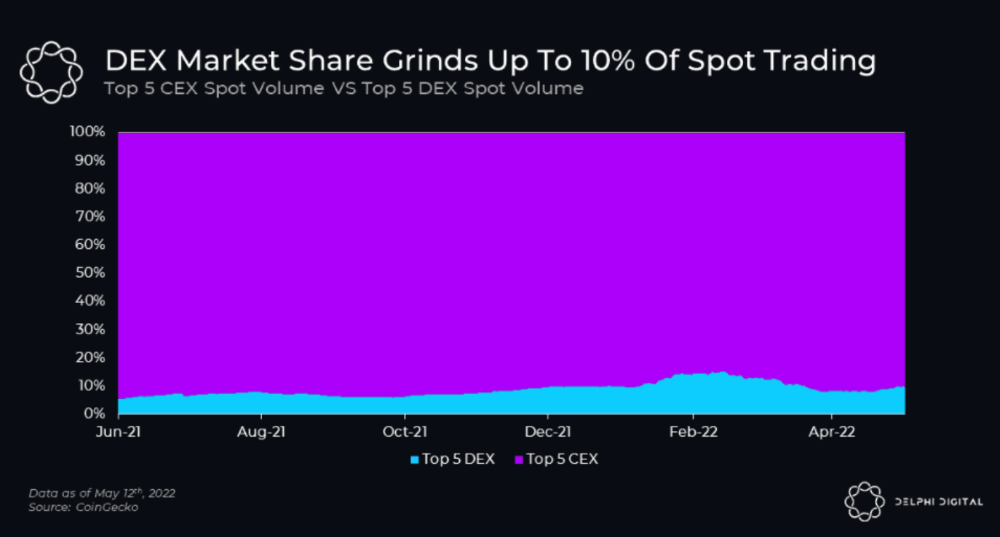
Decentralized derivatives exchanges' market share has increased tenfold in a year, but it's still 2% of CEXs'. DEXs have a long way to go before they can compete with centralized exchanges in speed, liquidity, user experience, and composability.
I'll cover gains.trade and GMX protocol in Polygon, Avalanche, and Arbitrum. Both protocols support leveraged perpetual crypto, stock, and Forex trading.
Why these protocols?
Decentralized GMX Gains protocol
Organic yield: path to sustainability
I've never trusted Defi's non-organic yields. Example: XYZ protocol. 20–75% of tokens may be set aside as farming rewards to provide liquidity, according to tokenomics.
Say you provide ETH-USDC liquidity. They advertise a 50% APR reward for this pair, 10% from trading fees and 40% from farming rewards. Only 10% is real, the rest is "Ponzi." The "real" reward is in protocol tokens.
Why keep this token? Governance voting or staking rewards are promoted services.
Most liquidity providers expect compensation for unused tokens. Basic psychological principles then? — Profit.
Nobody wants governance tokens. How many out of 100 care about the protocol's direction and will vote?
Staking increases your token's value. Currently, they're mostly non-liquid. If the protocol is compromised, you can't withdraw funds. Most people are sceptical of staking because of this.
"Free tokens," lack of use cases, and skepticism lead to tokens moving south. No farming reward protocols have lasted.
It may have shown strength in a bull market, but what about a bear market?
What is decentralized perpetual?
A perpetual contract is a type of futures contract that doesn't expire. So one can hold a position forever.
You can buy/sell any leveraged instruments (Long-Short) without expiration.
In centralized exchanges like Binance and coinbase, fees and revenue (liquidation) go to the exchanges, not users.
Users can provide liquidity that traders can use to leverage trade, and the revenue goes to liquidity providers.
Gains.trade and GMX protocol are perpetual trading platforms with a non-inflationary organic yield for liquidity providers.
GMX protocol
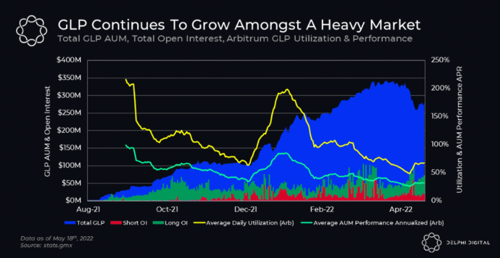
GMX is an Arbitrum and Avax protocol that rewards in ETH and Avax. GLP uses a fast oracle to borrow the "true price" from other trading venues, unlike a traditional AMM.
GLP and GMX are protocol tokens. GLP is used for leveraged trading, swapping, etc.
GLP is a basket of tokens, including ETH, BTC, AVAX, stablecoins, and UNI, LINK, and Stablecoins.
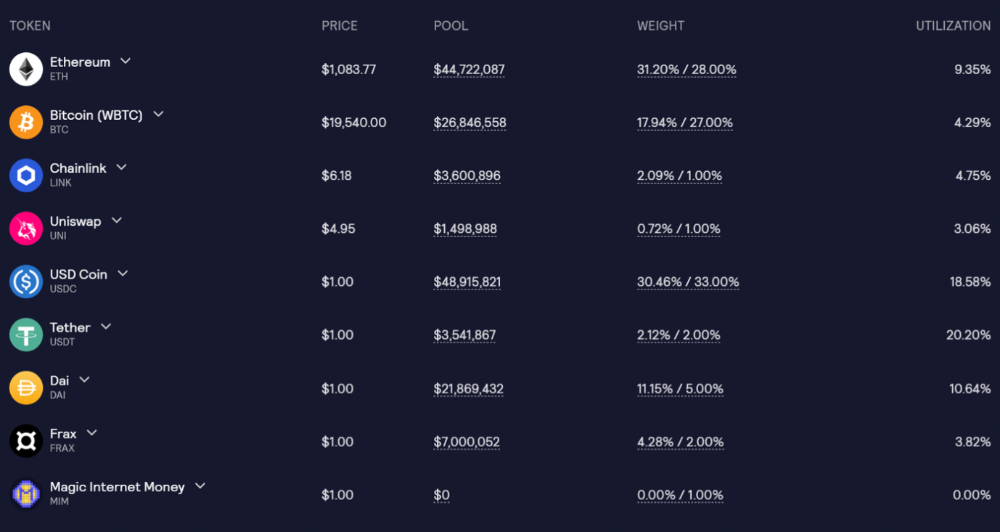
GLP composition on arbitrum
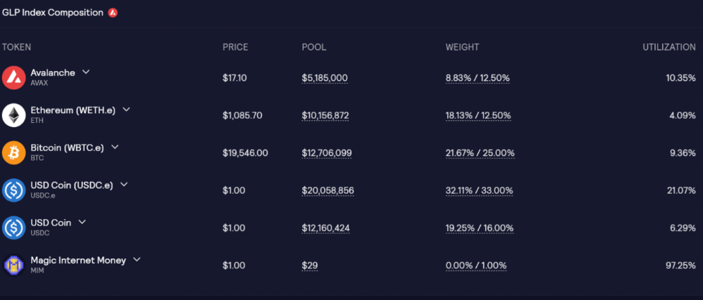
GLP composition on Avalanche
GLP token rebalances based on usage, providing liquidity without loss.
Protocol "runs" on Staking GLP. Depending on their chain, the protocol will reward users with ETH or AVAX. Current rewards are 22 percent (15.71 percent in ETH and the rest in escrowed GMX) and 21 percent (15.72 percent in AVAX and the rest in escrowed GMX). escGMX and ETH/AVAX percentages fluctuate.
Where is the yield coming from?
Swap fees, perpetual interest, and liquidations generate yield. 70% of fees go to GLP stakers, 30% to GMX. Organic yields aren't paid in inflationary farm tokens.
Escrowed GMX is vested GMX that unlocks in 365 days. To fully unlock GMX, you must farm the Escrowed GMX token for 365 days. That means less selling pressure for the GMX token.
GMX's status
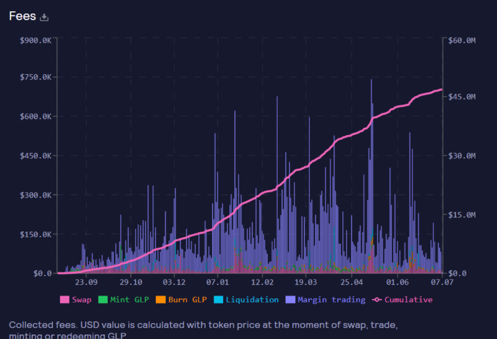
These are the fees in Arbitrum in the past 11 months by GMX.
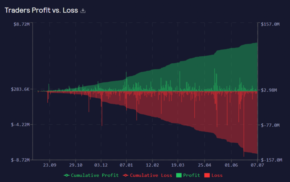
GMX works like a casino, which increases fees. Most fees come from Margin trading, which means most traders lose money; this money goes to the casino, or GLP stakers.
Strategies
My personal strategy is to DCA into GLP when markets hit bottom and stake it; GLP will be less volatile with extra staking rewards.
GLP YoY return vs. naked buying
Let's say I invested $10,000 in BTC, AVAX, and ETH in January.
BTC price: 47665$
ETH price: 3760$
AVAX price: $145
Current prices
BTC $21,000 (Down 56 percent )
ETH $1233 (Down 67.2 percent )
AVAX $20.36 (Down 85.95 percent )
Your $10,000 investment is now worth around $3,000.
How about GLP? My initial investment is 50% stables and 50% other assets ( Assuming the coverage ratio for stables is 50 percent at that time)
Without GLP staking yield, your value is $6500.
Let's assume the average APR for GLP staking is 23%, or $1500. So 8000$ total. It's 50% safer than holding naked assets in a bear market.
In a bull market, naked assets are preferable to GLP.
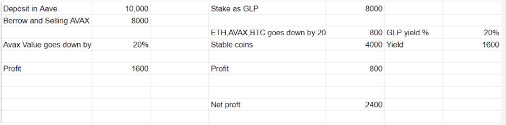
Short farming using GLP
Simple GLP short farming.
You use a stable asset as collateral to borrow AVAX. Sell it and buy GLP. Even if GLP rises, it won't rise as fast as AVAX, so we can get yields.
Let's do the maths
You deposit $10,000 USDT in Aave and borrow Avax. Say you borrow $8,000; you sell it, buy GLP, and risk 20%.
After a year, ETH, AVAX, and BTC rise 20%. GLP is $8800. $800 vanishes. 20% yields $1600. You're profitable. Shorting Avax costs $1600. (Assumptions-ETH, AVAX, BTC move the same, GLP yield is 20%. GLP has a 50:50 stablecoin/others ratio. Aave won't liquidate
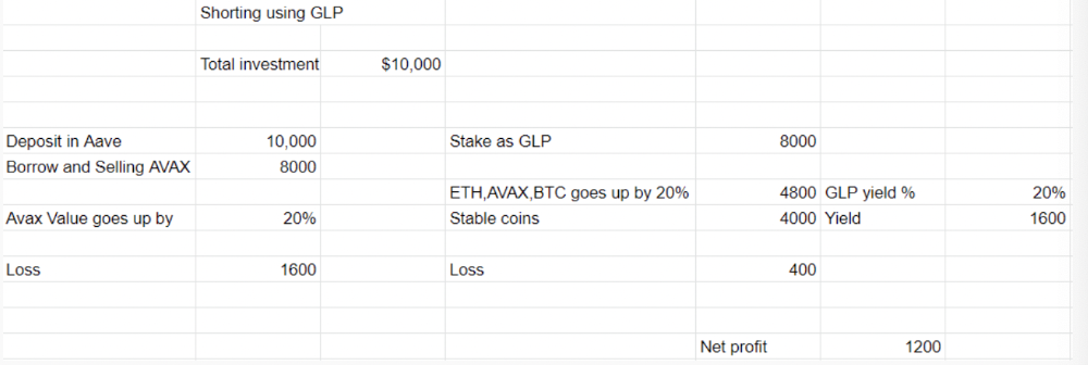
In naked Avax shorting, Avax falls 20% in a year. You'll make $1600. If you buy GLP and stake it using the sold Avax and BTC, ETH and Avax go down by 20% - your profit is 20%, but with the yield, your total gain is $2400.
Issues with GMX
GMX's historical funding rates are always net positive, so long always pays short. This makes long-term shorts less appealing.
Oracle price discovery isn't enough. This limitation doesn't affect Bitcoin and ETH, but it affects less liquid assets. Traders can buy and sell less liquid assets at a lower price than their actual cost as long as GMX exists.
As users must provide GLP liquidity, adding more assets to GMX will be difficult. Next iteration will have synthetic assets.
Gains Protocol
Best leveraged trading platform. Smart contract-based decentralized protocol. 46 crypto pairs can be leveraged 5–150x and 10 Forex pairs 5–1000x. $10 DAI @ 150x (min collateral x leverage pos size is $1500 DAI). No funding fees, no KYC, trade DAI from your wallet, keep funds.
DAI single-sided staking and the GNS-DAI pool are important parts of Gains trading. GNS-DAI stakers get 90% of trading fees and 100% swap fees. 10 percent of trading fees go to DAI stakers, which is currently 14 percent!
Trade volume
When a trader opens a trade, the leverage and profit are pulled from the DAI pool. If he loses, the protocol yield goes to the stakers.
If the trader's win rate is high and the DAI pool slowly depletes, the GNS token is minted and sold to refill DAI. Trader losses are used to burn GNS tokens. 25%+ of GNS is burned, making it deflationary.
Due to high leverage and volatility of crypto assets, most traders lose money and the protocol always wins, keeping GNS deflationary.
Gains uses a unique decentralized oracle for price feeds, which is better for leverage trading platforms. Let me explain.
Gains uses chainlink price oracles, not its own price feeds. Chainlink oracles only query centralized exchanges for price feeds every minute, which is unsuitable for high-precision trading.
Gains created a custom oracle that queries the eight chainlink nodes for the current price and, on average, for trade confirmation. This model eliminates every-second inquiries, which waste gas but are more efficient than chainlink's per-minute price.
This price oracle helps Gains open and close trades instantly, eliminate scam wicks, etc.
Other benefits include:
Stop-loss guarantee (open positions updated)
No scam wicks
Spot-pricing
Highest possible leverage
Fixed-spreads. During high volatility, a broker can increase the spread, which can hit your stop loss without the price moving.
Trade directly from your wallet and keep your funds.
>90% loss before liquidation (Some platforms liquidate as little as -50 percent)
KYC-free
Directly trade from wallet; keep funds safe
Further improvements
GNS-DAI liquidity providers fear the impermanent loss, so the protocol is migrating to its own liquidity and single staking GNS vaults. This allows users to stake GNS without permanent loss and obtain 90% DAI trading fees by staking. This starts in August.
Their upcoming improvements can be found here.
Gains constantly add new features and change pairs. It's an interesting protocol.
Conclusion
Next bull run, watch decentralized perpetual protocols. Effective tokenomics and non-inflationary yields may attract traders and liquidity providers. But still, there is a long way for them to develop, and I don't see them tackling the centralized exchanges any time soon until they fix their inherent problems and improve fast enough.
Read the full post here.