


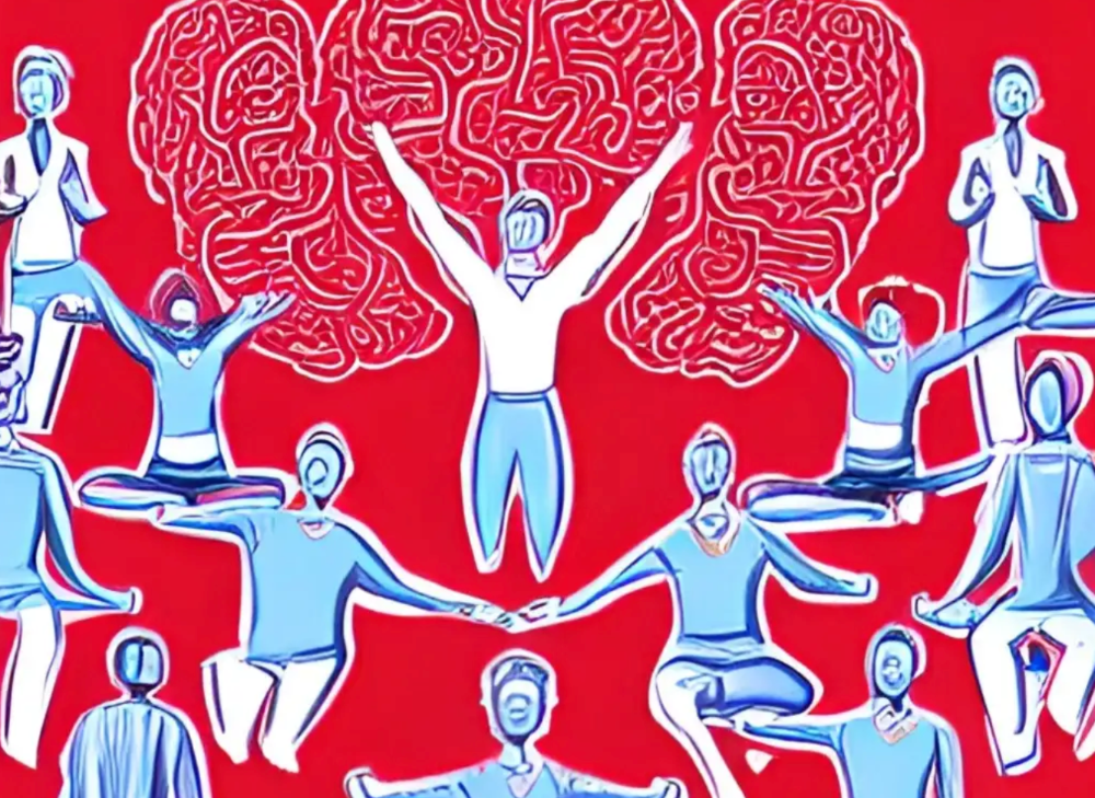
More on Productivity

Simon Egersand
3 years ago
Working from home for more than two years has taught me a lot.
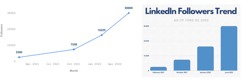
Since the pandemic, I've worked from home. It’s been +2 years (wow, time flies!) now, and during this time I’ve learned a lot. My 4 remote work lessons.
I work in a remote distributed team. This team setting shaped my experience and teachings.
Isolation ("I miss my coworkers")
The most obvious point. I miss going out with my coworkers for coffee, weekend chats, or just company while I work. I miss being able to go to someone's desk and ask for help. On a remote world, I must organize a meeting, share my screen, and avoid talking over each other in Zoom - sigh!
Social interaction is more vital for my health than I believed.
Online socializing stinks
My company used to come together every Friday to play Exploding Kittens, have food and beer, and bond over non-work things.
Different today. Every Friday afternoon is for fun, but it's not the same. People with screen weariness miss meetings, which makes sense. Sometimes you're too busy on Slack to enjoy yourself.
We laugh in meetings, but it's not the same as face-to-face.
Digital social activities can't replace real-world ones
Improved Work-Life Balance, if You Let It
At the outset of the pandemic, I recognized I needed to take better care of myself to survive. After not leaving my apartment for a few days and feeling miserable, I decided to walk before work every day. This turned into a passion for exercise, and today I run or go to the gym before work. I use my commute time for healthful activities.
Working from home makes it easier to keep working after hours. I sometimes forget the time and find myself writing coding at dinnertime. I said, "One more test." This is a disadvantage, therefore I keep my office schedule.
Spend your commute time properly and keep to your office schedule.
Remote Pair Programming Is Hard
As a software developer, I regularly write code. My team sometimes uses pair programming to write code collaboratively. One person writes code while another watches, comments, and asks questions. I won't list them all here.
Internet pairing is difficult. My team struggles with this. Even with Tuple, it's challenging. I lose attention when I get a notification or check my computer.
I miss a pen and paper to rapidly sketch down my thoughts for a colleague or a whiteboard for spirited talks with others. Best answers are found through experience.
Real-life pair programming beats the best remote pair programming tools.
Lessons Learned
Here are 4 lessons I've learned working remotely for 2 years.
-
Socializing is more vital to my health than I anticipated.
-
Digital social activities can't replace in-person ones.
-
Spend your commute time properly and keep your office schedule.
-
Real-life pair programming beats the best remote tools.
Conclusion
Our era is fascinating. Remote labor has existed for years, but software companies have just recently had to adapt. Companies who don't offer remote work will lose talent, in my opinion.
We're still figuring out the finest software development approaches, programming language features, and communication methods since the 1960s. I can't wait to see what advancements assist us go into remote work.
I'll certainly work remotely in the next years, so I'm interested to see what I've learnt from this post then.
This post is a summary of this one.

wordsmithwriter
3 years ago
2023 Will Be the Year of Evernote and Craft Notetaking Apps.
Note-taking is a vital skill. But it's mostly learned.

Recently, innovative note-taking apps have flooded the market.
In the next few years, Evernote and Craft will be important digital note-taking companies.
Evernote is a 2008 note-taking program. It can capture ideas, track tasks, and organize information on numerous platforms.
It's one of the only note-taking app that lets users input text, audio, photos, and videos. It's great for collecting research notes, brainstorming, and remaining organized.
Craft is a popular note-taking app.
Craft is a more concentrated note-taking application than Evernote. It organizes notes into subjects, tags, and relationships, making it ideal for technical or research notes.
Craft's search engine makes it easy to find what you need.
Both Evernote and Craft are likely to be the major players in digital note-taking in the years to come.
Their concentration on gathering and organizing information lets users generate notes quickly and simply. Multimedia elements and a strong search engine make them the note-taking apps of the future.
Evernote and Craft are great note-taking tools for staying organized and tracking ideas and projects.
With their focus on acquiring and organizing information, they'll dominate digital note-taking in 2023.
Pros
Concentrate on gathering and compiling information
special features including a strong search engine and multimedia components
Possibility of subject, tag, and relationship structuring
enables users to incorporate multimedia elements
Excellent tool for maintaining organization, arranging research notes, and brainstorming
Cons
Software may be difficult for folks who are not tech-savvy to utilize.
Limited assistance for hardware running an outdated operating system
Subscriptions could be pricey.
Data loss risk because of security issues
Evernote and Craft both have downsides.
The risk of data loss as a result of security flaws and software defects comes first.
Additionally, their subscription fees could be high, and they might restrict support for hardware that isn't running the newest operating systems.
Finally, folks who need to be tech-savvy may find the software difficult.
Evernote versus. Productivity Titans Evernote will make Notion more useful. medium.com

Dr Mehmet Yildiz
3 years ago
How I train my brain daily for clarity and productivity.
I use a conceptual and practical system I developed decades ago as an example.
Since childhood, I've been interested in the brain-mind connection, so I developed a system using scientific breakthroughs, experiments, and the experiences of successful people in my circles.
This story provides a high-level overview of a custom system to inform and inspire readers. Creating a mind gym was one of my best personal and professional investments.
Such a complex system may not be possible for everyone or appear luxurious at first. However, the process and approach may help you find more accessible and viable solutions.
Visualizing the brain as a muscle, I learned to stimulate it with physical and mental exercises, applying a new mindset and behavioral changes.
My methods and practices may not work for others because we're all different. I focus on the approach's principles and highlights so you can create your own program.
Some create a conceptual and practical system intuitively, and others intellectually. Both worked. I see intellect and intuition as higher selves.
The mental tools I introduce are based on lifestyle changes and can be personalized by anyone, barring physical constraints or underlying health conditions.
Some people can't meditate despite wanting to due to mental constraints. This story lacks exceptions.
People's systems may vary. Many have used my tools successfully. All have scientific backing because their benefits attracted scientists. None are unethical or controversial.
My focus is cognition, which is the neocortex's ability. These practices and tools can affect the limbic and reptilian brain regions.
A previous article discussed brain health's biological aspects. This article focuses on psychology.
Thinking, learning, and remembering are cognitive abilities. Cognitive abilities determine our health and performance.
Cognitive health is the ability to think, concentrate, learn, and remember. Cognitive performance boosting involves various tools and processes. My system and protocols address cognitive health and performance.
As a biological organ, the brain's abilities decline with age, especially if not used regularly. Older people have more neurodegenerative disorders like dementia.
As aging is inevitable, I focus on creating cognitive reserves to remain mentally functional as we age and face mental decline or cognitive impairment.
My protocols focus on neurogenesis, or brain growth and maintenance. Neurons and connections can grow at any age.
Metacognition refers to knowing our cognitive abilities, like thinking about thinking and learning how to learn.
In the following sections, I provide an overview of my system, mental tools, and protocols.
This system summarizes my 50-year career. Some may find it too abstract, so I give examples.
First, explain the system. Section 2 introduces activities. Third, how to measure and maintain mental growth.
1 — Developed a practical mental gym.
The mental gym is a metaphor for the physical fitness gym to improve our mental muscles.
This concept covers brain and mind functionality. Integrated biological and psychological components.
I'll describe my mental gym so my other points make sense. My mental gym has physical and mental tools.
Mindfulness, meditation, visualization, self-conversations, breathing exercises, expressive writing, working in a flow state, reading, music, dance, isometric training, barefoot walking, cold/heat exposure, CBT, and social engagements are regular tools.
Dancing, walking, and thermogenesis are body-related tools. As the brain is part of the body and houses the mind, these tools can affect mental abilities such as attention, focus, memory, task switching, and problem-solving.
Different people may like different tools. I chose these tools based on my needs, goals, and lifestyle. They're just examples. You can choose tools that fit your goals and personality.
2 — Performed tasks regularly.
These tools gave me clarity. They became daily hobbies. Some I did alone, others with others.
Some examples: I meditate daily. Even though my overactive mind made daily meditation difficult at first, I now enjoy it. Meditation three times a day sharpens my mind.
Self-talk is used for self-therapy and creativity. Self-talk was initially difficult, but neurogenesis rewired my brain to make it a habit.
Cold showers, warm baths with Epsom salts, fasting, barefoot walks on the beach or grass, dancing, calisthenics, trampoline hopping, and breathing exercises increase my mental clarity, creativity, and productivity.
These exercises can increase BDNF, which promotes nervous system growth. They improve mental capacity and performance by increasing blood flow and brain oxygenation.
I use weekly and occasional activities like dry saunas, talking with others, and community activities.
These activities stimulate the brain and mind, improving performance and cognitive capacity.
3 — Measured progress, set growth goals.
Measuring progress helps us stay on track. Without data, it's hard to stay motivated. When we face inevitable setbacks, we may abandon our dreams.
I created a daily checklist for a spreadsheet with macros. I tracked how often and long I did each activity.
I measured my progress objectively and subjectively. In the progress spreadsheet, I noted my meditation hours and subjective feelings.
In another column, I used good, moderate, and excellent to get qualitative data. It took time and effort. Later, I started benefiting from this automated structure.
Creating a page for each activity, such as meditation, self-talk, cold showers, walking, expressive writing, personal interactions, etc., gave me empirical data I could analyze, modify, and graph to show progress.
Colored charts showed each area's strengths and weaknesses.
Strengths motivate me to continue them. Identifying weaknesses helped me improve them.
As the system matured, data recording became a habit and took less time. I saw the result immediately because I automated the charts when I entered daily data. Early time investment paid off later.
Mind Gym Benefits, Effective Use, and Progress Measuring
This concept helped me move from comfort to risk. I accept things as they are.
Turnarounds were made. I stopped feeling "Fight-Flight-Freeze" and maintained self-control.
I tamed my overactive amygdala by strengthening my brain. Stress and anxiety decreased. With these shifts, I accepted criticism and turned envy into admiration. Clarity improved.
When the cognitive part of the brain became stronger and the primitive part was tamed, managing thoughts and emotions became easier. My AQ increased. I learned to tolerate people, physical, mental, and emotional obstacles.
Accessing vast information sources in my subconscious mind through an improved RAS allowed me to easily tap into my higher self and recognize flaws in my lower self.
Summary
The brain loves patterns and routines, so habits help. Observing, developing, and monitoring habits mindfully can be beneficial. Mindfulness helps us achieve this goal systematically.
As body and mind are connected, we must consider both when building habits. Consistent and joyful practices can strengthen neurons and neural connections.
Habits help us accomplish more with less effort. Regularly using mental tools and processes can improve our cognitive health and performance as we age.
Creating daily habits to improve cognitive abilities can sharpen our minds and boost our well-being.
Some apps monitor our activities and behavior to help build habits. If you can't replicate my system, try these apps. Some smartwatches and fitness devices include them.
Set aside time each day for mental activities you enjoy. Regular scheduling and practice can strengthen brain regions and form habits. Once you form habits, tasks become easy.
Improving our minds is a lifelong journey. It's easier and more sustainable to increase our efforts daily, weekly, monthly, or annually.
Despite life's ups and downs, many want to remain calm and cheerful.
This valuable skill is unrelated to wealth or fame. It's about our mindset, fueled by our biological and psychological needs.
Here are some lessons I've learned about staying calm and composed despite challenges and setbacks.
1 — Tranquillity starts with observing thoughts and feelings.
2 — Clear the mental clutter and emotional entanglements with conscious breathing and gentle movements.
3 — Accept situations and events as they are with no resistance.
4 — Self-love can lead to loving others and increasing compassion.
5 — Count your blessings and cultivate gratitude.
Clear thinking can bring joy and satisfaction. It's a privilege to wake up with a healthy body and clear mind, ready to connect with others and serve them.
Thank you for reading my perspectives. I wish you a healthy and happy life.
You might also like

Yusuf Ibrahim
4 years ago
How to sell 10,000 NFTs on OpenSea for FREE (Puppeteer/NodeJS)
So you've finished your NFT collection and are ready to sell it. Except you can't figure out how to mint them! Not sure about smart contracts or want to avoid rising gas prices. You've tried and failed with apps like Mini mouse macro, and you're not familiar with Selenium/Python. Worry no more, NodeJS and Puppeteer have arrived!
Learn how to automatically post and sell all 1000 of my AI-generated word NFTs (Nakahana) on OpenSea for FREE!
My NFT project — Nakahana |
NOTE: Only NFTs on the Polygon blockchain can be sold for free; Ethereum requires an initiation charge. NFTs can still be bought with (wrapped) ETH.
If you want to go right into the code, here's the GitHub link: https://github.com/Yusu-f/nftuploader
Let's start with the knowledge and tools you'll need.
What you should know
You must be able to write and run simple NodeJS programs. You must also know how to utilize a Metamask wallet.
Tools needed
- NodeJS. You'll need NodeJs to run the script and NPM to install the dependencies.
- Puppeteer – Use Puppeteer to automate your browser and go to sleep while your computer works.
- Metamask – Create a crypto wallet and sign transactions using Metamask (free). You may learn how to utilize Metamask here.
- Chrome – Puppeteer supports Chrome.
Let's get started now!
Starting Out
Clone Github Repo to your local machine. Make sure that NodeJS, Chrome, and Metamask are all installed and working. Navigate to the project folder and execute npm install. This installs all requirements.
Replace the “extension path” variable with the Metamask chrome extension path. Read this tutorial to find the path.
Substitute an array containing your NFT names and metadata for the “arr” variable and the “collection_name” variable with your collection’s name.
Run the script.
After that, run node nftuploader.js.
Open a new chrome instance (not chromium) and Metamask in it. Import your Opensea wallet using your Secret Recovery Phrase or create a new one and link it. The script will be unable to continue after this but don’t worry, it’s all part of the plan.
Next steps
Open your terminal again and copy the route that starts with “ws”, e.g. “ws:/localhost:53634/devtools/browser/c07cb303-c84d-430d-af06-dd599cf2a94f”. Replace the path in the connect function of the nftuploader.js script.
const browser = await puppeteer.connect({ browserWSEndpoint: "ws://localhost:58533/devtools/browser/d09307b4-7a75-40f6-8dff-07a71bfff9b3", defaultViewport: null });
Rerun node nftuploader.js. A second tab should open in THE SAME chrome instance, navigating to your Opensea collection. Your NFTs should now start uploading one after the other! If any errors occur, the NFTs and errors are logged in an errors.log file.
Error Handling
The errors.log file should show the name of the NFTs and the error type. The script has been changed to allow you to simply check if an NFT has already been posted. Simply set the “searchBeforeUpload” setting to true.
We're done!
If you liked it, you can buy one of my NFTs! If you have any concerns or would need a feature added, please let me know.
Thank you to everyone who has read and liked. I never expected it to be so popular.
Julie Plavnik
3 years ago
Why the Creator Economy needs a Web3 upgrade
Looking back into the past can help you understand what's happening today and why.
"Creator economy" conjures up images of originality, sincerity, and passion. Where do Michelangelos and da Vincis push advancement with their gifts without battling for bread and proving themselves posthumously?
Creativity has been as long as humanity, but it's just recently become a new economic paradigm. We even talk about Web3 now.
Let's examine the creative economy's history to better comprehend it. What brought us here? Looking back can help you understand what's happening now.
No yawning, I promise 😉.
Creator Economy's history
Long, uneven transition to creator economy. Let's examine the economic and societal changes that led us there.
1. Agriculture to industry
Mid-18th-century Industrial Revolution led to shift from agriculture to manufacturing. The industrial economy lasted until World War II.
The industrial economy's principal goal was to provide more affordable, accessible commodities.
Unlike today, products were scarce and inaccessible.
To fulfill its goals, industrialization triggered enormous economic changes, moving power from agrarians to manufacturers. Industrialization brought hard work, rivalry, and new ideas connected to production and automation. Creative thinkers focused on that then.
It doesn't mean music, poetry, or painting had no place back then. They weren't top priority. Artists were independent. The creative field wasn't considered a different economic subdivision.
2. The consumer economy
Manufacturers produced more things than consumers desired after World War II. Stuff was no longer scarce.
The economy must make customers want to buy what the market offers.
The consumer economic paradigm supplanted the industrial one. Customers (or consumers) replaced producers as the new economic center.
Salesmen, marketing, and journalists also played key roles (TV, radio, newspapers, etc.). Mass media greatly boosted demand for goods, defined trends, and changed views regarding nearly everything.
Mass media also gave rise to pop culture, which focuses on mass-market creative products. Design, printing, publishing, multi-media, audio-visual, cinematographic productions, etc. supported pop culture.
The consumer paradigm generated creative occupations and activities, unlike the industrial economy. Creativity was limited by the need for wide appeal.
Most creators were corporate employees.
Creating a following and making a living from it were difficult.
Paul Saffo said that only journalists and TV workers were known. Creators who wished to be known relied on producers, publishers, and other gatekeepers. To win their favor was crucial. Luck was the best tactic.
3. The creative economy
Consumer economy was digitized in the 1990s. IT solutions transformed several economic segments. This new digital economy demanded innovative, digital creativity.
Later, states declared innovation a "valuable asset that creates money and jobs." They also introduced the "creative industries" and the "creative economy" (not creator!) and tasked themselves with supporting them. Australia and the UK were early adopters.
Individual skill, innovation, and intellectual property fueled the creative economy. Its span covered design, writing, audio, video material, etc. The creative economy required IT-powered activity.
The new challenge was to introduce innovations to most economic segments and meet demand for digital products and services.
Despite what the title "creative economy" may imply, it was primarily oriented at meeting consumer needs. It didn't provide inventors any new options to become entrepreneurs. Instead of encouraging innovators to flourish on their own, the creative economy emphasized "employment-based creativity."
4. The creator economy
Next, huge IT platforms like Google, Facebook, YouTube, and others competed with traditional mainstream media.
During the 2008 global financial crisis, these mediums surpassed traditional media. People relied on them for information, knowledge, and networking. That was a digital media revolution. The creator economy started there.
The new economic paradigm aimed to engage and convert clients. The creator economy allowed customers to engage, interact, and provide value, unlike the consumer economy. It gave them instruments to promote themselves as "products" and make money.
Writers, singers, painters, and other creators have a great way to reach fans. Instead of appeasing old-fashioned gatekeepers (producers, casting managers, publishers, etc.), they can use the platforms to express their talent and gain admirers. Barriers fell.
It's not only for pros. Everyone with a laptop and internet can now create.
2022 creator economy:
Since there is no academic description for the current creator economy, we can freestyle.
The current (or Web2) creator economy is fueled by interactive digital platforms, marketplaces, and tools that allow users to access, produce, and monetize content.
No entry hurdles or casting in the creative economy. Sign up and follow platforms' rules. Trick: A platform's algorithm aggregates your data and tracks you. This is the payment for participation.
The platforms offer content creation, design, and ad distribution options. This is platforms' main revenue source.
The creator economy opens many avenues for creators to monetize their work. Artists can now earn money through advertising, tipping, brand sponsorship, affiliate links, streaming, and other digital marketing activities.
Even if your content isn't digital, you can utilize platforms to promote it, interact and convert your audience, and more. No limits. However, some of your income always goes to a platform (well, a huge one).
The creator economy aims to empower online entrepreneurship by offering digital marketing tools and reducing impediments.
Barriers remain. They are just different. Next articles will examine these.
Why update the creator economy for Web3?
I could address this question by listing the present creator economy's difficulties that led us to contemplate a Web3 upgrade.
I don't think these difficulties are the main cause. The mentality shift made us see these challenges and understand there was a better reality without them.
Crypto drove this thinking shift. It promoted disintermediation, independence from third-party service providers, 100% data ownership, and self-sovereignty. Crypto has changed the way we view everyday things.
Crypto's disruptive mission has migrated to other economic segments. It's now called Web3. Web3's creator economy is unique.
Here's the essence of the Web3 economy:
Eliminating middlemen between creators and fans.
100% of creators' data, brand, and effort.
Business and money-making transparency.
Authentic originality above ad-driven content.
In the next several articles, I'll explain. We'll also discuss the creator economy and Web3's remedies.
Final thoughts
The creator economy is the organic developmental stage we've reached after all these social and economic transformations.
The Web3 paradigm of the creator economy intends to allow creators to construct their own independent "open economy" and directly monetize it without a third party.
If this approach succeeds, we may enter a new era of wealth creation where producers aren't only the products. New economies will emerge.
This article is a summary. To read the full post, click here.

Tim Denning
3 years ago
One of the biggest publishers in the world offered me a book deal, but I don't feel deserving of it.

My ego is so huge it won't fit through the door.
I don't know how I feel about it. I should be excited. Many of you have this exact dream to publish a book with a well-known book publisher and get a juicy advance.
Let me dissect how I'm thinking about it to help you.
How it happened
An email comes in. A generic "can we put a backlink on your website and get a freebie" email.
Almost deleted it.
Then I noticed the logo. It seemed shady. I found the URL. Check. I searched the employee's LinkedIn. Legit. I avoided middlemen. Check.
Mixed feelings. LinkedIn hasn't valued my writing for years. I'm just a guy in an unironed t-shirt whose content they sell advertising against.
They get big dollars. I get $0 and a few likes, plus some email subscribers.
Still, I felt adrenaline for hours.
I texted a few friends to see how they felt. I wrapped them.
Messages like "No shocker. You're entertaining online." I didn't like praises, so I blushed.
The thrill faded after hours. Who knows?
Most authors desire this chance.
"You entitled piece of crap, Denning!"
You may think so. Okay. My job is to stand on the internet and get bananas thrown at me.
I approached writing backwards. More important than a book deal was a social media audience converted to an email list.
Romantic authors think backward. They hope a fantastic book will land them a deal and an audience.
Rarely occurs. So I never pursued it. It's like permission-seeking or the lottery.
Not being a professional writer, I've never written a good book. I post online for fun and to express my opinions.
Writing is therapeutic. I overcome mental illness and rebuilt my life this way. Without blogging, I'd be dead.
I've always dreamed of staying alive and doing something I love, not getting a book contract. Writing is my passion. I'm a winner without a book deal.
Why I was given a book deal
You may assume I received a book contract because of my views or follows. Nope.
They gave me a deal because they like my writing style. I've heard this for eight years.
Several authors agree. One asked me to improve their writer's voice.
Takeaway: highlight your writer's voice.
What if they discover I'm writing incompetently?
An edited book is published. It's edited.
I need to master writing mechanics, thus this concerns me. I need help with commas and sentence construction.
I must learn verb, noun, and adjective. Seriously.
Writing a book may reveal my imposter status to a famous publisher. Imagine the email
"It happened again. He doesn't even know how to spell. He thinks 'less' is the correct word, not 'fewer.' Are you sure we should publish his book?"
Fears stink.

I'm capable of blogging. Even listicles. So what?
Writing for a major publisher feels advanced.
I only blog. I'm good at listicles. Digital media executives have criticized me for this.
It is allegedly clickbait.
Or it is following trends.
Alternately, growth hacking.
Never. I learned copywriting to improve my writing.
Apple, Amazon, and Tesla utilize copywriting to woo customers. Whoever thinks otherwise is the wisest person in the room.
Old-schoolers loathe copywriters.
Their novels sell nothing.
They assume their elitist version of writing is better and that the TikTok generation will invest time in random writing with no subheadings and massive walls of text they can't read on their phones.
I'm terrified of book proposals.
My friend's book proposal suggestion was contradictory and made no sense.
They told him to compose another genre. This book got three Amazon reviews. Is that a good model?
The process disappointed him. I've heard other book proposal horror stories. Tim Ferriss' book "The 4-Hour Workweek" was criticized.
Because he has thick skin, his book came out. He wouldn't be known without that.
I hate book proposals.
An ongoing commitment
Writing a book is time-consuming.
I appreciate time most. I want to focus on my daughter for the next few years. I can't recreate her childhood because of a book.
No idea how parents balance kids' goals.
My silly face in a bookstore. Really?
Genuine thought.
I don't want my face in bookstores. I fear fame. I prefer anonymity.
I want to purchase a property in a bad Australian area, then piss off and play drums. Is bookselling worth it?
Are there even bookstores anymore?
(Except for Ryan Holiday's legendary Painted Porch Bookshop in Texas.)
What's most important about books
Many were duped.
Tweets and TikTok hopscotch vids are their future. Short-form content creates devoted audiences that buy newsletter subscriptions.
Books=depth.
Depth wins (if you can get people to buy your book). Creating a book will strengthen my reader relationships.
It's cheaper than my classes, so more people can benefit from my life lessons.
A deeper justification for writing a book
Mind wandered.
If I write this book, my daughter will follow it. "Look what you can do, love, when you ignore critics."
That's my favorite.
I'll be her best leader and teacher. If her dad can accomplish this, she can too.
My kid can read my book when I'm gone to remember her loving father.
Last paragraph made me cry.
The positive
This book thing might make me sound like Karen.
The upside is... Building in public, like I have with online writing, attracts the right people.
Proof-of-work over proposals, beautiful words, or huge aspirations. If you want a book deal, try writing online instead of the old manner.
Next steps
No idea.
I'm a rural Aussie. Writing a book in the big city is intimidating. Will I do it? Lots to think about. Right now, some level of reflection and gratitude feels most appropriate.
Sometimes when you don't feel worthy, it gives you the greatest lessons. That's how I feel about getting offered this book deal.
Perhaps you can relate.