


More on Economics & Investing

Cody Collins
3 years ago
The direction of the economy is as follows.
What quarterly bank earnings reveal

Big banks know the economy best. Unless we’re talking about a housing crisis in 2007…
Banks are crucial to the U.S. economy. The Fed, communities, and investments exchange money.
An economy depends on money flow. Banks' views on the economy can affect their decision-making.
Most large banks released quarterly earnings and forward guidance last week. Others were pessimistic about the future.
What Makes Banks Confident
Bank of America's profit decreased 30% year-over-year, but they're optimistic about the economy. Comparatively, they're bullish.
Who banks serve affects what they see. Bank of America supports customers.
They think consumers' future is bright. They believe this for many reasons.
The average customer has decent credit, unless the system is flawed. Bank of America's new credit card and mortgage borrowers averaged 771. New-car loan and home equity borrower averages were 791 and 797.
2008's housing crisis affected people with scores below 620.
Bank of America and the economy benefit from a robust consumer. Major problems can be avoided if individuals maintain spending.
Reasons Other Banks Are Less Confident
Spending requires income. Many companies, mostly in the computer industry, have announced they will slow or freeze hiring. Layoffs are frequently an indication of poor times ahead.
BOA is positive, but investment banks are bearish.
Jamie Dimon, CEO of JPMorgan, outlined various difficulties our economy could confront.
But geopolitical tension, high inflation, waning consumer confidence, the uncertainty about how high rates have to go and the never-before-seen quantitative tightening and their effects on global liquidity, combined with the war in Ukraine and its harmful effect on global energy and food prices are very likely to have negative consequences on the global economy sometime down the road.
That's more headwinds than tailwinds.
JPMorgan, which helps with mergers and IPOs, is less enthusiastic due to these concerns. Incoming headwinds signal drying liquidity, they say. Less business will be done.
Final Reflections
I don't think we're done. Yes, stocks are up 10% from a month ago. It's a long way from old highs.
I don't think the stock market is a strong economic indicator.
Many executives foresee a 2023 recession. According to the traditional definition, we may be in a recession when Q2 GDP statistics are released next week.
Regardless of criteria, I predict the economy will have a terrible year.
Weekly layoffs are announced. Inflation persists. Will prices return to 2020 levels if inflation cools? Perhaps. Still expensive energy. Ukraine's war has global repercussions.
I predict BOA's next quarter earnings won't be as bullish about the consumer's strength.
Chritiaan Hetzner
3 years ago
Mystery of the $1 billion'meme stock' that went to $400 billion in days
Who is AMTD Digital?
An unknown Hong Kong corporation joined the global megacaps worth over $500 billion on Tuesday.
The American Depository Share (ADS) with the ticker code HKD gapped at the open, soaring 25% over the previous closing price as trading began, before hitting an intraday high of $2,555.
At its peak, its market cap was almost $450 billion, more than Facebook parent Meta or Alibaba.
Yahoo Finance reported a daily volume of 350,500 shares, the lowest since the ADS began trading and much below the average of 1.2 million.
Despite losing a fifth of its value on Wednesday, it's still worth more than Toyota, Nike, McDonald's, or Walt Disney.
The company sold 16 million shares at $7.80 each in mid-July, giving it a $1 billion market valuation.
Why the boom?
That market cap seems unjustified.
According to SEC reports, its income-generating assets barely topped $400 million in March. Fortune's emails and calls went unanswered.
Website discloses little about company model. Its one-minute business presentation film uses a Star Wars–like design to sell the company as a "one-stop digital solutions platform in Asia"
The SEC prospectus explains.
AMTD Digital sells a "SpiderNet Ecosystems Solutions" kind of club membership that connects enterprises. This is the bulk of its $25 million annual revenue in April 2021.
Pretax profits have been higher than top line over the past three years due to fair value accounting gains on Appier, DayDayCook, WeDoctor, and five Asian fintechs.
AMTD Group, the company's parent, specializes in investment banking, hotel services, luxury education, and media and entertainment. AMTD IDEA, a $14 billion subsidiary, is also traded on the NYSE.
“Significant volatility”
Why AMTD Digital listed in the U.S. is unknown, as it informed investors in its share offering prospectus that could delist under SEC guidelines.
Beijing's red tape prevents the Sarbanes-Oxley Board from inspecting its Chinese auditor.
This frustrates Chinese stock investors. If the U.S. and China can't achieve a deal, 261 Chinese companies worth $1.3 trillion might be delisted.
Calvin Choi left UBS to become AMTD Group's CEO.
His capitalist background and status as a Young Global Leader with the World Economic Forum don't stop him from praising China's Communist party or celebrating the "glory and dream of the Great Rejuvenation of the Chinese nation" a century after its creation.
Despite having an executive vice chairman with a record of battling corruption and ties to Carrie Lam, Beijing's previous proconsul in Hong Kong, Choi is apparently being targeted for a two-year industry ban by the city's securities regulator after an investor accused Choi of malfeasance.
Some CMIG-funded initiatives produced money, but he didn't give us the proceeds, a corporate official told China's Caixin in October 2020. We don't know if he misappropriated or lost some money.
A seismic anomaly
In fundamental analysis, where companies are valued based on future cash flows, AMTD Digital's mind-boggling market cap is a statistical aberration that should occur once every hundred years.
AMTD Digital doesn't know why it's so valuable. In a thank-you letter to new shareholders, it said it was confused by the stock's performance.
Since its IPO, the company has seen significant ADS price volatility and active trading volume, it said Tuesday. "To our knowledge, there have been no important circumstances, events, or other matters since the IPO date."
Permabears awoke after the jump. Jim Chanos asked if "we're all going to ignore the $400 billion meme stock in the room," while Nate Anderson called AMTD Group "sketchy."
It happened the same day SEC Chair Gary Gensler praised the 20th anniversary of the Sarbanes-Oxley Act, aimed to restore trust in America's financial markets after the Enron and WorldCom accounting fraud scandals.
The run-up revived unpleasant memories of Robinhood's decision to limit retail investors' ability to buy GameStop, regarded as a measure to protect hedge funds invested in the meme company.
Why wasn't HKD's buy button removed? Because retail wasn't behind it?" tweeted Gensler on Tuesday. "Real stock fraud. "You're worthless."

Theresa W. Carey
3 years ago
How Payment for Order Flow (PFOF) Works
What is PFOF?
PFOF is a brokerage firm's compensation for directing orders to different parties for trade execution. The brokerage firm receives fractions of a penny per share for directing the order to a market maker.
Each optionable stock could have thousands of contracts, so market makers dominate options trades. Order flow payments average less than $0.50 per option contract.
Order Flow Payments (PFOF) Explained
The proliferation of exchanges and electronic communication networks has complicated equity and options trading (ECNs) Ironically, Bernard Madoff, the Ponzi schemer, pioneered pay-for-order-flow.
In a December 2000 study on PFOF, the SEC said, "Payment for order flow is a method of transferring trading profits from market making to brokers who route customer orders to specialists for execution."
Given the complexity of trading thousands of stocks on multiple exchanges, market making has grown. Market makers are large firms that specialize in a set of stocks and options, maintaining an inventory of shares and contracts for buyers and sellers. Market makers are paid the bid-ask spread. Spreads have narrowed since 2001, when exchanges switched to decimals. A market maker's ability to play both sides of trades is key to profitability.
Benefits, requirements
A broker receives fees from a third party for order flow, sometimes without a client's knowledge. This invites conflicts of interest and criticism. Regulation NMS from 2005 requires brokers to disclose their policies and financial relationships with market makers.
Your broker must tell you if it's paid to send your orders to specific parties. This must be done at account opening and annually. The firm must disclose whether it participates in payment-for-order-flow and, upon request, every paid order. Brokerage clients can request payment data on specific transactions, but the response takes weeks.
Order flow payments save money. Smaller brokerage firms can benefit from routing orders through market makers and getting paid. This allows brokerage firms to send their orders to another firm to be executed with other orders, reducing costs. The market maker or exchange benefits from additional share volume, so it pays brokerage firms to direct traffic.
Retail investors, who lack bargaining power, may benefit from order-filling competition. Arrangements to steer the business in one direction invite wrongdoing, which can erode investor confidence in financial markets and their players.
Pay-for-order-flow criticism
It has always been controversial. Several firms offering zero-commission trades in the late 1990s routed orders to untrustworthy market makers. During the end of fractional pricing, the smallest stock spread was $0.125. Options spreads widened. Traders found that some of their "free" trades cost them a lot because they weren't getting the best price.
The SEC then studied the issue, focusing on options trades, and nearly decided to ban PFOF. The proliferation of options exchanges narrowed spreads because there was more competition for executing orders. Options market makers said their services provided liquidity. In its conclusion, the report said, "While increased multiple-listing produced immediate economic benefits to investors in the form of narrower quotes and effective spreads, these improvements have been muted with the spread of payment for order flow and internalization."
The SEC allowed payment for order flow to continue to prevent exchanges from gaining monopoly power. What would happen to trades if the practice was outlawed was also unclear. SEC requires brokers to disclose financial arrangements with market makers. Since then, the SEC has watched closely.
2020 Order Flow Payment
Rule 605 and Rule 606 show execution quality and order flow payment statistics on a broker's website. Despite being required by the SEC, these reports can be hard to find. The SEC mandated these reports in 2005, but the format and reporting requirements have changed over the years, most recently in 2018.
Brokers and market makers formed a working group with the Financial Information Forum (FIF) to standardize order execution quality reporting. Only one retail brokerage (Fidelity) and one market maker remain (Two Sigma Securities). FIF notes that the 605/606 reports "do not provide the level of information that allows a retail investor to gauge how well a broker-dealer fills a retail order compared to the NBBO (national best bid or offer’) at the time the order was received by the executing broker-dealer."
In the first quarter of 2020, Rule 606 reporting changed to require brokers to report net payments from market makers for S&P 500 and non-S&P 500 equity trades and options trades. Brokers must disclose payment rates per 100 shares by order type (market orders, marketable limit orders, non-marketable limit orders, and other orders).
Richard Repetto, Managing Director of New York-based Piper Sandler & Co., publishes a report on Rule 606 broker reports. Repetto focused on Charles Schwab, TD Ameritrade, E-TRADE, and Robinhood in Q2 2020. Repetto reported that payment for order flow was higher in the second quarter than the first due to increased trading activity, and that options paid more than equities.
Repetto says PFOF contributions rose overall. Schwab has the lowest options rates, while TD Ameritrade and Robinhood have the highest. Robinhood had the highest equity rating. Repetto assumes Robinhood's ability to charge higher PFOF reflects their order flow profitability and that they receive a fixed rate per spread (vs. a fixed rate per share by the other brokers).
Robinhood's PFOF in equities and options grew the most quarter-over-quarter of the four brokers Piper Sandler analyzed, as did their implied volumes. All four brokers saw higher PFOF rates.
TD Ameritrade took the biggest income hit when cutting trading commissions in fall 2019, and this report shows they're trying to make up the shortfall by routing orders for additional PFOF. Robinhood refuses to disclose trading statistics using the same metrics as the rest of the industry, offering only a vague explanation on their website.
Summary
Payment for order flow has become a major source of revenue as brokers offer no-commission equity (stock and ETF) orders. For retail investors, payment for order flow poses a problem because the brokerage may route orders to a market maker for its own benefit, not the investor's.
Infrequent or small-volume traders may not notice their broker's PFOF practices. Frequent traders and those who trade larger quantities should learn about their broker's order routing system to ensure they're not losing out on price improvement due to a broker prioritizing payment for order flow.
This post is a summary. Read full article here
You might also like

Chris Newman
3 years ago
Clean Food: Get Over Yourself If You Want to Save the World.

I’m a permaculture farmer. I want to create food-producing ecosystems. My hope is a world with easy access to a cuisine that nourishes consumers, supports producers, and leaves the Earth joyously habitable.
Permaculturists, natural farmers, plantsmen, and foodies share this ambition. I believe this group of green thumbs, stock-folk, and food champions is falling to tribalism, forgetting that rescuing the globe requires saving all of its inhabitants, even those who adore cheap burgers and Coke. We're digging foxholes and turning folks who disagree with us or don't understand into monsters.
Take Dr. Daphne Miller's comments at the end of her Slow Money Journal interview:
“Americans are going to fall into two camps when all is said and done: People who buy cheap goods, regardless of quality, versus people who are willing and able to pay for things that are made with integrity. We are seeing the limits of the “buying cheap crap” approach.”
This is one of the most judgmental things I've read outside the Bible. Consequences:
People who purchase inexpensive things (food) are ignorant buffoons who prefer to choose fair trade coffee over fuel as long as the price is correct.
It all depends on your WILL to buy quality or cheaply. Both those who are WILLING and those who ARE NOT exist. And able, too.
People who are unwilling and unable are purchasing garbage. You're giving your kids bad food. Both the Earth and you are being destroyed by your actions. Your camp is the wrong one. You’re garbage! Disgrace to you.
Dr. Miller didn't say it, but words are worthless until interpreted. This interpretation depends on the interpreter's economic, racial, political, religious, family, and personal history. Complementary language insults another. Imagine how that Brown/Harvard M.D.'s comment sounds to a low-income household with no savings.
Dr. Miller's comment reflects the echo chamber into which nearly all clean food advocates speak. It asks easy questions and accepts non-solutions like raising food prices and eating less meat. People like me have cultivated an insular world unencumbered by challenges beyond the margins. We may disagree about technical details in rotationally-grazing livestock, but we short circuit when asked how our system could supply half the global beef demand. Most people have never seriously considered this question. We're so loved and affirmed that challenging ourselves doesn't seem necessary. Were generals insisting we don't need to study the terrain because God is on our side?
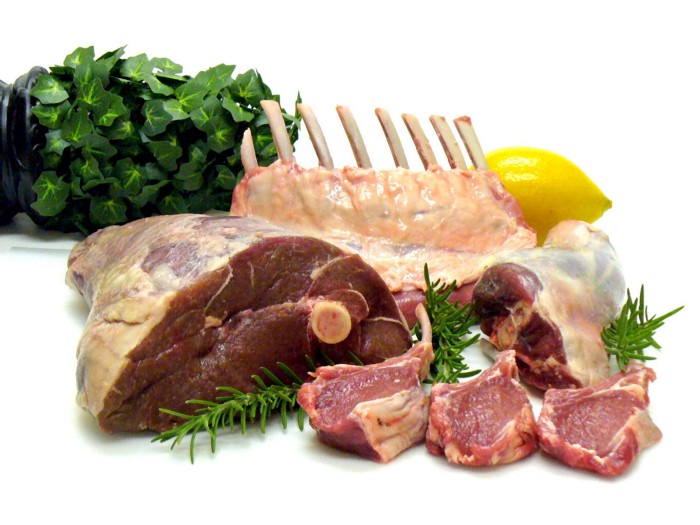
“Yes, the $8/lb ground beef is produced the way it should be. Yes, it’s good for my body. Yes it’s good for the Earth. But it’s eight freaking dollars, and my kid needs braces and protein. Bye Felicia, we’re going to McDonald’s.”
-Bobby Q. Homemaker
Funny clean foodies. People don't pay enough for food; they should value it more. Turn the concept of buying food with integrity into a wedge and drive it into the heart of America, dividing the willing and unwilling.
We go apeshit if you call our products high-end.
I've heard all sorts of gaslighting to defend a $10/lb pork chop as accessible (things I’ve definitely said in the past):
At Whole Foods, it costs more.
The steak at the supermarket is overly affordable.
Pay me immediately or the doctor gets paid later.
I spoke with Timbercreek Market and Local Food Hub in front of 60 people. We were asked about local food availability.
They came to me last, after my co-panelists gave the same responses I would have given two years before.
I grumbled, "Our food is inaccessible." Nope. It's beyond the wallets of nearly everyone, and it's the biggest problem with sustainable food systems. We're criminally unserious about being leaders in sustainability until we propose solutions beyond economic relativism, wishful thinking, and insisting that vulnerable, distracted people do all the heavy lifting of finding a way to afford our food. And until we talk about solutions, all this preserve the world? False.
The room fell silent as if I'd revealed a terrible secret. Long, thunderous applause followed my other remarks. But I’m probably not getting invited back to any VNRLI events.
I make pricey cuisine. It’s high-end. I have customers who really have to stretch to get it, and they let me know it. They're forgoing other creature comforts to help me make a living and keep the Earth of my grandmothers alive, and they're doing it as an act of love. They believe in us and our work.
I remember it when I'm up to my shoulders in frigid water, when my vehicle stinks of four types of shit, when I come home covered in blood and mud, when I'm hauling water in 100-degree heat, when I'm herding pigs in a rainstorm and dodging lightning bolts to close the chickens. I'm reminded I'm not alone. Their enthusiasm is worth more than money; it helps me make a life and a living. I won't label that gift less than it is to make my meal seem more accessible.
Not everyone can sacrifice.
Let's not pretend we want to go back to peasant fare, despite our nostalgia. Industrial food has leveled what rich and poor eat. How food is cooked will be the largest difference between what you and a billionaire eat. Rich and poor have access to chicken, pork, and beef. You might be shocked how recently that wasn't the case. This abundance, particularly of animal protein, has helped vulnerable individuals.
Industrial food causes environmental damage, chronic disease, and distribution inequities. Clean food promotes non-industrial, artisan farming. This creates a higher-quality, more expensive product than the competition; we respond with aggressive marketing and the "people need to value food more" shtick geared at consumers who can spend the extra money.
The guy who is NOT able is rendered invisible by clean food's elitist marketing, which is bizarre given a.) clean food insists it's trying to save the world, yet b.) MOST PEOPLE IN THE WORLD ARE THAT GUY. No one can help him except feel-good charities. That's crazy.
Also wrong: a foodie telling a kid he can't eat a 99-cent fast food hamburger because it lacks integrity. Telling him how easy it is to save his ducketts and maybe have a grass-fed house burger at the end of the month as a reward, but in the meantime get your protein from canned beans you can't bake because you don't have a stove and, even if you did, your mom works two jobs and moonlights as an Uber driver so she doesn't have time to heat that shitup anyway.
A wealthy person's attitude toward the poor is indecent. It's 18th-century Versailles.

Human rights include access to nutritious food without social or environmental costs. As a food-forest-loving permaculture farmer, I no longer balk at the concept of cultured beef and hydroponics. My food is out of reach for many people, but access to decent food shouldn't be. Cultures and hydroponics could scale to meet the clean food affordability gap without externalities. If technology can deliver great, affordable beef without environmental negative effects, I can't reject it because it's new, unusual, or might endanger my business.
Why is your farm needed if cultured beef and hydroponics can feed the world? Permaculture food forests with trees, perennial plants, and animals are crucial to economically successful environmental protection. No matter how advanced technology gets, we still need clean air, water, soil, greenspace, and food.
Clean Food cultivated in/on live soil, minimally processed, and eaten close to harvest is part of the answer, not THE solution. Clean food advocates must recognize the conflicts at the intersection of environmental, social, and economic sustainability, the disproportionate effects of those conflicts on the poor and lower-middle classes, and the immorality and impracticality of insisting vulnerable people address those conflicts on their own and judging them if they don't.
Our clients, relatives, friends, and communities need an honest assessment of our role in a sustainable future. If we're serious about preserving the world, we owe honesty to non-customers. We owe our goal and sanity to honesty. Future health and happiness of the world left to the average person's pocketbook and long-term moral considerations is a dismal proposition with few parallels.
Let's make soil and grow food. Let the lab folks do their thing. We're all interdependent.

Sukhad Anand
3 years ago
How Do Discord's Trillions Of Messages Get Indexed?
They depend heavily on open source..

Discord users send billions of messages daily. Users wish to search these messages. How do we index these to search by message keywords?
Let’s find out.
Discord utilizes Elasticsearch. Elasticsearch is a free, open search engine for textual, numerical, geographical, structured, and unstructured data. Apache Lucene powers Elasticsearch.
How does elastic search store data? It stores it as numerous key-value pairs in JSON documents.
How does elastic search index? Elastic search's index is inverted. An inverted index lists every unique word in every page and where it appears.
4. Elasticsearch indexes documents and generates an inverted index to make data searchable in near real-time. The index API adds or updates JSON documents in a given index.
Let's examine how discord uses Elastic Search. Elasticsearch prefers bulk indexing. Discord couldn't index real-time messages. You can't search posted messages. You want outdated messages.
6. Let's check what bulk indexing requires.
1. A temporary queue for incoming communications.
2. Indexer workers that index messages into elastic search.
Discord's queue is Celery. The queue is open-source. Elastic search won't run on a single server. It's clustered. Where should a message go? Where?
8. A shard allocator decides where to put the message. Nevertheless. Shattered? A shard combines elastic search and index on. So, these two form a shard which is used as a unit by discord. The elastic search itself has some shards. But this is different, so don’t get confused.
Now, the final part is service discovery — to discover the elastic search clusters and the hosts within that cluster. This, they do with the help of etcd another open source tool.
A great thing to notice here is that discord relies heavily on open source systems and their base implementations which is very different from a lot of other products.

TheRedKnight
3 years ago
Say goodbye to Ponzi yields - A new era of decentralized perpetual
Decentralized perpetual may be the next crypto market boom; with tons of perpetual popping up, let's look at two protocols that offer organic, non-inflationary yields.
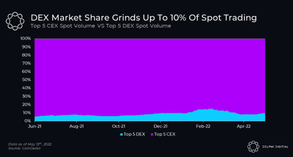
Decentralized derivatives exchanges' market share has increased tenfold in a year, but it's still 2% of CEXs'. DEXs have a long way to go before they can compete with centralized exchanges in speed, liquidity, user experience, and composability.
I'll cover gains.trade and GMX protocol in Polygon, Avalanche, and Arbitrum. Both protocols support leveraged perpetual crypto, stock, and Forex trading.
Why these protocols?
Decentralized GMX Gains protocol
Organic yield: path to sustainability
I've never trusted Defi's non-organic yields. Example: XYZ protocol. 20–75% of tokens may be set aside as farming rewards to provide liquidity, according to tokenomics.
Say you provide ETH-USDC liquidity. They advertise a 50% APR reward for this pair, 10% from trading fees and 40% from farming rewards. Only 10% is real, the rest is "Ponzi." The "real" reward is in protocol tokens.
Why keep this token? Governance voting or staking rewards are promoted services.
Most liquidity providers expect compensation for unused tokens. Basic psychological principles then? — Profit.
Nobody wants governance tokens. How many out of 100 care about the protocol's direction and will vote?
Staking increases your token's value. Currently, they're mostly non-liquid. If the protocol is compromised, you can't withdraw funds. Most people are sceptical of staking because of this.
"Free tokens," lack of use cases, and skepticism lead to tokens moving south. No farming reward protocols have lasted.
It may have shown strength in a bull market, but what about a bear market?
What is decentralized perpetual?
A perpetual contract is a type of futures contract that doesn't expire. So one can hold a position forever.
You can buy/sell any leveraged instruments (Long-Short) without expiration.
In centralized exchanges like Binance and coinbase, fees and revenue (liquidation) go to the exchanges, not users.
Users can provide liquidity that traders can use to leverage trade, and the revenue goes to liquidity providers.
Gains.trade and GMX protocol are perpetual trading platforms with a non-inflationary organic yield for liquidity providers.
GMX protocol
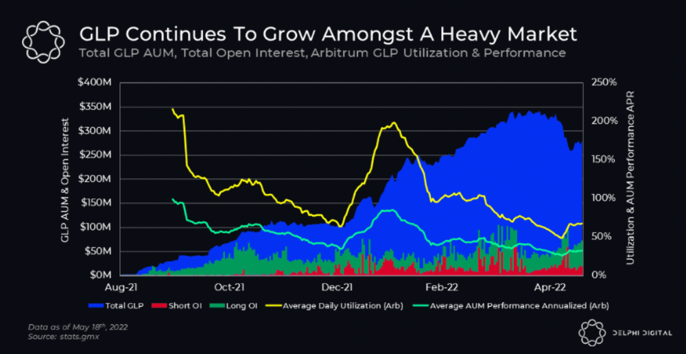
GMX is an Arbitrum and Avax protocol that rewards in ETH and Avax. GLP uses a fast oracle to borrow the "true price" from other trading venues, unlike a traditional AMM.
GLP and GMX are protocol tokens. GLP is used for leveraged trading, swapping, etc.
GLP is a basket of tokens, including ETH, BTC, AVAX, stablecoins, and UNI, LINK, and Stablecoins.
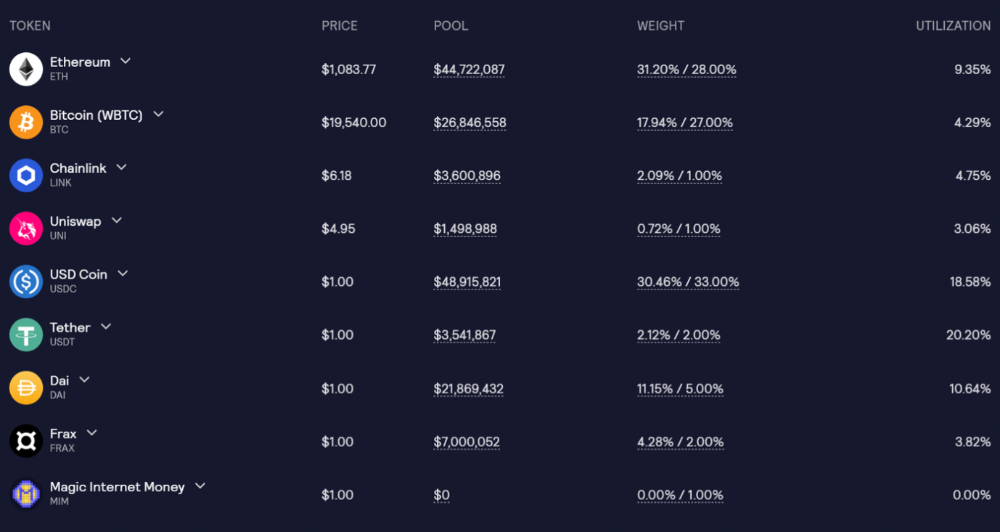
GLP composition on arbitrum
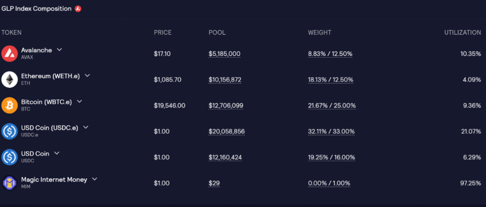
GLP composition on Avalanche
GLP token rebalances based on usage, providing liquidity without loss.
Protocol "runs" on Staking GLP. Depending on their chain, the protocol will reward users with ETH or AVAX. Current rewards are 22 percent (15.71 percent in ETH and the rest in escrowed GMX) and 21 percent (15.72 percent in AVAX and the rest in escrowed GMX). escGMX and ETH/AVAX percentages fluctuate.
Where is the yield coming from?
Swap fees, perpetual interest, and liquidations generate yield. 70% of fees go to GLP stakers, 30% to GMX. Organic yields aren't paid in inflationary farm tokens.
Escrowed GMX is vested GMX that unlocks in 365 days. To fully unlock GMX, you must farm the Escrowed GMX token for 365 days. That means less selling pressure for the GMX token.
GMX's status
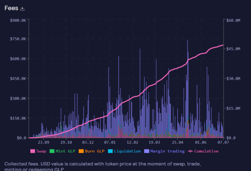
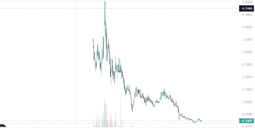
These are the fees in Arbitrum in the past 11 months by GMX.
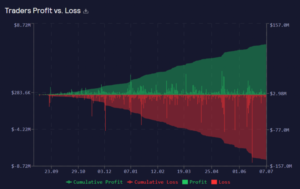
GMX works like a casino, which increases fees. Most fees come from Margin trading, which means most traders lose money; this money goes to the casino, or GLP stakers.
Strategies
My personal strategy is to DCA into GLP when markets hit bottom and stake it; GLP will be less volatile with extra staking rewards.
GLP YoY return vs. naked buying
Let's say I invested $10,000 in BTC, AVAX, and ETH in January.
BTC price: 47665$
ETH price: 3760$
AVAX price: $145
Current prices
BTC $21,000 (Down 56 percent )
ETH $1233 (Down 67.2 percent )
AVAX $20.36 (Down 85.95 percent )
Your $10,000 investment is now worth around $3,000.
How about GLP? My initial investment is 50% stables and 50% other assets ( Assuming the coverage ratio for stables is 50 percent at that time)
Without GLP staking yield, your value is $6500.
Let's assume the average APR for GLP staking is 23%, or $1500. So 8000$ total. It's 50% safer than holding naked assets in a bear market.
In a bull market, naked assets are preferable to GLP.
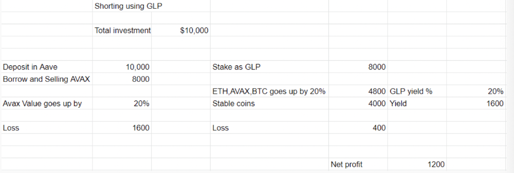
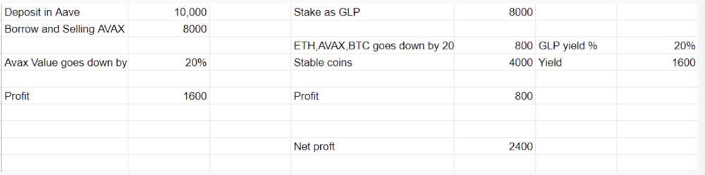
Short farming using GLP
Simple GLP short farming.
You use a stable asset as collateral to borrow AVAX. Sell it and buy GLP. Even if GLP rises, it won't rise as fast as AVAX, so we can get yields.
Let's do the maths
You deposit $10,000 USDT in Aave and borrow Avax. Say you borrow $8,000; you sell it, buy GLP, and risk 20%.
After a year, ETH, AVAX, and BTC rise 20%. GLP is $8800. $800 vanishes. 20% yields $1600. You're profitable. Shorting Avax costs $1600. (Assumptions-ETH, AVAX, BTC move the same, GLP yield is 20%. GLP has a 50:50 stablecoin/others ratio. Aave won't liquidate
In naked Avax shorting, Avax falls 20% in a year. You'll make $1600. If you buy GLP and stake it using the sold Avax and BTC, ETH and Avax go down by 20% - your profit is 20%, but with the yield, your total gain is $2400.
Issues with GMX
GMX's historical funding rates are always net positive, so long always pays short. This makes long-term shorts less appealing.
Oracle price discovery isn't enough. This limitation doesn't affect Bitcoin and ETH, but it affects less liquid assets. Traders can buy and sell less liquid assets at a lower price than their actual cost as long as GMX exists.
As users must provide GLP liquidity, adding more assets to GMX will be difficult. Next iteration will have synthetic assets.
Gains Protocol
Best leveraged trading platform. Smart contract-based decentralized protocol. 46 crypto pairs can be leveraged 5–150x and 10 Forex pairs 5–1000x. $10 DAI @ 150x (min collateral x leverage pos size is $1500 DAI). No funding fees, no KYC, trade DAI from your wallet, keep funds.
DAI single-sided staking and the GNS-DAI pool are important parts of Gains trading. GNS-DAI stakers get 90% of trading fees and 100% swap fees. 10 percent of trading fees go to DAI stakers, which is currently 14 percent!
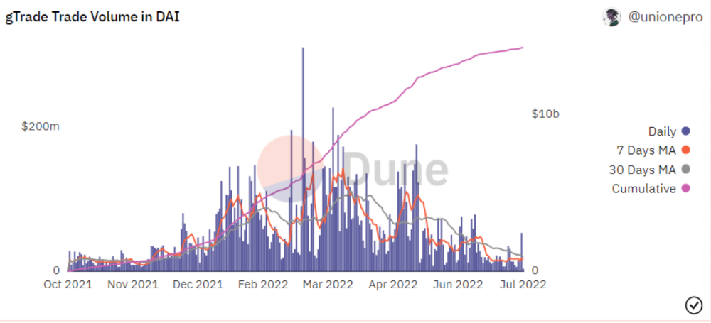
Trade volume
When a trader opens a trade, the leverage and profit are pulled from the DAI pool. If he loses, the protocol yield goes to the stakers.
If the trader's win rate is high and the DAI pool slowly depletes, the GNS token is minted and sold to refill DAI. Trader losses are used to burn GNS tokens. 25%+ of GNS is burned, making it deflationary.
Due to high leverage and volatility of crypto assets, most traders lose money and the protocol always wins, keeping GNS deflationary.
Gains uses a unique decentralized oracle for price feeds, which is better for leverage trading platforms. Let me explain.
Gains uses chainlink price oracles, not its own price feeds. Chainlink oracles only query centralized exchanges for price feeds every minute, which is unsuitable for high-precision trading.
Gains created a custom oracle that queries the eight chainlink nodes for the current price and, on average, for trade confirmation. This model eliminates every-second inquiries, which waste gas but are more efficient than chainlink's per-minute price.
This price oracle helps Gains open and close trades instantly, eliminate scam wicks, etc.
Other benefits include:
Stop-loss guarantee (open positions updated)
No scam wicks
Spot-pricing
Highest possible leverage
Fixed-spreads. During high volatility, a broker can increase the spread, which can hit your stop loss without the price moving.
Trade directly from your wallet and keep your funds.
>90% loss before liquidation (Some platforms liquidate as little as -50 percent)
KYC-free
Directly trade from wallet; keep funds safe
Further improvements
GNS-DAI liquidity providers fear the impermanent loss, so the protocol is migrating to its own liquidity and single staking GNS vaults. This allows users to stake GNS without permanent loss and obtain 90% DAI trading fees by staking. This starts in August.
Their upcoming improvements can be found here.
Gains constantly add new features and change pairs. It's an interesting protocol.
Conclusion
Next bull run, watch decentralized perpetual protocols. Effective tokenomics and non-inflationary yields may attract traders and liquidity providers. But still, there is a long way for them to develop, and I don't see them tackling the centralized exchanges any time soon until they fix their inherent problems and improve fast enough.
Read the full post here.