More on Productivity

Jano le Roux
3 years ago
Never Heard Of: The Apple Of Email Marketing Tools
Unlimited everything for $19 monthly!?

Even with pretty words, no one wants to read an ugly email.
Not Gen Z
Not Millennials
Not Gen X
Not Boomers
I am a minimalist.
I like Mozart. I like avos. I love Apple.
When I hear seamlessly, effortlessly, or Apple's new adverb fluidly, my toes curl.
No email marketing tool gave me that feeling.
As a marketing consultant helping high-growth brands create marketing that doesn't feel like marketing, I've worked with every email marketing platform imaginable, including that naughty monkey and the expensive platform whose sales teams don't stop calling.
Most email marketing platforms are flawed.
They are overpriced.
They use dreadful templates.
They employ a poor visual designer.
The user experience there is awful.
Too many useless buttons are present. (Similar to the TV remote!)
I may have finally found the perfect email marketing tool. It creates strong flows. It helps me focus on storytelling.
It’s called Flodesk.
It’s effortless. It’s seamless. It’s fluid.
Here’s why it excites me.
Unlimited everything for $19 per month
Sends unlimited. Emails unlimited. Signups unlimited.
Most email platforms penalize success.
Pay for performance?
$87 for 10k contacts
$605 for 100K contacts
$1,300+ for 200K contacts
In the 1990s, this made sense, but not now. It reminds me of when ISPs capped internet usage at 5 GB per month.
Flodesk made unlimited email for a low price a reality. Affordable, attractive email marketing isn't just for big companies.
Flodesk doesn't penalize you for growing your list. Price stays the same as lists grow.
Flodesk plans cost $38 per month, but I'll give you a 30-day trial for $19.
Amazingly strong flows
Foster different people's flows.
Email marketing isn't one-size-fits-all.
Different times require different emails.
People don't open emails because they're irrelevant, in my experience. A colder audience needs a nurturing sequence.
Flodesk automates your email funnels so top-funnel prospects fall in love with your brand and values before mid- and bottom-funnel email flows nudge them to take action.
I wish I could save more custom audience fields to further customize the experience.
Dynamic editor
Easy. Effortless.
Flodesk's editor is Apple-like.
You understand how it works almost instantly.
Like many Apple products, it's intentionally limited. No distractions. You can focus on emotional email writing.

Flodesk's inability to add inline HTML to emails is my biggest issue with larger projects. I wish I could upload HTML emails.
Simple sign-up procedures
Dream up joining.
I like how easy it is to create conversion-focused landing pages. Linkly lets you easily create 5 landing pages and A/B test messaging.

I like that you can use signup forms to ask people what they're interested in so they get relevant emails instead of mindless mass emails nobody opens.

I love how easy it is to embed in-line on a website.
Wonderful designer templates
Beautiful, connecting emails.
Flodesk has calm email templates. My designer's eye felt at rest when I received plain text emails with big impacts.

As a typography nerd, I love Flodesk's handpicked designer fonts. It gives emails a designer feel that is hard to replicate on other platforms without coding and custom font licenses.
Small adjustments can have a big impact
Details matter.
Flodesk remembers your brand colors. Flodesk automatically adds your logo and social handles to emails after signup.
Flodesk uses Zapier. This lets you send emails based on a user's action.
A bad live chat can trigger a series of emails to win back a customer.
Flodesk isn't for everyone.
Flodesk is great for Apple users like me.

Maria Stepanova
3 years ago
How Elon Musk Picks Things Up Quicker Than Anyone Else
Adopt Elon Musk's learning strategy to succeed.

Medium writers rank first and second when you Google “Elon Musk's learning approach”.
My article idea seems unoriginal. Lol
Musk is brilliant.
No doubt here.
His name connotes success and intelligence.
He knows rocket science, engineering, AI, and solar power.
Musk is a Unicorn, but his skills aren't special.
How does he manage it?
Elon Musk has two learning rules that anyone may use.
You can apply these rules and become anyone you want.
You can become a rocket scientist or a surgeon. If you want, of course.
The learning process is key.
Make sure you are creating a Tree of Knowledge according to Rule #1.
Musk told Reddit how he learns:
“It is important to view knowledge as sort of a semantic tree — make sure you understand the fundamental principles, i.e. the trunk and big branches, before you get into the leaves/details or there is nothing for them to hang onto.”
Musk understands the essential ideas and mental models of each of his business sectors.
He starts with the tree's trunk, making sure he learns the basics before going on to branches and leaves.
We often act otherwise. We memorize small details without understanding how they relate to the whole. Our minds are stuffed with useless data.
Cramming isn't learning.
Start with the basics to learn faster. Before diving into minutiae, grasp the big picture.

Rule #2: You can't connect what you can't remember.
Elon Musk transformed industries this way. As his expertise grew, he connected branches and leaves from different trees.
Musk read two books a day as a child. He didn't specialize like most people. He gained from his multidisciplinary education. It helped him stand out and develop billion-dollar firms.
He gained skills in several domains and began connecting them. World-class performances resulted.
Most of us never learn the basics and only collect knowledge. We never really comprehend information, thus it's hard to apply it.
Learn the basics initially to maximize your chances of success. Then start learning.
Learn across fields and connect them.
This method enabled Elon Musk to enter and revolutionize a century-old industry.

Asher Umerie
3 years ago
What is Bionic Reading?
Senses help us navigate a complicated world. They shape our worldview - how we hear, smell, feel, and taste. People claim a sixth sense, an intuitive capacity that extends perception.
Our brain is a half-pool of grey and white matter that stores data from our senses. Brains provide us context, so zombies' obsession makes sense.
Bionic reading uses the brain's visual information and context to simplify text comprehension.
Stay with me.
What is Bionic Reading?
Bionic reading is a software application established by Swiss typographic designer Renato Casutt. The term honors the brain (bio) and technology's collaboration to better text comprehension.
The image above shows two similar paragraphs with bionic reading.
Notice anything yet?
This Twitter user did.
I did too...
Image text describes bionic reading-
New method to aid reading by using artificial fixation points. The reader focuses on the highlighted starting letters, and the brain completes the word.
How is Bionic Reading possible?
Do you remember seeing social media posts asking you to stare at a black dot for 30 seconds (or more)? You blink and see an after-image on your wall.
Our brains are skilled at identifying patterns and'seeing' familiar objects, therefore optical illusions are conceivable.
Brain and sight collaborate well. Text comprehension proves it.
Considering evolutionary patterns, humans' understanding skills may be cosmic luck.
Scientists don't know why people can read and write, but they do know what reading does to the brain.
One portion of your brain recognizes words, while another analyzes their meaning. Fixation, saccade, and linguistic transparency/opacity aid.
Let's explain some terms.
-
Fixation is how the eyes move when reading. It's where you look. If the eyes fixate less, a reader can read quicker. [Eye fixation is a physiological process](Eye fixation is a naturally occurring physiological process) impacted by the reader's vocabulary, vision span, and text familiarity.
-
Saccade - Pause and look around. That's a saccade. Rapid eye movements that alter the place of fixation, as reading text or looking around a room. They can happen willingly (when you choose) or instinctively, even when your eyes are fixed.
-
Linguistic transparency and opacity analyze how well a composite word or phrase may be deduced from its constituents.
The Bionic reading website compares these tools.
Text highlights lead the eye. Fixation, saccade, and opacity can transfer visual stimuli to text, changing typeface.
## Final Thoughts on Bionic Reading
I'm excited about how this could influence my long-term assimilation and productivity.
This technology is still in development, with prototypes working on only a few apps. Like any new tech, it will be criticized.
I'll be watching Bionic Reading closely. Comment on it!
You might also like

Shalitha Suranga
3 years ago
The Top 5 Mathematical Concepts Every Programmer Needs to Know
Using math to write efficient code in any language

Programmers design, build, test, and maintain software. Employ cases and personal preferences determine the programming languages we use throughout development. Mobile app developers use JavaScript or Dart. Some programmers design performance-first software in C/C++.
A generic source code includes language-specific grammar, pre-implemented function calls, mathematical operators, and control statements. Some mathematical principles assist us enhance our programming and problem-solving skills.
We all use basic mathematical concepts like formulas and relational operators (aka comparison operators) in programming in our daily lives. Beyond these mathematical syntaxes, we'll see discrete math topics. This narrative explains key math topics programmers must know. Master these ideas to produce clean and efficient software code.
Expressions in mathematics and built-in mathematical functions
A source code can only contain a mathematical algorithm or prebuilt API functions. We develop source code between these two ends. If you create code to fetch JSON data from a RESTful service, you'll invoke an HTTP client and won't conduct any math. If you write a function to compute the circle's area, you conduct the math there.
When your source code gets more mathematical, you'll need to use mathematical functions. Every programming language has a math module and syntactical operators. Good programmers always consider code readability, so we should learn to write readable mathematical expressions.
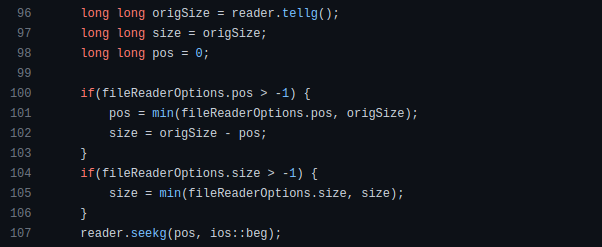
Linux utilizes clear math expressions.

Inbuilt max and min functions can minimize verbose if statements.

How can we compute the number of pages needed to display known data? In such instances, the ceil function is often utilized.
import math as m
results = 102
items_per_page = 10
pages = m.ceil(results / items_per_page)
print(pages)
Learn to write clear, concise math expressions.
Combinatorics in Algorithm Design
Combinatorics theory counts, selects, and arranges numbers or objects. First, consider these programming-related questions. Four-digit PIN security? what options exist? What if the PIN has a prefix? How to locate all decimal number pairs?
Combinatorics questions. Software engineering jobs often require counting items. Combinatorics counts elements without counting them one by one or through other verbose approaches, therefore it enables us to offer minimum and efficient solutions to real-world situations. Combinatorics helps us make reliable decision tests without missing edge cases. Write a program to see if three inputs form a triangle. This is a question I commonly ask in software engineering interviews.
Graph theory is a subfield of combinatorics. Graph theory is used in computerized road maps and social media apps.
Logarithms and Geometry Understanding
Geometry studies shapes, angles, and sizes. Cartesian geometry involves representing geometric objects in multidimensional planes. Geometry is useful for programming. Cartesian geometry is useful for vector graphics, game development, and low-level computer graphics. We can simply work with 2D and 3D arrays as plane axes.
GetWindowRect is a Windows GUI SDK geometric object.

High-level GUI SDKs and libraries use geometric notions like coordinates, dimensions, and forms, therefore knowing geometry speeds up work with computer graphics APIs.
How does exponentiation's inverse function work? Logarithm is exponentiation's inverse function. Logarithm helps programmers find efficient algorithms and solve calculations. Writing efficient code involves finding algorithms with logarithmic temporal complexity. Programmers prefer binary search (O(log n)) over linear search (O(n)). Git source specifies O(log n):

Logarithms aid with programming math. Metas Watchman uses a logarithmic utility function to find the next power of two.

Employing Mathematical Data Structures
Programmers must know data structures to develop clean, efficient code. Stack, queue, and hashmap are computer science basics. Sets and graphs are discrete arithmetic data structures. Most computer languages include a set structure to hold distinct data entries. In most computer languages, graphs can be represented using neighboring lists or objects.
Using sets as deduped lists is powerful because set implementations allow iterators. Instead of a list (or array), store WebSocket connections in a set.
Most interviewers ask graph theory questions, yet current software engineers don't practice algorithms. Graph theory challenges become obligatory in IT firm interviews.
Recognizing Applications of Recursion
A function in programming isolates input(s) and output(s) (s). Programming functions may have originated from mathematical function theories. Programming and math functions are different but similar. Both function types accept input and return value.
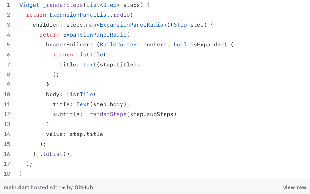
Recursion involves calling the same function inside another function. In its implementation, you'll call the Fibonacci sequence. Recursion solves divide-and-conquer software engineering difficulties and avoids code repetition. I recently built the following recursive Dart code to render a Flutter multi-depth expanding list UI:

Recursion is not the natural linear way to solve problems, hence thinking recursively is difficult. Everything becomes clear when a mathematical function definition includes a base case and recursive call.
Conclusion
Every codebase uses arithmetic operators, relational operators, and expressions. To build mathematical expressions, we typically employ log, ceil, floor, min, max, etc. Combinatorics, geometry, data structures, and recursion help implement algorithms. Unless you operate in a pure mathematical domain, you may not use calculus, limits, and other complex math in daily programming (i.e., a game engine). These principles are fundamental for daily programming activities.
Master the above math fundamentals to build clean, efficient code.

Yogita Khatri
3 years ago
Moonbirds NFT sells for $1 million in first week
On Saturday, Moonbird #2642, one of the collection's rarest NFTs, sold for a record 350 ETH (over $1 million) on OpenSea.
The Sandbox, a blockchain-based gaming company based in Hong Kong, bought the piece. The seller, "oscuranft" on OpenSea, made around $600,000 after buying the NFT for 100 ETH a week ago.
Owl avatars
Moonbirds is a 10,000 owl NFT collection. It is one of the quickest collections to achieve bluechip status. Proof, a media startup founded by renowned VC Kevin Rose, launched Moonbirds on April 16.
Rose is currently a partner at True Ventures, a technology-focused VC firm. He was a Google Ventures general partner and has 1.5 million Twitter followers.
Rose has an NFT podcast on Proof. It follows Proof Collective, a group of 1,000 NFT collectors and artists, including Beeple, who hold a Proof Collective NFT and receive special benefits.
These include early access to the Proof podcast and in-person events.
According to the Moonbirds website, they are "the official Proof PFP" (picture for proof).
Moonbirds NFTs sold nearly $360 million in just over a week, according to The Block Research and Dune Analytics. Its top ten sales range from $397,000 to $1 million.
In the current market, Moonbirds are worth 33.3 ETH. Each NFT is 2.5 ETH. Holders have gained over 12 times in just over a week.
Why was it so popular?
The Block Research's NFT analyst, Thomas Bialek, attributes Moonbirds' rapid rise to Rose's backing, the success of his previous Proof Collective project, and collectors' preference for proven NFT projects.
Proof Collective NFT holders have made huge gains. These NFTs were sold in a Dutch auction last December for 5 ETH each. According to OpenSea, the current floor price is 109 ETH.
According to The Block Research, citing Dune Analytics, Proof Collective NFTs have sold over $39 million to date.
Rose has bigger plans for Moonbirds. Moonbirds is introducing "nesting," a non-custodial way for holders to stake NFTs and earn rewards.
Holders of NFTs can earn different levels of status based on how long they keep their NFTs locked up.
"As you achieve different nest status levels, we can offer you different benefits," he said. "We'll have in-person meetups and events, as well as some crazy airdrops planned."
Rose went on to say that Proof is just the start of "a multi-decade journey to build a new media company."

Adam Frank
3 years ago
Humanity is not even a Type 1 civilization. What might a Type 3 be capable of?

The Kardashev scale grades civilizations from Type 1 to Type 3 based on energy harvesting.
How do technologically proficient civilizations emerge across timescales measuring in the tens of thousands or even millions of years? This is a question that worries me as a researcher in the search for “technosignatures” from other civilizations on other worlds. Since it is already established that longer-lived civilizations are the ones we are most likely to detect, knowing something about their prospective evolutionary trajectories could be translated into improved search tactics. But even more than knowing what to seek for, what I really want to know is what happens to a society after so long time. What are they capable of? What do they become?
This was the question Russian SETI pioneer Nikolai Kardashev asked himself back in 1964. His answer was the now-famous “Kardashev Scale.” Kardashev was the first, although not the last, scientist to try and define the processes (or stages) of the evolution of civilizations. Today, I want to launch a series on this question. It is crucial to technosignature studies (of which our NASA team is hard at work), and it is also important for comprehending what might lay ahead for mankind if we manage to get through the bottlenecks we have now.
The Kardashev scale
Kardashev’s question can be expressed another way. What milestones in a civilization’s advancement up the ladder of technical complexity will be universal? The main notion here is that all (or at least most) civilizations will pass through some kind of definable stages as they progress, and some of these steps might be mirrored in how we could identify them. But, while Kardashev’s major focus was identifying signals from exo-civilizations, his scale gave us a clear way to think about their evolution.
The classification scheme Kardashev employed was not based on social systems of ethics because they are something that we can probably never predict about alien cultures. Instead, it was built on energy, which is something near and dear to the heart of everybody trained in physics. Energy use might offer the basis for universal stages of civilisation progression because you cannot do the work of establishing a civilization without consuming energy. So, Kardashev looked at what energy sources were accessible to civilizations as they evolved technologically and used those to build his scale.
From Kardashev’s perspective, there are three primary levels or “types” of advancement in terms of harvesting energy through which a civilization should progress.
Type 1: Civilizations that can capture all the energy resources of their native planet constitute the first stage. This would imply capturing all the light energy that falls on a world from its host star. This makes it reasonable, given solar energy will be the largest source available on most planets where life could form. For example, Earth absorbs hundreds of atomic bombs’ worth of energy from the Sun every second. That is a rather formidable energy source, and a Type 1 race would have all this power at their disposal for civilization construction.
Type 2: These civilizations can extract the whole energy resources of their home star. Nobel Prize-winning scientist Freeman Dyson famously anticipated Kardashev’s thinking on this when he imagined an advanced civilization erecting a large sphere around its star. This “Dyson Sphere” would be a machine the size of the complete solar system for gathering stellar photons and their energy.
Type 3: These super-civilizations could use all the energy produced by all the stars in their home galaxy. A normal galaxy has a few hundred billion stars, so that is a whole lot of energy. One way this may be done is if the civilization covered every star in their galaxy with Dyson spheres, but there could also be more inventive approaches.
Implications of the Kardashev scale
Climbing from Type 1 upward, we travel from the imaginable to the god-like. For example, it is not hard to envisage utilizing lots of big satellites in space to gather solar energy and then beaming that energy down to Earth via microwaves. That would get us to a Type 1 civilization. But creating a Dyson sphere would require chewing up whole planets. How long until we obtain that level of power? How would we have to change to get there? And once we get to Type 3 civilizations, we are virtually thinking about gods with the potential to engineer the entire cosmos.
For me, this is part of the point of the Kardashev scale. Its application for thinking about identifying technosignatures is crucial, but even more strong is its capacity to help us shape our imaginations. The mind might become blank staring across hundreds or thousands of millennia, and so we need tools and guides to focus our attention. That may be the only way to see what life might become — what we might become — once it arises to start out beyond the boundaries of space and time and potential.
This is a summary. Read the full article here.
