


Donor-Advised Fund Tax Benefits (DAF)
Giving through a donor-advised fund can be tax-efficient. Using a donor-advised fund can reduce your tax liability while increasing your charitable impact.
Grow Your Donations Tax-Free.
Your DAF's charitable dollars can be invested before being distributed. Your DAF balance can grow with the market. This increases grantmaking funds. The assets of the DAF belong to the charitable sponsor, so you will not be taxed on any growth.
Avoid a Windfall Tax Year.
DAFs can help reduce tax burdens after a windfall like an inheritance, business sale, or strong market returns. Contributions to your DAF are immediately tax deductible, lowering your taxable income. With DAFs, you can effectively pre-fund years of giving with assets from a single high-income event.
Make a contribution to reduce or eliminate capital gains.
One of the most common ways to fund a DAF is by gifting publicly traded securities. Securities held for more than a year can be donated at fair market value and are not subject to capital gains tax. If a donor liquidates assets and then donates the proceeds to their DAF, capital gains tax reduces the amount available for philanthropy. Gifts of appreciated securities, mutual funds, real estate, and other assets are immediately tax deductible up to 30% of Adjusted gross income (AGI), with a five-year carry-forward for gifts that exceed AGI limits.
Using Appreciated Stock as a Gift
Donating appreciated stock directly to a DAF rather than liquidating it and donating the proceeds reduces philanthropists' tax liability by eliminating capital gains tax and lowering marginal income tax.
In the example below, a donor has $100,000 in long-term appreciated stock with a cost basis of $10,000:
Using a DAF would allow this donor to give more to charity while paying less taxes. This strategy often allows donors to give more than 20% more to their favorite causes.
For illustration purposes, this hypothetical example assumes a 35% income tax rate. All realized gains are subject to the federal long-term capital gains tax of 20% and the 3.8% Medicare surtax. No other state taxes are considered.
The information provided here is general and educational in nature. It is not intended to be, nor should it be construed as, legal or tax advice. NPT does not provide legal or tax advice. Furthermore, the content provided here is related to taxation at the federal level only. NPT strongly encourages you to consult with your tax advisor or attorney before making charitable contributions.
More on Economics & Investing

Jan-Patrick Barnert
3 years ago
Wall Street's Bear Market May Stick Around
If history is any guide, this bear market might be long and severe.
This is the S&P 500 Index's fourth such incident in 20 years. The last bear market of 2020 was a "shock trade" caused by the Covid-19 pandemic, although earlier ones in 2000 and 2008 took longer to bottom out and recover.
Peter Garnry, head of equities strategy at Saxo Bank A/S, compares the current selloff to the dotcom bust of 2000 and the 1973-1974 bear market marked by soaring oil prices connected to an OPEC oil embargo. He blamed high tech valuations and the commodity crises.
"This drop might stretch over a year and reach 35%," Garnry wrote.
Here are six bear market charts.
Time/depth
The S&P 500 Index plummeted 51% between 2000 and 2002 and 58% during the global financial crisis; it took more than 1,000 trading days to recover. The former took 638 days to reach a bottom, while the latter took 352 days, suggesting the present selloff is young.
Valuations
Before the tech bubble burst in 2000, valuations were high. The S&P 500's forward P/E was 25 times then. Before the market fell this year, ahead values were near 24. Before the global financial crisis, stocks were relatively inexpensive, but valuations dropped more than 40%, compared to less than 30% now.
Earnings
Every stock crash, especially earlier bear markets, returned stocks to fundamentals. The S&P 500 decouples from earnings trends but eventually recouples.
Support
Central banks won't support equity investors just now. The end of massive monetary easing will terminate a two-year bull run that was among the strongest ever, and equities may struggle without cheap money. After years of "don't fight the Fed," investors must embrace a new strategy.
Bear Haunting Bear
If the past is any indication, rising government bond yields are bad news. After the financial crisis, skyrocketing rates and a falling euro pushed European stock markets back into bear territory in 2011.
Inflation/rates
The current monetary policy climate differs from past bear markets. This is the first time in a while that markets face significant inflation and rising rates.
This post is a summary. Read full article here
Chritiaan Hetzner
3 years ago
Mystery of the $1 billion'meme stock' that went to $400 billion in days
Who is AMTD Digital?
An unknown Hong Kong corporation joined the global megacaps worth over $500 billion on Tuesday.
The American Depository Share (ADS) with the ticker code HKD gapped at the open, soaring 25% over the previous closing price as trading began, before hitting an intraday high of $2,555.
At its peak, its market cap was almost $450 billion, more than Facebook parent Meta or Alibaba.
Yahoo Finance reported a daily volume of 350,500 shares, the lowest since the ADS began trading and much below the average of 1.2 million.
Despite losing a fifth of its value on Wednesday, it's still worth more than Toyota, Nike, McDonald's, or Walt Disney.
The company sold 16 million shares at $7.80 each in mid-July, giving it a $1 billion market valuation.
Why the boom?
That market cap seems unjustified.
According to SEC reports, its income-generating assets barely topped $400 million in March. Fortune's emails and calls went unanswered.
Website discloses little about company model. Its one-minute business presentation film uses a Star Wars–like design to sell the company as a "one-stop digital solutions platform in Asia"
The SEC prospectus explains.
AMTD Digital sells a "SpiderNet Ecosystems Solutions" kind of club membership that connects enterprises. This is the bulk of its $25 million annual revenue in April 2021.
Pretax profits have been higher than top line over the past three years due to fair value accounting gains on Appier, DayDayCook, WeDoctor, and five Asian fintechs.
AMTD Group, the company's parent, specializes in investment banking, hotel services, luxury education, and media and entertainment. AMTD IDEA, a $14 billion subsidiary, is also traded on the NYSE.
“Significant volatility”
Why AMTD Digital listed in the U.S. is unknown, as it informed investors in its share offering prospectus that could delist under SEC guidelines.
Beijing's red tape prevents the Sarbanes-Oxley Board from inspecting its Chinese auditor.
This frustrates Chinese stock investors. If the U.S. and China can't achieve a deal, 261 Chinese companies worth $1.3 trillion might be delisted.
Calvin Choi left UBS to become AMTD Group's CEO.
His capitalist background and status as a Young Global Leader with the World Economic Forum don't stop him from praising China's Communist party or celebrating the "glory and dream of the Great Rejuvenation of the Chinese nation" a century after its creation.
Despite having an executive vice chairman with a record of battling corruption and ties to Carrie Lam, Beijing's previous proconsul in Hong Kong, Choi is apparently being targeted for a two-year industry ban by the city's securities regulator after an investor accused Choi of malfeasance.
Some CMIG-funded initiatives produced money, but he didn't give us the proceeds, a corporate official told China's Caixin in October 2020. We don't know if he misappropriated or lost some money.
A seismic anomaly
In fundamental analysis, where companies are valued based on future cash flows, AMTD Digital's mind-boggling market cap is a statistical aberration that should occur once every hundred years.
AMTD Digital doesn't know why it's so valuable. In a thank-you letter to new shareholders, it said it was confused by the stock's performance.
Since its IPO, the company has seen significant ADS price volatility and active trading volume, it said Tuesday. "To our knowledge, there have been no important circumstances, events, or other matters since the IPO date."
Permabears awoke after the jump. Jim Chanos asked if "we're all going to ignore the $400 billion meme stock in the room," while Nate Anderson called AMTD Group "sketchy."
It happened the same day SEC Chair Gary Gensler praised the 20th anniversary of the Sarbanes-Oxley Act, aimed to restore trust in America's financial markets after the Enron and WorldCom accounting fraud scandals.
The run-up revived unpleasant memories of Robinhood's decision to limit retail investors' ability to buy GameStop, regarded as a measure to protect hedge funds invested in the meme company.
Why wasn't HKD's buy button removed? Because retail wasn't behind it?" tweeted Gensler on Tuesday. "Real stock fraud. "You're worthless."

Ray Dalio
3 years ago
The latest “bubble indicator” readings.
As you know, I like to turn my intuition into decision rules (principles) that can be back-tested and automated to create a portfolio of alpha bets. I use one for bubbles. Having seen many bubbles in my 50+ years of investing, I described what makes a bubble and how to identify them in markets—not just stocks.
A bubble market has a high degree of the following:
- High prices compared to traditional values (e.g., by taking the present value of their cash flows for the duration of the asset and comparing it with their interest rates).
- Conditons incompatible with long-term growth (e.g., extrapolating past revenue and earnings growth rates late in the cycle).
- Many new and inexperienced buyers were drawn in by the perceived hot market.
- Broad bullish sentiment.
- Debt financing a large portion of purchases.
- Lots of forward and speculative purchases to profit from price rises (e.g., inventories that are more than needed, contracted forward purchases, etc.).
I use these criteria to assess all markets for bubbles. I have periodically shown you these for stocks and the stock market.
What Was Shown in January Versus Now
I will first describe the picture in words, then show it in charts, and compare it to the last update in January.
As of January, the bubble indicator showed that a) the US equity market was in a moderate bubble, but not an extreme one (ie., 70 percent of way toward the highest bubble, which occurred in the late 1990s and late 1920s), and b) the emerging tech companies (ie. As well, the unprecedented flood of liquidity post-COVID financed other bubbly behavior (e.g. SPACs, IPO boom, big pickup in options activity), making things bubbly. I showed which stocks were in bubbles and created an index of those stocks, which I call “bubble stocks.”
Those bubble stocks have popped. They fell by a third last year, while the S&P 500 remained flat. In light of these and other market developments, it is not necessarily true that now is a good time to buy emerging tech stocks.
The fact that they aren't at a bubble extreme doesn't mean they are safe or that it's a good time to get long. Our metrics still show that US stocks are overvalued. Once popped, bubbles tend to overcorrect to the downside rather than settle at “normal” prices.
The following charts paint the picture. The first shows the US equity market bubble gauge/indicator going back to 1900, currently at the 40% percentile. The charts also zoom in on the gauge in recent years, as well as the late 1920s and late 1990s bubbles (during both of these cases the gauge reached 100 percent ).
The chart below depicts the average bubble gauge for the most bubbly companies in 2020. Those readings are down significantly.
The charts below compare the performance of a basket of emerging tech bubble stocks to the S&P 500. Prices have fallen noticeably, giving up most of their post-COVID gains.
The following charts show the price action of the bubble slice today and in the 1920s and 1990s. These charts show the same market dynamics and two key indicators. These are just two examples of how a lot of debt financing stock ownership coupled with a tightening typically leads to a bubble popping.
Everything driving the bubbles in this market segment is classic—the same drivers that drove the 1920s bubble and the 1990s bubble. For instance, in the last couple months, it was how tightening can act to prick the bubble. Review this case study of the 1920s stock bubble (starting on page 49) from my book Principles for Navigating Big Debt Crises to grasp these dynamics.
The following charts show the components of the US stock market bubble gauge. Since this is a proprietary indicator, I will only show you some of the sub-aggregate readings and some indicators.
Each of these six influences is measured using a number of stats. This is how I approach the stock market. These gauges are combined into aggregate indices by security and then for the market as a whole. The table below shows the current readings of these US equity market indicators. It compares current conditions for US equities to historical conditions. These readings suggest that we’re out of a bubble.
1. How High Are Prices Relatively?
This price gauge for US equities is currently around the 50th percentile.
2. Is price reduction unsustainable?
This measure calculates the earnings growth rate required to outperform bonds. This is calculated by adding up the readings of individual securities. This indicator is currently near the 60th percentile for the overall market, higher than some of our other readings. Profit growth discounted in stocks remains high.
Even more so in the US software sector. Analysts' earnings growth expectations for this sector have slowed, but remain high historically. P/Es have reversed COVID gains but remain high historical.
3. How many new buyers (i.e., non-existing buyers) entered the market?
Expansion of new entrants is often indicative of a bubble. According to historical accounts, this was true in the 1990s equity bubble and the 1929 bubble (though our data for this and other gauges doesn't go back that far). A flood of new retail investors into popular stocks, which by other measures appeared to be in a bubble, pushed this gauge above the 90% mark in 2020. The pace of retail activity in the markets has recently slowed to pre-COVID levels.
4. How Broadly Bullish Is Sentiment?
The more people who have invested, the less resources they have to keep investing, and the more likely they are to sell. Market sentiment is now significantly negative.
5. Are Purchases Being Financed by High Leverage?
Leveraged purchases weaken the buying foundation and expose it to forced selling in a downturn. The leverage gauge, which considers option positions as a form of leverage, is now around the 50% mark.
6. To What Extent Have Buyers Made Exceptionally Extended Forward Purchases?
Looking at future purchases can help assess whether expectations have become overly optimistic. This indicator is particularly useful in commodity and real estate markets, where forward purchases are most obvious. In the equity markets, I look at indicators like capital expenditure, or how much businesses (and governments) invest in infrastructure, factories, etc. It reflects whether businesses are projecting future demand growth. Like other gauges, this one is at the 40th percentile.
What one does with it is a tactical choice. While the reversal has been significant, future earnings discounting remains high historically. In either case, bubbles tend to overcorrect (sell off more than the fundamentals suggest) rather than simply deflate. But I wanted to share these updated readings with you in light of recent market activity.
You might also like

Sammy Abdullah
3 years ago
Payouts to founders at IPO
How much do startup founders make after an IPO? We looked at 2018's major tech IPOs. Paydays aren't what founders took home at the IPO (shares are normally locked up for 6 months), but what they were worth at the IPO price on the day the firm went public. It's not cash, but it's nice. Here's the data.
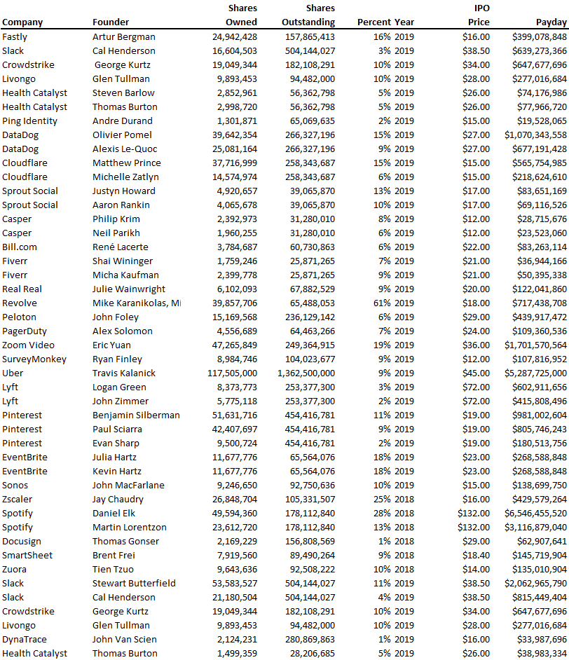
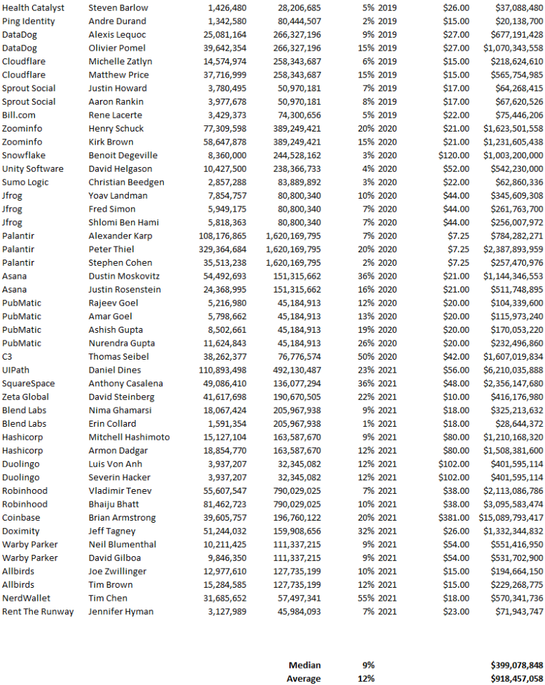
Several points are noteworthy.
Huge payoffs. Median and average pay were $399m and $918m. Average and median homeownership were 9% and 12%.
Coinbase, Uber, UI Path. Uber, Zoom, Spotify, UI Path, and Coinbase founders raised billions. Zoom's founder owned 19% and Spotify's 28% and 13%. Brian Armstrong controlled 20% of Coinbase at IPO and was worth $15bn. Preserving as much equity as possible by staying cash-efficient or raising at high valuations also helps.
The smallest was Ping. Ping's compensation was the smallest. Andre Duand owned 2% but was worth $20m at IPO. That's less than some billion-dollar paydays, but still good.
IPOs can be lucrative, as you can see. Preserving equity could be the difference between a $20mm and $15bln payday (Coinbase).

Yogesh Rawal
3 years ago
Blockchain to solve growing privacy challenges
Most online activity is now public. Businesses collect, store, and use our personal data to improve sales and services.
In 2014, Uber executives and employees were accused of spying on customers using tools like maps. Another incident raised concerns about the use of ‘FaceApp'. The app was created by a small Russian company, and the photos can be used in unexpected ways. The Cambridge Analytica scandal exposed serious privacy issues. The whole incident raised questions about how governments and businesses should handle data. Modern technologies and practices also make it easier to link data to people.
As a result, governments and regulators have taken steps to protect user data. The General Data Protection Regulation (GDPR) was introduced by the EU to address data privacy issues. The law governs how businesses collect and process user data. The Data Protection Bill in India and the General Data Protection Law in Brazil are similar.
Despite the impact these regulations have made on data practices, a lot of distance is yet to cover.
Blockchain's solution
Blockchain may be able to address growing data privacy concerns. The technology protects our personal data by providing security and anonymity. The blockchain uses random strings of numbers called public and private keys to maintain privacy. These keys allow a person to be identified without revealing their identity. Blockchain may be able to ensure data privacy and security in this way. Let's dig deeper.
Financial transactions
Online payments require third-party services like PayPal or Google Pay. Using blockchain can eliminate the need to trust third parties. Users can send payments between peers using their public and private keys without providing personal information to a third-party application. Blockchain will also secure financial data.
Healthcare data
Blockchain technology can give patients more control over their data. There are benefits to doing so. Once the data is recorded on the ledger, patients can keep it secure and only allow authorized access. They can also only give the healthcare provider part of the information needed.
The major challenge
We tried to figure out how blockchain could help solve the growing data privacy issues. However, using blockchain to address privacy concerns has significant drawbacks. Blockchain is not designed for data privacy. A ‘distributed' ledger will be used to store the data. Another issue is the immutability of blockchain. Data entered into the ledger cannot be changed or deleted. It will be impossible to remove personal data from the ledger even if desired.
MIT's Enigma Project aims to solve this. Enigma's ‘Secret Network' allows nodes to process data without seeing it. Decentralized applications can use Secret Network to use encrypted data without revealing it.
Another startup, Oasis Labs, uses blockchain to address data privacy issues. They are working on a system that will allow businesses to protect their customers' data.
Conclusion
Blockchain technology is already being used. Several governments use blockchain to eliminate centralized servers and improve data security. In this information age, it is vital to safeguard our data. How blockchain can help us in this matter is still unknown as the world explores the technology.
Matthew Royse
3 years ago
7 ways to improve public speaking
How to overcome public speaking fear and give a killer presentation

"Public speaking is people's biggest fear, according to studies. Death's second. The average person is better off in the casket than delivering the eulogy." — American comedian, actor, writer, and producer Jerry Seinfeld
People fear public speaking, according to research. Public speaking can be intimidating.
Most professions require public speaking, whether to 5, 50, 500, or 5,000 people. Your career will require many presentations. In a small meeting, company update, or industry conference.
You can improve your public speaking skills. You can reduce your anxiety, improve your performance, and feel more comfortable speaking in public.
“If I returned to college, I'd focus on writing and public speaking. Effective communication is everything.” — 38th president Gerald R. Ford
You can deliver a great presentation despite your fear of public speaking. There are ways to stay calm while speaking and become a more effective public speaker.
Seven tips to improve your public speaking today. Let's help you overcome your fear (no pun intended).
Know your audience.
"You're not being judged; the audience is." — Entrepreneur, author, and speaker Seth Godin
Understand your audience before speaking publicly. Before preparing a presentation, know your audience. Learn what they care about and find useful.
Your presentation may depend on where you're speaking. A classroom is different from a company meeting.
Determine your audience before developing your main messages. Learn everything about them. Knowing your audience helps you choose the right words, information (thought leadership vs. technical), and motivational message.
2. Be Observant
Observe others' speeches to improve your own. Watching free TED Talks on education, business, science, technology, and creativity can teach you a lot about public speaking.
What worked and what didn't?
What would you change?
Their strengths
How interesting or dull was the topic?
Note their techniques to learn more. Studying the best public speakers will amaze you.
Learn how their stage presence helped them communicate and captivated their audience. Please note their pauses, humor, and pacing.
3. Practice
"A speaker should prepare based on what he wants to learn, not say." — Author, speaker, and pastor Tod Stocker
Practice makes perfect when it comes to public speaking. By repeating your presentation, you can find your comfort zone.
When you've practiced your presentation many times, you'll feel natural and confident giving it. Preparation helps overcome fear and anxiety. Review notes and important messages.
When you know the material well, you can explain it better. Your presentation preparation starts before you go on stage.
Keep a notebook or journal of ideas, quotes, and examples. More content means better audience-targeting.
4. Self-record
Videotape your speeches. Check yourself. Body language, hands, pacing, and vocabulary should be reviewed.
Best public speakers evaluate their performance to improve.
Write down what you did best, what you could improve and what you should stop doing after watching a recording of yourself. Seeing yourself can be unsettling. This is how you improve.
5. Remove text from slides
"Humans can't read and comprehend screen text while listening to a speaker. Therefore, lots of text and long, complete sentences are bad, bad, bad.” —Communications expert Garr Reynolds
Presentation slides shouldn't have too much text. 100-slide presentations bore the audience. Your slides should preview what you'll say to the audience.
Use slides to emphasize your main point visually.
If you add text, use at least 40-point font. Your slides shouldn't require squinting to read. You want people to watch you, not your slides.
6. Body language
"Body language is powerful." We had body language before speech, and 80% of a conversation is read through the body, not the words." — Dancer, writer, and broadcaster Deborah Bull
Nonverbal communication dominates. Our bodies speak louder than words. Don't fidget, rock, lean, or pace.
Relax your body to communicate clearly and without distraction through nonverbal cues. Public speaking anxiety can cause tense body language.
Maintain posture and eye contact. Don’t put your hand in your pockets, cross your arms, or stare at your notes. Make purposeful hand gestures that match what you're saying.
7. Beginning/ending Strong
Beginning and end are memorable. Your presentation must start strong and end strongly. To engage your audience, don't sound robotic.
Begin with a story, stat, or quote. Conclude with a summary of key points. Focus on how you will start and end your speech.
You should memorize your presentation's opening and closing. Memorize something naturally. Excellent presentations start and end strong because people won't remember the middle.
Bringing It All Together
Seven simple yet powerful ways to improve public speaking. Know your audience, study others, prepare and rehearse, record yourself, remove as much text as possible from slides, and start and end strong.
Follow these tips to improve your speaking and audience communication. Prepare, practice, and learn from great speakers to reduce your fear of public speaking.
"Speaking to one person or a thousand is public speaking." — Vocal coach Roger Love