




More on Economics & Investing

Sofien Kaabar, CFA
3 years ago
How to Make a Trading Heatmap
Python Heatmap Technical Indicator

Heatmaps provide an instant overview. They can be used with correlations or to predict reactions or confirm the trend in trading. This article covers RSI heatmap creation.
The Market System
Market regime:
Bullish trend: The market tends to make higher highs, which indicates that the overall trend is upward.
Sideways: The market tends to fluctuate while staying within predetermined zones.
Bearish trend: The market has the propensity to make lower lows, indicating that the overall trend is downward.
Most tools detect the trend, but we cannot predict the next state. The best way to solve this problem is to assume the current state will continue and trade any reactions, preferably in the trend.
If the EURUSD is above its moving average and making higher highs, a trend-following strategy would be to wait for dips before buying and assuming the bullish trend will continue.
Indicator of Relative Strength
J. Welles Wilder Jr. introduced the RSI, a popular and versatile technical indicator. Used as a contrarian indicator to exploit extreme reactions. Calculating the default RSI usually involves these steps:
Determine the difference between the closing prices from the prior ones.
Distinguish between the positive and negative net changes.
Create a smoothed moving average for both the absolute values of the positive net changes and the negative net changes.
Take the difference between the smoothed positive and negative changes. The Relative Strength RS will be the name we use to describe this calculation.
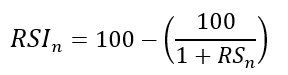
To obtain the RSI, use the normalization formula shown below for each time step.
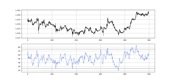
The 13-period RSI and black GBPUSD hourly values are shown above. RSI bounces near 25 and pauses around 75. Python requires a four-column OHLC array for RSI coding.
import numpy as np
def add_column(data, times):

    for i in range(1, times + 1):

        new = np.zeros((len(data), 1), dtype = float)

        data = np.append(data, new, axis = 1)
    return data
def delete_column(data, index, times):

    for i in range(1, times + 1):

        data = np.delete(data, index, axis = 1)
    return data
def delete_row(data, number):

    data = data[number:, ]

    return data
def ma(data, lookback, close, position):

    data = add_column(data, 1)

    for i in range(len(data)):

            try:

                data[i, position] = (data[i - lookback + 1:i + 1, close].mean())

            except IndexError:

                pass

    data = delete_row(data, lookback)

    return data
def smoothed_ma(data, alpha, lookback, close, position):

    lookback = (2 * lookback) - 1

    alpha = alpha / (lookback + 1.0)

    beta  = 1 - alpha

    data = ma(data, lookback, close, position)
    data[lookback + 1, position] = (data[lookback + 1, close] * alpha) + (data[lookback, position] * beta)
    for i in range(lookback + 2, len(data)):

            try:

                data[i, position] = (data[i, close] * alpha) + (data[i - 1, position] * beta)

            except IndexError:

                pass

    return data
def rsi(data, lookback, close, position):

    data = add_column(data, 5)

    for i in range(len(data)):

        data[i, position] = data[i, close] - data[i - 1, close]

    for i in range(len(data)):

        if data[i, position] > 0:

            data[i, position + 1] = data[i, position]

        elif data[i, position] < 0:

            data[i, position + 2] = abs(data[i, position])

    data = smoothed_ma(data, 2, lookback, position + 1, position + 3)
    data = smoothed_ma(data, 2, lookback, position + 2, position + 4)
    data[:, position + 5] = data[:, position + 3] / data[:, position + 4]

    data[:, position + 6] = (100 - (100 / (1 + data[:, position + 5])))
    data = delete_column(data, position, 6)
    data = delete_row(data, lookback)
    return data
Make sure to focus on the concepts and not the code. You can find the codes of most of my strategies in my books. The most important thing is to comprehend the techniques and strategies.
My weekly market sentiment report uses complex and simple models to understand the current positioning and predict the future direction of several major markets. Check out the report here:
Using the Heatmap to Find the Trend
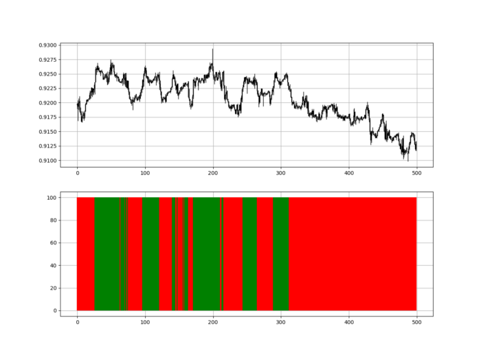
RSI trend detection is easy but useless. Bullish and bearish regimes are in effect when the RSI is above or below 50, respectively. Tracing a vertical colored line creates the conditions below. How:
When the RSI is higher than 50, a green vertical line is drawn.
When the RSI is lower than 50, a red vertical line is drawn.
Zooming out yields a basic heatmap, as shown below.
Plot code:
def indicator_plot(data, second_panel, window = 250):
    fig, ax = plt.subplots(2, figsize = (10, 5))
    sample = data[-window:, ]
    for i in range(len(sample)):
        ax[0].vlines(x = i, ymin = sample[i, 2], ymax = sample[i, 1], color = 'black', linewidth = 1)
        if sample[i, 3] > sample[i, 0]:
            ax[0].vlines(x = i, ymin = sample[i, 0], ymax = sample[i, 3], color = 'black', linewidth = 1.5)
        if sample[i, 3] < sample[i, 0]:
            ax[0].vlines(x = i, ymin = sample[i, 3], ymax = sample[i, 0], color = 'black', linewidth = 1.5)
        if sample[i, 3] == sample[i, 0]:
            ax[0].vlines(x = i, ymin = sample[i, 3], ymax = sample[i, 0], color = 'black', linewidth = 1.5)
    ax[0].grid()
    for i in range(len(sample)):
        if sample[i, second_panel] > 50:
            ax[1].vlines(x = i, ymin = 0, ymax = 100, color = 'green', linewidth = 1.5)
        if sample[i, second_panel] < 50:
            ax[1].vlines(x = i, ymin = 0, ymax = 100, color = 'red', linewidth = 1.5)
    ax[1].grid()
indicator_plot(my_data, 4, window = 500)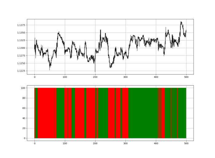
Call RSI on your OHLC array's fifth column. 4. Adjusting lookback parameters reduces lag and false signals. Other indicators and conditions are possible.
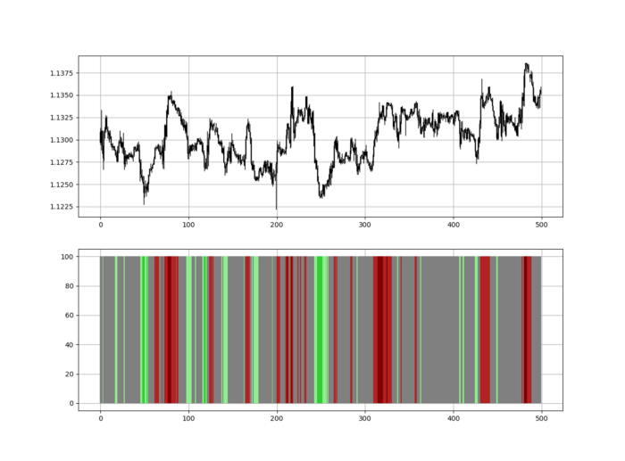
Another suggestion is to develop an RSI Heatmap for Extreme Conditions.
Contrarian indicator RSI. The following rules apply:
Whenever the RSI is approaching the upper values, the color approaches red.
The color tends toward green whenever the RSI is getting close to the lower values.
Zooming out yields a basic heatmap, as shown below.
Plot code:
import matplotlib.pyplot as plt
def indicator_plot(data, second_panel, window = 250):
    fig, ax = plt.subplots(2, figsize = (10, 5))
    sample = data[-window:, ]
    for i in range(len(sample)):
        ax[0].vlines(x = i, ymin = sample[i, 2], ymax = sample[i, 1], color = 'black', linewidth = 1)
        if sample[i, 3] > sample[i, 0]:
            ax[0].vlines(x = i, ymin = sample[i, 0], ymax = sample[i, 3], color = 'black', linewidth = 1.5)
        if sample[i, 3] < sample[i, 0]:
            ax[0].vlines(x = i, ymin = sample[i, 3], ymax = sample[i, 0], color = 'black', linewidth = 1.5)
        if sample[i, 3] == sample[i, 0]:
            ax[0].vlines(x = i, ymin = sample[i, 3], ymax = sample[i, 0], color = 'black', linewidth = 1.5)
    ax[0].grid()
    for i in range(len(sample)):
        if sample[i, second_panel] > 90:
            ax[1].vlines(x = i, ymin = 0, ymax = 100, color = 'red', linewidth = 1.5)
        if sample[i, second_panel] > 80 and sample[i, second_panel] < 90:
            ax[1].vlines(x = i, ymin = 0, ymax = 100, color = 'darkred', linewidth = 1.5)
        if sample[i, second_panel] > 70 and sample[i, second_panel] < 80:
            ax[1].vlines(x = i, ymin = 0, ymax = 100, color = 'maroon', linewidth = 1.5)
        if sample[i, second_panel] > 60 and sample[i, second_panel] < 70:
            ax[1].vlines(x = i, ymin = 0, ymax = 100, color = 'firebrick', linewidth = 1.5)
        if sample[i, second_panel] > 50 and sample[i, second_panel] < 60:
            ax[1].vlines(x = i, ymin = 0, ymax = 100, color = 'grey', linewidth = 1.5)
        if sample[i, second_panel] > 40 and sample[i, second_panel] < 50:
            ax[1].vlines(x = i, ymin = 0, ymax = 100, color = 'grey', linewidth = 1.5)
        if sample[i, second_panel] > 30 and sample[i, second_panel] < 40:
            ax[1].vlines(x = i, ymin = 0, ymax = 100, color = 'lightgreen', linewidth = 1.5)
        if sample[i, second_panel] > 20 and sample[i, second_panel] < 30:
            ax[1].vlines(x = i, ymin = 0, ymax = 100, color = 'limegreen', linewidth = 1.5)
        if sample[i, second_panel] > 10 and sample[i, second_panel] < 20:
            ax[1].vlines(x = i, ymin = 0, ymax = 100, color = 'seagreen', linewidth = 1.5)
        if sample[i, second_panel] > 0 and sample[i, second_panel] < 10:
            ax[1].vlines(x = i, ymin = 0, ymax = 100, color = 'green', linewidth = 1.5)
    ax[1].grid()
indicator_plot(my_data, 4, window = 500)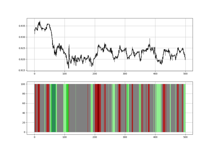
Dark green and red areas indicate imminent bullish and bearish reactions, respectively. RSI around 50 is grey.
Summary
To conclude, my goal is to contribute to objective technical analysis, which promotes more transparent methods and strategies that must be back-tested before implementation.
Technical analysis will lose its reputation as subjective and unscientific.
When you find a trading strategy or technique, follow these steps:
Put emotions aside and adopt a critical mindset.
Test it in the past under conditions and simulations taken from real life.
Try optimizing it and performing a forward test if you find any potential.
Transaction costs and any slippage simulation should always be included in your tests.
Risk management and position sizing should always be considered in your tests.
After checking the above, monitor the strategy because market dynamics may change and make it unprofitable.

Trevor Stark
3 years ago
Economics is complete nonsense.
Mainstream economics haven't noticed.

What come to mind when I say the word "economics"?
Probably GDP, unemployment, and inflation.
If you've ever watched the news or listened to an economist, they'll use data like these to defend a political goal.
The issue is that these statistics are total bunk.
I'm being provocative, but I mean it:
The economy is not measured by GDP.
How many people are unemployed is not counted in the unemployment rate.
Inflation is not measured by the CPI.
All orthodox economists' major economic statistics are either wrong or falsified.
Government institutions create all these stats. The administration wants to reassure citizens the economy is doing well.
GDP does not reflect economic expansion.
GDP measures a country's economic size and growth. It’s calculated by the BEA, a government agency.
The US has the world's largest (self-reported) GDP, growing 2-3% annually.
If GDP rises, the economy is healthy, say economists.
Why is the GDP flawed?
GDP measures a country's yearly spending.
The government may adjust this to make the economy look good.
GDP = C + G + I + NX
C = Consumer Spending
G = Government Spending
I = Investments (Equipment, inventories, housing, etc.)
NX = Exports minus Imports
GDP is a country's annual spending.
The government can print money to boost GDP. The government has a motive to increase and manage GDP.
Because government expenditure is part of GDP, printing money and spending it on anything will raise GDP.
They've done this. Since 1950, US government spending has grown 8% annually, faster than GDP.
In 2022, government spending accounted for 44% of GDP. It's the highest since WWII. In 1790-1910, it was 3% of GDP.
Who cares?
The economy isn't only spending. Focus on citizens' purchasing power or quality of life.
Since GDP just measures spending, the government can print money to boost GDP.
Even if Americans are poorer than last year, economists can say GDP is up and everything is fine.
How many people are unemployed is not counted in the unemployment rate.
The unemployment rate measures a country's labor market. If unemployment is high, people aren't doing well economically.
The BLS estimates the (self-reported) unemployment rate as 3-4%.
Why is the unemployment rate so high?
The US government surveys 100k persons to measure unemployment. They extrapolate this data for the country.
They come into 3 categories:
Employed
People with jobs are employed … duh.
Unemployed
People who are “jobless, looking for a job, and available for work” are unemployed
Not in the labor force
The “labor force” is the employed + the unemployed.
The unemployment rate is the percentage of unemployed workers.
Problem is unemployed definition. You must actively seek work to be considered unemployed.
You're no longer unemployed if you haven't interviewed in 4 weeks.
This shit makes no goddamn sense.
Why does this matter?
You can't interview if there are no positions available. You're no longer unemployed after 4 weeks.
In 1994, the BLS redefined "unemployed" to exclude discouraged workers.
If you haven't interviewed in 4 weeks, you're no longer counted in the unemployment rate.
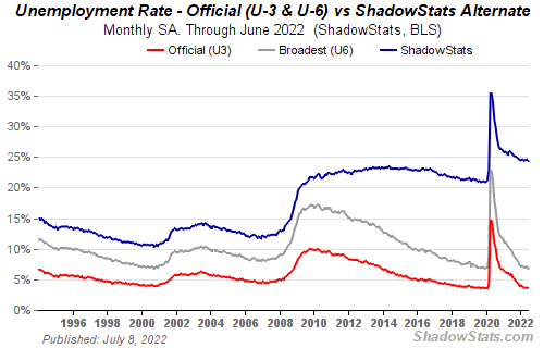
If unemployment were measured by total unemployed, it would be 25%.
Because the government wants to keep the unemployment rate low, they modify the definition.
If every US resident was unemployed and had no job interviews, economists would declare 0% unemployment. Excellent!
Inflation is not measured by the CPI.
The BLS measures CPI. This month was the highest since 1981.
CPI measures the cost of a basket of products across time. Food, energy, shelter, and clothes are included.
A 9.1% CPI means the basket of items is 9.1% more expensive.
What is the CPI problem?
Here's a more detailed explanation of CPI's flaws.
In summary, CPI is manipulated to be understated.
Housing costs are understated to manipulate CPI. Housing accounts for 33% of the CPI because it's the biggest expense for most people.
This signifies it's the biggest CPI weight.
Rather than using actual house prices, the Bureau of Labor Statistics essentially makes shit up. You can read more about the process here.
Surprise! It’s bullshit
The BLS stated Shelter's price rose 5.5% this month.
House prices are up 11-21%. (Source 1, Source 2, Source 3)
Rents are up 14-26%. (Source 1, Source 2)
Why is this important?
If CPI included housing prices, it would be 12-15 percent this month, not 9.1 percent.
9% inflation is nuts. Your money's value halves every 7 years at 9% inflation.
Worse is 15% inflation. Your money halves every 4 years at 15% inflation.
If everyone realized they needed to double their wage every 4-5 years to stay wealthy, there would be riots.
Inflation drains our money's value so the government can keep printing it.
The Solution
Most individuals know the existing system doesn't work, but can't explain why.
People work hard yet lag behind. The government lies about the economy's data.
In reality:
GDP has been down since 2008
25% of Americans are unemployed
Inflation is actually 15%
People might join together to vote out kleptocratic politicians if they knew the reality.
Having reliable economic data is the first step.
People can't understand the situation without sufficient information. Instead of immigrants or billionaires, people would blame liar politicians.
Here’s the vision:
A decentralized, transparent, and global dashboard that tracks economic data like GDP, unemployment, and inflation for every country on Earth.
Government incentives influence economic statistics.
ShadowStats has already started this effort, but the calculations must be transparent, decentralized, and global to be effective.
If interested, email me at trevorstark02@gmail.com.
Here are some links to further your research:
Sofien Kaabar, CFA
3 years ago
Innovative Trading Methods: The Catapult Indicator
Python Volatility-Based Catapult Indicator

As a catapult, this technical indicator uses three systems: Volatility (the fulcrum), Momentum (the propeller), and a Directional Filter (Acting as the support). The goal is to get a signal that predicts volatility acceleration and direction based on historical patterns. We want to know when the market will move. and where. This indicator outperforms standard indicators.
Knowledge must be accessible to everyone. This is why my new publications Contrarian Trading Strategies in Python and Trend Following Strategies in Python now include free PDF copies of my first three books (Therefore, purchasing one of the new books gets you 4 books in total). GitHub-hosted advanced indications and techniques are in the two new books above.
The Foundation: Volatility
The Catapult predicts significant changes with the 21-period Relative Volatility Index.
The Average True Range, Mean Absolute Deviation, and Standard Deviation all assess volatility. Standard Deviation will construct the Relative Volatility Index.
Standard Deviation is the most basic volatility. It underpins descriptive statistics and technical indicators like Bollinger Bands. Before calculating Standard Deviation, let's define Variance.
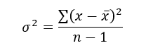
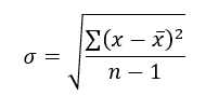
Variance is the squared deviations from the mean (a dispersion measure). We take the square deviations to compel the distance from the mean to be non-negative, then we take the square root to make the measure have the same units as the mean, comparing apples to apples (mean to standard deviation standard deviation). Variance formula:
As stated, standard deviation is:
# The function to add a number of columns inside an array
def adder(Data, times):

    for i in range(1, times + 1):

        new_col = np.zeros((len(Data), 1), dtype = float)
        Data = np.append(Data, new_col, axis = 1)

    return Data

# The function to delete a number of columns starting from an index
def deleter(Data, index, times):

    for i in range(1, times + 1):

        Data = np.delete(Data, index, axis = 1)

    return Data

# The function to delete a number of rows from the beginning
def jump(Data, jump):

    Data = Data[jump:, ]

    return Data

# Example of adding 3 empty columns to an array
my_ohlc_array = adder(my_ohlc_array, 3)

# Example of deleting the 2 columns after the column indexed at 3
my_ohlc_array = deleter(my_ohlc_array, 3, 2)

# Example of deleting the first 20 rows
my_ohlc_array = jump(my_ohlc_array, 20)

# Remember, OHLC is an abbreviation of Open, High, Low, and Close and it refers to the standard historical data file

def volatility(Data, lookback, what, where):

  for i in range(len(Data)):

     try:

        Data[i, where] = (Data[i - lookback + 1:i + 1, what].std())
     except IndexError:
        pass

  return Data
The RSI is the most popular momentum indicator, and for good reason—it excels in range markets. Its 0–100 range simplifies interpretation. Fame boosts its potential.
The more traders and portfolio managers look at the RSI, the more people will react to its signals, pushing market prices. Technical Analysis is self-fulfilling, therefore this theory is obvious yet unproven.
RSI is determined simply. Start with one-period pricing discrepancies. We must remove each closing price from the previous one. We then divide the smoothed average of positive differences by the smoothed average of negative differences. The RSI algorithm converts the Relative Strength from the last calculation into a value between 0 and 100.
def ma(Data, lookback, close, where):

    Data = adder(Data, 1)

    for i in range(len(Data)):

            try:
                Data[i, where] = (Data[i - lookback + 1:i + 1, close].mean())

            except IndexError:
                pass

    # Cleaning
    Data = jump(Data, lookback)

    return Data
def ema(Data, alpha, lookback, what, where):

    alpha = alpha / (lookback + 1.0)
    beta  = 1 - alpha

    # First value is a simple SMA
    Data = ma(Data, lookback, what, where)

    # Calculating first EMA
    Data[lookback + 1, where] = (Data[lookback + 1, what] * alpha) + (Data[lookback, where] * beta)

    # Calculating the rest of EMA
    for i in range(lookback + 2, len(Data)):
            try:
                Data[i, where] = (Data[i, what] * alpha) + (Data[i - 1, where] * beta)

            except IndexError:
                pass

    return Datadef rsi(Data, lookback, close, where, width = 1, genre = 'Smoothed'):

    # Adding a few columns
    Data = adder(Data, 7)

    # Calculating Differences
    for i in range(len(Data)):

        Data[i, where] = Data[i, close] - Data[i - width, close]

    # Calculating the Up and Down absolute values
    for i in range(len(Data)):

        if Data[i, where] > 0:

            Data[i, where + 1] = Data[i, where]

        elif Data[i, where] < 0:

            Data[i, where + 2] = abs(Data[i, where])

    # Calculating the Smoothed Moving Average on Up and Down
    absolute values

    lookback = (lookback * 2) - 1 # From exponential to smoothed
    Data = ema(Data, 2, lookback, where + 1, where + 3)
    Data = ema(Data, 2, lookback, where + 2, where + 4)

    # Calculating the Relative Strength
    Data[:, where + 5] = Data[:, where + 3] / Data[:, where + 4]

    # Calculate the Relative Strength Index
    Data[:, where + 6] = (100 - (100 / (1 + Data[:, where + 5])))

    # Cleaning
    Data = deleter(Data, where, 6)
    Data = jump(Data, lookback)

    return Data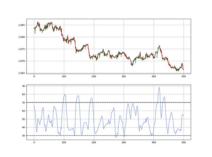
def relative_volatility_index(Data, lookback, close, where):

    # Calculating Volatility
    Data = volatility(Data, lookback, close, where)

    # Calculating the RSI on Volatility
    Data = rsi(Data, lookback, where, where + 1)

    # Cleaning
    Data = deleter(Data, where, 1)

    return Data
The Arm Section: Speed
The Catapult predicts momentum direction using the 14-period Relative Strength Index.
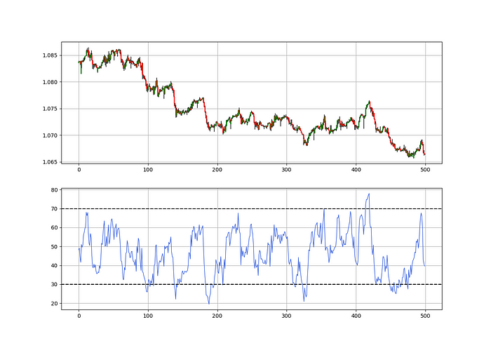
As a reminder, the RSI ranges from 0 to 100. Two levels give contrarian signals:
A positive response is anticipated when the market is deemed to have gone too far down at the oversold level 30, which is 30.
When the market is deemed to have gone up too much, at overbought level 70, a bearish reaction is to be expected.
Comparing the RSI to 50 is another intriguing use. RSI above 50 indicates bullish momentum, while below 50 indicates negative momentum.
The direction-finding filter in the frame
The Catapult's directional filter uses the 200-period simple moving average to keep us trending. This keeps us sane and increases our odds.
Moving averages confirm and ride trends. Its simplicity and track record of delivering value to analysis make them the most popular technical indicator. They help us locate support and resistance, stops and targets, and the trend. Its versatility makes them essential trading tools.
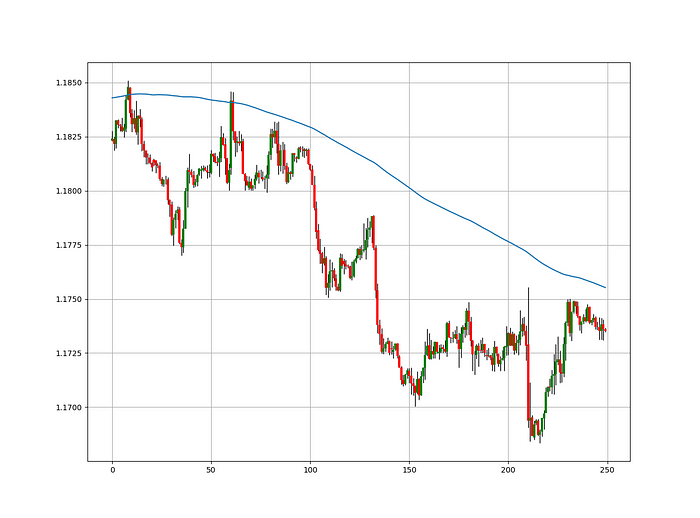
This is the plain mean, employed in statistics and everywhere else in life. Simply divide the number of observations by their total values. Mathematically, it's:

We defined the moving average function above. Create the Catapult indication now.
Indicator of the Catapult
The indicator is a healthy mix of the three indicators:
The first trigger will be provided by the 21-period Relative Volatility Index, which indicates that there will now be above average volatility and, as a result, it is possible for a directional shift.
If the reading is above 50, the move is likely bullish, and if it is below 50, the move is likely bearish, according to the 14-period Relative Strength Index, which indicates the likelihood of the direction of the move.
The likelihood of the move's direction will be strengthened by the 200-period simple moving average. When the market is above the 200-period moving average, we can infer that bullish pressure is there and that the upward trend will likely continue. Similar to this, if the market falls below the 200-period moving average, we recognize that there is negative pressure and that the downside is quite likely to continue.
lookback_rvi = 21
lookback_rsi = 14
lookback_ma  = 200
my_data = ma(my_data, lookback_ma, 3, 4)
my_data = rsi(my_data, lookback_rsi, 3, 5)
my_data = relative_volatility_index(my_data, lookback_rvi, 3, 6)
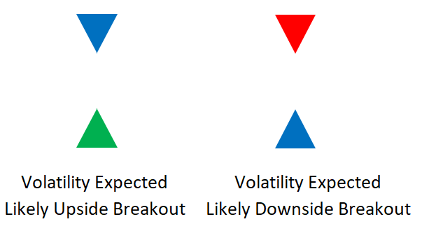
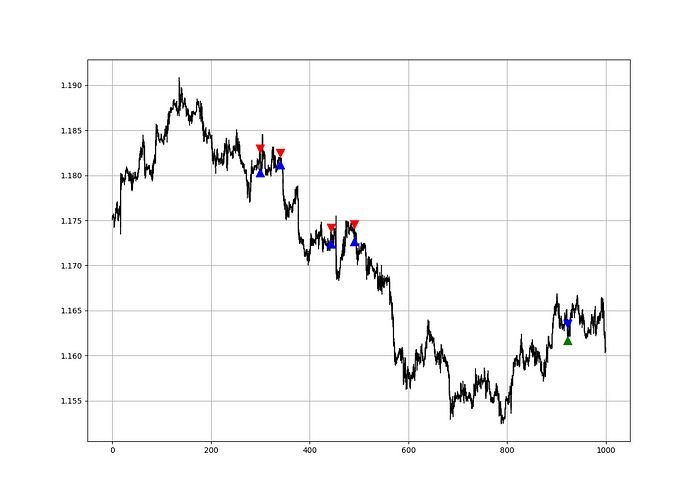
Two-handled overlay indicator Catapult. The first exhibits blue and green arrows for a buy signal, and the second shows blue and red for a sell signal.
The chart below shows recent EURUSD hourly values.
def signal(Data, rvi_col, signal):

    Data = adder(Data, 10)

    for i in range(len(Data)):

        if Data[i,     rvi_col] < 30 and \
           Data[i - 1, rvi_col] > 30 and \
           Data[i - 2, rvi_col] > 30 and \
           Data[i - 3, rvi_col] > 30 and \
           Data[i - 4, rvi_col] > 30 and \
           Data[i - 5, rvi_col] > 30:

               Data[i, signal] = 1

    return Data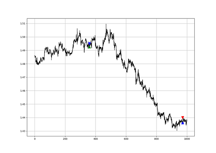
Signals are straightforward. The indicator can be utilized with other methods.
my_data = signal(my_data, 6, 7)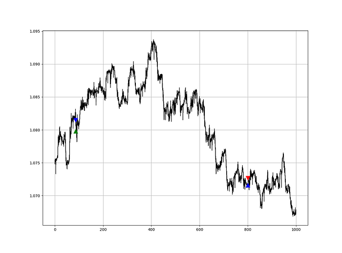
Lumiwealth shows how to develop all kinds of algorithms. I recommend their hands-on courses in algorithmic trading, blockchain, and machine learning.
Summary
To conclude, my goal is to contribute to objective technical analysis, which promotes more transparent methods and strategies that must be back-tested before implementation. Technical analysis will lose its reputation as subjective and unscientific.
After you find a trading method or approach, follow these steps:
Put emotions aside and adopt an analytical perspective.
Test it in the past in conditions and simulations taken from real life.
Try improving it and performing a forward test if you notice any possibility.
Transaction charges and any slippage simulation should always be included in your tests.
Risk management and position sizing should always be included in your tests.
After checking the aforementioned, monitor the plan because market dynamics may change and render it unprofitable.
You might also like

Aldric Chen
3 years ago
Jack Dorsey's Meeting Best Practice was something I tried. It Performs Exceptionally Well in Consulting Engagements.

Yes, client meetings are difficult. Especially when I'm alone.
Clients must tell us their problems so we can help.
In-meeting challenges contribute nothing to our work. Consider this:
Clients are unprepared.
Clients are distracted.
Clients are confused.
Introducing Jack Dorsey's Google Doc approach
I endorse his approach to meetings.
Not Google Doc-related. Jack uses it for meetings.
This is what his meetings look like.
Prior to the meeting, the Chair creates the agenda, structure, and information using Google Doc.
Participants in the meeting would have 5-10 minutes to read the Google Doc.
They have 5-10 minutes to type their comments on the document.
In-depth discussion begins
There is elegance in simplicity. Here's how Jack's approach is fantastic.
Unprepared clients are given time to read.
During the meeting, they think and work on it.
They can see real-time remarks from others.
Discussion ensues.
Three months ago, I fell for this strategy. After trying it with a client, I got good results.
I conducted social control experiments in a few client workshops.
Context matters.
I am sure Jack Dorsey’s method works well in meetings. What about client workshops?
So, I tested Enterprise of the Future with a consulting client.
I sent multiple emails to client stakeholders describing the new approach.
No PowerPoints that day. I spent the night setting up the Google Doc with conversation topics, critical thinking questions, and a Before and After section.
The client was shocked. First, a Google Doc was projected. Second surprise was a verbal feedback.
“No pre-meeting materials?”
“Don’t worry. I know you are not reading it before our meeting, anyway.”
We laughed. The experiment started.
Observations throughout a 90-minute engagement workshop from beginning to end
For 10 minutes, the workshop was silent.
People read the Google Doc. For some, the silence was unnerving.
“Are you not going to present anything to us?”
I said everything's in Google Doc. I asked them to read, remark, and add relevant paragraphs.
As they unlocked their laptops, they were annoyed.
Ten client stakeholders are typing on the Google Doc. My laptop displays comment bubbles, red lines, new paragraphs, and strikethroughs.
The first 10 minutes were productive. Everyone has seen and contributed to the document.
I was silent.
The move to a classical workshop was smooth. I didn't stimulate dialogue. They did.
Stephanie asked Joe why a blended workforce hinders company productivity. She questioned his comments and additional paragraphs.
That is when a light bulb hit my head. Yes, you want to speak to the right person to resolve issues!
Not only that was discussed. Others discussed their remark bubbles with neighbors. Debate circles sprung up one after the other.
The best part? I asked everyone to add their post-discussion thoughts on a Google Doc.
After the workshop, I have:
An agreement-based working document
A post-discussion minutes that are prepared for publication
A record of the discussion points that were brought up, argued, and evaluated critically
It showed me how stakeholders viewed their Enterprise of the Future. It allowed me to align with them.
Finale Keynotes
Client meetings are a hit-or-miss. I know that.
Jack Dorsey's meeting strategy works for consulting. It promotes session alignment.
It relieves clients of preparation.
I get the necessary information to advance this consulting engagement.
It is brilliant.

Francesca Furchtgott
4 years ago
Giving customers what they want or betraying the values of the brand?
A J.Crew collaboration for fashion label Eveliina Vintage is not a paradox; it is a solution.

Eveliina Vintage's capsule collection debuted yesterday at J.Crew. This J.Crew partnership stopped me in my tracks.
Eveliina Vintage sells vintage goods. Eeva Musacchia founded the shop in Finland in the 1970s. It's recognized for its one-of-a-kind slip dresses from the 1930s and 1940s.
I wondered why a vintage brand would partner with a mass shop. Fast fashion against vintage shopping? Will Eveliina Vintages customers be turned off?
But Eveliina Vintages customers don't care about sustainability. They want Eveliina's Instagram look. Eveliina Vintage collaborated with J.Crew to give customers what they wanted: more Eveliina at a lower price.
Vintage: A Fashion Option That Is Eco-Conscious
Secondhand shopping is a trendy response to quick fashion. J.Crew releases hundreds of styles annually. Waste and environmental damage have been criticized. A pair of jeans requires 1,800 gallons of water. J.Crew's limited-time deals promote more purchases. J.Crew items are likely among those Americans wear 7 times before discarding.
Consumers and designers have emphasized sustainability in recent years. Stella McCartney and Eileen Fisher are popular eco-friendly brands. They've also flocked to ThredUp and similar sites.
Gap, Levis, and Allbirds have listened to consumer requests. They promote recycling, ethical sourcing, and secondhand shopping.
Secondhand shoppers feel good about reusing and recycling clothing that might have ended up in a landfill.
Eco-conscious fashionistas shop vintage. These shoppers enjoy the thrill of the hunt (that limited-edition Chanel bag!) and showing off a unique piece (nobody will have my look!). They also reduce their environmental impact.
Is Eveliina Vintage capitalizing on an aesthetic or is it a sustainable brand?
Eveliina Vintage emphasizes environmental responsibility. Vogue's Amanda Musacchia emphasized sustainability. Amanda, founder Eeva's daughter, is a company leader.
But Eveliina's press message doesn't address sustainability, unlike Instagram. Scarcity and fame rule.
Eveliina Vintages Instagram has see-through dresses and lace-trimmed slip dresses. Celebrities and influencers are often photographed in Eveliina's apparel, which has 53,000+ followers. Vogue appreciates Eveliina's style. Multiple publications discuss Alexa Chung's Eveliina dress.
Eveliina Vintage markets its one-of-a-kind goods. It teases future content, encouraging visitors to return. Scarcity drives demand and raises clothing prices. One dress is $1,600+, but most are $500-$1,000.
The catch: Eveliina can't monetize its expanding popularity due to exorbitant prices and limited quantity. Why?
Most people struggle to pay for their clothing. But Eveliina Vintage lacks those more affordable entry-level products, in contrast to other luxury labels that sell accessories or perfume.
Many people have trouble fitting into their clothing. The bodies of most women in the past were different from those for which vintage clothing was designed. Each Eveliina dress's specific measurements are mentioned alongside it. Be careful, you can fall in love with an ill-fitting dress.
No matter how many people can afford it and fit into it, there is only one item to sell. To get the item before someone else does, those people must be on the Eveliina Vintage website as soon as it becomes available.
A Way for Eveliina Vintage to Make Money (and Expand) with J.Crew Its following
Eveliina Vintages' cooperation with J.Crew makes commercial sense.
This partnership spreads Eveliina's style. Slightly better pricing The $390 outfits have multicolored slips and gauzy cotton gowns. Sizes range from 00 to 24, which is wider than vintage racks.
Eveliina Vintage customers like the combination. Excited comments flood the brand's Instagram launch post. Nobody is mocking the 50-year-old vintage brand's fast-fashion partnership.
Vintage may be a sustainable fashion trend, but that's not why Eveliina's clients love the brand. They only care about the old look.
And that is a tale as old as fashion.

Jim Clyde Monge
4 years ago
Can You Sell Images Created by AI?

Some AI-generated artworks sell for enormous sums of money.
But can you sell AI-Generated Artwork?
Simple answer: yes.
However, not all AI services enable allow usage and redistribution of images.
Let's check some of my favorite AI text-to-image generators:
Dall-E2 by OpenAI
The AI art generator Dall-E2 is powerful. Since it’s still in beta, you can join the waitlist here.
OpenAI DOES NOT allow the use and redistribution of any image for commercial purposes.
Here's the policy as of April 6, 2022.
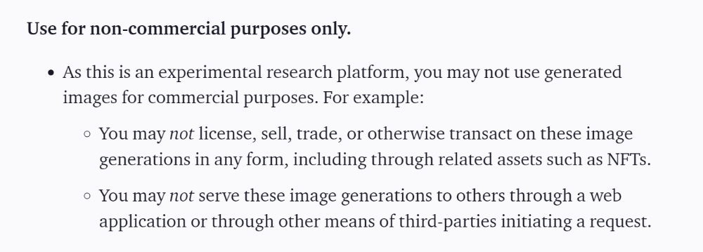
Here are some images from Dall-E2’s webpage to show its art quality.

Several Reddit users reported receiving pricing surveys from OpenAI.
This suggests the company may bring out a subscription-based tier and a commercial license to sell images soon.
MidJourney
I like Midjourney's art generator. It makes great AI images. Here are some samples:

Standard Licenses are available for $10 per month.
Standard License allows you to use, copy, modify, merge, publish, distribute, and/or sell copies of the images, except for blockchain technologies.
If you utilize or distribute the Assets using blockchain technology, you must pay MidJourney 20% of revenue above $20,000 a month or engage in an alternative agreement.
Here's their copyright and trademark page.

Dream by Wombo
Dream is one of the first public AI art generators.
This AI program is free, easy to use, and Wombo gives a royalty-free license to copy or share artworks.
Users own all artworks generated by the tool. Including all related copyrights or intellectual property rights.
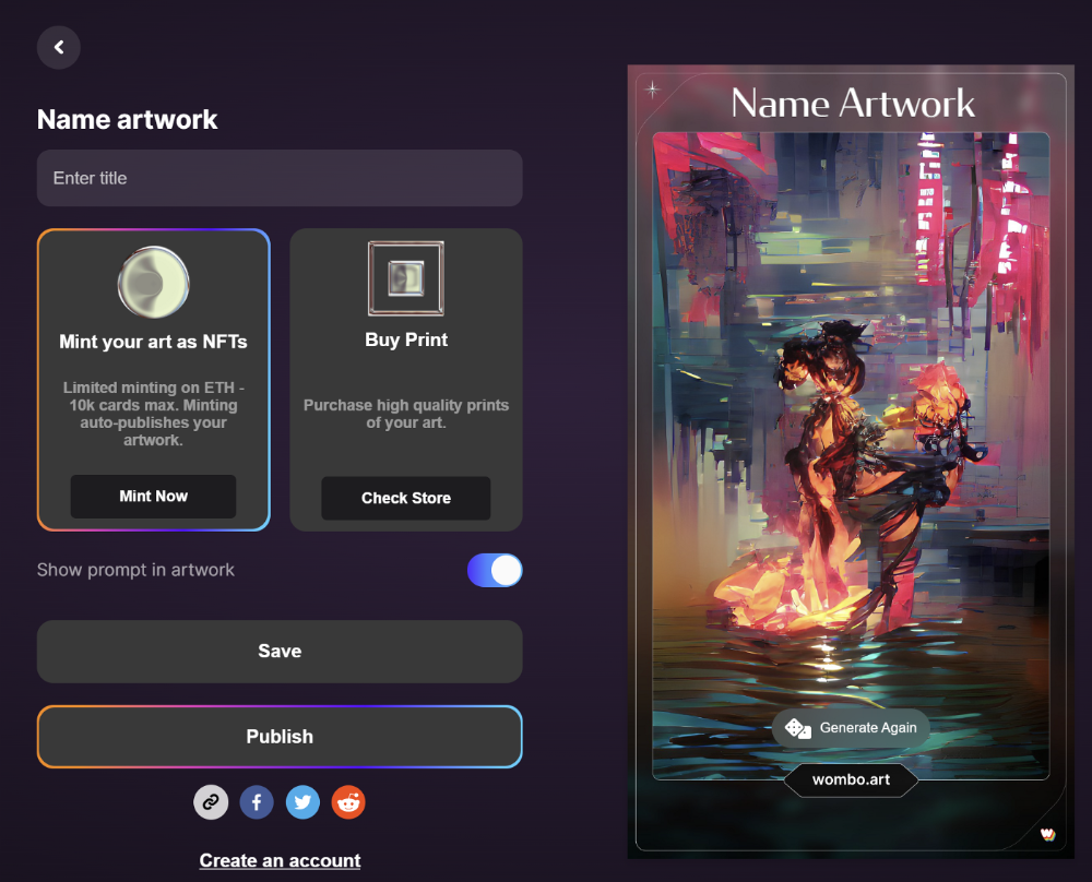
Here’s Wombos' intellectual property policy.

Final Reflections
AI is creating a new sort of art that's selling well. It’s becoming popular and valued, despite some skepticism.
Now that you know MidJourney and Wombo let you sell AI-generated art, you need to locate buyers. There are several ways to achieve this, but that’s for another story.