

The latest “bubble indicator” readings.
As you know, I like to turn my intuition into decision rules (principles) that can be back-tested and automated to create a portfolio of alpha bets. I use one for bubbles. Having seen many bubbles in my 50+ years of investing, I described what makes a bubble and how to identify them in markets—not just stocks.
A bubble market has a high degree of the following:
- High prices compared to traditional values (e.g., by taking the present value of their cash flows for the duration of the asset and comparing it with their interest rates).
- Conditons incompatible with long-term growth (e.g., extrapolating past revenue and earnings growth rates late in the cycle).
- Many new and inexperienced buyers were drawn in by the perceived hot market.
- Broad bullish sentiment.
- Debt financing a large portion of purchases.
- Lots of forward and speculative purchases to profit from price rises (e.g., inventories that are more than needed, contracted forward purchases, etc.).
I use these criteria to assess all markets for bubbles. I have periodically shown you these for stocks and the stock market.
What Was Shown in January Versus Now
I will first describe the picture in words, then show it in charts, and compare it to the last update in January.
As of January, the bubble indicator showed that a) the US equity market was in a moderate bubble, but not an extreme one (ie., 70 percent of way toward the highest bubble, which occurred in the late 1990s and late 1920s), and b) the emerging tech companies (ie. As well, the unprecedented flood of liquidity post-COVID financed other bubbly behavior (e.g. SPACs, IPO boom, big pickup in options activity), making things bubbly. I showed which stocks were in bubbles and created an index of those stocks, which I call “bubble stocks.”
Those bubble stocks have popped. They fell by a third last year, while the S&P 500 remained flat. In light of these and other market developments, it is not necessarily true that now is a good time to buy emerging tech stocks.
The fact that they aren't at a bubble extreme doesn't mean they are safe or that it's a good time to get long. Our metrics still show that US stocks are overvalued. Once popped, bubbles tend to overcorrect to the downside rather than settle at “normal” prices.
The following charts paint the picture. The first shows the US equity market bubble gauge/indicator going back to 1900, currently at the 40% percentile. The charts also zoom in on the gauge in recent years, as well as the late 1920s and late 1990s bubbles (during both of these cases the gauge reached 100 percent ).
The chart below depicts the average bubble gauge for the most bubbly companies in 2020. Those readings are down significantly.
The charts below compare the performance of a basket of emerging tech bubble stocks to the S&P 500. Prices have fallen noticeably, giving up most of their post-COVID gains.
The following charts show the price action of the bubble slice today and in the 1920s and 1990s. These charts show the same market dynamics and two key indicators. These are just two examples of how a lot of debt financing stock ownership coupled with a tightening typically leads to a bubble popping.
Everything driving the bubbles in this market segment is classic—the same drivers that drove the 1920s bubble and the 1990s bubble. For instance, in the last couple months, it was how tightening can act to prick the bubble. Review this case study of the 1920s stock bubble (starting on page 49) from my book Principles for Navigating Big Debt Crises to grasp these dynamics.
The following charts show the components of the US stock market bubble gauge. Since this is a proprietary indicator, I will only show you some of the sub-aggregate readings and some indicators.
Each of these six influences is measured using a number of stats. This is how I approach the stock market. These gauges are combined into aggregate indices by security and then for the market as a whole. The table below shows the current readings of these US equity market indicators. It compares current conditions for US equities to historical conditions. These readings suggest that we’re out of a bubble.
1. How High Are Prices Relatively?
This price gauge for US equities is currently around the 50th percentile.
2. Is price reduction unsustainable?
This measure calculates the earnings growth rate required to outperform bonds. This is calculated by adding up the readings of individual securities. This indicator is currently near the 60th percentile for the overall market, higher than some of our other readings. Profit growth discounted in stocks remains high.
Even more so in the US software sector. Analysts' earnings growth expectations for this sector have slowed, but remain high historically. P/Es have reversed COVID gains but remain high historical.
3. How many new buyers (i.e., non-existing buyers) entered the market?
Expansion of new entrants is often indicative of a bubble. According to historical accounts, this was true in the 1990s equity bubble and the 1929 bubble (though our data for this and other gauges doesn't go back that far). A flood of new retail investors into popular stocks, which by other measures appeared to be in a bubble, pushed this gauge above the 90% mark in 2020. The pace of retail activity in the markets has recently slowed to pre-COVID levels.
4. How Broadly Bullish Is Sentiment?
The more people who have invested, the less resources they have to keep investing, and the more likely they are to sell. Market sentiment is now significantly negative.
5. Are Purchases Being Financed by High Leverage?
Leveraged purchases weaken the buying foundation and expose it to forced selling in a downturn. The leverage gauge, which considers option positions as a form of leverage, is now around the 50% mark.
6. To What Extent Have Buyers Made Exceptionally Extended Forward Purchases?
Looking at future purchases can help assess whether expectations have become overly optimistic. This indicator is particularly useful in commodity and real estate markets, where forward purchases are most obvious. In the equity markets, I look at indicators like capital expenditure, or how much businesses (and governments) invest in infrastructure, factories, etc. It reflects whether businesses are projecting future demand growth. Like other gauges, this one is at the 40th percentile.
What one does with it is a tactical choice. While the reversal has been significant, future earnings discounting remains high historically. In either case, bubbles tend to overcorrect (sell off more than the fundamentals suggest) rather than simply deflate. But I wanted to share these updated readings with you in light of recent market activity.
More on Economics & Investing

Jan-Patrick Barnert
3 years ago
Wall Street's Bear Market May Stick Around
If history is any guide, this bear market might be long and severe.
This is the S&P 500 Index's fourth such incident in 20 years. The last bear market of 2020 was a "shock trade" caused by the Covid-19 pandemic, although earlier ones in 2000 and 2008 took longer to bottom out and recover.
Peter Garnry, head of equities strategy at Saxo Bank A/S, compares the current selloff to the dotcom bust of 2000 and the 1973-1974 bear market marked by soaring oil prices connected to an OPEC oil embargo. He blamed high tech valuations and the commodity crises.
"This drop might stretch over a year and reach 35%," Garnry wrote.
Here are six bear market charts.
Time/depth
The S&P 500 Index plummeted 51% between 2000 and 2002 and 58% during the global financial crisis; it took more than 1,000 trading days to recover. The former took 638 days to reach a bottom, while the latter took 352 days, suggesting the present selloff is young.
Valuations
Before the tech bubble burst in 2000, valuations were high. The S&P 500's forward P/E was 25 times then. Before the market fell this year, ahead values were near 24. Before the global financial crisis, stocks were relatively inexpensive, but valuations dropped more than 40%, compared to less than 30% now.
Earnings
Every stock crash, especially earlier bear markets, returned stocks to fundamentals. The S&P 500 decouples from earnings trends but eventually recouples.
Support
Central banks won't support equity investors just now. The end of massive monetary easing will terminate a two-year bull run that was among the strongest ever, and equities may struggle without cheap money. After years of "don't fight the Fed," investors must embrace a new strategy.
Bear Haunting Bear
If the past is any indication, rising government bond yields are bad news. After the financial crisis, skyrocketing rates and a falling euro pushed European stock markets back into bear territory in 2011.
Inflation/rates
The current monetary policy climate differs from past bear markets. This is the first time in a while that markets face significant inflation and rising rates.
This post is a summary. Read full article here

Quant Galore
3 years ago
I created BAW-IV Trading because I was short on money.
More retail traders means faster, more sophisticated, and more successful methods.
Tech specifications
Only requires a laptop and an internet connection.
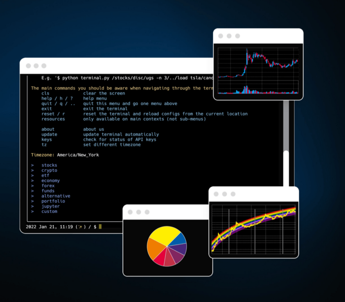
We'll use OpenBB's research platform for data/analysis.
Pricing and execution on Options-Quant

Background
You don't need to know the arithmetic details to use this method.
Black-Scholes is a popular option pricing model. It's best for pricing European options. European options are only exercisable at expiration, unlike American options. American options are always exercisable.
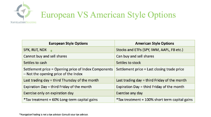
American options carry a premium to cover for the risk of early exercise. The Black-Scholes model doesn't account for this premium, hence it can't price genuine, traded American options.
Barone-Adesi-Whaley (BAW) model. BAW modifies Black-Scholes. It accounts for exercise risk premium and stock dividends. It adds the option's early exercise value to the Black-Scholes value.
The trader need not know the formulaic derivations of this model.
https://ir.nctu.edu.tw/bitstream/11536/14182/1/000264318900005.pdf
Strategy
This strategy targets implied volatility. First, we'll locate liquid options that expire within 30 days and have minimal implied volatility.
After selecting the option that meets the requirements, we price it to get the BAW implied volatility (we choose BAW because it's a more accurate Black-Scholes model). If estimated implied volatility is larger than market volatility, we'll capture the spread.
(Calculated IV — Market IV) = (Profit)
Some approaches to target implied volatility are pricey and inaccessible to individual investors. The best and most cost-effective alternative is to acquire a straddle and delta hedge. This may sound terrifying and pricey, but as shown below, it's much less so.
The Trade
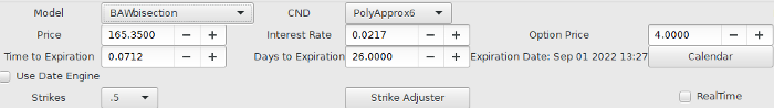
First, we want to find our ideal option, so we use OpenBB terminal to screen for options that:
Have an IV at least 5% lower than the 20-day historical IV
Are no more than 5% out-of-the-money
Expire in less than 30 days
We query:
stocks/options/screen/set low_IV/scr --export Output.csv
This uses the screener function to screen for options that satisfy the above criteria, which we specify in the low IV preset (more on custom presets here). It then saves the matching results to a csv(Excel) file for viewing and analysis.
Stick to liquid names like SPY, AAPL, and QQQ since getting out of a position is just as crucial as getting in. Smaller, illiquid names have higher inefficiencies, which could restrict total profits.

We calculate IV using the BAWbisection model (the bisection is a method of calculating IV, more can be found here.) We price the IV first.
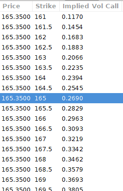
According to the BAW model, implied volatility at this level should be priced at 26.90%. When re-pricing the put, IV is 24.34%, up 3%.
Now it's evident. We must purchase the straddle (long the call and long the put) assuming the computed implied volatility is more appropriate and efficient than the market's. We just want to speculate on volatility, not price fluctuations, thus we delta hedge.
The Fun Starts
We buy both options for $7.65. (x100 multiplier). Initial delta is 2. For every dollar the stock price swings up or down, our position value moves $2.

We want delta to be 0 to avoid price vulnerability. A delta of 0 suggests our position's value won't change from underlying price changes. Being delta-hedged allows us to profit/lose from implied volatility. Shorting 2 shares makes us delta-neutral.
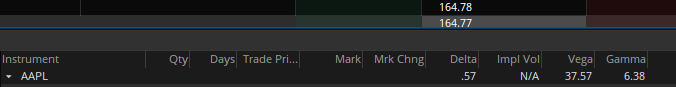
That's delta hedging. (Share price * shares traded) = $330.7 to become delta-neutral. You may have noted that delta is not truly 0.00. This is common since delta-hedging means getting as near to 0 as feasible, since it is rare for deltas to align at 0.00.
Now we're vulnerable to changes in Vega (and Gamma, but given we're dynamically hedging, it's not a big risk), or implied volatility. We wanted to gamble that the position's IV would climb by at least 2%, so we'll maintain it delta-hedged and watch IV.
Because the underlying moves continually, the option's delta moves continuously. A trader can short/long 5 AAPL shares at most. Paper trading lets you practice delta-hedging. Being quick-footed will help with this tactic.
Profit-Closing
As expected, implied volatility rose. By 10 minutes before market closure, the call's implied vol rose to 27% and the put's to 24%. This allowed us to sell the call for $4.95 and the put for $4.35, creating a profit of $165.

You may pull historical data to see how this trade performed. Note the implied volatility and pricing in the final options chain for August 5, 2022 (the position date).

Final Thoughts
Congratulations, that was a doozy. To reiterate, we identified tickers prone to increased implied volatility by screening OpenBB's low IV setting. We double-checked the IV by plugging the price into Options-BAW Quant's model. When volatility was off, we bought a straddle and delta-hedged it. Finally, implied volatility returned to a normal level, and we profited on the spread.
The retail trading space is very quickly catching up to that of institutions. Commissions and fees used to kill this method, but now they cost less than $5. Watching momentum, technical analysis, and now quantitative strategies evolve is intriguing.
I'm not linked with these sites and receive no financial benefit from my writing.
Tell me how your experience goes and how I helped; I love success tales.

Sam Hickmann
3 years ago
What is this Fed interest rate everybody is talking about that makes or breaks the stock market?
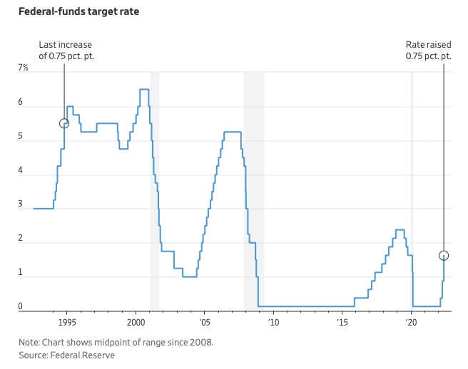
The Federal Funds Rate (FFR) is the target interest rate set by the Federal Reserve System (Fed)'s policy-making body (FOMC). This target is the rate at which the Fed suggests commercial banks borrow and lend their excess reserves overnight to each other.
The FOMC meets 8 times a year to set the target FFR. This is supposed to promote economic growth. The overnight lending market sets the actual rate based on commercial banks' short-term reserves. If the market strays too far, the Fed intervenes.
Banks must keep a certain percentage of their deposits in a Federal Reserve account. A bank's reserve requirement is a percentage of its total deposits. End-of-day bank account balances averaged over two-week reserve maintenance periods are used to determine reserve requirements.
If a bank expects to have end-of-day balances above what's needed, it can lend the excess to another institution.
The FOMC adjusts interest rates based on economic indicators that show inflation, recession, or other issues that affect economic growth. Core inflation and durable goods orders are indicators.
In response to economic conditions, the FFR target has changed over time. In the early 1980s, inflation pushed it to 20%. During the Great Recession of 2007-2009, the rate was slashed to 0.15 percent to encourage growth.
Inflation picked up in May 2022 despite earlier rate hikes, prompting today's 0.75 percent point increase. The largest increase since 1994. It might rise to around 3.375% this year and 3.1% by the end of 2024.
You might also like

Pat Vieljeux
3 years ago
In 5 minutes, you can tell if a startup will succeed.
Or the “lie to me” method.

I can predict a startup's success in minutes.
Just interview its founder.
Ask "why?"
I question "why" till I sense him.
I need to feel the person I have in front of me. I need to know if he or she can deliver. Startups aren't easy. Without abilities, a brilliant idea will fail.
Good entrepreneurs have these qualities: He's a leader, determined, and resilient.
For me, they can be split in two categories.
The first entrepreneur aspires to live meaningfully. The second wants to get rich. The second is communicative. He wants to wow the crowd. He's motivated by the thought of one day sailing a boat past palm trees and sunny beaches.
What drives the first entrepreneur is evident in his speech, face, and voice. He will not speak about his product. He's (nearly) uninterested. He's not selling anything. He's not a salesman. He wants to succeed. The product is his fuel.
He'll explain his decision. He'll share his motivations. His desire. And he'll use meaningful words.
Paul Ekman has shown that face expressions aren't cultural. His study influenced the American TV series "lie to me" about body language and speech.
Passionate entrepreneurs are obvious. It's palpable. Faking passion is tough. Someone who wants your favor and money will expose his actual motives through his expressions and language.
The good liar will be able to fool you for a while, but not for long if you pay attention to his body language and how he expresses himself.
And also, if you look at his business plan.
His business plan reveals his goals. Read between the lines.
Entrepreneur 1 will focus on his "why", whereas Entrepreneur 2 will focus on the "how".
Entrepreneur 1 will develop a vision-driven culture.
The second, on the other hand, will focus on his EBITDA.
Why is the culture so critical? Because it will allow entrepreneur 1 to develop a solid team that can tackle his problems and trials. His team's "why" will keep them together in tough times.
"Give me a terrific start-up team with a mediocre idea over a weak one any day." Because a great team knows when to pivot and trusts each other. Weak teams fail.” — Bernhard Schroeder
Closings thoughts
Every VC must ask Why. Entrepreneur's motivations. This "why" will create the team's culture. This culture will help the team adjust to any setback.

Trevor Stark
3 years ago
Peter Thiels's Multi-Billion Dollar Net Worth's Unknown Philosopher
Peter Thiel studied philosophy as an undergraduate.
Peter Thiel has $7.36 billion.
Peter is a world-ranked chess player, has a legal degree, and has written profitable novels.
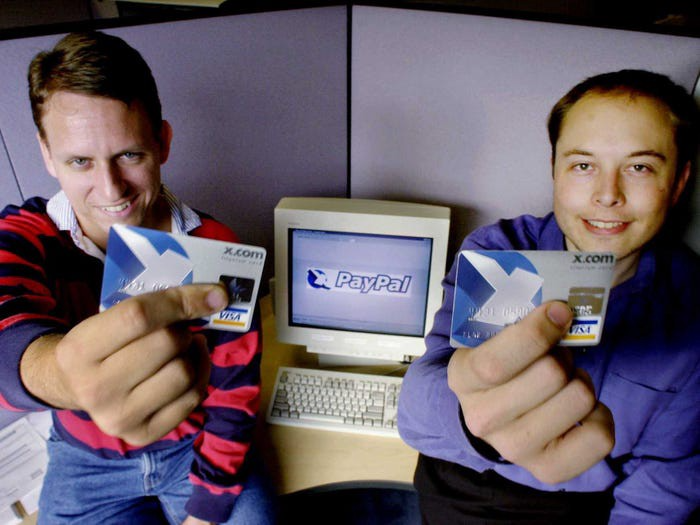
In 1999, he co-founded PayPal with Max Levchin, which merged with X.com.
Peter Thiel made $55 million after selling the company to eBay for $1.5 billion in 2002.
You may be wondering…
How did Peter turn $55 million into his now multi-billion dollar net worth?
One amazing investment?
Facebook.
Thiel was Facebook's first external investor. He bought 10% of the company for $500,000 in 2004.
This investment returned 159% annually, 200x in 8 years.
By 2012, Thiel sold almost all his Facebook shares, becoming a billionaire.
What was the investment thesis of Peter?
This investment appeared ridiculous. Facebook was an innovative startup.
Thiel's $500,000 contribution transformed Facebook.
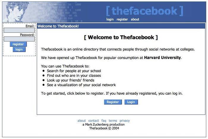
Harvard students have access to Facebook's 8 features and 1 photo per profile.
How did Peter determine that this would be a wise investment, then?
Facebook is a mimetic desire machine.
Social media's popularity is odd. Why peek at strangers' images on a computer?
Peter Thiel studied under French thinker Rene Girard at Stanford.
Mimetic Desire explains social media's success.
Mimetic Desire is the idea that humans desire things simply because other people do.
If nobody wanted it, would you?
Would you desire a family, a luxury car, or expensive clothes if no one else did? Girard says no.
People we admire affect our aspirations because we're social animals. Every person has a role model.
Our nonreligious culture implies role models are increasingly other humans, not God.
The idea explains why social media influencers are so powerful.
Why would Andrew Tate or Kim Kardashian matter if people weren't mimetic?
Humanity is fundamentally motivated by social comparison.
Facebook takes advantage of this need for social comparison, and puts it on a global scale.
It aggregates photographs and updates from millions of individuals.
Facebook mobile allows 24/7 social comparison.
Thiel studied mimetic desire with Girard and realized Facebook exploits the urge for social comparison to gain money.
Social media is more significant and influential than ever, despite Facebook's decline.
Thiel and Girard show that applied philosophy (particularly in business) can be immensely profitable.

Entreprogrammer
3 years ago
The Steve Jobs Formula: A Guide to Everything
A must-read for everyone

Jobs is well-known. You probably know the tall, thin guy who wore the same clothing every day. His influence is unavoidable. In fewer than 40 years, Jobs' innovations have impacted computers, movies, cellphones, music, and communication.
Steve Jobs may be more imaginative than the typical person, but if we can use some of his ingenuity, ambition, and good traits, we'll be successful. This essay explains how to follow his guidance and success secrets.
1. Repetition is necessary for success.
Be patient and diligent to master something. Practice makes perfect. This is why older workers are often more skilled.
When should you repeat a task? When you're confident and excited to share your product. It's when to stop tweaking and repeating.
Jobs stated he'd make the crowd sh** their pants with an iChat demo.
Use this in your daily life.
Start with the end in mind. You can put it in writing and be as detailed as you like with your plan's schedule and metrics. For instance, you have a goal of selling three coffee makers in a week.
Break it down, break the goal down into particular tasks you must complete, and then repeat those tasks. To sell your coffee maker, you might need to make 50 phone calls.
Be mindful of the amount of work necessary to produce the desired results. Continue doing this until you are happy with your product.
2. Acquire the ability to add and subtract.
How did Picasso invent cubism? Pablo Picasso was influenced by stylised, non-naturalistic African masks that depict a human figure.
Artists create. Constantly seeking inspiration. They think creatively about random objects. Jobs said creativity is linking things. Creative people feel terrible when asked how they achieved something unique because they didn't do it all. They saw innovation. They had mastered connecting and synthesizing experiences.
Use this in your daily life.
On your phone, there is a note-taking app. Ideas for what you desire to learn should be written down. It may be learning a new language, calligraphy, or anything else that inspires or intrigues you.
Note any ideas you have, quotations, or any information that strikes you as important.
Spend time with smart individuals, that is the most important thing. Jim Rohn, a well-known motivational speaker, has observed that we are the average of the five people with whom we spend the most time.
Learning alone won't get you very far. You need to put what you've learnt into practice. If you don't use your knowledge and skills, they are useless.
3. Develop the ability to refuse.
Steve Jobs deleted thousands of items when he created Apple's design ethic. Saying no to distractions meant upsetting customers and partners.
John Sculley, the former CEO of Apple, said something like this. According to Sculley, Steve’s methodology differs from others as he always believed that the most critical decisions are things you choose not to do.
Use this in your daily life.
Never be afraid to say "no," "I won't," or "I don't want to." Keep it simple. This method works well in some situations.
Give a different option. For instance, X might be interested even if I won't be able to achieve it.
Control your top priority. Before saying yes to anything, make sure your work schedule and priority list are up to date.
4. Follow your passion
“Follow your passion” is the worst advice people can give you. Steve Jobs didn't start Apple because he suddenly loved computers. He wanted to help others attain their maximum potential.
Great things take a lot of work, so quitting makes sense if you're not passionate. Jobs learned from history that successful people were passionate about their work and persisted through challenges.
Use this in your daily life.
Stay away from your passion. Allow it to develop daily. Keep working at your 9-5-hour job while carefully gauging your level of desire and endurance. Less risk exists.
The truth is that if you decide to work on a project by yourself rather than in a group, it will take you years to complete it instead of a week. Instead, network with others who have interests in common.
Prepare a fallback strategy in case things go wrong.
Success, this small two-syllable word eventually gives your life meaning, a perspective. What is success? For most, it's achieving their ambitions. However, there's a catch. Successful people aren't always happy.
Furthermore, where do people’s goals and achievements end? It’s a never-ending process. Success is a journey, not a destination. We wish you not to lose your way on this journey.