


The latest “bubble indicator” readings.
As you know, I like to turn my intuition into decision rules (principles) that can be back-tested and automated to create a portfolio of alpha bets. I use one for bubbles. Having seen many bubbles in my 50+ years of investing, I described what makes a bubble and how to identify them in markets—not just stocks.
A bubble market has a high degree of the following:
- High prices compared to traditional values (e.g., by taking the present value of their cash flows for the duration of the asset and comparing it with their interest rates).
- Conditons incompatible with long-term growth (e.g., extrapolating past revenue and earnings growth rates late in the cycle).
- Many new and inexperienced buyers were drawn in by the perceived hot market.
- Broad bullish sentiment.
- Debt financing a large portion of purchases.
- Lots of forward and speculative purchases to profit from price rises (e.g., inventories that are more than needed, contracted forward purchases, etc.).
I use these criteria to assess all markets for bubbles. I have periodically shown you these for stocks and the stock market.
What Was Shown in January Versus Now
I will first describe the picture in words, then show it in charts, and compare it to the last update in January.
As of January, the bubble indicator showed that a) the US equity market was in a moderate bubble, but not an extreme one (ie., 70 percent of way toward the highest bubble, which occurred in the late 1990s and late 1920s), and b) the emerging tech companies (ie. As well, the unprecedented flood of liquidity post-COVID financed other bubbly behavior (e.g. SPACs, IPO boom, big pickup in options activity), making things bubbly. I showed which stocks were in bubbles and created an index of those stocks, which I call “bubble stocks.”
Those bubble stocks have popped. They fell by a third last year, while the S&P 500 remained flat. In light of these and other market developments, it is not necessarily true that now is a good time to buy emerging tech stocks.
The fact that they aren't at a bubble extreme doesn't mean they are safe or that it's a good time to get long. Our metrics still show that US stocks are overvalued. Once popped, bubbles tend to overcorrect to the downside rather than settle at “normal” prices.
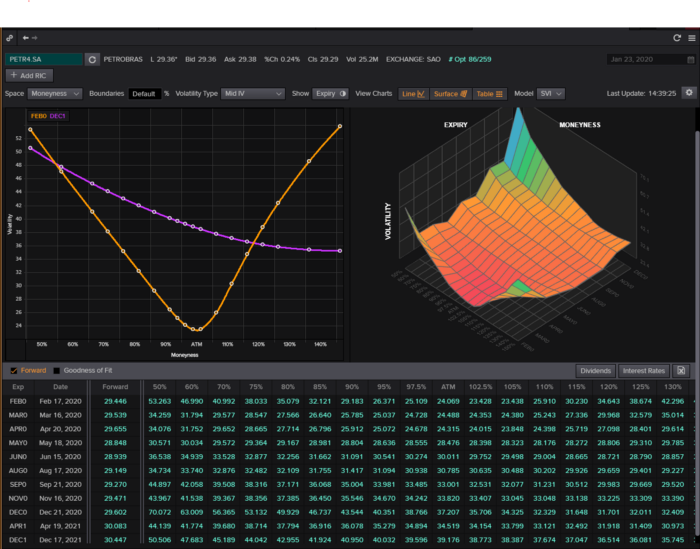
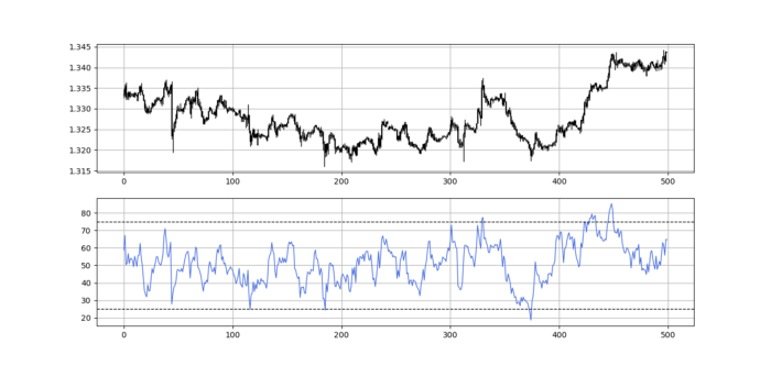
The following charts paint the picture. The first shows the US equity market bubble gauge/indicator going back to 1900, currently at the 40% percentile. The charts also zoom in on the gauge in recent years, as well as the late 1920s and late 1990s bubbles (during both of these cases the gauge reached 100 percent ).
The chart below depicts the average bubble gauge for the most bubbly companies in 2020. Those readings are down significantly.
The charts below compare the performance of a basket of emerging tech bubble stocks to the S&P 500. Prices have fallen noticeably, giving up most of their post-COVID gains.
The following charts show the price action of the bubble slice today and in the 1920s and 1990s. These charts show the same market dynamics and two key indicators. These are just two examples of how a lot of debt financing stock ownership coupled with a tightening typically leads to a bubble popping.
Everything driving the bubbles in this market segment is classic—the same drivers that drove the 1920s bubble and the 1990s bubble. For instance, in the last couple months, it was how tightening can act to prick the bubble. Review this case study of the 1920s stock bubble (starting on page 49) from my book Principles for Navigating Big Debt Crises to grasp these dynamics.
The following charts show the components of the US stock market bubble gauge. Since this is a proprietary indicator, I will only show you some of the sub-aggregate readings and some indicators.
Each of these six influences is measured using a number of stats. This is how I approach the stock market. These gauges are combined into aggregate indices by security and then for the market as a whole. The table below shows the current readings of these US equity market indicators. It compares current conditions for US equities to historical conditions. These readings suggest that we’re out of a bubble.
1. How High Are Prices Relatively?
This price gauge for US equities is currently around the 50th percentile.
2. Is price reduction unsustainable?
This measure calculates the earnings growth rate required to outperform bonds. This is calculated by adding up the readings of individual securities. This indicator is currently near the 60th percentile for the overall market, higher than some of our other readings. Profit growth discounted in stocks remains high.
Even more so in the US software sector. Analysts' earnings growth expectations for this sector have slowed, but remain high historically. P/Es have reversed COVID gains but remain high historical.
3. How many new buyers (i.e., non-existing buyers) entered the market?
Expansion of new entrants is often indicative of a bubble. According to historical accounts, this was true in the 1990s equity bubble and the 1929 bubble (though our data for this and other gauges doesn't go back that far). A flood of new retail investors into popular stocks, which by other measures appeared to be in a bubble, pushed this gauge above the 90% mark in 2020. The pace of retail activity in the markets has recently slowed to pre-COVID levels.
4. How Broadly Bullish Is Sentiment?
The more people who have invested, the less resources they have to keep investing, and the more likely they are to sell. Market sentiment is now significantly negative.
5. Are Purchases Being Financed by High Leverage?
Leveraged purchases weaken the buying foundation and expose it to forced selling in a downturn. The leverage gauge, which considers option positions as a form of leverage, is now around the 50% mark.
6. To What Extent Have Buyers Made Exceptionally Extended Forward Purchases?
Looking at future purchases can help assess whether expectations have become overly optimistic. This indicator is particularly useful in commodity and real estate markets, where forward purchases are most obvious. In the equity markets, I look at indicators like capital expenditure, or how much businesses (and governments) invest in infrastructure, factories, etc. It reflects whether businesses are projecting future demand growth. Like other gauges, this one is at the 40th percentile.
What one does with it is a tactical choice. While the reversal has been significant, future earnings discounting remains high historically. In either case, bubbles tend to overcorrect (sell off more than the fundamentals suggest) rather than simply deflate. But I wanted to share these updated readings with you in light of recent market activity.
More on Economics & Investing

Quant Galore
3 years ago
I created BAW-IV Trading because I was short on money.
More retail traders means faster, more sophisticated, and more successful methods.
Tech specifications
Only requires a laptop and an internet connection.
We'll use OpenBB's research platform for data/analysis.
Pricing and execution on Options-Quant

Background
You don't need to know the arithmetic details to use this method.
Black-Scholes is a popular option pricing model. It's best for pricing European options. European options are only exercisable at expiration, unlike American options. American options are always exercisable.
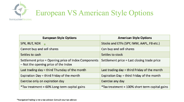
American options carry a premium to cover for the risk of early exercise. The Black-Scholes model doesn't account for this premium, hence it can't price genuine, traded American options.
Barone-Adesi-Whaley (BAW) model. BAW modifies Black-Scholes. It accounts for exercise risk premium and stock dividends. It adds the option's early exercise value to the Black-Scholes value.
The trader need not know the formulaic derivations of this model.
https://ir.nctu.edu.tw/bitstream/11536/14182/1/000264318900005.pdf
Strategy
This strategy targets implied volatility. First, we'll locate liquid options that expire within 30 days and have minimal implied volatility.
After selecting the option that meets the requirements, we price it to get the BAW implied volatility (we choose BAW because it's a more accurate Black-Scholes model). If estimated implied volatility is larger than market volatility, we'll capture the spread.
(Calculated IV — Market IV) = (Profit)
Some approaches to target implied volatility are pricey and inaccessible to individual investors. The best and most cost-effective alternative is to acquire a straddle and delta hedge. This may sound terrifying and pricey, but as shown below, it's much less so.
The Trade
First, we want to find our ideal option, so we use OpenBB terminal to screen for options that:
Have an IV at least 5% lower than the 20-day historical IV
Are no more than 5% out-of-the-money
Expire in less than 30 days
We query:
stocks/options/screen/set low_IV/scr --export Output.csv
This uses the screener function to screen for options that satisfy the above criteria, which we specify in the low IV preset (more on custom presets here). It then saves the matching results to a csv(Excel) file for viewing and analysis.
Stick to liquid names like SPY, AAPL, and QQQ since getting out of a position is just as crucial as getting in. Smaller, illiquid names have higher inefficiencies, which could restrict total profits.

We calculate IV using the BAWbisection model (the bisection is a method of calculating IV, more can be found here.) We price the IV first.
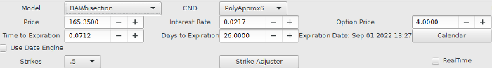
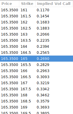
According to the BAW model, implied volatility at this level should be priced at 26.90%. When re-pricing the put, IV is 24.34%, up 3%.
Now it's evident. We must purchase the straddle (long the call and long the put) assuming the computed implied volatility is more appropriate and efficient than the market's. We just want to speculate on volatility, not price fluctuations, thus we delta hedge.
The Fun Starts
We buy both options for $7.65. (x100 multiplier). Initial delta is 2. For every dollar the stock price swings up or down, our position value moves $2.

We want delta to be 0 to avoid price vulnerability. A delta of 0 suggests our position's value won't change from underlying price changes. Being delta-hedged allows us to profit/lose from implied volatility. Shorting 2 shares makes us delta-neutral.
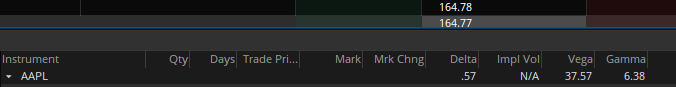
That's delta hedging. (Share price * shares traded) = $330.7 to become delta-neutral. You may have noted that delta is not truly 0.00. This is common since delta-hedging means getting as near to 0 as feasible, since it is rare for deltas to align at 0.00.
Now we're vulnerable to changes in Vega (and Gamma, but given we're dynamically hedging, it's not a big risk), or implied volatility. We wanted to gamble that the position's IV would climb by at least 2%, so we'll maintain it delta-hedged and watch IV.
Because the underlying moves continually, the option's delta moves continuously. A trader can short/long 5 AAPL shares at most. Paper trading lets you practice delta-hedging. Being quick-footed will help with this tactic.
Profit-Closing
As expected, implied volatility rose. By 10 minutes before market closure, the call's implied vol rose to 27% and the put's to 24%. This allowed us to sell the call for $4.95 and the put for $4.35, creating a profit of $165.

You may pull historical data to see how this trade performed. Note the implied volatility and pricing in the final options chain for August 5, 2022 (the position date).

Final Thoughts
Congratulations, that was a doozy. To reiterate, we identified tickers prone to increased implied volatility by screening OpenBB's low IV setting. We double-checked the IV by plugging the price into Options-BAW Quant's model. When volatility was off, we bought a straddle and delta-hedged it. Finally, implied volatility returned to a normal level, and we profited on the spread.
The retail trading space is very quickly catching up to that of institutions. Commissions and fees used to kill this method, but now they cost less than $5. Watching momentum, technical analysis, and now quantitative strategies evolve is intriguing.
I'm not linked with these sites and receive no financial benefit from my writing.
Tell me how your experience goes and how I helped; I love success tales.

Liam Vaughan
4 years ago
Investors can bet big on almost anything on a new prediction market.
Kalshi allows five-figure bets on the Grammys, the next Covid wave, and future SEC commissioners. Worst-case scenario
On Election Day 2020, two young entrepreneurs received a call from the CFTC chairman. Luana Lopes Lara and Tarek Mansour spent 18 months trying to start a new type of financial exchange. Instead of betting on stock prices or commodity futures, people could trade instruments tied to real-world events, such as legislation, the weather, or the Oscar winner.
Heath Tarbert, a Trump appointee, shouted "Congratulations." "You're competing with 1840s-era markets. I'm sure you'll become a powerhouse too."
Companies had tried to introduce similar event markets in the US for years, but Tarbert's agency, the CFTC, said no, arguing they were gambling and prone to cheating. Now the agency has reversed course, approving two 24-year-olds who will have first-mover advantage in what could become a huge new asset class. Kalshi Inc. raised $30 million from venture capitalists within weeks of Tarbert's call, his representative says. Mansour, 26, believes this will be bigger than crypto.
Anyone who's read The Wisdom of Crowds knows prediction markets' potential. Well-designed markets can help draw out knowledge from disparate groups, and research shows that when money is at stake, people make better predictions. Lopes Lara calls it a "bullshit tax." That's why Google, Microsoft, and even the US Department of Defense use prediction markets internally to guide decisions, and why university-linked political betting sites like PredictIt sometimes outperform polls.
Regulators feared Wall Street-scale trading would encourage investors to manipulate reality. If the stakes are high enough, traders could pressure congressional staffers to stall a bill or bet on whether Kanye West's new album will drop this week. When Lopes Lara and Mansour pitched the CFTC, senior regulators raised these issues. Politically appointed commissioners overruled their concerns, and one later joined Kalshi's board.
Will Kanye’s new album come out next week? Yes or no?
Kalshi's victory was due more to lobbying and legal wrangling than to Silicon Valley-style innovation. Lopes Lara and Mansour didn't invent anything; they changed a well-established concept's governance. The result could usher in a new era of market-based enlightenment or push Wall Street's destructive tendencies into the real world.
If Kalshi's founders lacked experience to bolster their CFTC application, they had comical youth success. Lopes Lara studied ballet at the Brazilian Bolshoi before coming to the US. Mansour won France's math Olympiad. They bonded over their work ethic in an MIT computer science class.
Lopes Lara had the idea for Kalshi while interning at a New York hedge fund. When the traders around her weren't working, she noticed they were betting on the news: Would Apple hit a trillion dollars? Kylie Jenner? "It was anything," she says.
Are mortgage rates going up? Yes or no?
Mansour saw the business potential when Lopes Lara suggested it. He interned at Goldman Sachs Group Inc., helping investors prepare for the UK leaving the EU. Goldman sold clients complex stock-and-derivative combinations. As he discussed it with Lopes Lara, they agreed that investors should hedge their risk by betting on Brexit itself rather than an imperfect proxy.
Lopes Lara and Mansour hypothesized how a marketplace might work. They settled on a "event contract," a binary-outcome instrument like "Will inflation hit 5% by the end of the month?" The contract would settle at $1 (if the event happened) or zero (if it didn't), but its price would fluctuate based on market sentiment. After a good debate, a politician's election odds may rise from 50 to 55. Kalshi would charge a commission on every trade and sell data to traders, political campaigns, businesses, and others.
In October 2018, five months after graduation, the pair flew to California to compete in a hackathon for wannabe tech founders organized by the Silicon Valley incubator Y Combinator. They built a website in a day and a night and presented it to entrepreneurs the next day. Their prototype barely worked, but they won a three-month mentorship program and $150,000. Michael Seibel, managing director of Y Combinator, said of their idea, "I had to take a chance!"
Will there be another moon landing by 2025?
Seibel's skepticism was rooted in America's historical wariness of gambling. Roulette, poker, and other online casino games are largely illegal, and sports betting was only legal in a few states until May 2018. Kalshi as a risk-hedging platform rather than a bookmaker seemed like a good idea, but convincing the CFTC wouldn't be easy. In 2012, the CFTC said trading on politics had no "economic purpose" and was "contrary to the public interest."
Lopes Lara and Mansour cold-called 60 Googled lawyers during their time at Y Combinator. Everyone advised quitting. Mansour recalls the pain. Jeff Bandman, a former CFTC official, helped them navigate the agency and its characters.
When they weren’t busy trying to recruit lawyers, Lopes Lara and Mansour were meeting early-stage investors. Alfred Lin of Sequoia Capital Operations LLC backed Airbnb, DoorDash, and Uber Technologies. Lin told the founders their idea could capitalize on retail trading and challenge how the financial world manages risk. "Come back with regulatory approval," he said.
In the US, even small bets on most events were once illegal. Under the Commodity Exchange Act, the CFTC can stop exchanges from listing contracts relating to "terrorism, assassination, war" and "gaming" if they are "contrary to the public interest," which was often the case.
Will subway ridership return to normal? Yes or no?
In 1988, as academic interest in the field grew, the agency allowed the University of Iowa to set up a prediction market for research purposes, as long as it didn't make a profit or advertise and limited bets to $500. PredictIt, the biggest and best-known political betting platform in the US, also got an exemption thanks to an association with Victoria University of Wellington in New Zealand. Today, it's a sprawling marketplace with its own subculture and lingo. PredictIt users call it "Rules Cuck Panther" when they lose on a technicality. Major news outlets cite PredictIt's odds on Discord and the Star Spangled Gamblers podcast.
CFTC limits PredictIt bets to $850. To keep traders happy, PredictIt will often run multiple variations of the same question, listing separate contracts for two dozen Democratic primary candidates, for example. A trader could have more than $10,000 riding on a single outcome. Some of the site's traders are current or former campaign staffers who can answer questions like "How many tweets will Donald Trump post from Nov. 20 to 27?" and "When will Anthony Scaramucci's role as White House communications director end?"
According to PredictIt co-founder John Phillips, politicians help explain the site's accuracy. "Prediction markets work well and are accurate because they attract people with superior information," he said in a 2016 podcast. “In the financial stock market, it’s called inside information.”
Will Build Back Better pass? Yes or no?
Trading on nonpublic information is illegal outside of academia, which presented a dilemma for Lopes Lara and Mansour. Kalshi's forecasts needed to be accurate. Kalshi must eliminate insider trading as a regulated entity. Lopes Lara and Mansour wanted to build a high-stakes PredictIt without the anarchy or blurred legal lines—a "New York Stock Exchange for Events." First, they had to convince regulators event trading was safe.
When Lopes Lara and Mansour approached the CFTC in the spring of 2019, some officials in the Division of Market Oversight were skeptical, according to interviews with people involved in the process. For all Kalshi's talk of revolutionizing finance, this was just a turbocharged version of something that had been rejected before.
The DMO couldn't see the big picture. The staff review was supposed to ensure Kalshi could complete a checklist, "23 Core Principles of a Designated Contract Market," which included keeping good records and having enough money. The five commissioners decide. With Trump as president, three of them were ideologically pro-market.
Lopes Lara, Mansour, and their lawyer Bandman, an ex-CFTC official, answered the DMO's questions while lobbying the commissioners on Zoom about the potential of event markets to mitigate risks and make better decisions. Before each meeting, they would write a script and memorize it word for word.
Will student debt be forgiven? Yes or no?
Several prediction markets that hadn't sought regulatory approval bolstered Kalshi's case. Polymarket let customers bet hundreds of thousands of dollars anonymously using cryptocurrencies, making it hard to track. Augur, which facilitates private wagers between parties using blockchain, couldn't regulate bets and hadn't stopped users from betting on assassinations. Kalshi, by comparison, argued it was doing everything right. (The CFTC fined Polymarket $1.4 million for operating an unlicensed exchange in January 2022. Polymarket says it's now compliant and excited to pioneer smart contract-based financial solutions with regulators.
Kalshi was approved unanimously despite some DMO members' concerns about event contracts' riskiness. "Once they check all the boxes, they're in," says a CFTC insider.
Three months after CFTC approval, Kalshi announced funding from Sequoia, Charles Schwab, and Henry Kravis. Sequoia's Lin, who joined the board, said Tarek, Luana, and team created a new way to invest and engage with the world.
The CFTC hadn't asked what markets the exchange planned to run since. After approval, Lopes Lara and Mansour had the momentum. Kalshi's March list of 30 proposed contracts caused chaos at the DMO. The division handles exchanges that create two or three new markets a year. Kalshi’s business model called for new ones practically every day.
Uncontroversial proposals included weather and GDP questions. Others, on the initial list and later, were concerning. DMO officials feared Covid-19 contracts amounted to gambling on human suffering, which is why war and terrorism markets are banned. (Similar logic doomed ex-admiral John Poindexter's Policy Analysis Market, a Bush-era plan to uncover intelligence by having security analysts bet on Middle East events.) Regulators didn't see how predicting the Grammy winners was different from betting on the Patriots to win the Super Bowl. Who, other than John Legend, would need to hedge the best R&B album winner?
Event contracts raised new questions for the DMO's product review team. Regulators could block gaming contracts that weren't in the public interest under the Commodity Exchange Act, but no one had defined gaming. It was unclear whether the CFTC had a right or an obligation to consider whether a contract was in the public interest. How was it to determine public interest? Another person familiar with the CFTC review says, "It was a mess." The agency didn't comment.
CFTC staff feared some event contracts could be cheated. Kalshi wanted to run a bee-endangerment market. The DMO pushed back, saying it saw two problems symptomatic of the asset class: traders could press government officials for information, and officials could delay adding the insects to the list to cash in.
The idea that traders might manipulate prediction markets wasn't paranoid. In 2013, academics David Rothschild and Rajiv Sethi found that an unidentified party lost $7 million buying Mitt Romney contracts on Intrade, a now-defunct, unlicensed Irish platform, in the runup to the 2012 election. The authors speculated that the trader, whom they dubbed the “Romney Whale,” may have been looking to boost morale and keep donations coming in.
Kalshi said manipulation and insider trading are risks for any market. It built a surveillance system and said it would hire a team to monitor it. "People trade on events all the time—they just use options and other instruments. This brings everything into the open, Mansour says. Kalshi didn't include election contracts, a red line for CFTC Democrats.
Lopes Lara and Mansour were ready to launch kalshi.com that summer, but the DMO blocked them. Product reviewers were frustrated by spending half their time on an exchange that represented a tiny portion of the derivatives market. Lopes Lara and Mansour pressed politically appointed commissioners during the impasse.
Tarbert, the chairman, had moved on, but Kalshi found a new supporter in Republican Brian Quintenz, a crypto-loving former hedge fund manager. He was unmoved by the DMO's concerns, arguing that speculation on Kalshi's proposed events was desirable and the agency had no legal standing to prevent it. He supported a failed bid to allow NFL futures earlier this year. Others on the commission were cautious but supportive. Given the law's ambiguity, they worried they'd be on shaky ground if Kalshi sued if they blocked a contract. Without a permanent chairman, the agency lacked leadership.
To block a contract, DMO staff needed a majority of commissioners' support, which they didn't have in all but a few cases. "We didn't have the votes," a reviewer says, paraphrasing Hamilton. By the second half of 2021, new contract requests were arriving almost daily at the DMO, and the demoralized and overrun division eventually accepted defeat and stopped fighting back. By the end of the year, three senior DMO officials had left the agency, making it easier for Kalshi to list its contracts unimpeded.
Today, Kalshi is growing. 32 employees work in a SoHo office with big windows and exposed brick. Quintenz, who left the CFTC 10 months after Kalshi was approved, is on its board. He joined because he was interested in the market's hedging and risk management opportunities.
Mid-May, the company's website had 75 markets, such as "Will Q4 GDP be negative?" Will NASA land on the moon by 2025? The exchange recently reached 2 million weekly contracts, a jump from where it started but still a small number compared to other futures exchanges. Early adopters are PredictIt and Polymarket fans. Bets on the site are currently capped at $25,000, but Kalshi hopes to increase that to $100,000 and beyond.
With the regulatory drawbridge down, Lopes Lara and Mansour must move quickly. Chicago's CME Group Inc. plans to offer index-linked event contracts. Kalshi will release a smartphone app to attract customers. After that, it hopes to partner with a big brokerage. Sequoia is a major investor in Robinhood Markets Inc. Robinhood users could have access to Kalshi so that after buying GameStop Corp. shares, they'd be prompted to bet on the Oscars or the next Fed commissioner.
Some, like Illinois Democrat Sean Casten, accuse Robinhood and its competitors of gamifying trading to encourage addiction, but Kalshi doesn't seem worried. Mansour says Kalshi's customers can't bet more than they've deposited, making debt difficult. Eventually, he may introduce leveraged bets.
Tension over event contracts recalls another CFTC episode. Brooksley Born proposed regulating the financial derivatives market in 1994. Alan Greenspan and others in the government opposed her, saying it would stifle innovation and push capital overseas. Unrestrained, derivatives grew into a trillion-dollar industry until 2008, when they sparked the financial crisis.
Today, with a midterm election looming, it seems reasonable to ask whether Kalshi plans to get involved. Elections have historically been the biggest draw in prediction markets, with 125 million shares traded on PredictIt for 2020. “We can’t discuss specifics,” Mansour says. “All I can say is, you know, we’re always working on expanding the universe of things that people can trade on.”
Any election contracts would need CFTC approval, which may be difficult with three Democratic commissioners. A Republican president would change the equation.

Sofien Kaabar, CFA
3 years ago
How to Make a Trading Heatmap
Python Heatmap Technical Indicator
Heatmaps provide an instant overview. They can be used with correlations or to predict reactions or confirm the trend in trading. This article covers RSI heatmap creation.
The Market System
Market regime:
Bullish trend: The market tends to make higher highs, which indicates that the overall trend is upward.
Sideways: The market tends to fluctuate while staying within predetermined zones.
Bearish trend: The market has the propensity to make lower lows, indicating that the overall trend is downward.
Most tools detect the trend, but we cannot predict the next state. The best way to solve this problem is to assume the current state will continue and trade any reactions, preferably in the trend.
If the EURUSD is above its moving average and making higher highs, a trend-following strategy would be to wait for dips before buying and assuming the bullish trend will continue.
Indicator of Relative Strength
J. Welles Wilder Jr. introduced the RSI, a popular and versatile technical indicator. Used as a contrarian indicator to exploit extreme reactions. Calculating the default RSI usually involves these steps:
Determine the difference between the closing prices from the prior ones.
Distinguish between the positive and negative net changes.
Create a smoothed moving average for both the absolute values of the positive net changes and the negative net changes.
Take the difference between the smoothed positive and negative changes. The Relative Strength RS will be the name we use to describe this calculation.
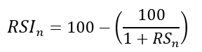
To obtain the RSI, use the normalization formula shown below for each time step.
The 13-period RSI and black GBPUSD hourly values are shown above. RSI bounces near 25 and pauses around 75. Python requires a four-column OHLC array for RSI coding.
import numpy as np
def add_column(data, times):

    for i in range(1, times + 1):

        new = np.zeros((len(data), 1), dtype = float)

        data = np.append(data, new, axis = 1)
    return data
def delete_column(data, index, times):

    for i in range(1, times + 1):

        data = np.delete(data, index, axis = 1)
    return data
def delete_row(data, number):

    data = data[number:, ]

    return data
def ma(data, lookback, close, position):

    data = add_column(data, 1)

    for i in range(len(data)):

            try:

                data[i, position] = (data[i - lookback + 1:i + 1, close].mean())

            except IndexError:

                pass

    data = delete_row(data, lookback)

    return data
def smoothed_ma(data, alpha, lookback, close, position):

    lookback = (2 * lookback) - 1

    alpha = alpha / (lookback + 1.0)

    beta  = 1 - alpha

    data = ma(data, lookback, close, position)
    data[lookback + 1, position] = (data[lookback + 1, close] * alpha) + (data[lookback, position] * beta)
    for i in range(lookback + 2, len(data)):

            try:

                data[i, position] = (data[i, close] * alpha) + (data[i - 1, position] * beta)

            except IndexError:

                pass

    return data
def rsi(data, lookback, close, position):

    data = add_column(data, 5)

    for i in range(len(data)):

        data[i, position] = data[i, close] - data[i - 1, close]

    for i in range(len(data)):

        if data[i, position] > 0:

            data[i, position + 1] = data[i, position]

        elif data[i, position] < 0:

            data[i, position + 2] = abs(data[i, position])

    data = smoothed_ma(data, 2, lookback, position + 1, position + 3)
    data = smoothed_ma(data, 2, lookback, position + 2, position + 4)
    data[:, position + 5] = data[:, position + 3] / data[:, position + 4]

    data[:, position + 6] = (100 - (100 / (1 + data[:, position + 5])))
    data = delete_column(data, position, 6)
    data = delete_row(data, lookback)
    return data
Make sure to focus on the concepts and not the code. You can find the codes of most of my strategies in my books. The most important thing is to comprehend the techniques and strategies.
My weekly market sentiment report uses complex and simple models to understand the current positioning and predict the future direction of several major markets. Check out the report here:
Using the Heatmap to Find the Trend
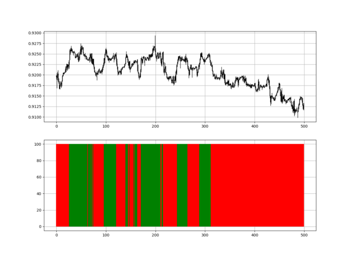
RSI trend detection is easy but useless. Bullish and bearish regimes are in effect when the RSI is above or below 50, respectively. Tracing a vertical colored line creates the conditions below. How:
When the RSI is higher than 50, a green vertical line is drawn.
When the RSI is lower than 50, a red vertical line is drawn.
Zooming out yields a basic heatmap, as shown below.
Plot code:
def indicator_plot(data, second_panel, window = 250):
    fig, ax = plt.subplots(2, figsize = (10, 5))
    sample = data[-window:, ]
    for i in range(len(sample)):
        ax[0].vlines(x = i, ymin = sample[i, 2], ymax = sample[i, 1], color = 'black', linewidth = 1)
        if sample[i, 3] > sample[i, 0]:
            ax[0].vlines(x = i, ymin = sample[i, 0], ymax = sample[i, 3], color = 'black', linewidth = 1.5)
        if sample[i, 3] < sample[i, 0]:
            ax[0].vlines(x = i, ymin = sample[i, 3], ymax = sample[i, 0], color = 'black', linewidth = 1.5)
        if sample[i, 3] == sample[i, 0]:
            ax[0].vlines(x = i, ymin = sample[i, 3], ymax = sample[i, 0], color = 'black', linewidth = 1.5)
    ax[0].grid()
    for i in range(len(sample)):
        if sample[i, second_panel] > 50:
            ax[1].vlines(x = i, ymin = 0, ymax = 100, color = 'green', linewidth = 1.5)
        if sample[i, second_panel] < 50:
            ax[1].vlines(x = i, ymin = 0, ymax = 100, color = 'red', linewidth = 1.5)
    ax[1].grid()
indicator_plot(my_data, 4, window = 500)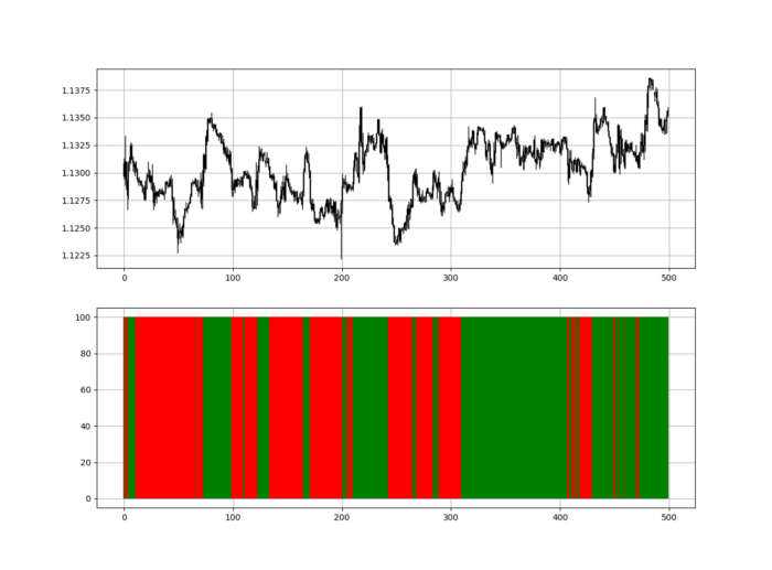
Call RSI on your OHLC array's fifth column. 4. Adjusting lookback parameters reduces lag and false signals. Other indicators and conditions are possible.
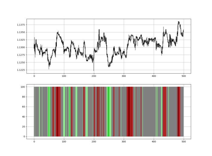
Another suggestion is to develop an RSI Heatmap for Extreme Conditions.
Contrarian indicator RSI. The following rules apply:
Whenever the RSI is approaching the upper values, the color approaches red.
The color tends toward green whenever the RSI is getting close to the lower values.
Zooming out yields a basic heatmap, as shown below.
Plot code:
import matplotlib.pyplot as plt
def indicator_plot(data, second_panel, window = 250):
    fig, ax = plt.subplots(2, figsize = (10, 5))
    sample = data[-window:, ]
    for i in range(len(sample)):
        ax[0].vlines(x = i, ymin = sample[i, 2], ymax = sample[i, 1], color = 'black', linewidth = 1)
        if sample[i, 3] > sample[i, 0]:
            ax[0].vlines(x = i, ymin = sample[i, 0], ymax = sample[i, 3], color = 'black', linewidth = 1.5)
        if sample[i, 3] < sample[i, 0]:
            ax[0].vlines(x = i, ymin = sample[i, 3], ymax = sample[i, 0], color = 'black', linewidth = 1.5)
        if sample[i, 3] == sample[i, 0]:
            ax[0].vlines(x = i, ymin = sample[i, 3], ymax = sample[i, 0], color = 'black', linewidth = 1.5)
    ax[0].grid()
    for i in range(len(sample)):
        if sample[i, second_panel] > 90:
            ax[1].vlines(x = i, ymin = 0, ymax = 100, color = 'red', linewidth = 1.5)
        if sample[i, second_panel] > 80 and sample[i, second_panel] < 90:
            ax[1].vlines(x = i, ymin = 0, ymax = 100, color = 'darkred', linewidth = 1.5)
        if sample[i, second_panel] > 70 and sample[i, second_panel] < 80:
            ax[1].vlines(x = i, ymin = 0, ymax = 100, color = 'maroon', linewidth = 1.5)
        if sample[i, second_panel] > 60 and sample[i, second_panel] < 70:
            ax[1].vlines(x = i, ymin = 0, ymax = 100, color = 'firebrick', linewidth = 1.5)
        if sample[i, second_panel] > 50 and sample[i, second_panel] < 60:
            ax[1].vlines(x = i, ymin = 0, ymax = 100, color = 'grey', linewidth = 1.5)
        if sample[i, second_panel] > 40 and sample[i, second_panel] < 50:
            ax[1].vlines(x = i, ymin = 0, ymax = 100, color = 'grey', linewidth = 1.5)
        if sample[i, second_panel] > 30 and sample[i, second_panel] < 40:
            ax[1].vlines(x = i, ymin = 0, ymax = 100, color = 'lightgreen', linewidth = 1.5)
        if sample[i, second_panel] > 20 and sample[i, second_panel] < 30:
            ax[1].vlines(x = i, ymin = 0, ymax = 100, color = 'limegreen', linewidth = 1.5)
        if sample[i, second_panel] > 10 and sample[i, second_panel] < 20:
            ax[1].vlines(x = i, ymin = 0, ymax = 100, color = 'seagreen', linewidth = 1.5)
        if sample[i, second_panel] > 0 and sample[i, second_panel] < 10:
            ax[1].vlines(x = i, ymin = 0, ymax = 100, color = 'green', linewidth = 1.5)
    ax[1].grid()
indicator_plot(my_data, 4, window = 500)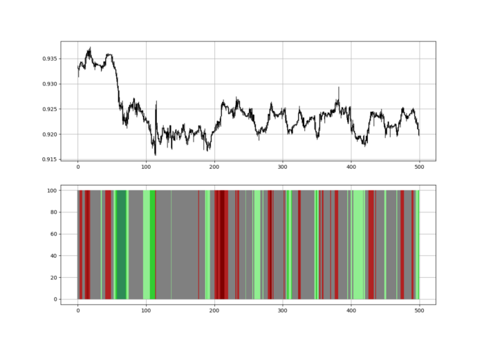
Dark green and red areas indicate imminent bullish and bearish reactions, respectively. RSI around 50 is grey.
Summary
To conclude, my goal is to contribute to objective technical analysis, which promotes more transparent methods and strategies that must be back-tested before implementation.
Technical analysis will lose its reputation as subjective and unscientific.
When you find a trading strategy or technique, follow these steps:
Put emotions aside and adopt a critical mindset.
Test it in the past under conditions and simulations taken from real life.
Try optimizing it and performing a forward test if you find any potential.
Transaction costs and any slippage simulation should always be included in your tests.
Risk management and position sizing should always be considered in your tests.
After checking the above, monitor the strategy because market dynamics may change and make it unprofitable.
You might also like

Pat Vieljeux
3 years ago
Your entrepreneurial experience can either be a beautiful adventure or a living hell with just one decision.
Choose.
DNA makes us distinct.
We act alike. Most people follow the same road, ignoring differences. We remain quiet about our uniqueness for fear of exclusion (family, social background, religion). We live a more or less imposed life.
Off the beaten path, we stand out from the others. We obey without realizing we're sewing a shroud. We're told to do as everyone else and spend 40 years dreaming of a golden retirement and regretting not living.
“One of the greatest regrets in life is being what others would want you to be, rather than being yourself.” - Shannon L. Alder
Others dare. Again, few are creative; most follow the example of those who establish a business for the sake of entrepreneurship. To live.
They pick a potential market and model their MVP on an existing solution. Most mimic others, alter a few things, appear to be original, and end up with bland products, adding to an already crowded market.
SaaS, PaaS, etc. followed suit. It's reduced pricing, profitability, and product lifespan.
As competitors become more aggressive, their profitability diminishes, making life horrible for them and their employees. They fail to innovate, cut costs, and close their company.
Few of them look happy and fulfilled.
How did they do it?
The answer is unsettlingly simple.
They are themselves.
They start their company, propelled at first by a passion or maybe a calling.
Then, at their own pace, they create it with the intention of resolving a dilemma.
They assess what others are doing and consider how they might improve it.
In contrast to them, they respond to it in their own way by adding a unique personal touch. Therefore, it is obvious.
Originals, like their DNA, can't be copied. Or if they are, they're poorly printed. Originals are unmatched. Artist-like. True collectors only buy Picasso paintings by the master, not forgeries, no matter how good.
Imaginative people are constantly ahead. Copycats fall behind unless they innovate. They watch their competition continuously. Their solution or product isn't sexy. They hope to cash in on their copied product by flooding the market.
They're mostly pirates. They're short-sighted, unlike creators.
Creators see further ahead and have no rivals. They use copiers to confirm a necessity. To maintain their individuality, creators avoid copying others. They find copying boring. It's boring. They oppose plagiarism.
It's thrilling and inspiring.
It will also make them more able to withstand their opponents' tension. Not to mention roadblocks. For creators, impediments are games.
Others fear it. They race against the clock and fear threats that could interrupt their momentum since they lack inventiveness and their product has a short life cycle.
Creators have time on their side. They're dedicated. Clearly. Passionate booksellers will have their own bookstore. Their passion shows in their book choices. Only the ones they love.
The copier wants to display as many as possible, including mediocre authors, and will cut costs. All this to dominate the market. They're digging their own grave.
The bookseller is just one example. I could give you tons of them.
Closing remarks
Entrepreneurs might follow others or be themselves. They risk exhaustion trying to predict what their followers will do.
It's true.
Life offers choices.
Being oneself or doing as others do, with the possibility of regretting not expressing our uniqueness and not having lived.
“Be yourself; everyone else is already taken”. Oscar Wilde
The choice is yours.

Hudson Rennie
3 years ago
My Work at a $1.2 Billion Startup That Failed
Sometimes doing everything correctly isn't enough.

In 2020, I could fix my life.
After failing to start a business, I owed $40,000 and had no work.
A $1.2 billion startup on the cusp of going public pulled me up.
Ironically, it was getting ready for an epic fall — with the world watching.
Life sometimes helps. Without a base, even the strongest fall. A corporation that did everything right failed 3 months after going public.
First-row view.
Apple is the creator of Adore.
Out of respect, I've altered the company and employees' names in this account, despite their failure.
Although being a publicly traded company, it may become obvious.
We’ll call it “Adore” — a revolutionary concept in retail shopping.
Two Apple execs established Adore in 2014 with a focus on people-first purchasing.
Jon and Tim:
The concept for the stylish Apple retail locations you see today was developed by retail expert Jon Swanson, who collaborated closely with Steve Jobs.
Tim Cruiter is a graphic designer who produced the recognizable bouncing lamp video that appears at the start of every Pixar film.
The dynamic duo realized their vision.
“What if you could combine the convenience of online shopping with the confidence of the conventional brick-and-mortar store experience.”
Adore's mobile store concept combined traditional retail with online shopping.
Adore brought joy to 70+ cities and 4 countries over 7 years, including the US, Canada, and the UK.
Being employed on the ground floor, with world dominance and IPO on the horizon, was exciting.
I started as an Adore Expert.
I delivered cell phones, helped consumers set them up, and sold add-ons.
As the company grew, I became a Virtual Learning Facilitator and trained new employees across North America using Zoom.
In this capacity, I gained corporate insider knowledge. I worked with the creative team and Jon and Tim.
It's where I saw company foundation fissures. Despite appearances, investors were concerned.
The business strategy was ground-breaking.
Even after seeing my employee stocks fall from a home down payment to $0 (when Adore filed for bankruptcy), it's hard to pinpoint what went wrong.
Solid business model, well-executed.
Jon and Tim's chase for public funding ended in glory.
Here’s the business model in a nutshell:
Buying cell phones is cumbersome. You have two choices:
Online purchase: not knowing what plan you require or how to operate your device.
Enter a store, which can be troublesome and stressful.
Apple, AT&T, and Rogers offered Adore as a free delivery add-on. Customers could:
Have their phone delivered by UPS or Canada Post in 1-2 weeks.
Alternately, arrange for a person to visit them the same day (or sometimes even the same hour) to assist them set up their phone and demonstrate how to use it (transferring contacts, switching the SIM card, etc.).
Each Adore Expert brought a van with extra devices and accessories to customers.
Happy customers.
Here’s how Adore and its partners made money:
Adores partners appreciated sending Experts to consumers' homes since they improved customer satisfaction, average sale, and gadget returns.
**Telecom enterprises have low customer satisfaction. The average NPS is 30/100. Adore's global NPS was 80.
Adore made money by:
a set cost for each delivery
commission on sold warranties and extras
Consumer product applications seemed infinite.
A proprietary scheduling system (“The Adore App”), allowed for same-day, even same-hour deliveries.
It differentiates Adore.
They treated staff generously by:
Options on stock
health advantages
sales enticements
high rates per hour
Four-day workweeks were set by experts.
Being hired early felt like joining Uber, Netflix, or Tesla. We hoped the company's stocks would rise.
Exciting times.
I smiled as I greeted more than 1,000 new staff.
I spent a decade in retail before joining Adore. I needed a change.
After a leap of faith, I needed a lifeline. So, I applied for retail sales jobs in the spring of 2019.
The universe typically offers you what you want after you accept what you need. I needed a job to settle my debt and reach $0 again.
And the universe listened.
After being hired as an Adore Expert, I became a Virtual Learning Facilitator. Enough said.
After weeks of economic damage from the pandemic.
This employment let me work from home during the pandemic. It taught me excellent business skills.
I was active in brainstorming, onboarding new personnel, and expanding communication as we grew.
This job gave me vital skills and a regular paycheck during the pandemic.
It wasn’t until January of 2022 that I left on my own accord to try to work for myself again — this time, it’s going much better.
Adore was perfect. We valued:
Connection
Discovery
Empathy
Everything we did centered on compassion, and we held frequent Justice Calls to discuss diversity and work culture.
The last day of onboarding typically ended in tears as employees felt like they'd found a home, as I had.
Like all nice things, the wonderful vibes ended.
First indication of distress
My first day at the workplace was great.
Fun, intuitive, and they wanted creative individuals, not salesman.
While sales were important, the company's vision was more important.
“To deliver joy through life-changing mobile retail experiences.”
Thorough, forward-thinking training. We had a module on intuition. It gave us role ownership.
We were flown cross-country for training, gave feedback, and felt like we made a difference. Multiple contacts responded immediately and enthusiastically.
The atmosphere was genuine.
Making money was secondary, though. Incredible service was a priority.
Jon and Tim answered new hires' questions during Zoom calls during onboarding. CEOs seldom meet new hires this way, but they seemed to enjoy it.
All appeared well.
But in late 2021, things started changing.
Adore's leadership changed after its IPO. From basic values to sales maximization. We lost communication and were forced to fend for ourselves.
Removed the training wheels.
It got tougher to gain instructions from those above me, and new employees told me their roles weren't as advertised.
External money-focused managers were hired.
Instead of creative types, we hired salespeople.
With a new focus on numbers, Adore's uniqueness began to crumble.
Via Zoom, hundreds of workers were let go.
So.
Early in 2022, mass Zoom firings were trending. A CEO firing 900 workers over Zoom went viral.
Adore was special to me, but it became a headline.
30 June 2022, Vice Motherboard published Watch as Adore's CEO Fires Hundreds.
It described a leaked video of Jon Swanson laying off all staff in Canada and the UK.
They called it a “notice of redundancy”.
The corporation couldn't pay its employees.
I loved Adore's underlying ideals, among other things. We called clients Adorers and sold solutions, not add-ons.
But, like anything, a company is only as strong as its weakest link. And obviously, the people-first focus wasn’t making enough money.
There were signs. The expansion was presumably a race against time and money.
Adore finally declared bankruptcy.
Adore declared bankruptcy 3 months after going public. It happened in waves, like any large-scale fall.
Initial key players to leave were
Then, communication deteriorated.
Lastly, the corporate culture disintegrated.
6 months after leaving Adore, I received a letter in the mail from a Law firm — it was about my stocks.
Adore filed Chapter 11. I had to sue to collect my worthless investments.
I hoped those stocks will be valuable someday. Nope. Nope.
Sad, I sighed.
$1.2 billion firm gone.
I left the workplace 3 months before starting a writing business. Despite being mediocre, I'm doing fine.
I got up as Adore fell.
Finally, can we scale kindness?
I trust my gut. Changes at Adore made me leave before it sank.
Adores' unceremonious slide from a top startup to bankruptcy is astonishing to me.
The company did everything perfectly, in my opinion.
first to market,
provided excellent service
paid their staff handsomely.
was responsible and attentive to criticism
The company wasn't led by an egotistical eccentric. The crew had centuries of cumulative space experience.
I'm optimistic about the future of work culture, but is compassion scalable?

Sammy Abdullah
24 years ago
How to properly price SaaS
Price Intelligently put out amazing content on pricing your SaaS product. This blog's link to the whole report is worth reading. Our key takeaways are below.

Don't base prices on the competition. Competitor-based pricing has clear drawbacks. Their pricing approach is yours. Your company offers customers something unique. Otherwise, you wouldn't create it. This strategy is static, therefore you can't add value by raising prices without outpricing competitors. Look, but don't touch is the competitor-based moral. You want to know your competitors' prices so you're in the same ballpark, but they shouldn't guide your selections. Competitor-based pricing also drives down prices.
Value-based pricing wins. This is customer-based pricing. Value-based pricing looks outward, not inward or laterally at competitors. Your clients are the best source of pricing information. By valuing customer comments, you're focusing on buyers. They'll decide if your pricing and packaging are right. In addition to asking consumers about cost savings or revenue increases, look at data like number of users, usage per user, etc.
Value-based pricing increases prices. As you learn more about the client and your worth, you'll know when and how much to boost rates. Every 6 months, examine pricing.
Cloning top customers. You clone your consumers by learning as much as you can about them and then reaching out to comparable people or organizations. You can't accomplish this without knowing your customers. Segmenting and reproducing them requires as much detail as feasible. Offer pricing plans and feature packages for 4 personas. The top plan should state Contact Us. Your highest-value customers want more advice and support.
Question your 4 personas. What's the one item you can't live without? Which integrations matter most? Do you do analytics? Is support important or does your company self-solve? What's too cheap? What's too expensive?
Not everyone likes per-user pricing. SaaS organizations often default to per-user analytics. About 80% of companies utilizing per-user pricing should use an alternative value metric because their goods don't give more value with more users, so charging for them doesn't make sense.
At least 3:1 LTV/CAC. Break even on the customer within 2 years, and LTV to CAC is greater than 3:1. Because customer acquisition costs are paid upfront but SaaS revenues accrue over time, SaaS companies face an early financial shortfall while paying back the CAC.
ROI should be >20:1. Indeed. Ensure the customer's ROI is 20x the product's cost. Microsoft Office costs $80 a year, but consumers would pay much more to maintain it.
A/B Testing. A/B testing is guessing. When your pricing page varies based on assumptions, you'll upset customers. You don't have enough customers anyway. A/B testing optimizes landing pages, design decisions, and other site features when you know the problem but not pricing.
Don't discount. It cheapens the product, makes it permanent, and increases churn. By discounting, you're ruining your pricing analysis.