


More on Economics & Investing

Arthur Hayes
3 years ago
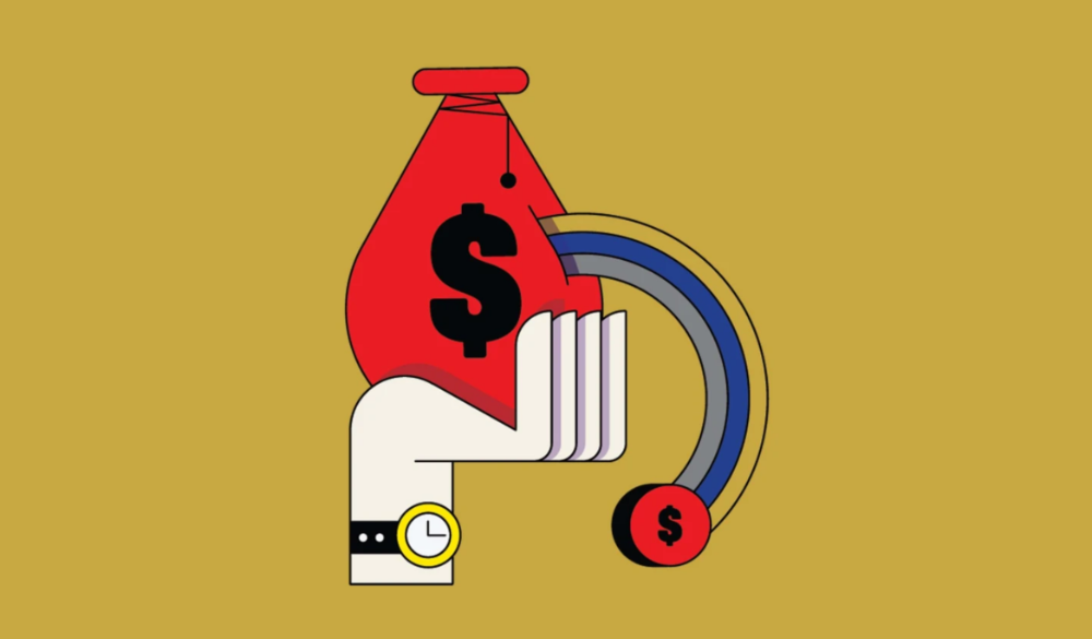
Contagion
(The author's opinions should not be used to make investment decisions or as a recommendation to invest.)

The pandemic and social media pseudoscience have made us all epidemiologists, for better or worse. Flattening the curve, social distancing, lockdowns—remember? Some of you may remember R0 (R naught), the number of healthy humans the average COVID-infected person infects. Thankfully, the world has moved on from Greater China's nightmare. Politicians have refocused their talent for misdirection on getting their constituents invested in the war for Russian Reunification or Russian Aggression, depending on your side of the iron curtain.
Humanity battles two fronts. A war against an invisible virus (I know your Commander in Chief might have told you COVID is over, but viruses don't follow election cycles and their economic impacts linger long after the last rapid-test clinic has closed); and an undeclared World War between US/NATO and Eurasia/Russia/China. The fiscal and monetary authorities' current policies aim to mitigate these two conflicts' economic effects.
Since all politicians are short-sighted, they usually print money to solve most problems. Printing money is the easiest and fastest way to solve most problems because it can be done immediately without much discussion. The alternative—long-term restructuring of our global economy—would hurt stakeholders and require an honest discussion about our civilization's state. Both of those requirements are non-starters for our short-sighted political friends, so whether your government practices capitalism, communism, socialism, or fascism, they all turn to printing money-ism to solve all problems.
Free money stimulates demand, so people buy crap. Overbuying shit raises prices. Inflation. Every nation has food, energy, or goods inflation. The once-docile plebes demand action when the latter two subsets of inflation rise rapidly. They will be heard at the polls or in the streets. What would you do to feed your crying hungry child?
Global central banks During the pandemic, the Fed, PBOC, BOJ, ECB, and BOE printed money to aid their governments. They worried about inflation and promised to remove fiat liquidity and tighten monetary conditions.
Imagine Nate Diaz's round-house kick to the face. The financial markets probably felt that way when the US and a few others withdrew fiat wampum. Sovereign debt markets suffered a near-record bond market rout.
The undeclared WW3 is intensifying, with recent gas pipeline attacks. The global economy is already struggling, and credit withdrawal will worsen the situation. The next pandemic, the Yield Curve Control (YCC) virus, is spreading as major central banks backtrack on inflation promises. All central banks eventually fail.
Here's a scorecard.
In order to save its financial system, BOE recently reverted to Quantitative Easing (QE).
BOJ Continuing YCC to save their banking system and enable affordable government borrowing.
ECB printing money to buy weak EU member bonds, but will soon start Quantitative Tightening (QT).
PBOC Restarting the money printer to give banks liquidity to support the falling residential property market.
Fed raising rates and QT-shrinking balance sheet.
80% of the world's biggest central banks are printing money again. Only the Fed has remained steadfast in the face of a financial market bloodbath, determined to end the inflation for which it is at least partially responsible—the culmination of decades of bad economic policies and a world war.
YCC printing is the worst for fiat currency and society. Because it necessitates central banks fixing a multi-trillion-dollar bond market. YCC central banks promise to infinitely expand their balance sheets to keep a certain interest rate metric below an unnatural ceiling. The market always wins, crushing humanity with inflation.
BOJ's YCC policy is longest-standing. The BOE joined them, and my essay this week argues that the ECB will follow. The ECB joining YCC would make 60% of major central banks follow this terrible policy. Since the PBOC is part of the Chinese financial system, the number could be 80%. The Chinese will lend any amount to meet their economic activity goals.
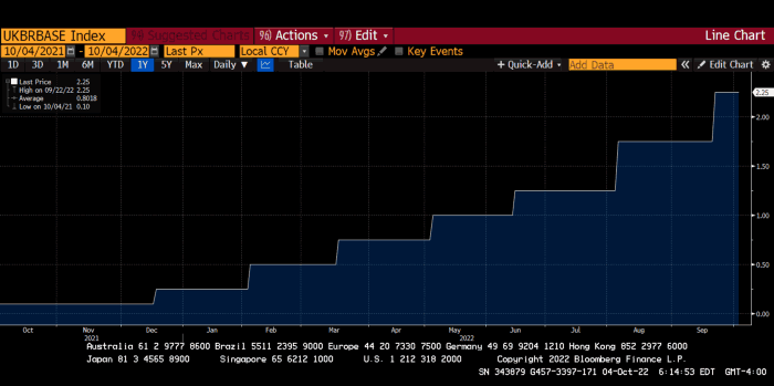
The BOE committed to a 13-week, GBP 65bn bond price-fixing operation. However, BOEs YCC may return. If you lose to the market, you're stuck. Since the BOE has announced that it will buy your Gilt at inflated prices, why would you not sell them all? Market participants taking advantage of this policy will only push the bank further into the hole it dug itself, so I expect the BOE to re-up this program and count them as YCC.
In a few trading days, the BOE went from a bank determined to slay inflation by raising interest rates and QT to buying an unlimited amount of UK Gilts. I expect the ECB to be dragged kicking and screaming into a similar policy. Spoiler alert: big daddy Fed will eventually die from the YCC virus.
Threadneedle St, London EC2R 8AH, UK
Before we discuss the BOE's recent missteps, a chatroom member called the British royal family the Kardashians with Crowns, which made me laugh. I'm sad about royal attention. If the public was as interested in energy and economic policies as they are in how the late Queen treated Meghan, Duchess of Sussex, UK politicians might not have been able to get away with energy and economic fairy tales.
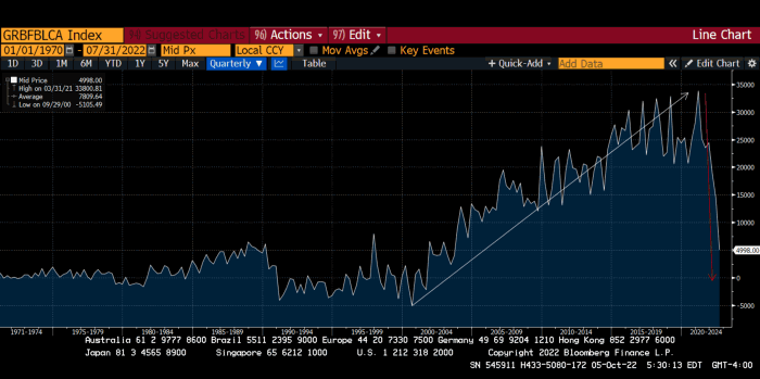
The BOE printed money to recover from COVID, as all good central banks do. For historical context, this chart shows the BOE's total assets as a percentage of GDP since its founding in the 18th century.
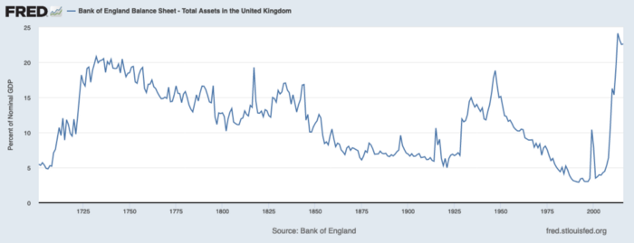
The UK has had a rough three centuries. Pandemics, empire wars, civil wars, world wars. Even so, the BOE's recent money printing was its most aggressive ever!
BOE Total Assets as % of GDP (white) vs. UK CPI
Now, inflation responded slowly to the bank's most aggressive monetary loosening. King Charles wishes the gold line above showed his popularity, but it shows his subjects' suffering.
The BOE recognized early that its money printing caused runaway inflation. In its August 2022 report, the bank predicted that inflation would reach 13% by year end before aggressively tapering in 2023 and 2024.
Aug 2022 BOE Monetary Policy Report
The BOE was the first major central bank to reduce its balance sheet and raise its policy rate to help.
The BOE first raised rates in December 2021. Back then, JayPow wasn't even considering raising rates.
UK policymakers, like most developed nations, believe in energy fairy tales. Namely, that the developed world, which grew in lockstep with hydrocarbon use, could switch to wind and solar by 2050. The UK's energy import bill has grown while coal, North Sea oil, and possibly stranded shale oil have been ignored.
WW3 is an economic war that is balkanizing energy markets, which will continue to inflate. A nation that imports energy and has printed the most money in its history cannot avoid inflation.
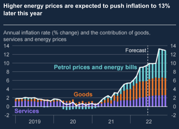
The chart above shows that energy inflation is a major cause of plebe pain.
The UK is hit by a double whammy: the BOE must remove credit to reduce demand, and energy prices must rise due to WW3 inflation. That's not economic growth.
Boris Johnson was knocked out by his country's poor economic performance, not his lockdown at 10 Downing St. Prime Minister Truss and her merry band of fools arrived with the tried-and-true government remedy: goodies for everyone.
She released a budget full of economic stimulants. She cut corporate and individual taxes for the rich. She plans to give poor people vouchers for higher energy bills. Woohoo! Margret Thatcher's new pants suit.
My buddy Jim Bianco said Truss budget's problem is that it works. It will boost activity at a time when inflation is over 10%. Truss' budget didn't include austerity measures like tax increases or spending cuts, which the bond market wanted. The bond market protested.
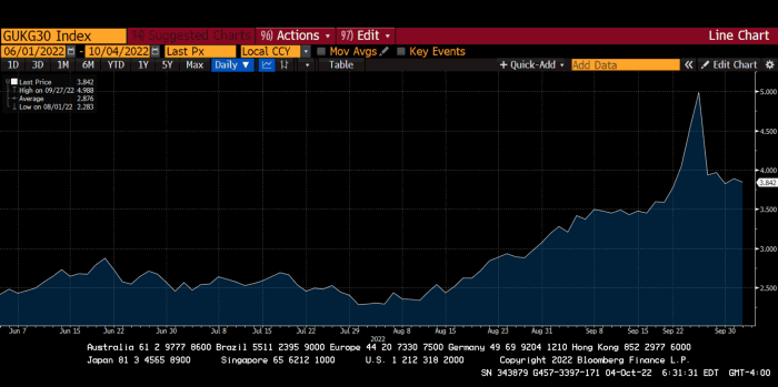
30-year Gilt yield chart. Yields spiked the most ever after Truss announced her budget, as shown. The Gilt market is the longest-running bond market in the world.
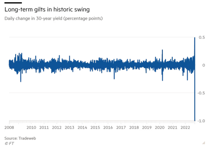
The Gilt market showed the pole who's boss with Cardi B.
Before this, the BOE was super-committed to fighting inflation. To their credit, they raised short-term rates and shrank their balance sheet. However, rapid yield rises threatened to destroy the entire highly leveraged UK financial system overnight, forcing them to change course.
Accounting gimmicks allowed by regulators for pension funds posed a systemic threat to the UK banking system. UK pension funds could use interest rate market levered derivatives to match liabilities. When rates rise, short rate derivatives require more margin. The pension funds spent all their money trying to pick stonks and whatever else their sell side banker could stuff them with, so the historic rate spike would have bankrupted them overnight. The FT describes BOE-supervised chicanery well.
To avoid a financial apocalypse, the BOE in one morning abandoned all their hard work and started buying unlimited long-dated Gilts to drive prices down.
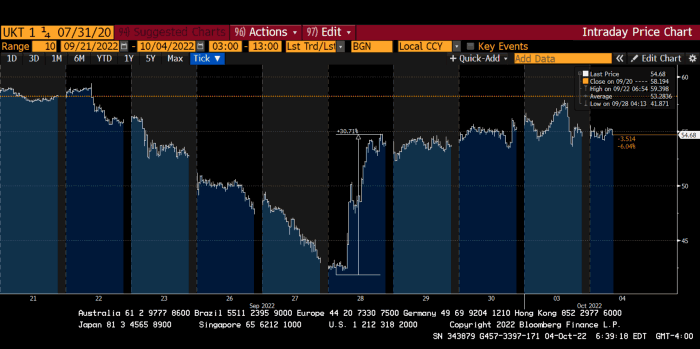
Another reminder to never fight a central bank. The 30-year Gilt is shown above. After the BOE restarted the money printer on September 28, this bond rose 30%. Thirty-fucking-percent! Developed market sovereign bonds rarely move daily. You're invested in His Majesty's government obligations, not a Chinese property developer's offshore USD bond.
The political need to give people goodies to help them fight the terrible economy ran into a financial reality. The central bank protected the UK financial system from asset-price deflation because, like all modern economies, it is debt-based and highly levered. As bad as it is, inflation is not their top priority. The BOE example demonstrated that. To save the financial system, they abandoned almost a year of prudent monetary policy in a few hours. They also started the endgame.
Let's play Central Bankers Say the Darndest Things before we go to the continent (and sorry if you live on a continent other than Europe, but you're not culturally relevant).
Pre-meltdown BOE output:
FT, October 17, 2021 On Sunday, the Bank of England governor warned that it must act to curb inflationary pressure, ignoring financial market moves that have priced in the first interest rate increase before the end of the year.
On July 19, 2022, Gov. Andrew Bailey spoke. Our 2% inflation target is unwavering. We'll do our job.
August 4th 2022 MPC monetary policy announcement According to its mandate, the MPC will sustainably return inflation to 2% in the medium term.
Catherine Mann, MPC member, September 5, 2022 speech. Fast and forceful monetary tightening, possibly followed by a hold or reversal, is better than gradualism because it promotes inflation expectations' role in bringing inflation back to 2% over the medium term.
When their financial system nearly collapsed in one trading session, they said:
The Bank of England's Financial Policy Committee warned on 28 September that gilt market dysfunction threatened UK financial stability. It advised action and supported the Bank's urgent gilt market purchases for financial stability.
It works when the price goes up but not down. Is my crypto portfolio dysfunctional enough to get a BOE bailout?
Next, the EU and ECB. The ECB is also fighting inflation, but it will also succumb to the YCC virus for the same reasons as the BOE.
Frankfurt am Main, ECB Tower, Sonnemannstraße 20, 60314
Only France and Germany matter economically in the EU. Modern European history has focused on keeping Germany and Russia apart. German manufacturing and cheap Russian goods could change geopolitics.
France created the EU to keep Germany down, and the Germans only cooperated because of WWII guilt. France's interests are shared by the US, which lurks in the shadows to prevent a Germany-Russia alliance. A weak EU benefits US politics. Avoid unification of Eurasia. (I paraphrased daddy Felix because I thought quoting a large part of his most recent missive would get me spanked.)
As with everything, understanding Germany's energy policy is the best way to understand why the German economy is fundamentally fucked and why that spells doom for the EU. Germany, the EU's main economic engine, is being crippled by high energy prices, threatening a depression. This economic downturn threatens the union. The ECB may have to abandon plans to shrink its balance sheet and switch to YCC to save the EU's unholy political union.
France did the smart thing and went all in on nuclear energy, which is rare in geopolitics. 70% of electricity is nuclear-powered. Their manufacturing base can survive Russian gas cuts. Germany cannot.
My boy Zoltan made this great graphic showing how screwed Germany is as cheap Russian gas leaves the industrial economy.
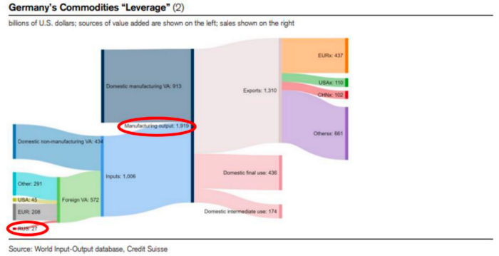
$27 billion of Russian gas powers almost $2 trillion of German economic output, a 75x energy leverage. The German public was duped into believing the same energy fairy tales as their politicians, and they overwhelmingly allowed the Green party to dismantle any efforts to build a nuclear energy ecosystem over the past several decades. Germany, unlike France, must import expensive American and Qatari LNG via supertankers due to Nordstream I and II pipeline sabotage.
American gas exports to Europe are touted by the media. Gas is cheap because America isn't the Western world's swing producer. If gas prices rise domestically in America, the plebes would demand the end of imports to avoid paying more to heat their homes.
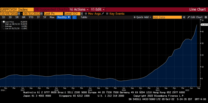
German goods would cost much more in this scenario. German producer prices rose 46% YoY in August. The German current account is rapidly approaching zero and will soon be negative.
German PPI Change YoY
German Current Account
The reason this matters is a curious construction called TARGET2. Let’s hear from the horse’s mouth what exactly this beat is:
TARGET2 is the real-time gross settlement (RTGS) system owned and operated by the Eurosystem. Central banks and commercial banks can submit payment orders in euro to TARGET2, where they are processed and settled in central bank money, i.e. money held in an account with a central bank.
Source: ECB
Let me explain this in plain English for those unfamiliar with economic dogma.
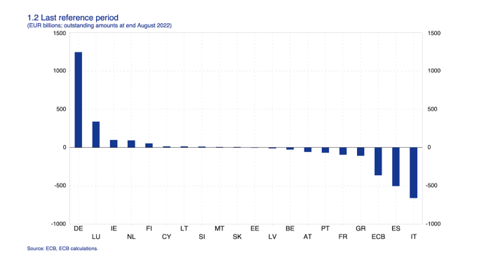
This chart shows intra-EU credits and debits. TARGET2. Germany, Europe's powerhouse, is owed money. IOU-buying Greeks buy G-wagons. The G-wagon pickup truck is badass.

If all EU countries had fiat currencies, the Deutsche Mark would be stronger than the Italian Lira, according to the chart above. If Europe had to buy goods from non-EU countries, the Euro would be much weaker. Credits and debits between smaller political units smooth out imbalances in other federal-provincial-state political systems. Financial and fiscal unions allow this. The EU is financial, so the centre cannot force the periphery to settle their imbalances.
Greece has never had to buy Fords or Kias instead of BMWs, but what if Germany had to shut down its auto manufacturing plants due to energy shortages?
Italians have done well buying ammonia from Germany rather than China, but what if BASF had to close its Ludwigshafen facility due to a lack of affordable natural gas?
I think you're seeing the issue.
Instead of Germany, EU countries would owe foreign producers like America, China, South Korea, Japan, etc. Since these countries aren't tied into an uneconomic union for politics, they'll demand hard fiat currency like USD instead of Euros, which have become toilet paper (or toilet plastic).
Keynesian economists have a simple solution for politicians who can't afford market prices. Government debt can maintain production. The debt covers the difference between what a business can afford and the international energy market price.
Germans are monetary policy conservative because of the Weimar Republic's hyperinflation. The Bundesbank is the only thing preventing ECB profligacy. Germany must print its way out without cheap energy. Like other nations, they will issue more bonds for fiscal transfers.
More Bunds mean lower prices. Without German monetary discipline, the Euro would have become a trash currency like any other emerging market that imports energy and food and has uncompetitive labor.
Bunds price all EU country bonds. The ECB's money printing is designed to keep the spread of weak EU member bonds vs. Bunds low. Everyone falls with Bunds.
Like the UK, German politicians seeking re-election will likely cause a Bunds selloff. Bond investors will understandably reject their promises of goodies for industry and individuals to offset the lack of cheap Russian gas. Long-dated Bunds will be smoked like UK Gilts. The ECB will face a wave of ultra-levered financial players who will go bankrupt if they mark to market their fixed income derivatives books at higher Bund yields.
Some treats People: Germany will spend 200B to help consumers and businesses cope with energy prices, including promoting renewable energy.
That, ladies and germs, is why the ECB will immediately abandon QT, move to a stop-gap QE program to normalize the Bund and every other EU bond market, and eventually graduate to YCC as the market vomits bonds of all stripes into Christine Lagarde's loving hands. She probably has soft hands.
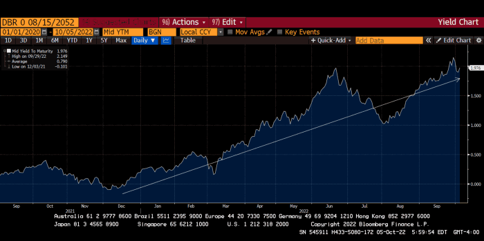
The 30-year Bund market has noticed Germany's economic collapse. 2021 yields skyrocketed.
30-year Bund Yield
ECB Says the Darndest Things:
Because inflation is too high and likely to stay above our target for a long time, we took today's decision and expect to raise interest rates further.- Christine Lagarde, ECB Press Conference, Sept 8.
The Governing Council will adjust all of its instruments to stabilize inflation at 2% over the medium term. July 21 ECB Monetary Decision
Everyone struggles with high inflation. The Governing Council will ensure medium-term inflation returns to two percent. June 9th ECB Press Conference
I'm excited to read the after. Like the BOE, the ECB may abandon their plans to shrink their balance sheet and resume QE due to debt market dysfunction.
Eighty Percent
I like YCC like dark chocolate over 80%. ;).
Can 80% of the world's major central banks' QE and/or YCC overcome Sir Powell's toughness on fungible risky asset prices?
Gold and crypto are fungible global risky assets. Satoshis and gold bars are the same in New York, London, Frankfurt, Tokyo, and Shanghai.
As more Euros, Yen, Renminbi, and Pounds are printed, people will move their savings into Dollars or other stores of value. As the Fed raises rates and reduces its balance sheet, the USD will strengthen. Gold/EUR and BTC/JPY may also attract buyers.
Gold and crypto markets are much smaller than the trillions in fiat money that will be printed, so they will appreciate in non-USD currencies. These flows only matter in one instance because we trade the global or USD price. Arbitrage occurs when BTC/EUR rises faster than EUR/USD. Here is how it works:
An investor based in the USD notices that BTC is expensive in EUR terms.
Instead of buying BTC, this investor borrows USD and then sells it.
After that, they sell BTC and buy EUR.
Then they choose to sell EUR and buy USD.
The investor receives their profit after repaying the USD loan.
This triangular FX arbitrage will align the global/USD BTC price with the elevated EUR, JPY, CNY, and GBP prices.
Even if the Fed continues QT, which I doubt they can do past early 2023, small stores of value like gold and Bitcoin may rise as non-Fed central banks get serious about printing money.
“Arthur, this is just more copium,” you might retort.
Patience. This takes time. Economic and political forcing functions take time. The BOE example shows that bond markets will reject politicians' policies to appease voters. Decades of bad energy policy have no immediate fix. Money printing is the only politically viable option. Bond yields will rise as bond markets see more stimulative budgets, and the over-leveraged fiat debt-based financial system will collapse quickly, followed by a monetary bailout.
America has enough food, fuel, and people. China, Europe, Japan, and the UK suffer. America can be autonomous. Thus, the Fed can prioritize domestic political inflation concerns over supplying the world (and most of its allies) with dollars. A steady flow of dollars allows other nations to print their currencies and buy energy in USD. If the strongest player wins, everyone else loses.
I'm making a GDP-weighted index of these five central banks' money printing. When ready, I'll share its rate of change. This will show when the 80%'s money printing exceeds the Fed's tightening.

Desiree Peralta
3 years ago
How to Use the 2023 Recession to Grow Your Wealth Exponentially
This season's three best money moves.

“Millionaires are made in recessions.” — Time Capital
We're in a serious downturn, whether or not we're in a recession.
97% of business owners are decreasing costs by more than 10%, and all markets are down 30%.
If you know what you're doing and analyze the markets correctly, this is your chance to become a millionaire.
In any recession, there are always excellent possibilities to seize. Real estate, crypto, stocks, enterprises, etc.
What you do with your money could influence your future riches.
This article analyzes the three key markets, their circumstances for 2023, and how to profit from them.
Ways to make money on the stock market.
If you're conservative like me, you should invest in an index fund. Most of these funds are down 10-30% of ATH:
In earlier recessions, most money index funds lost 20%. After this downturn, they grew and passed the ATH in subsequent months.
Now is the greatest moment to invest in index funds to grow your money in a low-risk approach and make 20%.
If you want to be risky but wise, pick companies that will get better next year but are struggling now.
Even while we can't be 100% confident of a company's future performance, we know some are strong and will have a fantastic year.
Microsoft (down 22%), JPMorgan Chase (15.6%), Amazon (45%), and Disney (33.8%).
These firms give dividends, so you can earn passively while you wait.
So I consider that a good strategy to make wealth in the current stock market is to create two portfolios: one based on index funds to earn 10% to 20% profit when the corrections end, and the other based on individual stocks of popular and strong companies to earn 20%-30% return and dividends while you wait.
How to profit from the downturn in the real estate industry.
With rising mortgage rates, it's the worst moment to buy a home if you don't want to be eaten by banks. In the U.S., interest rates are double what they were three years ago, so buying now looks foolish.
Due to these rates, property prices are falling, but that won't last long since individuals will take advantage.
According to historical data, now is the ideal moment to buy a house for the next five years and perhaps forever.
If you can buy a house, do it. You can refinance the interest at a lower rate with acceptable credit, but not the house price.
Take advantage of the housing market prices now because you won't find a decent deal when rates normalize.
How to profit from the cryptocurrency market.
This is the riskiest market to tackle right now, but it could offer the most opportunities if done appropriately.
The most powerful cryptocurrencies are down more than 60% from last year: $68,990 for BTC and $4,865 for ETH.
If you focus on those two coins, you can make 30%-60% without waiting for them to return to their ATH, and they're low enough to be a solid investment.
I don't encourage trying other altcoins because the crypto market is in crisis and you can lose everything if you're greedy.
Still, the main Cryptos are a good investment provided you store them in an external wallet and follow financial gurus' security advice.
Last thoughts
We can't anticipate a recession until it ends. We can't forecast a market or asset's lowest point, therefore waiting makes little sense.
If you want to develop your wealth, assess the money prospects on all the marketplaces and initiate long-term trades.
Many millionaires are made during recessions because they don't fear negative figures and use them to scale their money.

Sylvain Saurel
3 years ago
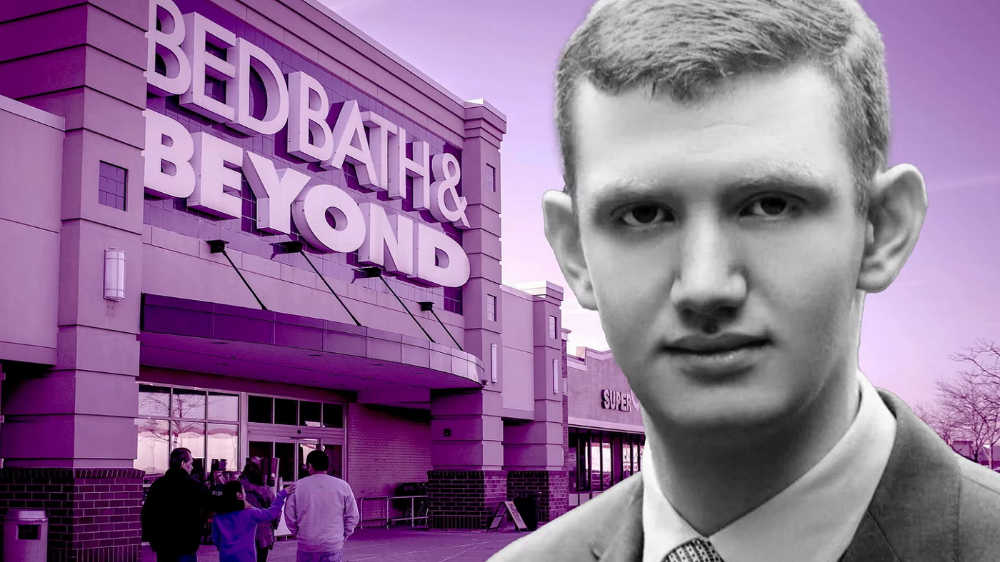
A student trader from the United States made $110 million in one month and rose to prominence on Wall Street.
Genius or lucky?
From the title, you might think I'm selling advertising for a financial influencer, a dubious trading site, or a training organization to attract clients. I'm suspicious. Better safe than sorry.
But not here.
Jake Freeman, 20, made $110 million in a month, according to the Financial Times. At 18, he ran for president. He made his name in markets, not politics. Two years later, he's Wall Street's prince. Interview requests flood the prodigy.
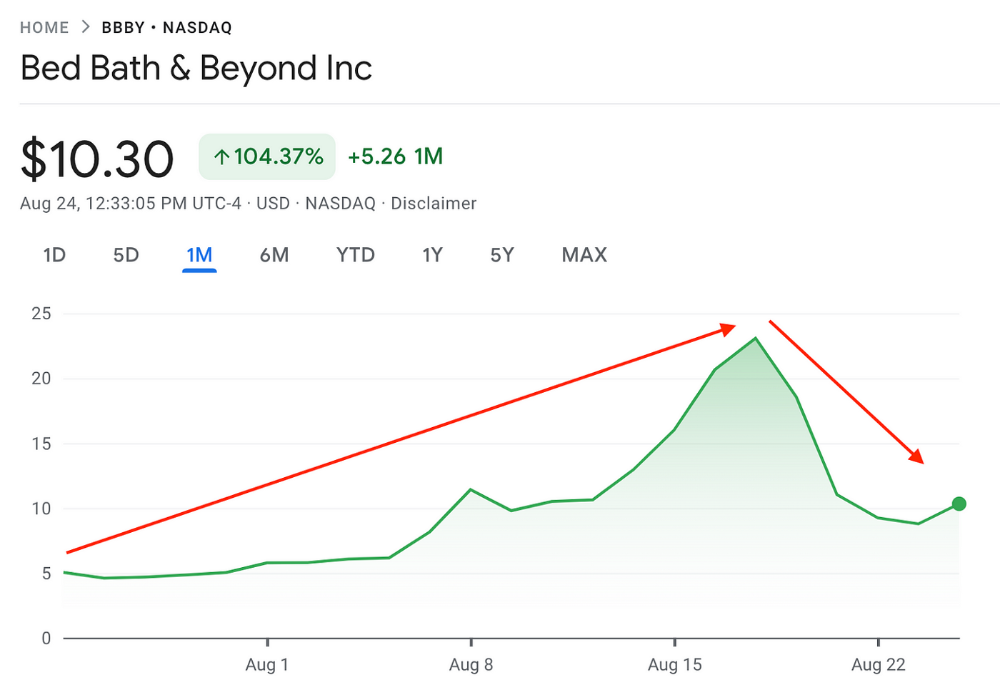
Jake Freeman bought 5 million Bed Bath & Beyond Group shares for $5.5 in July 2022 and sold them for $27 a month later. He thought the stock might double. Since speculation died down, he sold well. The stock fell 40.5% to 11 dollars on Friday, 19 August 2022. On August 22, 2022, it fell 16% to $9.
Smallholders have been buying the stock for weeks and will lose heavily if it falls further. Bed Bath & Beyond is the second most popular stock after Foot Locker, ahead of GameStop and Apple.
Jake Freeman earned $110 million thanks to a significant stock market flurry.
Online broker customers aren't the only ones with jitters. By June 2022, Ken Griffin's Citadel and Stephen Mandel's Lone Pine Capital held nearly a third of the company's capital. Did big managers sell before the stock plummeted?
Recent stock movements (derivatives) and rumors could prompt a SEC investigation.
Jake Freeman wrote to the board of directors after his investment to call for a turnaround, given the company's persistent problems and short sellers. The bathroom and kitchen products distribution group's stock soared in July 2022 due to renewed buying by private speculators, who made it one of their meme stocks with AMC and GameStop.
Second-quarter 2022 results and financial health worsened. He didn't celebrate his miraculous operation in a nightclub. He told a British newspaper, "I'm shocked." His parents dined in New York. He returned to Los Angeles to study math and economics.
Jake Freeman founded Freeman Capital Management with his savings and $25 million from family, friends, and acquaintances. They are the ones who are entitled to the $110 million he raised in one month. Will his investors pocket and withdraw all or part of their profits or will they trust the young prodigy for new stunts on Wall Street?
His operation should attract new clients. Well-known hedge funds may hire him.
Jake Freeman didn't listen to gurus or former traders. At 17, he interned at a quantitative finance and derivatives hedge fund, Volaris. At 13, he began investing with his pharmaceutical executive uncle. All countries have increased their Google searches for the young trader in the last week.
Naturally, his success has inspired resentment.
His success stirs jealousy, and he's attacked on social media. On Reddit, people who lost money on Bed Bath & Beyond, Jake Freeman's fortune, are mourning.
Several conspiracy theories circulate about him, including that he doesn't exist or is working for a Taiwanese amusement park.
If all 20 million American students had the same trading skills, they would have generated $1.46 trillion. Jake Freeman is unique. Apprentice traders' careers are often short, disillusioning, and tragic.
Two years ago, 20-year-old Robinhood client Alexander Kearns committed suicide after losing $750,000 trading options. Great traders start young. Michael Platt of BlueCrest invested in British stocks at age 12 under his grandmother's supervision and made a £30,000 fortune. Paul Tudor Jones started trading before he turned 18 with his uncle. Warren Buffett, at age 10, was discussing investments with Goldman Sachs' head. Oracle of Omaha tells all.
You might also like

Marcus Lu
3 years ago
The Brand Structure of U.S. Electric Vehicle Production
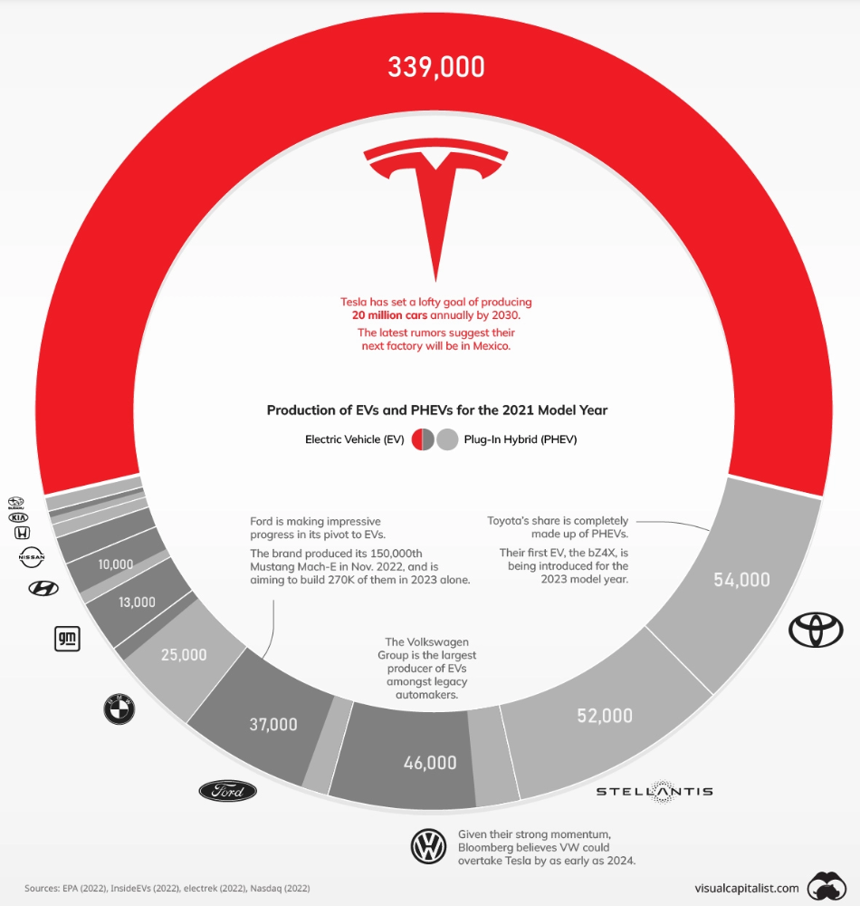
Will Tesla be able to maintain its lead in the EV market for very long?
This is one of the most pressing issues in the American auto sector today. One positive aspect of Tesla is the company's devoted customer base and recognizable name recognition (similar to Apple). It also invests more in research and development per vehicle than its rivals and has a head start in EV production.
Conversely, established automakers like Volkswagen are actively plotting their strategy to surpass Tesla. As the current market leaders, they have decades of experience in the auto industry and are spending billions to catch up.
We've visualized data from the EPA's 2022 Automotive Trends Report to bring you up to speed on this developing story.
Info for the Model Year of 2021
The full production data used in this infographic is for the 2021 model year, but it comes from a report for 2022.
Combined EV and PHEV output is shown in the table below (plug-in hybrid electric vehicle).
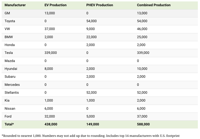
It is important to note that Toyota and Stellantis, the two largest legacy automakers in this dataset, only produced PHEVs. Toyota's first electric vehicle, the bZ4X, won't hit the market until 2023.
Stellantis seems to be falling even further behind, despite having enormous unrealized potential in its Jeep and Ram brands. Stellantis CEO Carlos Tavares said in a recent interview that the firm has budgeted $36 billion for electrification and software.
Legacy Brands with the Most Momentum
In the race to develop electric vehicles, some long-standing manufacturers have gotten the jump on their rivals.
Volkswagen, one of these storied manufacturers, has made a significant investment in electric vehicles (EVs) in the wake of the Dieselgate scandal. The company plans to roll out multiple EV models, including the ID.3 hatchback, ID.4 SUV, and ID. Buzz, with the goal of producing 22 million EVs by 2028. (an electric revival of the classic Microbus).
Even Ford is keeping up, having just announced an EV investment of $22 billion between 2021 and 2025. In November of 2022, the company manufactured their 150,000th Mustang Mach-E, and by the end of 2023, they hoped to have 270,000 of them in circulation.
Additionally, over 200,000 F-150 Lightnings have been reserved since Ford announced the truck. The Lightning is scheduled to have a production run of 15,000 in 2022, 55,000 in 2023, and 80,000 in 2024. Ford's main competitor in the electric pickup truck segment, Rivian, is on track to sell 25,000 vehicles by 2022.

Al Anany
2 years ago
Because of this covert investment that Bezos made, Amazon became what it is today.
He kept it under wraps for years until he legally couldn’t.
His shirt is incomplete. I can’t stop thinking about this…
Actually, ignore the article. Look at it. JUST LOOK at it… It’s quite disturbing, isn’t it?
Ughh…
Me: “Hey, what up?” Friend: “All good, watching lord of the rings on amazon prime video.” Me: “Oh, do you know how Amazon grew and became famous?” Friend: “Geek alert…Can I just watch in peace?” Me: “But… Bezos?” Friend: “Let it go, just let it go…”
I can question you, the reader, and start answering instantly without his consent. This far.
Reader, how did Amazon succeed? You'll say, Of course, it was an internet bookstore, then it sold everything.
Mistaken. They moved from zero to one because of this. How did they get from one to thousand? AWS-some. Understand? It's geeky and lame. If not, I'll explain my geekiness.
Over an extended period of time, Amazon was not profitable.
Business basics. You want customers if you own a bakery, right?
Well, 100 clients per day order $5 cheesecakes (because cheesecakes are awesome.)
$5 x 100 consumers x 30 days Equals $15,000 monthly revenue. You proudly work here.
Now you have to pay the barista (unless ChatGPT is doing it haha? Nope..)
The barista is requesting $5000 a month.
Each cheesecake costs the cheesecake maker $2.5 ($2.5 × 100 x 30 = $7500).
The monthly cost of running your bakery, including power, is about $5000.
Assume no extra charges. Your operating costs are $17,500.
Just $15,000? You have income but no profit. You might make money selling coffee with your cheesecake next month.
Is losing money bad? You're broke. Losing money. It's bad for financial statements.
It's almost a business ultimatum. Most startups fail. Amazon took nine years.
I'm reading Amazon Unbound: Jeff Bezos and the Creation of a Global Empire to comprehend how a company has a $1 trillion market cap.
Many things made Amazon big. The book claims that Bezos and Amazon kept a specific product secret for a long period.
Clouds above the bald head.
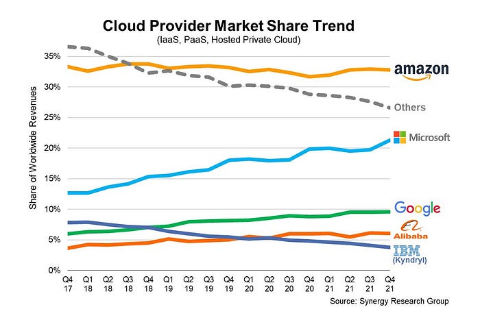
In 2006, Bezos started a cloud computing initiative. They believed many firms like Snapchat would pay for reliable servers.
In 2006, cloud computing was not what it is today. I'll simplify. 2006 had no iPhone.
Bezos invested in Amazon Web Services (AWS) without disclosing its revenue. That's permitted till a certain degree.
Google and Microsoft would realize Amazon is heavily investing in this market and worry.
Bezos anticipated high demand for this product. Microsoft built its cloud in 2010, and Google in 2008.
If you managed Google or Microsoft, you wouldn't know how much Amazon makes from their cloud computing service. It's enough. Yet, Amazon is an internet store, so they'll focus on that.
All but Bezos were wrong.
Time to come clean now.
They revealed AWS revenue in 2015. Two things were apparent:
Bezos made the proper decision to bet on the cloud and keep it a secret.
In this race, Amazon is in the lead.
They continued. Let me list some AWS users today.
Netflix
Airbnb
Twitch
More. Amazon was unprofitable for nine years, remember? This article's main graph.
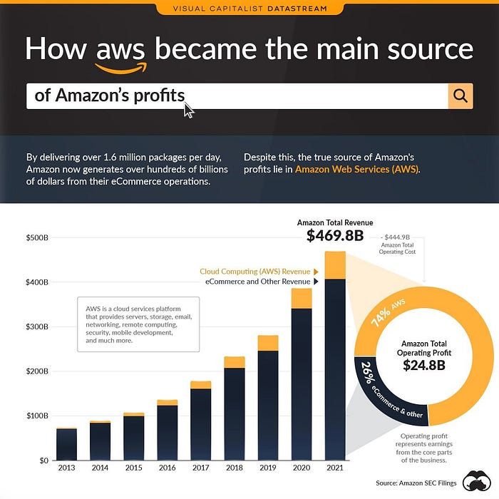
AWS accounted for 74% of Amazon's profit in 2021. This 74% might not exist if they hadn't invested in AWS.
Bring this with you home.
Amazon predated AWS. Yet, it helped the giant reach $1 trillion. Bezos' secrecy? Perhaps, until a time machine is invented (they might host the time machine software on AWS, though.)
Without AWS, Amazon would have been profitable but unimpressive. They may have invested in anything else that would have returned more (like crypto? No? Ok.)
Bezos has business flaws. His success. His failures include:
introducing the Fire Phone and suffering a $170 million loss.
Amazon's failure in China In 2011, Amazon had a about 15% market share in China. 2019 saw a decrease of about 1%.
not offering a higher price to persuade the creator of Netflix to sell the company to him. He offered a rather reasonable $15 million in his proposal. But what if he had offered $30 million instead (Amazon had over $100 million in revenue at the time)? He might have owned Netflix, which has a $156 billion market valuation (and saved billions rather than invest in Amazon Prime Video).
Some he could control. Some were uncontrollable. Nonetheless, every action he made in the foregoing circumstances led him to invest in AWS.

Christian Soschner
3 years ago
Steve Jobs' Secrets Revealed
From 1984 until 2011, he ran Apple using the same template.

What is a founder CEO's most crucial skill?
Presentation, communication, and sales
As a Business Angel Investor, I saw many pitch presentations and met with investors one-on-one to promote my companies.
There is always the conception of “Investors have to invest,” so there is no need to care about the presentation.
It's false. Nobody must invest. Many investors believe that entrepreneurs must convince them to invest in their business.
Sometimes — like in 2018–2022 — too much money enters the market, and everyone makes good money.
Do you recall the Buy Now, Pay Later Movement? This amazing narrative had no return potential. Only buyers who couldn't acquire financing elsewhere shopped at these companies.
Klarna's failing business concept led to high valuations.
Investors become more cautious when the economy falters. 2022 sees rising inflation, interest rates, wars, and civil instability. It's like the apocalypse's four horsemen have arrived.
Storytelling is important in rough economies.
When investors draw back, how can entrepreneurs stand out?
In Q2/2022, every study I've read said:
Investors cease investing
Deals are down in almost all IT industries from previous quarters.
What do founders need to do?
Differentiate yourself.
Storytelling talents help.
The Steve Jobs Way
Every time I watch a Steve Jobs presentation, I'm enthralled.
I'm a techie. Everything technical interests me. But, I skim most presentations.
What's Steve Jobs's secret?
Steve Jobs created Apple in 1976 and made it a profitable software and hardware firm in the 1980s. Macintosh goods couldn't beat IBM's. This mistake sacked him in 1985.
Before rejoining Apple in 1997, Steve Jobs founded Next Inc. and Pixar.
From then on, Apple became America's most valuable firm.
Steve Jobs understood people's needs. He said:
“People don’t know what they want until you show it to them. That’s why I never rely on market research. Our task is to read things that are not yet on the page.”
In his opinion, people talk about problems. A lot. Entrepreneurs must learn what the population's pressing problems are and create a solution.
Steve Jobs showed people what they needed before they realized it.
I'll explain:
Present a Big Vision
Steve Jobs starts every presentation by describing his long-term goals for Apple.
1984's Macintosh presentation set up David vs. Goliath. In a George Orwell-style dystopia, IBM computers were bad. It was 1984.
Apple will save the world, like Jedis.
Why do customers and investors like Big Vision?
People want a wider perspective, I think. Humans love improving the planet.
Apple users often cite emotional reasons for buying the brand.
Revolutionizing several industries with breakthrough inventions
Establish Authority
Everyone knows Apple in 2022. It's hard to find folks who confuse Apple with an apple around the world.
Apple wasn't as famous as it is today until Steve Jobs left in 2011.
Most entrepreneurs lack experience. They may market their company or items to folks who haven't heard of it.
Steve Jobs presented the company's historical accomplishments to overcome opposition.
In his presentation of the first iPhone, he talked about the Apple Macintosh, which altered the computing sector, and the iPod, which changed the music industry.
People who have never heard of Apple feel like they're seeing a winner. It raises expectations that the new product will be game-changing and must-have.
The Big Reveal
A pitch or product presentation always has something new.
Steve Jobs doesn't only demonstrate the product. I don't think he'd skip the major point of a company presentation.
He consistently discusses present market solutions, their faults, and a better consumer solution.
No solution exists yet.
It's a multi-faceted play:
It's comparing the new product to something familiar. This makes novelty and the product more relatable.
Describe a desirable solution.
He's funny. He demonstrated an iPod with an 80s phone dial in his iPhone presentation.
Then he reveals the new product. Macintosh presented itself.
Show the benefits
He outlines what Apple is doing differently after demonstrating the product.
How do you distinguish from others? The Big Breakthrough Presentation.
A few hundred slides might list all benefits.
Everyone would fall asleep. Have you ever had similar presentations?
When the brain is overloaded with knowledge, the limbic system changes to other duties, like lunch planning.
What should a speaker do? There's a classic proverb:
“Tell me and I forget, teach me and I may remember, involve me and I learn” (— Not Benjamin Franklin).
Steve Jobs showcased the product live.
Again, using ordinary scenarios to highlight the product's benefits makes it relatable.
The 2010 iPad Presentation uses this technique.
Invite the Team and Let Them Run the Presentation
CEOs spend most time outside the organization. Many companies elect to have only one presenter.
It sends the incorrect message to investors. Product presentations should always include the whole team.
Let me explain why.
Companies needing investment money frequently have shaky business strategies or no product-market fit or robust corporate structure.
Investors solely bet on a team's ability to implement ideas and make a profit.
Early team involvement helps investors understand the company's drivers. Travel costs are worthwhile.
But why for product presentations?
Presenters of varied ages, genders, social backgrounds, and skillsets are relatable. CEOs want relatable products.
Some customers may not believe a white man's message. A black woman's message may be more accepted.
Make the story relatable when you have the best product that solves people's concerns.
Best example: 1984 Macintosh presentation with development team panel.
What is the largest error people make when companies fail?
Saving money on the corporate and product presentation.
Invite your team to five partner meetings when five investors are shortlisted.
Rehearse the presentation till it's natural. Let the team speak.
Successful presentations require structure, rehearsal, and a team. Steve Jobs nailed it.