


More on Economics & Investing

Arthur Hayes
3 years ago
Contagion
(The author's opinions should not be used to make investment decisions or as a recommendation to invest.)

The pandemic and social media pseudoscience have made us all epidemiologists, for better or worse. Flattening the curve, social distancing, lockdowns—remember? Some of you may remember R0 (R naught), the number of healthy humans the average COVID-infected person infects. Thankfully, the world has moved on from Greater China's nightmare. Politicians have refocused their talent for misdirection on getting their constituents invested in the war for Russian Reunification or Russian Aggression, depending on your side of the iron curtain.
Humanity battles two fronts. A war against an invisible virus (I know your Commander in Chief might have told you COVID is over, but viruses don't follow election cycles and their economic impacts linger long after the last rapid-test clinic has closed); and an undeclared World War between US/NATO and Eurasia/Russia/China. The fiscal and monetary authorities' current policies aim to mitigate these two conflicts' economic effects.
Since all politicians are short-sighted, they usually print money to solve most problems. Printing money is the easiest and fastest way to solve most problems because it can be done immediately without much discussion. The alternative—long-term restructuring of our global economy—would hurt stakeholders and require an honest discussion about our civilization's state. Both of those requirements are non-starters for our short-sighted political friends, so whether your government practices capitalism, communism, socialism, or fascism, they all turn to printing money-ism to solve all problems.
Free money stimulates demand, so people buy crap. Overbuying shit raises prices. Inflation. Every nation has food, energy, or goods inflation. The once-docile plebes demand action when the latter two subsets of inflation rise rapidly. They will be heard at the polls or in the streets. What would you do to feed your crying hungry child?
Global central banks During the pandemic, the Fed, PBOC, BOJ, ECB, and BOE printed money to aid their governments. They worried about inflation and promised to remove fiat liquidity and tighten monetary conditions.
Imagine Nate Diaz's round-house kick to the face. The financial markets probably felt that way when the US and a few others withdrew fiat wampum. Sovereign debt markets suffered a near-record bond market rout.
The undeclared WW3 is intensifying, with recent gas pipeline attacks. The global economy is already struggling, and credit withdrawal will worsen the situation. The next pandemic, the Yield Curve Control (YCC) virus, is spreading as major central banks backtrack on inflation promises. All central banks eventually fail.
Here's a scorecard.
In order to save its financial system, BOE recently reverted to Quantitative Easing (QE).
BOJ Continuing YCC to save their banking system and enable affordable government borrowing.
ECB printing money to buy weak EU member bonds, but will soon start Quantitative Tightening (QT).
PBOC Restarting the money printer to give banks liquidity to support the falling residential property market.
Fed raising rates and QT-shrinking balance sheet.
80% of the world's biggest central banks are printing money again. Only the Fed has remained steadfast in the face of a financial market bloodbath, determined to end the inflation for which it is at least partially responsible—the culmination of decades of bad economic policies and a world war.
YCC printing is the worst for fiat currency and society. Because it necessitates central banks fixing a multi-trillion-dollar bond market. YCC central banks promise to infinitely expand their balance sheets to keep a certain interest rate metric below an unnatural ceiling. The market always wins, crushing humanity with inflation.
BOJ's YCC policy is longest-standing. The BOE joined them, and my essay this week argues that the ECB will follow. The ECB joining YCC would make 60% of major central banks follow this terrible policy. Since the PBOC is part of the Chinese financial system, the number could be 80%. The Chinese will lend any amount to meet their economic activity goals.
The BOE committed to a 13-week, GBP 65bn bond price-fixing operation. However, BOEs YCC may return. If you lose to the market, you're stuck. Since the BOE has announced that it will buy your Gilt at inflated prices, why would you not sell them all? Market participants taking advantage of this policy will only push the bank further into the hole it dug itself, so I expect the BOE to re-up this program and count them as YCC.
In a few trading days, the BOE went from a bank determined to slay inflation by raising interest rates and QT to buying an unlimited amount of UK Gilts. I expect the ECB to be dragged kicking and screaming into a similar policy. Spoiler alert: big daddy Fed will eventually die from the YCC virus.
Threadneedle St, London EC2R 8AH, UK
Before we discuss the BOE's recent missteps, a chatroom member called the British royal family the Kardashians with Crowns, which made me laugh. I'm sad about royal attention. If the public was as interested in energy and economic policies as they are in how the late Queen treated Meghan, Duchess of Sussex, UK politicians might not have been able to get away with energy and economic fairy tales.
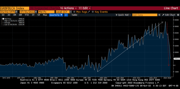
The BOE printed money to recover from COVID, as all good central banks do. For historical context, this chart shows the BOE's total assets as a percentage of GDP since its founding in the 18th century.
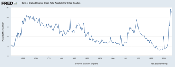
The UK has had a rough three centuries. Pandemics, empire wars, civil wars, world wars. Even so, the BOE's recent money printing was its most aggressive ever!
BOE Total Assets as % of GDP (white) vs. UK CPI
Now, inflation responded slowly to the bank's most aggressive monetary loosening. King Charles wishes the gold line above showed his popularity, but it shows his subjects' suffering.
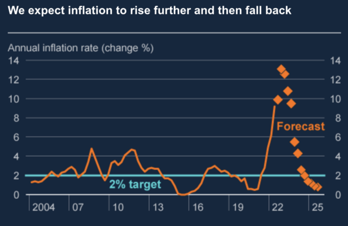
The BOE recognized early that its money printing caused runaway inflation. In its August 2022 report, the bank predicted that inflation would reach 13% by year end before aggressively tapering in 2023 and 2024.
Aug 2022 BOE Monetary Policy Report
The BOE was the first major central bank to reduce its balance sheet and raise its policy rate to help.
The BOE first raised rates in December 2021. Back then, JayPow wasn't even considering raising rates.
UK policymakers, like most developed nations, believe in energy fairy tales. Namely, that the developed world, which grew in lockstep with hydrocarbon use, could switch to wind and solar by 2050. The UK's energy import bill has grown while coal, North Sea oil, and possibly stranded shale oil have been ignored.
WW3 is an economic war that is balkanizing energy markets, which will continue to inflate. A nation that imports energy and has printed the most money in its history cannot avoid inflation.
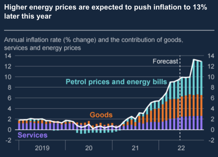
The chart above shows that energy inflation is a major cause of plebe pain.
The UK is hit by a double whammy: the BOE must remove credit to reduce demand, and energy prices must rise due to WW3 inflation. That's not economic growth.
Boris Johnson was knocked out by his country's poor economic performance, not his lockdown at 10 Downing St. Prime Minister Truss and her merry band of fools arrived with the tried-and-true government remedy: goodies for everyone.
She released a budget full of economic stimulants. She cut corporate and individual taxes for the rich. She plans to give poor people vouchers for higher energy bills. Woohoo! Margret Thatcher's new pants suit.
My buddy Jim Bianco said Truss budget's problem is that it works. It will boost activity at a time when inflation is over 10%. Truss' budget didn't include austerity measures like tax increases or spending cuts, which the bond market wanted. The bond market protested.
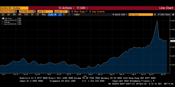
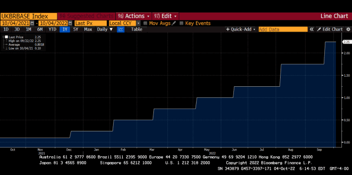
30-year Gilt yield chart. Yields spiked the most ever after Truss announced her budget, as shown. The Gilt market is the longest-running bond market in the world.
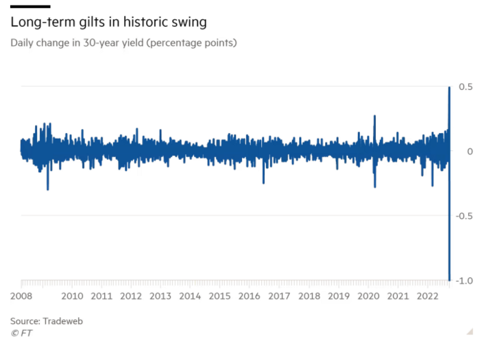
The Gilt market showed the pole who's boss with Cardi B.
Before this, the BOE was super-committed to fighting inflation. To their credit, they raised short-term rates and shrank their balance sheet. However, rapid yield rises threatened to destroy the entire highly leveraged UK financial system overnight, forcing them to change course.
Accounting gimmicks allowed by regulators for pension funds posed a systemic threat to the UK banking system. UK pension funds could use interest rate market levered derivatives to match liabilities. When rates rise, short rate derivatives require more margin. The pension funds spent all their money trying to pick stonks and whatever else their sell side banker could stuff them with, so the historic rate spike would have bankrupted them overnight. The FT describes BOE-supervised chicanery well.
To avoid a financial apocalypse, the BOE in one morning abandoned all their hard work and started buying unlimited long-dated Gilts to drive prices down.
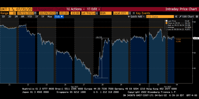
Another reminder to never fight a central bank. The 30-year Gilt is shown above. After the BOE restarted the money printer on September 28, this bond rose 30%. Thirty-fucking-percent! Developed market sovereign bonds rarely move daily. You're invested in His Majesty's government obligations, not a Chinese property developer's offshore USD bond.
The political need to give people goodies to help them fight the terrible economy ran into a financial reality. The central bank protected the UK financial system from asset-price deflation because, like all modern economies, it is debt-based and highly levered. As bad as it is, inflation is not their top priority. The BOE example demonstrated that. To save the financial system, they abandoned almost a year of prudent monetary policy in a few hours. They also started the endgame.
Let's play Central Bankers Say the Darndest Things before we go to the continent (and sorry if you live on a continent other than Europe, but you're not culturally relevant).
Pre-meltdown BOE output:
FT, October 17, 2021 On Sunday, the Bank of England governor warned that it must act to curb inflationary pressure, ignoring financial market moves that have priced in the first interest rate increase before the end of the year.
On July 19, 2022, Gov. Andrew Bailey spoke. Our 2% inflation target is unwavering. We'll do our job.
August 4th 2022 MPC monetary policy announcement According to its mandate, the MPC will sustainably return inflation to 2% in the medium term.
Catherine Mann, MPC member, September 5, 2022 speech. Fast and forceful monetary tightening, possibly followed by a hold or reversal, is better than gradualism because it promotes inflation expectations' role in bringing inflation back to 2% over the medium term.
When their financial system nearly collapsed in one trading session, they said:
The Bank of England's Financial Policy Committee warned on 28 September that gilt market dysfunction threatened UK financial stability. It advised action and supported the Bank's urgent gilt market purchases for financial stability.
It works when the price goes up but not down. Is my crypto portfolio dysfunctional enough to get a BOE bailout?
Next, the EU and ECB. The ECB is also fighting inflation, but it will also succumb to the YCC virus for the same reasons as the BOE.
Frankfurt am Main, ECB Tower, Sonnemannstraße 20, 60314
Only France and Germany matter economically in the EU. Modern European history has focused on keeping Germany and Russia apart. German manufacturing and cheap Russian goods could change geopolitics.
France created the EU to keep Germany down, and the Germans only cooperated because of WWII guilt. France's interests are shared by the US, which lurks in the shadows to prevent a Germany-Russia alliance. A weak EU benefits US politics. Avoid unification of Eurasia. (I paraphrased daddy Felix because I thought quoting a large part of his most recent missive would get me spanked.)
As with everything, understanding Germany's energy policy is the best way to understand why the German economy is fundamentally fucked and why that spells doom for the EU. Germany, the EU's main economic engine, is being crippled by high energy prices, threatening a depression. This economic downturn threatens the union. The ECB may have to abandon plans to shrink its balance sheet and switch to YCC to save the EU's unholy political union.
France did the smart thing and went all in on nuclear energy, which is rare in geopolitics. 70% of electricity is nuclear-powered. Their manufacturing base can survive Russian gas cuts. Germany cannot.
My boy Zoltan made this great graphic showing how screwed Germany is as cheap Russian gas leaves the industrial economy.
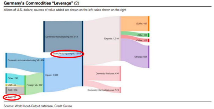
$27 billion of Russian gas powers almost $2 trillion of German economic output, a 75x energy leverage. The German public was duped into believing the same energy fairy tales as their politicians, and they overwhelmingly allowed the Green party to dismantle any efforts to build a nuclear energy ecosystem over the past several decades. Germany, unlike France, must import expensive American and Qatari LNG via supertankers due to Nordstream I and II pipeline sabotage.
American gas exports to Europe are touted by the media. Gas is cheap because America isn't the Western world's swing producer. If gas prices rise domestically in America, the plebes would demand the end of imports to avoid paying more to heat their homes.
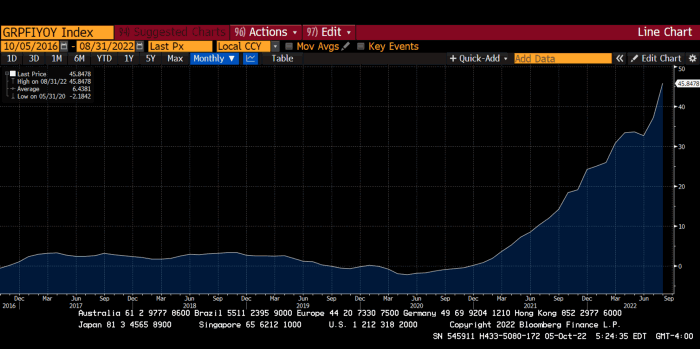
German goods would cost much more in this scenario. German producer prices rose 46% YoY in August. The German current account is rapidly approaching zero and will soon be negative.
German PPI Change YoY
German Current Account
The reason this matters is a curious construction called TARGET2. Let’s hear from the horse’s mouth what exactly this beat is:
TARGET2 is the real-time gross settlement (RTGS) system owned and operated by the Eurosystem. Central banks and commercial banks can submit payment orders in euro to TARGET2, where they are processed and settled in central bank money, i.e. money held in an account with a central bank.
Source: ECB
Let me explain this in plain English for those unfamiliar with economic dogma.
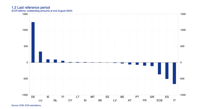
This chart shows intra-EU credits and debits. TARGET2. Germany, Europe's powerhouse, is owed money. IOU-buying Greeks buy G-wagons. The G-wagon pickup truck is badass.

If all EU countries had fiat currencies, the Deutsche Mark would be stronger than the Italian Lira, according to the chart above. If Europe had to buy goods from non-EU countries, the Euro would be much weaker. Credits and debits between smaller political units smooth out imbalances in other federal-provincial-state political systems. Financial and fiscal unions allow this. The EU is financial, so the centre cannot force the periphery to settle their imbalances.
Greece has never had to buy Fords or Kias instead of BMWs, but what if Germany had to shut down its auto manufacturing plants due to energy shortages?
Italians have done well buying ammonia from Germany rather than China, but what if BASF had to close its Ludwigshafen facility due to a lack of affordable natural gas?
I think you're seeing the issue.
Instead of Germany, EU countries would owe foreign producers like America, China, South Korea, Japan, etc. Since these countries aren't tied into an uneconomic union for politics, they'll demand hard fiat currency like USD instead of Euros, which have become toilet paper (or toilet plastic).
Keynesian economists have a simple solution for politicians who can't afford market prices. Government debt can maintain production. The debt covers the difference between what a business can afford and the international energy market price.
Germans are monetary policy conservative because of the Weimar Republic's hyperinflation. The Bundesbank is the only thing preventing ECB profligacy. Germany must print its way out without cheap energy. Like other nations, they will issue more bonds for fiscal transfers.
More Bunds mean lower prices. Without German monetary discipline, the Euro would have become a trash currency like any other emerging market that imports energy and food and has uncompetitive labor.
Bunds price all EU country bonds. The ECB's money printing is designed to keep the spread of weak EU member bonds vs. Bunds low. Everyone falls with Bunds.
Like the UK, German politicians seeking re-election will likely cause a Bunds selloff. Bond investors will understandably reject their promises of goodies for industry and individuals to offset the lack of cheap Russian gas. Long-dated Bunds will be smoked like UK Gilts. The ECB will face a wave of ultra-levered financial players who will go bankrupt if they mark to market their fixed income derivatives books at higher Bund yields.
Some treats People: Germany will spend 200B to help consumers and businesses cope with energy prices, including promoting renewable energy.
That, ladies and germs, is why the ECB will immediately abandon QT, move to a stop-gap QE program to normalize the Bund and every other EU bond market, and eventually graduate to YCC as the market vomits bonds of all stripes into Christine Lagarde's loving hands. She probably has soft hands.
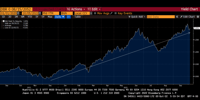
The 30-year Bund market has noticed Germany's economic collapse. 2021 yields skyrocketed.
30-year Bund Yield
ECB Says the Darndest Things:
Because inflation is too high and likely to stay above our target for a long time, we took today's decision and expect to raise interest rates further.- Christine Lagarde, ECB Press Conference, Sept 8.
The Governing Council will adjust all of its instruments to stabilize inflation at 2% over the medium term. July 21 ECB Monetary Decision
Everyone struggles with high inflation. The Governing Council will ensure medium-term inflation returns to two percent. June 9th ECB Press Conference
I'm excited to read the after. Like the BOE, the ECB may abandon their plans to shrink their balance sheet and resume QE due to debt market dysfunction.
Eighty Percent
I like YCC like dark chocolate over 80%. ;).
Can 80% of the world's major central banks' QE and/or YCC overcome Sir Powell's toughness on fungible risky asset prices?
Gold and crypto are fungible global risky assets. Satoshis and gold bars are the same in New York, London, Frankfurt, Tokyo, and Shanghai.
As more Euros, Yen, Renminbi, and Pounds are printed, people will move their savings into Dollars or other stores of value. As the Fed raises rates and reduces its balance sheet, the USD will strengthen. Gold/EUR and BTC/JPY may also attract buyers.
Gold and crypto markets are much smaller than the trillions in fiat money that will be printed, so they will appreciate in non-USD currencies. These flows only matter in one instance because we trade the global or USD price. Arbitrage occurs when BTC/EUR rises faster than EUR/USD. Here is how it works:
An investor based in the USD notices that BTC is expensive in EUR terms.
Instead of buying BTC, this investor borrows USD and then sells it.
After that, they sell BTC and buy EUR.
Then they choose to sell EUR and buy USD.
The investor receives their profit after repaying the USD loan.
This triangular FX arbitrage will align the global/USD BTC price with the elevated EUR, JPY, CNY, and GBP prices.
Even if the Fed continues QT, which I doubt they can do past early 2023, small stores of value like gold and Bitcoin may rise as non-Fed central banks get serious about printing money.
“Arthur, this is just more copium,” you might retort.
Patience. This takes time. Economic and political forcing functions take time. The BOE example shows that bond markets will reject politicians' policies to appease voters. Decades of bad energy policy have no immediate fix. Money printing is the only politically viable option. Bond yields will rise as bond markets see more stimulative budgets, and the over-leveraged fiat debt-based financial system will collapse quickly, followed by a monetary bailout.
America has enough food, fuel, and people. China, Europe, Japan, and the UK suffer. America can be autonomous. Thus, the Fed can prioritize domestic political inflation concerns over supplying the world (and most of its allies) with dollars. A steady flow of dollars allows other nations to print their currencies and buy energy in USD. If the strongest player wins, everyone else loses.
I'm making a GDP-weighted index of these five central banks' money printing. When ready, I'll share its rate of change. This will show when the 80%'s money printing exceeds the Fed's tightening.

Cody Collins
3 years ago
The direction of the economy is as follows.
What quarterly bank earnings reveal

Big banks know the economy best. Unless we’re talking about a housing crisis in 2007…
Banks are crucial to the U.S. economy. The Fed, communities, and investments exchange money.
An economy depends on money flow. Banks' views on the economy can affect their decision-making.
Most large banks released quarterly earnings and forward guidance last week. Others were pessimistic about the future.
What Makes Banks Confident
Bank of America's profit decreased 30% year-over-year, but they're optimistic about the economy. Comparatively, they're bullish.
Who banks serve affects what they see. Bank of America supports customers.
They think consumers' future is bright. They believe this for many reasons.
The average customer has decent credit, unless the system is flawed. Bank of America's new credit card and mortgage borrowers averaged 771. New-car loan and home equity borrower averages were 791 and 797.
2008's housing crisis affected people with scores below 620.
Bank of America and the economy benefit from a robust consumer. Major problems can be avoided if individuals maintain spending.
Reasons Other Banks Are Less Confident
Spending requires income. Many companies, mostly in the computer industry, have announced they will slow or freeze hiring. Layoffs are frequently an indication of poor times ahead.
BOA is positive, but investment banks are bearish.
Jamie Dimon, CEO of JPMorgan, outlined various difficulties our economy could confront.
But geopolitical tension, high inflation, waning consumer confidence, the uncertainty about how high rates have to go and the never-before-seen quantitative tightening and their effects on global liquidity, combined with the war in Ukraine and its harmful effect on global energy and food prices are very likely to have negative consequences on the global economy sometime down the road.
That's more headwinds than tailwinds.
JPMorgan, which helps with mergers and IPOs, is less enthusiastic due to these concerns. Incoming headwinds signal drying liquidity, they say. Less business will be done.
Final Reflections
I don't think we're done. Yes, stocks are up 10% from a month ago. It's a long way from old highs.
I don't think the stock market is a strong economic indicator.
Many executives foresee a 2023 recession. According to the traditional definition, we may be in a recession when Q2 GDP statistics are released next week.
Regardless of criteria, I predict the economy will have a terrible year.
Weekly layoffs are announced. Inflation persists. Will prices return to 2020 levels if inflation cools? Perhaps. Still expensive energy. Ukraine's war has global repercussions.
I predict BOA's next quarter earnings won't be as bullish about the consumer's strength.

Liam Vaughan
4 years ago
Investors can bet big on almost anything on a new prediction market.
Kalshi allows five-figure bets on the Grammys, the next Covid wave, and future SEC commissioners. Worst-case scenario
On Election Day 2020, two young entrepreneurs received a call from the CFTC chairman. Luana Lopes Lara and Tarek Mansour spent 18 months trying to start a new type of financial exchange. Instead of betting on stock prices or commodity futures, people could trade instruments tied to real-world events, such as legislation, the weather, or the Oscar winner.
Heath Tarbert, a Trump appointee, shouted "Congratulations." "You're competing with 1840s-era markets. I'm sure you'll become a powerhouse too."
Companies had tried to introduce similar event markets in the US for years, but Tarbert's agency, the CFTC, said no, arguing they were gambling and prone to cheating. Now the agency has reversed course, approving two 24-year-olds who will have first-mover advantage in what could become a huge new asset class. Kalshi Inc. raised $30 million from venture capitalists within weeks of Tarbert's call, his representative says. Mansour, 26, believes this will be bigger than crypto.
Anyone who's read The Wisdom of Crowds knows prediction markets' potential. Well-designed markets can help draw out knowledge from disparate groups, and research shows that when money is at stake, people make better predictions. Lopes Lara calls it a "bullshit tax." That's why Google, Microsoft, and even the US Department of Defense use prediction markets internally to guide decisions, and why university-linked political betting sites like PredictIt sometimes outperform polls.
Regulators feared Wall Street-scale trading would encourage investors to manipulate reality. If the stakes are high enough, traders could pressure congressional staffers to stall a bill or bet on whether Kanye West's new album will drop this week. When Lopes Lara and Mansour pitched the CFTC, senior regulators raised these issues. Politically appointed commissioners overruled their concerns, and one later joined Kalshi's board.
Will Kanye’s new album come out next week? Yes or no?
Kalshi's victory was due more to lobbying and legal wrangling than to Silicon Valley-style innovation. Lopes Lara and Mansour didn't invent anything; they changed a well-established concept's governance. The result could usher in a new era of market-based enlightenment or push Wall Street's destructive tendencies into the real world.
If Kalshi's founders lacked experience to bolster their CFTC application, they had comical youth success. Lopes Lara studied ballet at the Brazilian Bolshoi before coming to the US. Mansour won France's math Olympiad. They bonded over their work ethic in an MIT computer science class.
Lopes Lara had the idea for Kalshi while interning at a New York hedge fund. When the traders around her weren't working, she noticed they were betting on the news: Would Apple hit a trillion dollars? Kylie Jenner? "It was anything," she says.
Are mortgage rates going up? Yes or no?
Mansour saw the business potential when Lopes Lara suggested it. He interned at Goldman Sachs Group Inc., helping investors prepare for the UK leaving the EU. Goldman sold clients complex stock-and-derivative combinations. As he discussed it with Lopes Lara, they agreed that investors should hedge their risk by betting on Brexit itself rather than an imperfect proxy.
Lopes Lara and Mansour hypothesized how a marketplace might work. They settled on a "event contract," a binary-outcome instrument like "Will inflation hit 5% by the end of the month?" The contract would settle at $1 (if the event happened) or zero (if it didn't), but its price would fluctuate based on market sentiment. After a good debate, a politician's election odds may rise from 50 to 55. Kalshi would charge a commission on every trade and sell data to traders, political campaigns, businesses, and others.
In October 2018, five months after graduation, the pair flew to California to compete in a hackathon for wannabe tech founders organized by the Silicon Valley incubator Y Combinator. They built a website in a day and a night and presented it to entrepreneurs the next day. Their prototype barely worked, but they won a three-month mentorship program and $150,000. Michael Seibel, managing director of Y Combinator, said of their idea, "I had to take a chance!"
Will there be another moon landing by 2025?
Seibel's skepticism was rooted in America's historical wariness of gambling. Roulette, poker, and other online casino games are largely illegal, and sports betting was only legal in a few states until May 2018. Kalshi as a risk-hedging platform rather than a bookmaker seemed like a good idea, but convincing the CFTC wouldn't be easy. In 2012, the CFTC said trading on politics had no "economic purpose" and was "contrary to the public interest."
Lopes Lara and Mansour cold-called 60 Googled lawyers during their time at Y Combinator. Everyone advised quitting. Mansour recalls the pain. Jeff Bandman, a former CFTC official, helped them navigate the agency and its characters.
When they weren’t busy trying to recruit lawyers, Lopes Lara and Mansour were meeting early-stage investors. Alfred Lin of Sequoia Capital Operations LLC backed Airbnb, DoorDash, and Uber Technologies. Lin told the founders their idea could capitalize on retail trading and challenge how the financial world manages risk. "Come back with regulatory approval," he said.
In the US, even small bets on most events were once illegal. Under the Commodity Exchange Act, the CFTC can stop exchanges from listing contracts relating to "terrorism, assassination, war" and "gaming" if they are "contrary to the public interest," which was often the case.
Will subway ridership return to normal? Yes or no?
In 1988, as academic interest in the field grew, the agency allowed the University of Iowa to set up a prediction market for research purposes, as long as it didn't make a profit or advertise and limited bets to $500. PredictIt, the biggest and best-known political betting platform in the US, also got an exemption thanks to an association with Victoria University of Wellington in New Zealand. Today, it's a sprawling marketplace with its own subculture and lingo. PredictIt users call it "Rules Cuck Panther" when they lose on a technicality. Major news outlets cite PredictIt's odds on Discord and the Star Spangled Gamblers podcast.
CFTC limits PredictIt bets to $850. To keep traders happy, PredictIt will often run multiple variations of the same question, listing separate contracts for two dozen Democratic primary candidates, for example. A trader could have more than $10,000 riding on a single outcome. Some of the site's traders are current or former campaign staffers who can answer questions like "How many tweets will Donald Trump post from Nov. 20 to 27?" and "When will Anthony Scaramucci's role as White House communications director end?"
According to PredictIt co-founder John Phillips, politicians help explain the site's accuracy. "Prediction markets work well and are accurate because they attract people with superior information," he said in a 2016 podcast. “In the financial stock market, it’s called inside information.”
Will Build Back Better pass? Yes or no?
Trading on nonpublic information is illegal outside of academia, which presented a dilemma for Lopes Lara and Mansour. Kalshi's forecasts needed to be accurate. Kalshi must eliminate insider trading as a regulated entity. Lopes Lara and Mansour wanted to build a high-stakes PredictIt without the anarchy or blurred legal lines—a "New York Stock Exchange for Events." First, they had to convince regulators event trading was safe.
When Lopes Lara and Mansour approached the CFTC in the spring of 2019, some officials in the Division of Market Oversight were skeptical, according to interviews with people involved in the process. For all Kalshi's talk of revolutionizing finance, this was just a turbocharged version of something that had been rejected before.
The DMO couldn't see the big picture. The staff review was supposed to ensure Kalshi could complete a checklist, "23 Core Principles of a Designated Contract Market," which included keeping good records and having enough money. The five commissioners decide. With Trump as president, three of them were ideologically pro-market.
Lopes Lara, Mansour, and their lawyer Bandman, an ex-CFTC official, answered the DMO's questions while lobbying the commissioners on Zoom about the potential of event markets to mitigate risks and make better decisions. Before each meeting, they would write a script and memorize it word for word.
Will student debt be forgiven? Yes or no?
Several prediction markets that hadn't sought regulatory approval bolstered Kalshi's case. Polymarket let customers bet hundreds of thousands of dollars anonymously using cryptocurrencies, making it hard to track. Augur, which facilitates private wagers between parties using blockchain, couldn't regulate bets and hadn't stopped users from betting on assassinations. Kalshi, by comparison, argued it was doing everything right. (The CFTC fined Polymarket $1.4 million for operating an unlicensed exchange in January 2022. Polymarket says it's now compliant and excited to pioneer smart contract-based financial solutions with regulators.
Kalshi was approved unanimously despite some DMO members' concerns about event contracts' riskiness. "Once they check all the boxes, they're in," says a CFTC insider.
Three months after CFTC approval, Kalshi announced funding from Sequoia, Charles Schwab, and Henry Kravis. Sequoia's Lin, who joined the board, said Tarek, Luana, and team created a new way to invest and engage with the world.
The CFTC hadn't asked what markets the exchange planned to run since. After approval, Lopes Lara and Mansour had the momentum. Kalshi's March list of 30 proposed contracts caused chaos at the DMO. The division handles exchanges that create two or three new markets a year. Kalshi’s business model called for new ones practically every day.
Uncontroversial proposals included weather and GDP questions. Others, on the initial list and later, were concerning. DMO officials feared Covid-19 contracts amounted to gambling on human suffering, which is why war and terrorism markets are banned. (Similar logic doomed ex-admiral John Poindexter's Policy Analysis Market, a Bush-era plan to uncover intelligence by having security analysts bet on Middle East events.) Regulators didn't see how predicting the Grammy winners was different from betting on the Patriots to win the Super Bowl. Who, other than John Legend, would need to hedge the best R&B album winner?
Event contracts raised new questions for the DMO's product review team. Regulators could block gaming contracts that weren't in the public interest under the Commodity Exchange Act, but no one had defined gaming. It was unclear whether the CFTC had a right or an obligation to consider whether a contract was in the public interest. How was it to determine public interest? Another person familiar with the CFTC review says, "It was a mess." The agency didn't comment.
CFTC staff feared some event contracts could be cheated. Kalshi wanted to run a bee-endangerment market. The DMO pushed back, saying it saw two problems symptomatic of the asset class: traders could press government officials for information, and officials could delay adding the insects to the list to cash in.
The idea that traders might manipulate prediction markets wasn't paranoid. In 2013, academics David Rothschild and Rajiv Sethi found that an unidentified party lost $7 million buying Mitt Romney contracts on Intrade, a now-defunct, unlicensed Irish platform, in the runup to the 2012 election. The authors speculated that the trader, whom they dubbed the “Romney Whale,” may have been looking to boost morale and keep donations coming in.
Kalshi said manipulation and insider trading are risks for any market. It built a surveillance system and said it would hire a team to monitor it. "People trade on events all the time—they just use options and other instruments. This brings everything into the open, Mansour says. Kalshi didn't include election contracts, a red line for CFTC Democrats.
Lopes Lara and Mansour were ready to launch kalshi.com that summer, but the DMO blocked them. Product reviewers were frustrated by spending half their time on an exchange that represented a tiny portion of the derivatives market. Lopes Lara and Mansour pressed politically appointed commissioners during the impasse.
Tarbert, the chairman, had moved on, but Kalshi found a new supporter in Republican Brian Quintenz, a crypto-loving former hedge fund manager. He was unmoved by the DMO's concerns, arguing that speculation on Kalshi's proposed events was desirable and the agency had no legal standing to prevent it. He supported a failed bid to allow NFL futures earlier this year. Others on the commission were cautious but supportive. Given the law's ambiguity, they worried they'd be on shaky ground if Kalshi sued if they blocked a contract. Without a permanent chairman, the agency lacked leadership.
To block a contract, DMO staff needed a majority of commissioners' support, which they didn't have in all but a few cases. "We didn't have the votes," a reviewer says, paraphrasing Hamilton. By the second half of 2021, new contract requests were arriving almost daily at the DMO, and the demoralized and overrun division eventually accepted defeat and stopped fighting back. By the end of the year, three senior DMO officials had left the agency, making it easier for Kalshi to list its contracts unimpeded.
Today, Kalshi is growing. 32 employees work in a SoHo office with big windows and exposed brick. Quintenz, who left the CFTC 10 months after Kalshi was approved, is on its board. He joined because he was interested in the market's hedging and risk management opportunities.
Mid-May, the company's website had 75 markets, such as "Will Q4 GDP be negative?" Will NASA land on the moon by 2025? The exchange recently reached 2 million weekly contracts, a jump from where it started but still a small number compared to other futures exchanges. Early adopters are PredictIt and Polymarket fans. Bets on the site are currently capped at $25,000, but Kalshi hopes to increase that to $100,000 and beyond.
With the regulatory drawbridge down, Lopes Lara and Mansour must move quickly. Chicago's CME Group Inc. plans to offer index-linked event contracts. Kalshi will release a smartphone app to attract customers. After that, it hopes to partner with a big brokerage. Sequoia is a major investor in Robinhood Markets Inc. Robinhood users could have access to Kalshi so that after buying GameStop Corp. shares, they'd be prompted to bet on the Oscars or the next Fed commissioner.
Some, like Illinois Democrat Sean Casten, accuse Robinhood and its competitors of gamifying trading to encourage addiction, but Kalshi doesn't seem worried. Mansour says Kalshi's customers can't bet more than they've deposited, making debt difficult. Eventually, he may introduce leveraged bets.
Tension over event contracts recalls another CFTC episode. Brooksley Born proposed regulating the financial derivatives market in 1994. Alan Greenspan and others in the government opposed her, saying it would stifle innovation and push capital overseas. Unrestrained, derivatives grew into a trillion-dollar industry until 2008, when they sparked the financial crisis.
Today, with a midterm election looming, it seems reasonable to ask whether Kalshi plans to get involved. Elections have historically been the biggest draw in prediction markets, with 125 million shares traded on PredictIt for 2020. “We can’t discuss specifics,” Mansour says. “All I can say is, you know, we’re always working on expanding the universe of things that people can trade on.”
Any election contracts would need CFTC approval, which may be difficult with three Democratic commissioners. A Republican president would change the equation.
You might also like

Ashraful Islam
4 years ago
Clean API Call With React Hooks
| Photo by Juanjo Jaramillo on Unsplash |
Calling APIs is the most common thing to do in any modern web application. When it comes to talking with an API then most of the time we need to do a lot of repetitive things like getting data from an API call, handling the success or error case, and so on.
When calling tens of hundreds of API calls we always have to do those tedious tasks. We can handle those things efficiently by putting a higher level of abstraction over those barebone API calls, whereas in some small applications, sometimes we don’t even care.
The problem comes when we start adding new features on top of the existing features without handling the API calls in an efficient and reusable manner. In that case for all of those API calls related repetitions, we end up with a lot of repetitive code across the whole application.
In React, we have different approaches for calling an API. Nowadays mostly we use React hooks. With React hooks, it’s possible to handle API calls in a very clean and consistent way throughout the application in spite of whatever the application size is. So let’s see how we can make a clean and reusable API calling layer using React hooks for a simple web application.
I’m using a code sandbox for this blog which you can get here.
import "./styles.css";
import React, { useEffect, useState } from "react";
import axios from "axios";
export default function App() {
const [posts, setPosts] = useState(null);
const [error, setError] = useState("");
const [loading, setLoading] = useState(false);
useEffect(() => {
handlePosts();
}, []);
const handlePosts = async () => {
setLoading(true);
try {
const result = await axios.get(
"https://jsonplaceholder.typicode.com/posts"
);
setPosts(result.data);
} catch (err) {
setError(err.message || "Unexpected Error!");
} finally {
setLoading(false);
}
};
return (
<div className="App">
<div>
<h1>Posts</h1>
{loading && <p>Posts are loading!</p>}
{error && <p>{error}</p>}
<ul>
{posts?.map((post) => (
<li key={post.id}>{post.title}</li>
))}
</ul>
</div>
</div>
);
}
I know the example above isn’t the best code but at least it’s working and it’s valid code. I will try to improve that later. For now, we can just focus on the bare minimum things for calling an API.
Here, you can try to get posts data from JsonPlaceholer. Those are the most common steps we follow for calling an API like requesting data, handling loading, success, and error cases.
If we try to call another API from the same component then how that would gonna look? Let’s see.
500: Internal Server Error
Now it’s going insane! For calling two simple APIs we’ve done a lot of duplication. On a top-level view, the component is doing nothing but just making two GET requests and handling the success and error cases. For each request, it’s maintaining three states which will periodically increase later if we’ve more calls.
Let’s refactor to make the code more reusable with fewer repetitions.
Step 1: Create a Hook for the Redundant API Request Codes
Most of the repetitions we have done so far are about requesting data, handing the async things, handling errors, success, and loading states. How about encapsulating those things inside a hook?
The only unique things we are doing inside handleComments and handlePosts are calling different endpoints. The rest of the things are pretty much the same. So we can create a hook that will handle the redundant works for us and from outside we’ll let it know which API to call.
500: Internal Server Error
Here, this request function is identical to what we were doing on the handlePosts and handleComments. The only difference is, it’s calling an async function apiFunc which we will provide as a parameter with this hook. This apiFunc is the only independent thing among any of the API calls we need.
With hooks in action, let’s change our old codes in App component, like this:
500: Internal Server Error
How about the current code? Isn’t it beautiful without any repetitions and duplicate API call handling things?
Let’s continue our journey from the current code. We can make App component more elegant. Now it knows a lot of details about the underlying library for the API call. It shouldn’t know that. So, here’s the next step…
Step 2: One Component Should Take Just One Responsibility
Our App component knows too much about the API calling mechanism. Its responsibility should just request the data. How the data will be requested under the hood, it shouldn’t care about that.
We will extract the API client-related codes from the App component. Also, we will group all the API request-related codes based on the API resource. Now, this is our API client:
import axios from "axios";

const apiClient = axios.create({
  // Later read this URL from an environment variable
  baseURL: "https://jsonplaceholder.typicode.com"
});

export default apiClient;
All API calls for comments resource will be in the following file:
import client from "./client";

const getComments = () => client.get("/comments");

export default {
  getComments
};
All API calls for posts resource are placed in the following file:
import client from "./client";

const getPosts = () => client.get("/posts");

export default {
  getPosts
};
Finally, the App component looks like the following:
import "./styles.css";
import React, { useEffect } from "react";
import commentsApi from "./api/comments";
import postsApi from "./api/posts";
import useApi from "./hooks/useApi";

export default function App() {
  const getPostsApi = useApi(postsApi.getPosts);
  const getCommentsApi = useApi(commentsApi.getComments);

  useEffect(() => {
    getPostsApi.request();
    getCommentsApi.request();
  }, []);

  return (
    <div className="App">
      {/* Post List */}
      <div>
        <h1>Posts</h1>
        {getPostsApi.loading && <p>Posts are loading!</p>}
        {getPostsApi.error && <p>{getPostsApi.error}</p>}
        <ul>
          {getPostsApi.data?.map((post) => (
            <li key={post.id}>{post.title}</li>
          ))}
        </ul>
      </div>
      {/* Comment List */}
      <div>
        <h1>Comments</h1>
        {getCommentsApi.loading && <p>Comments are loading!</p>}
        {getCommentsApi.error && <p>{getCommentsApi.error}</p>}
        <ul>
          {getCommentsApi.data?.map((comment) => (
            <li key={comment.id}>{comment.name}</li>
          ))}
        </ul>
      </div>
    </div>
  );
}
Now it doesn’t know anything about how the APIs get called. Tomorrow if we want to change the API calling library from axios to fetch or anything else, our App component code will not get affected. We can just change the codes form client.js This is the beauty of abstraction.
Apart from the abstraction of API calls, Appcomponent isn’t right the place to show the list of the posts and comments. It’s a high-level component. It shouldn’t handle such low-level data interpolation things.
So we should move this data display-related things to another low-level component. Here I placed those directly in the App component just for the demonstration purpose and not to distract with component composition-related things.
Final Thoughts
The React library gives the flexibility for using any kind of third-party library based on the application’s needs. As it doesn’t have any predefined architecture so different teams/developers adopted different approaches to developing applications with React. There’s nothing good or bad. We choose the development practice based on our needs/choices. One thing that is there beyond any choices is writing clean and maintainable codes.

Sammy Abdullah
3 years ago
Payouts to founders at IPO
How much do startup founders make after an IPO? We looked at 2018's major tech IPOs. Paydays aren't what founders took home at the IPO (shares are normally locked up for 6 months), but what they were worth at the IPO price on the day the firm went public. It's not cash, but it's nice. Here's the data.
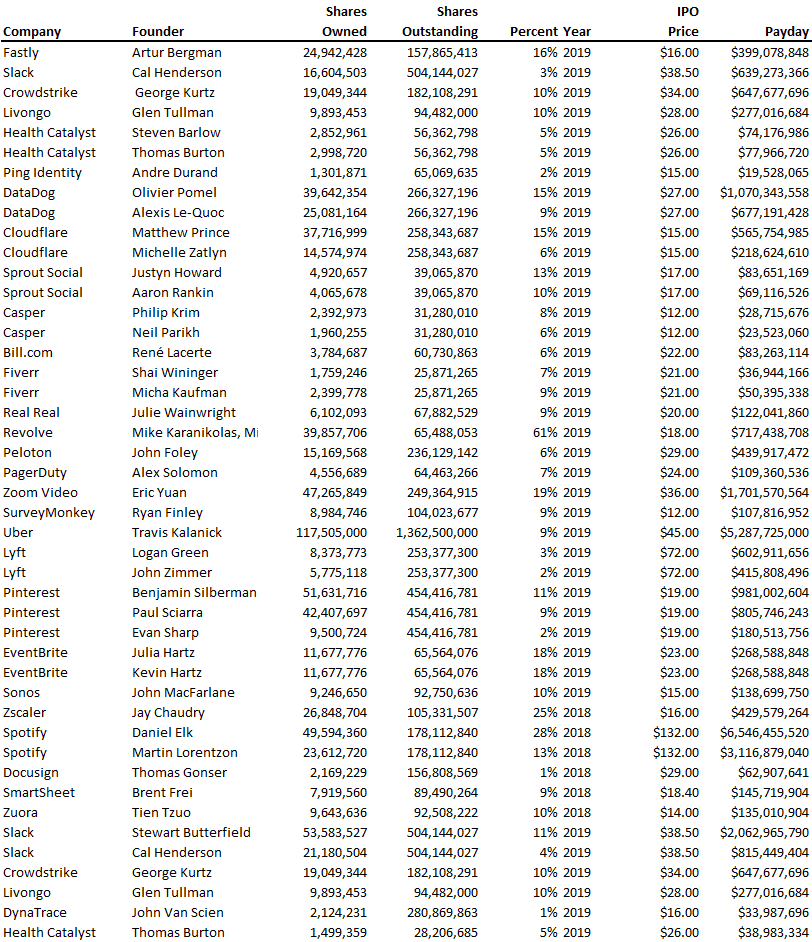
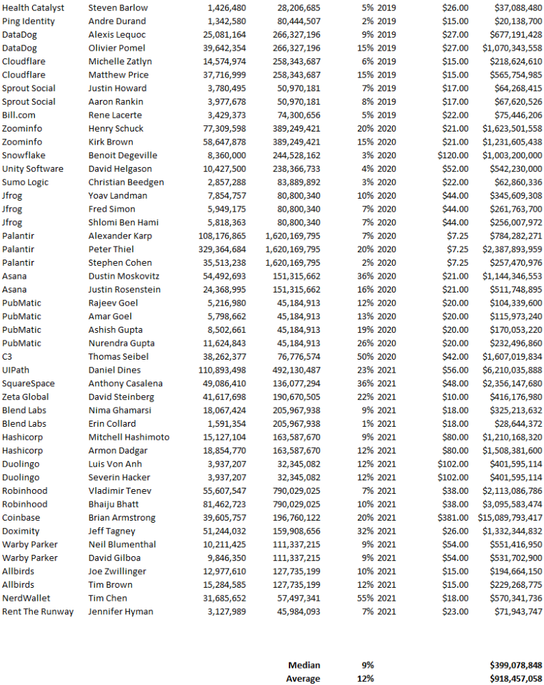
Several points are noteworthy.
Huge payoffs. Median and average pay were $399m and $918m. Average and median homeownership were 9% and 12%.
Coinbase, Uber, UI Path. Uber, Zoom, Spotify, UI Path, and Coinbase founders raised billions. Zoom's founder owned 19% and Spotify's 28% and 13%. Brian Armstrong controlled 20% of Coinbase at IPO and was worth $15bn. Preserving as much equity as possible by staying cash-efficient or raising at high valuations also helps.
The smallest was Ping. Ping's compensation was the smallest. Andre Duand owned 2% but was worth $20m at IPO. That's less than some billion-dollar paydays, but still good.
IPOs can be lucrative, as you can see. Preserving equity could be the difference between a $20mm and $15bln payday (Coinbase).

Will Lockett
3 years ago
Thanks to a recent development, solar energy may prove to be the best energy source.

Perovskite solar cells will revolutionize everything.
Humanity is in a climatic Armageddon. Our widespread ecological crimes of the previous century are catching up with us, and planet-scale karma threatens everyone. We must adjust to new technologies and lifestyles to avoid this fate. Even solar power, a renewable energy source, has climate problems. A recent discovery could boost solar power's eco-friendliness and affordability. Perovskite solar cells are amazing.
Perovskite is a silicon-like semiconductor. Semiconductors are used to make computer chips, LEDs, camera sensors, and solar cells. Silicon makes sturdy and long-lasting solar cells, thus it's used in most modern solar panels.
Perovskite solar cells are far better. First, they're easy to make at room temperature, unlike silicon cells, which require long, intricate baking processes. This makes perovskite cells cheaper to make and reduces their carbon footprint. Perovskite cells are efficient. Most silicon panel solar farms are 18% efficient, meaning 18% of solar radiation energy is transformed into electricity. Perovskite cells are 25% efficient, making them 38% more efficient than silicon.
However, perovskite cells are nowhere near as durable. A normal silicon panel will lose efficiency after 20 years. The first perovskite cells were ineffective since they lasted barely minutes.
Recent research from Princeton shows that perovskite cells can endure 30 years. The cells kept their efficiency, therefore no sacrifices were made.
No electrical or chemical engineer here, thus I can't explain how they did it. But strangely, the team said longevity isn't the big deal. In the next years, perovskite panels will become longer-lasting. How do you test a panel if you only have a month or two? This breakthrough technique needs a uniform method to estimate perovskite life expectancy fast. The study's key milestone was establishing a standard procedure.
Lab-based advanced aging tests are their solution. Perovskite cells decay faster at higher temperatures, so scientists can extrapolate from that. The test heated the panel to 110 degrees and waited for its output to reduce by 20%. Their panel lasted 2,100 hours (87.5 days) before a 20% decline.
They did some math to extrapolate this data and figure out how long the panel would have lasted in different climates, and were shocked to find it would last 30 years in Princeton. This made perovskite panels as durable as silicon panels. This panel could theoretically be sold today.
This technology will soon allow these brilliant panels to be released into the wild. This technology could be commercially viable in ten, maybe five years.
Solar power will be the best once it does. Solar power is cheap and low-carbon. Perovskite is the cheapest renewable energy source if we switch to it. Solar panel manufacturing's carbon footprint will also drop.
Perovskites' impact goes beyond cost and carbon. Silicon panels require harmful mining and contain toxic elements (cadmium). Perovskite panels don't require intense mining or horrible materials, making their production and expiration more eco-friendly.
Solar power destroys habitat. Massive solar farms could reduce biodiversity and disrupt local ecology by destroying vital habitats. Perovskite cells are more efficient, so they can shrink a solar farm while maintaining energy output. This reduces land requirements, making perovskite solar power cheaper, and could reduce solar's environmental impact.
Perovskite solar power is scalable and environmentally friendly. Princeton scientists will speed up the development and rollout of this energy.
Why bother with fusion, fast reactors, SMRs, or traditional nuclear power? We're close to developing a nearly perfect environmentally friendly power source, and we have the tools and systems to do so quickly. It's also affordable, so we can adopt it quickly and let the developing world use it to grow. Even I struggle to justify spending billions on fusion when a great, cheap technology outperforms it. Perovskite's eco-credentials and cost advantages could save the world and power humanity's future.